Built with Lovart
Aquilifer Brand Identity and System Design

Révolté


AQUILIFER — JEWELRY AS SOMETHING CARRIED, NOT WORN
LOGLINE
A jewelry brand built around a Roman military role — the aquilifer, the standard-bearer who carried the one thing the legion couldn't afford to drop. I built the entire visual system, photography, and motion language around that single idea: jewelry as something borne on the body, not decoration sitting on top of it.
THE BRIEF
I set this one for myself. Most jewelry brand systems split into two failure modes — either glossy, over-lit product photography that could belong to any brand, or moody macro imagery that's sensual but says nothing about the object itself. I wanted a system where the name, the photography, the color logic, and the motion on the website were all making the same argument, not four different departments doing their own thing under one logo.
The name came first. Aquilifer isn't a pretty word — it's a job title, and a dangerous one. That gave me the whole conceptual spine before a single ring was designed.
THE APPROACH
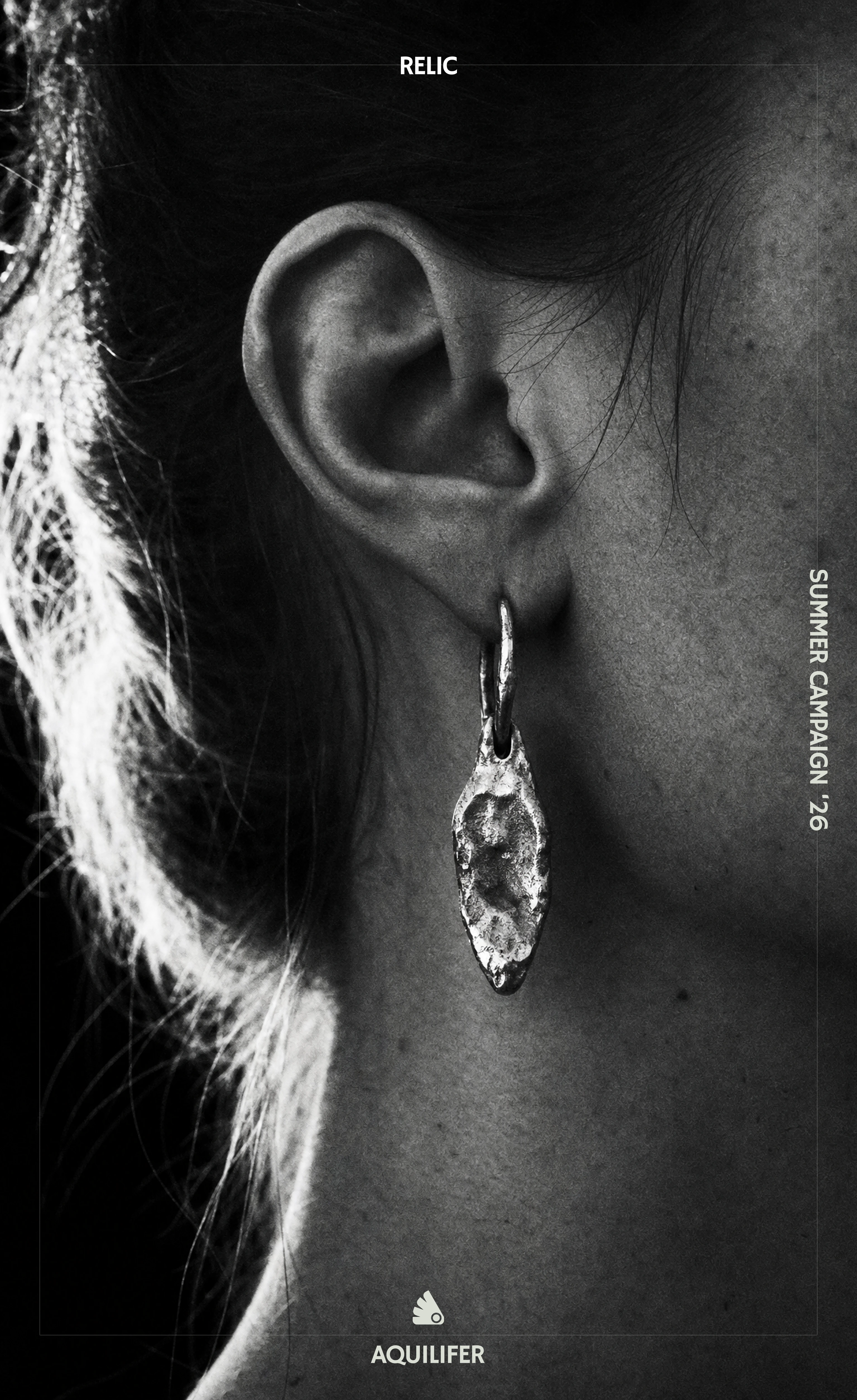
My first instinct was to treat this like most fine jewelry brands do — polished metal, faceted stones, the usual studio gloss. It didn't survive contact with the name. A standard-bearer doesn't carry something pretty, he carries something that matters, and polished perfection reads as decorative, not load-bearing. I killed the gem-set direction early and moved to hand-cast, asymmetric pieces with visible tool marks left in — the metal has to look forged, not manufactured.
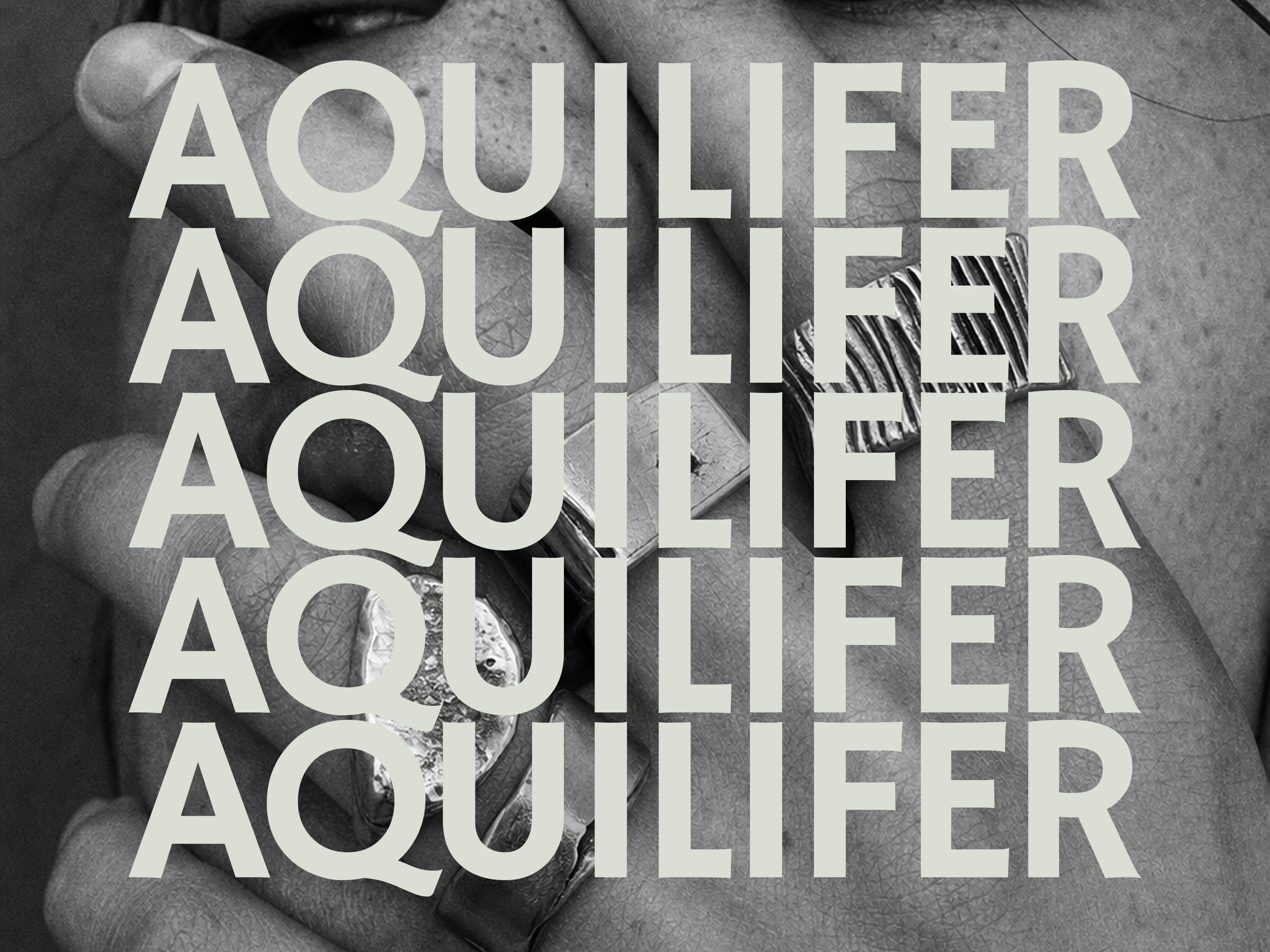
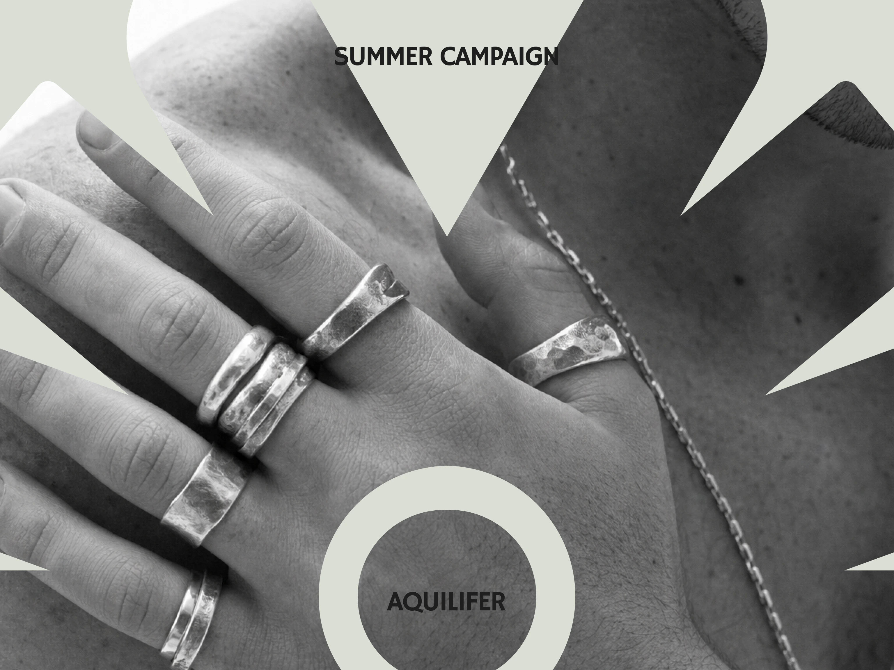
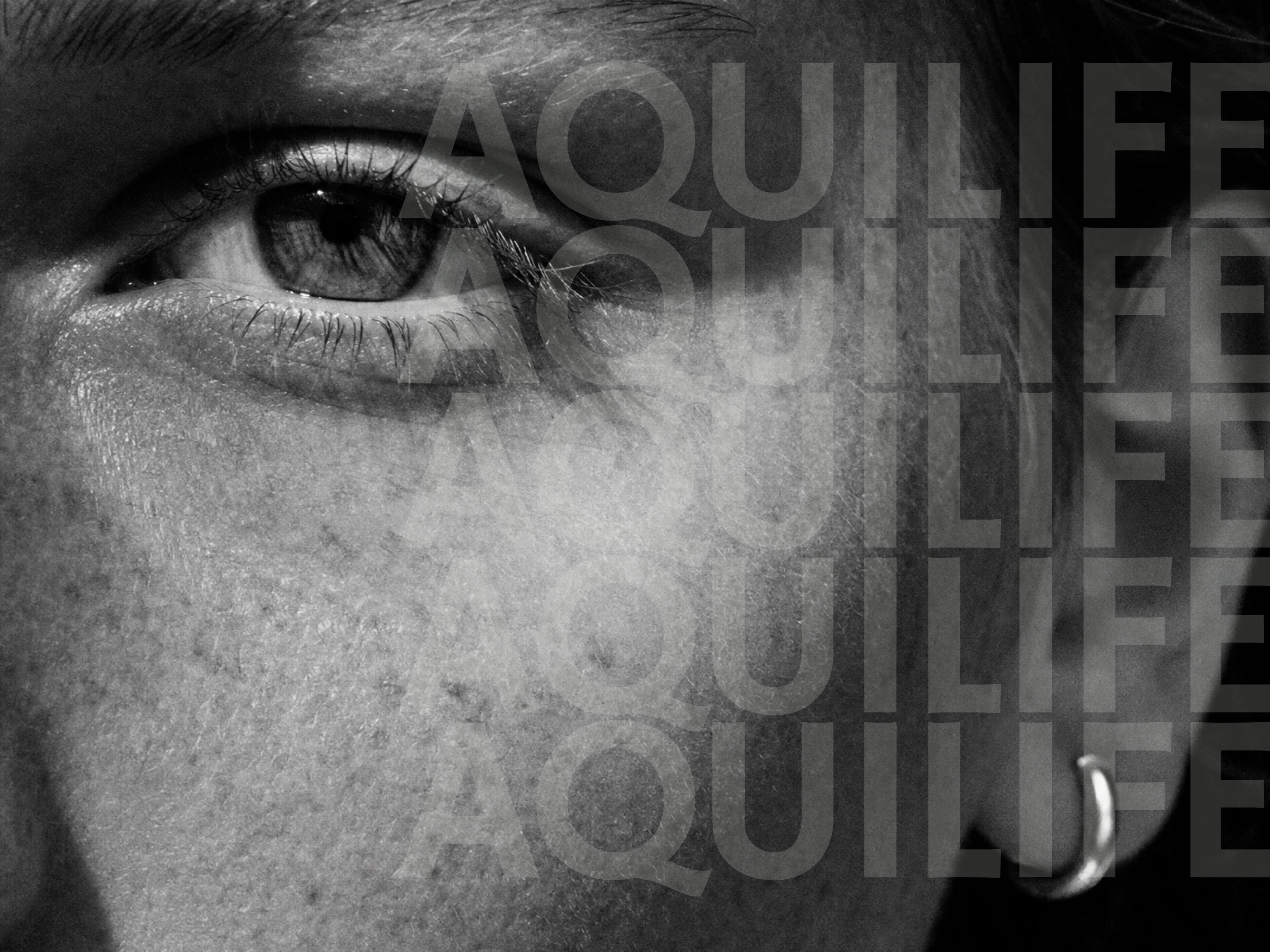
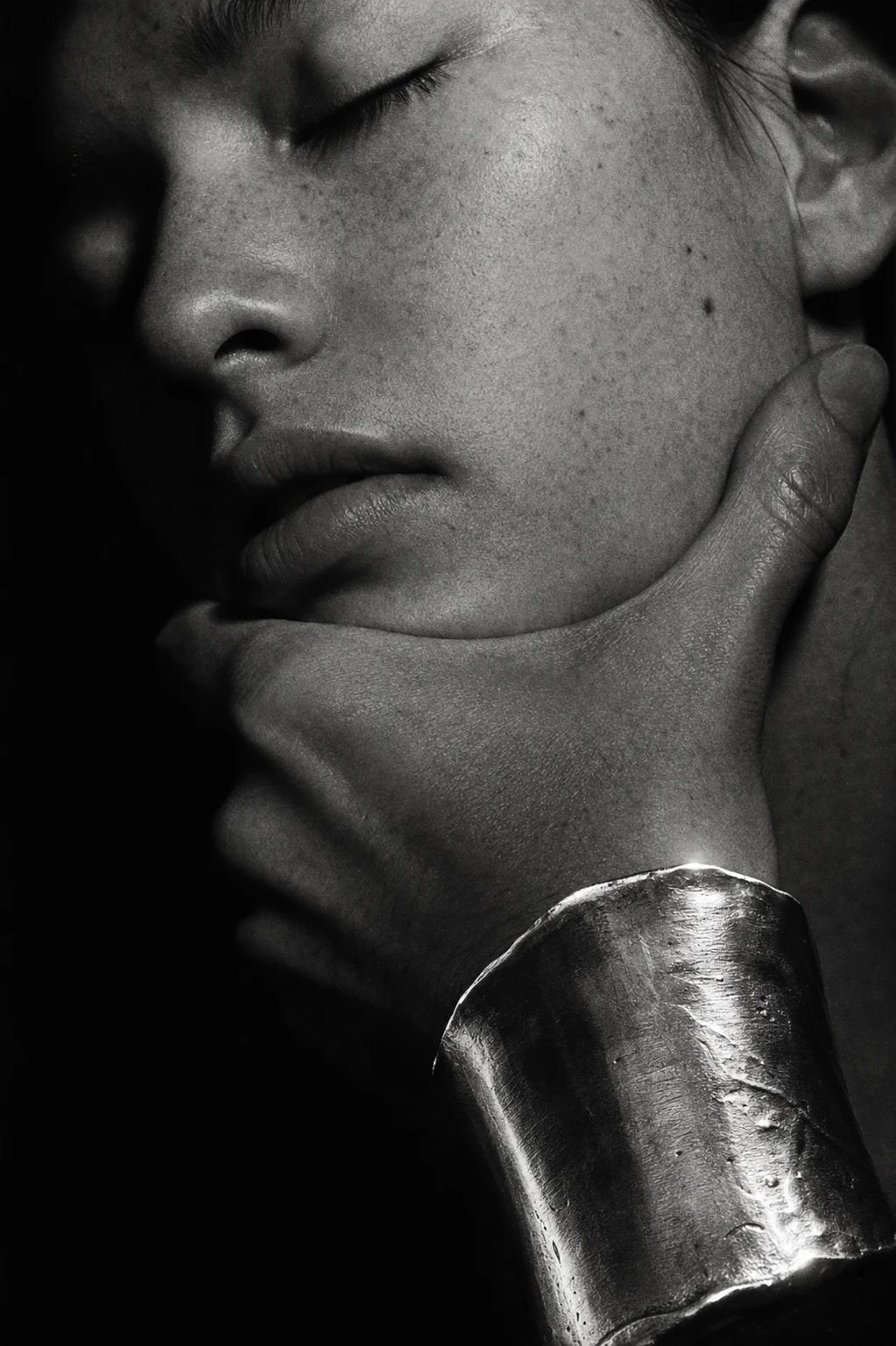
That decision cascaded into everything else. If the object isn't polished, the photography can't be either — so I moved the entire campaign register to extreme macro, unretouched skin, hands gripping and covering the face rather than posed at a distance. Freckles, pores, fine hairs, all left in. The jewelry photographs like it's being held onto, not modeled.
The color system followed the same logic. I didn't want one dark and one accent — I built two darks,
#1E1E1E and #27331A, so the brand could shift register (campaign world versus object world) without ever leaving the palette's severity to go light or bright. #D9DED4 stays structural — text, thin lines, the occasional wash — never a background fill. The system only breaks that discipline once: when Product photography needs to feel like a genuinely different room from Campaign, and even then it's a scroll-triggered transition, never a hard cut.Motion was the last piece and the one I was most stubborn about. No rotation, anywhere, on anything — a spinning object reads as being shown off, and this brand isn't about showing off, it's about carrying weight. Every reveal on the site is a diagonal mask, same angle family, same easing curve, top to bottom — logo, headline, image, section transition, all cut from the same gesture instead of a grab-bag of scroll effects. If it doesn't reinforce "carried, not displayed," it's not in the system.
THE WORK
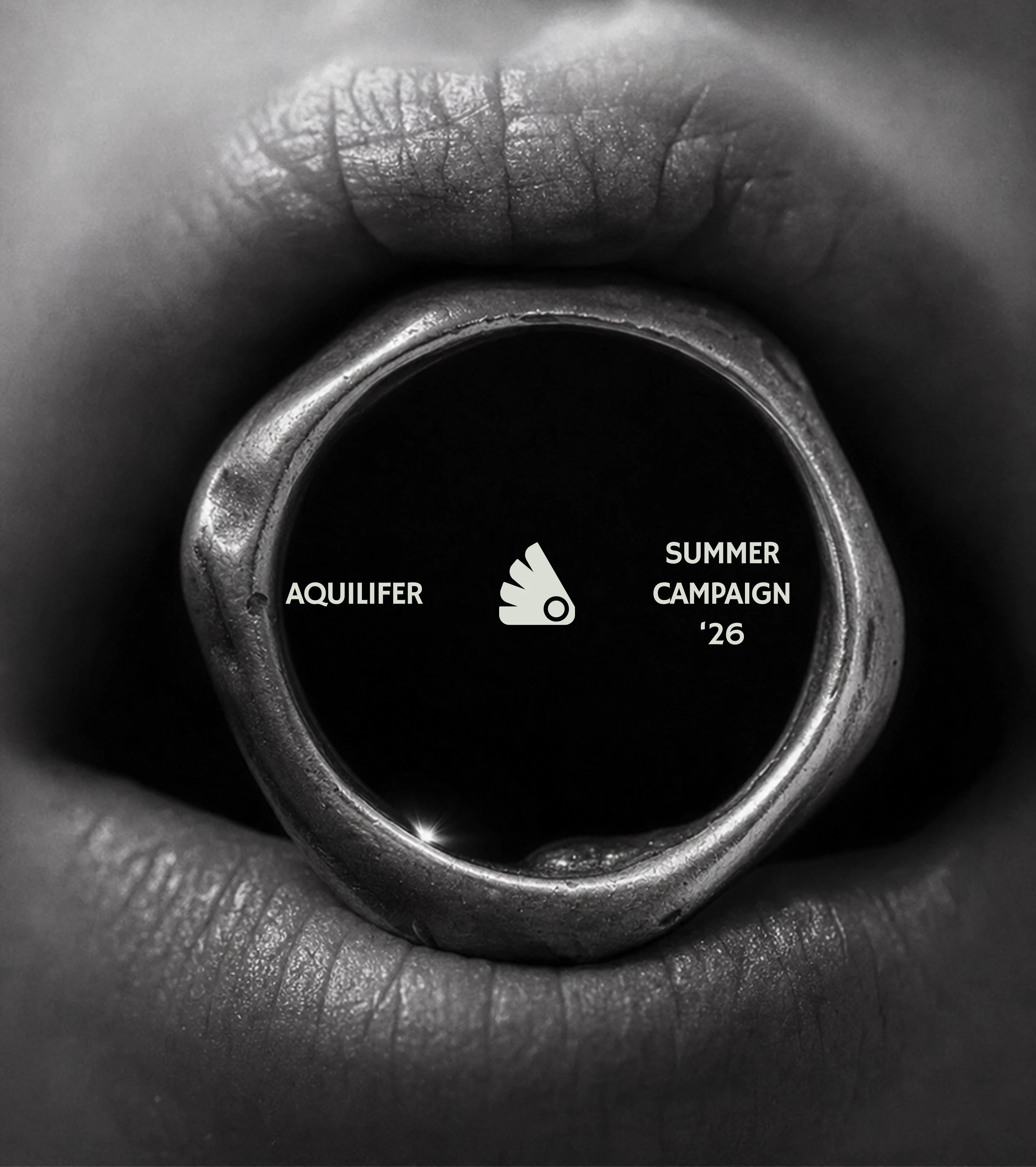
LOGO & WORDMARK
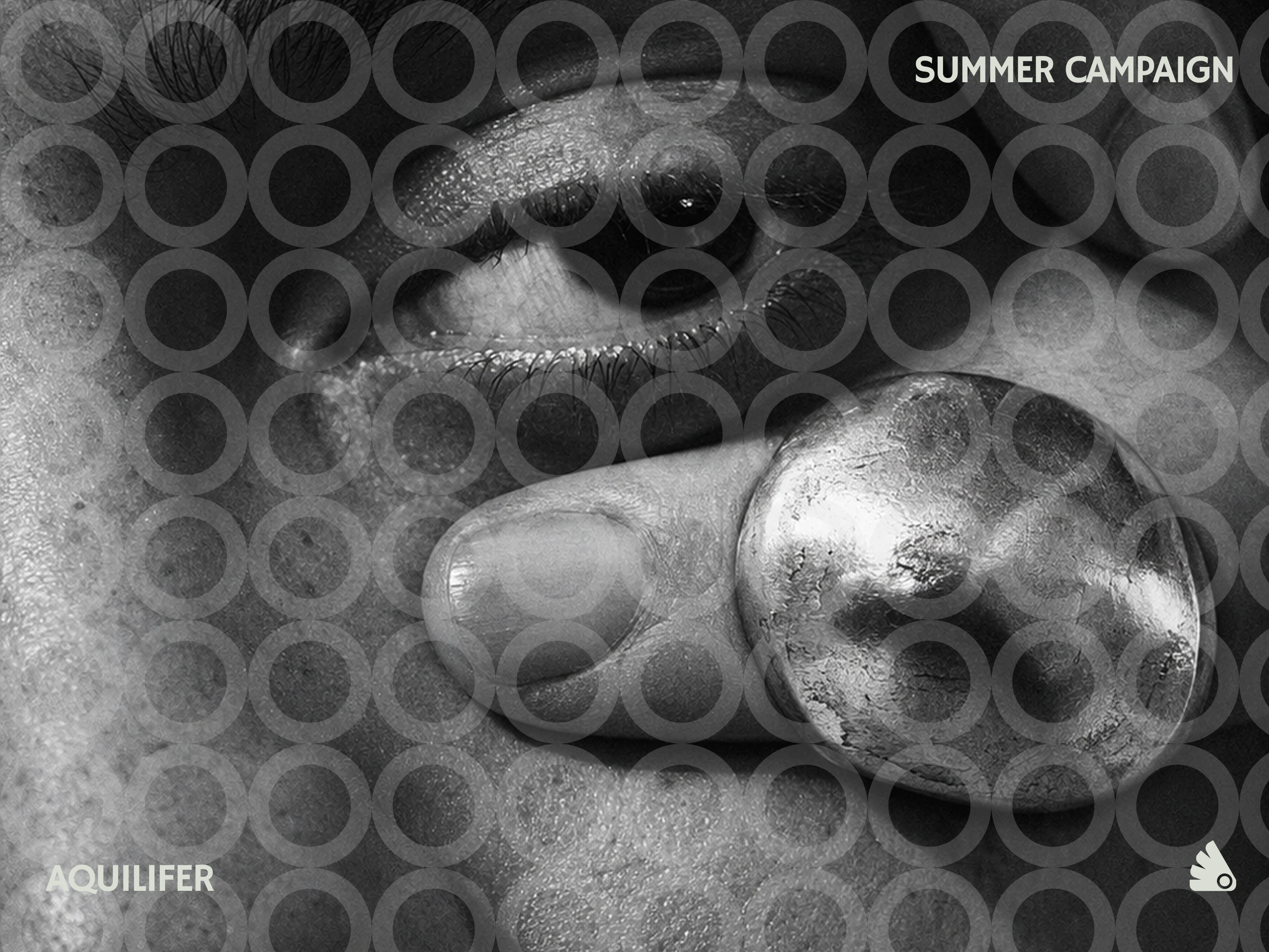
Hand/talon mark paired with the AQUILIFER wordmark in Hammersmith One, lowercase for the mark, wide-tracked uppercase for headers. The typeface's rounded terminals were the deciding factor — they echo the molten, hand-formed edges of the pieces themselves rather than fighting them with something sharp.
COLOR SYSTEM
A functional four-value palette —
#1E1E1E and #27331A as two distinct dark grounds, #D9DED4 reserved for structure and text, #FFFFFF used sparingly. No accent color outside this set anywhere in the system.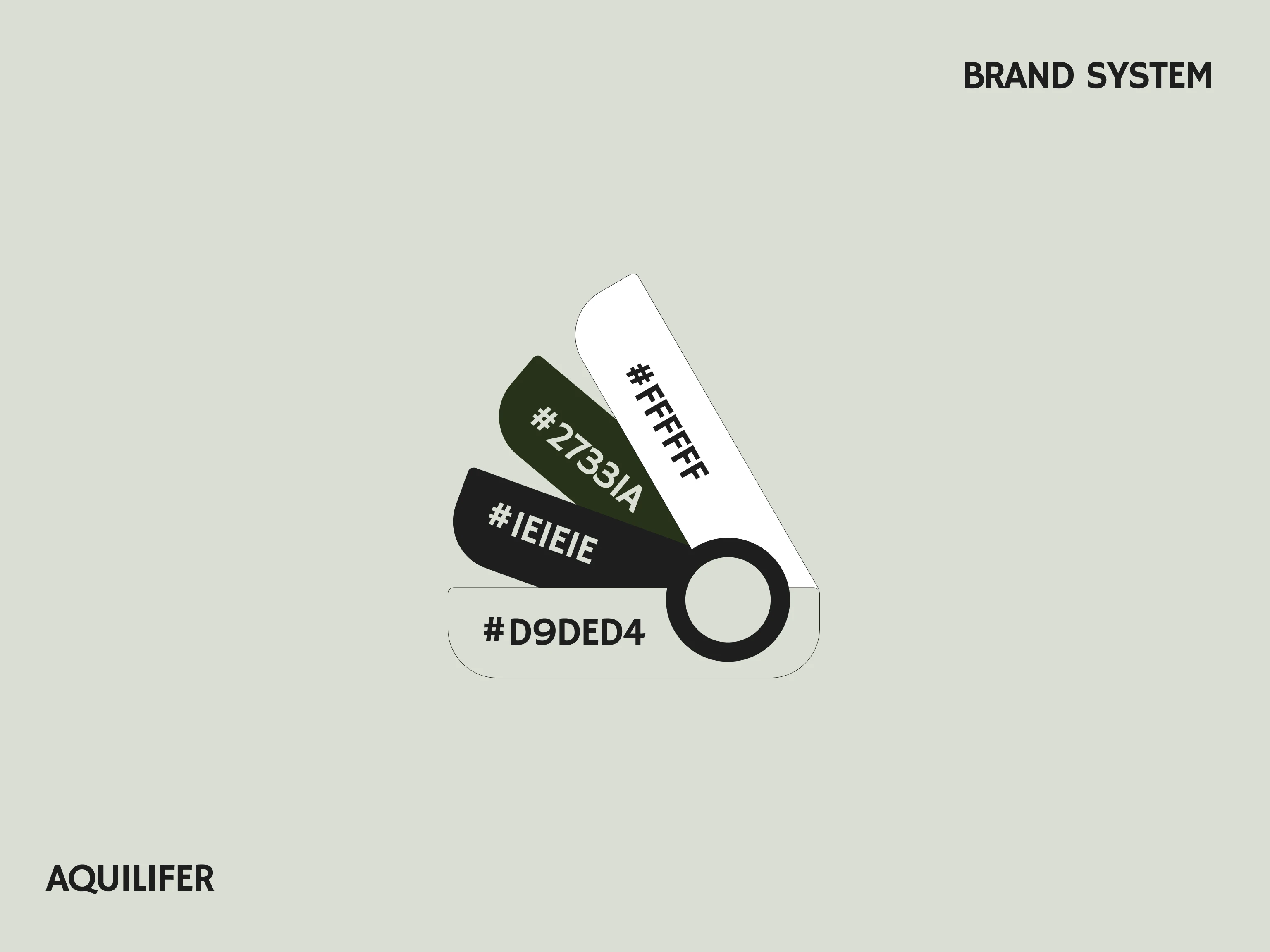
CAMPAIGN PHOTOGRAPHY DIRECTION
Ten campaign concepts shot as extreme macro, high-contrast 35mm-style black and white, unretouched skin, hands gripping or covering the face rather than posed — jewelry documented as body contact, not still life.
PRODUCT PHOTOGRAPHY DIRECTION
A separate studio register — raw stone fragments and brushed matte metal standing in for generic mockup props, near-black grounds, restrained sage-grey wash. Ten mockups covering single pieces, packaging, and grouped product shots.
MOTION & WEB DIRECTION
A full landing page system built on diagonal-only clip-path masks, driven by GSAP and Framer Motion rather than CSS transitions — no rotation, no particles, no bounce. A two-step color transition moves the site between its two dark grounds as the narrative shifts from campaign to product.
THE RESULT
What shipped is a system where a single conceptual decision — jewelry as something carried rather than worn — is legible in the name, the object's surface finish, the photography's intimacy, the restraint of the color palette, and the physics of how things move on the page. Nothing in the system is decorative for its own sake, which is exactly the argument the brand is making about the jewelry itself.
This is also, honestly, the pitch for how I work. A client doesn't come to me for a logo and a moodboard — they come because I'll take one real idea and refuse to let any part of the system contradict it, down to the easing curve on a hover state.
Révolté — revolte.design
Project: Aquilifer
Year: 2026
Scope: Brand Identity, Campaign & Product Photography Direction, Motion & Web Direction
Industry: Jewelry
Like this project
Posted Sep 14, 2026
A jewelry brand built on one idea — carried, not worn — down to the easing curve on a hover state, the one thing the legion couldn't afford to drop.
Likes
0
Views
13
Timeline
Aug 11, 2026 - Sep 14, 2026

