Built with Lovart
Hive Index: Raw Honey Brand Identity

Révolté


HIVE INDEX — Honey Treated Like Evidence
LOGLINE
A raw honey brand that refused to be cute about it. Instead of flavor names and rustic jars, I built a system where every batch gets a specimen number, a harvest date, and tasting notes written the week it was pulled — because raw honey isn't a product, it's a report from a season.
THE BRIEF
I picked this one deliberately. Looking back at my own portfolio, I noticed I'd built a lot of fashion, beauty, cannabis, and beverage brands — and almost nothing rooted in a genuinely unglamorous, overlooked industry. Raw honey was exactly that gap. Every honey brand I looked at reached for the same three moves: cursive script, a cartoon bee, and a "golden hour" glow. None of it was honest about what raw honey actually is — a substance that changes every single harvest depending on weather, bloom, and forage radius.
The tension was simple: how do you brand something that's inherently inconsistent without pretending it's consistent? Most honey brands solve this by blending batches until every jar tastes identical. I didn't want to solve it. I wanted to document it.
What I took on was the full system — identity, packaging, OOH, retail and social applications, and a website — built around one governing idea: treat honey like a field specimen, not a flavor.
THE APPROACH
My first instinct was to lean into naturalist illustration — pinned-specimen line drawings, the kind you'd see in an old field guide. It looked good in isolation, but it fought the brand's core premise. Illustration implies interpretation. I needed something that read as recorded, not designed.
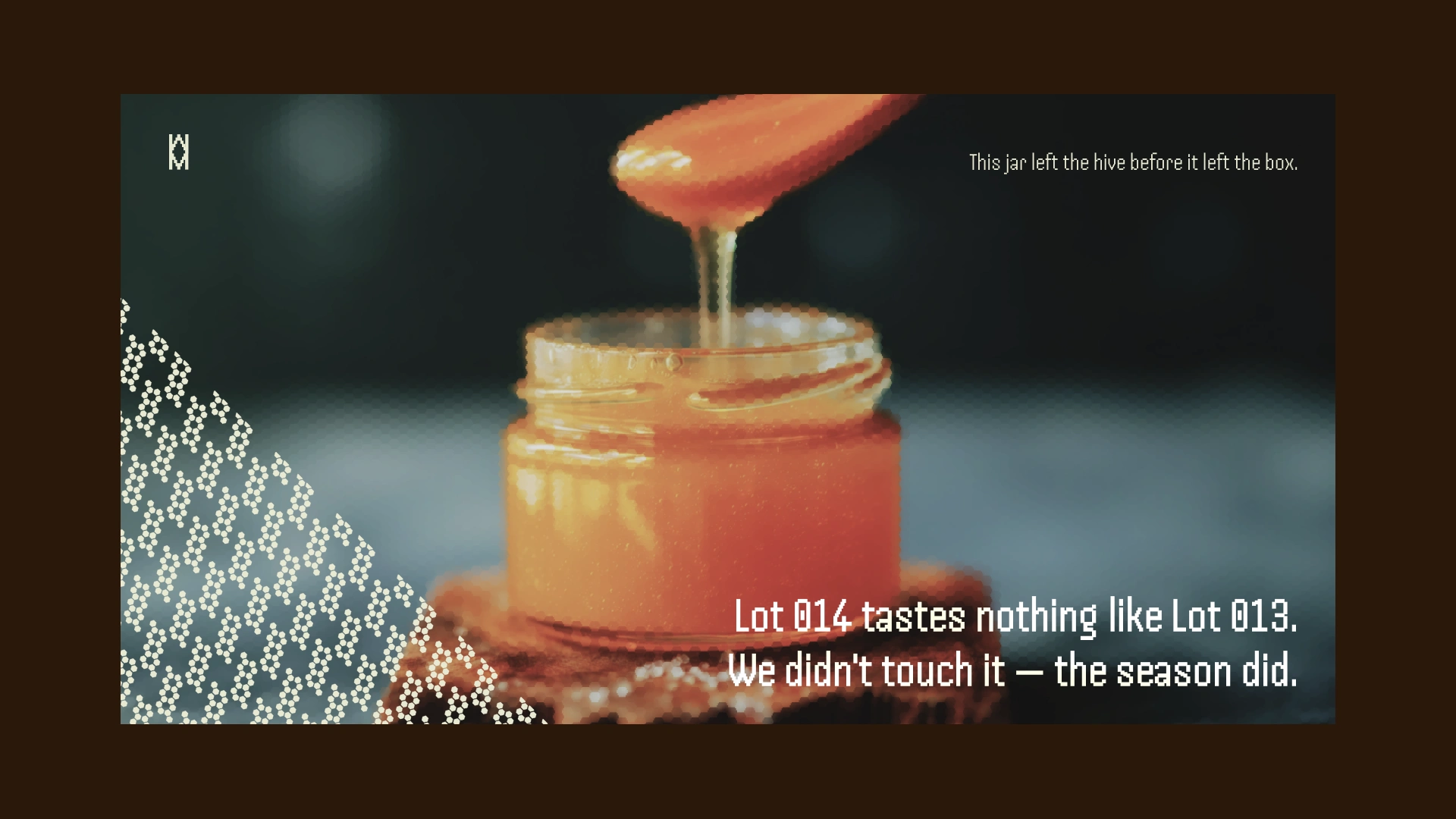
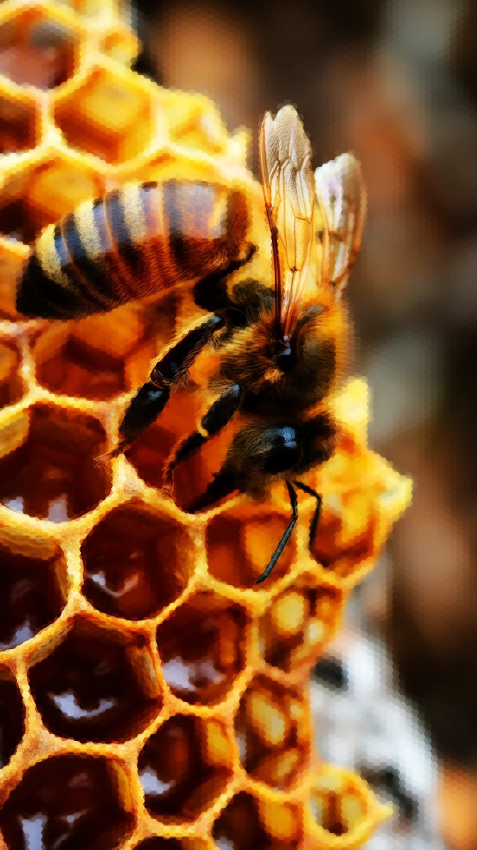
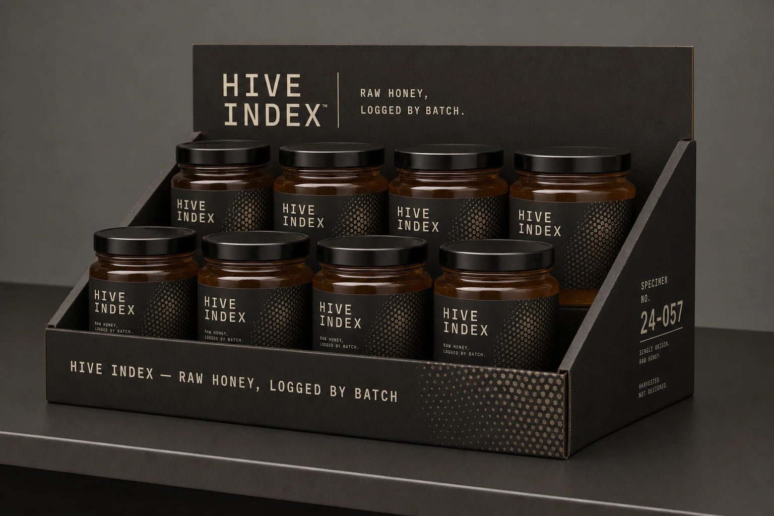
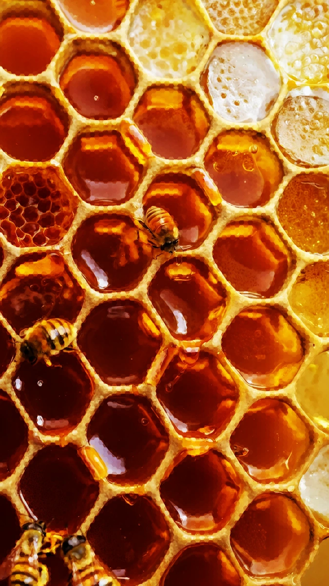
That's when I dropped the illustration entirely and rebuilt the system around real photography and real data. Instead of decorative bee drawings, I used actual macro photography — pulled low-contrast and desaturated, so the honey reads closer to clay and rust than glossy gold. Instead of an illustrated hex pattern, I used a literal dot-matrix hex texture, treated as a graphic device bleeding in from image edges rather than a cute honeycomb motif.
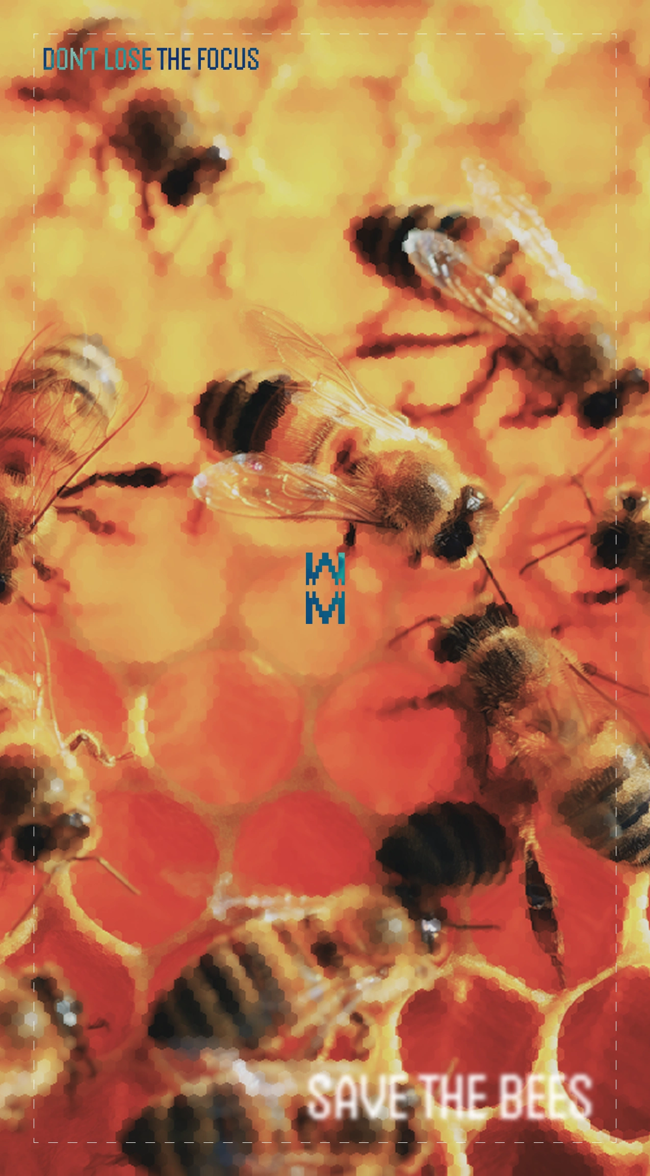
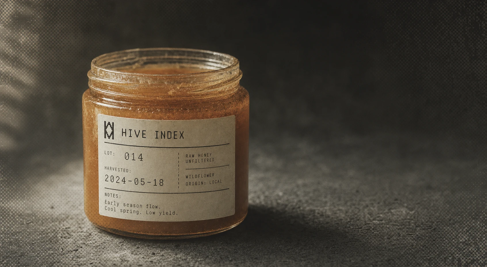
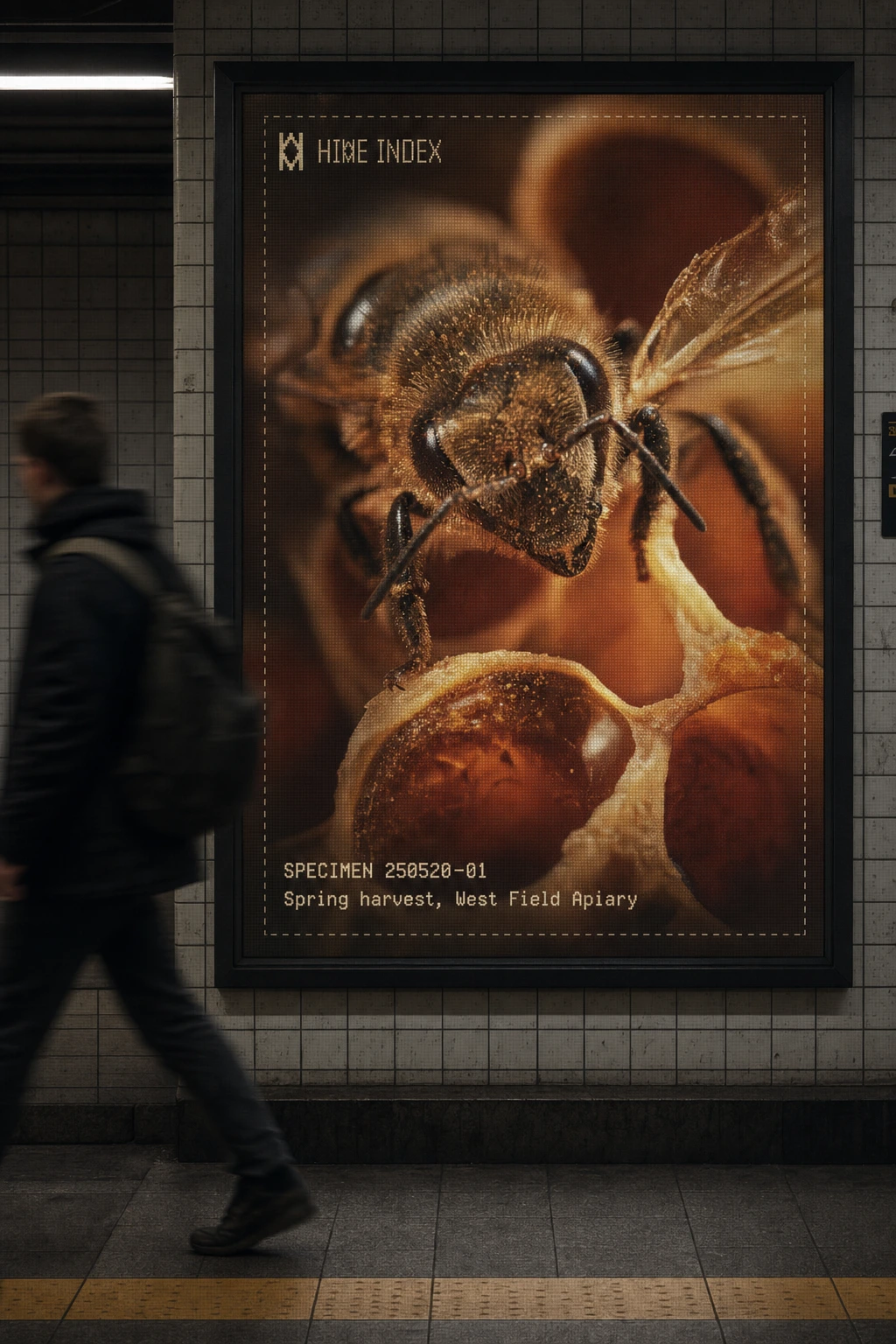
The specimen-card format was the unlock. Once I decided every product page, every label, every OOH placement would carry a specimen number, harvest date, and tasting note — the same way a lab intake form or a museum catalog card works — the rest of the system built itself. The dashed border framing device came directly from that logic: it's not decoration, it's an evidence-card crop mark. Even the copywriting followed the rule — "Lot 014 tastes nothing like Lot 013. We didn't touch it — the season did" became the thesis statement for the entire brand.
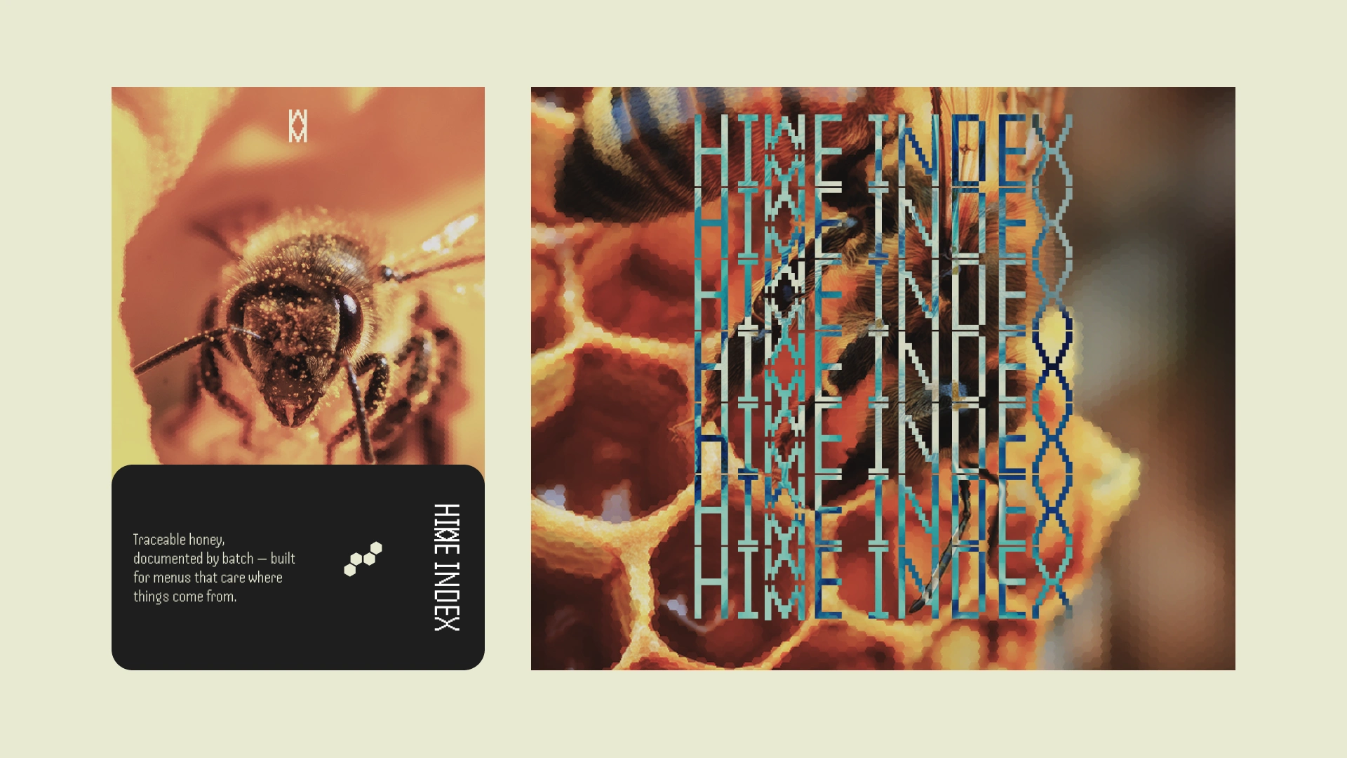
The logo took longer to get right. My first version of the hex-glyph "H" mark looked clean in isolation but started dissolving into ambiguous geometry once placed on busy photography or scaled down to favicon size. I had to go back and test it in isolation at multiple sizes, stress-test it as a single-color stamp, and only then commit to a stroke weight that held up across both flat print applications and on-photo placements.
THE WORK
BRAND IDENTITY / VISUAL SYSTEM
The full system runs on a single rule: document, don't decorate. Every touchpoint — packaging, signage, digital — carries some version of the specimen-card format: a numbered lot, a harvest date, an origin, and a tasting note, styled like lab documentation rather than marketing copy.
LOGO
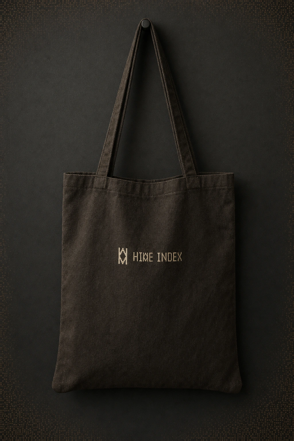
A hex-geometry glyph built to abstract an "H" from hexagonal structure rather than illustrate a bee or a comb. Refined for legibility at small sizes and tested as a single-color stamp/deboss, since so much of the brand lives in physical, tactile applications.
COLOR SYSTEM
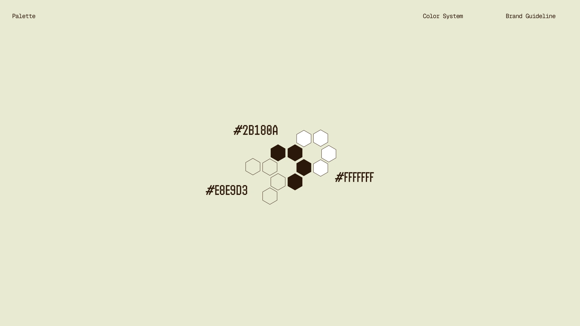
Graphite/near-black (#1A1410) and specimen paper cream (#EAE6D4) form the structural palette. Amber (#C8622A–#E8934A) is used only within photography — honey, comb, harvest imagery — never as a flat brand color, keeping the system from tipping into typical "warm honey brand" territory.
TYPOGRAPHY SYSTEM
Monospace type carries all data — specimen numbers, harvest dates, lot notes — reinforcing the lab-report register. A humanist sans handles headlines and longer copy, keeping the system readable without breaking the technical mood.
PACKAGING
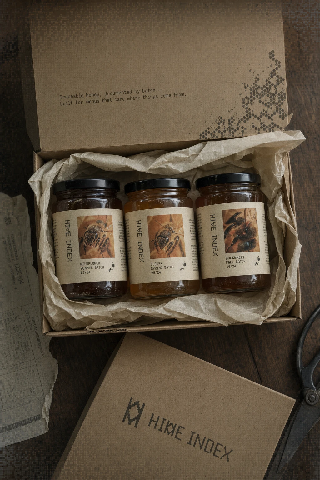
Jar labels formatted as specimen cards with lot number, harvest date, apiary origin, and tasting notes. Shipping cartons carry the same logic on the interior flap, with a hex dot-matrix texture bleeding from one corner and a stamped, single-color logo rather than a full-color print.
WEB DESIGN
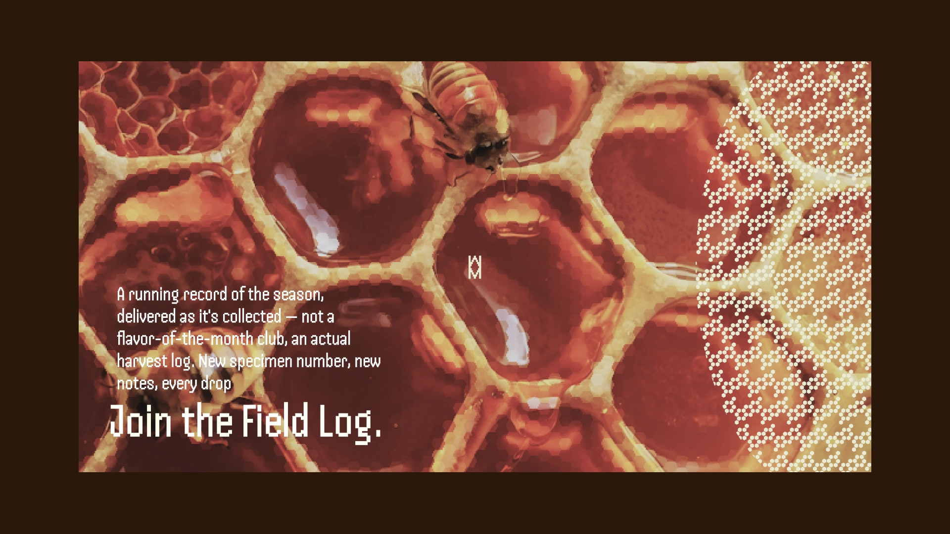
Built in Framer, structured around Specimens / Process / Field Log rather than a conventional product-grid ecommerce layout. The traceability section turns literal weather data — flowering window, rainfall reading — into on-page content, which is the clearest expression of the brand's whole premise: the season writes the copy, I just log it.
PRINT / OOH / ENVIRONMENTAL
A subway platform poster treats the ad space like an evidence card, dashed border and all. Farmers market signage, storefront window decals, a retail shelf riser, and a delivery van wrap all carry the system at different scales, deliberately avoiding rustic market styling in favor of something closer to research documentation moved into public space.
THE RESULT
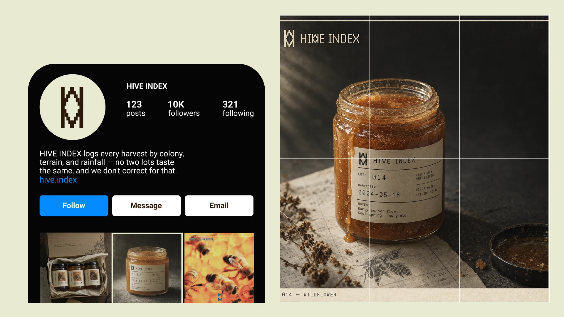
The system shipped across a genuinely wide range of touchpoints — packaging, environmental signage, transit advertising, social, and a live website — without the identity fracturing at any scale. The specimen-card logic proved flexible enough to hold up on a subway poster and on a jar label without feeling like two different brands.
The website is where the concept clicked hardest for me. Turning rainfall and flowering-window data into actual page content wasn't something I planned from the start — it came out of pushing the "document, don't decorate" rule as far as it would go. That's usually the sign a system is working: it starts generating its own content logic.
Révolté — revolte.design
Project: Hive Index
Year: 2026
Scope: Brand Identity, Logo Design, Packaging, Web Design, OOH, Environmental Design, Social Templates
Industry: Food & Beverage — Specialty Apiary
See more at revolte.design
Like this project
Posted Sep 18, 2026
Raw honey branded like lab evidence — every jar carries a specimen number, harvest date, and tasting notes instead of a flavor name
Likes
0
Views
1
Timeline
Aug 20, 2026 - Sep 18, 2026


