NADIR Brand Identity and Systems Development

Révolté


NADIR — Building the Case I Needed to Make
LOGLINE
I needed to prove I could think in systems, not just make things look good. So I built a full aerial-hardware brand from a single logo mark — name, identity, product photography direction, and two working landing page specs — and let the discipline of the work make the argument for me.
THE BRIEF
This one didn't come from a client. It came from a conversation with another studio founder who told me, gently but directly, that my work reads as strong on the art/visual side and thin on brand systems. He wasn't wrong, and he wasn't being diplomatic about it either — he said he needed someone who could develop full brand systems, and my portfolio wasn't proving that yet.
I could have sent him more of what I already had. Instead I decided to build something new, specifically to close that gap — a project with no client constraints, where the only brief was mine: prove the systems thinking is real, not just claimed.
I already had a mark I liked — a black geometric quadrant swoosh, the kind of shape that reads like a rotor caught mid-turn or a radar sweep frozen at one frame. I didn't have a brand around it yet. That became the whole exercise.
THE APPROACH
The mark told me where to go before I consciously decided anything. That curved negative-space sweep reads as motion — a blade, an arc, an aperture. I didn't want to name it with the obvious eagle-hawk-shield vocabulary every drone brand reaches for. I went looking in orbital mechanics and navigation terminology instead, because a brand about precision aerial systems should sound like it understands flight, not like it's decorating a weapon.
I tested against real astronomy and Latin roots — Arcus, Perigee, Meridian — before landing on NADIR: the point on a map or in the sky directly beneath the observer, the opposite of zenith. It's the term for "straight down," which is exactly what a drone's camera sees. It sounded invented without being invented, and it gave me a name with an actual argument behind it instead of a mood board word.
The harder pivot came in the product photography direction. My first instinct was cinematic — night skies, glowing light trails, a navy-and-neon energy that felt "premium tech launch." When I finally sat down with real studio references — the kind of soft, warm-grey catalog photography DJI and Apple actually use — I saw the mismatch immediately. The reference work wasn't cold or moody. It was bright, warm-lit, generous with negative space, grain doing the texture work instead of dramatic lighting. I threw the night-sci-fi direction out and rebuilt the entire mockup system against the real references instead of what I assumed "trendy drone brand" should look like. That correction is the actual proof of systems thinking here — not defending the first idea, but recognizing when the system and the reference didn't agree, and fixing the system.
Once the physical brand held together, I pushed it into the one place most portfolios stop short of: the product's own interface. I built out two structurally distinct landing page specs — not just visual direction, but full GSAP and Framer Motion choreography, real easing curves, real scroll-trigger logic — because a brand system that only exists as static mockups isn't a system yet. It's a mood board with good typography.
THE WORK
LOGO AND MARK
A geometric quadrant-swoosh mark, rendered in flat black on white, no gradients or dimensional shading. The form reads simultaneously as a rotor sweep, a radar arc, and an aperture — deliberately ambiguous enough to carry all three associations without over-illustrating any one of them.
WORDMARK AND TYPE SYSTEM
Josefin Sans set at -15% tracking, paired against the mark as a horizontal lockup. Untracked, Josefin Sans reads editorial and slightly boutique; pulling the tracking in that far pushes it back toward technical and instrument-grade, which is the entire point of the pairing — the typeface's natural warmth kept in check by tighter spacing.
COLOR SYSTEM
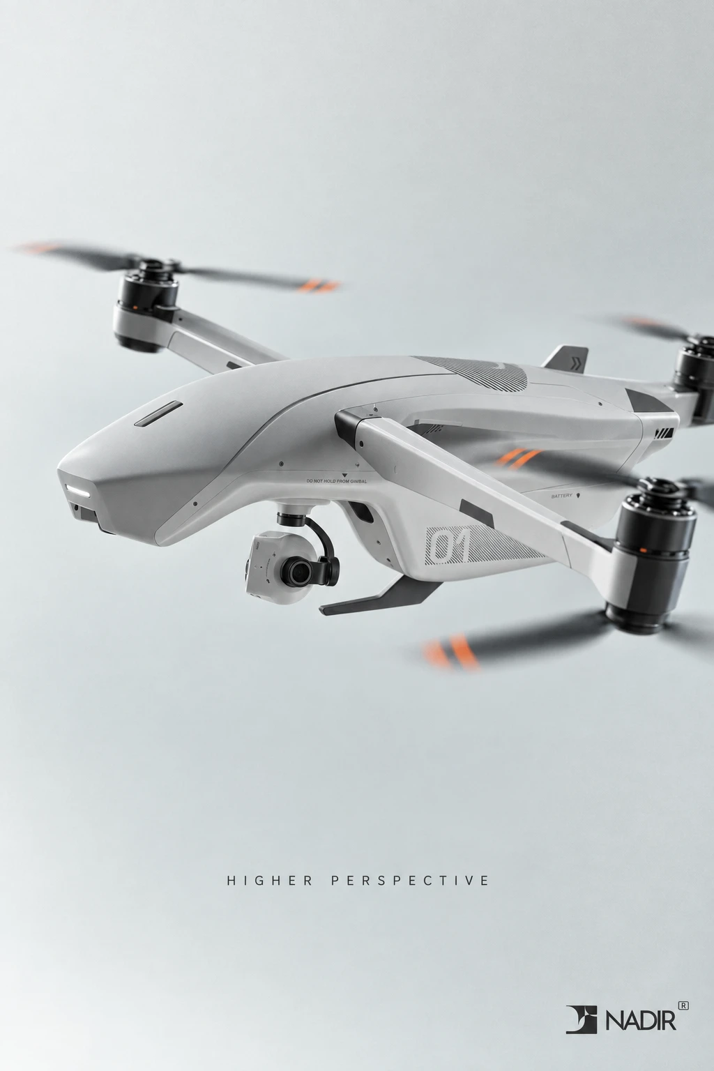
Gunmetal grey
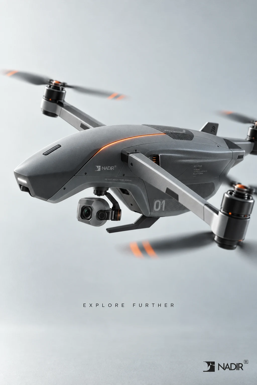
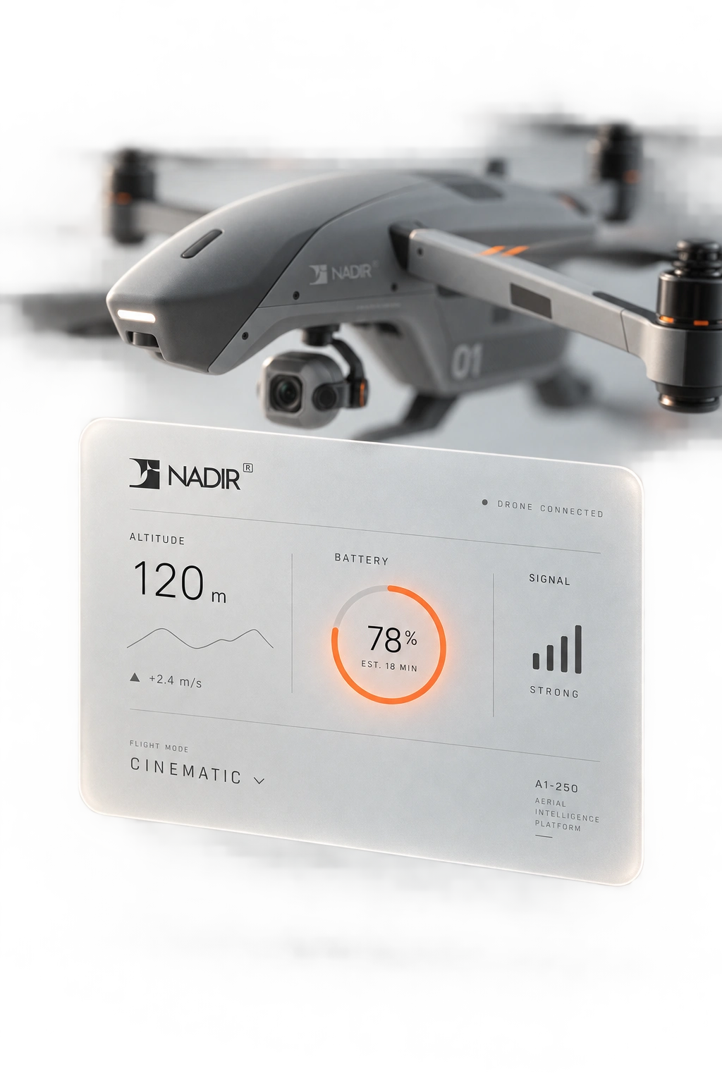
#3A3D40 and mid-grey #8A8C8E carry the product body and roughly 85% of every composition. A background gradient from #D8D9D6 to #F4F4F2 keeps every studio shot soft and bright rather than stark. Signal-orange #E85C2B is rationed to a strict single-accent rule — one glowing seam, one propeller stripe, one live data readout per frame, never a fill, never more than one per composition.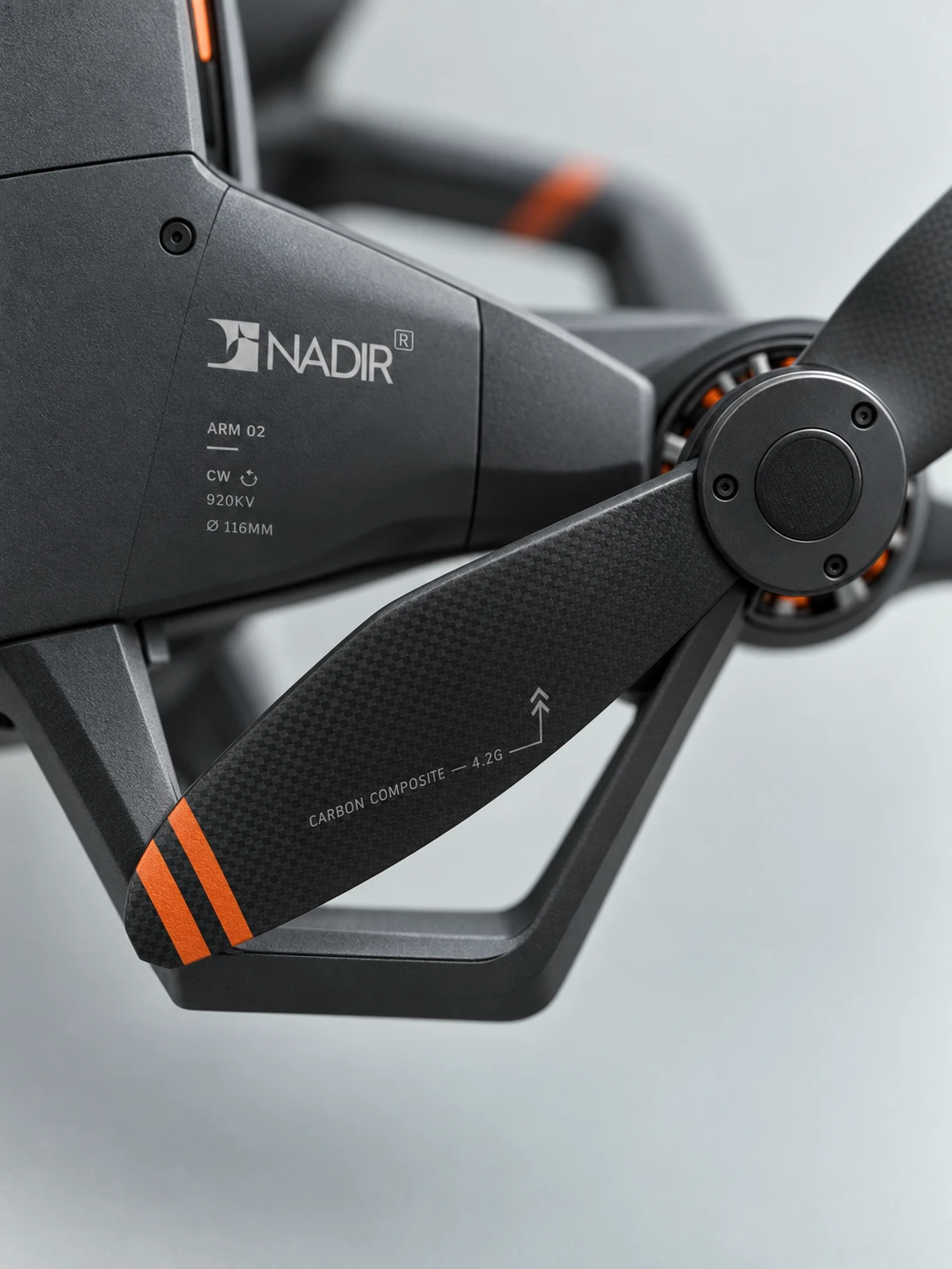
PRODUCT PHOTOGRAPHY SYSTEM
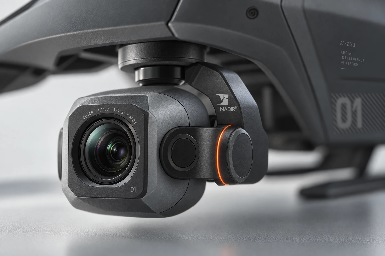
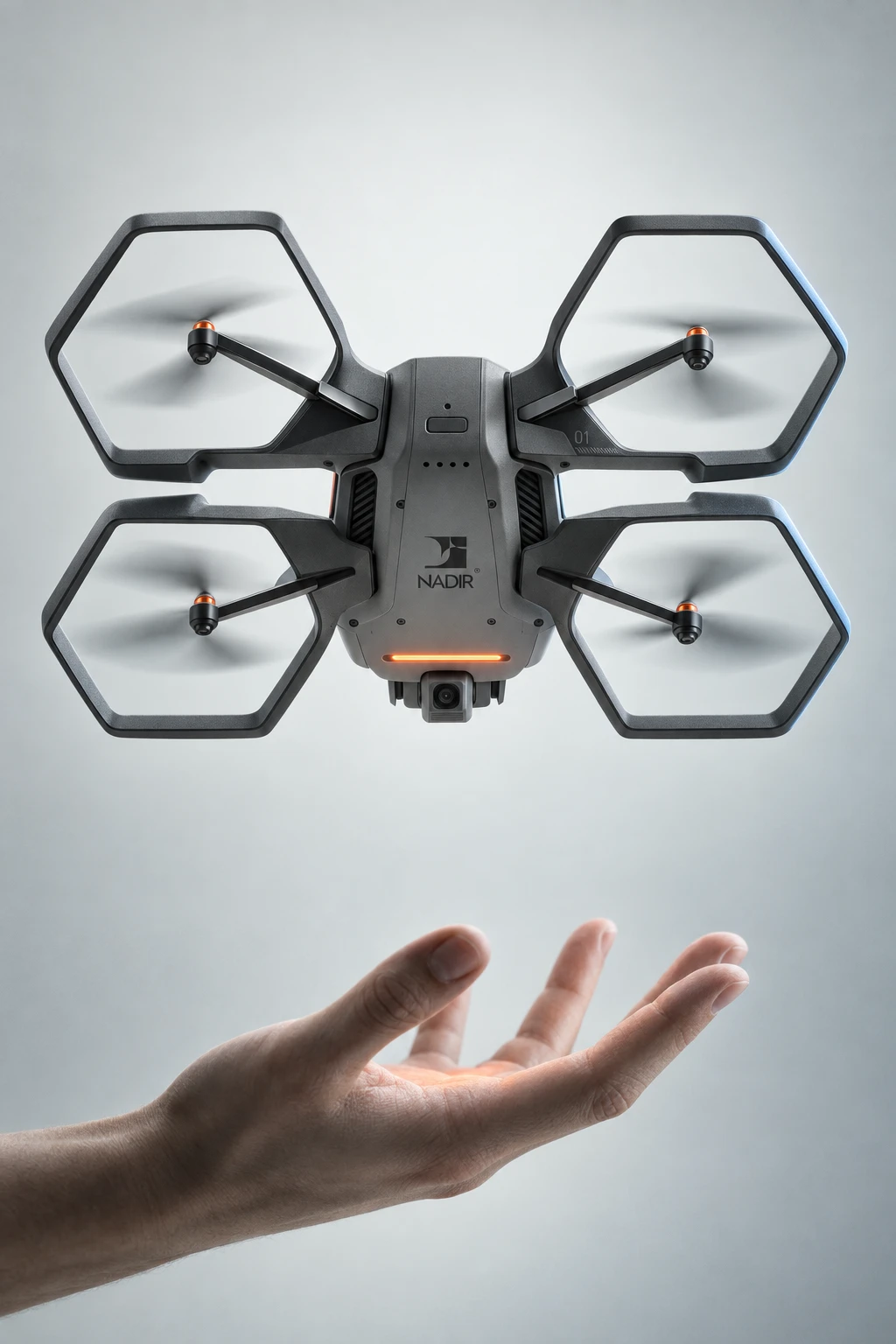
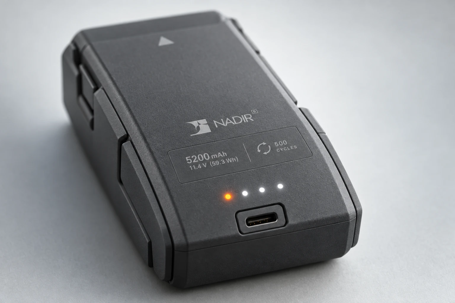
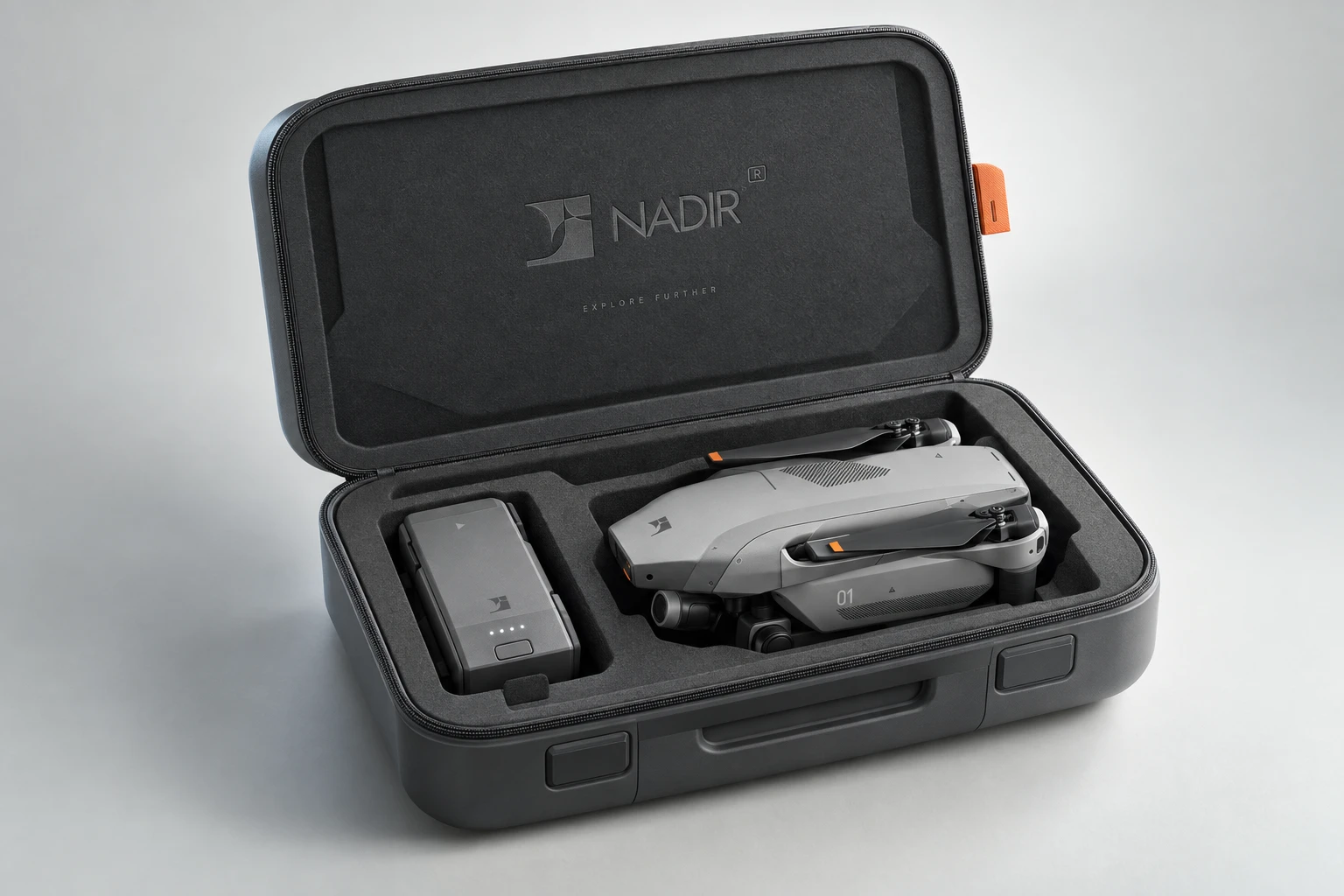
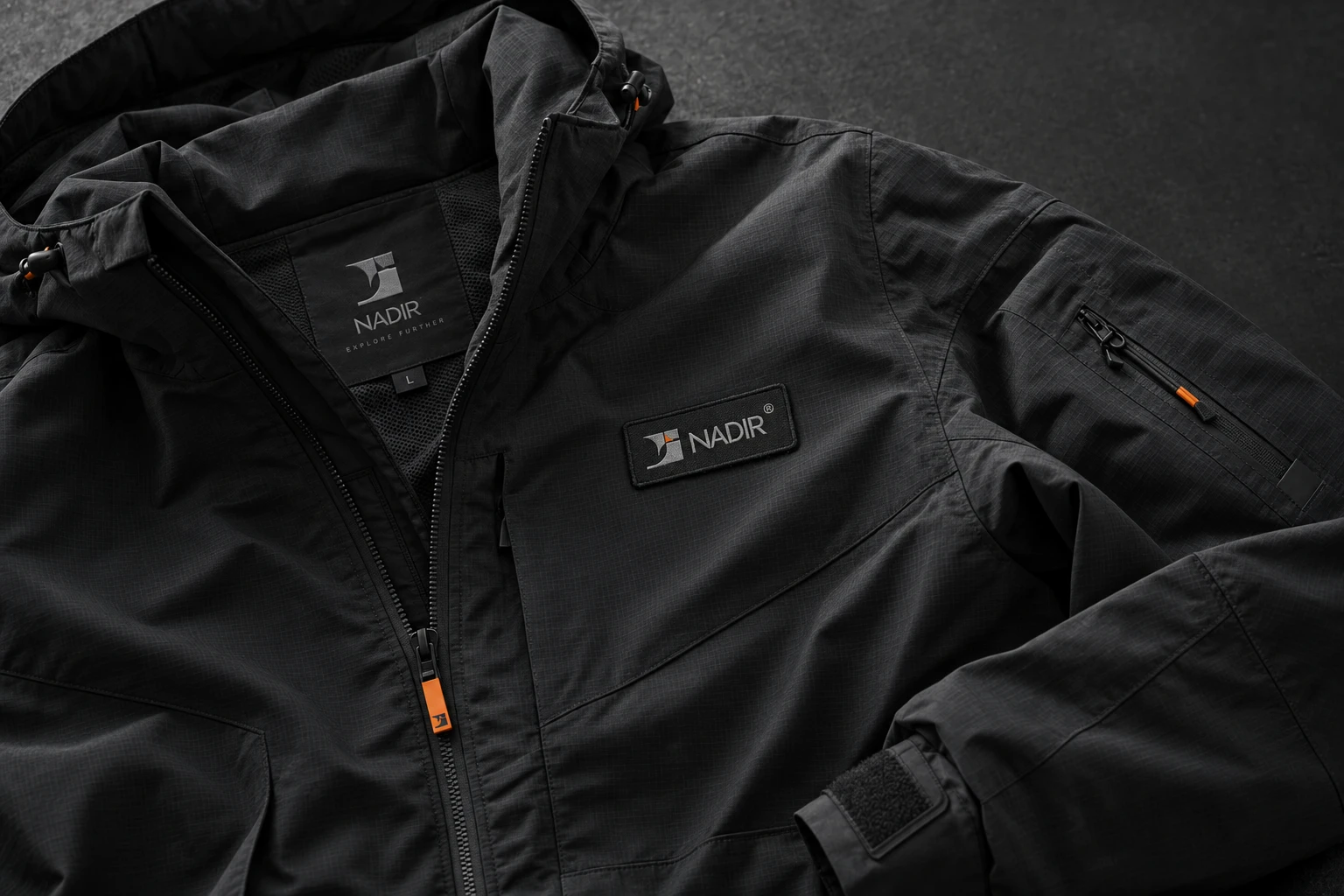
A full mockup set for the flagship A1-250 unit: hero side-profile, motor-arm and prop-guard detail, an in-hand scale shot, a branded transport case, a campaign print visual, and macro shots of the stenciled technical labeling — serials, spec callouts, material notes — all set in the same tracked Josefin Sans as the wordmark, so the hardware itself carries the brand's typographic discipline down to the rivet level.
WEB / INTERACTION SYSTEM
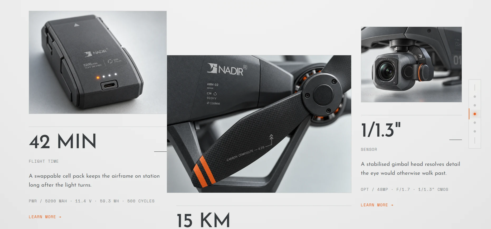
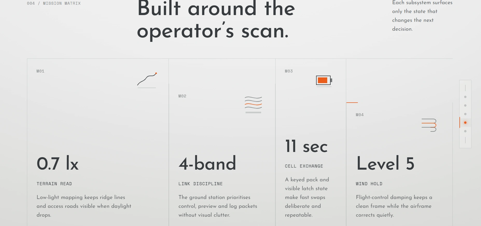
Two full landing page build specs, each treating the same hero footage differently on structural terms, not just stylistic ones. One scrubs the video's own playback position directly to scroll input across a pinned 400vh hero, handing off into a telemetry section where a live UI card — altitude, battery, signal — builds in with overlapping GSAP-timeline stagger. The other keeps the hero video looping undisturbed at its own pace inside a bordered, framed display, then resolves its telemetry section as a strict, sequential boot sequence, each data row connecting and resolving one at a time. Same brand, same typography, same 8px spacing system underneath both — genuinely different motion personalities on top of it.
THE RESULT
The identity, the full mockup set, and both landing page specs are built. What's left is execution — coding the page and shooting or sourcing final hardware photography against the system I've laid out. I'm treating this project as the piece I lead with when this exact conversation comes up again: not a claim that I can think in systems, but a full, built argument for it.
Révolté — revolte.design
Project: NADIR
Year: 2026
Scope: Brand Identity, Product Photography Direction, Web Design, Motion System
Industry: Aerial Hardware / Precision Instrumentation
See more at revolte.design
Like this project
Posted Sep 22, 2026
NADIR — a full aerial-hardware brand system built from one logo mark, to prove systems thinking beats a mood board
Likes
0
Views
1
Timeline
Sep 3, 2026 - Sep 22, 2026


