Brand Identity System for Linea Scenic Rail

Révolté


LINEA — THE LINE IS THE TERRAIN
Every route has a shape. Most rail brands decorate over it. Linea traces it.
THE BRIEF
I set out to build a brand for a boutique scenic rail operator — the kind of company that exists in the space low-cost, high-speed rail has abandoned. Three routes, three fare tiers, a small, considered fleet. The kind of travel brand that doesn't sell speed, it sells the specific, unrepeatable shape of the ground between two places.
The real brief, though, was mine. I needed a project that proved I think in systems, not just surface. I'd been told, fairly, that my portfolio leaned art-directed over architected — strong single images, weaker proof of a rule that could scale. Linea was built specifically to answer that gap. Every deliverable had to trace back to one generative logic, not just share a palette.
That constraint shaped everything. A travel brand is an unusually good test case for systems thinking — tickets, cabin interiors, uniforms, an app, a loyalty program, packaging, a full site. If the idea doesn't hold across all of that, it isn't a system, it's a mood board.
THE APPROACH
My first instinct was a tier-based line system — thin lines for the base fare, bold lines for the top tier, spacing and weight doing the differentiating work. It was clean, but it was arbitrary. The rule didn't mean anything. I could have picked any variable and it would have worked just as well, which told me it wasn't the right variable.
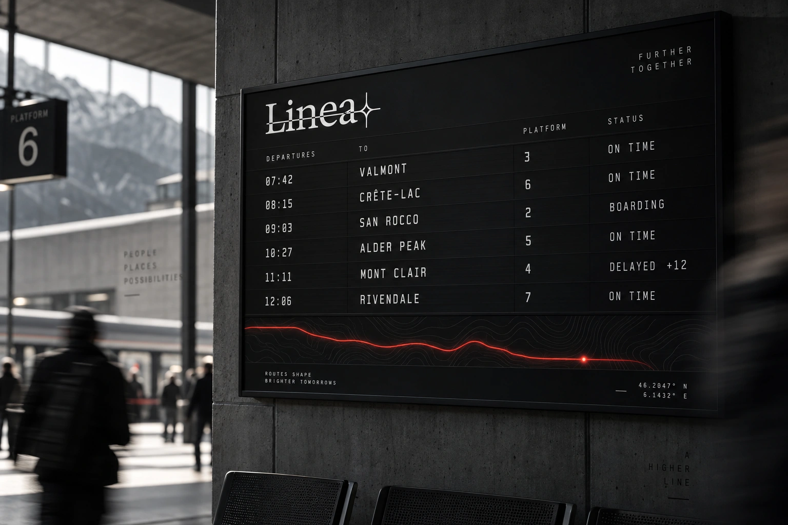
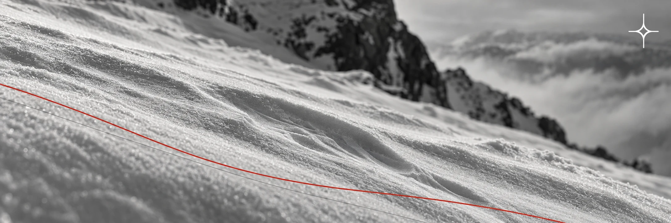
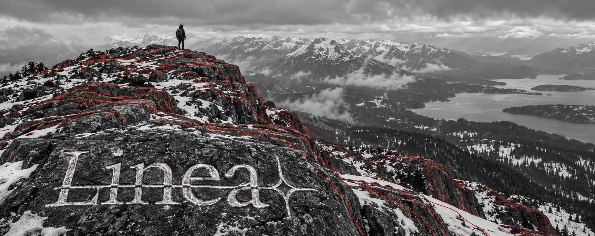
The unlock came from architecture references I'd been collecting — wave-form building facades, rippling balconies, repeated structural rhythm photographed in black and white. I kept coming back to one idea: what if the line wasn't decorative at all, what if it was data. Not a graphic device applied to the brand, but a literal trace of the terrain each route runs through — elevation profiles rendered as contour lines, the way a topographic map or a seismograph would draw them.
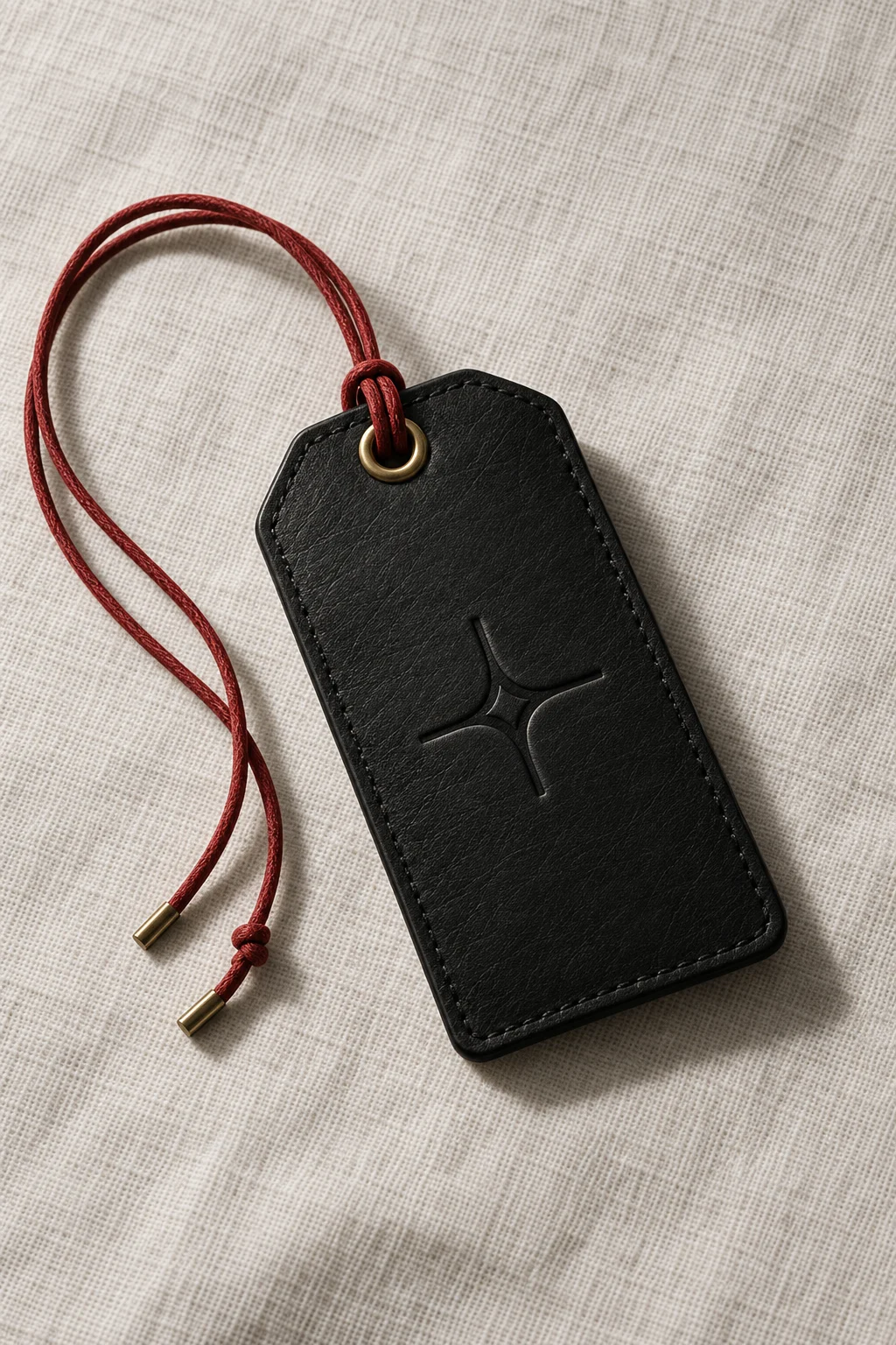
That single substitution changed the entire system's logic. Route differentiation stopped being "pick an accent color" and became "trace that route's actual ground." Fare tier stopped being about line weight and became about density — how much of the terrain's detail you get to see, could scale the exact same way a real class system does: more information, more resolution, more access. The wordmark's sparkle glyph, which I'd designed early as a small warm counterpoint to an otherwise geometric system, turned out to already fit the story — in the site's "data becomes a mark" sequence, the same contour-drawing logic that traces a mountain ridge resolves into that exact glyph. I didn't force that connection in afterward; the system was specific enough that it fell out on its own, which is usually how I know an idea is actually load-bearing rather than decorative.
I dropped the parallel-line grid entirely once the topographic direction proved out. It would have been easy to keep both and hedge, but a system with two unrelated line languages isn't a system.
THE WORK
BRAND IDENTITY / VISUAL SYSTEM
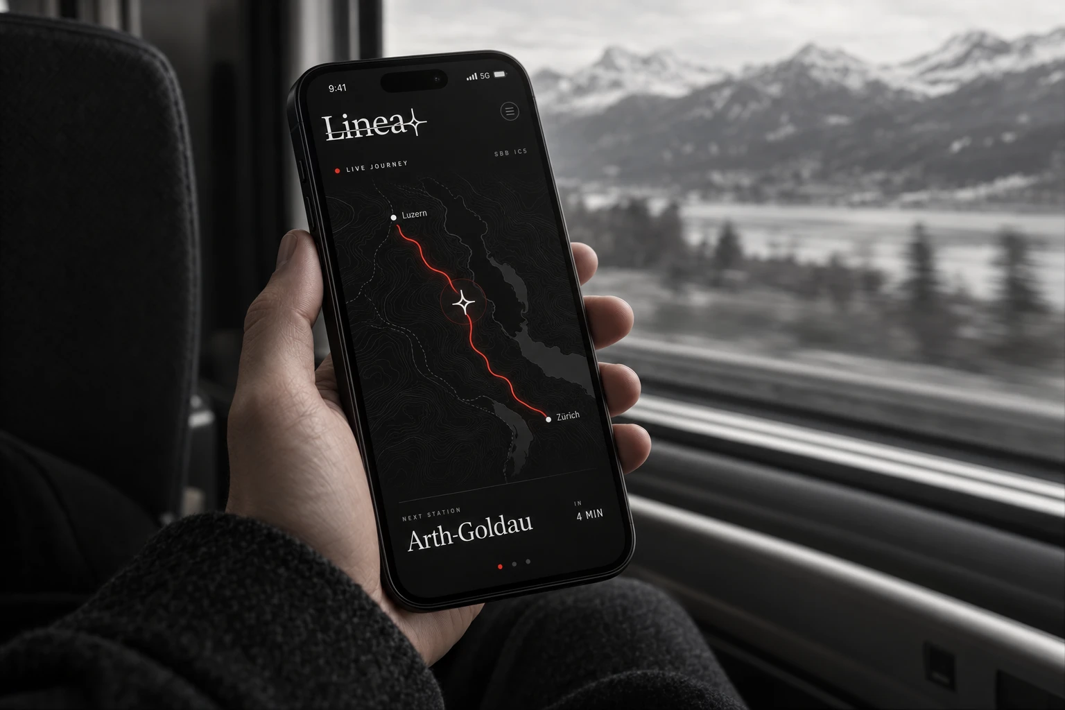
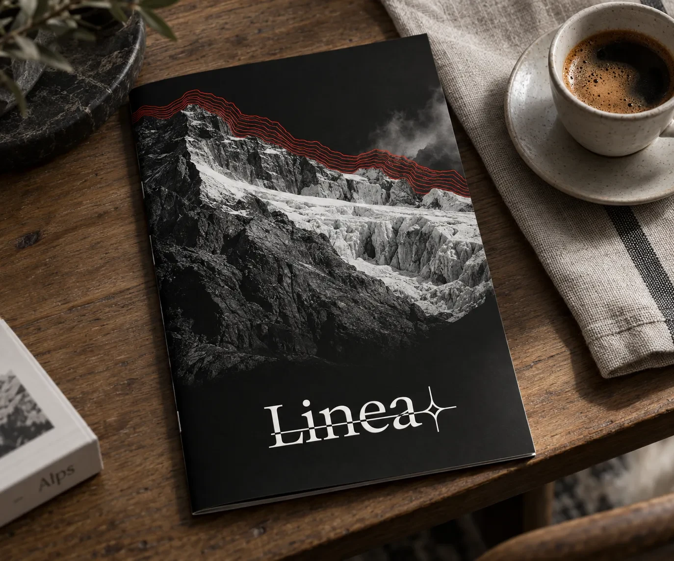
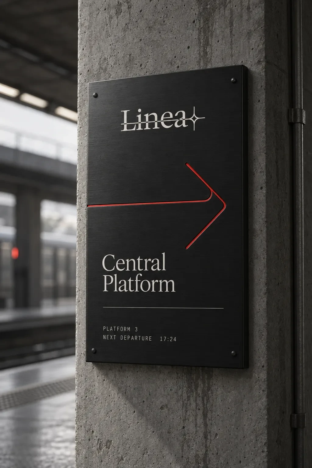
Everything derives from one rule: real or simulated elevation data, traced as a hairline contour, in signal red C22118 over a fainter structural grey layer. Nothing in the system is drawn from scratch per application — every route mark, every packaging detail, every UI accent is the same rule at a different scale and density.
TYPOGRAPHY
An editorial high-contrast serif in the style of GT Sectra/Reckless Neue (built with Fraunces at opsz 144 as the production-safe substitute) carries the wordmark, headlines, and route names — warm, literary, slightly at odds with the rest of the system's precision, deliberately. A clean grotesk mono (JetBrains Mono in production) handles every functional layer — times, seat numbers, coordinates, fare data.
COLOR SYSTEM
Linea Black 0A0A0A and Linea Paper F4F2EE carry roughly 95% of every surface. Signal red C22118 is rationed to a single dominant element per composition — the contour line itself, one interactive state, nothing more. Grey 4A4A4A is reserved for the secondary structural contour layer and never appears in UI or type.
PRINT / COLLATERAL
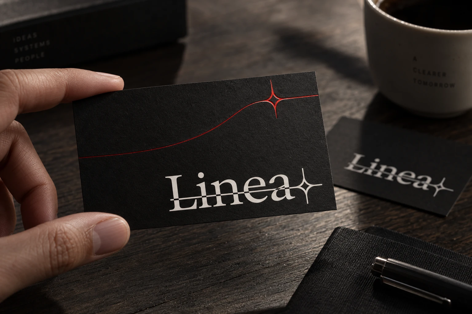
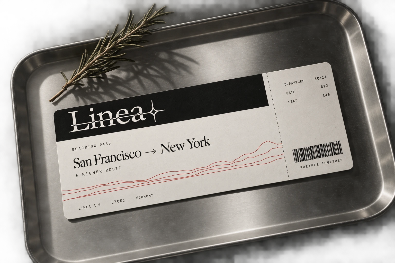
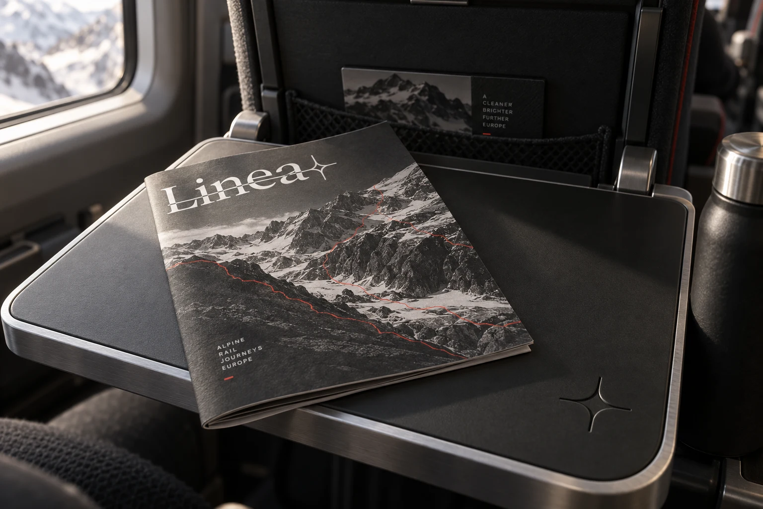
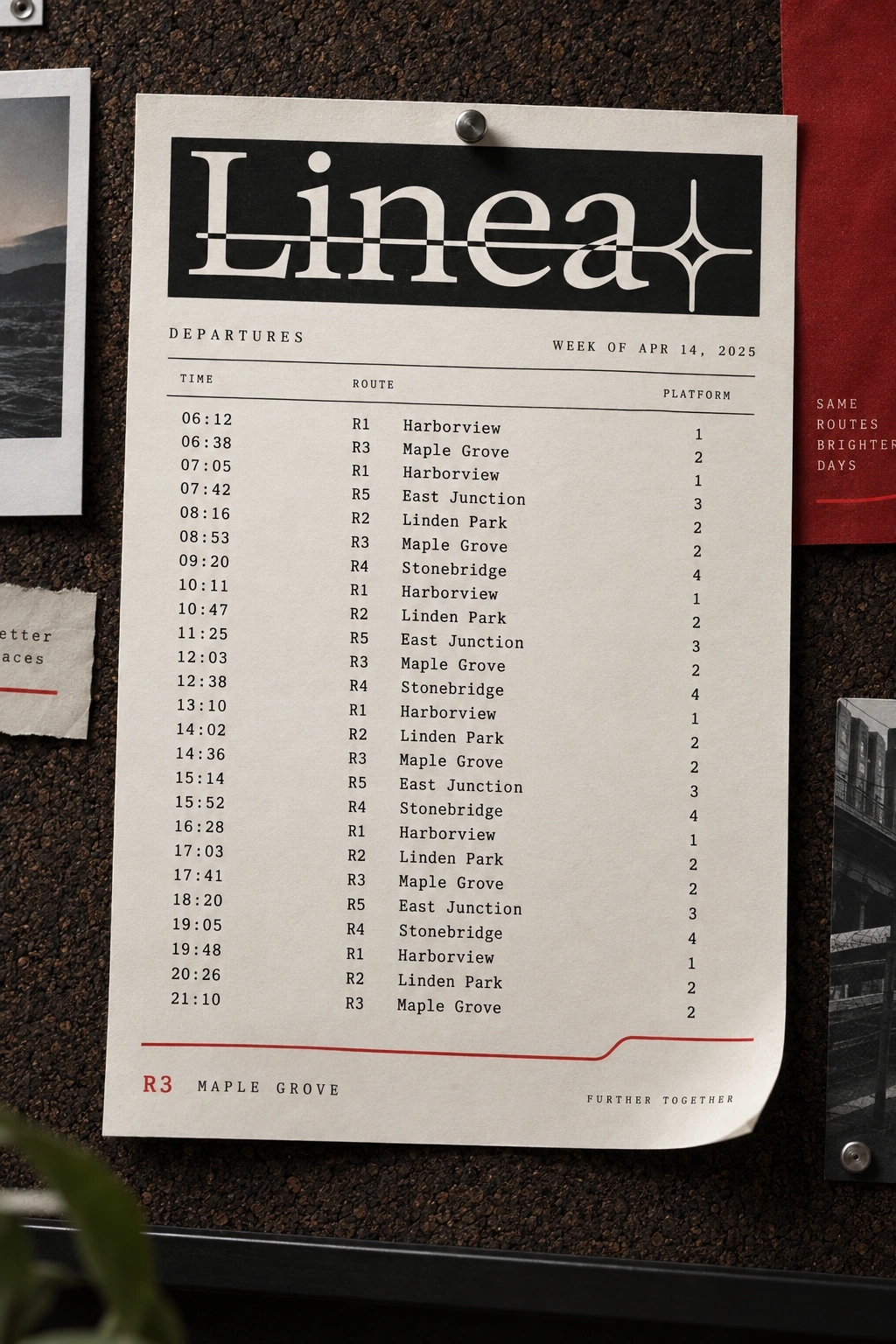
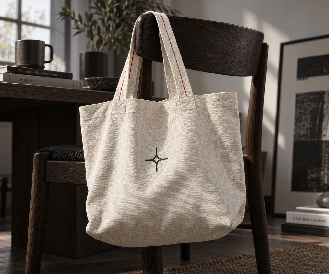
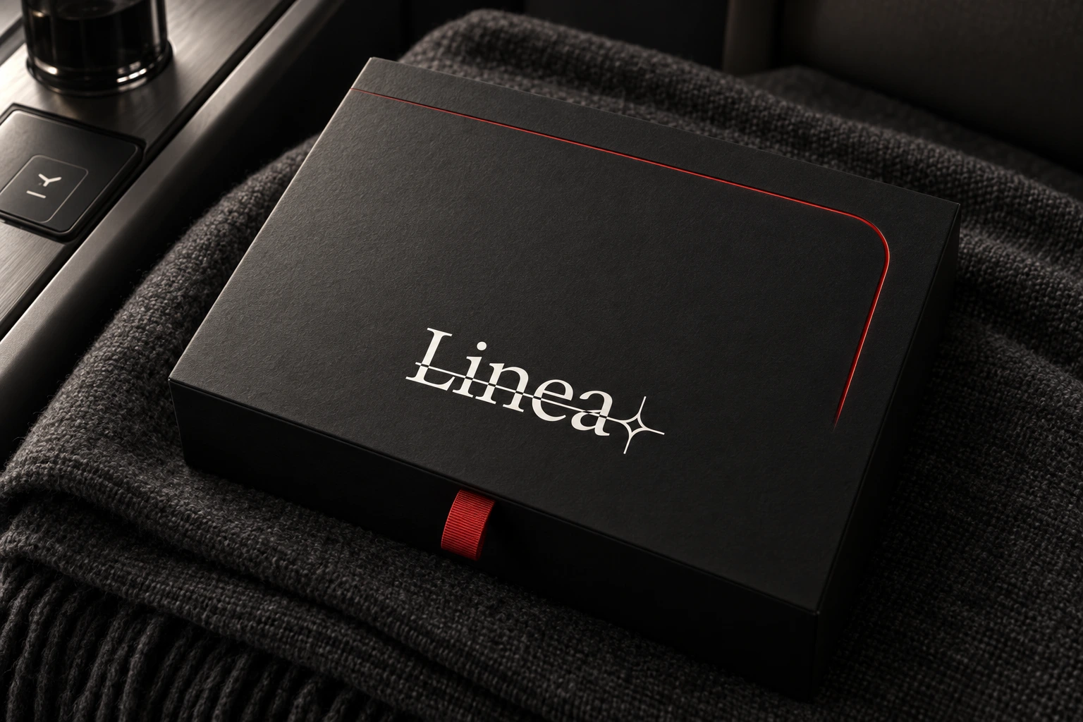
Fifteen-plus touchpoints built from the same rule: a boarding ticket with a route's actual elevation profile printed along its lower edge, an amenity kit box with a single engraved contour line, a wool blanket with the motif woven at cabin scale, a business card where the line resolves into the sparkle glyph at the exact point a viewer's eye lands on it. Photography throughout is black-and-white terrain only — ridgelines, glaciers, coastlines — never architecture, keeping the system honest to its own premise.
WEB DESIGN
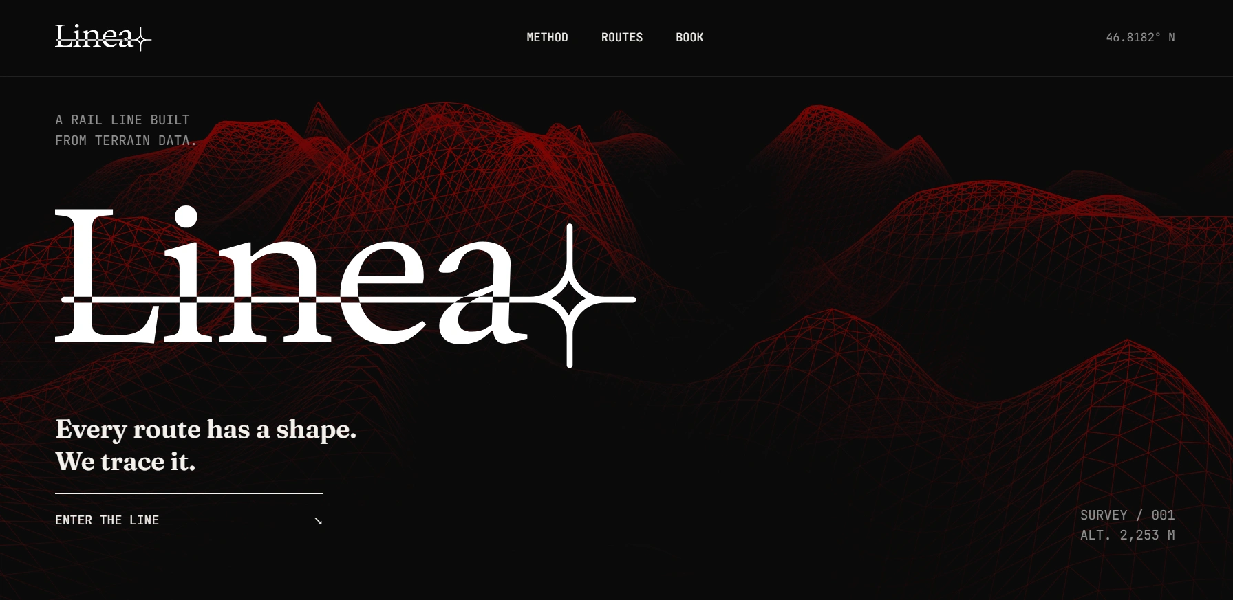
Built and live at the prototype stage (terra-scout-path.lovable.app). Three route cards — Coastal, Alpine, Valley — each carrying a distinct contour signature generated from the same underlying logic at a different seed value, plus a fare comparison structured around density rather than arbitrary tier labels. I also wrote two full technical build specs for an eventual production site — one built around a persistent ambient WebGL contour field reacting to scroll, one built around a real 3D wireframe terrain mesh the camera moves through — both staged around the same "data becomes the mark" sequence as the site's proof-of-concept moment.
THE RESULT
Linea shipped as a complete, self-consistent system — identity, a fifteen-plus-piece collateral set, and a working site — with every piece traceable back to one idea instead of a shared mood. The strongest proof of that is the smallest detail: the sparkle glyph isn't a separate logo decision, it's the output of the same contour rule used everywhere else, which is the kind of thing that's very hard to fake after the fact and very easy to demonstrate when it's true.
As a portfolio piece, it's built to answer one specific question directly — not "does this look good," but "can you show me the rule."
Révolté — revolte.design
Project: Linea
Year: 2026
Scope: Brand Identity, Typography System, Packaging & Collateral, Web Design
Industry: Travel / Rail
Like this project
Posted Sep 24, 2026
A boutique rail brand where every mark, from ticket to logo, traces real terrain data — nothing decorative, everything derived
Likes
0
Views
6
Timeline
Sep 8, 2026 - Sep 24, 2026


