Built with Lovart
Baleen Brand Identity Design & Website

Révolté


BALEEN — The Paperwork Is the Product
A marine salvage brand that treats a corroded ship's bell the same way a 1960s postage stamp treated a clownfish — catalogued, denominated, verified. I built the entire identity out of vintage natural-history stamps instead of treasure-hunt clichés.
THE BRIEF
I set out to build a brand for a category that didn't really have one yet — marine salvage and shipwreck archaeology. Not a diving brand, not a marine-tourism brand. Something closer to an insurance house or a museum registry, for a company that recovers objects off the seabed and sells them with their provenance intact.
The obvious visual territory was already exhausted. Skulls, gold doubloons, swashbuckling script — every salvage-adjacent brand reaches for the same pirate kit. I ruled all of it out on day one. The tension I actually wanted to solve was different: how do you make recovery feel less like plunder and more like custody?
What made it hard wasn't the industry — it was resisting the easy version of it.
THE APPROACH
My first instinct was nautical minimalism — navy, brass, a clean sans wordmark. It held up for about ten minutes. It felt like every other "elevated maritime" brand, and it said nothing about what actually made this company different: the paperwork.
The unlock came from thinking about what a postage stamp actually is. A denomination, a place name, a date, a verification mark, an illustrated specimen — stamped, catalogued, done. Old natural-history stamps did this for fish and birds. I realized BALEEN could do the exact same thing for a corroded anchor or a ship's bell. The object stops being a trophy and becomes an entry in a registry.
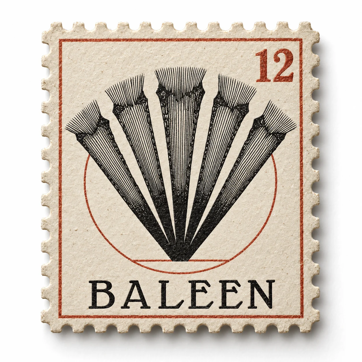
The name gave me the rest of the logic for free. Baleen plates are a filtering apparatus — a whale sifting the ocean for what's worth keeping. That's not incidental brand color, that's the entire thesis, so I built the mark around it directly: a whale in profile, inside a circular postmark frame, rendered in engraved cross-hatching instead of flat shape. I almost used the baleen-plate fan itself as the primary mark, but it read too abstract on its own — I demoted it to a recurring border texture instead and let the whale carry the identity.
THE WORK
BRAND IDENTITY / VISUAL SYSTEM
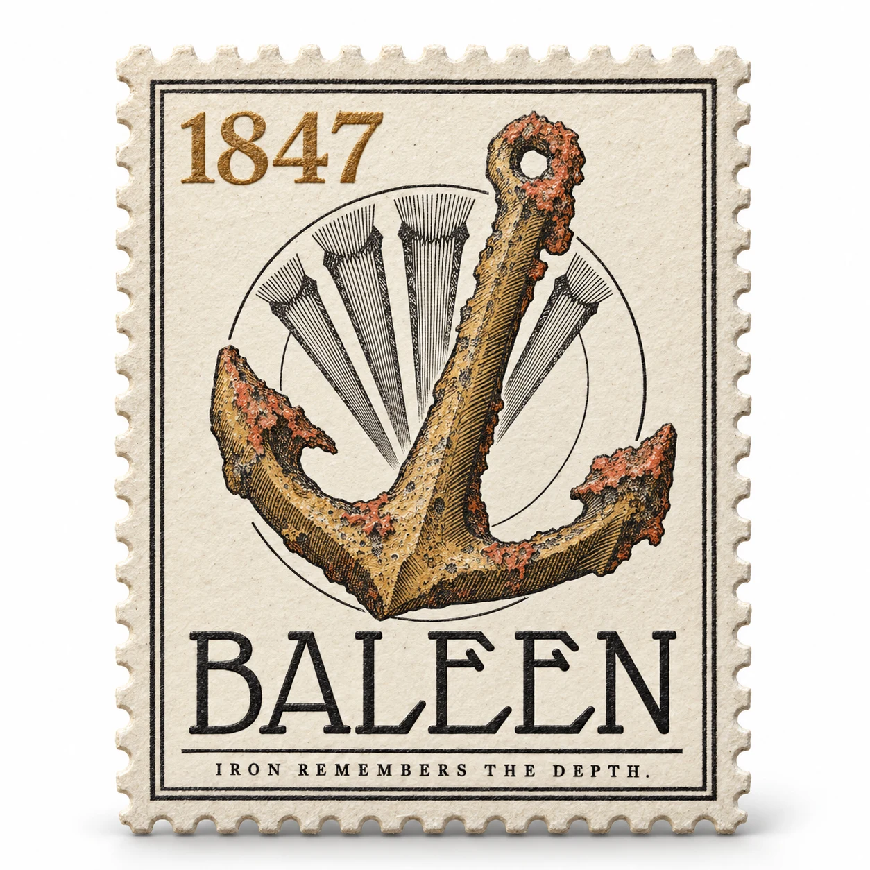
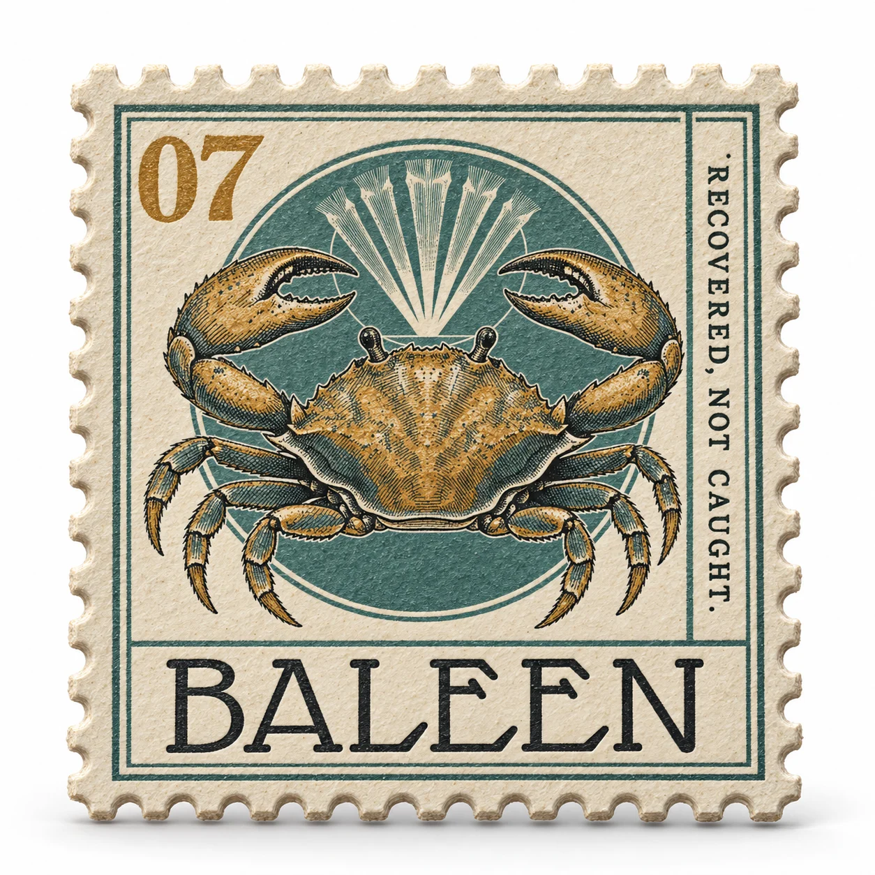
Built entirely on the mechanics of a specimen stamp — engraved linework, denomination-style numerals for depth and lot numbers, a fixed double-rule border standing in for perforation. Nothing in the system is airbrushed or flat-vector; every illustrated element carries hand-drawn hatching density for shading.
LOGO
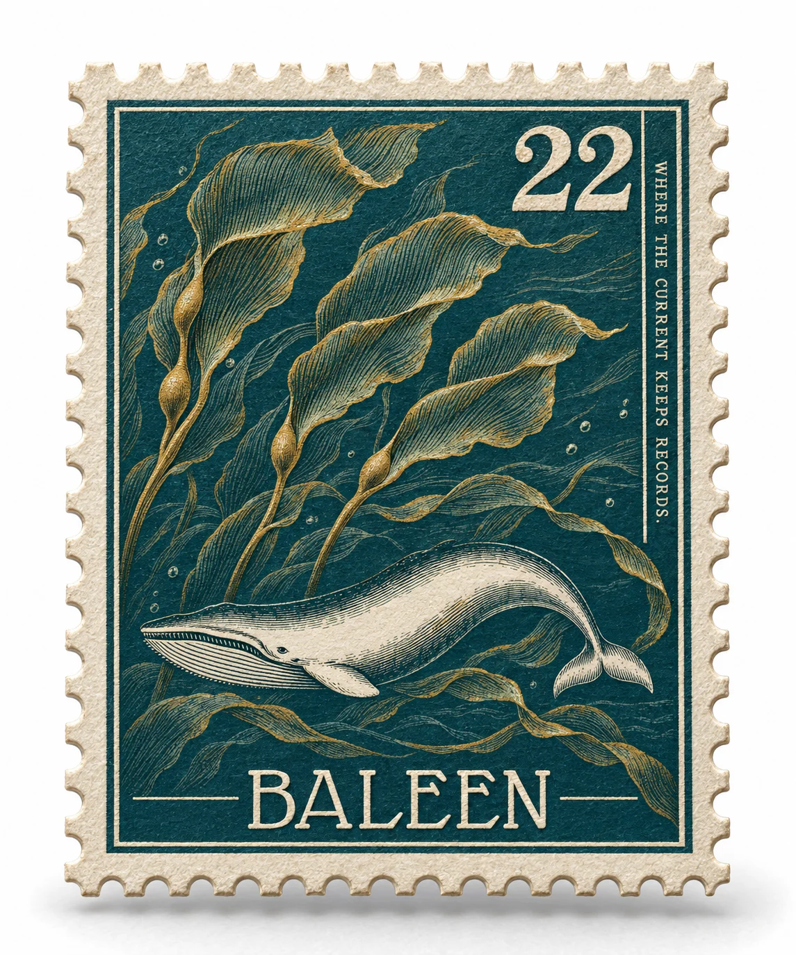
A whale in full side profile, housed in a circular postmark, drawn with dense cross-hatching along the back and sparse hatching along the flank — closer to a field-guide plate than a modern logomark. The baleen-plate fan runs as a secondary motif only, never competing with the whale for primary-mark status.
TYPOGRAPHY SYSTEM
Glass Antiqua carries the wordmark exclusively — its ink-trap joints echo the same engraving technique used in the illustrations, so the type and the imagery feel cut from the same tool. A plain mechanical serif handles all data: catalogue numbers, coordinates, dates, captions.
COLOR SYSTEM
A locked five-color core: Deep Postal Teal
#1B4C4A, Salvage Rust #C1502E, Denomination Red #B23A2E, Aged Paper #EDE6D6, Registry Black #1A1A18. A separate specimen-accent set — Weathered Ochre, Faded Verdigris, Dusty Coral, Bone White — is reserved strictly for illustrated subjects, never for UI chrome or type, so the system stays legible as "official" even when the illustrations get colorful.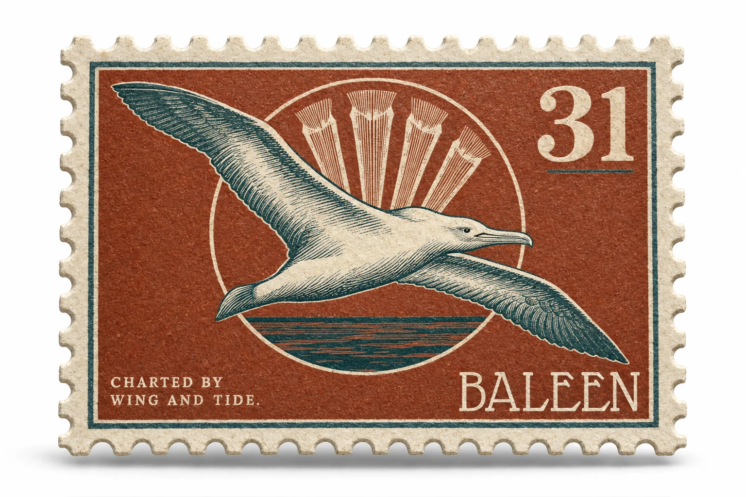
STAMP SERIES / PRODUCT PHOTOGRAPHY
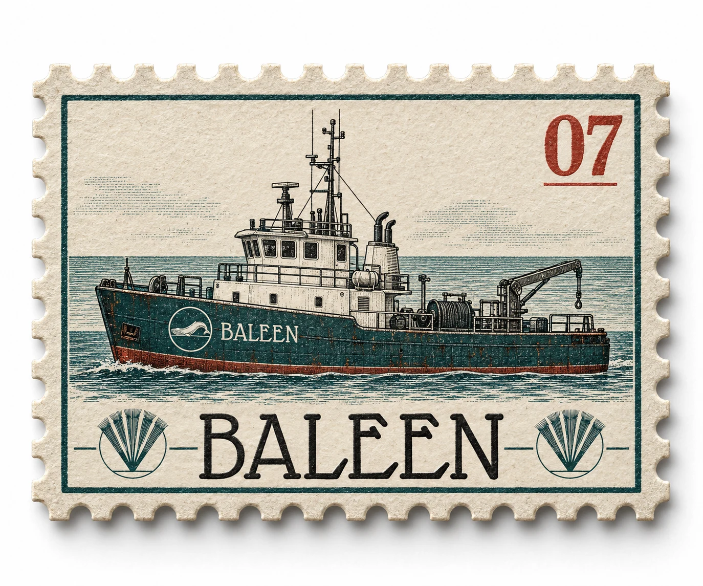
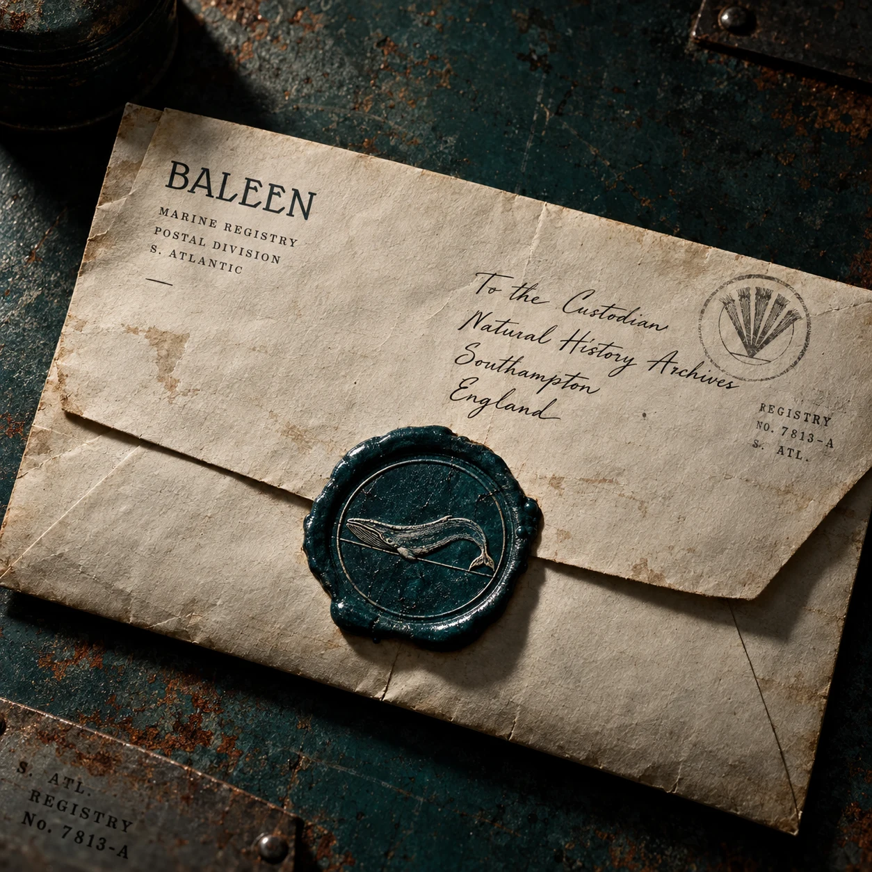
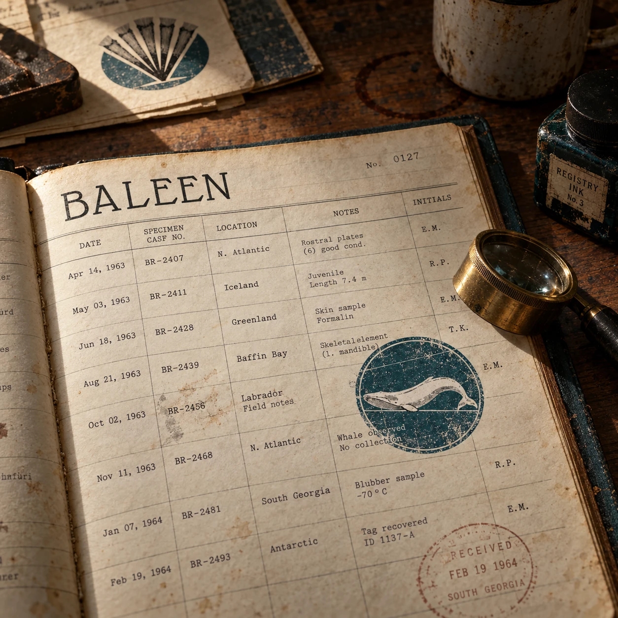
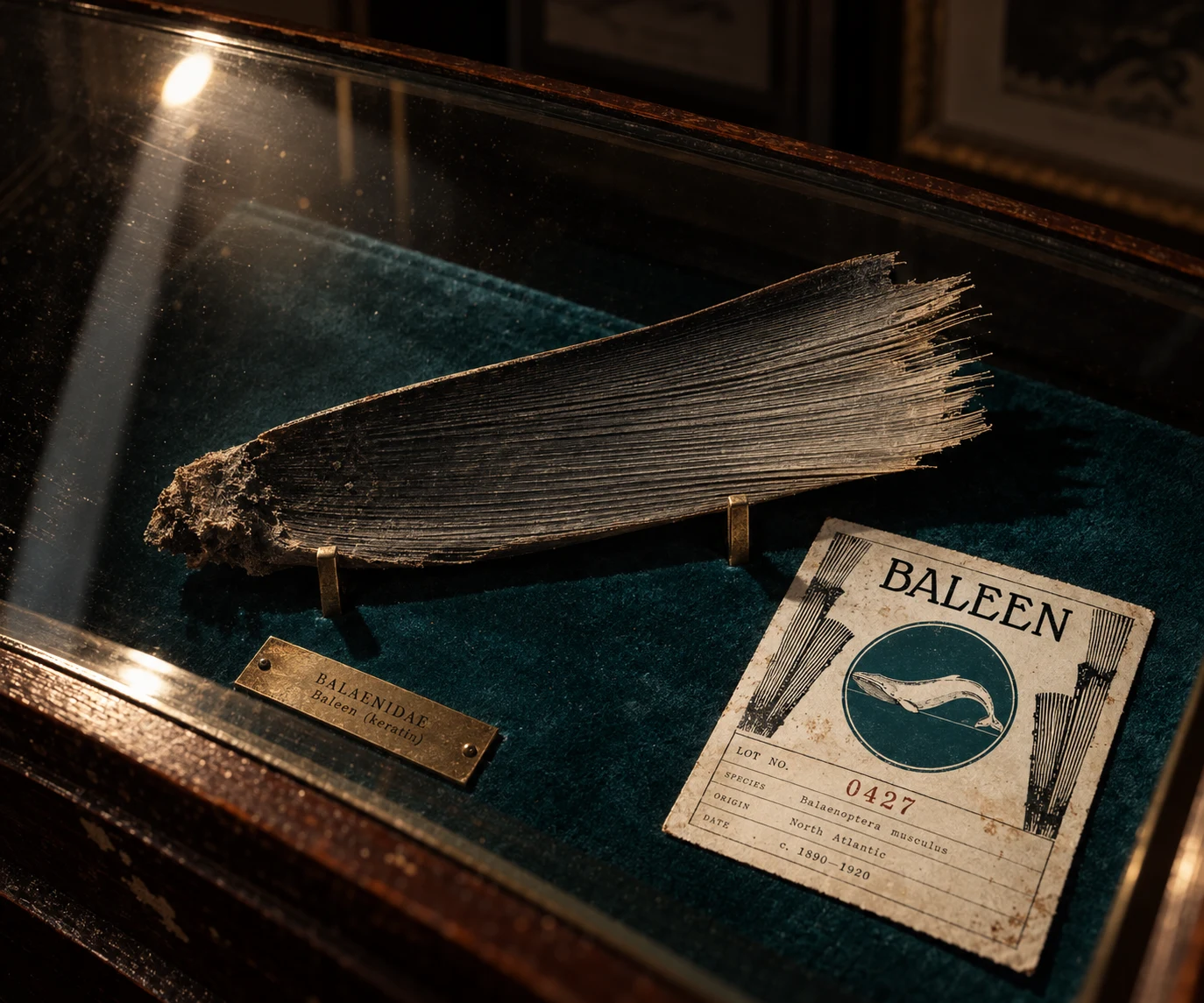
Eight hyperrealistic CGI stamps — whale, baleen plate, ship's bell, vessel, coral, crab, seabird, anchor fragment — modeled with real paper thickness, individually die-cut perforation, and letterpress-level ink emboss. Paired with five grounded, evidence-photography mockups (a specimen tag tied to a recovered object, an open ledger mid-entry, a stenciled shipping crate, a wax-sealed manifest, a vitrine lot card) that deliberately avoid clean product-photography gloss in favor of single hard-light, working-desk realism.
WEB DESIGN
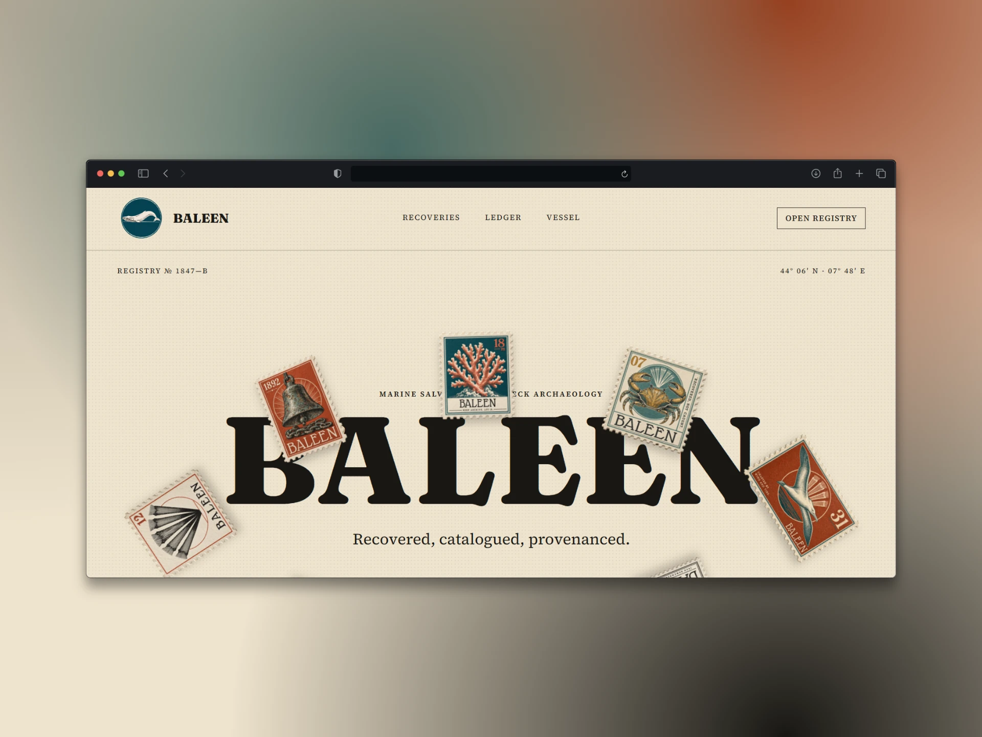
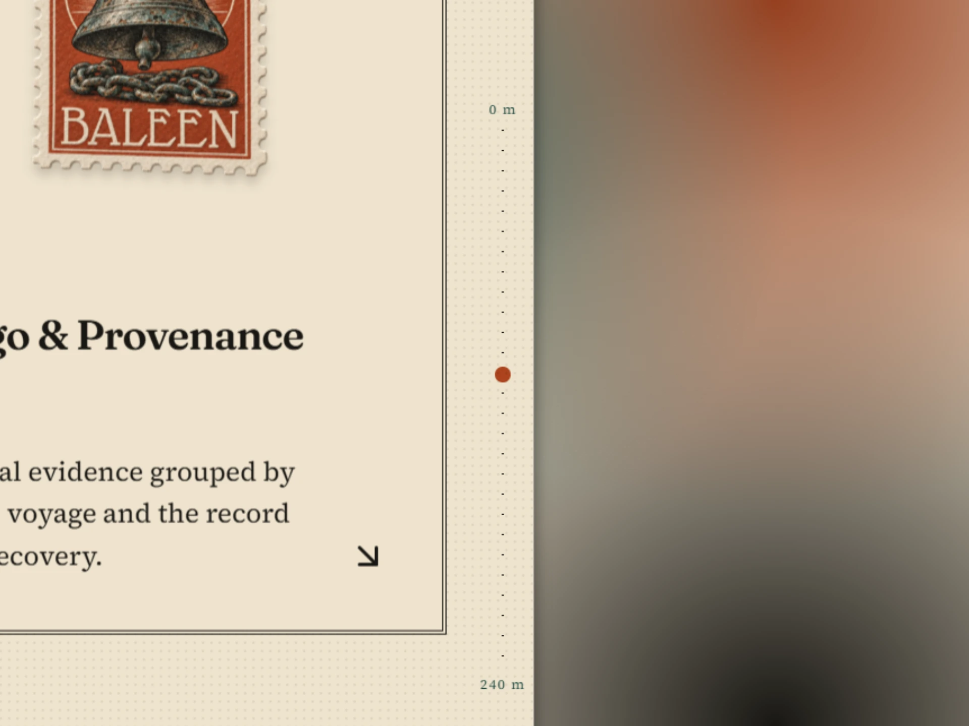
Built the site as a working registry, not a brochure. The hero is a draggable archive of the stamp series instead of a static image. Below it: a classification system for what BALEEN recovers, a live ledger table of catalogue entries, and a vessel section with call sign, registry, and working depth. The whale mark reappears throughout as a recurring verification stamp — "Site Recorded," "Depth Confirmed," "Provenance Sealed" — so the authentication logic from the stamps carries through every section instead of stopping at the homepage.
THE RESULT
What shipped is a brand that doesn't look like it's selling anything — which was exactly the point. The stamp series reads as a specimen collection before it reads as marketing, and the site behaves like an archive someone could actually get lost in. The system holds up whether it's applied to a single stamp or a full hull-branding mockup, because every decision traces back to the same rule: document first, sell never.
Révolté — revolte.design
Project: BALEEN
Year: 2026
Scope: Brand Identity, Logo Design, Illustration System, Web Design
Industry: Marine Salvage & Shipwreck Archaeology
See more at revolte.design
Like this project
Posted Sep 26, 2026
A salvage brand that catalogues shipwreck relics like natural-history specimens instead of selling them as treasure
Likes
0
Views
2
Timeline
Sep 9, 2026 - Sep 26, 2026