ARCLIGHT Brand Identity and Campaign Design

Révolté


ARCLIGHT — Apparel That's Dormant Until the Light Finds It
LOGLINE
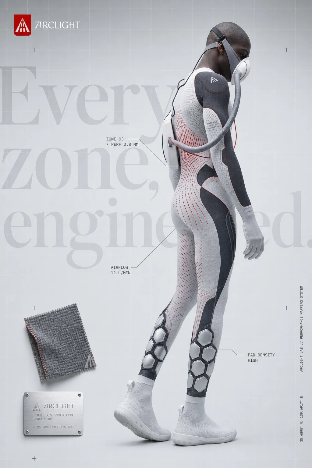
A sportswear brand built on a single mechanical idea: garments that read as quiet and grey until a flash or headlight hits them, then reveal reflective panels and dot-matrix body maps underneath. I built the identity, the campaign system, and the product photography language around that one on/off switch.
THE BRIEF
I set this up myself, as a portfolio piece: a futuristic sportswear brand, no existing name, no existing references beyond a direction. I'd already designed the mark before I started on the system — a red shield with a road drawn in one-point perspective, lane lines converging into an A. That logo was the whole brief, really. It told me the brand had to be about roads, distance, and light.
The tension I set for myself was simple to state and harder to hold: most "futuristic sportswear" moodboards collapse into generic neon-HUD cyberpunk within a few references. I didn't want neon. I wanted something that looked expensive in daylight and did something different at night.
THE APPROACH
I started with ten name directions before landing on ARCLIGHT — names like KINETH, NULLGRAV, TENSOR were all live candidates. ARCLIGHT won because it was the only name that gave me a built-in campaign mechanic instead of just an aesthetic.
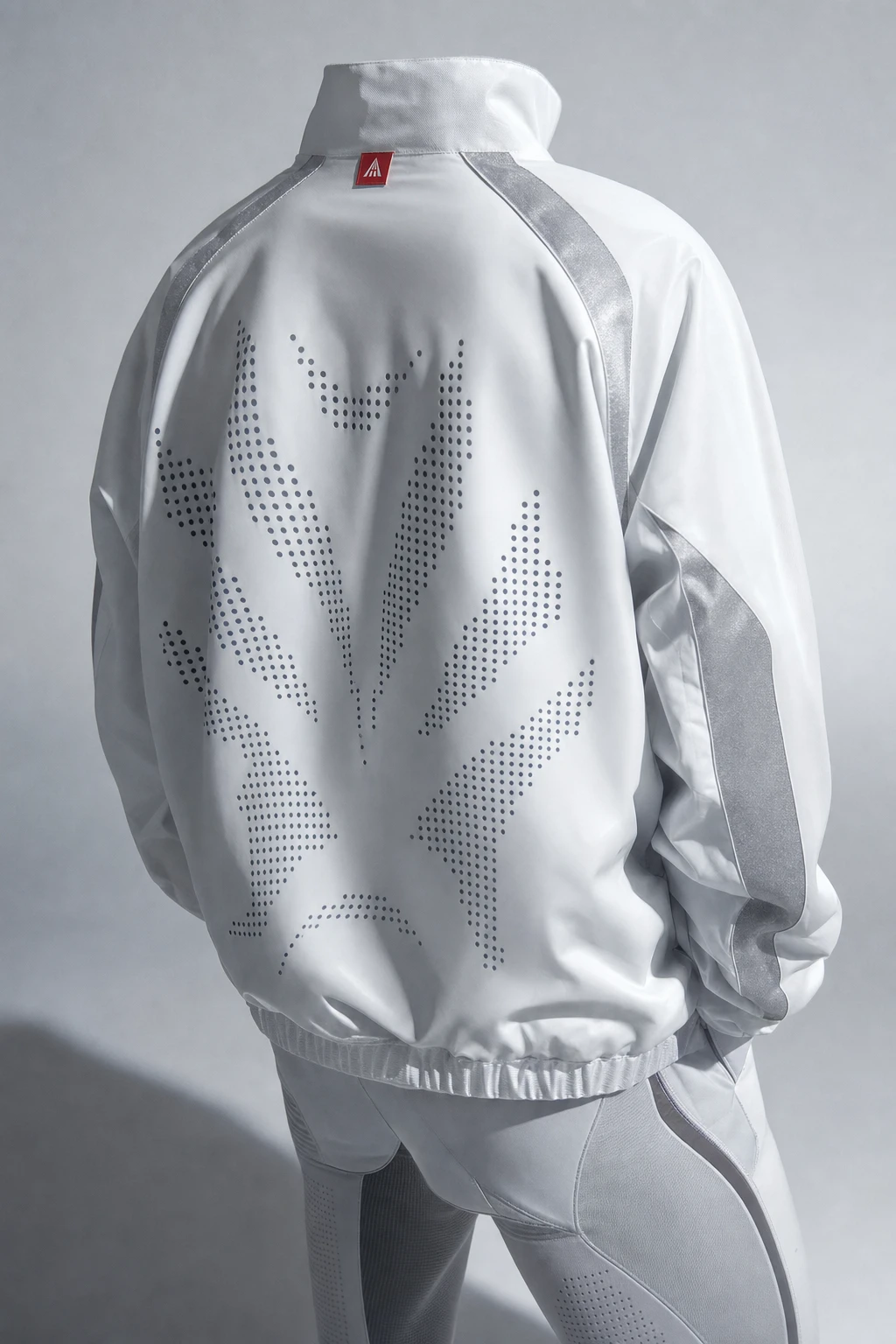
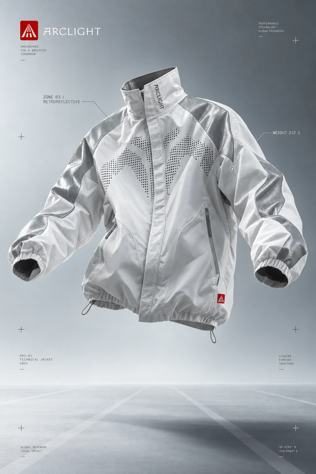
The road logo decided the rest. If the mark is a road converging to a vanishing point, the whole brand had to behave like a road: quiet markings that only mean something under the right light. That's where "revealed by light" came from — not as a tagline first, but as a literal material logic. Garments get reflective panels and perforated dot-matrix graphics that sit flat and grey in ambient light and ignite under flash or headlights.
I pulled a stack of Cosmos-style technical sportswear references — perforation macro shots, hex-pad knit details, a mask-and-tubing suit, a dot-matrix jacket back — and used them to ground the idea in real garment construction instead of sci-fi decoration. The dot-matrix wasn't an afterthought graphic; I treated it as a pressure/airflow map, which gave me a second content layer (spec-sheet mono labels, leader lines, zone callouts) that could run through every campaign image without repeating itself.
The campaign direction that took the most iteration was the road motif itself. My first pass had five separate ideas competing for the same real estate — a lane-discipline track direction, a vanishing-point road direction, a beacon direction. I folded LANE DISCIPLINE into VANISHING POINT once I realized they were the same photographic idea wearing two names. That consolidation is what let the system breathe — one road motif, five or six lighting conditions, instead of eight half-ideas.
For the product mockups, I made a deliberate cut: no floating ghost garments, no typography in frame. Everything upstream of that point had logos and Macondo taglines baked into the image. The product set needed to be pure material — fabric, construction, light — so a buyer or a developer could use it without fighting baked-in text.
THE WORK
BRAND IDENTITY
Red shield mark (
#C40000) with a white road rendered in one-point perspective, lane lines converging to form the negative-space A. Logotype set in Macondo — a calligraphic, slightly hand-lettered face that gives the system a human counterweight against all the technical mono data layers running underneath it.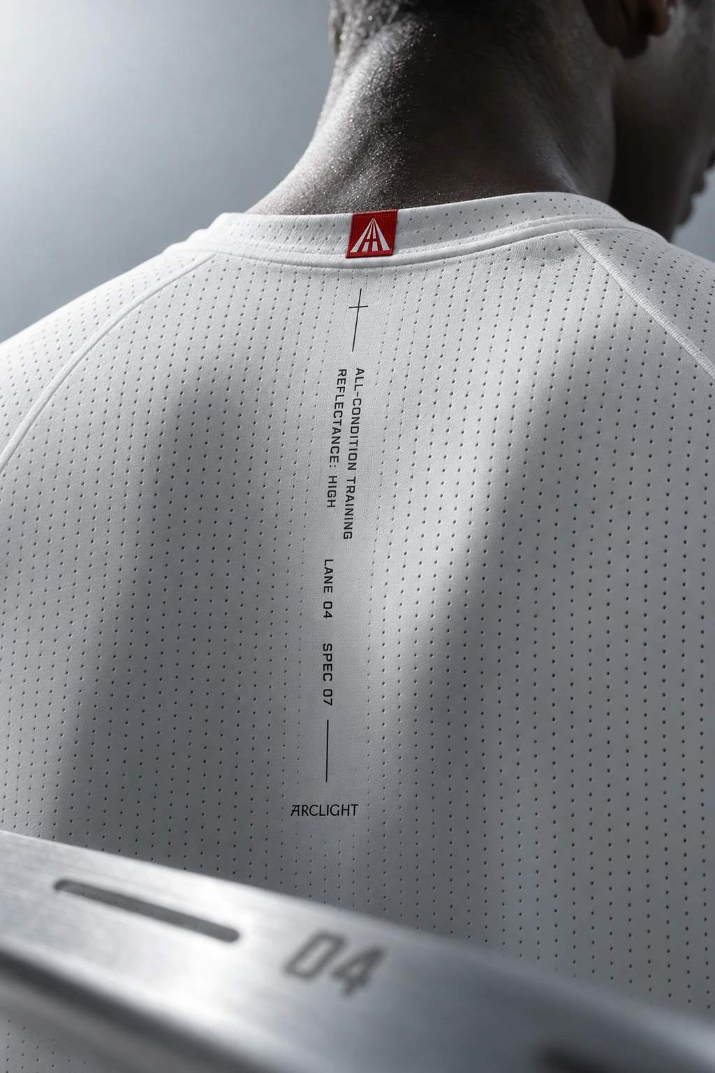
COLOR SYSTEM
Four colors, strict ratios: Lab White
#E9ECEE and Reflect Silver #A9AFB5 carry the ambient state, Graphite #2A2E33 carries the dark/night state, Flash Red #C40000 is capped at roughly 5-10% of any frame and never appears twice in the same viewport. The restraint is the point — red had to stay rare enough that it read as a signal, not a brand color.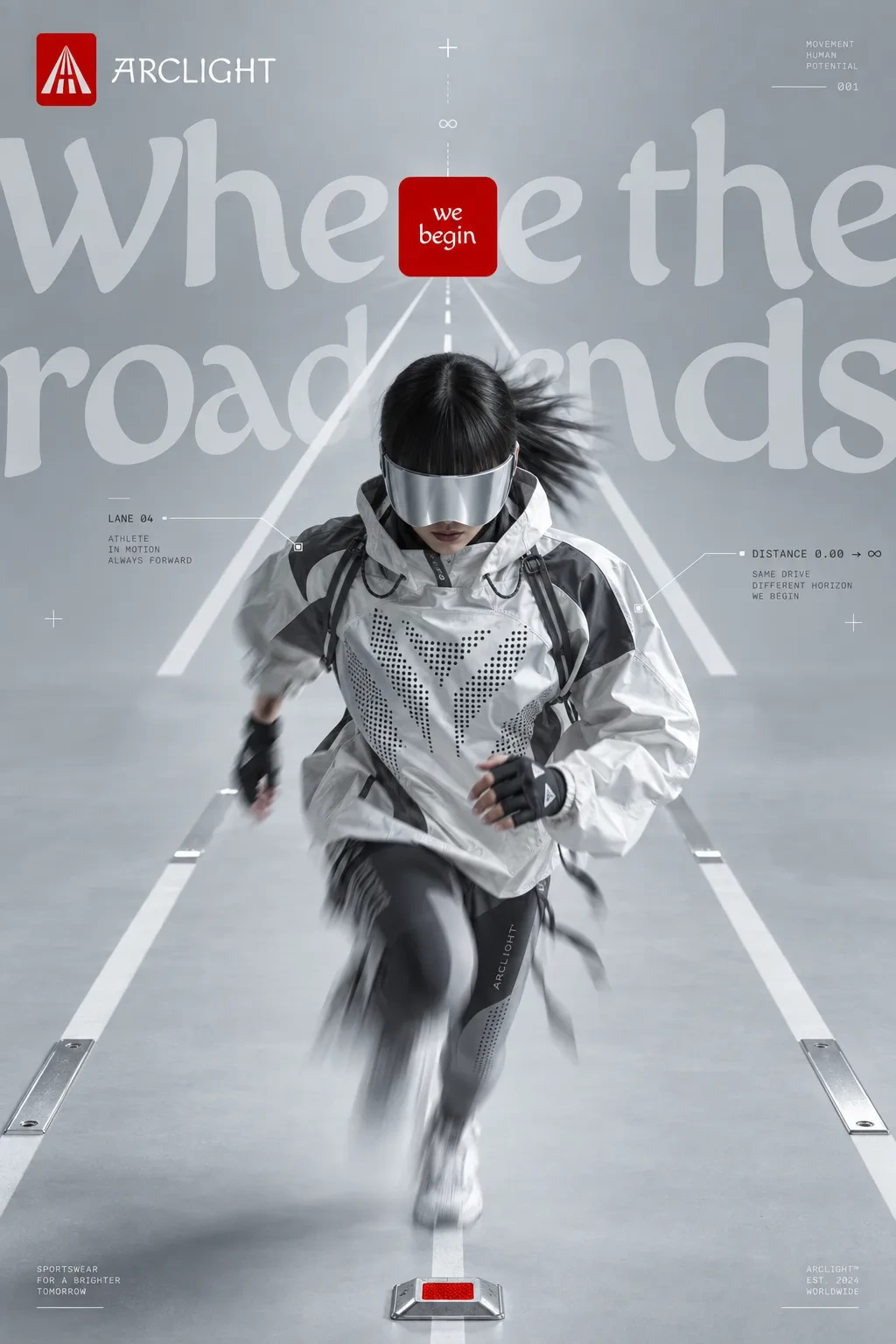
TYPOGRAPHY
Macondo for display and taglines, always oversized and cropped by the frame edge. Archivo Expanded, a wide extended sans, for UI and body copy. IBM Plex Mono for the spec-sheet data layer — zone callouts, distance counters, lux readings — set small and tracked wide so it reads as instrumentation, not headline type.
CAMPAIGN SYSTEM
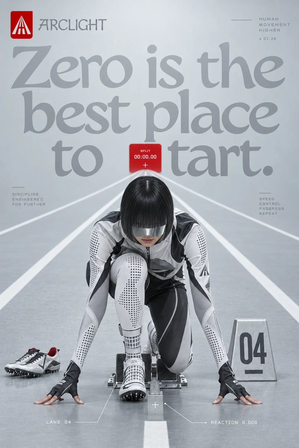
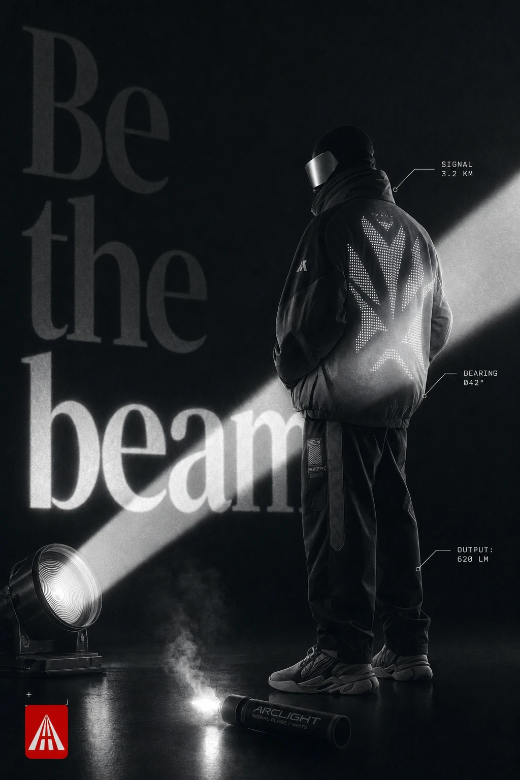
Eight to nine directions built on one shared axis: lane lines converging to a vanishing point, hairline crosshair ticks, mono technical labels on leader lines, and a model always partially obscured (visor, fringe, hood). ZERO METRES is the daylight hero. LAST LIGHT/NIGHT SHIFT is the brand's clearest "revealed by light" statement — an ambient-vs-flash diptych where the garment is nearly invisible until a strobe hits it. BODY MAP turns the dot-matrix graphic into a pressure/airflow diagram. BEACON stages the logo's ray motif as an actual sweeping light beam. FIELD MANUAL is the most Macondo-forward, hand-lettered annotations next to clinical spec callouts.
PRODUCT PHOTOGRAPHY
A second, deliberately quieter set: worn jacket back details, folded knit on a plinth, a bodysuit profile, a jacket on a hanger, a fabric macro. No logos floating free of the garment, no text anywhere in frame — pure product and material, built to sit underneath the campaign work rather than compete with it.
WEB DESIGN
Two full build specifications for a GSAP/Framer Motion landing page, written for a React build target. ZERO METRES is a single continuous cinematic scroll down the converging road, sections arriving like distance markers. NIGHT SHIFT is a sharper, section-pinned sequence built around hard ambient-to-flash cuts rather than one slow reveal. Both specs were written to accept real hero video later without restructuring, since no footage existed yet at build time.
THE RESULT
ARCLIGHT is at the identity-and-campaign-system stage — the mark, palette, type system, eight-plus campaign directions, a standalone product-photography language, and two fully specced web builds are done. What's still ahead is producing real photography against these specs and building out the site itself. I'm treating the restraint on red and the "no floating brand, no text" rule on the product set as the two decisions I'd defend hardest if challenged — they're what stop this from reading like a hundred other sci-fi sportswear moodboards.
Révolté — revolte.design
Project: ARCLIGHT
Year: 2026
Scope: Brand Identity, Campaign Direction, Product Photography Direction, Web Design
Industry: Sportswear / Performance Apparel
See more at revolte.design
Like this project
Posted Oct 7, 2026
A sportswear brand built on one mechanical idea: garments dormant in daylight, revealed by a single flash at night
Likes
0
Views
0
Timeline
Sep 16, 2026 - Oct 7, 2026


