Built with Lovart
DEDICATED Brand Identity Design & Web Design

Révolté


DEDICATED — A Stance, Not a Performance
LOGLINE
Training brands shout. I made one that holds still: a faceless figure, three flat colours and a single hard light, all arguing that discipline is a form of care.
THE BRIEF
I started with one word and one problem. The word was DEDICATED. The problem was that every training brand I looked at sold the same thing: intensity. Strain, sweat, the grind as an identity. Dedication is closer to the opposite. It is showing up on a Tuesday when nobody is watching.
That left me with a contradiction I wanted to keep: a training brand with no spectacle in it. No hero athlete, no equipment, no effort face. The scope was everything a brand like this needs on day one: a mark, a wordmark, colour, a photographic system, out-of-home, apparel, packaging, signage and a website.
THE APPROACH
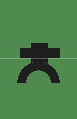
My first instinct was a pictogram of a person, and the first problem was the head. A circle on a body is the default human icon, and every round-headed version I tried looked like a restroom sign. I replaced it with a square block stacked on the shoulder bar. The face disappeared, so the mark could no longer perform, and what remained was a stance.
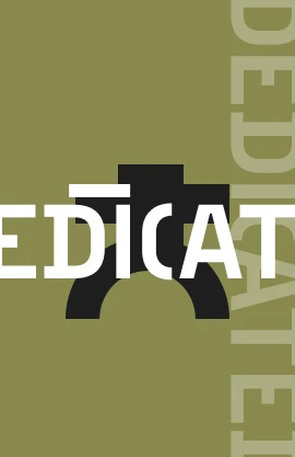
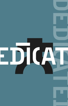
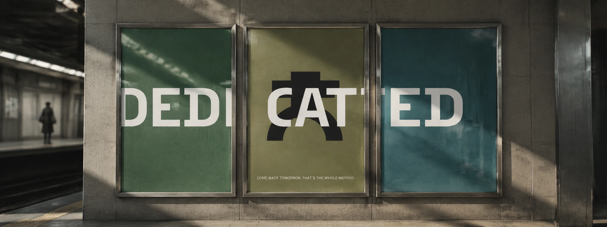
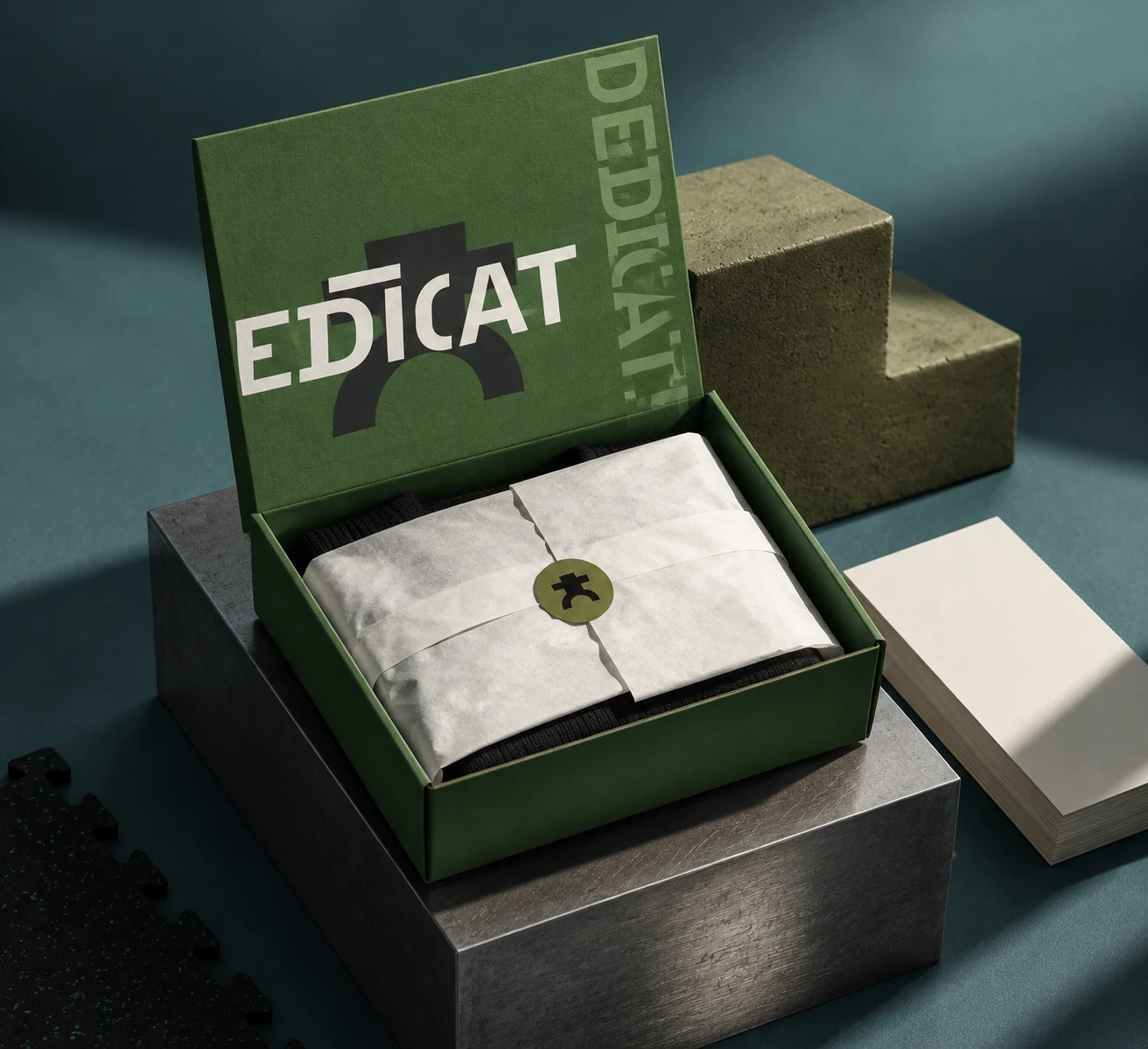
The wordmark came from the same instinct. I cut the D and the C open and put an overline on the I, so the letters read like signage sprayed through a stencil: maintained, not marketed. Then I stopped showing the whole word. Cropped to EDICAT, the name asks you to finish it yourself, which is the brand’s argument in one gesture.
My first palette was saturated orange against green. It read as a sports festival, so I dropped it. The final colours are three muted flats with near-black and soft white, one per surface, never mixed at equal weight, and the figure is always black.
THE WORK
LOGO
A stepped square-and-bar torso over one arch. The bar reads as shoulders and as a load-bearing beam, and the arch reads as legs and as a doorway. The stencil-cut wordmark is a condensed cap, tracked tight. The mark appears in near-black on colour or white on near-black, and the logotype only ever appears in white.
COLOUR AND TYPE
Green
#4A8A4F, Olive #8A8A50 and Teal #4D7A85 are all flat, with no gradients anywhere. Near-black #1E1E1E and soft white #F2EFEA carry text and the figure. For the web, headlines run in Archivo at 75% width and weight 800, with Instrument Sans for body.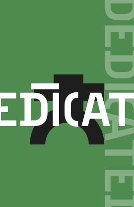
CAMPAIGN PHOTOGRAPHY
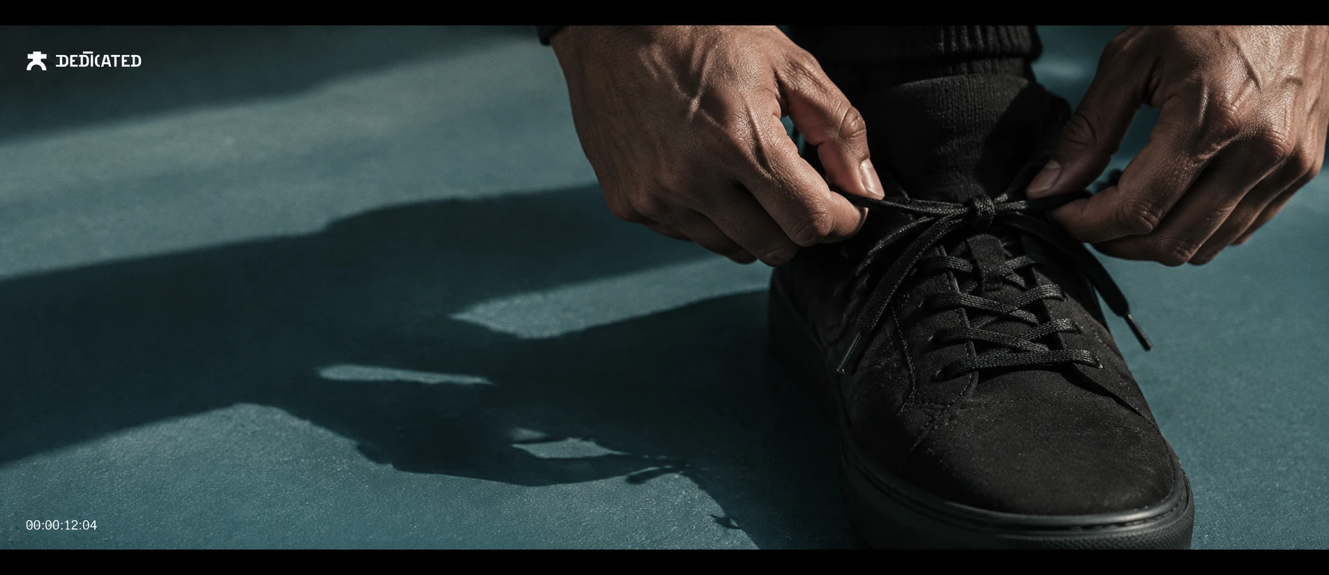
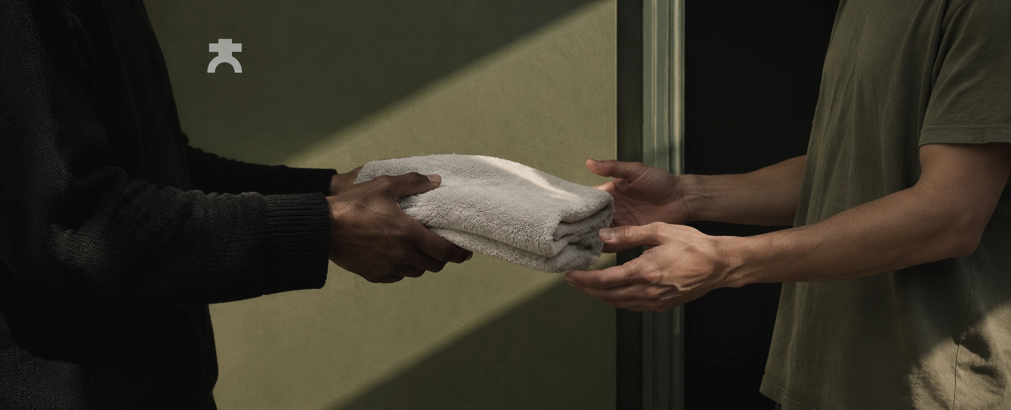
One light source, always hard, and the shadows are the second subject. In Open Stance, six people stand in the same stance against a Green wall, and their shadows read as a repeating row of figures. In Handoff, only hands and torsos appear, passing a folded towel across a diagonal stripe of sun, so care is shown without a face. The Stairwell, Back to Back and Desk frames follow the same rules: unretouched people, neutral expressions, no equipment. The most athletic image in the set is a pair of hands tying a lace.
OUT-OF-HOME
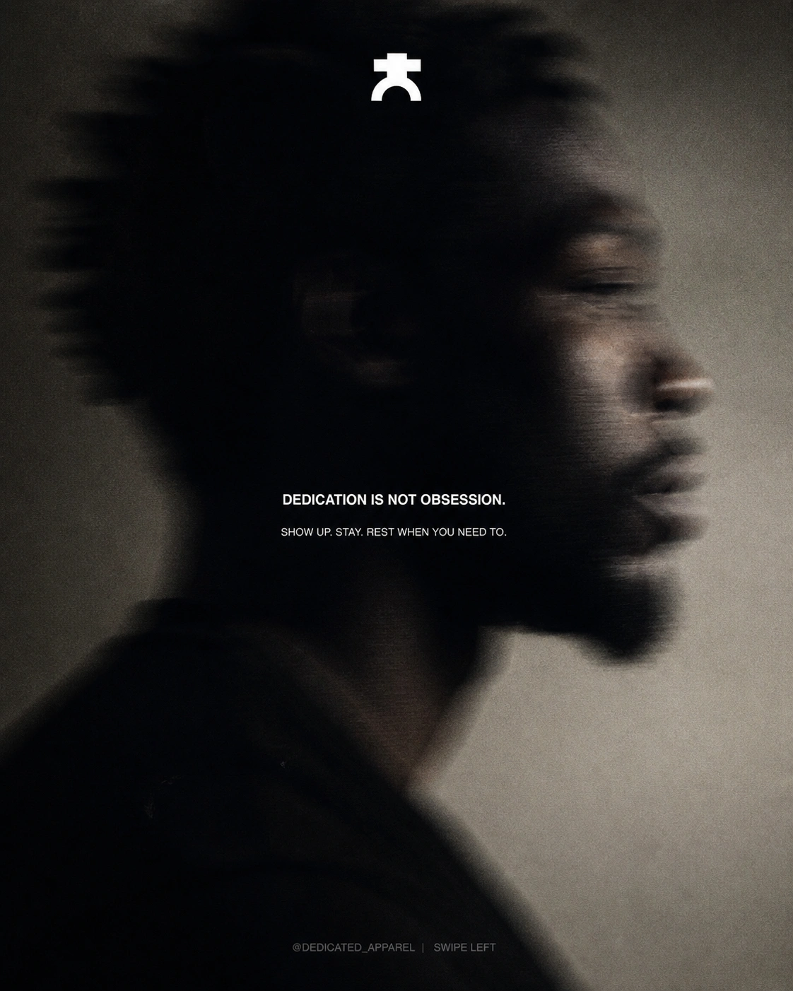
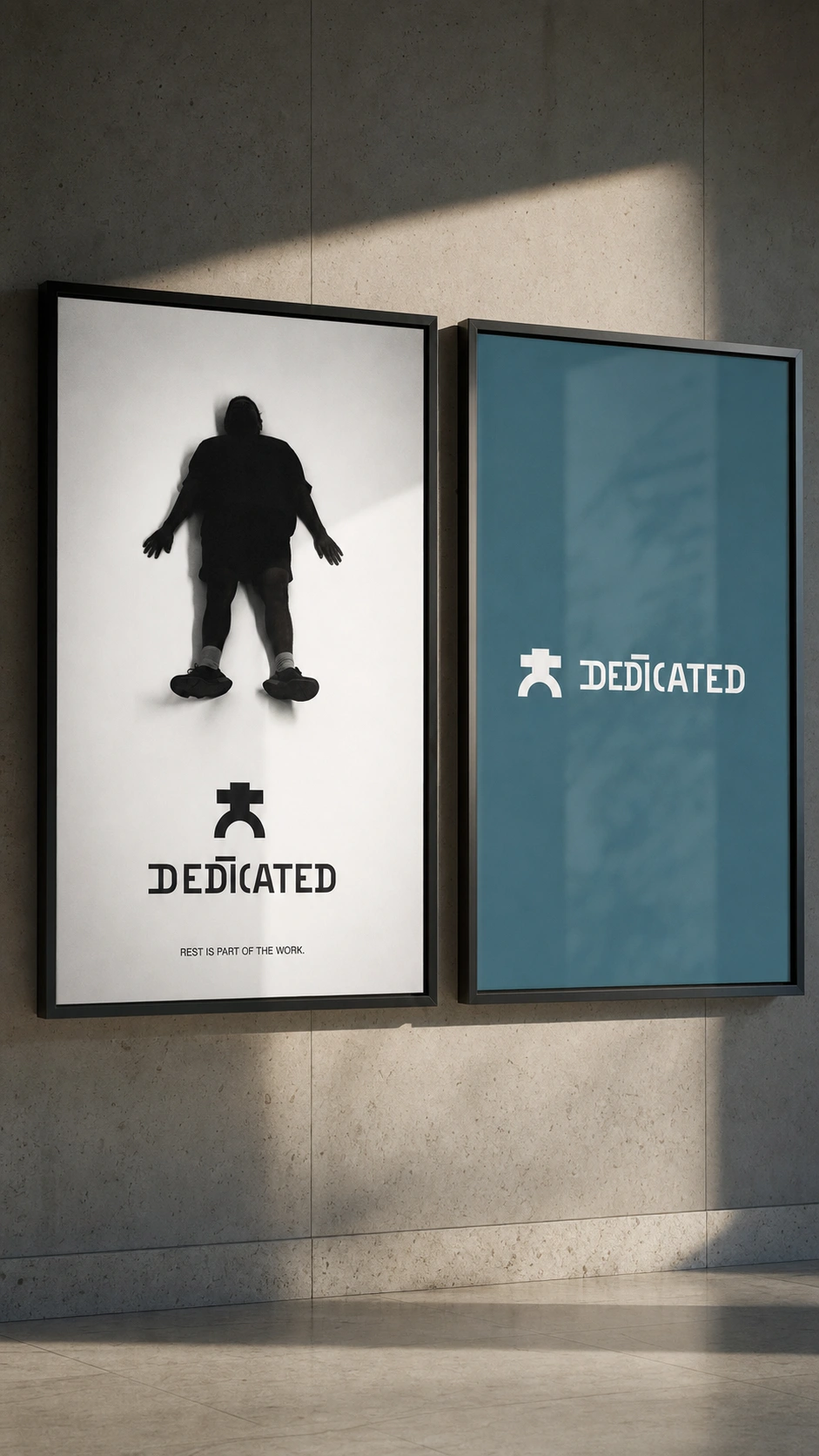
A painted brick wall carries the figure at building scale, with a ghost vertical wordmark in a lighter tint of the ground. The transit set splits one wordmark across three colour panels, so the full name only exists when you stand in front of all three. A wheatpaste grid of twelve posters repeats the cropped lockup, with one poster peeled back to reveal another colourway. A blurred profile portrait carries the manifesto, and a pair of screens shows a silhouette at rest.
APPAREL AND PACKAGING
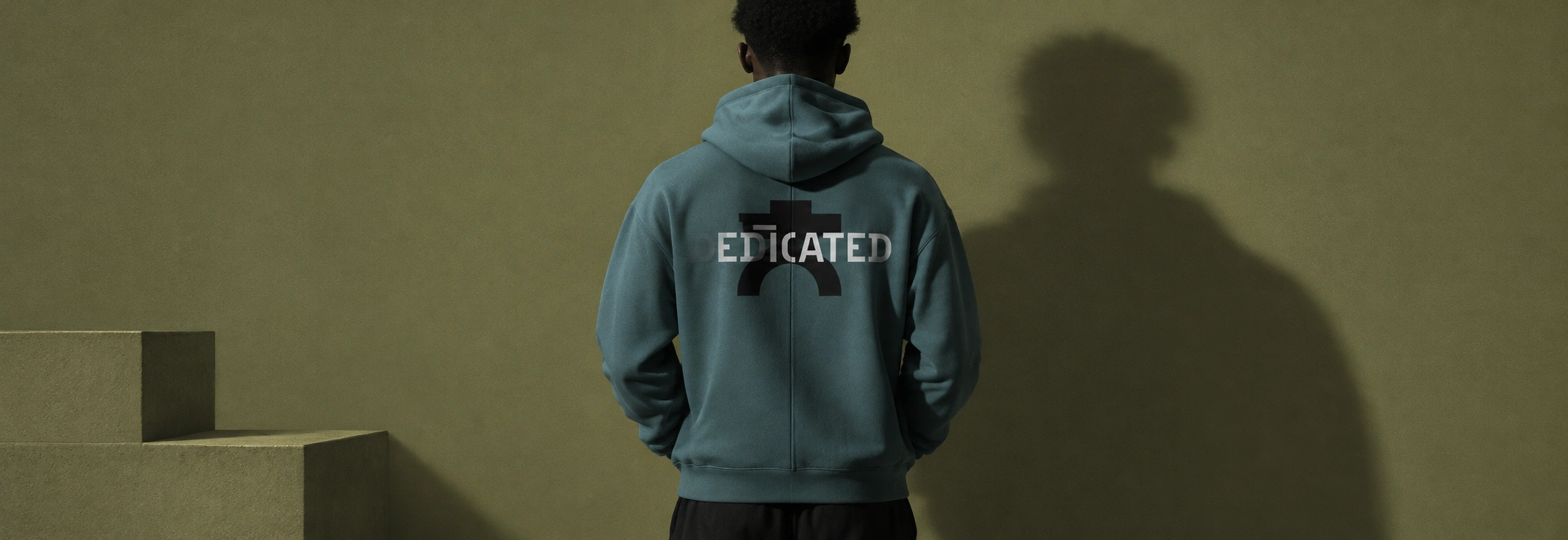
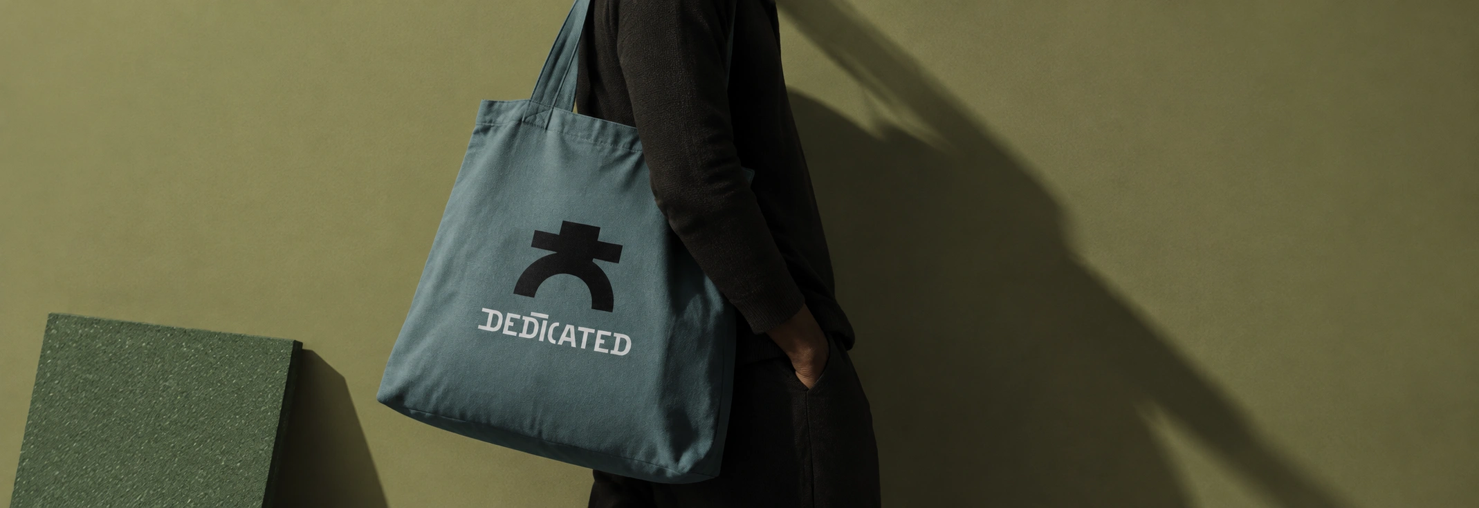
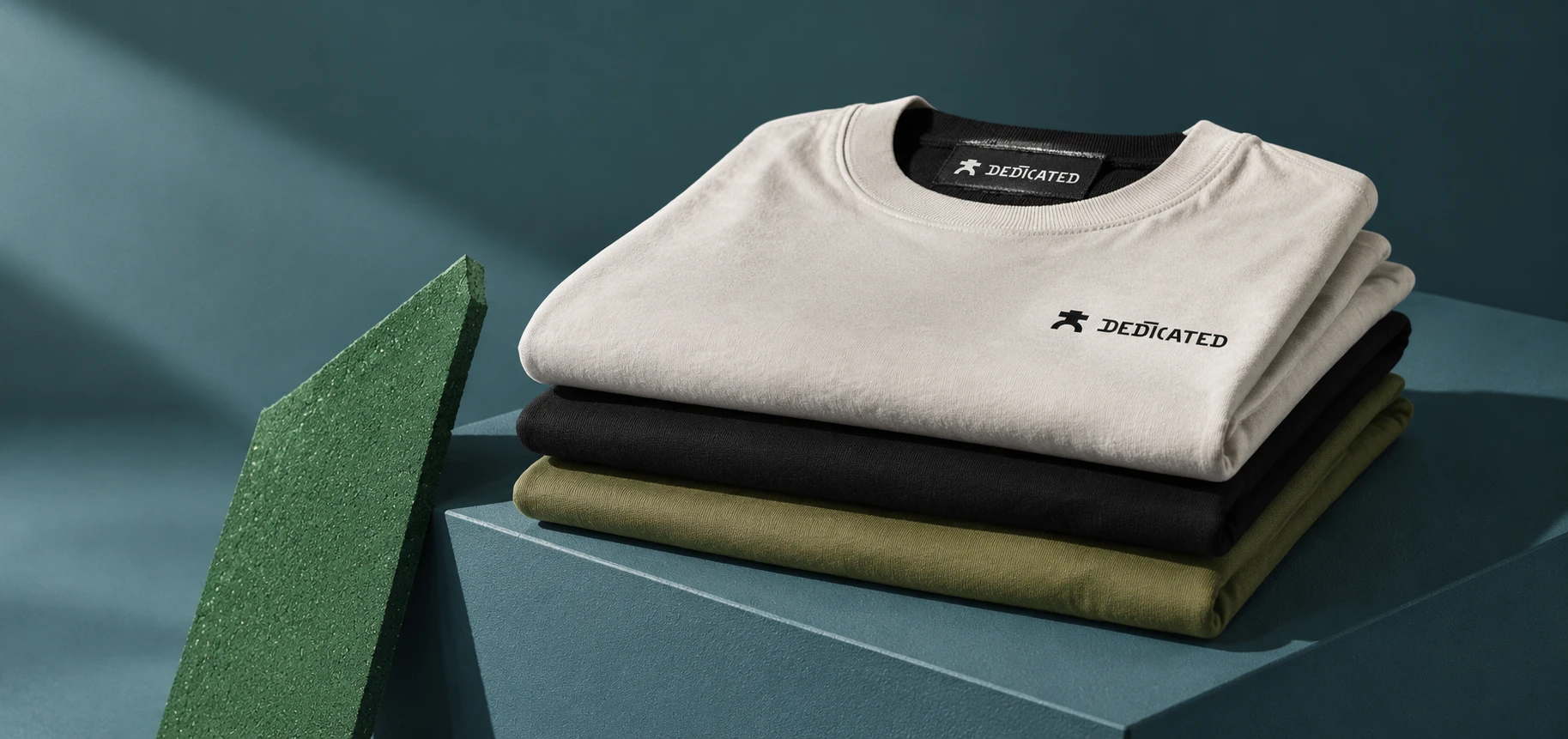
A tee stack in stone, black and Olive carries a small chest lockup and a woven neck label. An Olive tee carries the cropped wordmark across the chest. A Teal hoodie has the black figure on the back under the white logotype, and a Teal tote repeats the pairing. The Green mailer box carries a ghost wordmark down its lid and an Olive seal sticker with the figure.
SIGNAGE AND PRINT
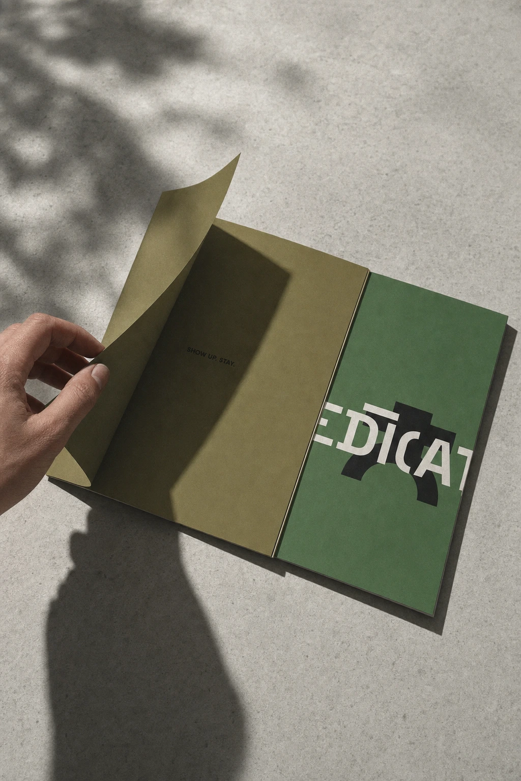
The entrance sign is cut steel, with the figure and logotype raised off an Olive wall. A Teal locker plate carries the figure alone in white. The pocket booklet has a Green cover with the cropped wordmark and an Olive spread that says only SHOW UP. STAY.
WEB AND MOTION
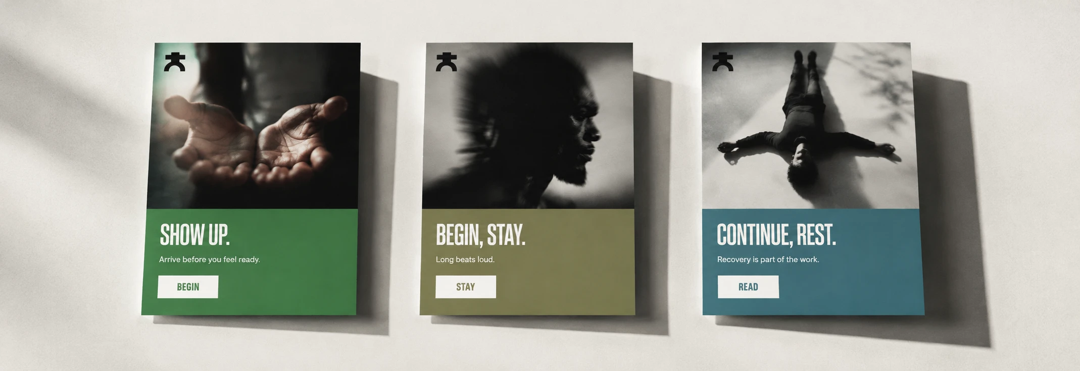
Landing cards in Green, Olive and Teal pair condensed headlines with one-line captions: SHOW UP., BEGIN, STAY., CONTINUE, REST. I explored two motion systems for the site. One is vertical and scroll-scrubbed, with the background handing off from Green to Olive as you read. The other is horizontal and snap-pinned, with a three-panel hero that slides apart like platform doors. A letterboxed 2.39:1 motion still closes the set: hands tying a lace on a Teal rubber floor.
Version A
Version B
THE RESULT
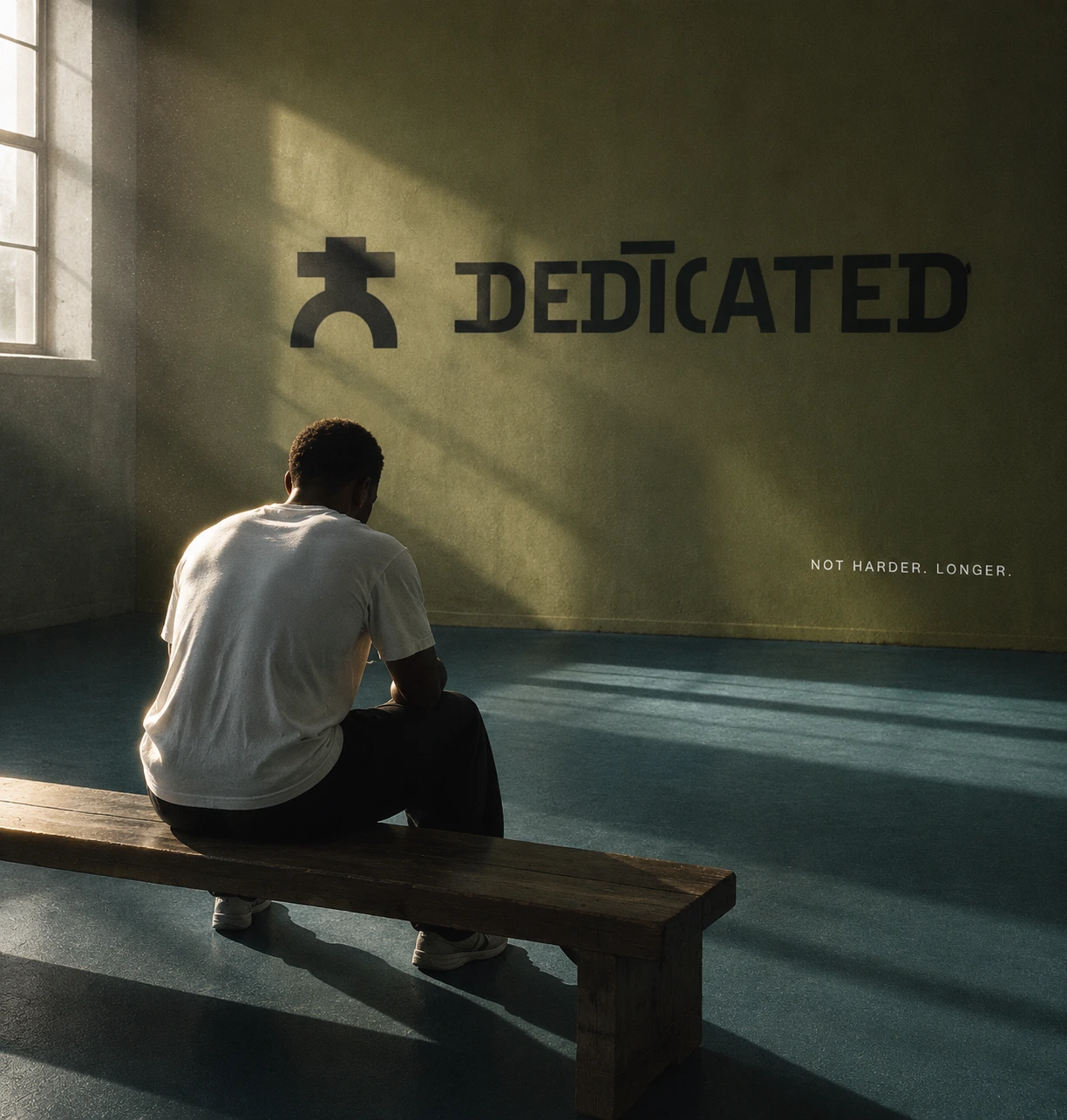
DEDICATED now runs across twenty applications and one animation without an off-system colour or a second display typeface. The figure, the cropped wordmark and the hard shadow turned out to be enough to carry everything from a building wall to a hang tag.
The project is still in progress. The identity is locked, and I’m putting the two motion directions for the site up for a vote. Next is filmed footage for the site’s video slots.
CREDITS / PROJECT INFO
Révolté — revolte.design
Project: DEDICATED
Year: 2026
Scope: Brand Identity, Logo, Art Direction, Out-of-Home, Apparel, Packaging, Signage, Web Design, Motion
Industry: Sports and Training
See more at revolte.design
Like this project
Posted Oct 13, 2026
One figure with no face, three flat colours, one hard light. Discipline as a form of care, not punishment
Likes
1
Views
3
Timeline
Oct 1, 2026 - Oct 13, 2026

