Built with Lovart
Norr & Co. Brand Identity Project & Website

Révolté


NORR & CO.: The Dot That Tells Time
LOGLINE
A hospitality group with a bakery, a lunch counter, a dining room and a late bar, sharing nothing but a standard. I gave the identity one punctuation mark and let the hour of the day change everything else.
THE BRIEF
Norr & Co. is a holding company with four places under it: a morning coffee and bakery, a midday fast-casual kitchen, an evening fine-dining room and a night bar. Four guests, four speeds, four rooms.
The problem is the one every multi-concept group hits. Make the four too alike and the bar feels like the bakery with the lights off. Make them too different and the parent is a stranger to its own children. Most groups solve it by stamping a shared logo on every menu. I wanted the opposite: a parent that stays quiet, and a system strict enough that you can feel four places belong together without a single “by Norr & Co.” line.
I took all of it: parent identity, four sub-brands, voice, the website, the photography direction and the applications.
THE APPROACH
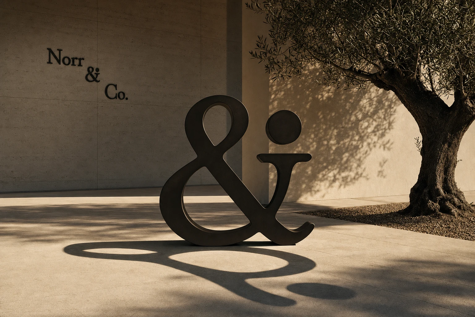
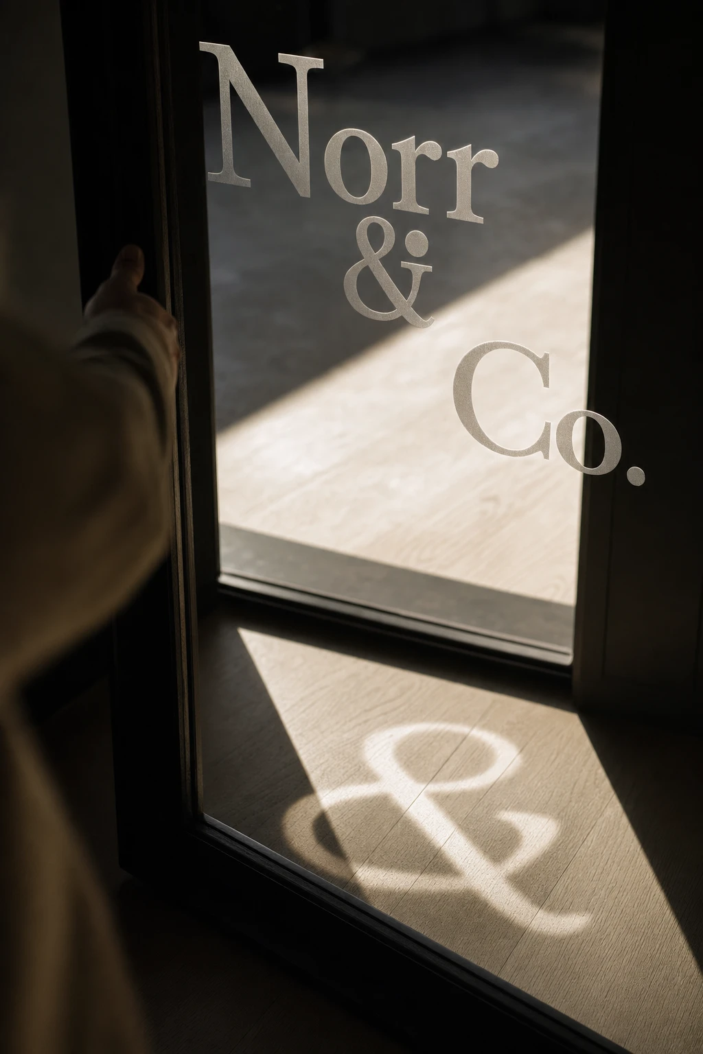
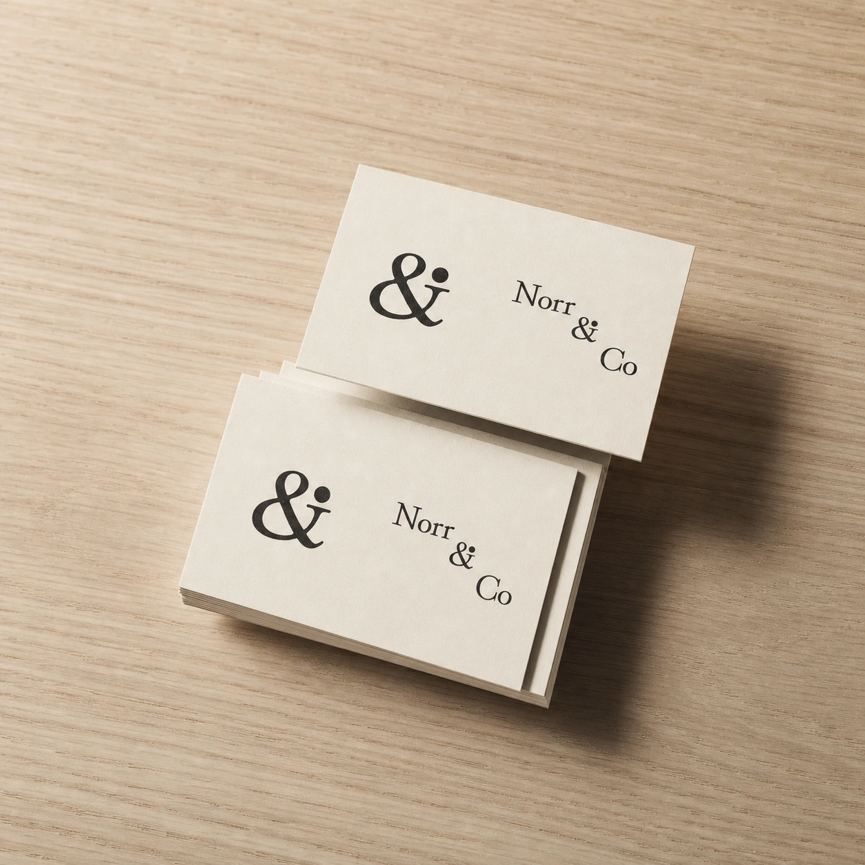
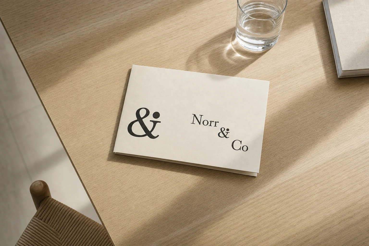
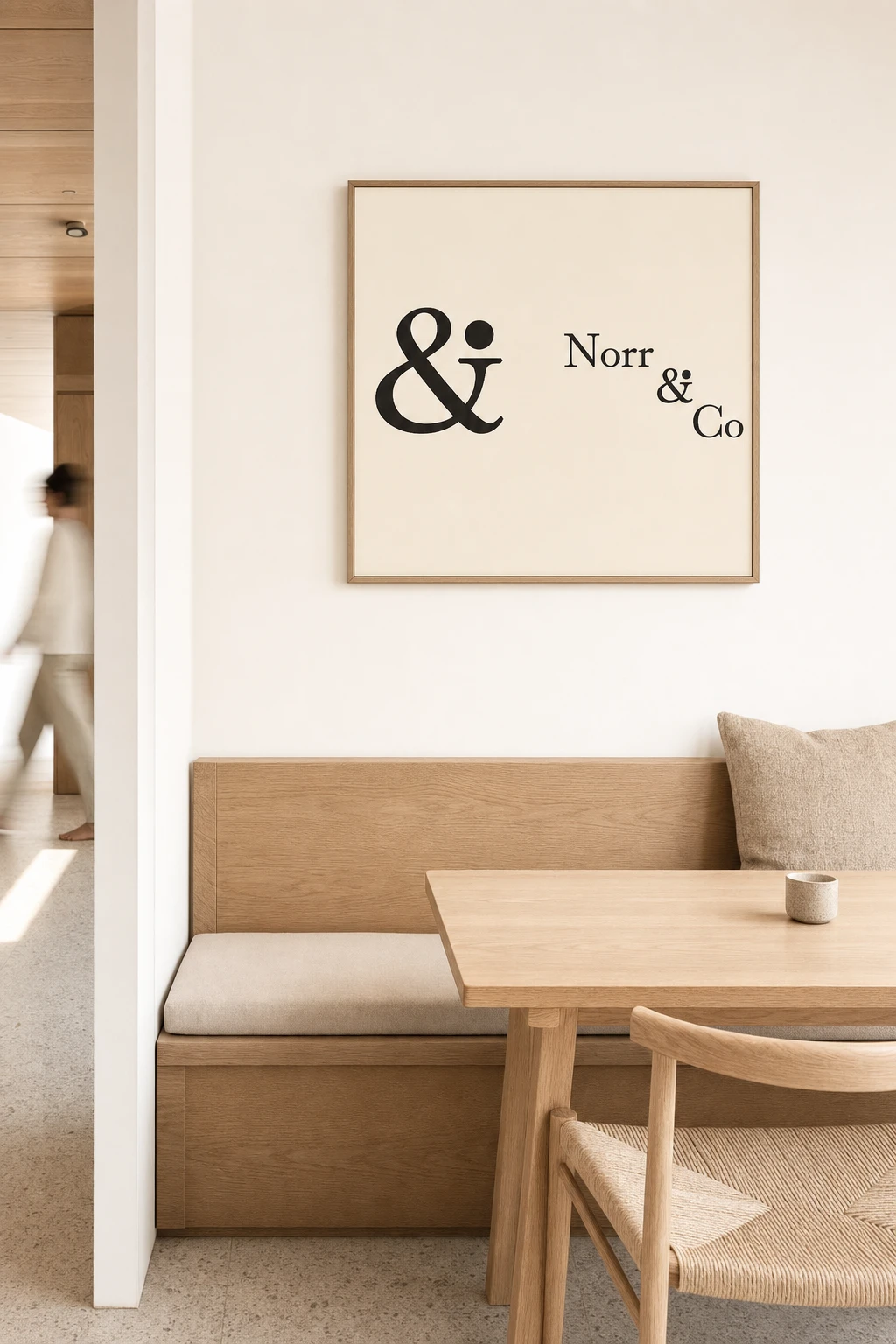
I started with the name. Norr means north, direction. It’s short enough to disappear behind the places it runs. The logotype is set in Hina Mincho, a Japanese mincho serif, chosen because it carries editorial restraint without the stiffness of a typical luxury serif. The mark came from pulling the ampersand out of the lockup and giving it a dot, so it behaves like punctuation: small enough to stamp, strong enough to stand alone.
My first instinct for tying the four together was the standard one: shared typeface, shared palette logic. It held up on paper and went flat in practice. One typeface across a bar and a bakery blurs both. What unlocked it was treating the day itself as the system. Each sub-brand owns an hour: 07:00 Molla, 12:30 Norr Kitchen, 18:45 Ash, 23:10 Low Key. Every decision then had to answer one question: what time is it?
That gave me fixed rules and variables. Fixed: the ampersand’s construction, and Hina Mincho as the body face everywhere. Variable: the dot’s colour, the display typeface and how loud the ampersand gets. I made that last one a deliberate gradient. Beside Molla’s wordmark the ampersand is small and the dot moves into the letters. By Ash it’s large and owns the room. For Low Key I almost pulled it back, then did the opposite: I kept the ampersand at Ash’s scale and moved all the risk into the typeface.
THE WORK
COLOUR SYSTEM
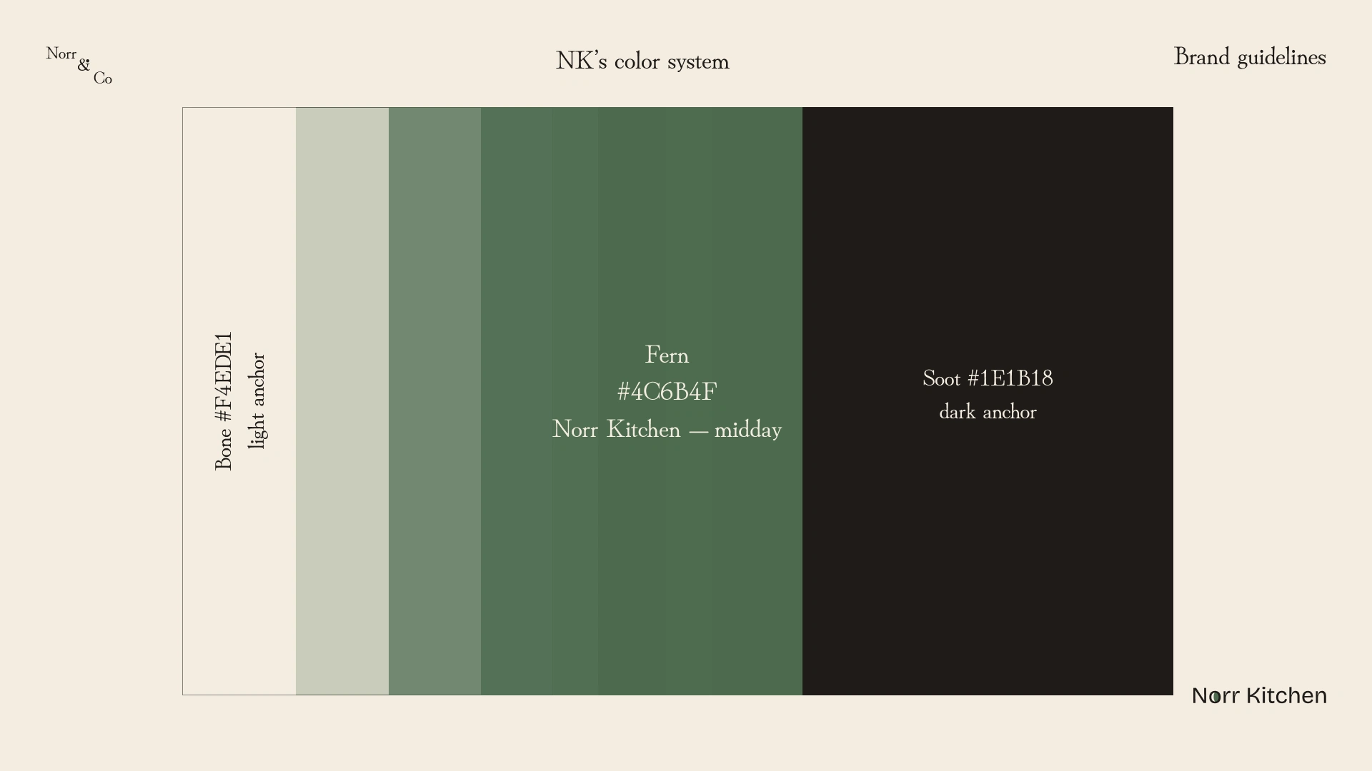
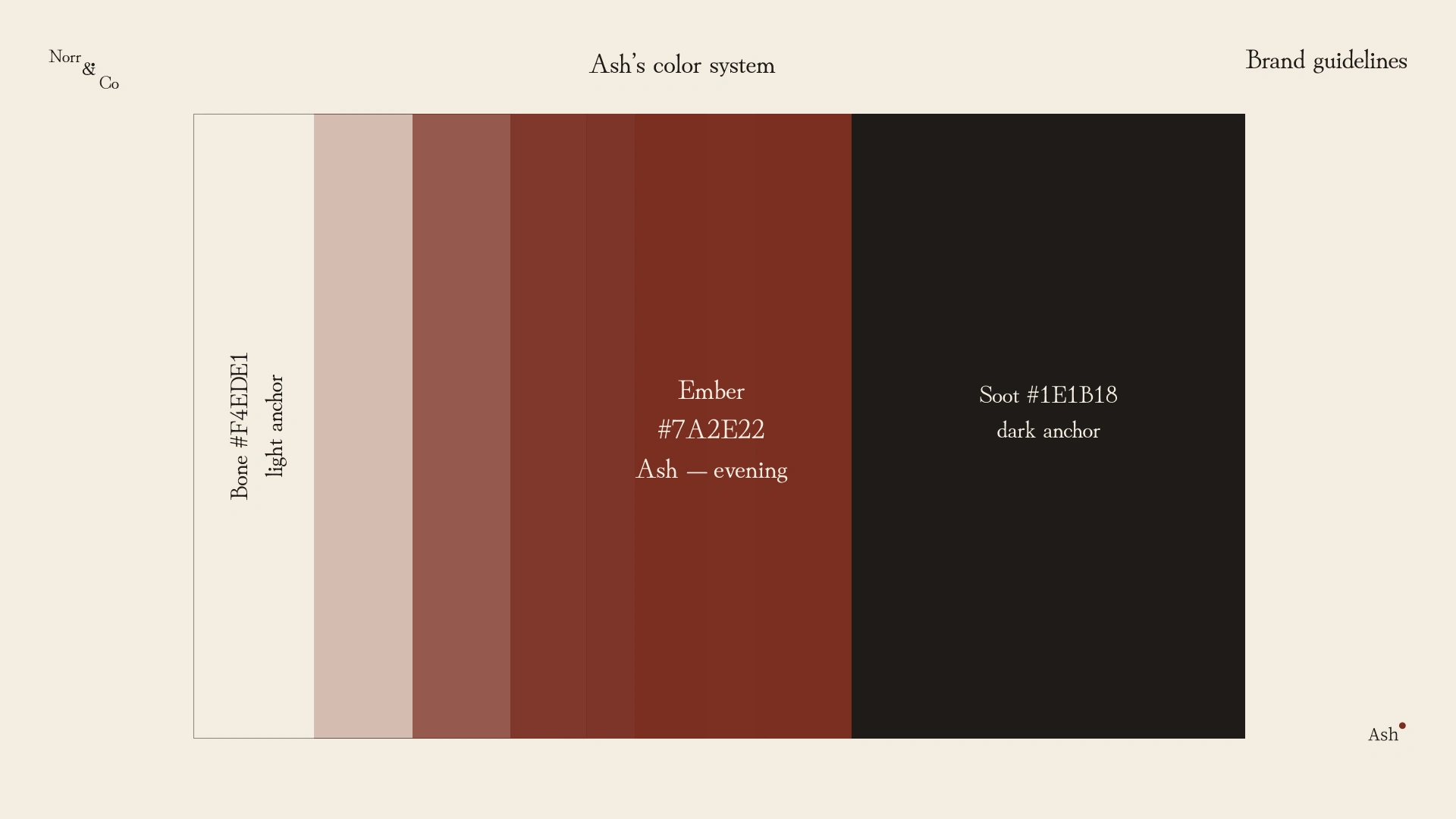
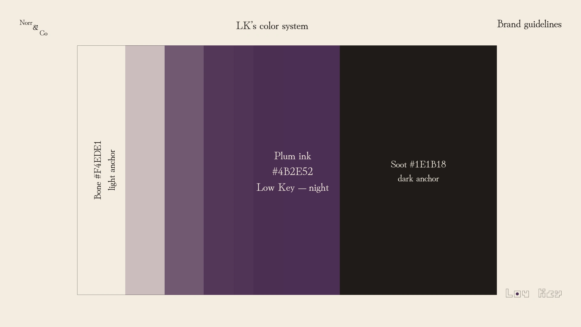
Two anchors, four accents. Soot
#1E1B18 is a warm near-black, never pure black. Bone #F4EDE1 is a yellowed off-white, closer to uncoated paper than a screen white. The accents are Toasted Wheat #B8894A for Molla, Fern #4C6B4F for Norr Kitchen, Ember #7A2E22 for Ash and Plum Ink #4B2E52 for Low Key. Each one arrives as a small, deliberate event: a dot, a counter, a glow. Six colours total. The restraint is the argument.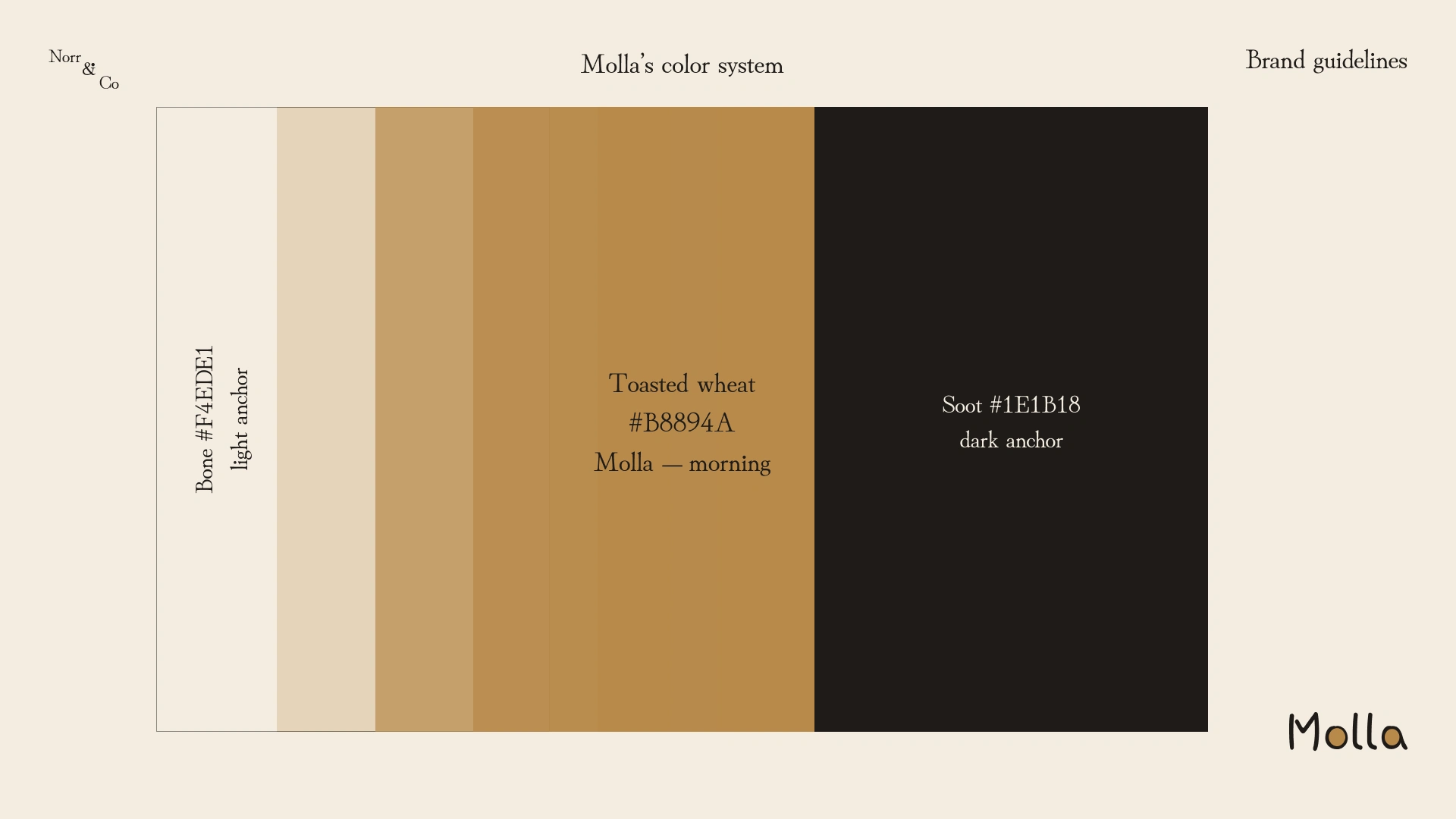
LOGO AND MARK
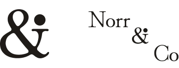
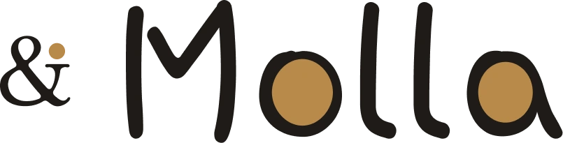
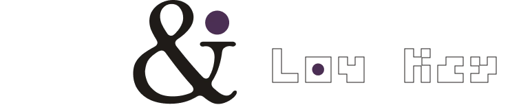
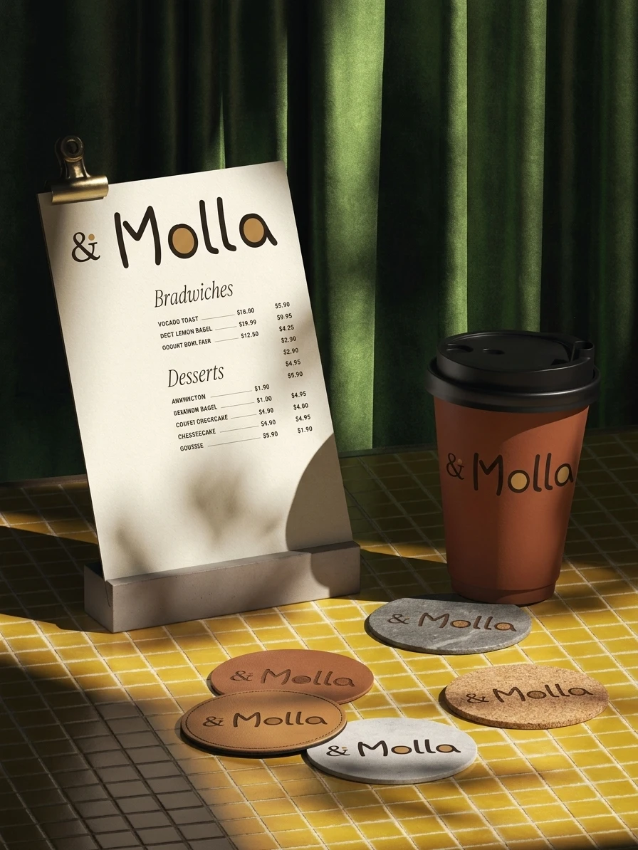
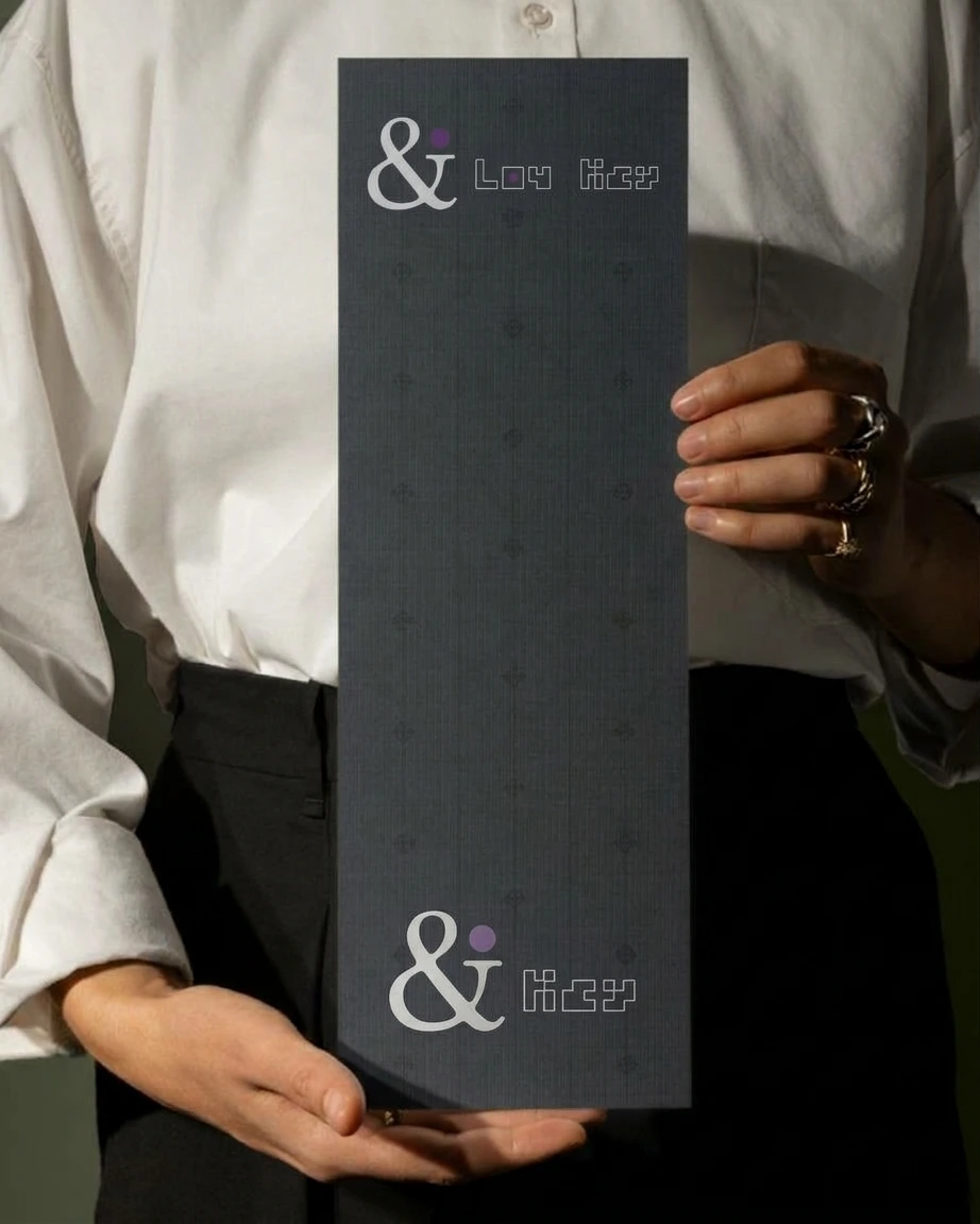
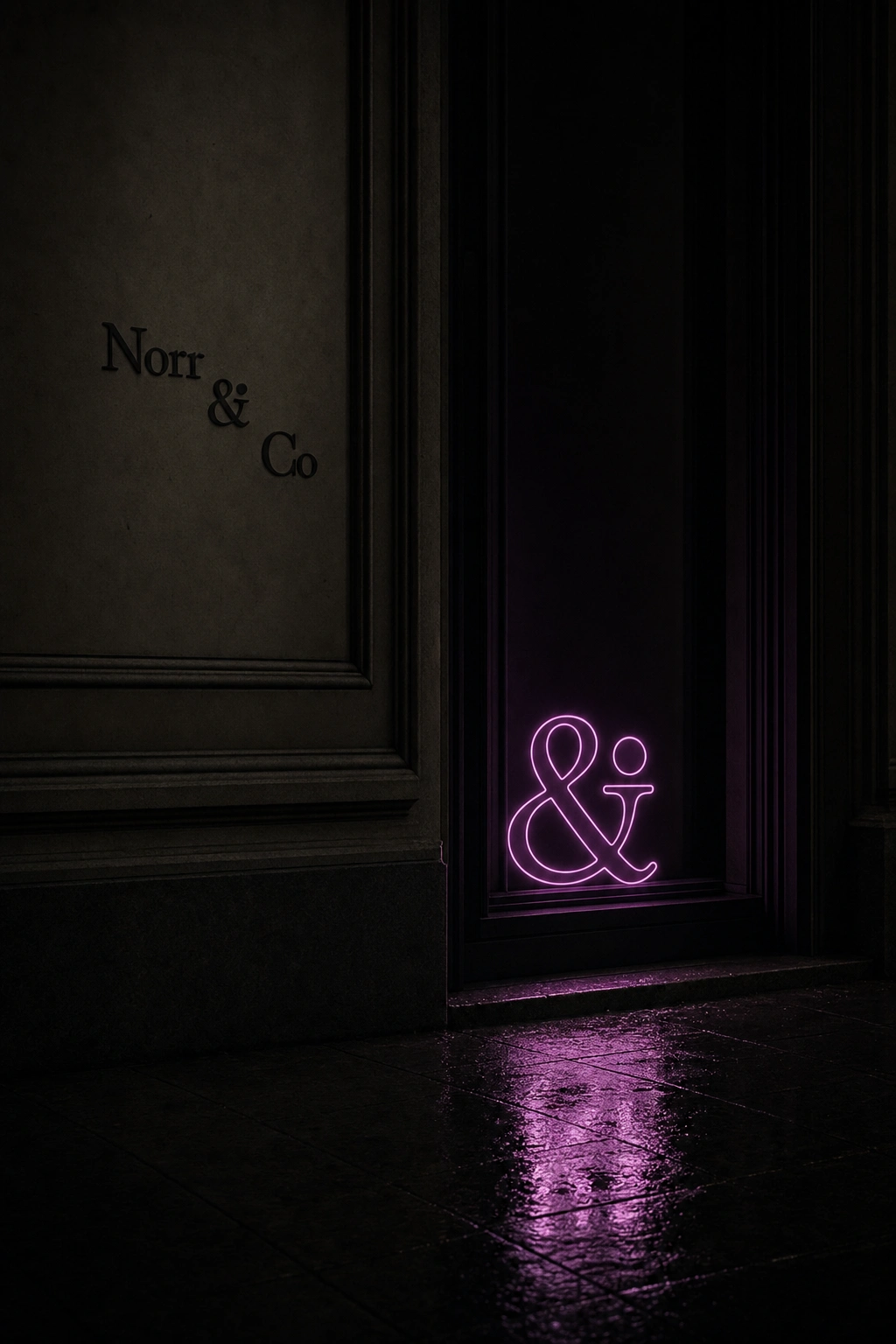
The parent logotype steps diagonally down the page: Norr, a dotted ampersand, then Co., all in Hina Mincho at three sizes. Each sub-brand moves the dot differently. In Molla it fills the counters of the o and a in Toasted Wheat. In Norr Kitchen it’s a Fern ellipse inside the o of Norr. In Ash an Ember dot lands on the ampersand and a second one trails the name. In Low Key a Plum Ink dot sits inside the o of an outlined pixel wordmark.


TYPOGRAPHY SYSTEM
Display changes per sub-brand. Body never does. Molla is set in Hi Melody, handwritten and a little imperfect, like a name scrawled on a cup. Norr Kitchen uses Bricolage Grotesque, upright and fast to read on a board or a bag. Ash uses Cactus Classical Serif, the most formal voice in the family. Low Key uses Bytesized, hollow and pixelated, the one face that doesn’t ask to be taken seriously. Underneath all four, Hina Mincho carries every line of supporting copy.
VOICE
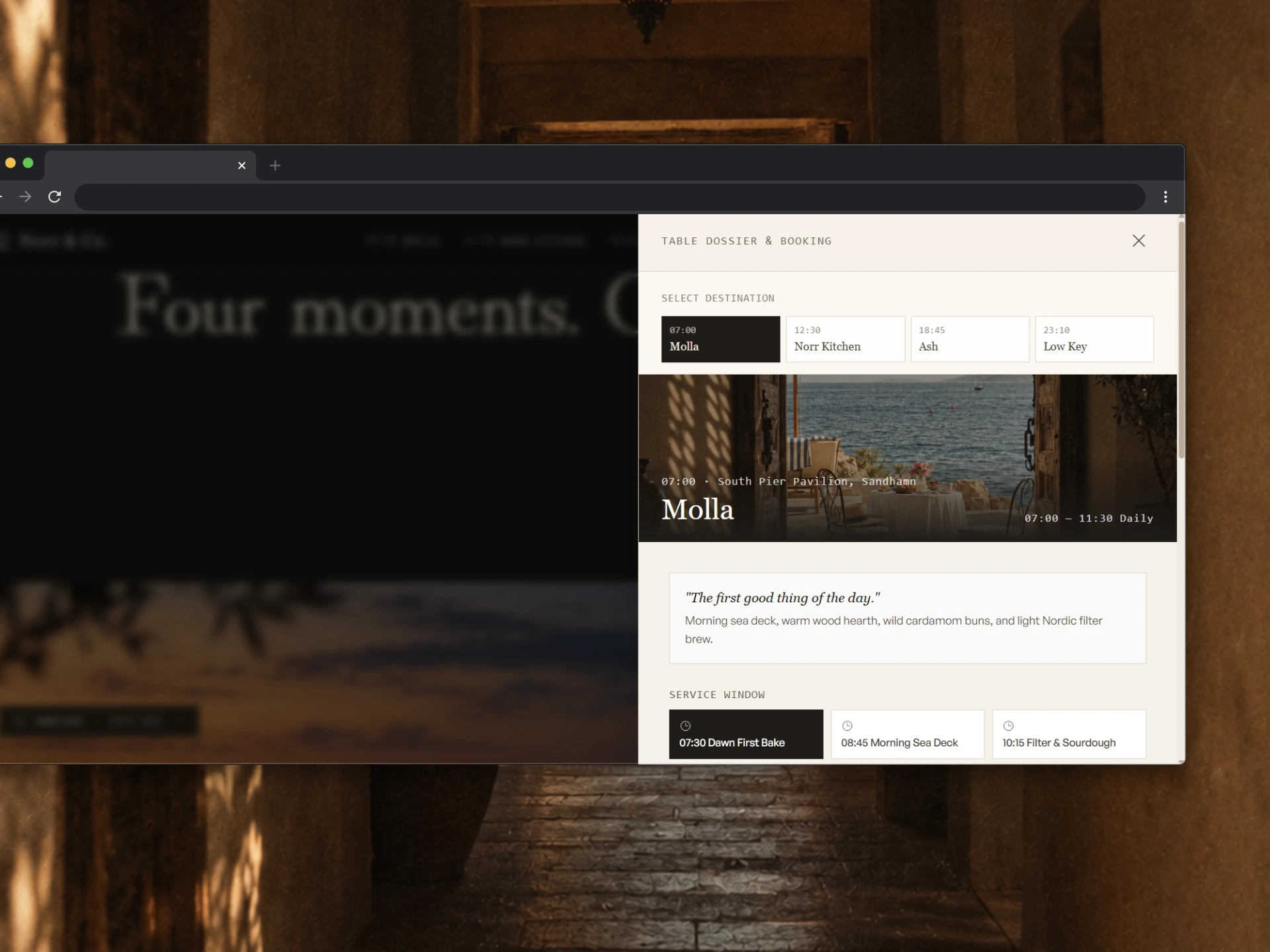
Each brand speaks shorter as the day goes on. Molla: “The first good thing of the day.” Norr Kitchen: “Lunch, kept in motion.” Ash: “An evening worth taking slowly.” Low Key: “Stay for one more.” The parent barely speaks at all, and when it does it states things instead of selling them.
WEB DESIGN
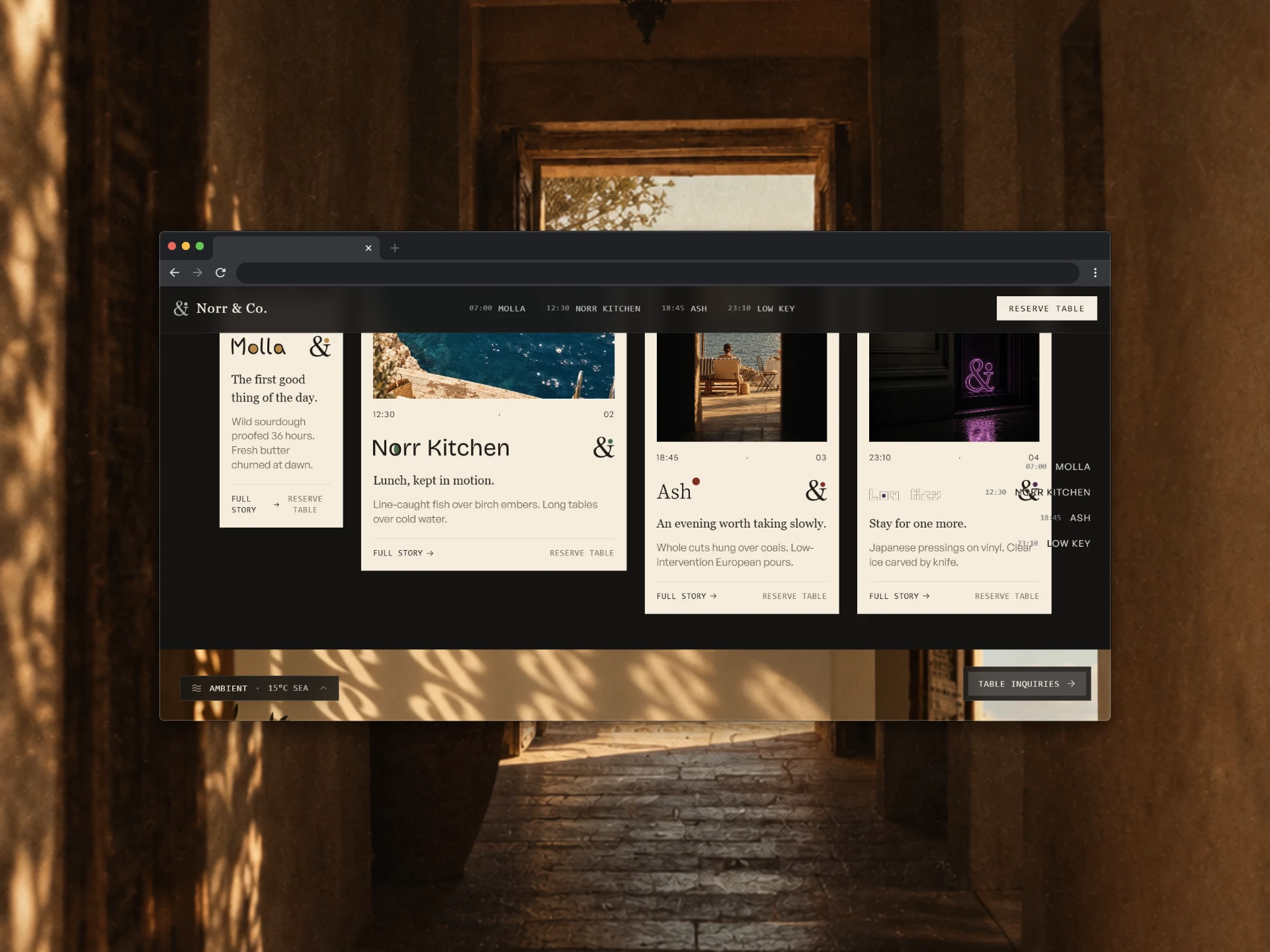
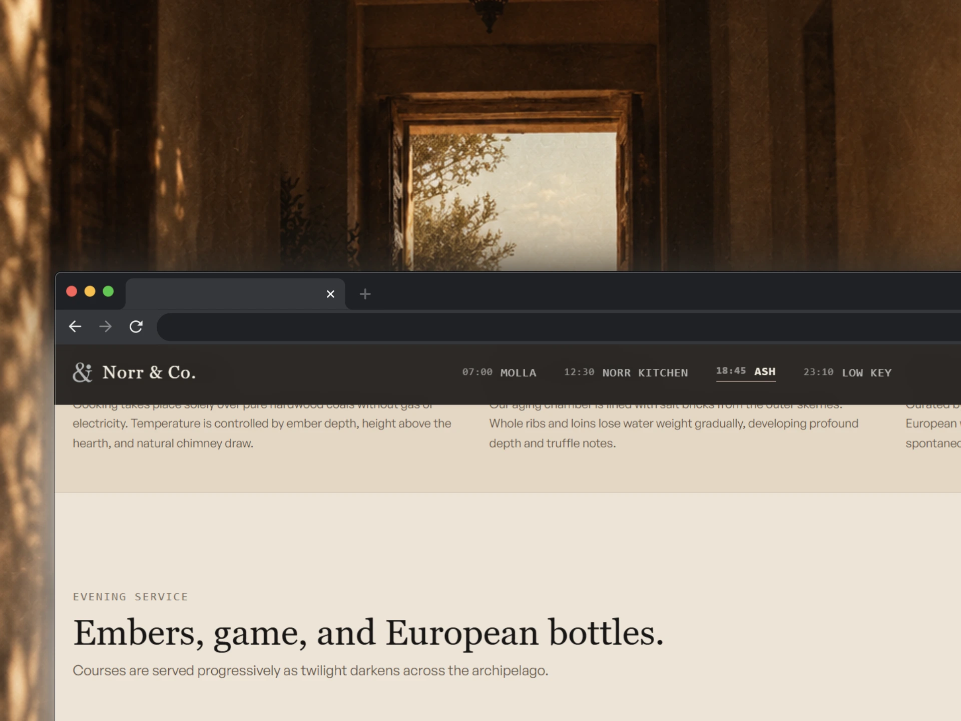
The site is one scroll that runs a day. The nav carries the timestamps, so you move by hour instead of by page name. The Four Moments section lays the brands out as four unequal cards, because midday and midnight don’t carry the same visual weight. My first pass had a bug: I’d offset Low Key’s card downward for the late-night feel and also pulled it sideways, and it buried Ash completely. It read as a mistake, not a decision. I kept the vertical drop and restored the gap. A booking drawer slides over the page with destination tabs keyed to the same four hours.
PHOTOGRAPHY AND IN-WORLD MARKS
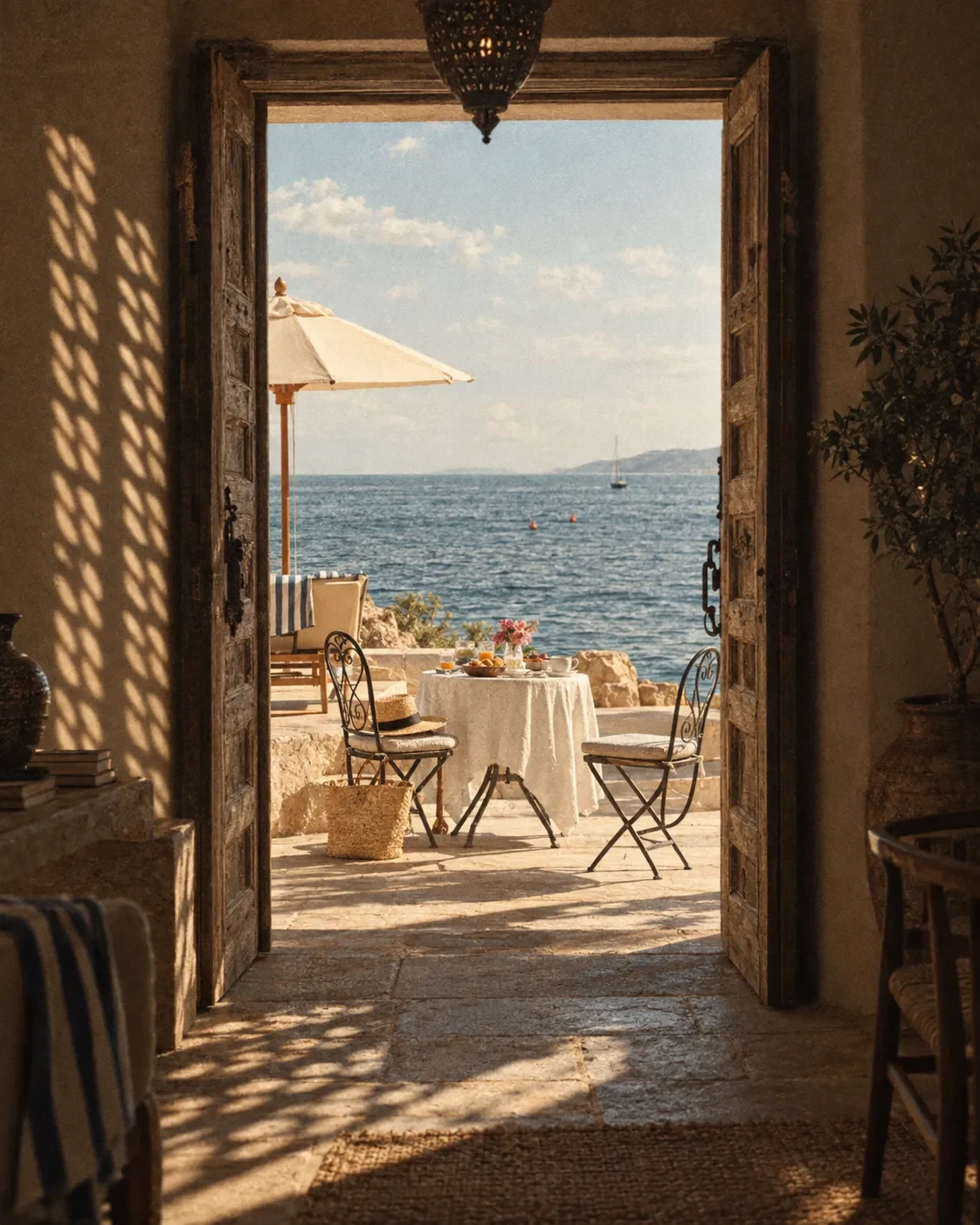
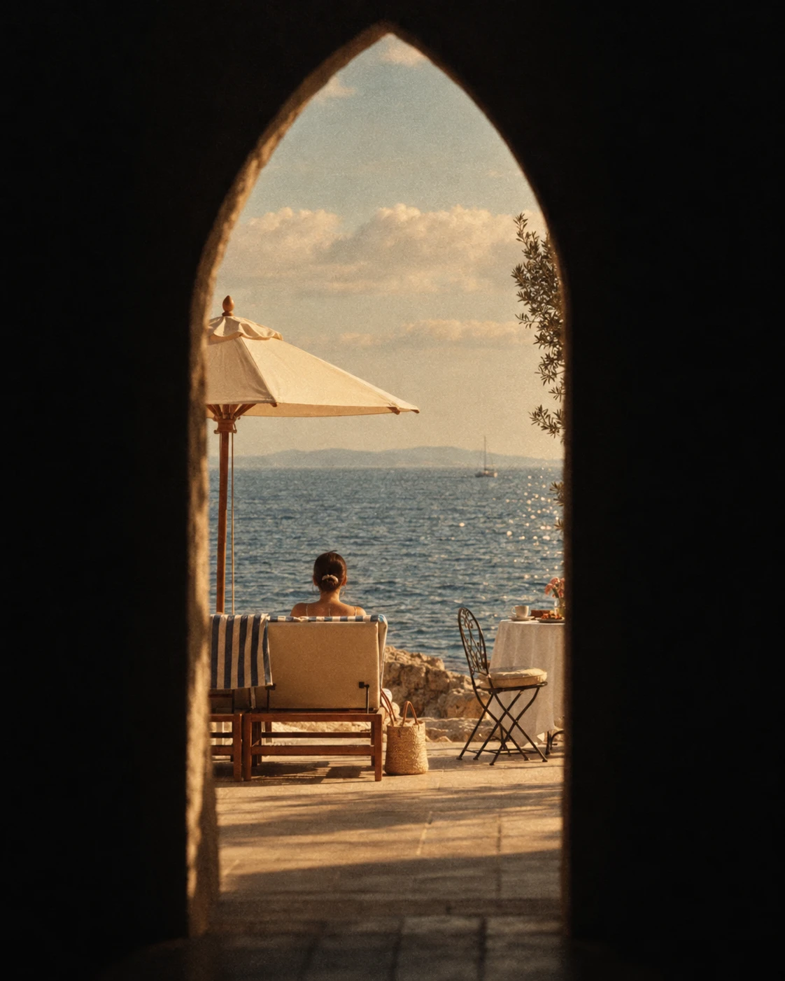
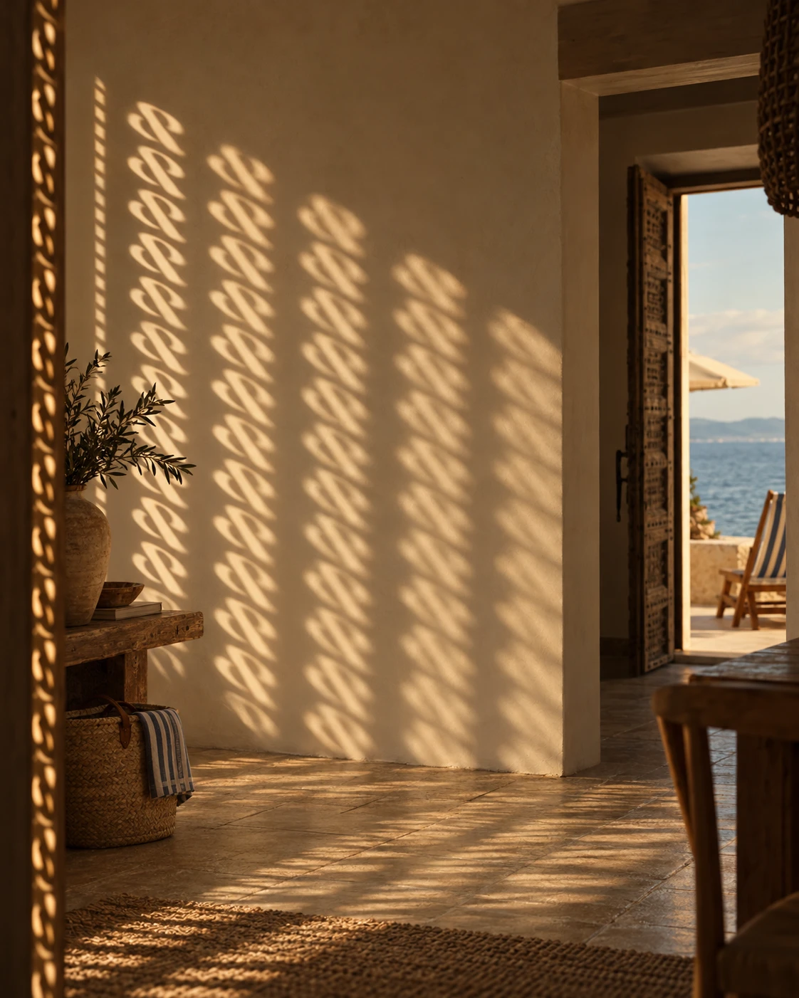
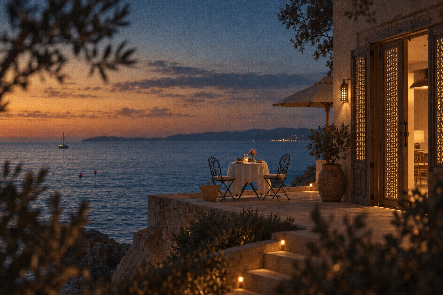
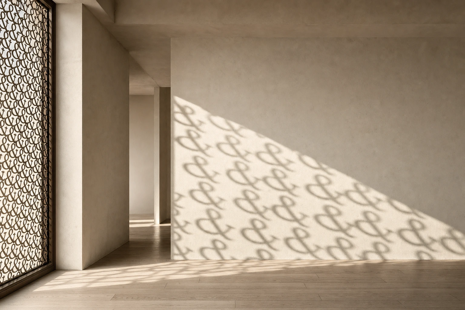
My first direction was pale oak, white plaster and Scandinavian light. It was well-behaved and forgettable, and the first mockup batch confirmed it: flat, stationery-adjacent, nothing anyone would stop for. I dropped stationery entirely and rebuilt the visual language around sun-bleached film grain. Every frame is shot through a threshold: a door, an arch, a rail, a corridor. People are small, turned away, mid-motion. The marks appear once per image, physically in the world: a brass plaque on a door, a Toasted Wheat ampersand stitched into a napkin, an enamel tag on a wet tote, an etched candle holder at dusk, an outline neon in Plum Ink.
APPLICATIONS
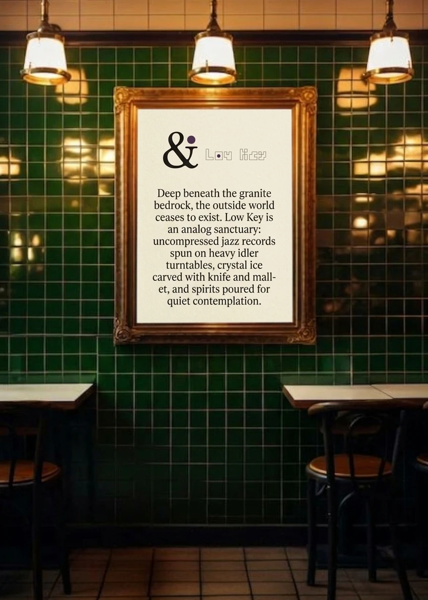
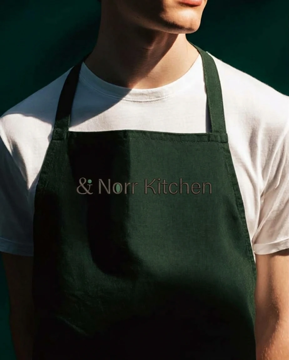
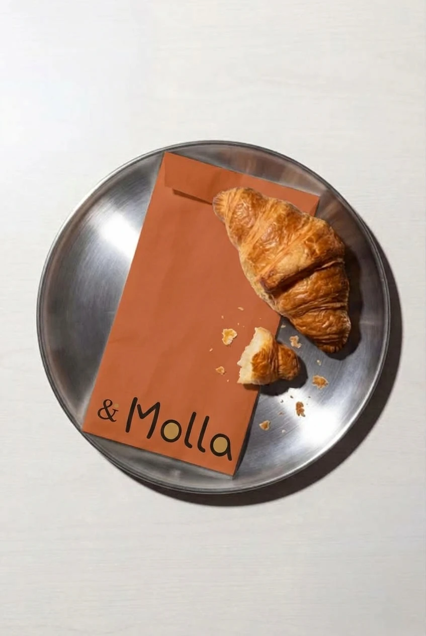
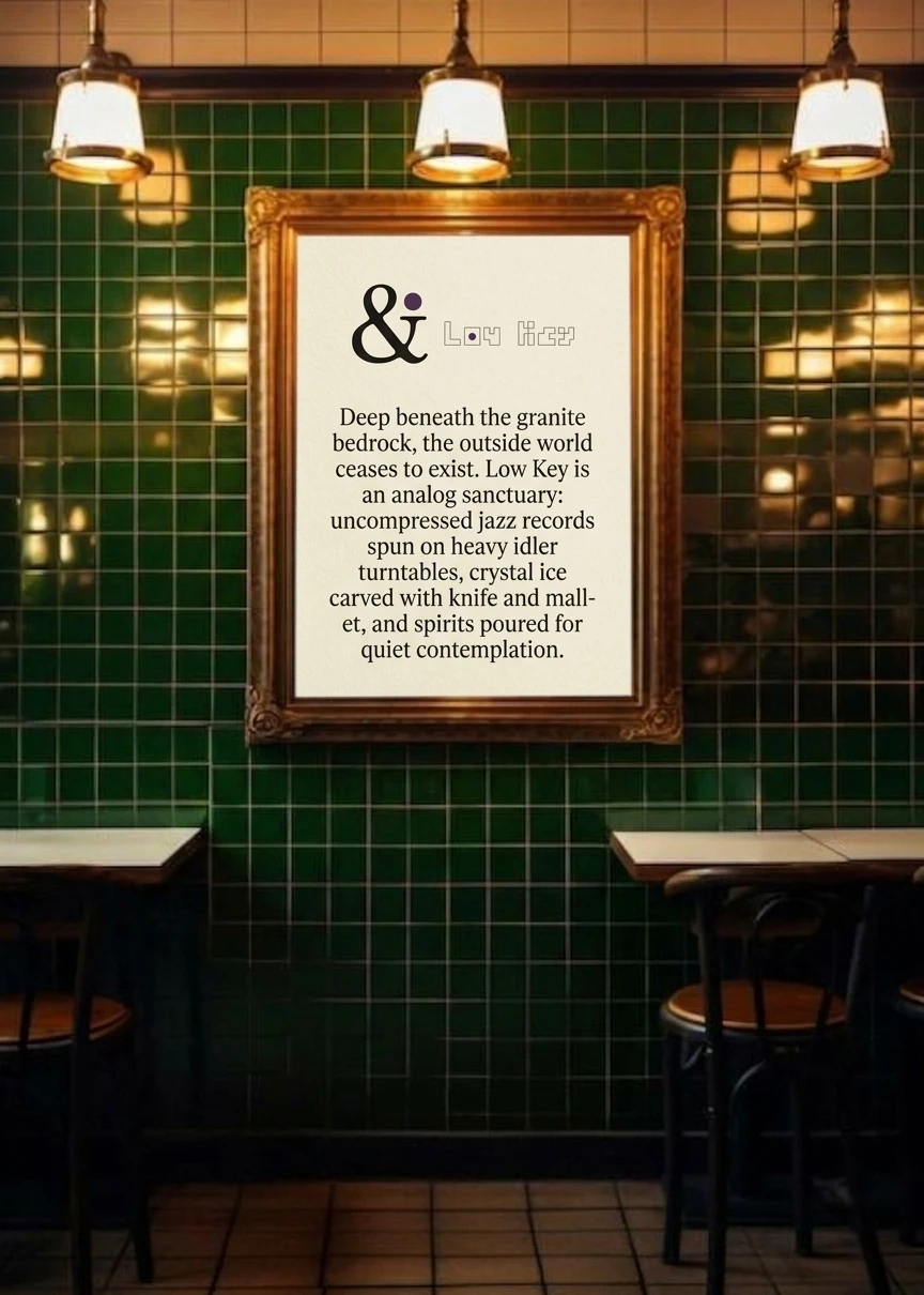
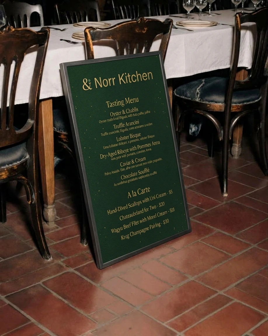
Each brand also gets objects people actually hold. Molla gets a terracotta cup, leather, cork and stone coasters on yellow tile, a clip-stand menu and a paper bag with a croissant on it. Norr Kitchen gets a deep green apron stitched tone on tone and a green menu board with gold lettering. Ash gets two kitchen tees, one with a photograph of whole cuts hung over embers on the back, plus an apron with a small lockup. Low Key gets a tall slate card with the ampersand at the top and again at the foot, and a framed print on green tile.
THE RESULT
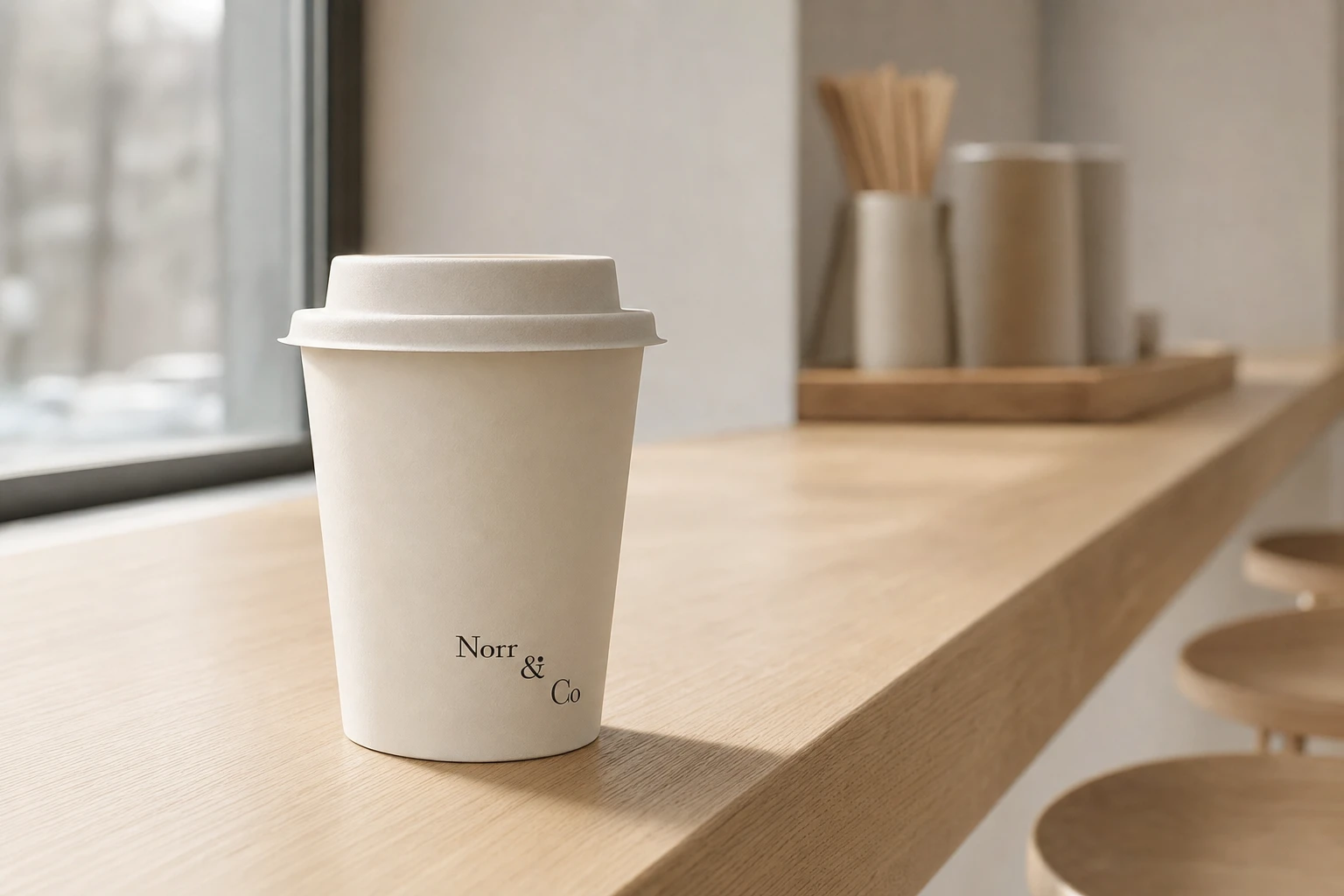
What shipped is a complete system: parent identity and guidelines, four sub-brand marks with their own type and colour, a voice ladder, a live website, a photography direction that works without a logo in frame, and applications across cups, aprons, menus and tees.
The part I’m most certain about is the inheritance diagram, one slide with a row of ampersands where only the dot changes colour. You can read the whole system from it in a few seconds. What’s next is the test I can’t run on a screen: whether it survives real menus, real signage and a real kitchen.
Révolté (revolte.design)
PROJECT: Norr & Co.
YEAR: 2026
SCOPE: Brand Identity, Brand Strategy, Web Design, Art Direction
INDUSTRY: Hospitality
See more at revolte.design
Like this project
Posted Oct 19, 2026
One dotted ampersand, four hours of the day. A hospitality identity where colour, type and voice shift by the clock and the standard holds
Likes
0
Views
13
Timeline
Aug 27, 2026 - Oct 19, 2026