Built with Lovart
NURV® — Integrated Fitness and Nutrition App Design

Révolté


NURV® — The Body, Read Like an Instrument
LOGLINE
Fitness apps treat the body like a mood. I wanted one that treats it like a system worth instrumenting, so I gave swim, food and supplements a single language: nine dots and one orange.
THE BRIEF
NURV® is a self-initiated project for my Friday series, one app a week. It's an Android app that does four jobs people usually split across four apps: swim training, nutrition, supplements and an AI coach.
The tension was the category. Training apps default to neon gradients, flames and shouted motivation. But the person NURV is for is counting laps, tracking glycogen, working around allergens and timing doses. They don't need hype. They need a readout.
I took on everything: the identity, the app interface and a set of campaign scenes, to test whether the system could survive off the screen, on a metro wall, in an airport, on a foil sachet and on a finger.
THE APPROACH
My first instinct was dark mode with an electric accent, because that's what "performance" looks like. I killed it fast. It made NURV look like every other tracker, and it buried the thing I cared about: numbers that read at a glance in a bright, wet pool hall.
The unlock was the dot. The mark is nine dots in an orange squircle, and a dot-matrix display draws numbers the same way. So the logo stopped being a logo and became the unit of the whole system. Numerals are dots. The phase counter is dots. The timeline scrubber is dots on a curved rail. The notification badge is a dot with a number in it.
Then one rule: a single signal color. Orange (
#FF5200) appears only where something is live: the icon, the active meal, a status LED, a seam of light on a monolith. Everything else lives in cream, bone and graphite. When orange shows up, it means look here.THE WORK
APP INTERFACE
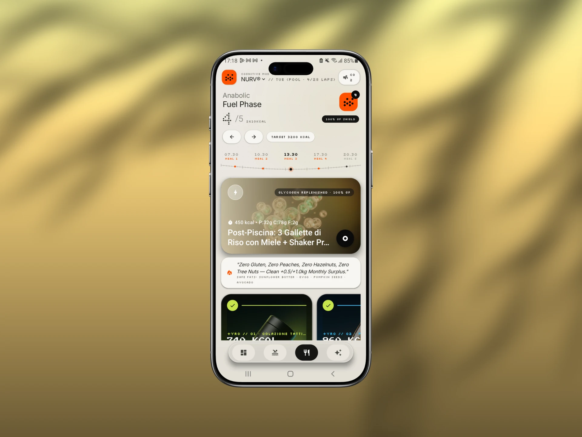
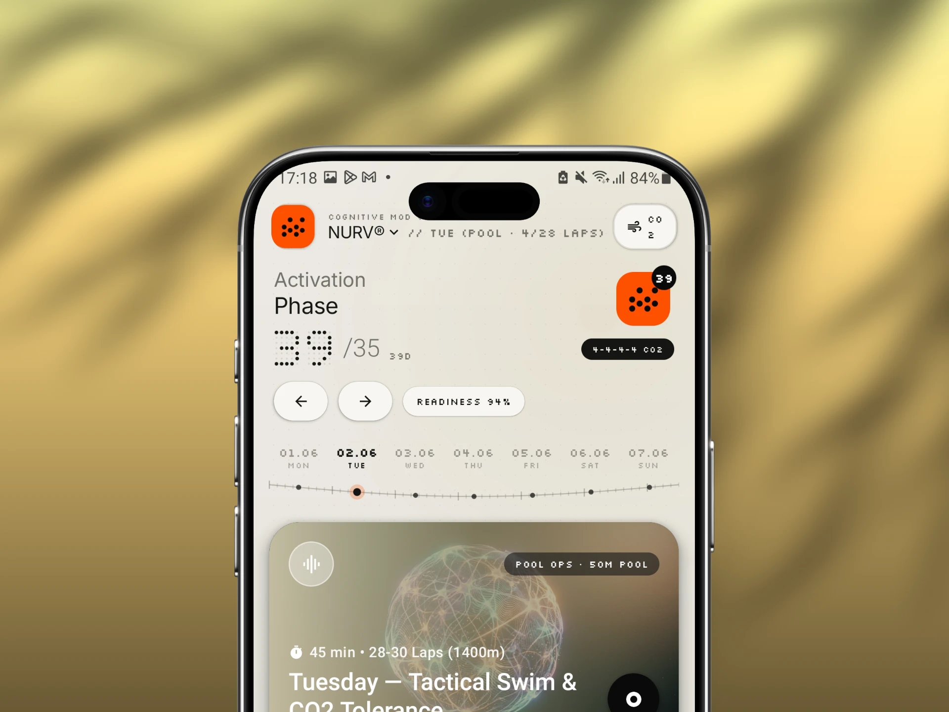
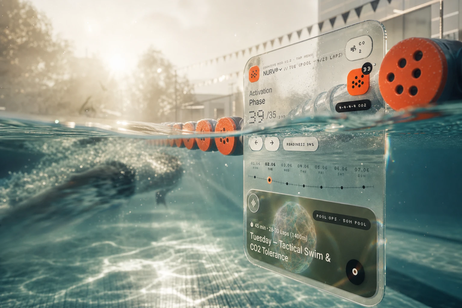
The home screen is organized by phase, not by tab: Activation Phase 39/35 for training, Fuel Phase 4/5 for food. Large dot-matrix numerals sit next to a light grotesk title, and tiny tracked mono labels (READINESS 94%, 4-4-4-4 CO2, TARGET 3200 KCAL) do the instrument-panel work. A curved dial scrubber replaces day tabs, so moving through the week or the five meals feels like turning a knob.
DATA MODULES
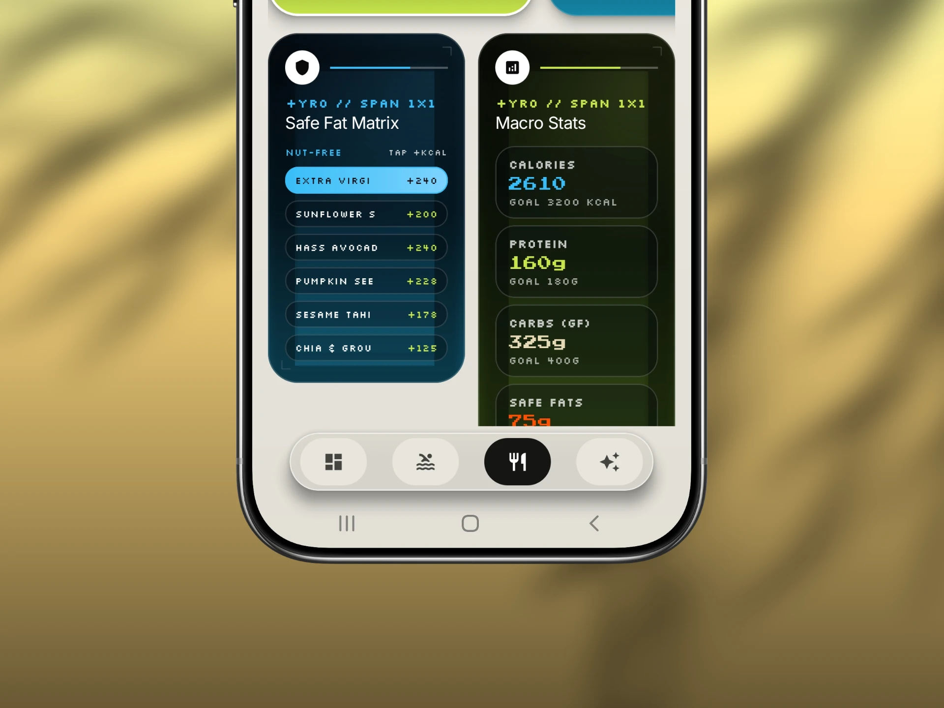
Dark glass cards break the cream canvas for the dense stuff: the Safe Fat Matrix (nut-free, tap to add kcal) and Macro Stats (2610 of 3200 kcal, protein, GF carbs). Acid lime and electric blue are reserved for these modules, so data reads as hardware plugged into the page.
NEURAL COACH
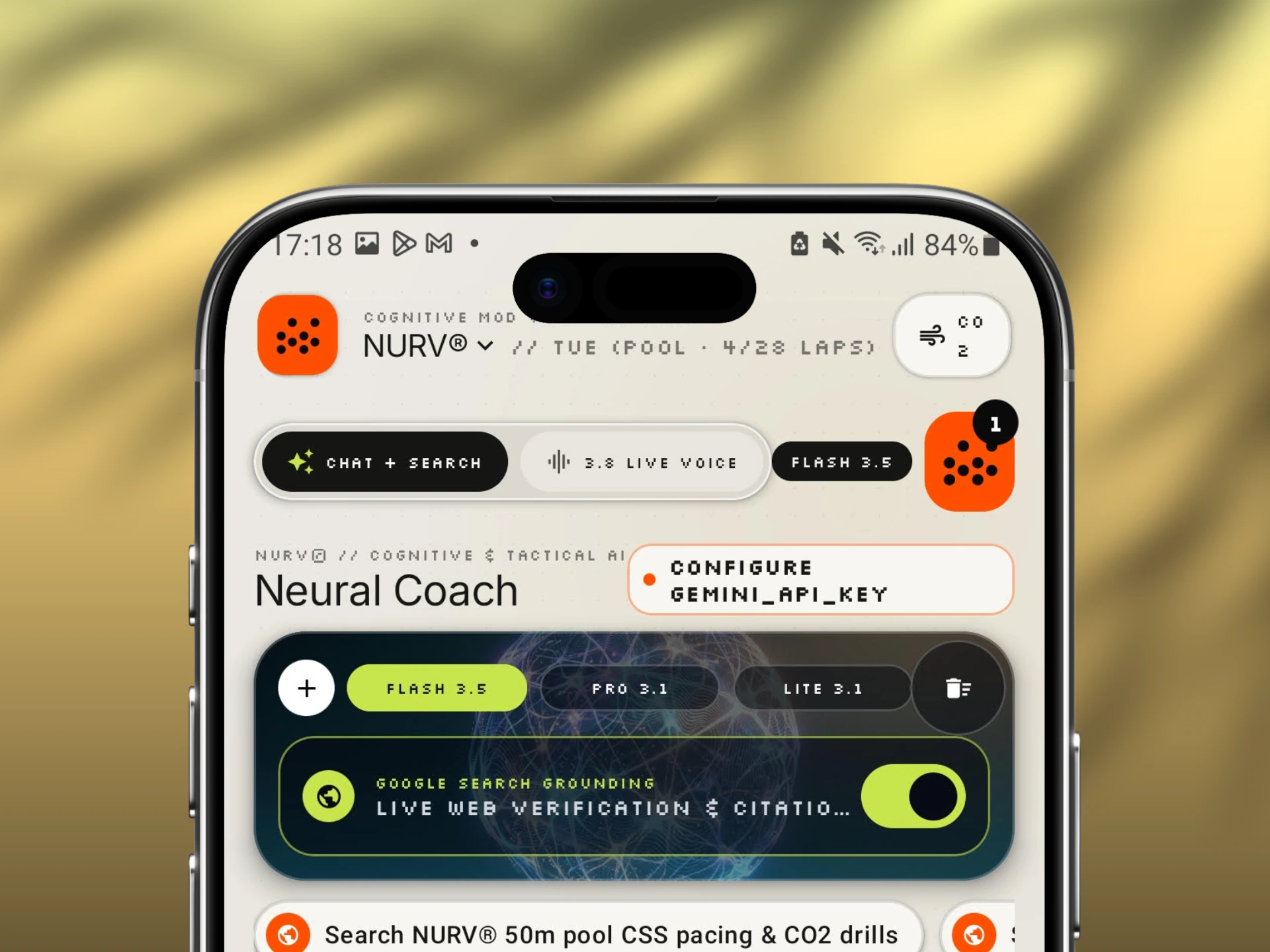
The coach sits in a dark glass panel with a neural sphere behind it, like a different room in the same building. Chat plus search, live voice, three model tiers as pills, and a toggle for live web verification with citations.
IDENTITY
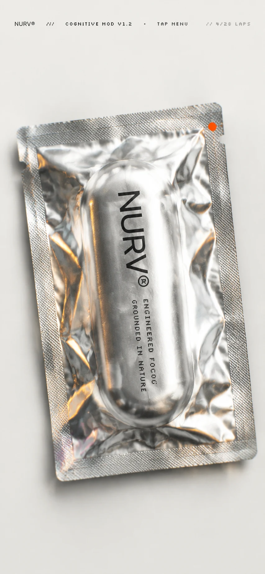
Orange squircle, nine black dots, one badge. The wordmark is NURV® in a heavy wide grotesk, with COGNITIVE MOD V1.2 in mono as a version tag, because I wanted the brand to talk like firmware.
PHYSICAL SYSTEM
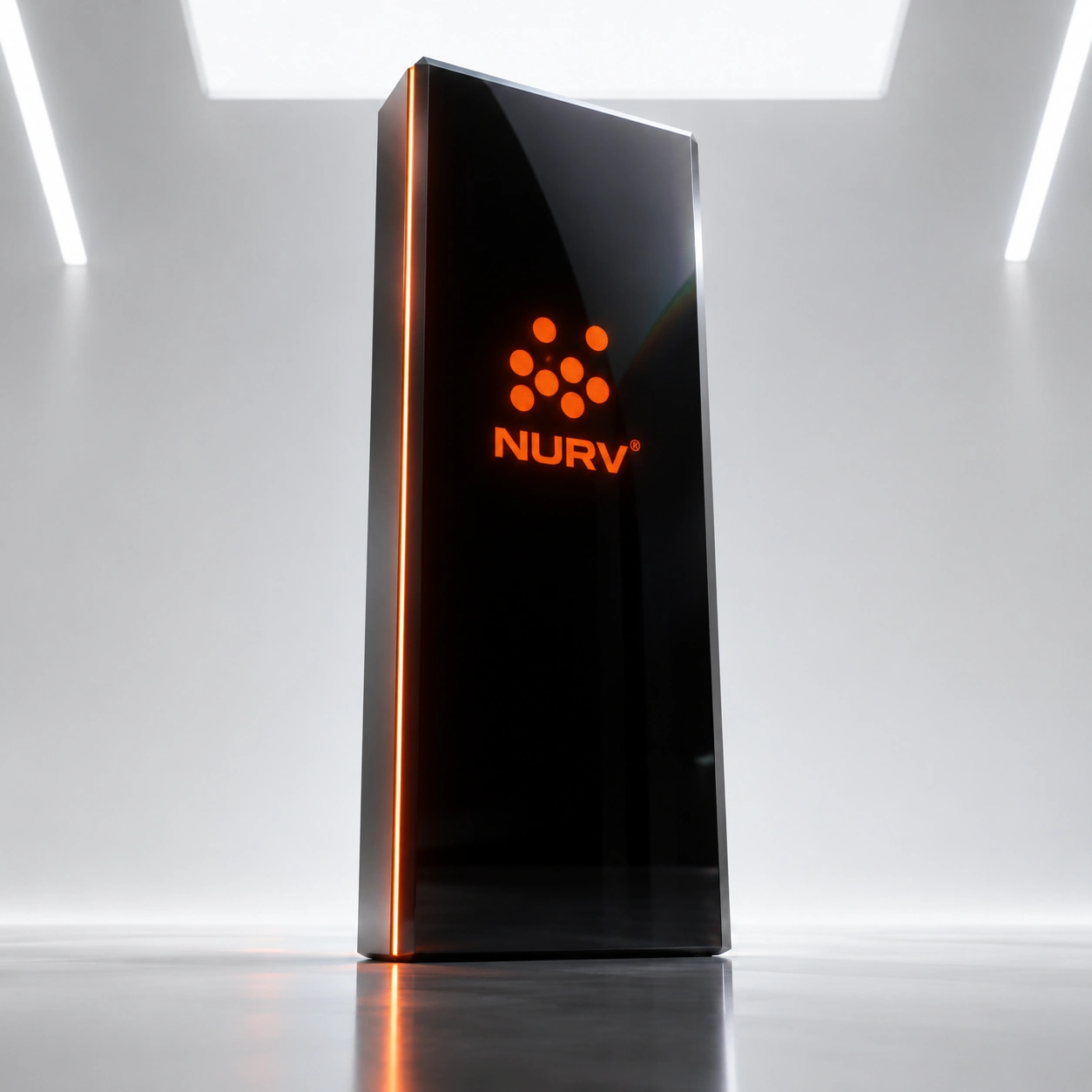
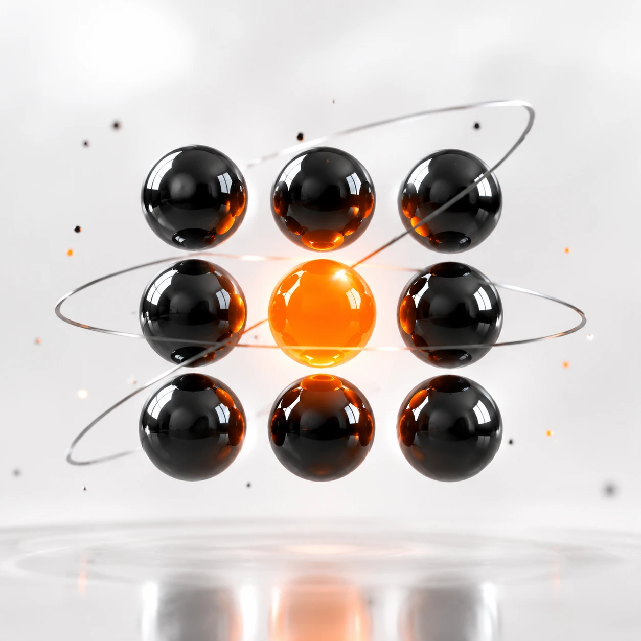
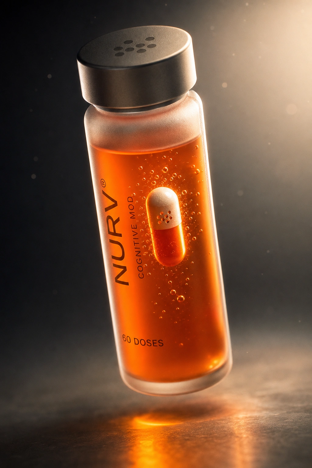
Nine scenes in two registers. Warm and tactile: an orange metro lightbox on a wet platform, a crinkled foil sachet with an orange dot at the tear notch, a split-level pool with a glass slab beside the lane rope, a hand holding a glowing-edge device in the dark. Cold and precise: an obsidian monolith with a single orange seam, an airport LED wall carrying a giant 39, a frosted vial with a capsule suspended in amber, a titanium ring reading 4/28 LAPS with one orange pixel, and nine chrome spheres with one that burns.
The site is a continuation of the app, not a separate brand layer. Same cream canvas, same dot-matrix numerals, same single orange (
#FF5200) used only where something is live. The hero is the obsidian slab with its orange seam, and the page breaks into short scroll blocks, each led by one dot-matrix figure (39/35, 94%, 4/28) that works as the headline. Tracked mono labels carry the captions, and the nine campaign scenes sit in a horizontal gallery near the end. I kept motion to one idea: a row of nine dots in the margin that fills orange as you scroll.THE RESULT
The dot held up on every surface I put it on: a 2-inch icon, a wall of LEDs, a titanium band, a capsule. I never had to redraw the system for a new context, only change the material.
NURV® shipped as a full concept: four app screens, an identity and nine campaign scenes in one visual language. It's one week of the series, and it's the one where the logo ended up doing the work of the grid.
CREDITS
Révolté — revolte.design
Project: NURV®
Year: 2026
Scope: Brand Identity, App Design, Packaging, Campaign Visuals, Web Design
Industry: Health, Sport and Nutrition
See more at revolte.design or Website
Like this project
Posted Oct 5, 2026
NURV® turns swim, fuel and supplements into one dot-matrix instrument panel, with an AI coach and one hot-orange signal
Likes
0
Views
1
Timeline
Sep 14, 2026 - Oct 5, 2026