Built with Lovart
Rootbook: A Sustainable Brand Design, Web and App design

Révolté


ROOTBOOK — Finance That Grows Downward First
I built a carbon accounting brand on one image: tree rings that double as ledger lines, so every number could show its working.
THE BRIEF
Nobody handed me this one. I gave myself a rule: pick a field I had never designed for and build the brand from zero. I picked sustainable finance, specifically carbon accounting, because it has the clearest contradiction I could find. It sells rigor, and it sells it badly.
The category speaks in two registers. The accounting side gives you grey dashboards and footnoted PDFs. The sustainability side gives you a leaf and a gradient. Neither makes you trust a number. The tension I wrote at the top of the file: look exact enough to audit, feel warm enough to live with, in the same layout. Most brands in this space pick one.
I took on positioning and voice, a logomark system, a five-poster campaign, outdoor and print, a website direction and an Android app. The hard part was making all of it feel like one hand, from a bus shelter to a phone screen.
THE APPROACH
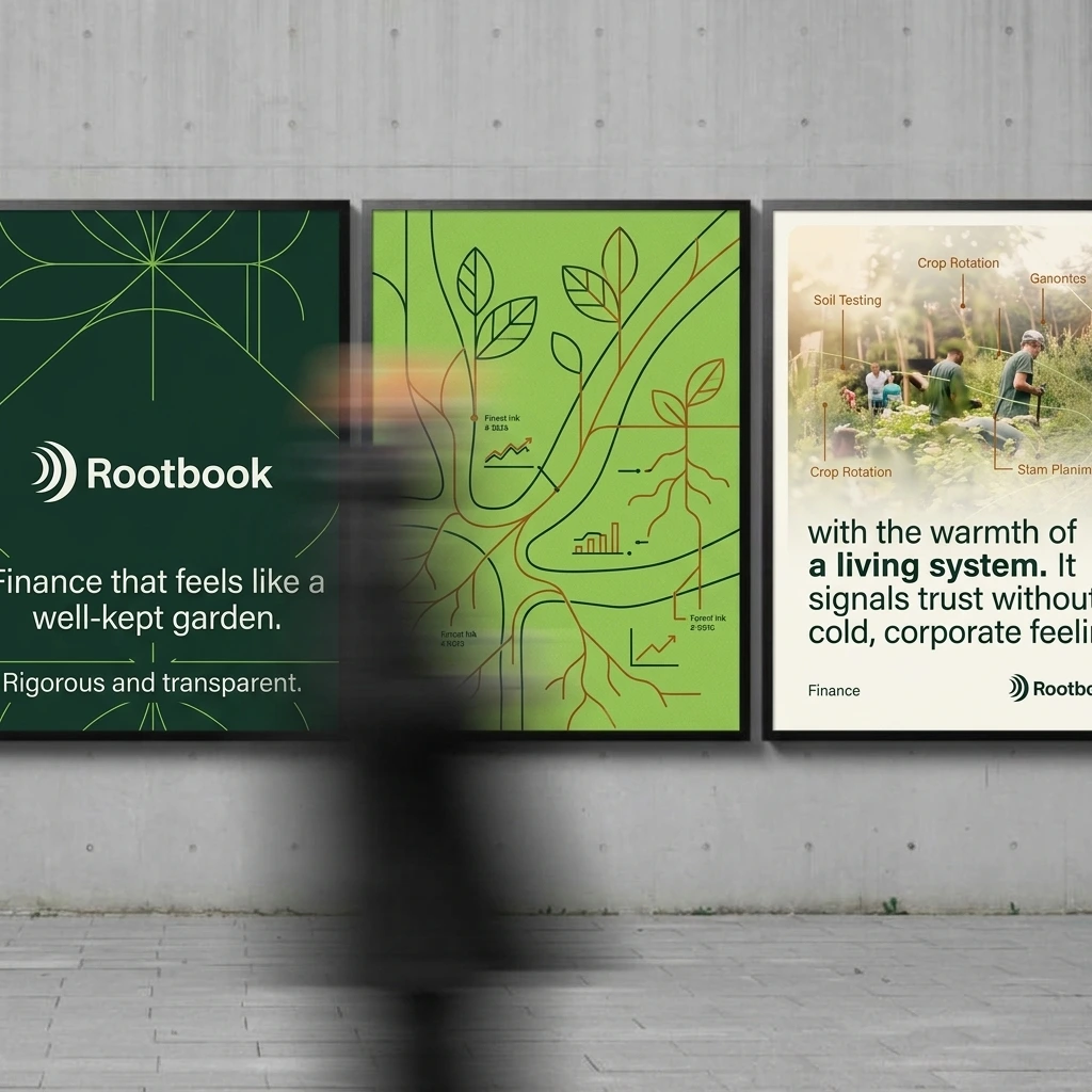
I started wide: ten brand directions in ten unrelated fields. I kept the one I could say in a sentence, finance that feels like a well-kept garden. The name fell out of it. Rootbook is a root and a ledger in one word.
My first instinct was botanical: engraved plants, ledger paper, ink stamps, root networks with chart glyphs. It worked in the first posters, and it went soft the moment I put it next to the references I was pulling: flat green grounds, one oversized shape, heavy type, grain. The illustration was decorating the idea. I wanted the idea to be the structure. So I kept the roots and the rings and moved them from drawing to geometry.
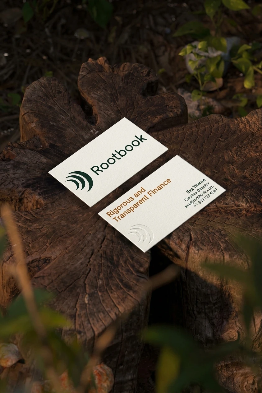
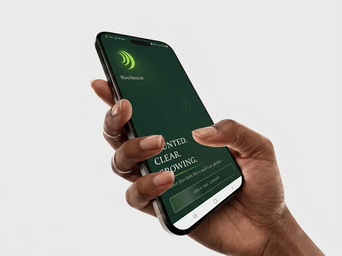
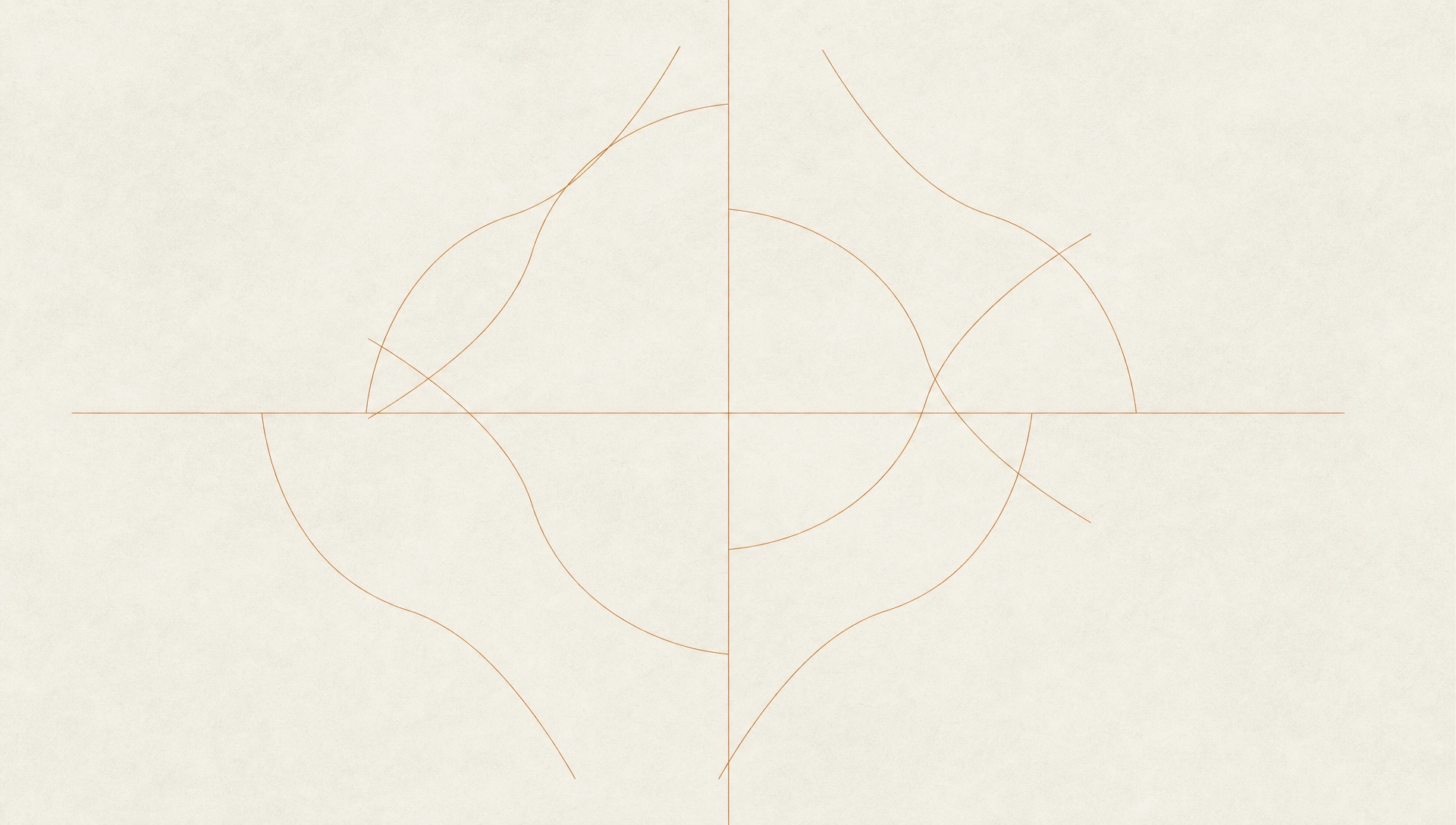
The unlock was the logomark. Concentric crescents read as tree rings (time, growth) and as a signal rippling outward (transparency). One shape, two readings, and everything else derived from it: the crescent windows I crop imagery through, the contour lines on the posters, the progress marks in the app. I stopped designing new elements and started cutting new views of the same one.
The second constraint was annoying and useful. Clay
#B5651D on Deep Green #0F2A20 lands around 3.5:1. That passes for graphics and large type, and it fails for anything small. So Clay never carries body copy. It’s contour lines, a single headline word and an ink stamp. The rule made the palette tighter and the layouts calmer.THE WORK
LOGO
Three nested crescents and a Comfortaa logotype in sentence case, light weight. The rounded terminals soften the hard geometry of the arcs. Lime
#9BE04A on dark grounds, Forest Ink #14352A on Paper #F6F4EC, never recolored and never redrawn. There are light and dark lockups, plus a compact version where the mark stands alone.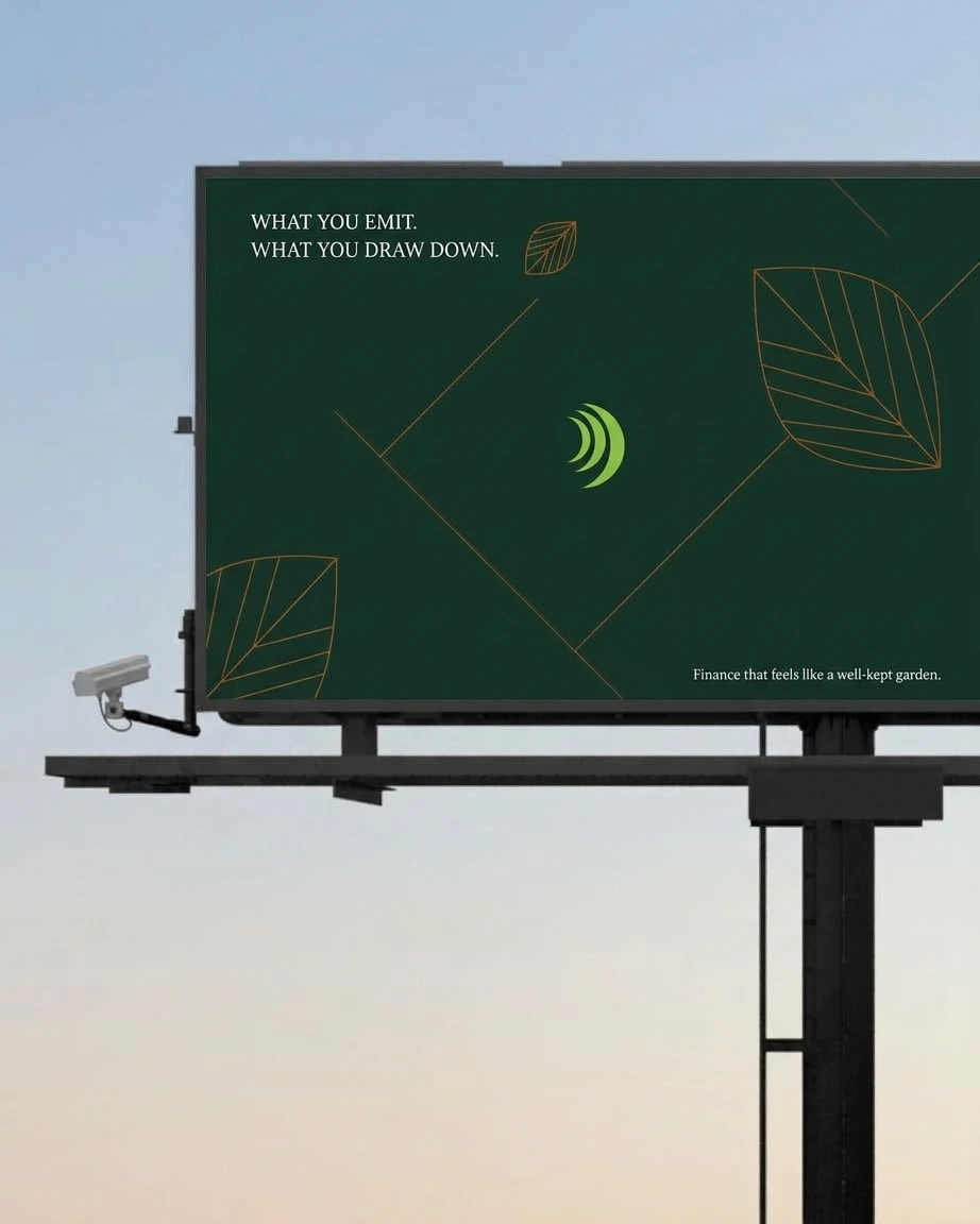
COLOR SYSTEM
Five colors, each with one job. Forest Ink and Deep Green
#0F2A20 carry the grounds. Paper is the surface and the text on dark. Lime means growth and appears once per viewport. Clay means weight and stays under a few percent of any layout. No pure black, no pure white.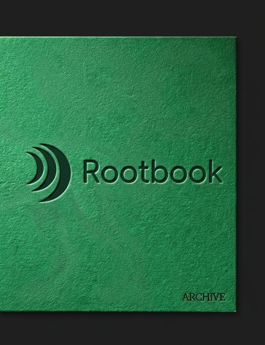
TYPOGRAPHY
Four voices. A condensed all-caps grotesque for headlines at roughly 0.9 line-height. An italic serif for one-line asides. A grotesque for body. A monospace with tabular numerals for every figure, because a ledger should line its decimals up.
POSTER SYSTEM
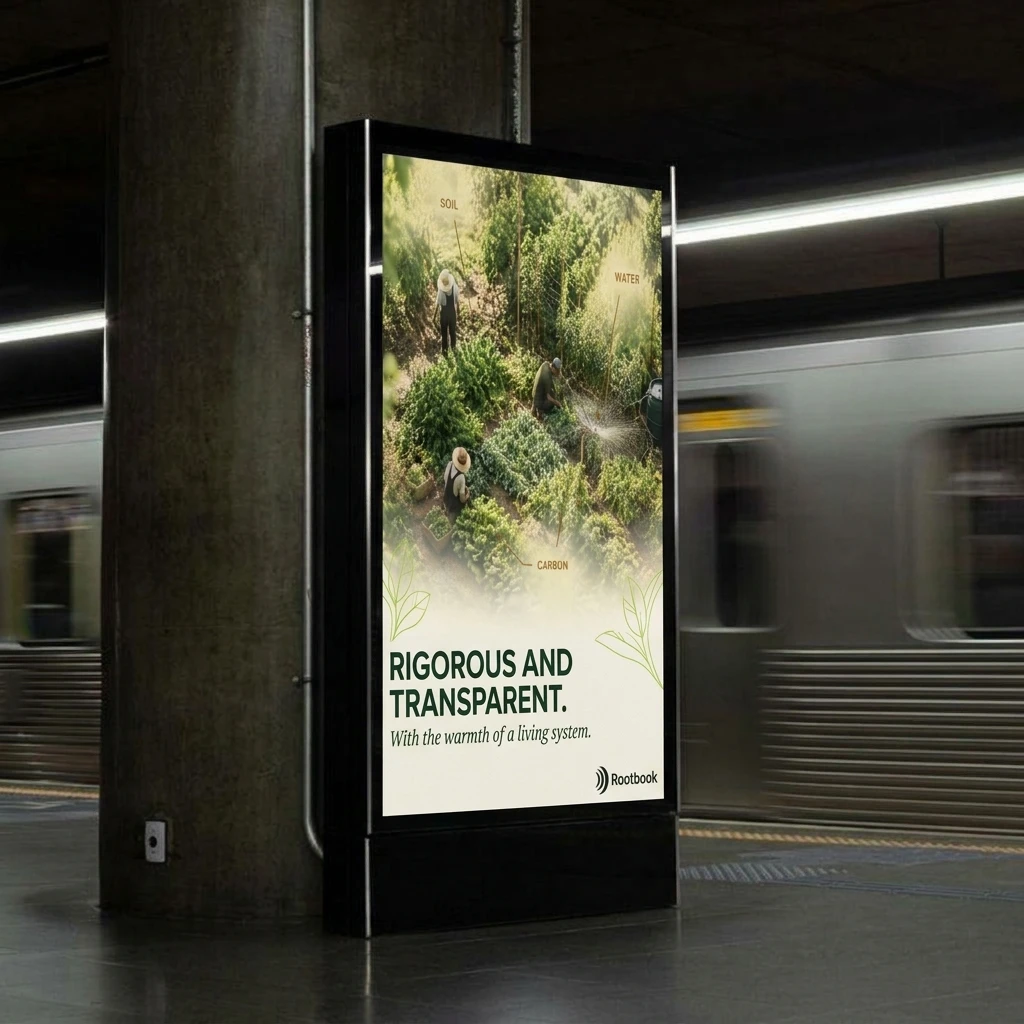
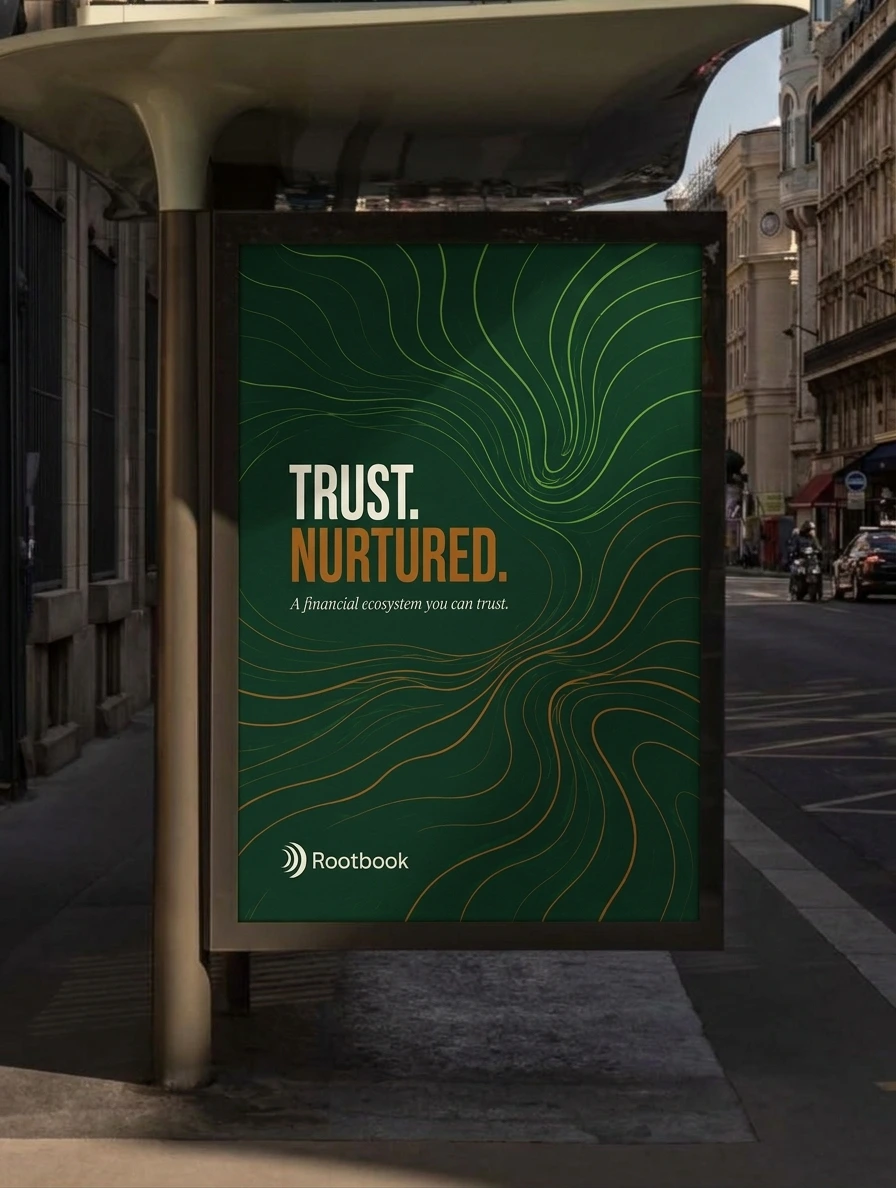
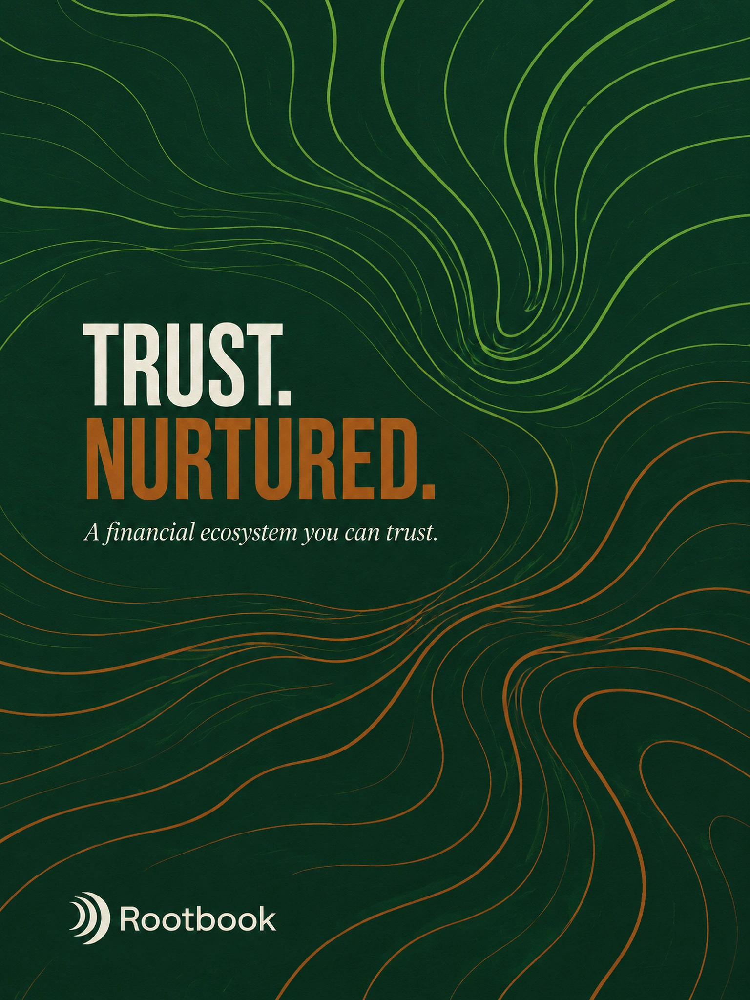
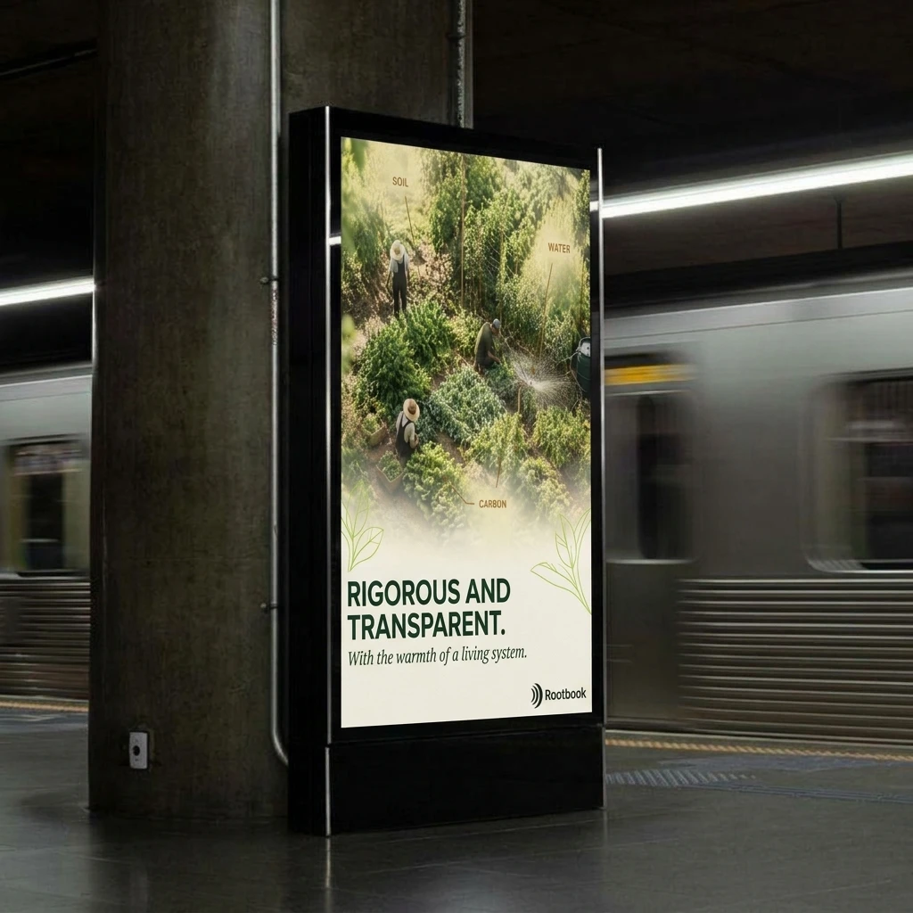
Five posters, one rule each. Below the Surface: a seedling above a ground line, Clay roots below, each ending in a square node like a ledger entry. Growth Rings: a cross-section in Forest Ink, Clay and Lime, with one ring broken by a tick labeled 2026. Field Notes: an aerial garden with three callouts, Soil, Water, Carbon. Pruned: a hedge cut into a five-bar chart with a Lime shoot on the tallest bar. Contour Flow: Lime lines turning to Clay as they sink, under TRUST. NURTURED.
OUTDOOR AND PRINT
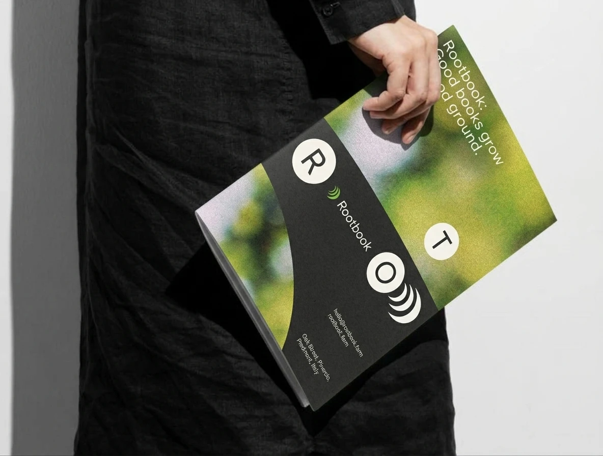
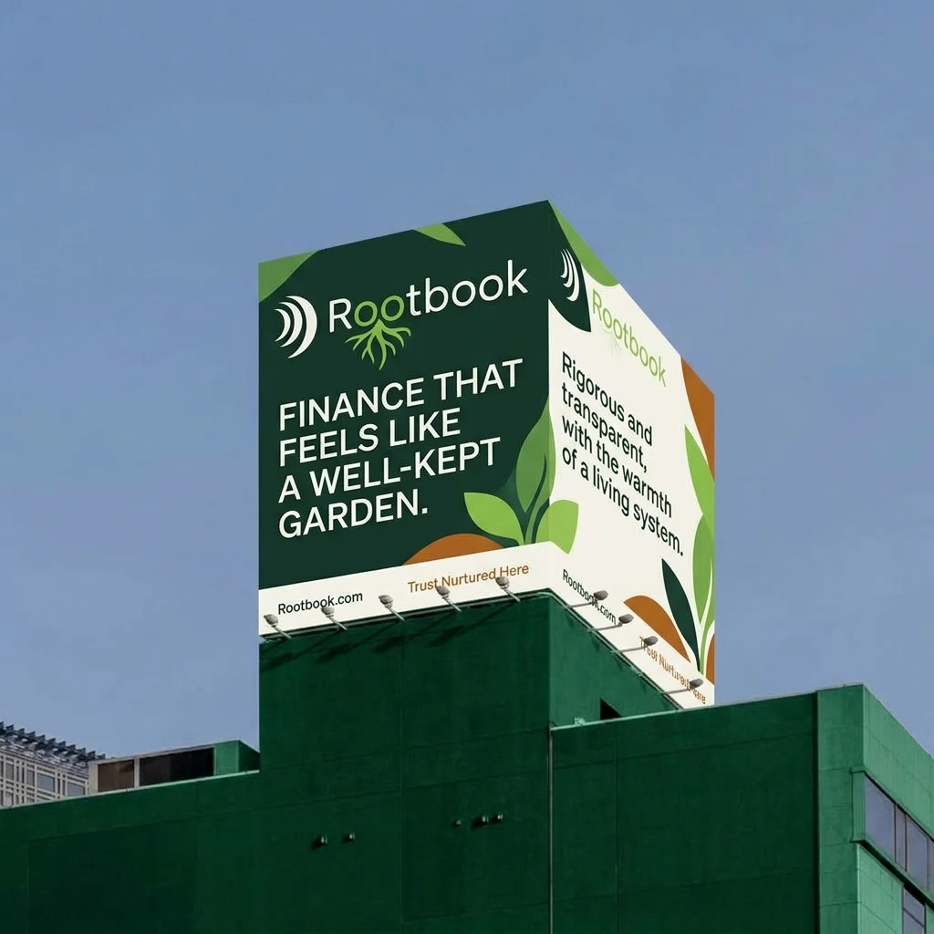
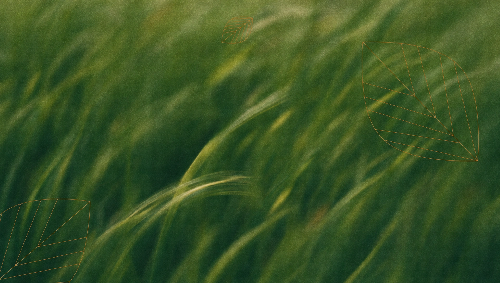
The posters scale to a bus shelter, a subway lightbox and a roadside billboard. On the billboard I cropped the arcs to a single Lime centerpiece and let hairline leaf drawings in Clay carry the rest. In print: a debossed archive cover, business cards with a blind-embossed mark, a brochure with circles carrying the letters of the name, and a knit sweater with the mark embroidered in Lime.
WEBSITE
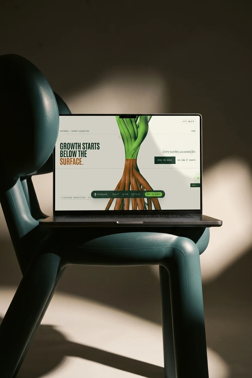
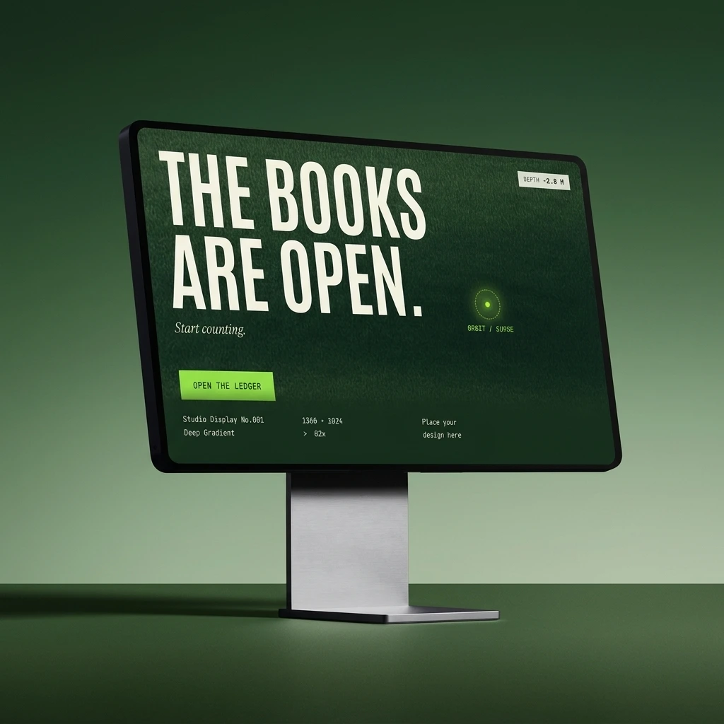
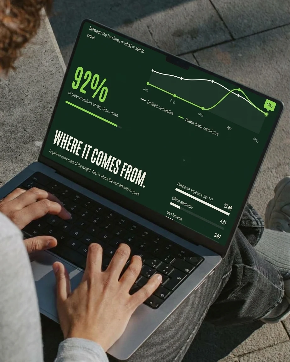
Two structures. One is a continuous descent: a depth gauge counts from 0.0 m to minus 12.0 m while a single root line draws down the page and the ground darkens. The other is a hairline-gridded ledger with pinned chapters. Both open on lines that do work: “Growth starts below the surface.” “The books are open.”
APP
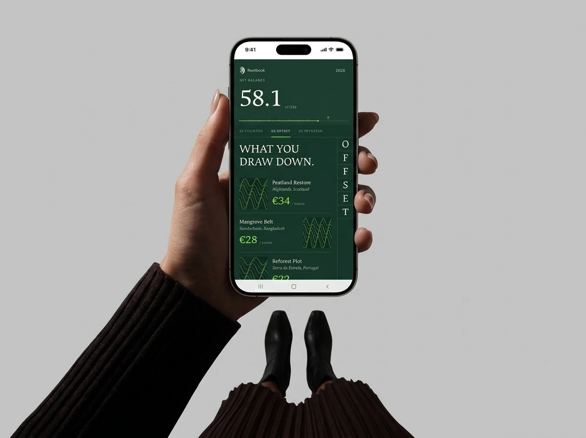
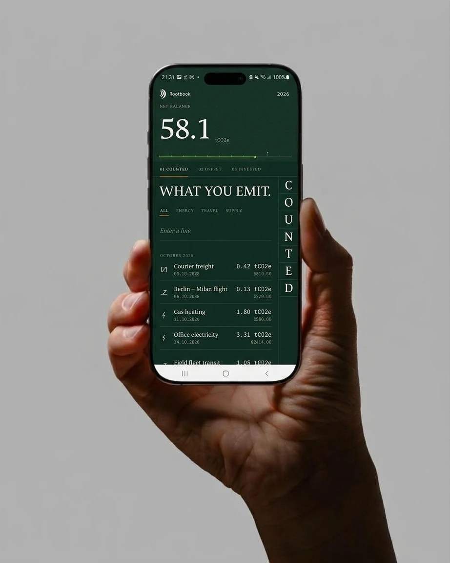
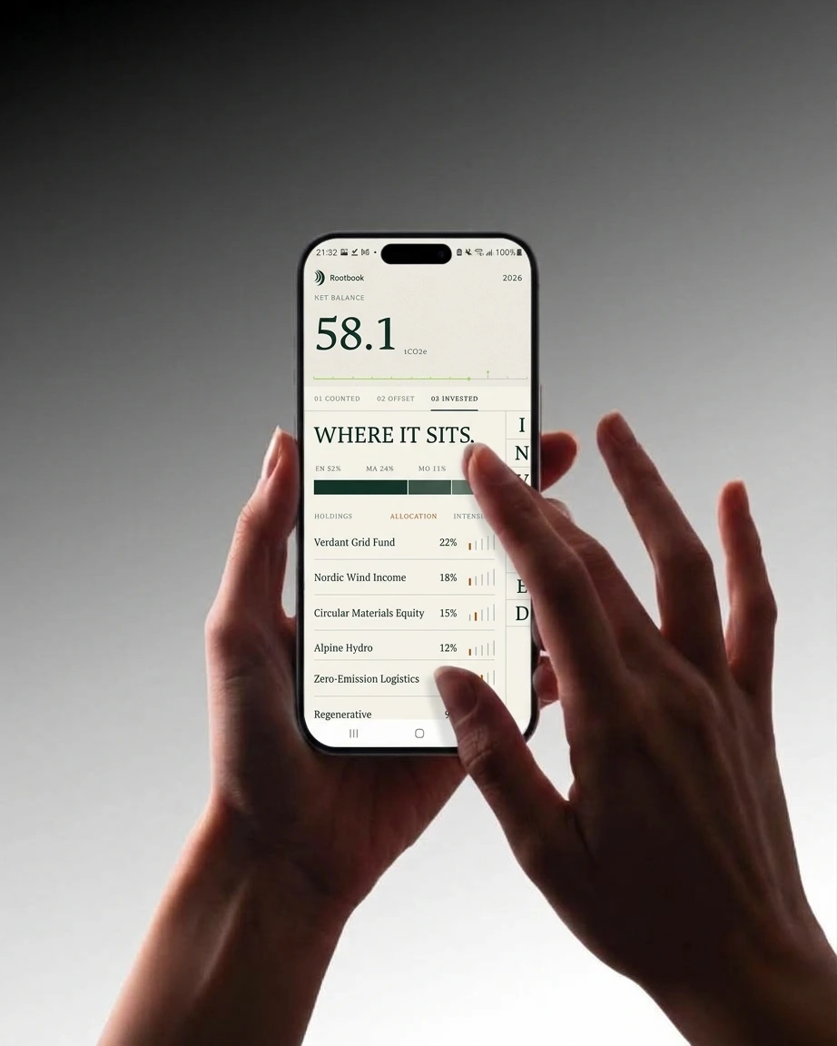
A three-sheet pager, Counted, Offset, Invested, with no bottom navigation. A persistent header carries the net balance, 58.1 tCO2e, in an oversized serif. Each sheet’s name runs down the right edge as stacked letters, one per ruled cell, lifted from a poster. New entries go on a blank ruled line labeled “Enter a line,” not a floating button. The Invested sheet flips to a Paper ground and replaces filter chips with a five-tick carbon-intensity gauge.
THE RESULT
Rootbook came out as a full system, not a logo with applications stuck on. The same three crescents run from the app header to a billboard centerpiece to a debossed cover without being redrawn. Every layout answers one test: could a stranger audit this number from what’s on screen?



Every figure in the work is illustrative, and the web layouts say so on the page. That was deliberate. A brand built on showing its working can’t invent proof.
Révolté — revolte.design
Project: Rootbook
Year: 2026
Scope: Brand Strategy, Brand Identity, Poster Campaign, Outdoor, Print, Web Design, App UI
Industry: Sustainable Finance, Carbon Accounting
See more at revolte.design
Like this project
Posted Oct 22, 2026
Rootbook: carbon accounting as a well-kept garden. One mark that reads as tree rings and ledger lines, built into posters, a site and an Android app
Likes
2
Views
7
Timeline
Oct 1, 2026 - Oct 22, 2026