SINE/16 Brand Identity Project

Révolté


SINE/16 — Sound Counted in Squares
A 16-bit signal has 65,536 steps. I made a brand where every curve has to show them.
THE BRIEF
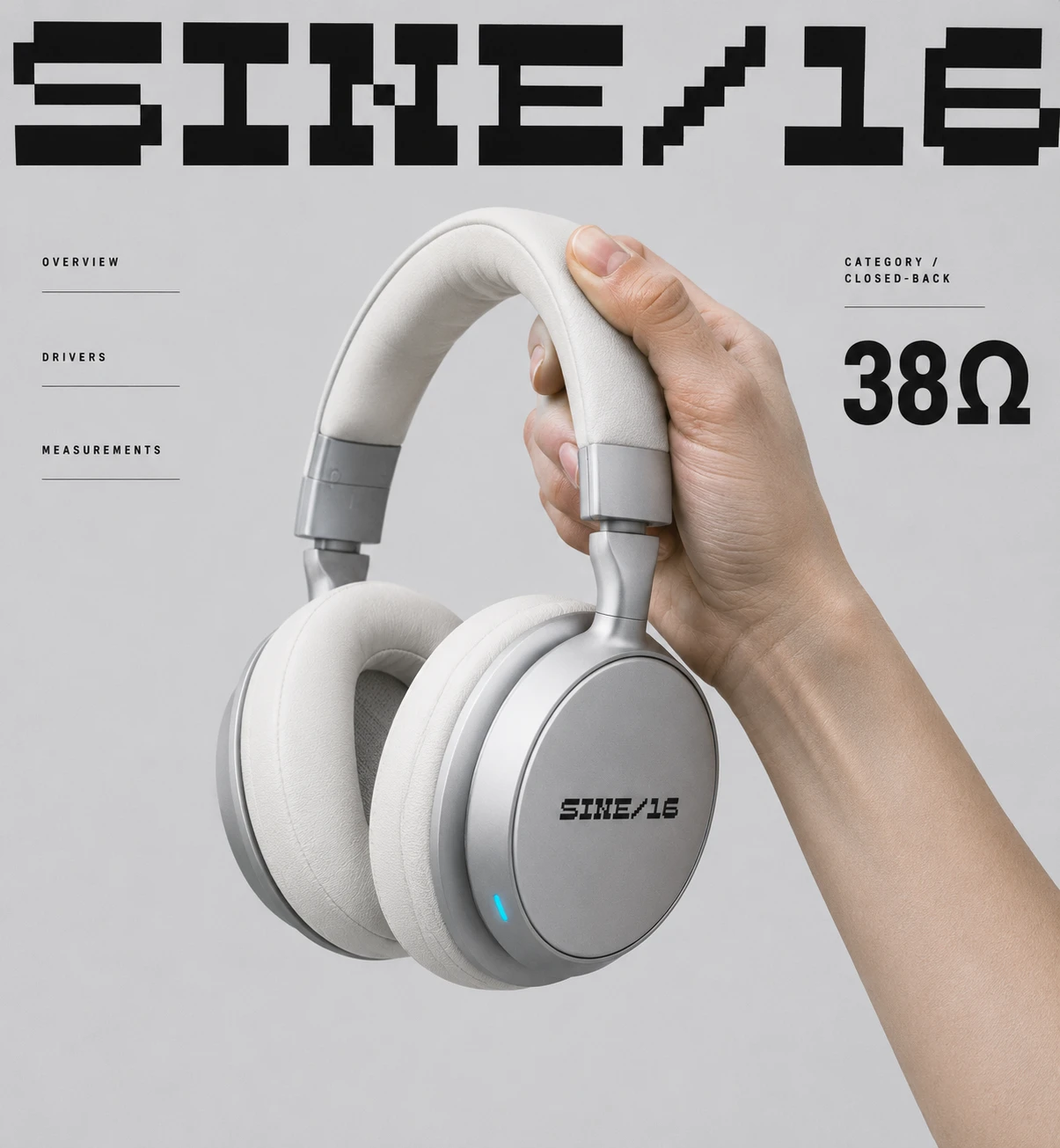
I started from a feeling, not a client. Oversized pixel lettering over a grey field, tiny spec labels in ruled columns, one point of light. I wanted that quiet-futurist temperature in a category that rarely has it, so I picked audio hardware: over-ear headphones, a desktop speaker, a DAC.
The tension sat in the category itself. Audio sells mystery: walnut, gold, “warm analogue soul.” The product is a measurement. The pixel look had its own trap too, because one wrong step turns it into arcade nostalgia.
So the brief I gave myself was narrow. Precise, calm, a little clinical. Honest about specs. No retro kitsch.
THE APPROACH
I explored ten directions and killed nine. An amber dot-matrix world felt like a late-night lounge, and warmth is exactly the lie this category tells. A terminal-style hi-fi was fun, but it only talks to people who already agree with it. A soft silicone version was friendly and lost the spec-sheet spine.
Pixel Waveform survived because the name did the work. SINE/16 is a sine wave at 16-bit resolution. If the name is a resolution, the brand should show its resolution, so every waveform, meter and icon is drawn from one identical square.
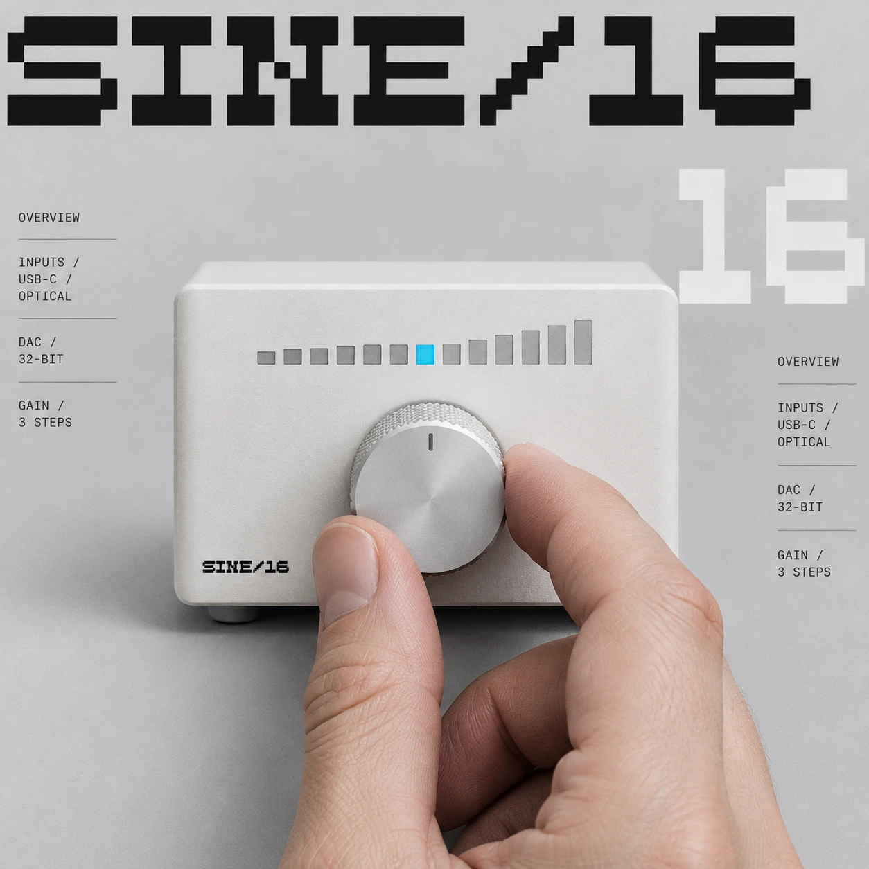
Then I wrote rules and obeyed them. One cyan element per frame, and it is always a light. Two type sizes dominate any layout: enormous pixel display and tiny label. Copy leads with the measurement and the feeling follows.
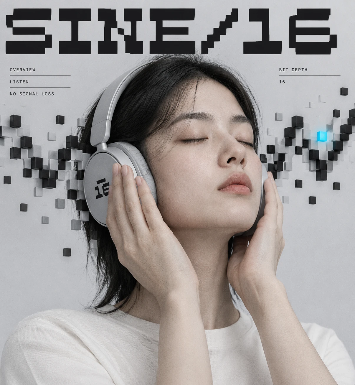
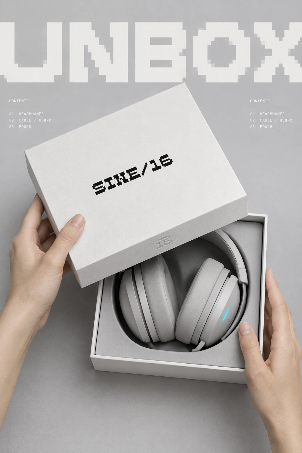
My first round of presentation scenes was product-on-grey, and it was forgettable. It looked like every audio launch deck. I threw it out and made touch the rule. Sound is invisible, so a thumb on a knob, a lifted lid or a palm over an earcup has to carry it.
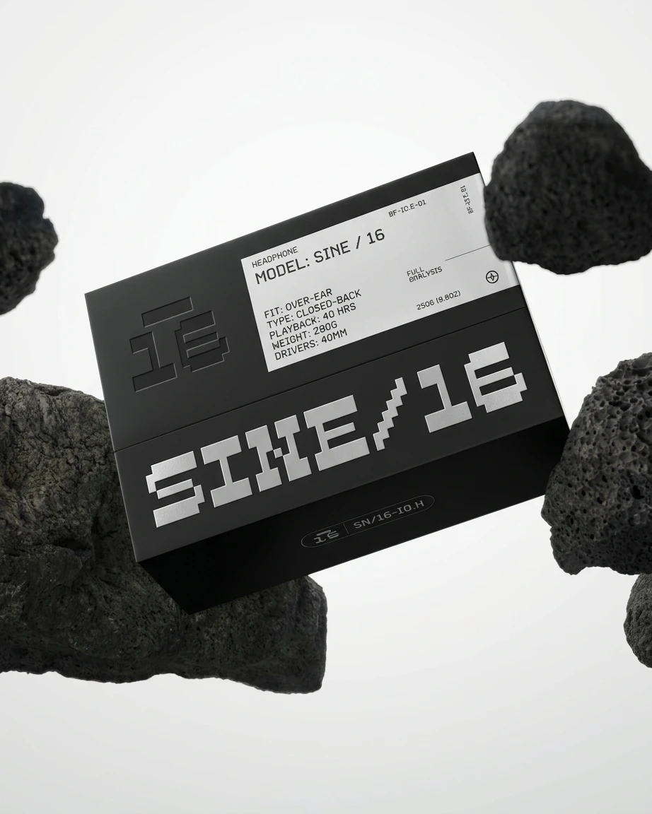
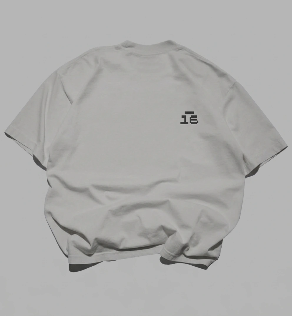
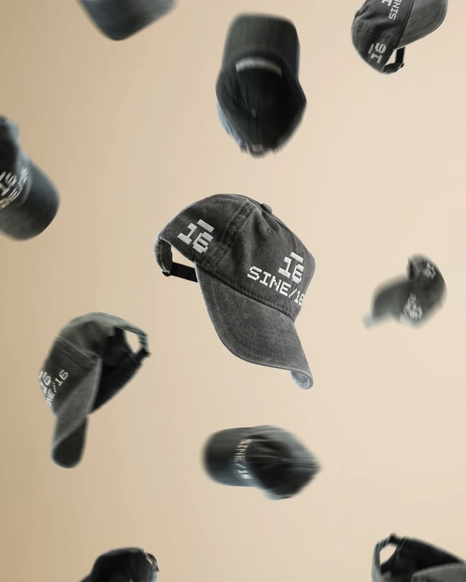
Two more corrections followed. The logo files I’d been reading were light-on-dark, but the real mark is Signal Black, so I flipped every product to Paper White polymer and pale anodized aluminium. Black now appears only as the inverse: a foil-stamped night box, washed black caps. And early scenes kept dropping the bar above the 16. I rewrote the construction as numbers (bar half the width of the numerals, one pixel of gap, never merged) and checked it at hem-label size.
THE WORK
LOGO
The wordmark is set in Hopping Mappy Neue. The slash is the only diagonal in the system, and it’s a staircase, so even the diagonal is quantised. The logomark is a stacked pixel 16 with a floating bar one pixel above it, on a tile with two rounded corners and two nearly square ones. I read the bar as the peak-hold marker on a level meter, the small light that stays at the highest point.
TYPOGRAPHY
The bitmap display face is set huge and cropped off the edge, always behind the subject. Labels are uppercase grotesque, 10 to 12 pt, tracked +8 to +12%. Data sits in a mono. I use almost no mid-sized text, because the contrast between giant and tiny is what makes the system look like a spec sheet.
COLOUR
Lab Grey
#D9D9DB carries about 60% of every layout. Signal Black #0B0B0D takes 20%, Paper White #F6F6F4 10%, Mute Grey #8C8C91 8%. Pulse Cyan #19C3FF gets 2%, and it is never a fill, a gradient or text. Cyan on Lab Grey fails contrast as type, so it only ever appears as a shape: an LED, one lit bar, one square.PRODUCT AND PACKAGING
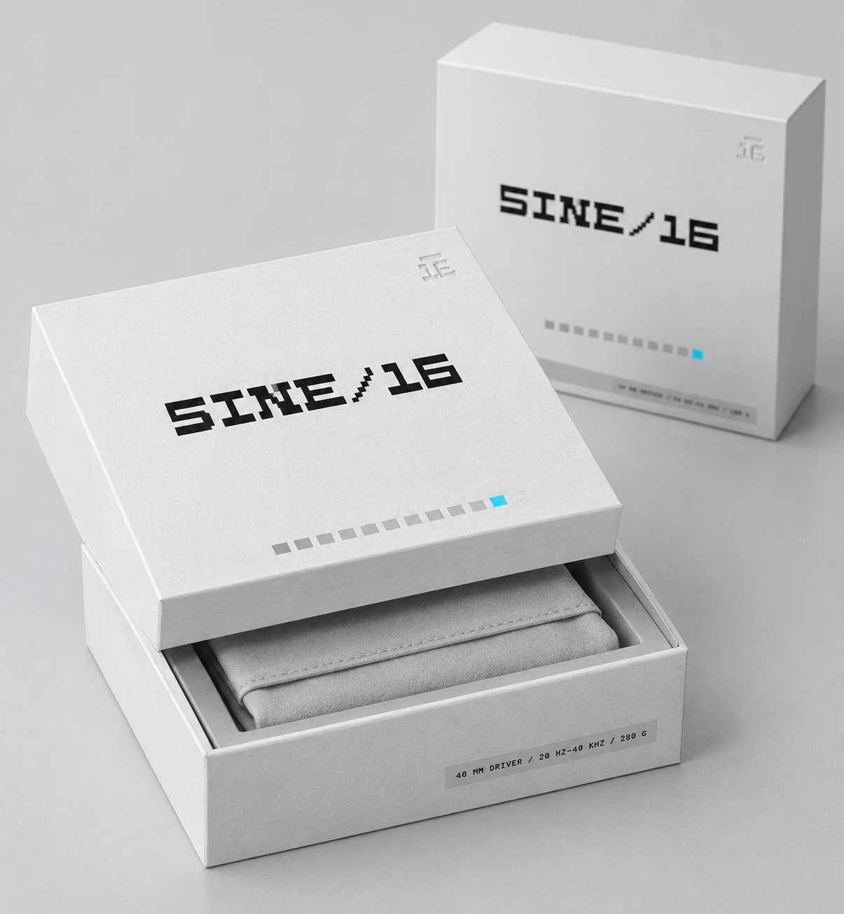
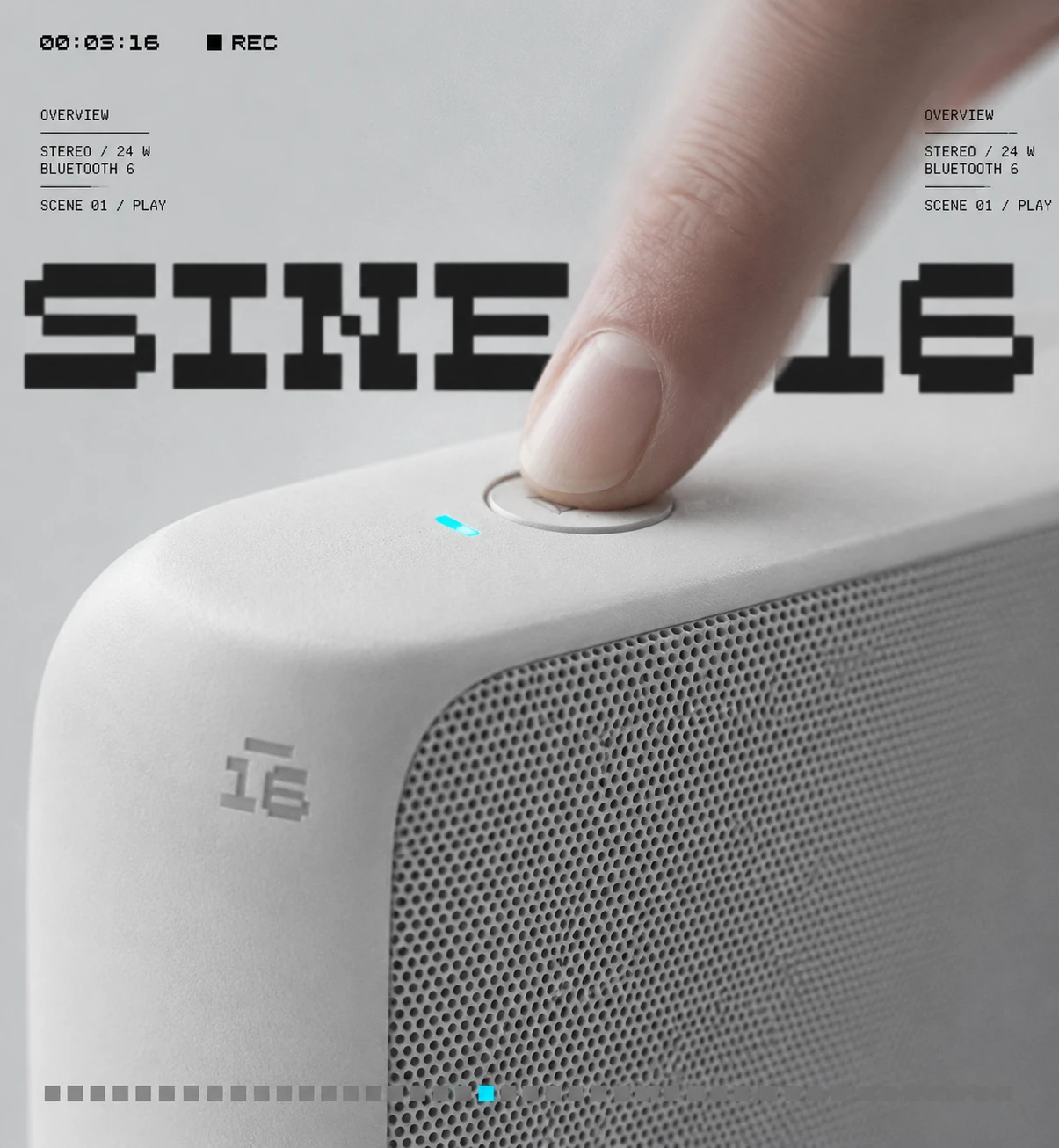
The headphones are pale aluminium and Paper White pads, with a ring of perforated mesh on the earcup and one cyan LED on the rim. The box lid carries a printed level meter along its lower edge with exactly one pixel lit. The inverse box is black with silver foil and a spec label set like a lab tag.
INTERFACE
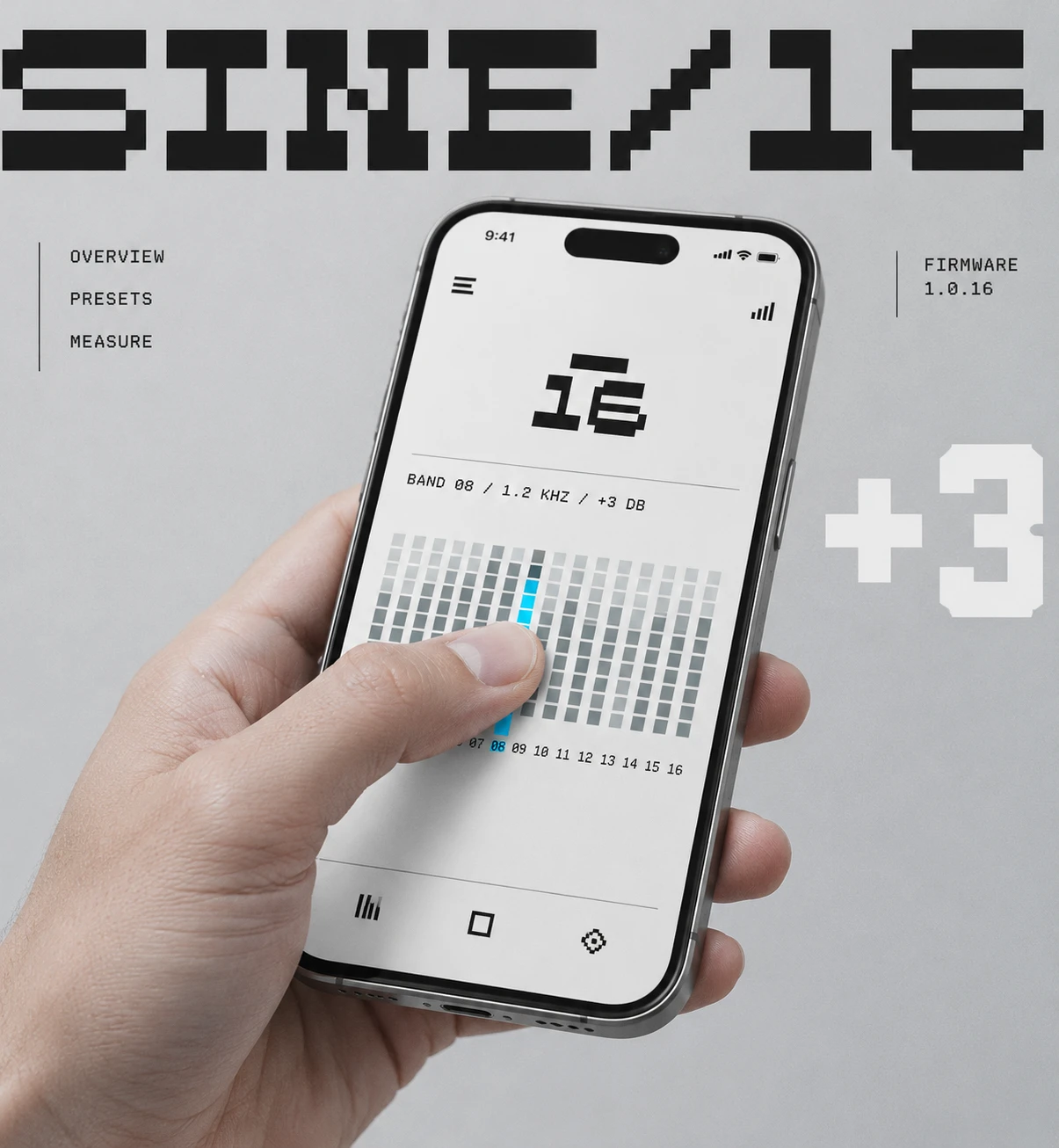
The companion app is a 16-band equaliser drawn as columns of identical squares. You drag one column with your thumb and it turns cyan, with the readout “BAND 08 / 1.2 KHZ / +3 DB” above it. The EQ is a texture you press.
ENVIRONMENT AND CAMPAIGN
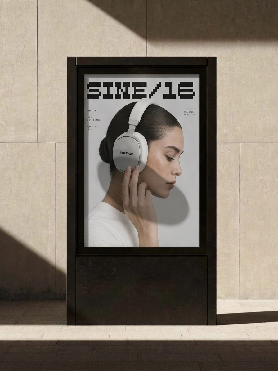
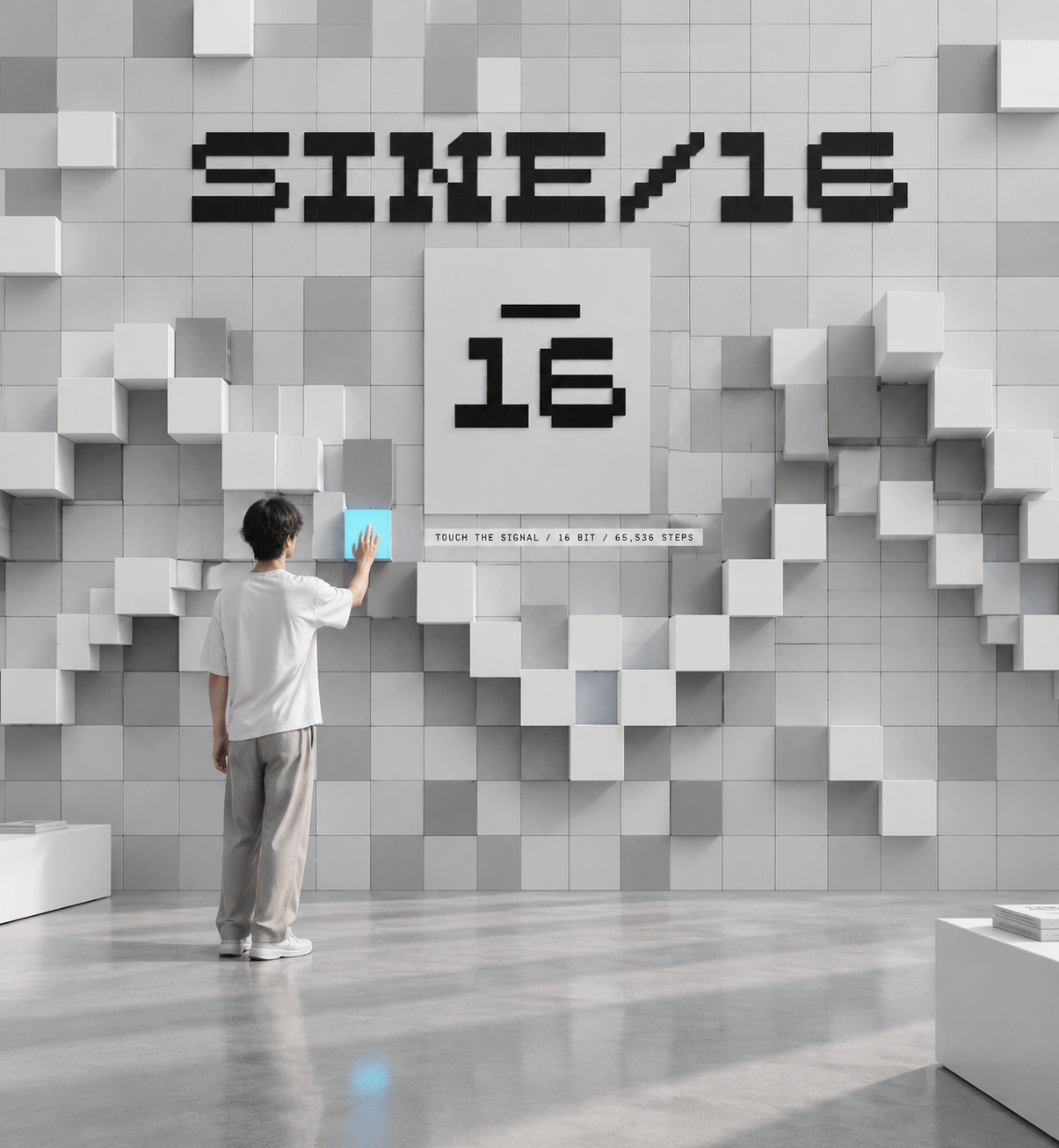
A gallery wall holds hundreds of square tiles, and the raised ones form a waveform across it. One tile is lit cyan and a visitor presses it, under the line “TOUCH THE SIGNAL / 16 BIT / 65,536 STEPS.” The posters repeat the same grammar, with the enormous cropped wordmark layered behind a person’s head like a magazine masthead, and spec columns on both sides.
MERCH
The tee carries the wordmark across the chest, cropped at the seams. The logomark goes small and off-axis on the back, as a hem label and on the tote. The caps use embroidered wordmark and mark, tossed in the air in a blur.
THE RESULT
SINE/16 shipped as a full system: identity, type, colour, voice, product language, packaging, app interface, environmental concept, campaign posters, merch and a short animated cut. That comes to 19 stills and one moving piece, all following the same rules.
The grid holds from a woven hem label to a gallery wall, and the overline survives at both sizes. There’s no client or metrics here, only a brand that stays consistent when the subject changes from a wall to a thumb.
Révolté — revolte.design
Project: SINE/16
Year: 2026
Scope: Brand Identity, Logo, Typography, Colour System, Packaging, Interface Direction, Art Direction, Motion
Industry: Audio Hardware
See more at revolte.design
Like this project
Posted Oct 24, 2026
SINE/16: audio hardware where sound is counted in squares. One cyan light per frame, one grid under everything, 65,536 steps
Likes
0
Views
6
Timeline
Oct 2, 2026 - Oct 24, 2026