Datum: A Tidal Wordmark Experiment

Révolté


DATUM: A Wordmark That Reads the Tide
LOGLINE
Every brand guideline protects the logo from change. I tied one to the sea instead. Datum is a wordmark that stands half underwater, and the tide decides its water level, tilt, weight and moon.
THE BRIEF
Nobody commissioned this one, and that was the point. I wanted to break the one rule I have written into every identity guideline: the logo does not change. Minimum size, clear space, never stretch, never recolour. I wanted to see what happens to a brand when the mark is the one thing allowed to move, and the movement is a measurement, not decoration.
The audience was two people. The first gives a wordmark two seconds on a billboard and needs it legible in any state. The second stays twenty minutes on a site and needs a reason to come back. Moving logos usually serve neither. A loop that looks the same every time earns the first glance and nothing after.
The real problem was discipline. A mark that can be anything is nothing. So I set one hard edge: every change must be caused by something real, and every cause must map to one visible rule.
WHAT I DID
My scope was concept, logotype system, colour and type, site and interface design, campaign art direction, and the motion and export formats.
THE APPROACH
I started with the obvious move: water rising inside the letters. It held for about a day. One variable reads as a loading bar, and a loading bar is not a brand.
The unlock was refusing to let one idea do all the work. A tide is not one thing. It has a height (how much water), a phase (which way it is going), a range (how hard it pulls, spring or neap) and a moon that drives it. I confused height and phase for a while. The same height at flood and at ebb are different moments. So height sets the waterline and phase tilts it. Range, the slow fortnightly swing, became weight. The moon became a small mark at the top right. Four causes, four visible changes, no overlap.
The first dead end was the type. I sketched the weight ladder in Gilroy, five steps from thin to black. It looked right on a slide and wrong in motion, because a tide does not move in steps. I moved to Outfit, a variable font, and let weight run continuously from 300 to 800.
THE WORK
LOGOTYPE SYSTEM
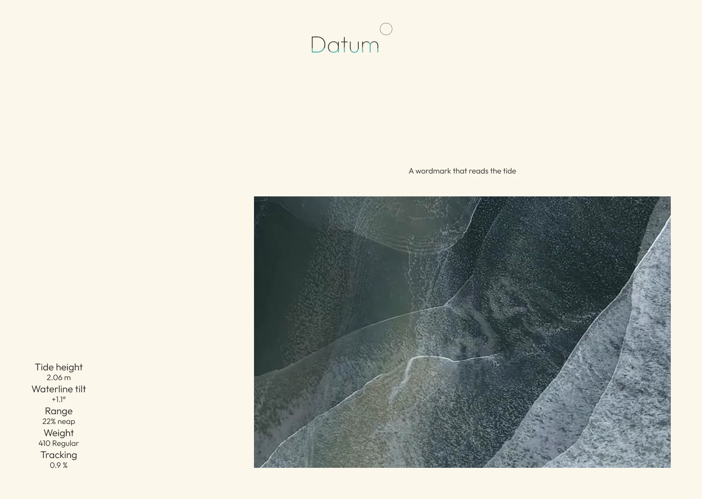
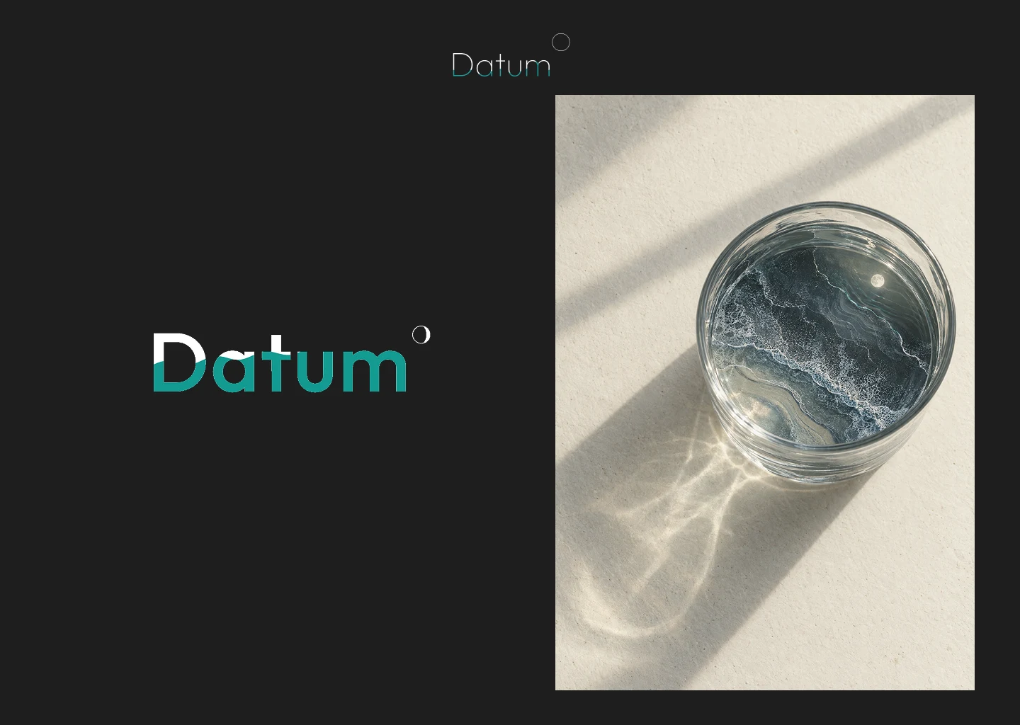
The wordmark is Outfit in lowercase-led geometry, with weight on a continuous 300 to 800 axis. Tracking opens as weight rises, up to 0.04 em at the heaviest, so the dense states do not clot. The waterline cuts through the letters and tilts up to 12 degrees toward flood or ebb. Height decides where it sits. Phase decides which way it leans.
THE MOON
A small outlined circle sits at the top right, with a lit path that follows moon age across the 29.53 day cycle. The gap between wordmark and moon is the same horizontally and vertically, 0.08 of the font size, and the radius is 0.104 of the font size. That equal gap is what makes it part of the lockup instead of a sticker.
COLOUR
Paper
#FBF7EA, ink #1C1E1D, muted #6E716B, rule #D8D3C2. One accent: water #139A91, a green-leaning teal pulled from shallow sea, not corporate blue. Dark mode flips to ground #111716, ink #EFEADB and water #3FC2B7.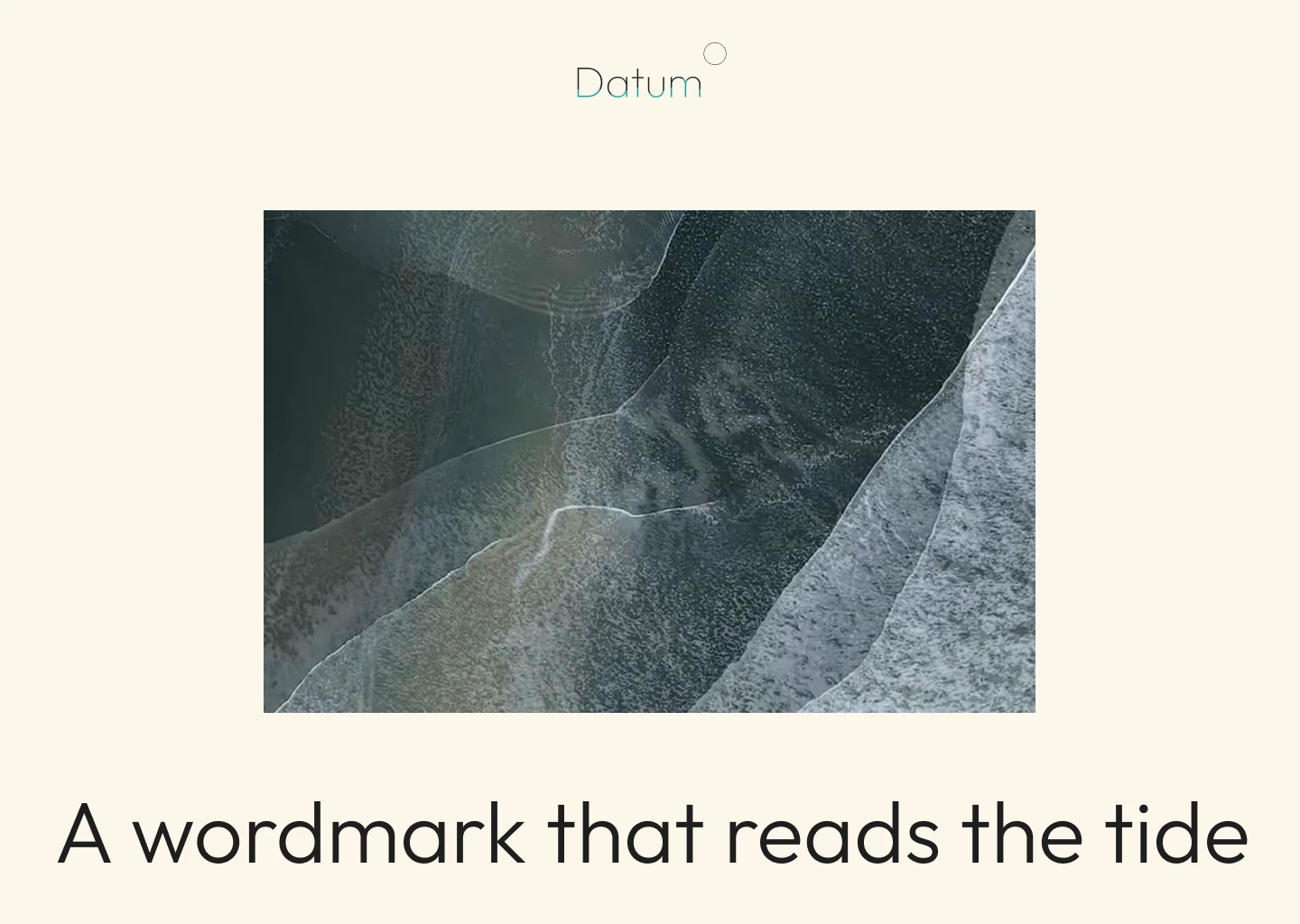
THE SITE AS INSTRUMENT
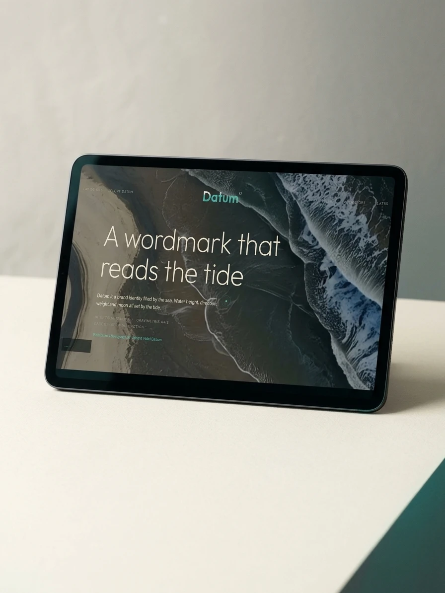
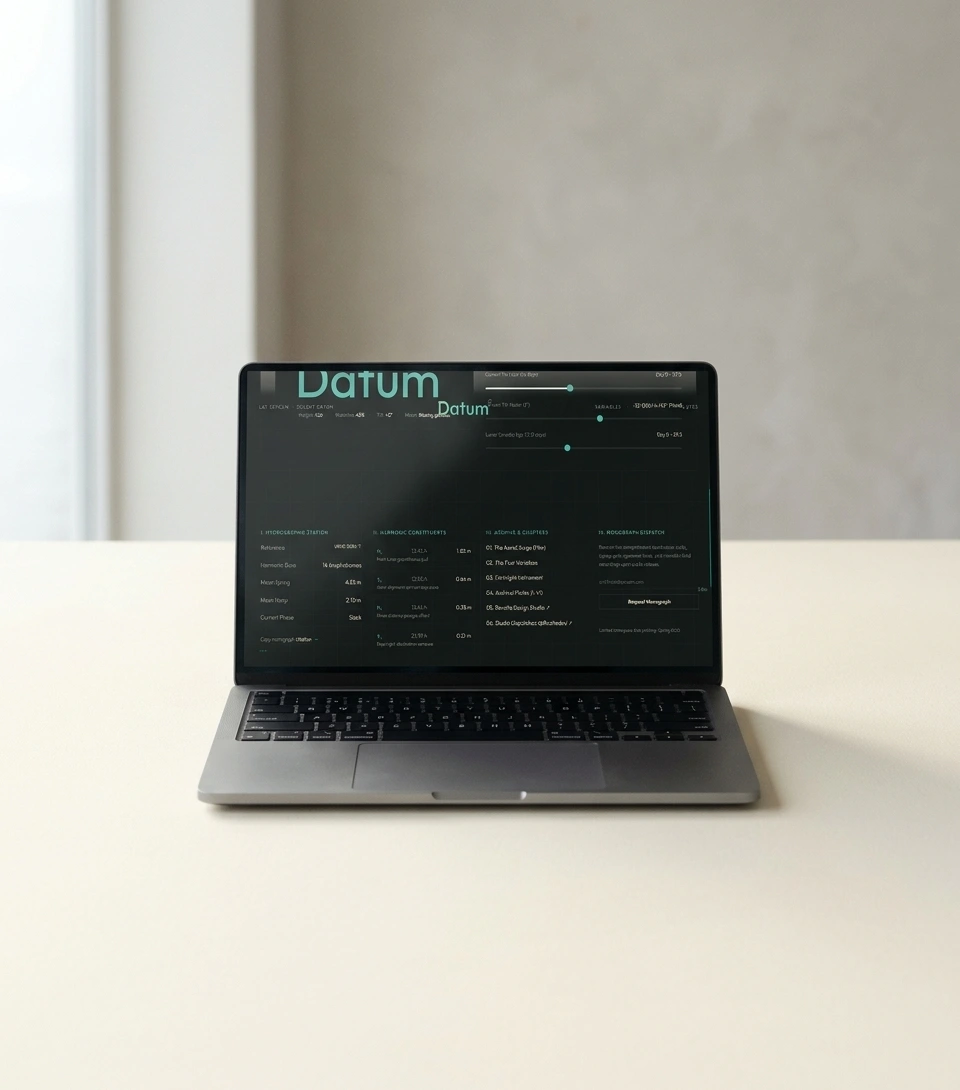
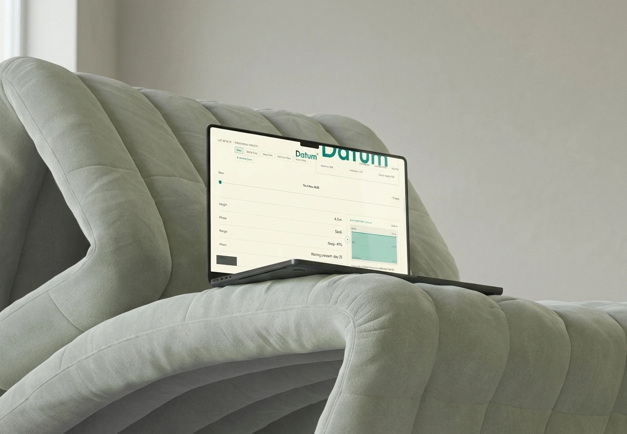
The site is built around a control panel. A tilt vector runs from minus 12 degrees (ebb) to plus 12 (flood), a lunar age slider runs across the synodic month, and readouts report weight, waterline, tilt and moon. Presets (Now, Spring Surge, Neap Slack, Full Moon Peak, Solent Crest) jump to named states. Below it, a hydrographic station table, a harmonic constituents table (M2 at 12.42 h, S2 at 12.00 h, N2, K1) and a bathymetric scale that marks LAT Datum at 0.00 m. The tables are there so the logo’s behaviour has visible causes. Latitude and station codes frame every section in small caps, and a teal ring follows the cursor.
THE EPILOGUE
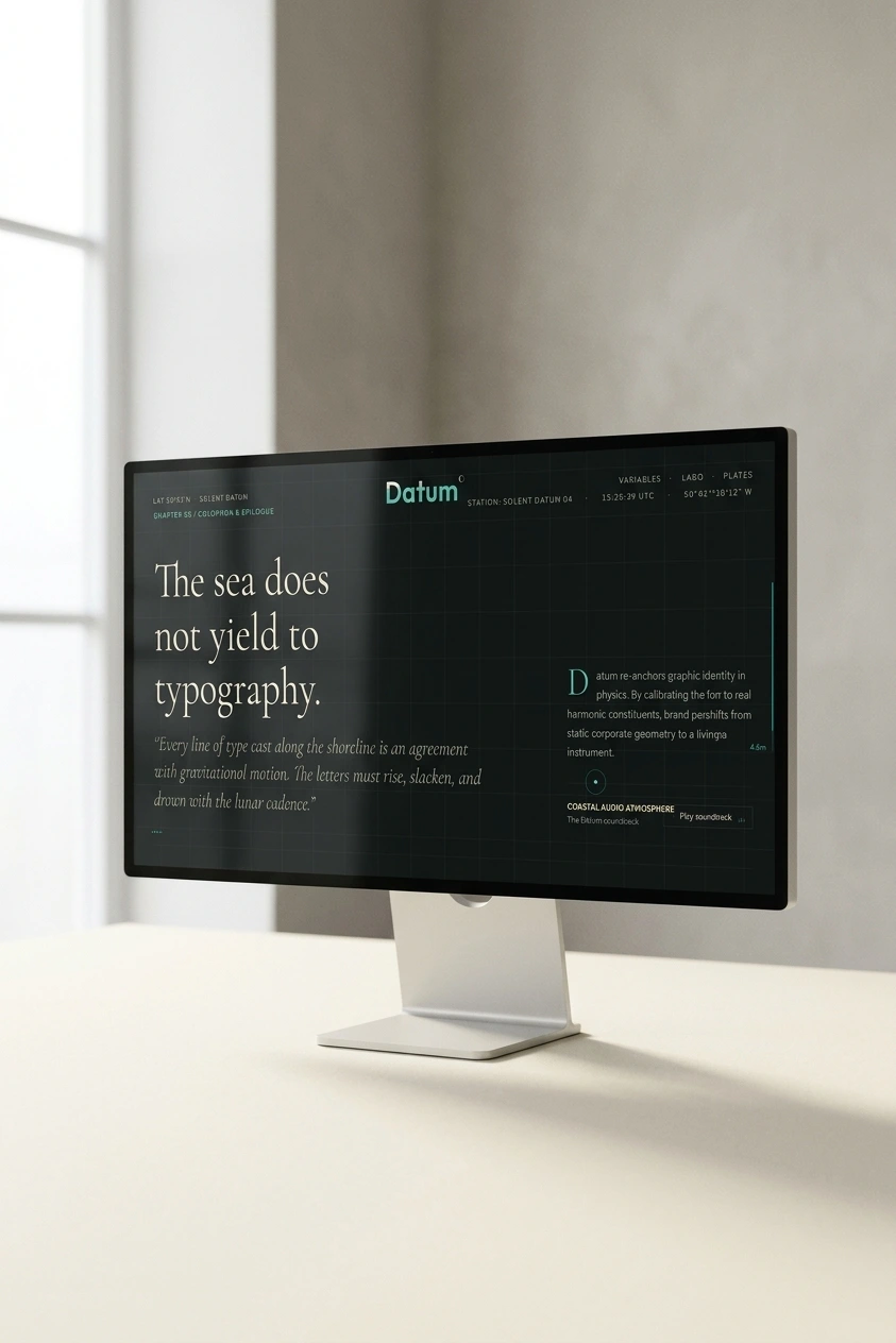
The only place the system goes quiet. A large serif sets “The sea does not yield to typography.” against the geometric Outfit used everywhere else. One line, near-black ground, hairline grid. After a page of instruments, it reads like a verdict.
CAMPAIGN
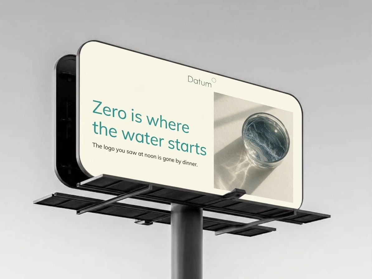
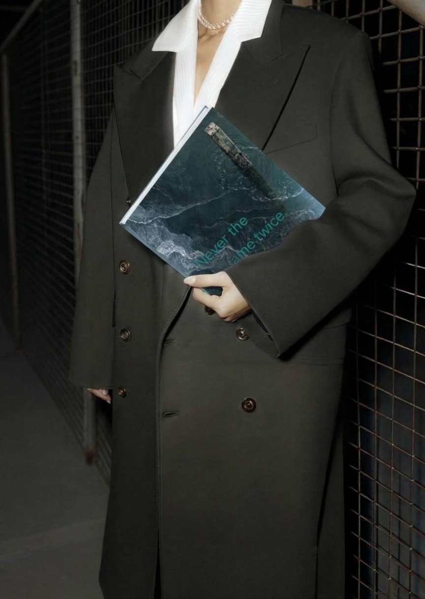
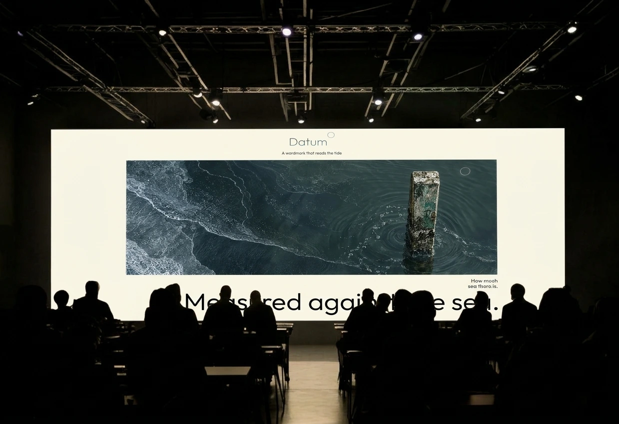
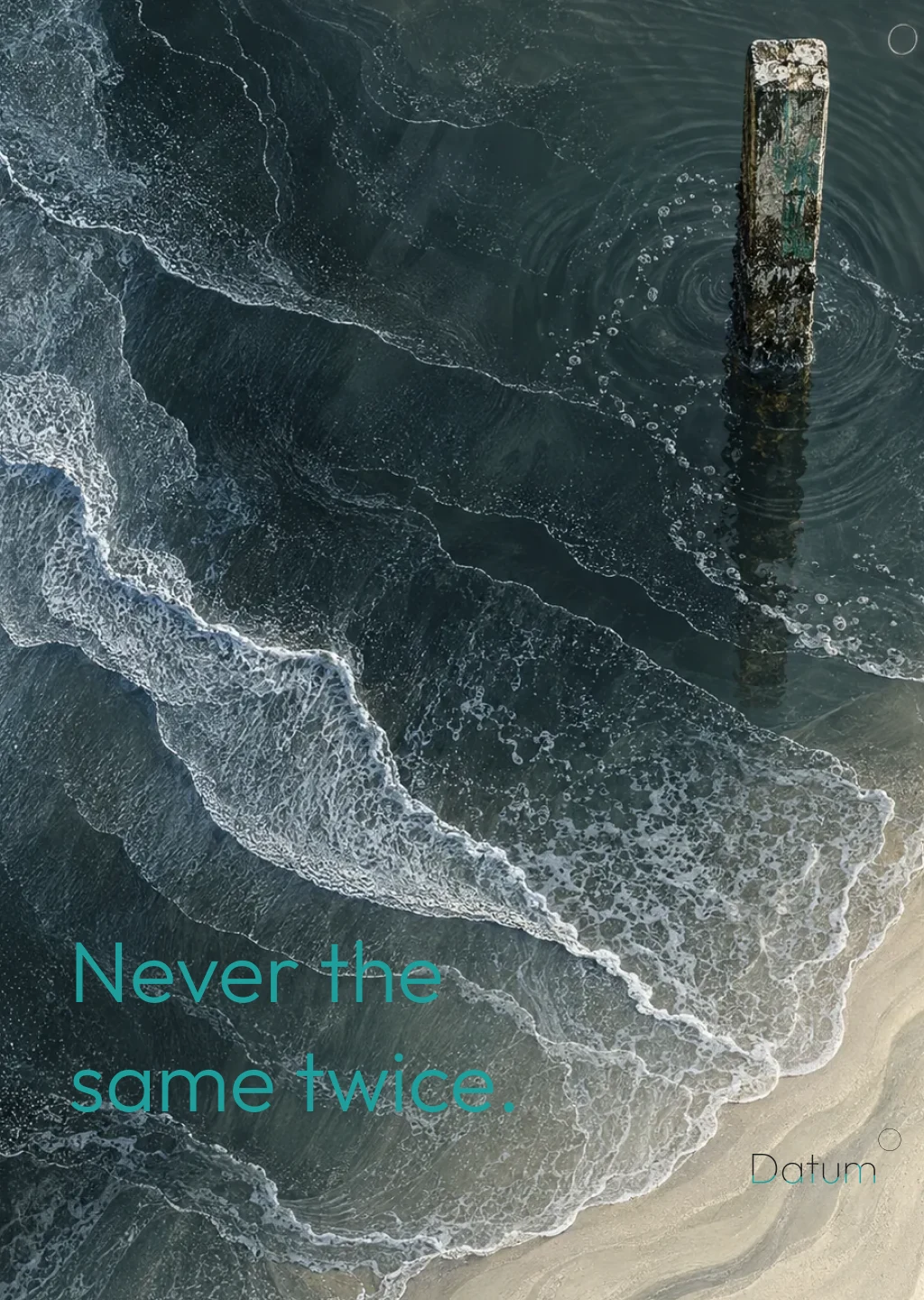
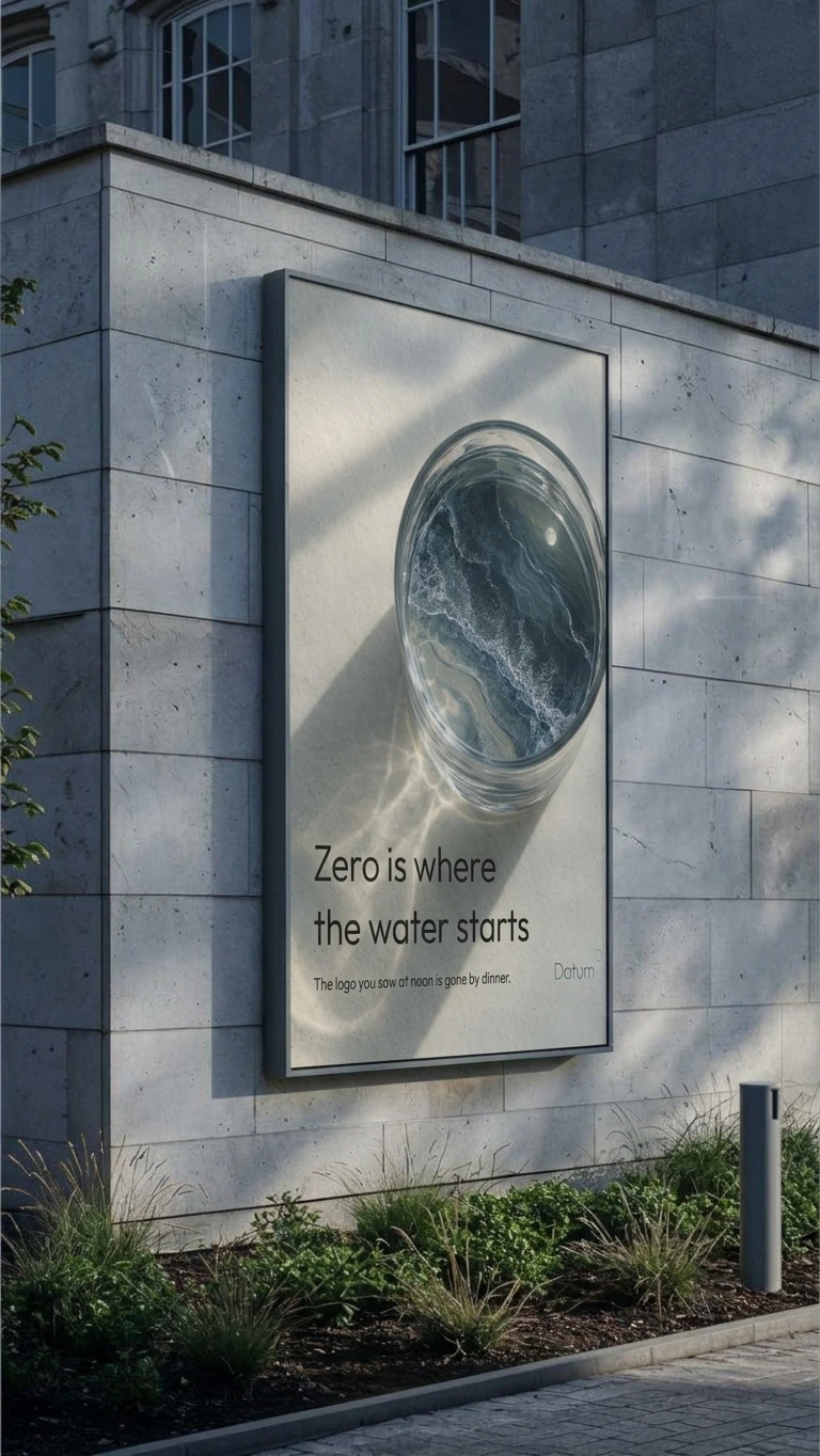
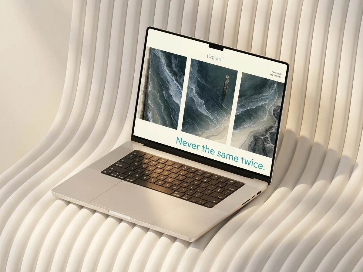
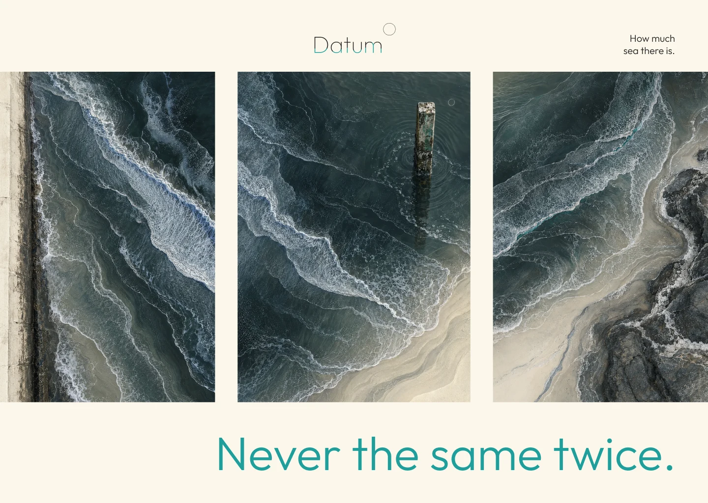
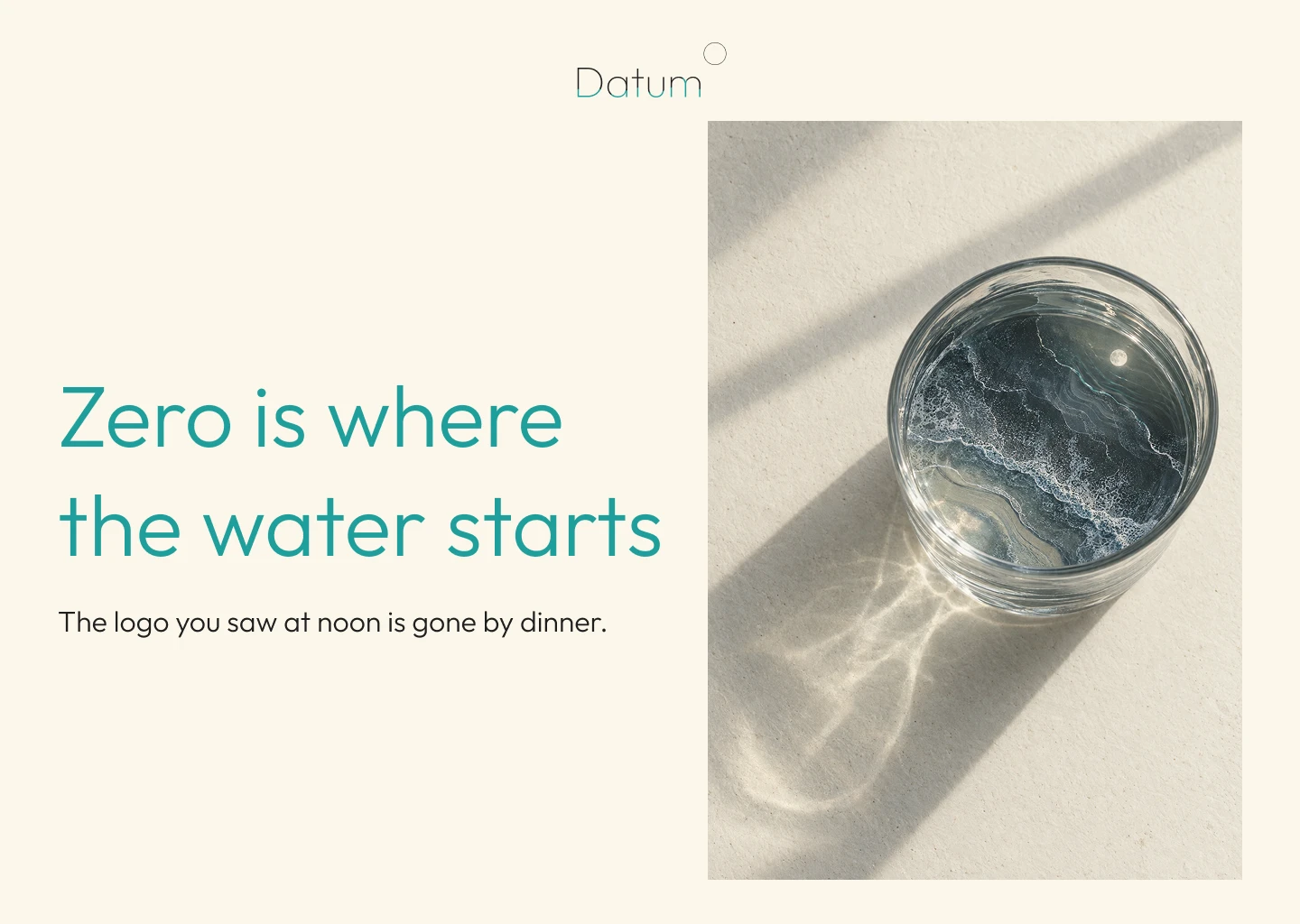
Cream ground, wordmark top centre, one image, one line in teal. The images are aerial sea in triptych, a pier post standing in the surf, and a glass bowl holding a small sea with a moon in it. The lines come from the idea: “Never the same twice.” “Zero is where the water starts.” “Measured against the sea.” Zero is the chart datum, the point from which every depth is counted. It is also the logo’s baseline.
MOTION AND EXPORT
The logo exports as a transparent GIF. MP4 cannot hold alpha, so the other route is a logo-on-black and matte pair for compositing. A coastal audio layer, Silver and Dark, runs under the site.
THE RESULT
Datum ended up with one rule that holds across every surface: nothing moves without a cause. The mark is never the same twice, but it is always readable, because each change maps to something you can read in a table beside it. The site, the campaign set and the exports all run from the same four variables. The project stands as a working identity system and a working instrument, and the next step is the case study going out into the world.
CREDITS / PROJECT INFO
Designer: Révolté (solo freelance designer), revolte.design
Project: Datum
Year: 2026
Scope: concept, logotype system, colour and type, site and interface design, campaign art direction, motion and export formats
Site live here
Industry: Weather Forecast
See more at revolte.design
Like this project
Posted Nov 9, 2026
A wordmark that stands half underwater, with weight, tilt and a small moon set by the tide. One logo, never the same twice
Likes
1
Views
5
Timeline
Oct 28, 2026 - Nov 9, 2026