Altair Brand Identity Development & Web Design

Révolté


ALTAIR: A Predator in a Quiet Room
LOGLINE
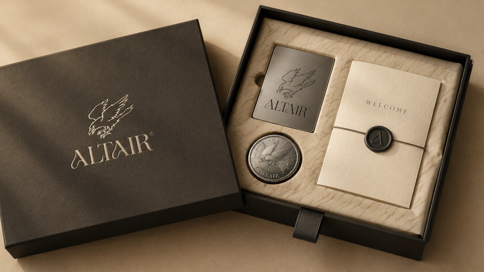
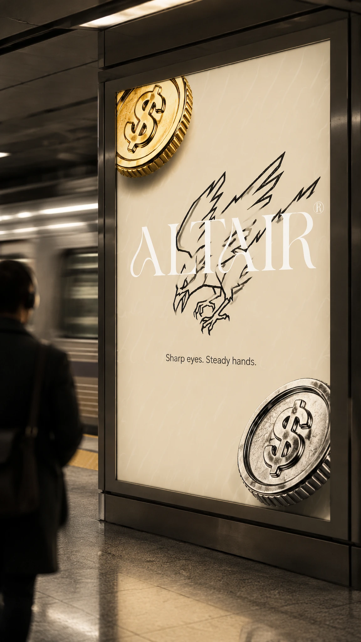
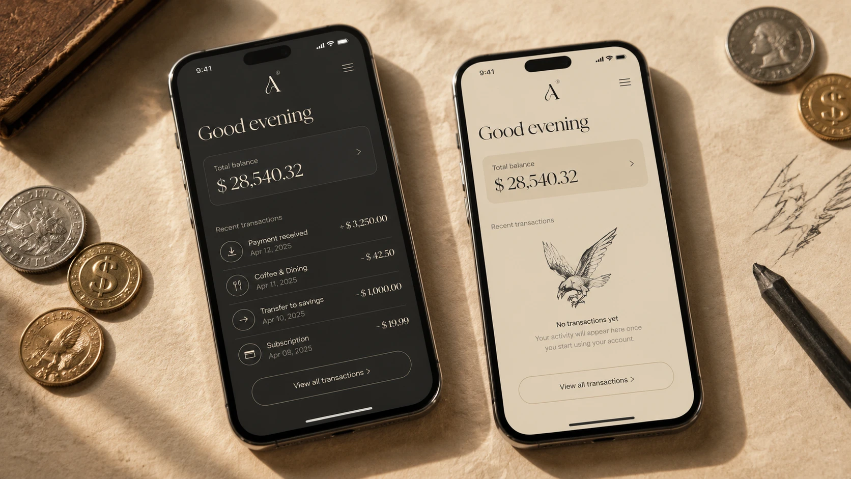
A fintech with a hand-inked raptor, a swash serif and a flat refusal of neon. I made roughness and polish read as one brand by treating everything as something struck, like a coin.
THE BRIEF
Altair arrived as three things: a name, a bird and a typeface. The name belongs to the brightest star in Aquila, the eagle. The bird is a jagged, scratchy raptor caught mid-dive. The typeface is Lamoric Rowen, a high-contrast serif whose A carries a swash that curls like a talon. Two colors were fixed, charcoal #3C3A37 and parchment #EEE2CB, plus white.
The audience, as I read it, has real money and little patience for performance. These are financially literate adults who have watched fintech shout in gradients and trust brands that sound exact.
The problem was a contradiction. The bird is rough and the type is refined, and no fintech convention knows what to do with both. The category picks one lane, corporate blue or glowing dark mode. I needed a world where a scratchy predator and a swash serif share a frame and neither looks like a mistake.
WHAT I DID
My scope: positioning direction, identity system, art direction and applications across print, objects, signage, apparel, social, app icon and motion.
THE APPROACH
I started by mapping ten directions, each with a hard attitude: an atelier, a night flight, a paper ledger, a raptor grid, a family heirloom, an observatory, brutalist calm, a gallery, a mint and a soft horizon. Most died fast. Night Flight was the obvious star story, and it slid straight into the glowing cockpit look I was avoiding. Soft Horizon made the bird friendly, which ruins a bird that dives.
What survived was the overlap of three: the mint, the paper ledger and the raptor. The unlock was treating money as metal and paper instead of as a symbol. A mint strikes things. It engraves, stamps and hallmarks. Once the bird became an engraving and the swash became security-print texture, rough and refined stopped fighting. Both are marks made on a surface, one by force and one by a fine tool.
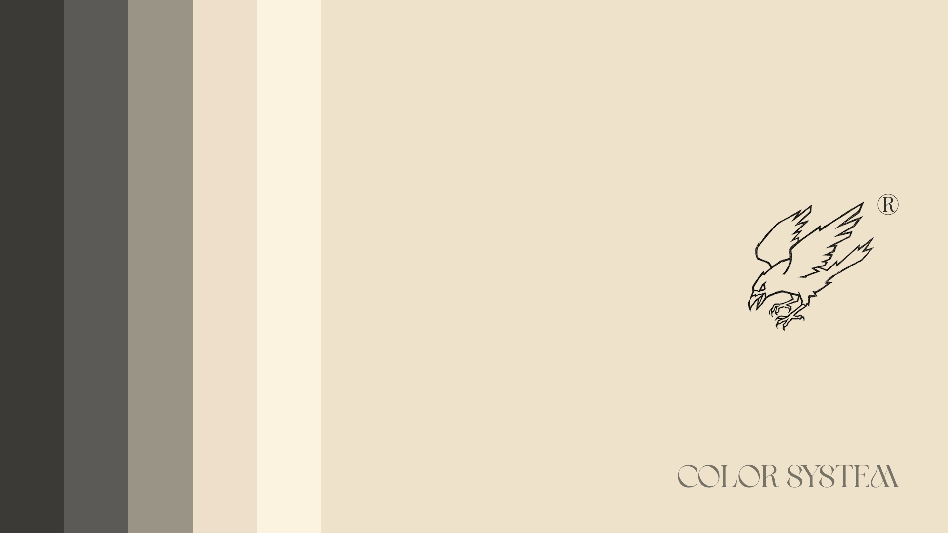
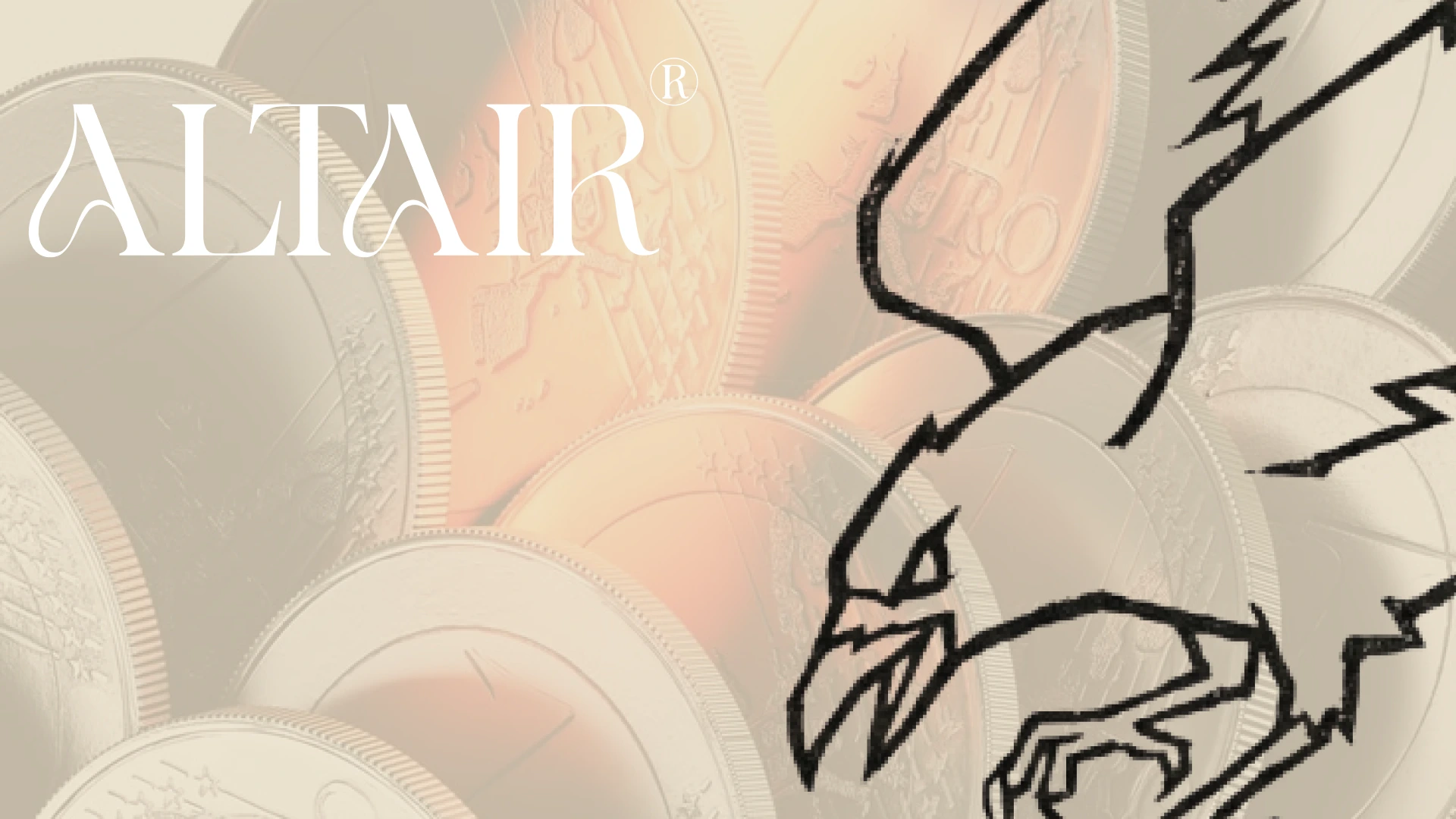
Then came the constraints. The palette stays tonal and warm, and the only saturated color comes from metal catching light, a narrow copper-peach band across chrome, gold and charcoal. Nothing cool, ever. A failed test gave me the second rule: white ALTAIR on parchment sits near 1.3 to 1 in contrast, so it works only as a ghosted layer. Anything meant to be read is set in #3C3A37.
The last piece is scale and direction. A small, exact wordmark faces a monumental, cropped bird, and compositions follow the bird’s dive from upper right to lower left.
THE WORK
LOGO SYSTEM
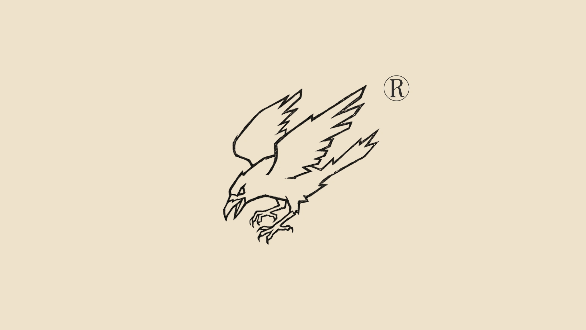
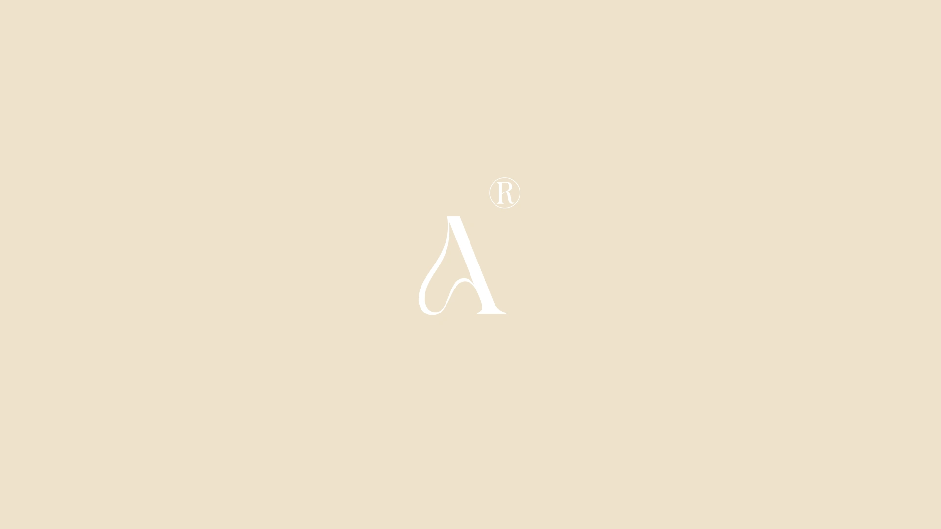
Four lockups from the assets I was given. A primary signature with the circled ® at top right, aligned to the cap height of the final R. A monogram that isolates the swash A, with the ® in the identical position so it reads as a seal. The bird alone. And an overlap lockup where the raptor dives through the wordmark, head near the second A, talons below the baseline. No asset is split, recolored or redrawn.
COLOR SYSTEM
Parchment #EEE2CB carries roughly 55 percent of any layout, charcoal #3C3A37 about 25. Sand and cream tones handle panels and highlights, slate and stone take captions and hairlines, and white is reserved for the wordmark over charcoal or imagery. Gold, silver and copper are never fills. They live inside the metal.
TYPOGRAPHY SYSTEM
Lamoric Rowen appears only at display sizes, in caps for the wordmark and sentence case for large statements, because the swashes collapse when small. A quiet grotesque in regular and medium handles contact details and captions, with uppercase labels tracked near 0.18em. The jump between sizes is extreme, with nothing in the middle.
SWASH PATTERN
The tail of the A, lifted out of the letter and repeated on an offset grid. It appears pale cream on parchment, blind-embossed in card stock and as fine gold lines on metal. It reads like banknote security print, which is the point.
PRINT AND OBJECTS
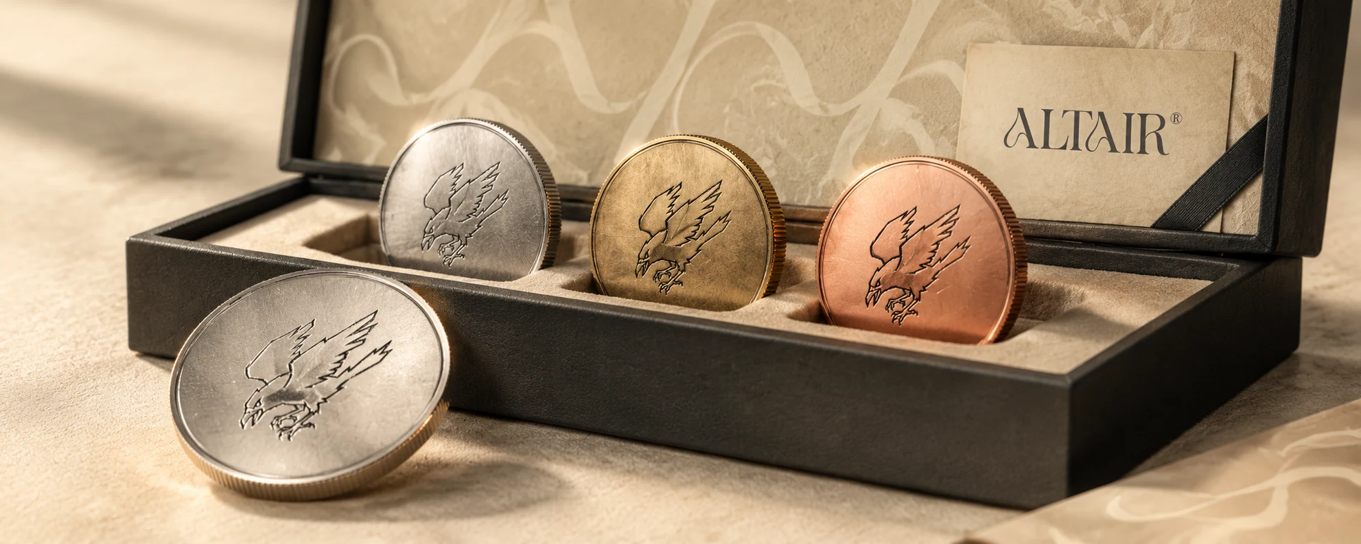
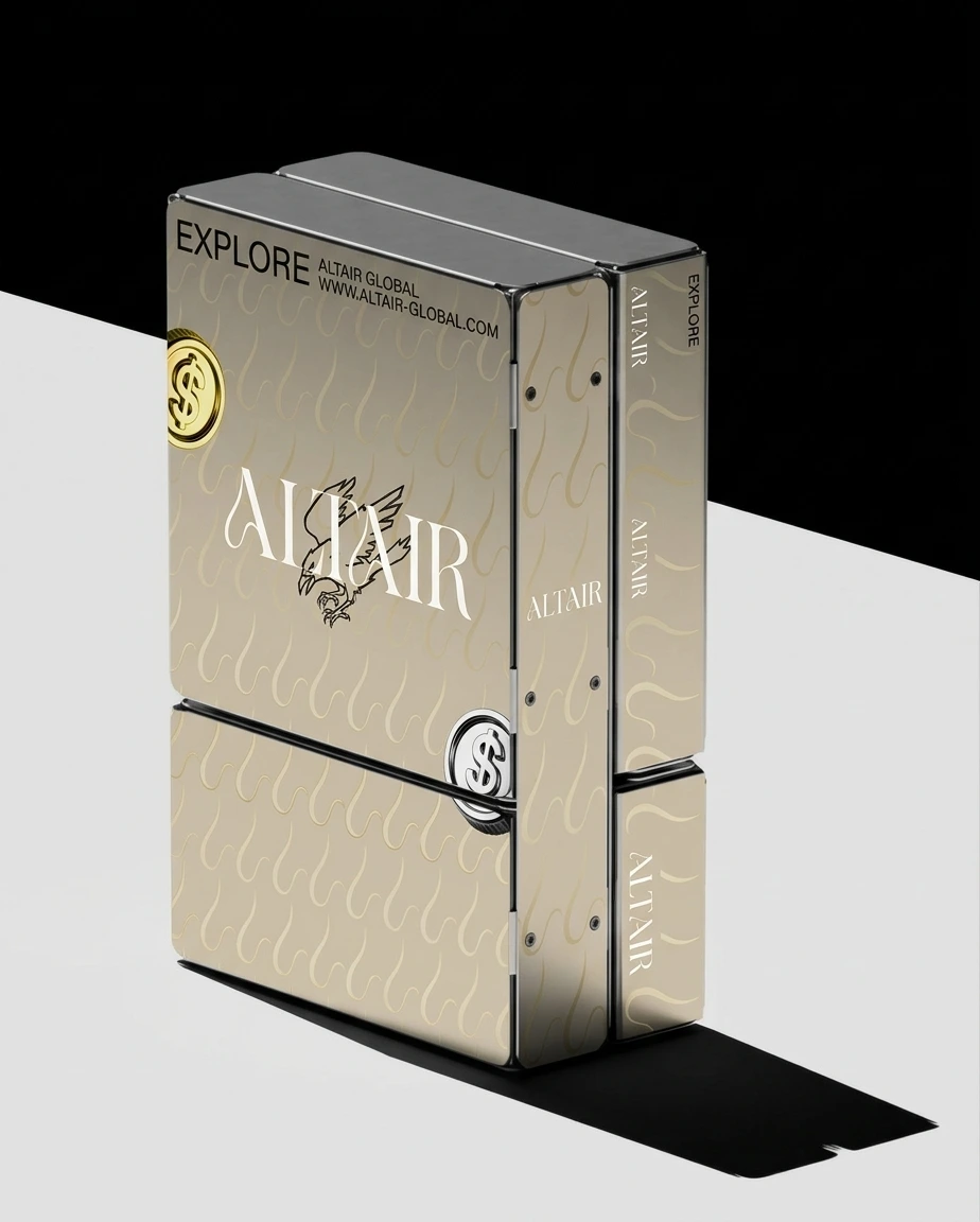
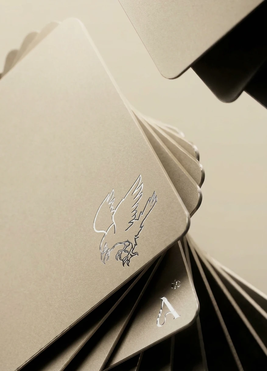
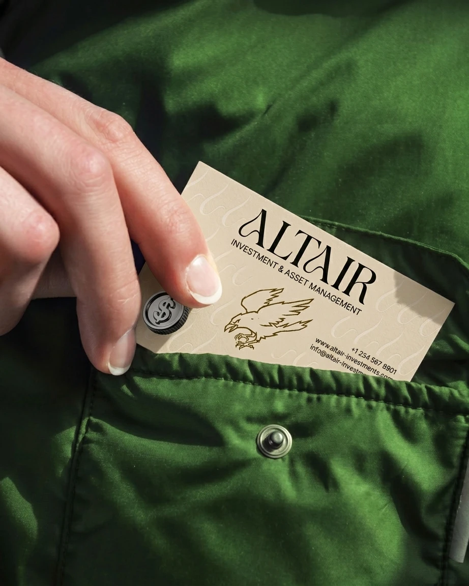
A business card on sand stock with the swash embossed and the bird in gold ink. A hinged metal case in brushed champagne carrying the lockup on its lid. Fanned metal cards with a silver foil bird and a foil A in the corner. A translucent card held to the light with the bird printed in black. Three medallions in chrome, gold and copper, bird engraved on each face, resting in a charcoal case lined with sand felt.
ENVIRONMENT
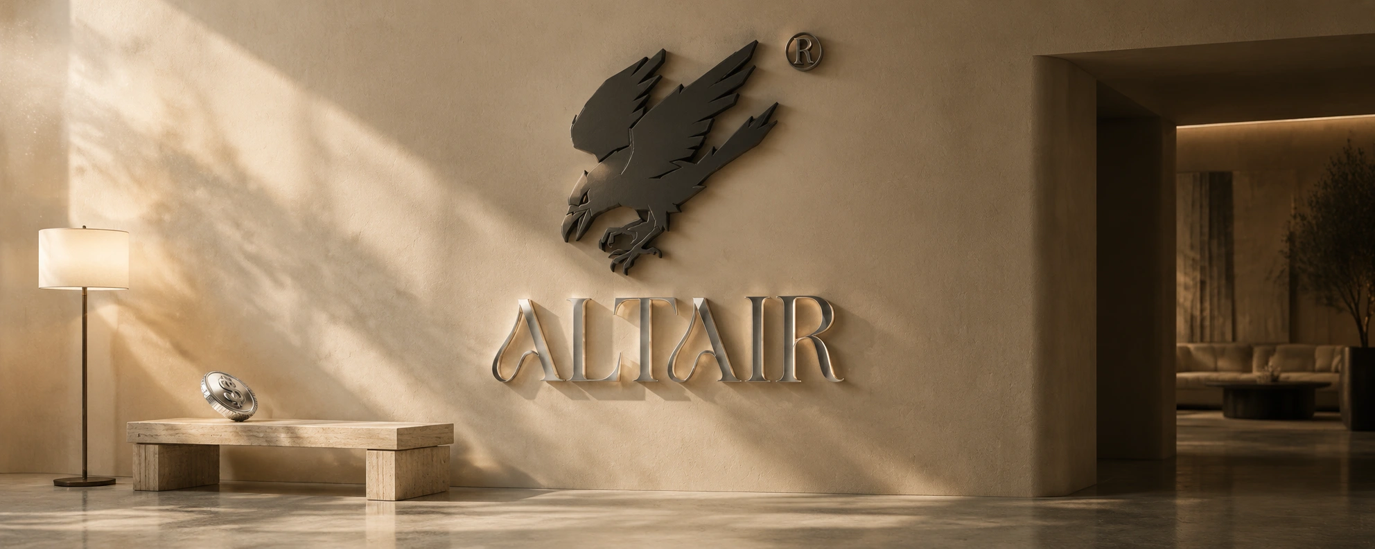
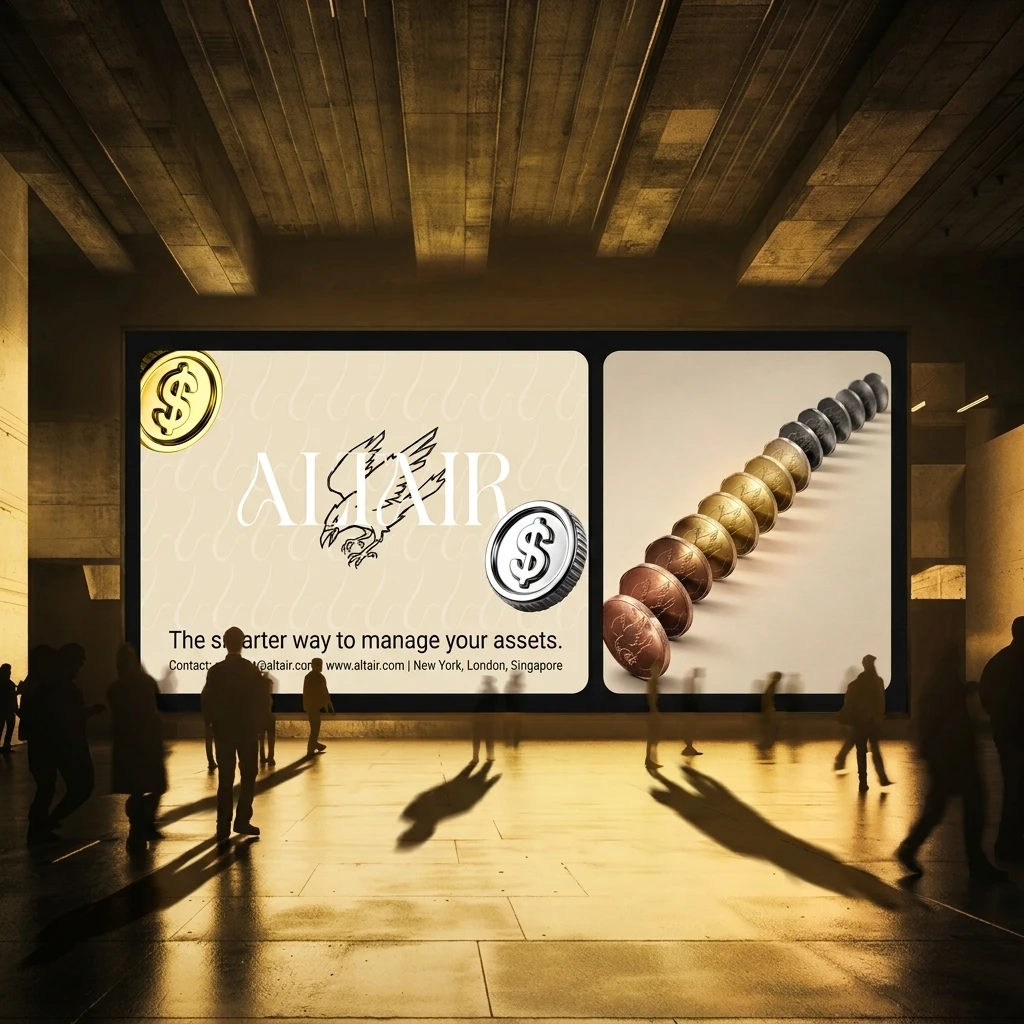
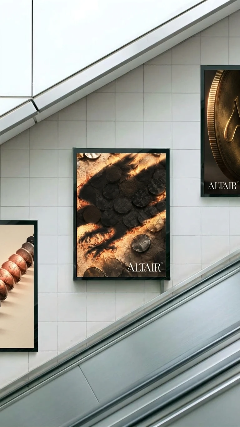
A lobby wall with a charcoal bird in relief above brushed-chrome letters edged with warm backlight. Metro posters showing a coin field crossed by the bird’s shadow, and a macro of a gold coin carrying the monogram. A split billboard pairing the lockup with a line of coins that shifts from copper to charcoal.
APPAREL AND DIGITAL
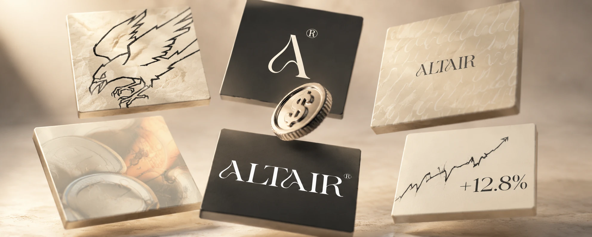
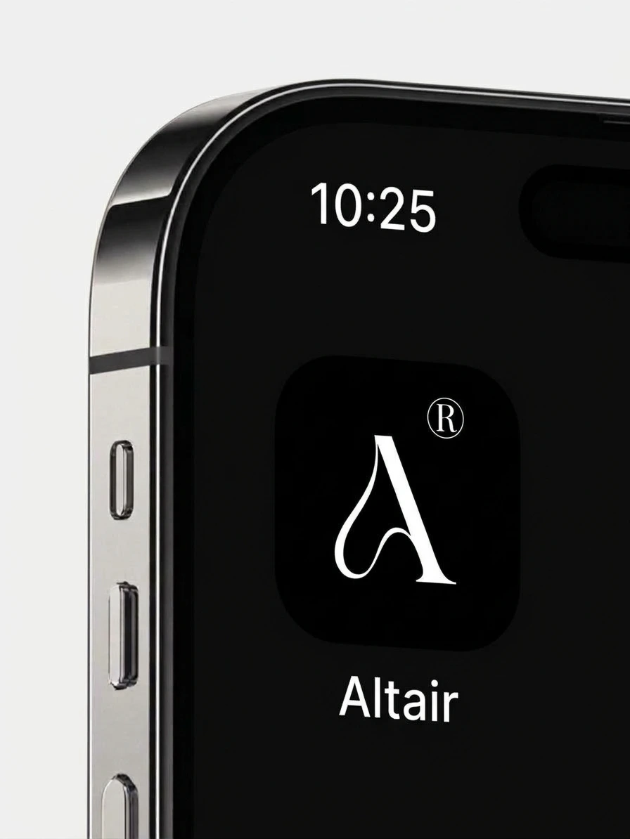
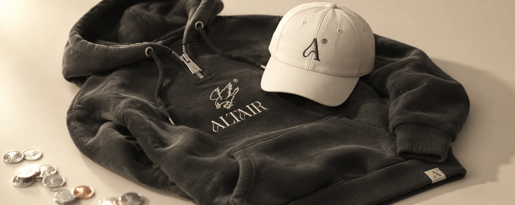
A charcoal hoodie with the bird and wordmark embroidered in cream thread, a cap with the monogram in tonal stitching and a woven A label on the hem. An app icon with a cream A and ® on charcoal. Six floating social tiles that show the brand in six registers: bird, monogram, pattern, veiled coin photograph, wordmark and a hand-drawn chart line.
MOTION
An opening title frame. An engraved coin hangs mid-air with a paper ribbon curling behind it, dust rising below, the bird’s shadow filling the background and the wordmark sitting small in the lower third.
THE RESULT
There are no metrics to report, and I will not invent any. What exists is a complete identity system that holds from an app icon to a lobby wall, with the rough bird and the refined type sharing every frame. The tension I started with is now the signature.
A scroll-driven site and a 15-second launch film
CREDITS
Designer: Révolté (solo freelance designer), revolte.design
Project: Altair
Year: 2026
Scope: Positioning direction, identity system, art direction, applications, motion
Industry: Fintech, investment and asset management
See more at revolte.design
Like this project
Posted Oct 29, 2026
A fintech raptor in a private mint: hand-inked bird, swash serif, parchment and struck metal for a brand that hunts quietly
Likes
0
Views
6
Timeline
Sep 17, 2026 - Oct 29, 2026