Built with Lovart
Muted Winter Voice Assistant Concept

Révolté


MUTED WINTER: The assistant that answers in three words
LOGLINE
Every voice assistant I know talks too much. Muted Winter answers in the fewest words, at the lowest volume that works, and lets a six-petal mark show what it is doing so it never has to explain itself.
THE PROBLEM
It is 2:14 in the morning. Someone wakes up and asks the time. The assistant greets them, gives the time, adds the date, mentions the weather and offers more help. The person wanted three digits.
That is the real problem. Voice products are sold as hands-free and eyes-free, but the moments they live in are the ones where attention is thinnest: a dim kitchen, a drive at dusk, a bedroom after midnight. Their answers are written like conversation and their screens are written like dashboards. Both ask for more attention than the moment has.
It is also a hard problem, because removing words is harder than adding them. Every cut risks coldness, and a quiet interface still has to feel alive.
THE THESIS
Answer in the fewest words, at the lowest volume that works.
I bet on it because it can be tested at every level. A reply passes or fails by word count. A screen passes or fails by whether you can read it in one glance. The name carries the same idea. Wintermute, the AI in Gibson’s Neuromancer, wants more. I turned it around: muted.
THE DECISIONS
Quiet is the product, not a mode.
I explored ten directions for an AI interface: a ghost-text writing editor, an inbox that silences itself, a local-only assistant, a confidence layer, a terminal agent, a screenless home device, a critic that disagrees, a captioning tool. I chose the quiet voice assistant. I rejected the other nine because only this one makes restraint the feature instead of a setting. The cost: no personality to fall back on. It cannot joke its way out of a bad answer.
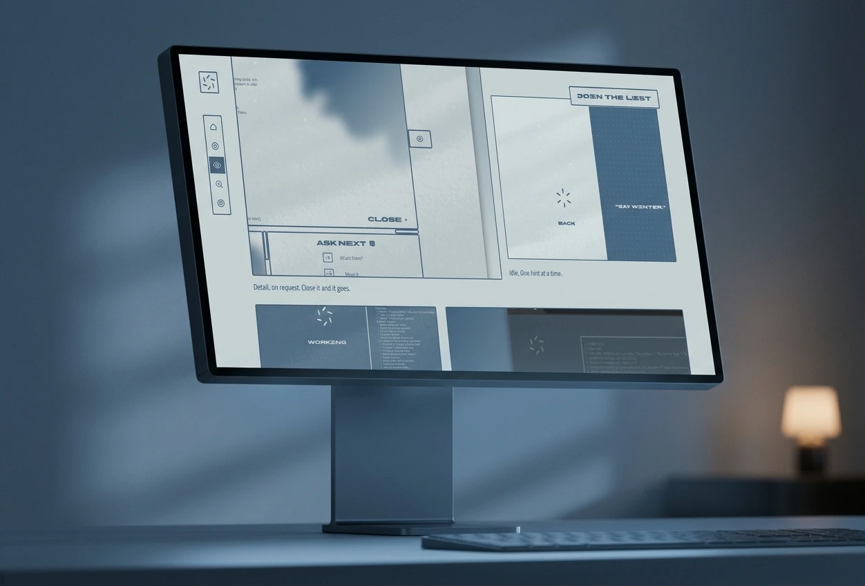
The mark is the state machine.
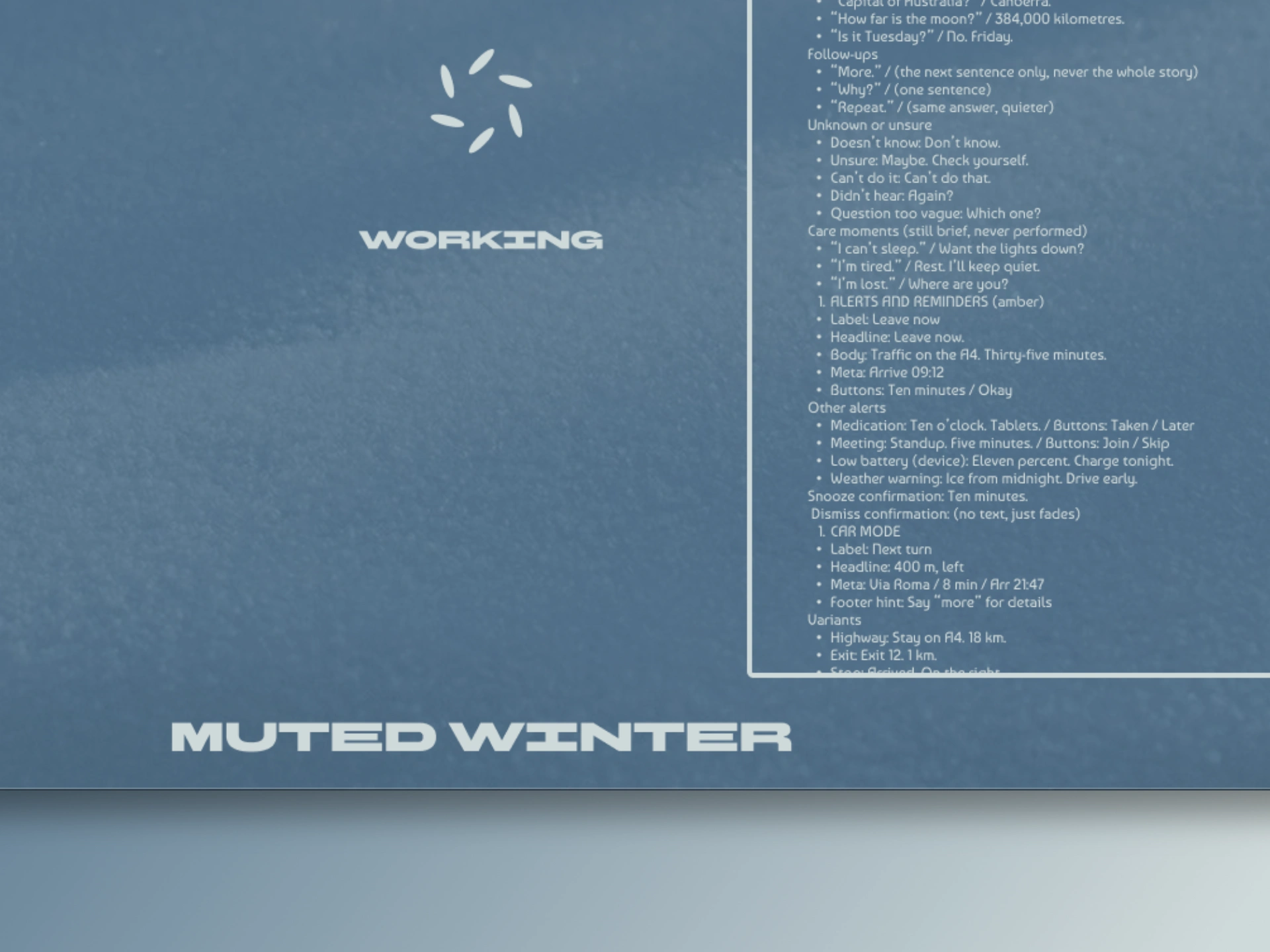
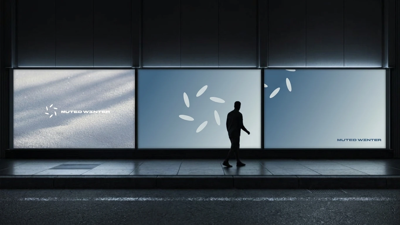
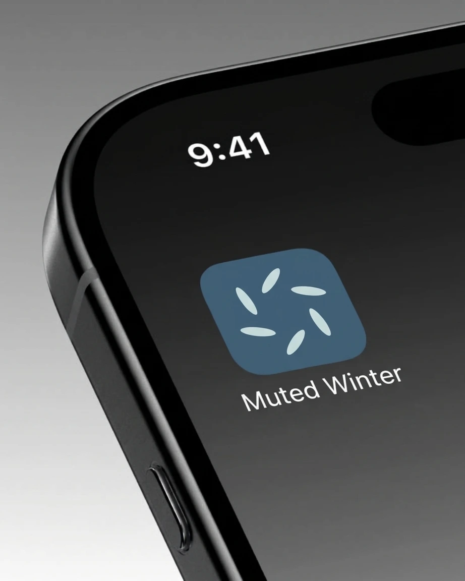
Six petals, one ring. Idle: scattered, as if caught mid-spin. Listening: the petals pulse out of phase. Working: they drift inward on a steel-blue field. Speaking: they align into a star. Error: a broken amber ring with a smaller echo ring inside it. Back: the petals close up and return to steel blue. I rejected a spinner, a waveform and typing dots, because a status line has to be read and a shape is understood at the edge of your vision. The cost: the geometry has to stay exact. One petal too many and the whole system stops making sense.
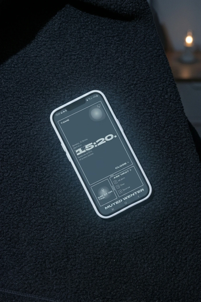
The answer sits on top of the detail, on purpose.
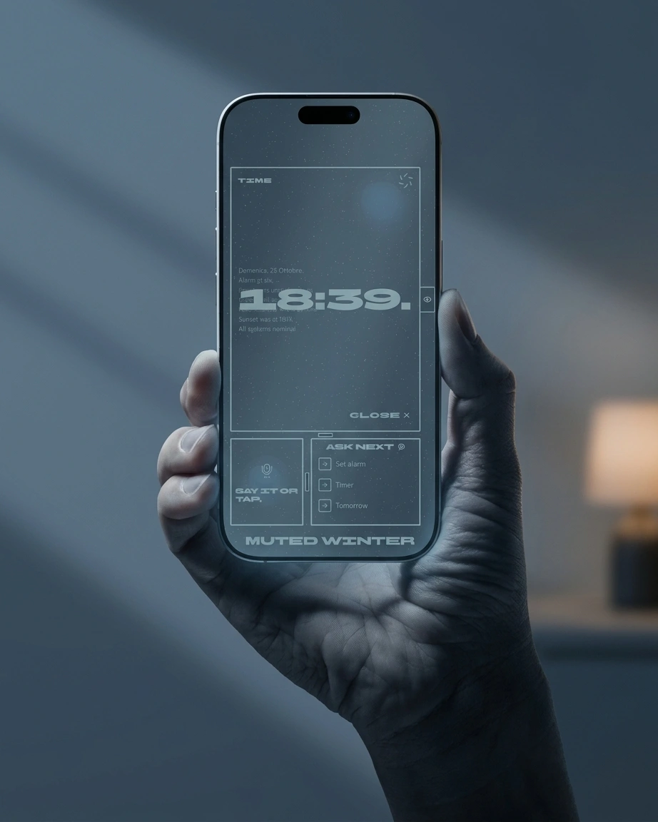
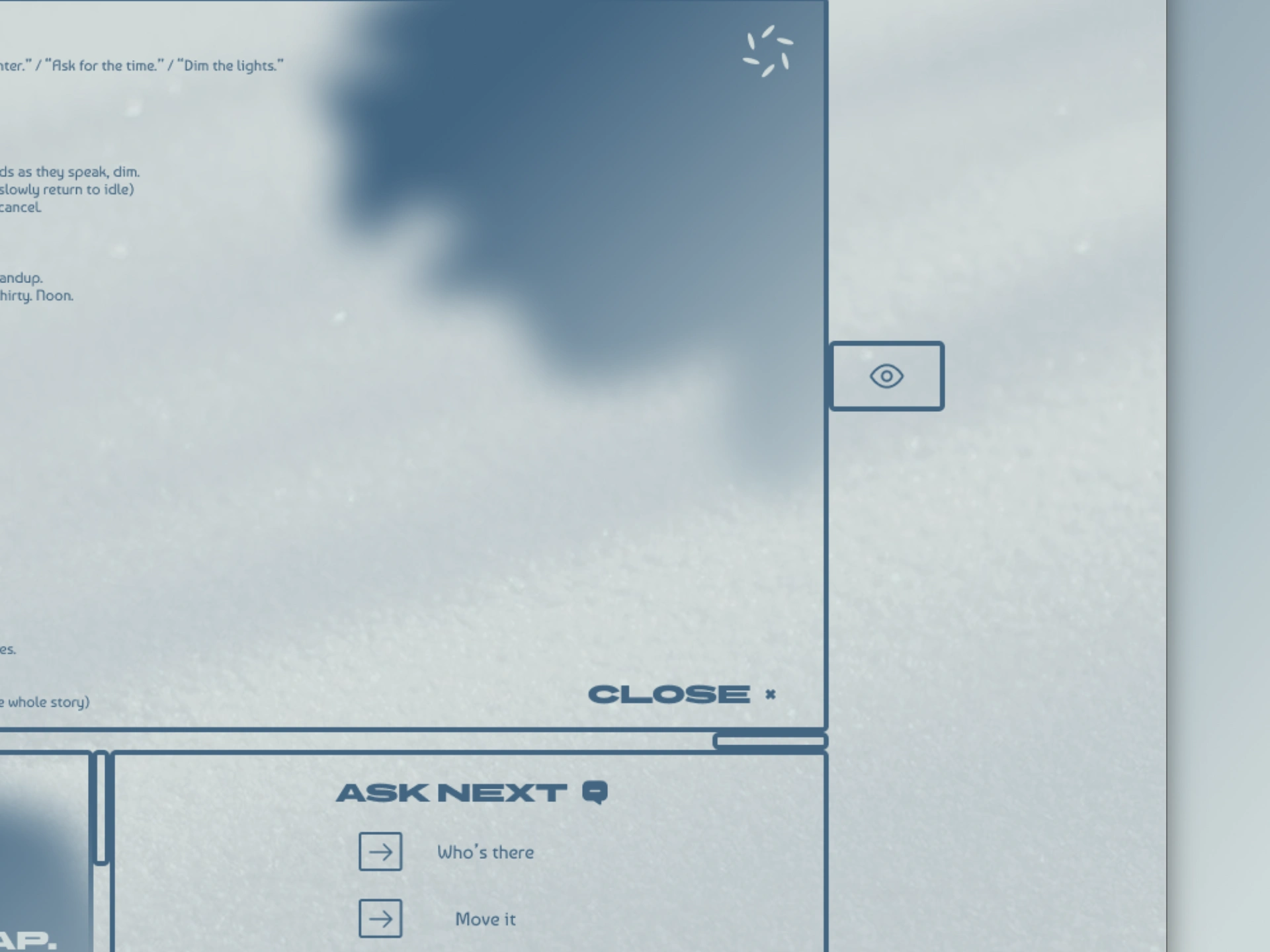
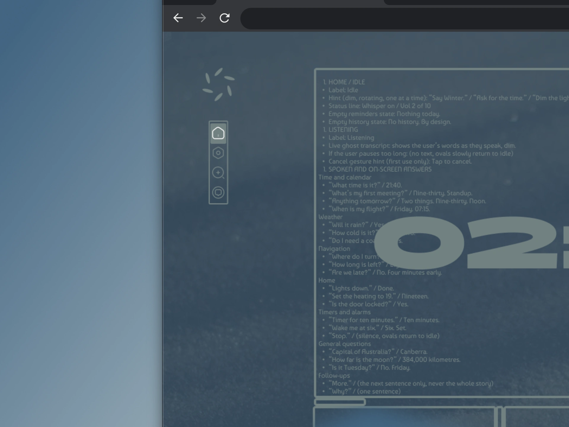
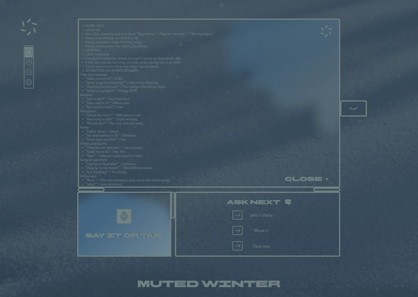
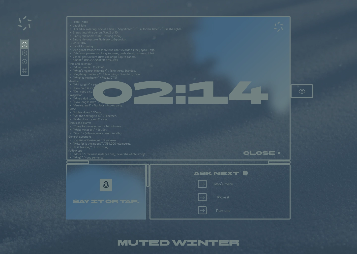
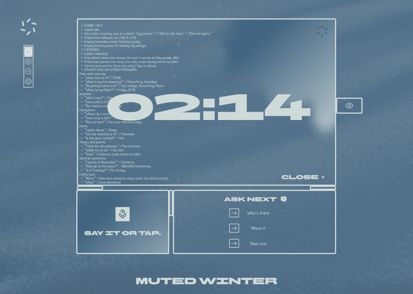
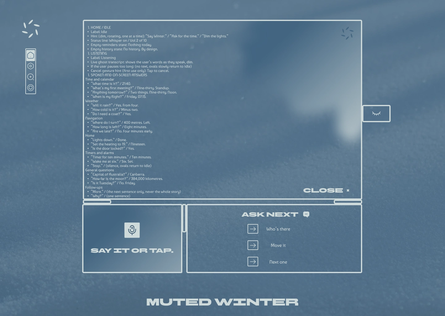
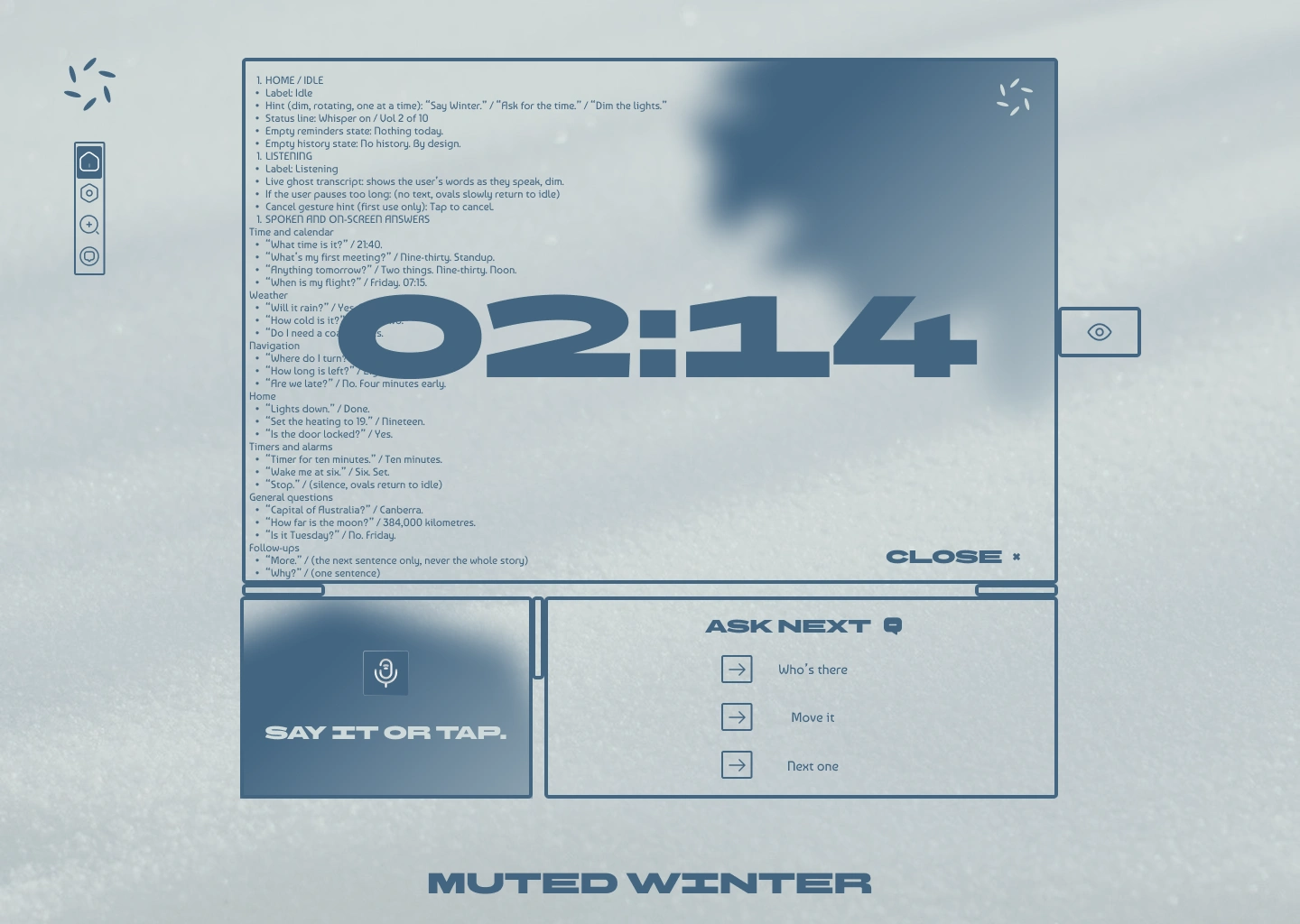
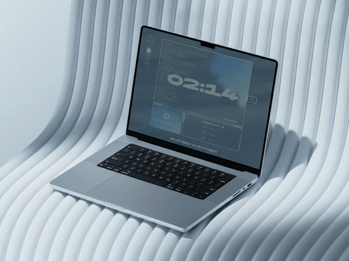
My first answer panel dumped the whole reply as a list. It read like documentation, which is the opposite of the promise, so I scrapped it. Now the answer is one huge line, “02:14.”, and the long reply sits behind it in the same colour. The two layers collide. I weighed cross-fading them and flipping the text colour inside the digits, and I kept the plain collision, because the overlap tells you there is more underneath without asking you to read it. An eye tab on the panel edge brings the detail forward. The cost: where the layers overlap, small text loses legibility, so the detail stays at half strength and never sits behind a control.
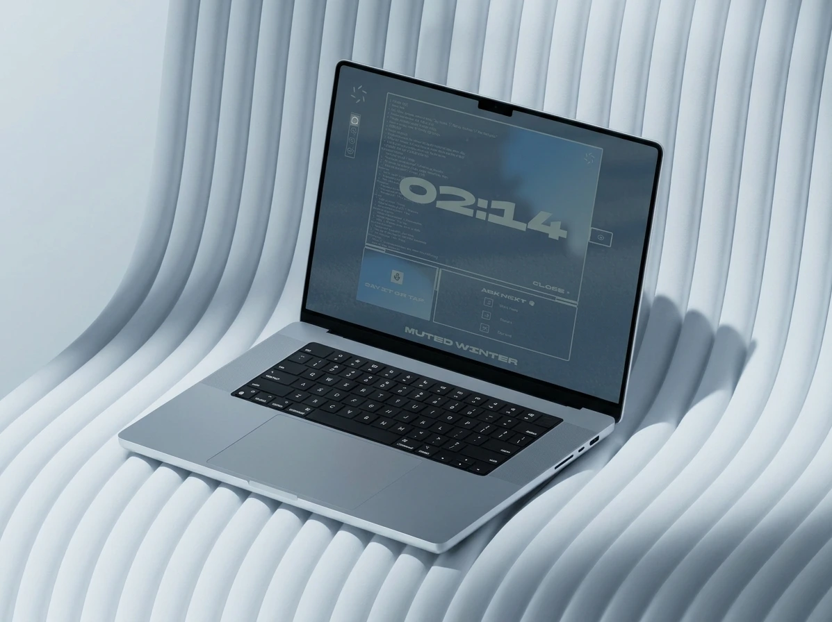
Three hours, three themes.
Day, Quiet hours from 8pm to midnight, and Late night after midnight. The product dims with the clock instead of waiting for a dark mode toggle. My first late-night pass dimmed the frames and the type but left a saturated blue blob, which became the brightest object on a dark screen. A quiet product cannot have a lamp in the corner. The blob is now desaturated and shrinks with the hour. The cost: three sets of values and one hard rule, nothing at night gets brighter than the layer below it.
Errors say what happens next.
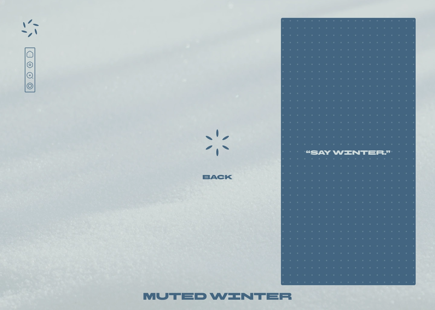
The first error line was “Memory fault.” Nobody in a dark kitchen can act on that. It now reads “Restarting.” and then “Try again.” My first online state was neon green. I cut it, because online is the default and should not announce itself. Recovery has no colour of its own. The petals close back into steel blue and the line says “Back.” The cost: no reward moment. The product stays calm even when it recovers, and I accepted that.
THE EXPERIENCE
Idle is a snow texture with a steel-blue mic tile in the centre and one hint at a time in BBH Bartle caps: “Say Winter.” then “Ask for the time.” then “Dim the lights.” A vertical rail on the left holds four outlined icons in a thick frame: home, settings, search, history. The wordmark sits centred at the bottom.
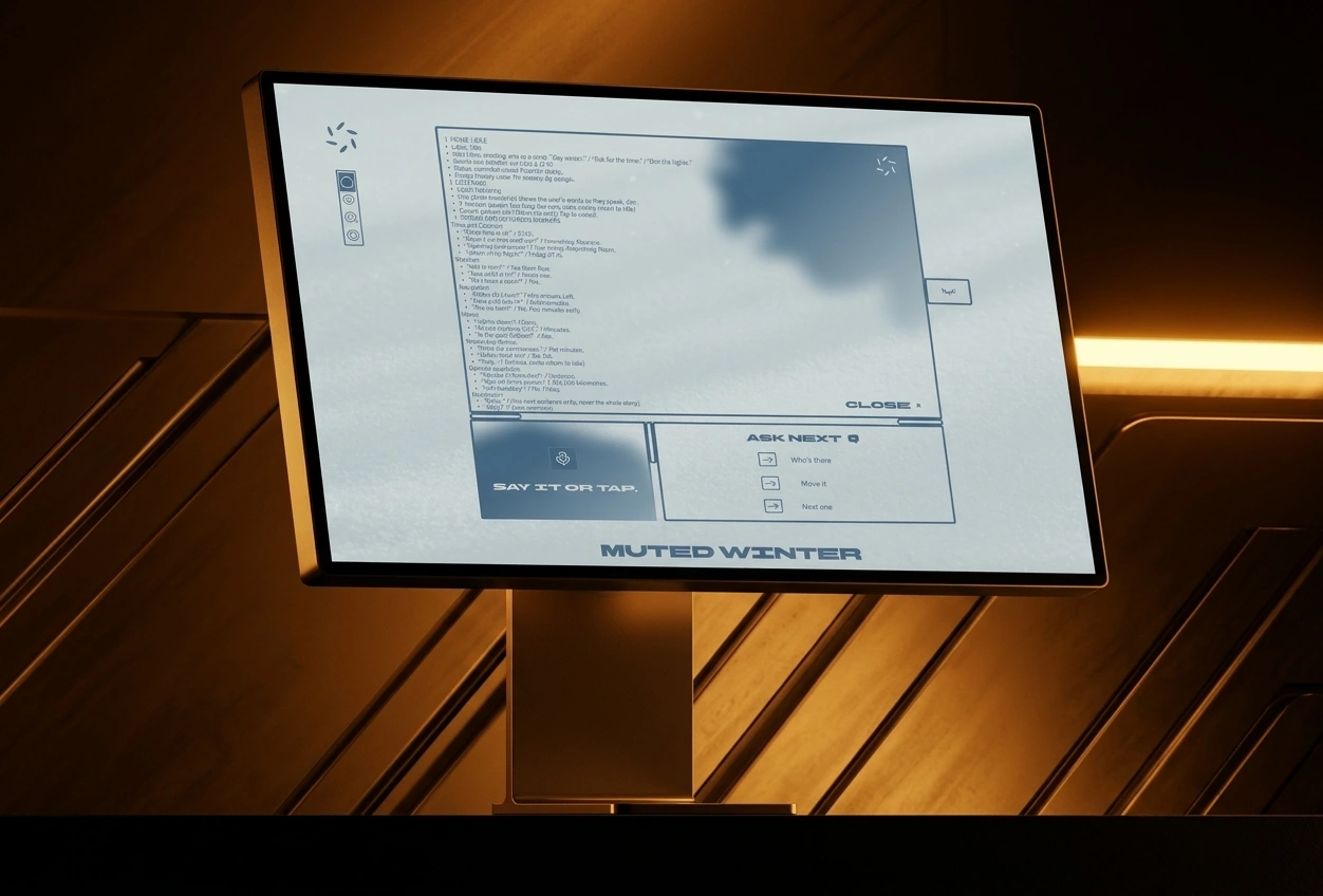
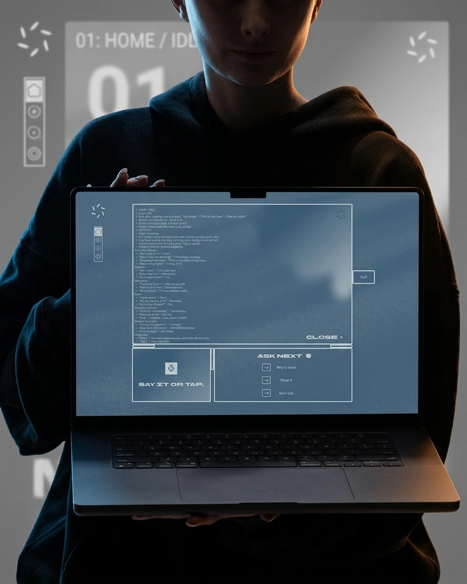
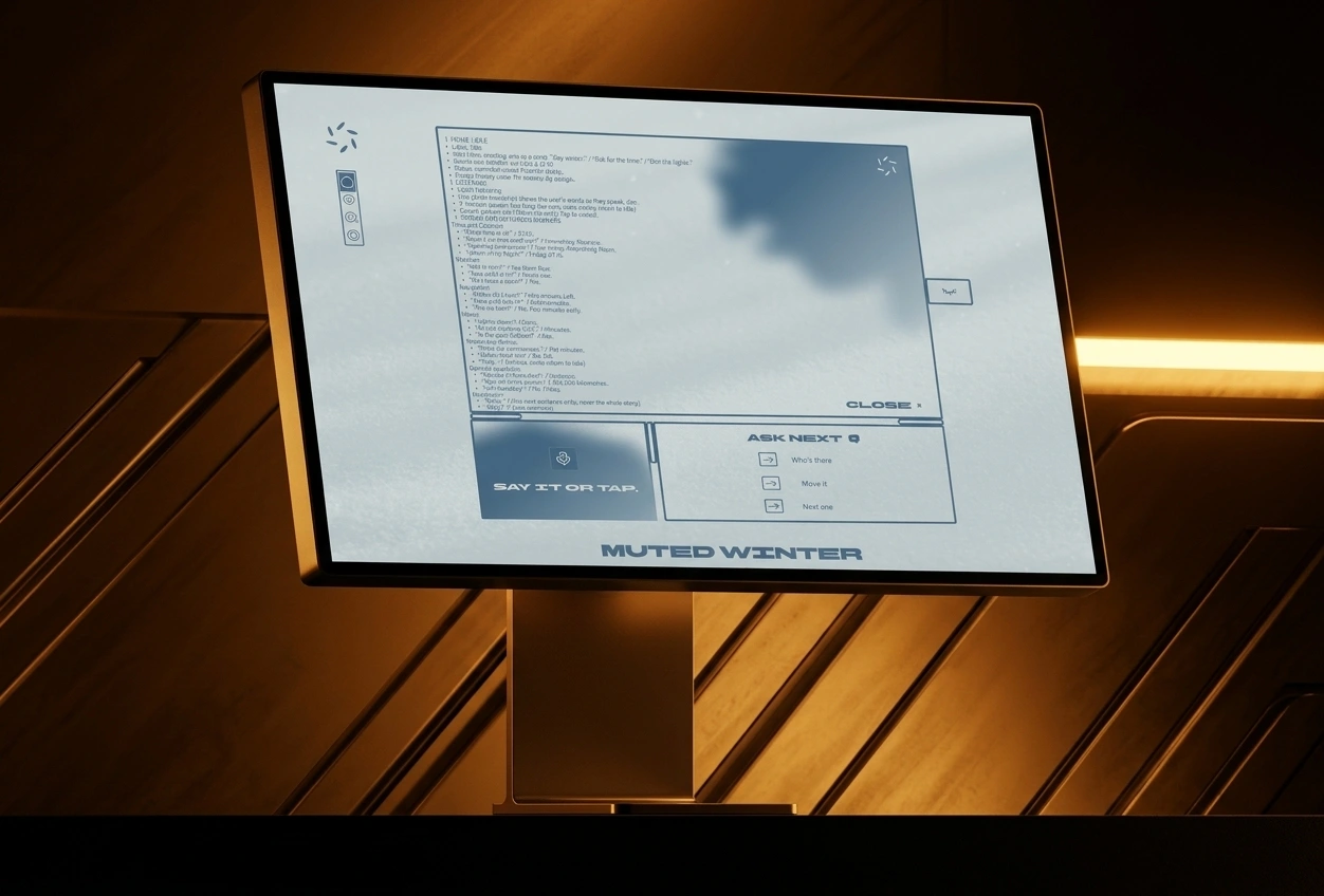
The answer screen is where the idea lives. A thick-outlined frame with small seam nubs holds the detail text in Baumans at half strength, with the answer in BBH Bartle sized to fill the panel in one line. The six-petal mark sits in the top-right corner, “Close ×” bottom-right, the eye tab on the right edge. Under the frame are two tiles: “Say it or tap.” with a soft ink-like blob, and “Ask next” with three commands of one to three words each, “Who’s there”, “Move it”, “Next one”, each beside an outlined arrow box. A tall dot-grid panel in steel blue carries system messages: “Restarting.” in amber, “Say Winter.” in ice.
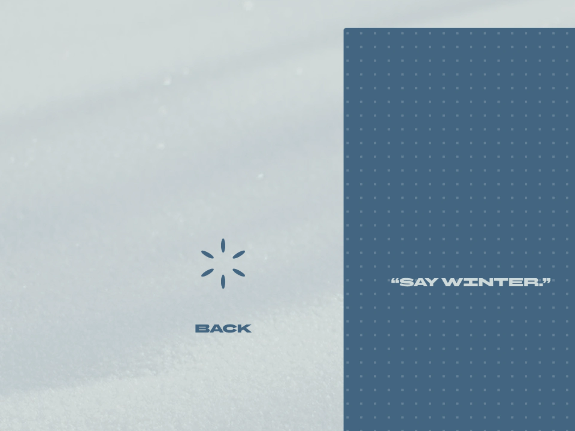
Both typefaces have a single weight, so hierarchy comes from size, case and opacity. BBH Bartle carries the logo and titles. Baumans carries everything you read twice.
Colour is a short list. Snow field
#CDD9D9, steel blue #426583, ink #3A5B78, Quiet hours #587691, Late night #34444F, and amber #D9A05B reserved for the things that need you. There is no green and no pure white.The copy follows a rulebook I wrote before I touched spacing. Answer first. One to six words. No greeting, no apology, no exclamation marks. When it does not know, it says so in three words or fewer. “Nine-thirty. Standup.” “Yes. From four.” “400 m, left.” “Can’t do that.”
The restraint comes from Japanese design. Ma, the pause as part of the experience. The mon, the family crest, which is how I read the six-petal rosette. Ink wash, which is where the soft blue shapes come from. In motion, the petals pulse out of phase while it listens and fall into line when it speaks.
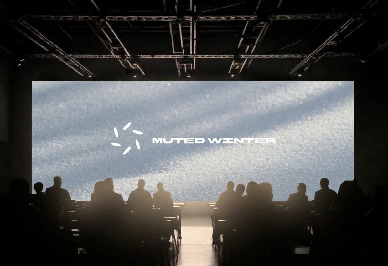
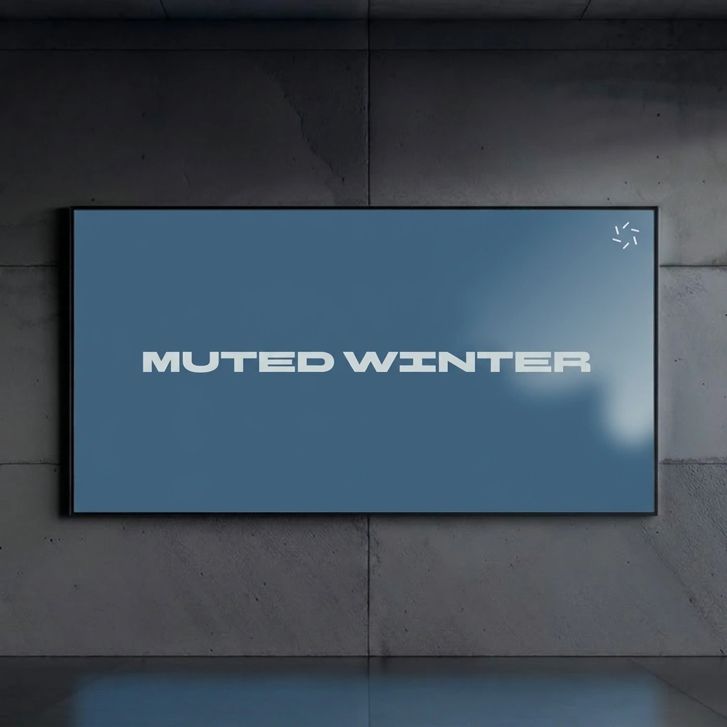
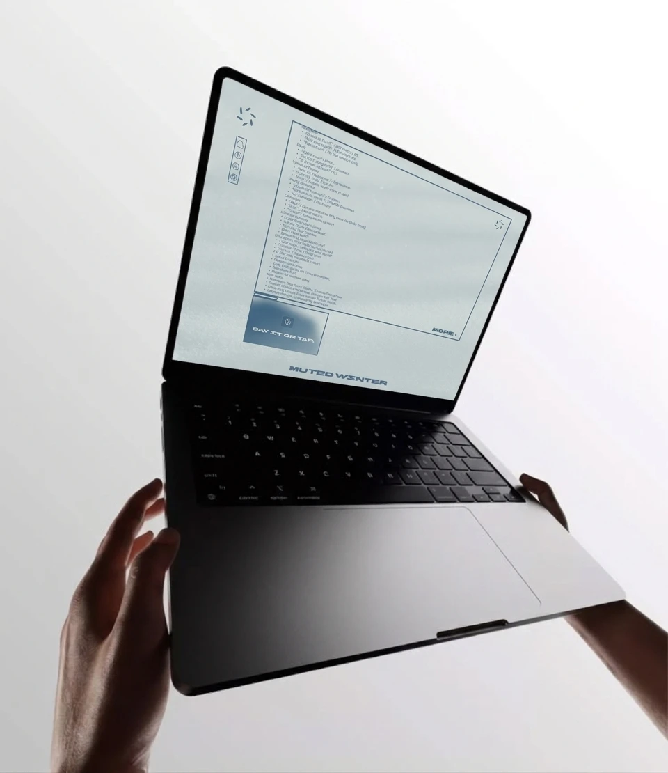
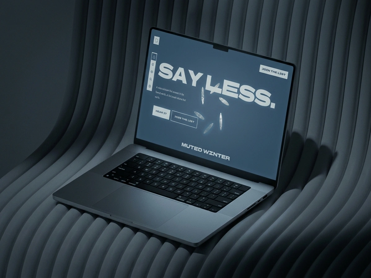
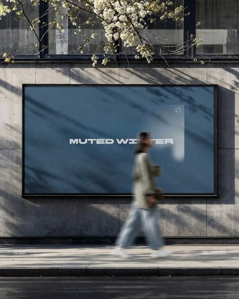
I put the system into context: a stage LED wall, storefront windows where the mark breaks across three panes, a billboard, a laptop on a dark desk, a phone icon.
THE RESULT
Muted Winter is a concept, and I will not dress it up as anything else. What exists: the identity, an interface system with six states and three themes, a copy rulebook, and the context scenes. An Android prototype brief and a landing page spec are written and ready.
I have no metrics. The test I plan to run is simple: show someone the answer screen for one second, take it away, and ask what it said. “Nine-thirty” is the only acceptable response.
WHAT I’D DO DIFFERENTLY
I started on a desktop screen for a product that speaks. The truest version of the idea is the bedside device: six LEDs, no screen, nothing to read. I reached it last. Next time I would start with the room and add the panel afterwards. I would also label the rail icons or cut them, because two of the four still ask you to guess.
CREDITS
Designer: Révolté
Project: Muted Winter
Year: 2026
Scope: Brand Identity, Product Design, UI, Copywriting
Platform: Web, Android (concept)
See more at revoltedesign.contra.com
Like this project
Posted Oct 26, 2026
A voice assistant that answers in three words, shows its mood with six petals and dims itself after midnight
Likes
0
Views
0
Timeline
Oct 9, 2026 - Oct 26, 2026