Vetti Brand Identity Design

Révolté
Verified

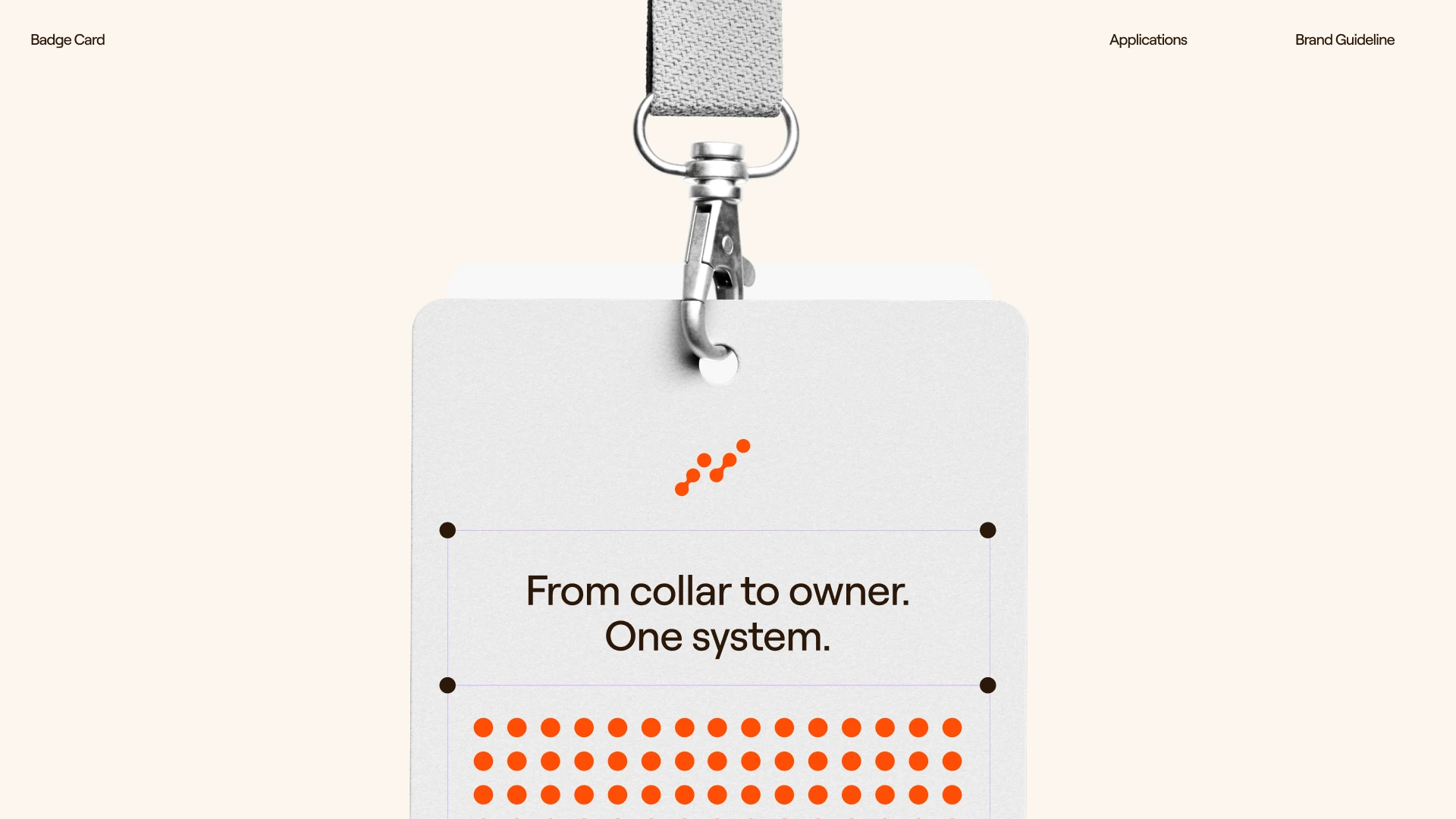
VETTI — The Quiet That Comes From Knowing
A pre-launch pet health brand needed to feel like something you'd hand a life to. Not a gadget. Not a clinic. The brand that emerged lives somewhere between a nature documentary and a precision instrument.
THE BRIEF
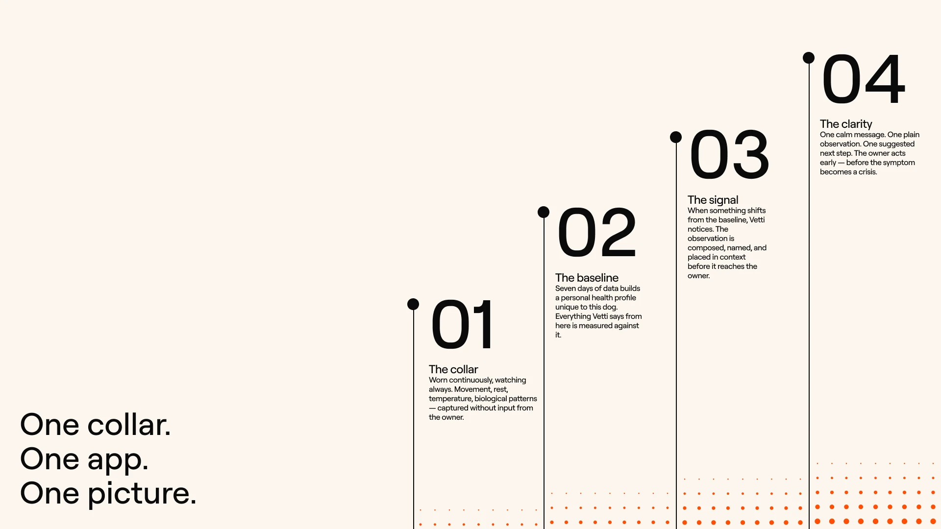
Vetti is a smart health collar and subscription app for dogs — continuous biometric monitoring, proactive health alerts, an AI health overview, and a vet connection layer built in. The shorthand the founding team used to describe it: Whoop for dogs. The brief came through Bright Studios and Daniel Bright, who held the strategy, naming, and client relationship while I handled the full visual identity execution.
The tension was immediate. Pet health technology sits in two ditches: cold clinical hardware that feels like a medical device, and candy-colored activity toys that scream gadget. Vetti needed to be neither. The strategy was already well-defined — the category is proactive pet health, the reference point is Owlet or Nanit rather than Fi or Tractive, the target owner treats their dog as a dependent. My job was to make that positioning visible on every surface.
What made it hard was the emotional demand of the brief: it had to feel warm enough to trust with a life, precise enough to feel credible as a health product, and bold enough to stand out in a category full of timid identity work. That's a narrow target. I missed it twice before I found it.
THE APPROACH
I started in the wrong place. The first direction I built was warm, documentary, Field Report — golden-hour photography, thin annotation overlays, a compass-pill logomark, a parchment and moss palette. It was considered and cohesive and it read like an outdoor brand. The client's note after the first presentation: it's strong technically but needs more heart. The dog wasn't the hero. The data was. I'd reversed the brief's own equation.
The second round pushed further toward warmth — softer palettes, more editorial photography, the serif-on-field-photography moves that every premium pet brand with taste is doing right now. It was beautiful and it was invisible. Wrong again.
What unlocked it was a single line from the creative brief that I'd been treating as context rather than instruction: the emotion comes from the animal, the information comes from the technology. Once I read that as a design rule rather than a positioning note, everything changed. The visual system needed to split those two jobs and assign them to different parts of the identity — the photography owns the emotion entirely, the data layer owns the information entirely, and they never swap roles.
D5 was where that logic finally became a real brand. Bold rectangular grid. Full-bleed cinematic dog photography against
#0A0A0A dark grounds. #FF4E06 as a hard saturated energy color, never a data state. A ring-chart data visualization system in its own independent palette. Roobert Bold carrying everything — one typeface, two weights, maximum discipline. The client responded immediately. That was the direction.THE WORK
THE TRAIL — LOGOMARK
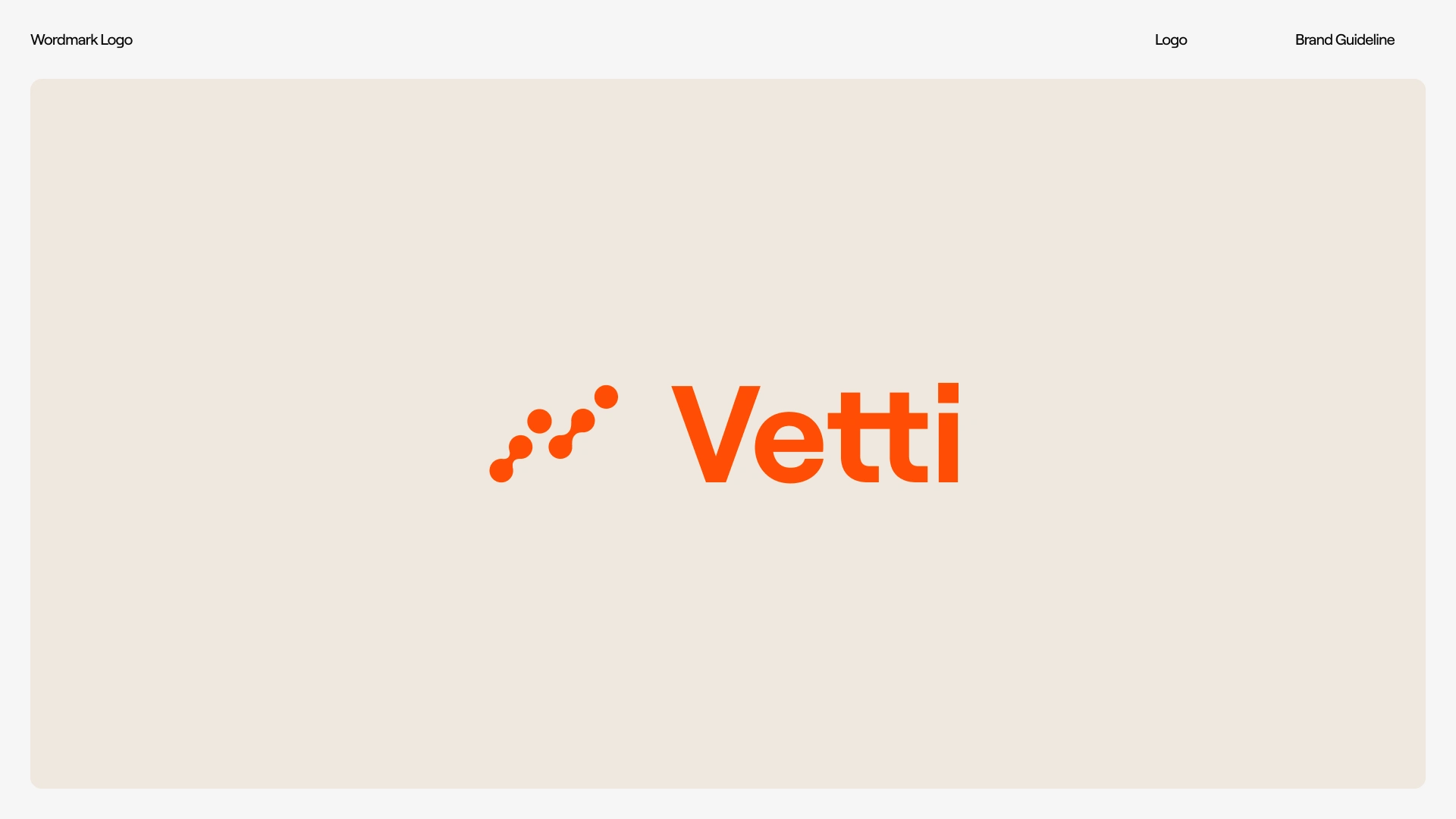
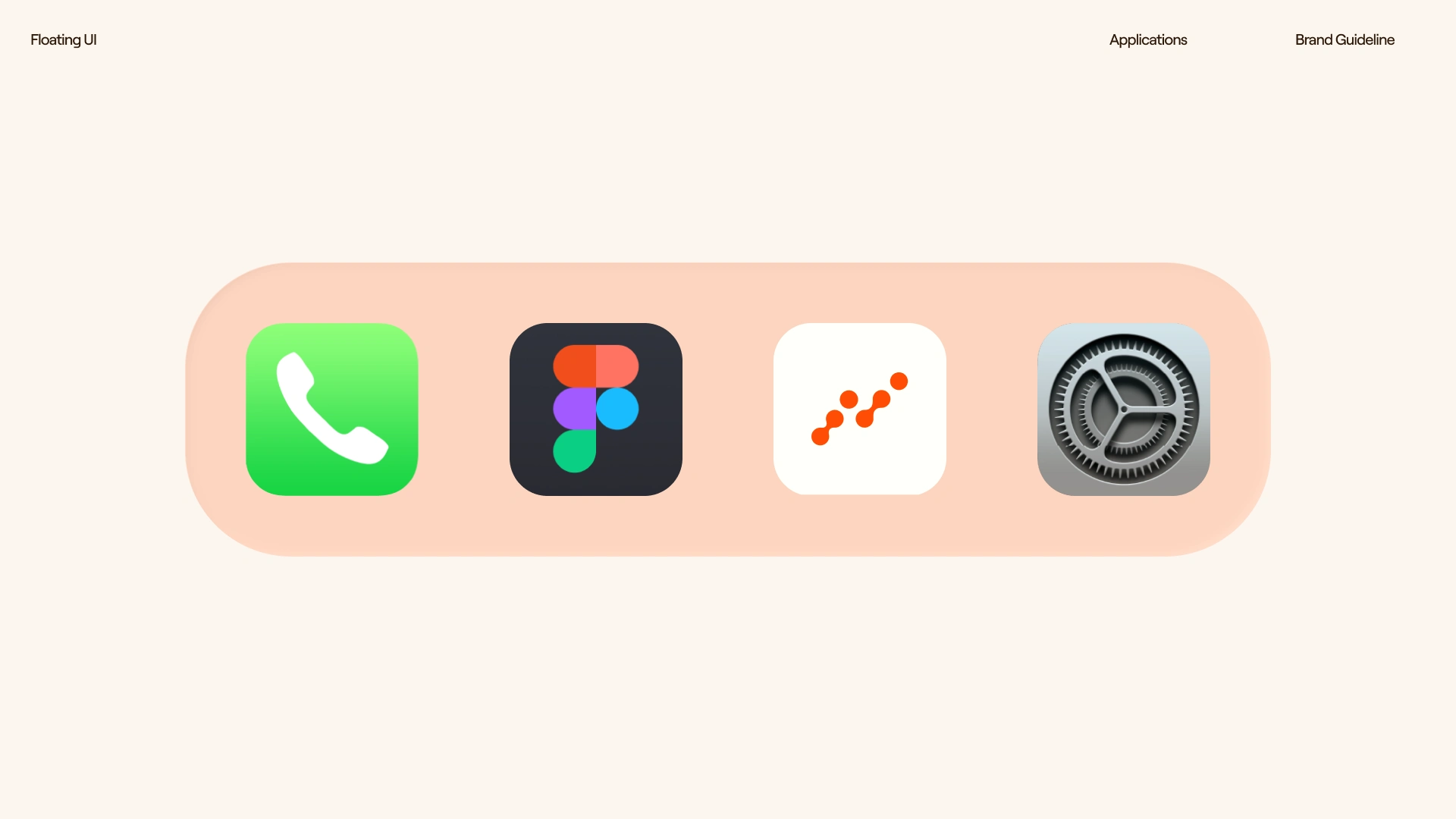
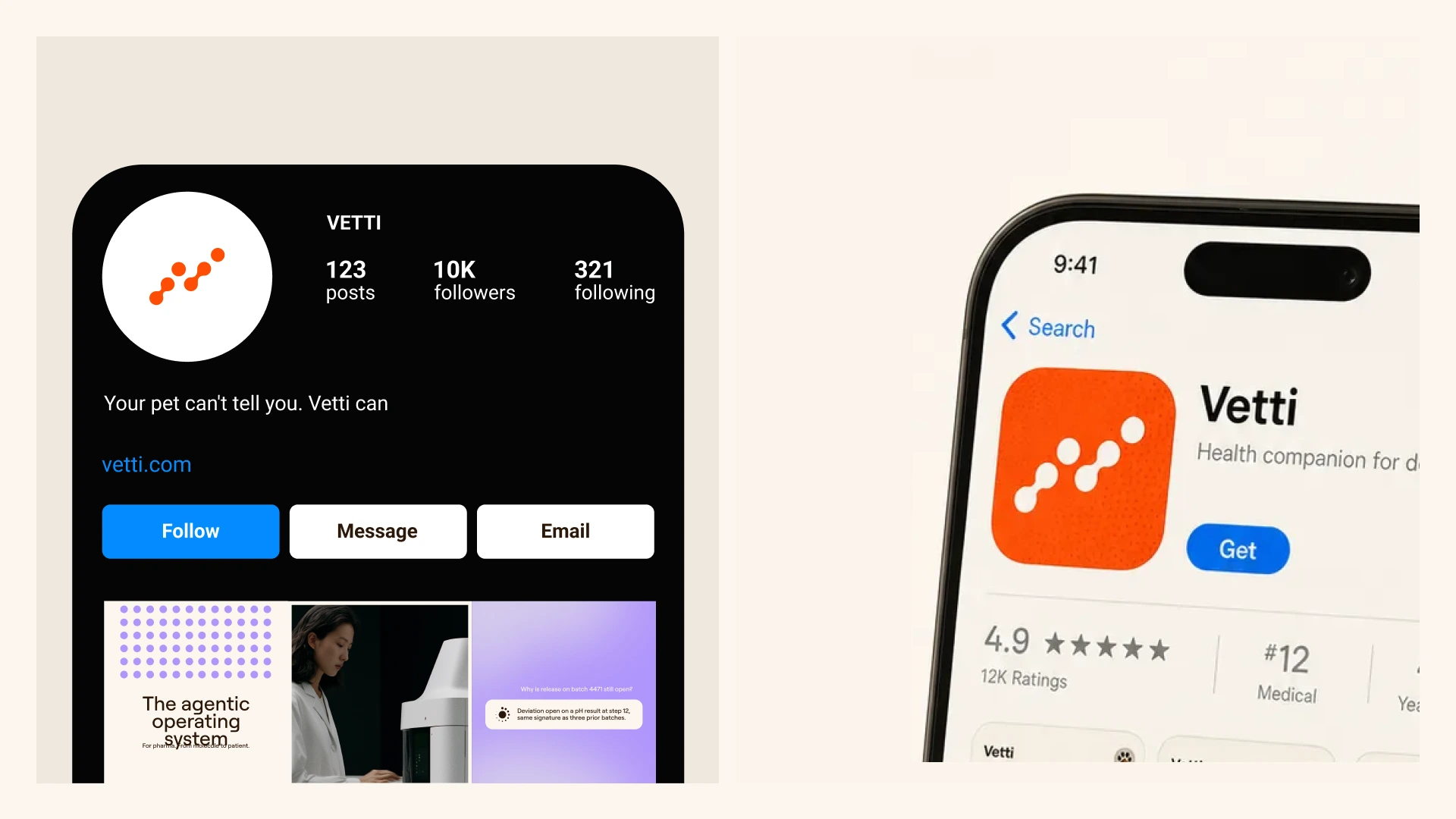
The mark is six nodes on an ascending diagonal: two blended pairs and two solo nodes reading pair-solo-pair-solo from bottom-left to top-right, each node larger than the last. I called it the Trail — the pattern made visible, the small signals followed in order that become knowing. It climbs bottom-left to top-right, from data to direction, which is also Vetti's entire product promise compressed into a single form. The blended pairs were the detail that took the most iteration — early generation attempts treated the mark as dots connected by lines rather than one continuous organic shape per pair, which killed the sophistication entirely. The construction logic took several rounds to communicate precisely enough to hold.
WORDMARK
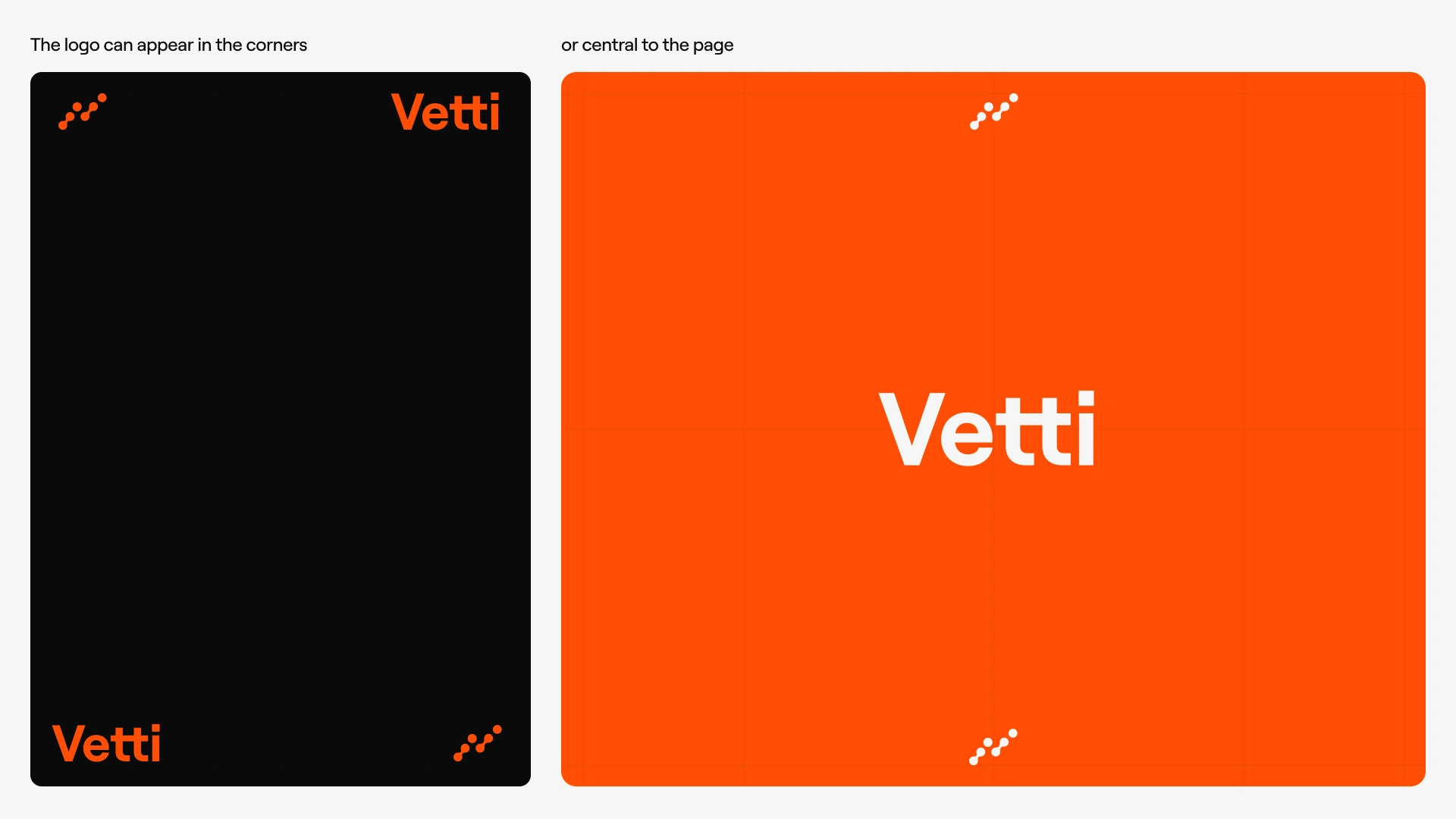
Vetti in Roobert Bold. The double-T stems are the wordmark's fastest-recognized detail and I treated them as such — never respaced, never reweighted, the ligature potential of those two stems was the naming strategy's own gift to the identity. Roobert carries the entire typographic system: Bold for headlines, display, state labels, and data numbers; Regular for body, captions, and annotation. One typeface, no exceptions. If a layout needed a third weight to work, the layout was the problem.
COLOR SYSTEM
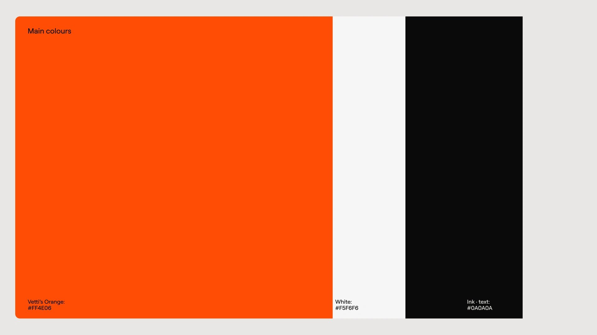
Three primaries: Orange
#FF4E06 as the brand's dominant energy — full-bleed grounds, campaign, OOH, social, never a data state inside the product. Near-black #0A0A0A as the primary dark ground. White #F5F6F6 as warm typography and light surface, never pure white which reads clinical. Supporting tones: #E9E7E5 (Linen) for card and stationery surfaces, #D94200 (Ember) for texture overlay. The data ring palette runs independently — Blaze, Harvest, Slate, Field, Coral — and never shares a surface with brand orange, which is the rule that keeps orange meaning exactly one thing.ORANGE SURFACE TEXTURE
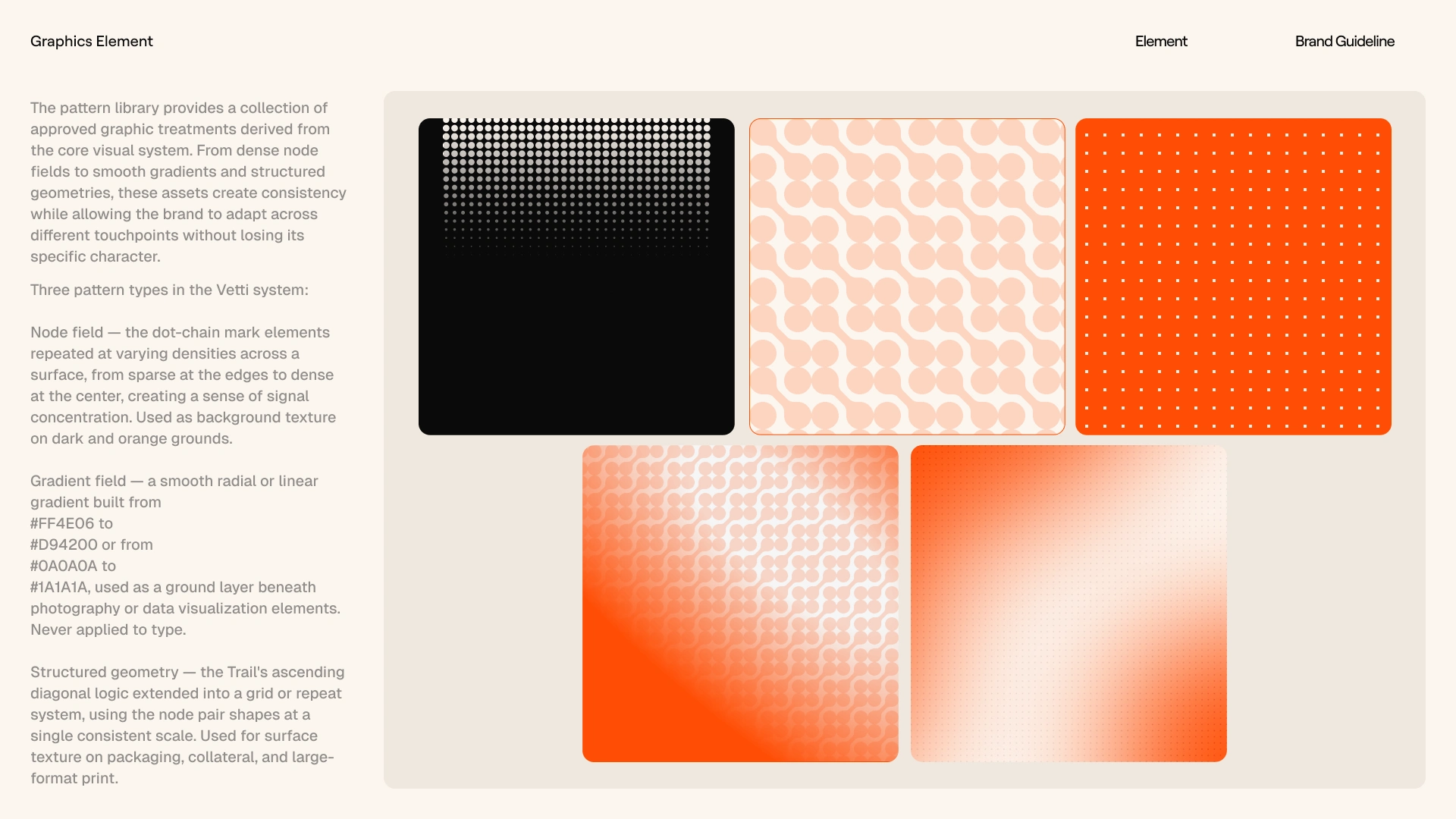
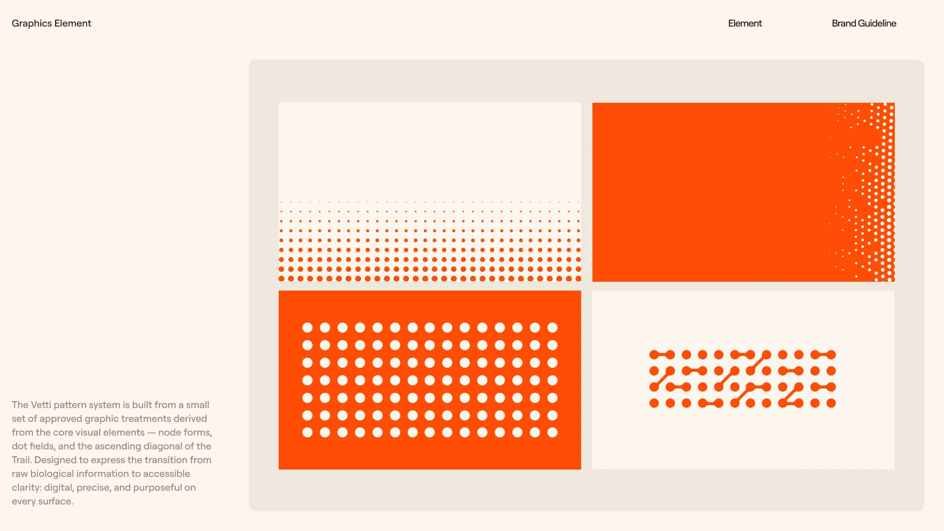
Flat orange at scale reads plastic. Every
#FF4E06 surface carries either a dot halftone grid at 8–12% opacity in #D94200, or the Trail mark repeated at 10–14px in the same tone at 6–10% opacity on a diagonal axis that mirrors the mark's own ascent. No plain orange surfaces exist in the system.PHOTOGRAPHY SYSTEM
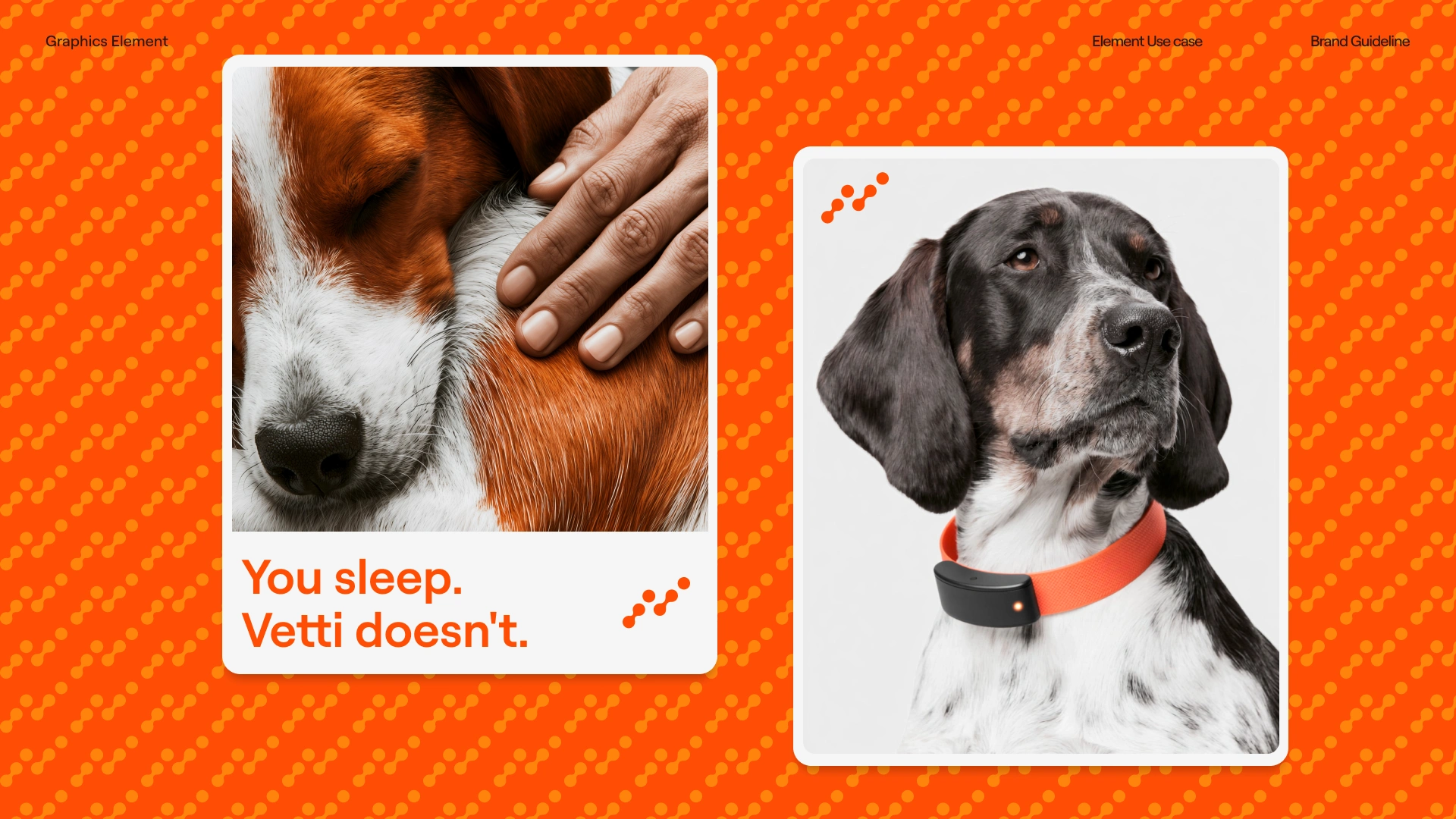
Two approved moods, equally weighted. Dark-ground: cinematic,
#0A0A0A backgrounds, #FF4E06 appearing only as a natural environmental element — a door, a wall, a collar. High contrast, 35mm grain, a single hard light source. Light-ground: warm and intimate, grounds pulling toward #F5F6F6 and #E9E7E5, window light, morning light, the dog at rest with its owner. Both moods share the same rule: the dog is always caught, never posed, and the technology is never the visual subject.BRAND GUIDELINES
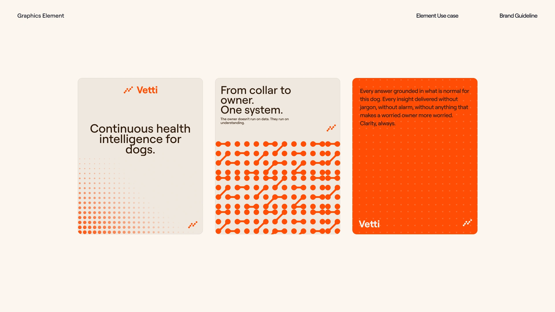
The final deliverable is a comprehensive Figma guidelines document built to the standard of Bright Studios' own reference: section-by-section, fully designed, covering brand foundation, tone of voice, logo system, color system, typography, photography, data visualization, design elements, applications, and governance. Every section carries both the rule and the reason for it.
THE RESULT
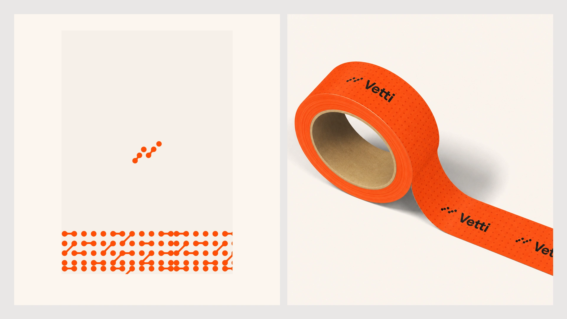
The project is in its final delivery phase. What I can say about the work so far: it's the identity that most clearly survives the brief's own hardest test. It feels like something you would hand a life to. The photography is warm. The data layer is precise. The orange is loud in exactly the right moments and absent in exactly the right others. Daniel Bright and Bright Studios shaped the strategic foundation that made the execution possible — without a brief that clear, the identity wouldn't have found its footing as fast as it did.
Révolté — revolte.design
Directed by: Bright Studios / Daniel Bright
Project: Vetti Brand Identity
Year: 2026
Scope: Brand Identity, Logo System, Typography, Color System, Photography Direction, Data Visualization, Brand Guidelines
Industry: Pet Health Technology
See more at revolte.design
Like this project
Posted Sep 10, 2026
Brand identity for Vetti — a bold, precise health companion for dogs built between warmth and data, emotion and technology
Likes
15
Views
160
Timeline
Jul 1, 2026 - Aug 3, 2026
Clients
BrightStudios®

