Little Fen Brand Identity and Illustration System

Révolté


Little Fen: A Club Where Everything Looks Back
PROJECT
Little Fen is a wetland nature club for kids. Children go out to the reeds, the ponds and the mud to find newts, dragonflies and everything else that lives in a fen. The club treats them as field naturalists rather than customers, and I wanted the identity to do the same.
The category has a problem. Nature brands for children sit at one of two extremes: pastel cartoons that talk down, or museum-grade illustration that talks over. I wanted a third position. Bold, flat, a little wry, and honest about the mud.
The brief I set myself had three parts. It had to read from across a road. It had to feel trustworthy to a parent within seconds. And it had to give a seven-year-old something to point at. I took the complete system: logo, illustration, color, typography, print, packaging and web.
PROCESS
Starting point. I began with plants. I collected flat botanical posters, hard-edged silhouettes, one saturated green against cream, posters pasted into real foliage with dappled shadow. The look was right but the idea was wrong. Plants say garden centre. Children want something that moves.
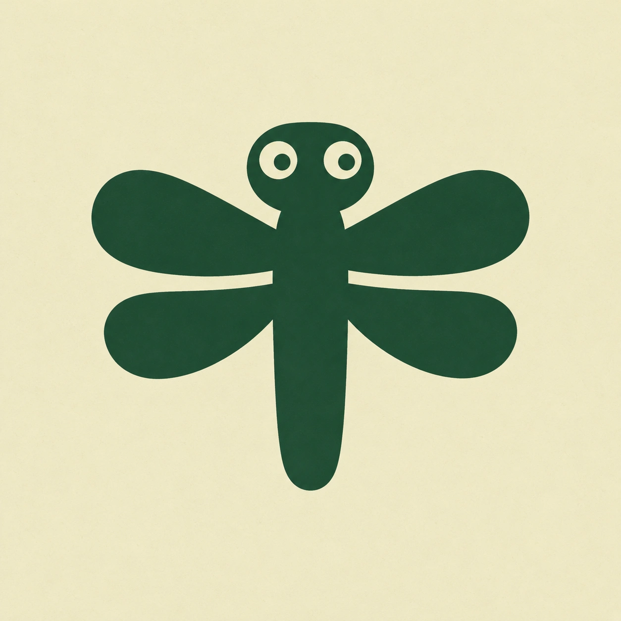
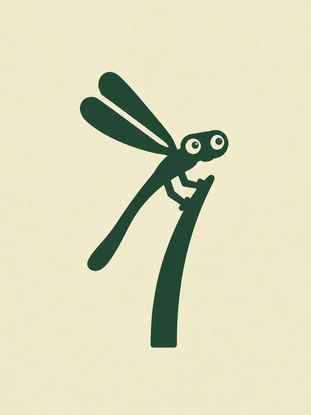
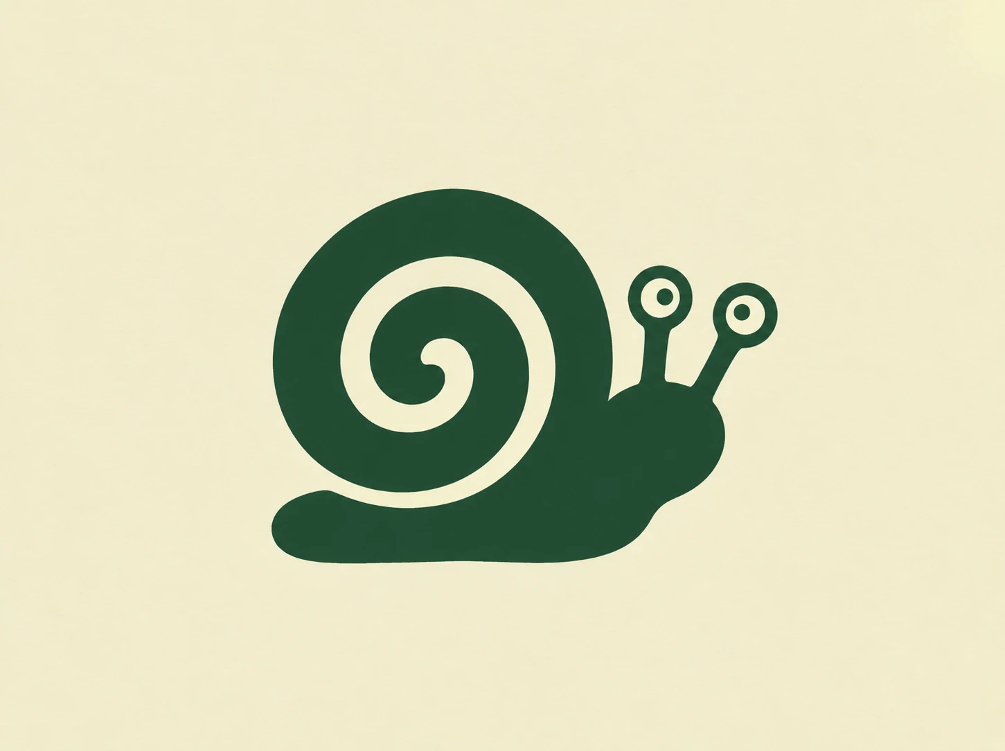
The rule. I switched to a cast of characters and wrote one rule I would not break: thick solid silhouettes, stubby stepped feet, two cream circle eyes with a smaller green pupil. No outlines, no gradients, no gloss. Details are only ever thin cream gaps cut out of the shape.
I enforced it hard. A damselfly that arrived with stick legs and glossy highlights in its eyes got rejected, because it looked clever and belonged to a different brand. Thin and shiny went out, thick and flat stayed.
Logo exploration. I wrote five creature-led concepts:
The Newt Line: a newt from above, one S-curved body
The Reed Face: three capsule reeds, two of them with eyes
The Dragonfly Cut: a symmetrical dragonfly with wing gaps
The Frog Between the Letters: a frog head replacing the dot of the i
The Fen Family: the whole cast packed into a rounded tile
I chose the newt. It reads at once, it carries the S-curve of a stream, and its two eyes are the brand’s signature in the smallest possible space. The frog-in-the-i failed at small sizes. The family tile works as a seal but is too dense to carry the name.
Color. My first palette had a lime accent and a coral stamp colour. I cut both. The final system has three colors, and the discipline is the point.
SYSTEM
Logo. The newt is one continuous capsule body with a tapered tail, four stepped paddle feet and eyes set forward, paired with a stacked wordmark in a heavy rounded grotesque, sentence case, tight tracking. There is a cream-on-teal reversal for cards and dark formats. A snake in cream on near-black acts as a secondary mark for darker, quieter applications.
Color system.
Reed Cream
#F1EBD0: the surface, about 60 percent of any layoutFen Green
#1F4530: creatures, headlines, textPond Teal
#29665B: reversals, water, darker formatsTypography. Headlines are set in a heavy rounded grotesque with tight tracking. Body copy is a friendly humanist sans. Latin names, plate numbers and labels are in a small spaced mono, so the club sounds like a field guide that has been left out in the rain.
Illustration system. Five sets, one shared rule:
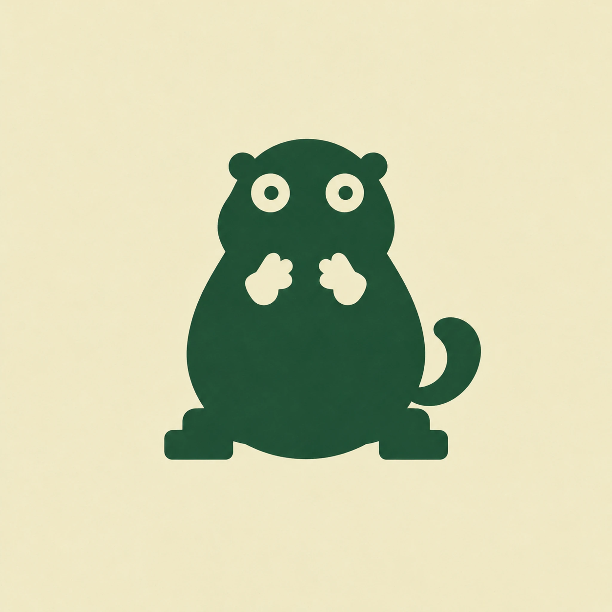
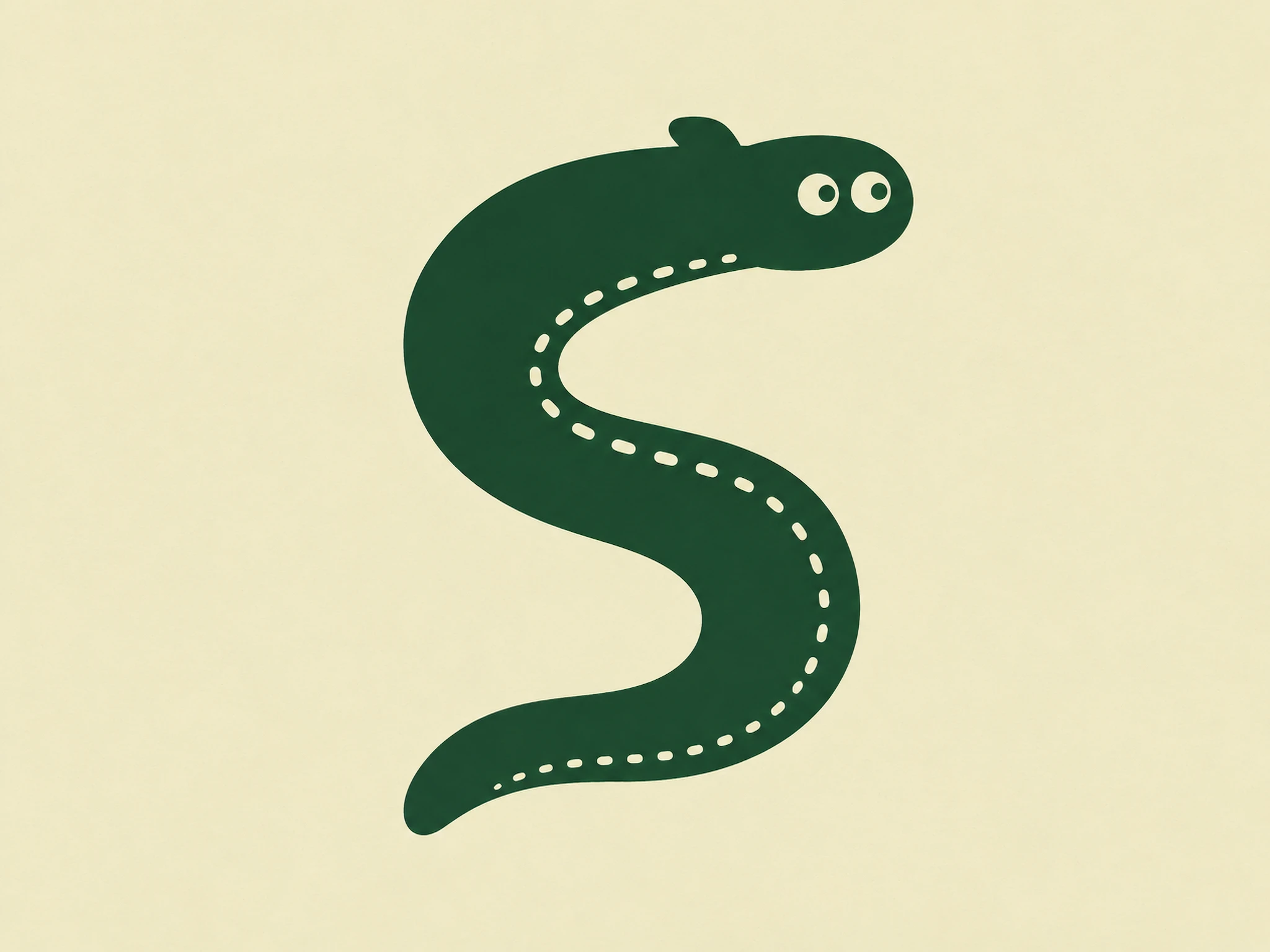
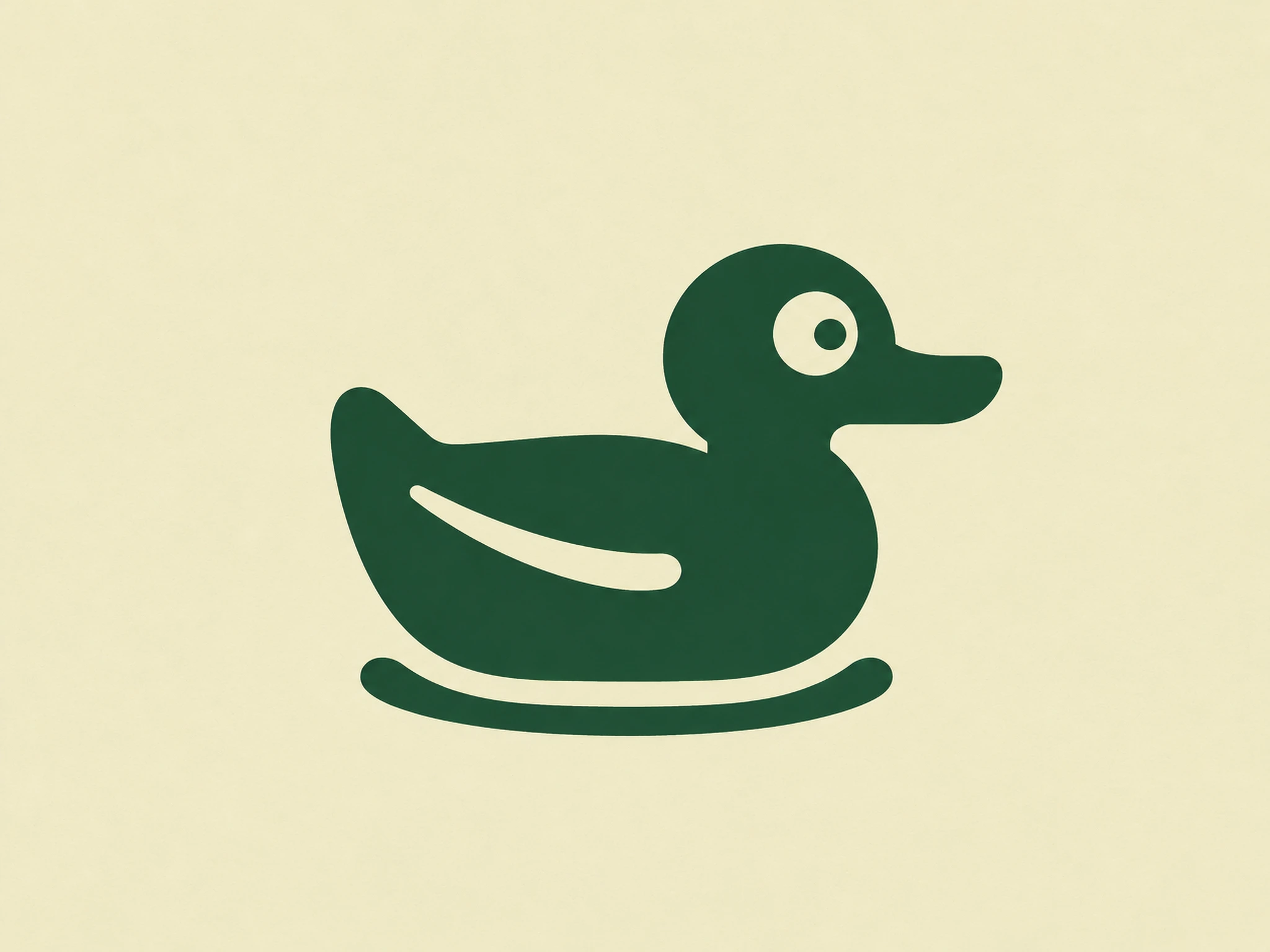
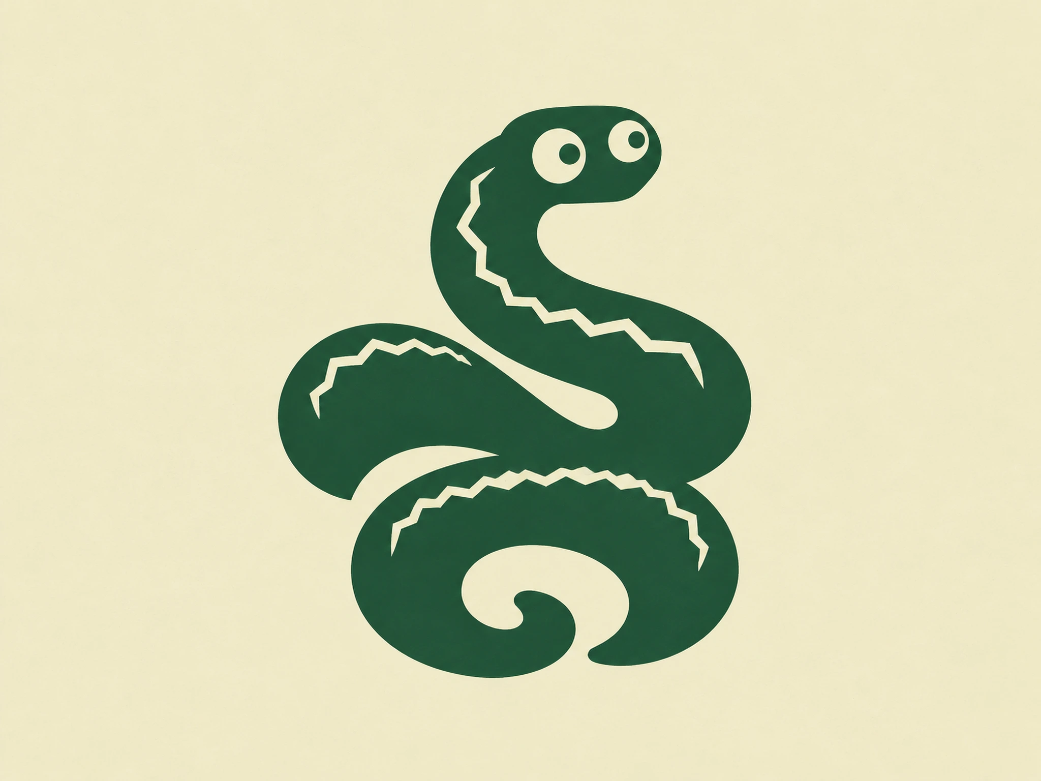
The Fen Cast: newt, frog, dragonfly, damselfly, water snail, heron, vole, grass snake, mallard, eel
Fen Plants: reeds, bulrush, lily, iris, moss
Pond Life: tadpoles, beetles, mayflies and other tiny creatures
The Field Kit: nets, boots, jars, notebooks, each with a tiny pair of eyes
Places and Weather: wide scenes for backgrounds and hoardings
APPLICATIONS
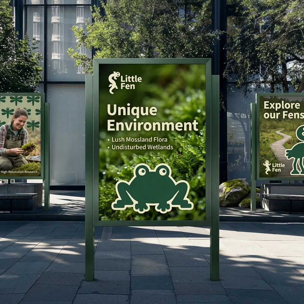
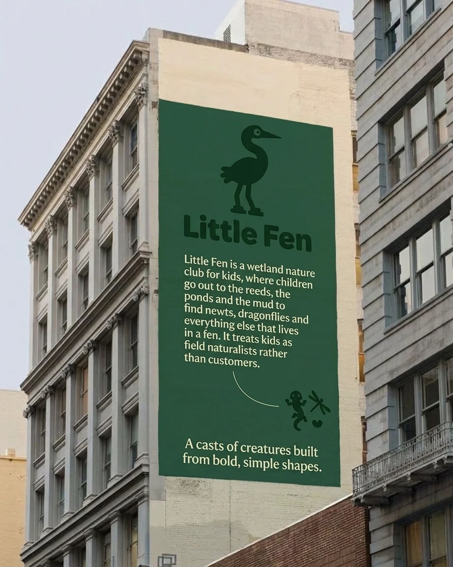
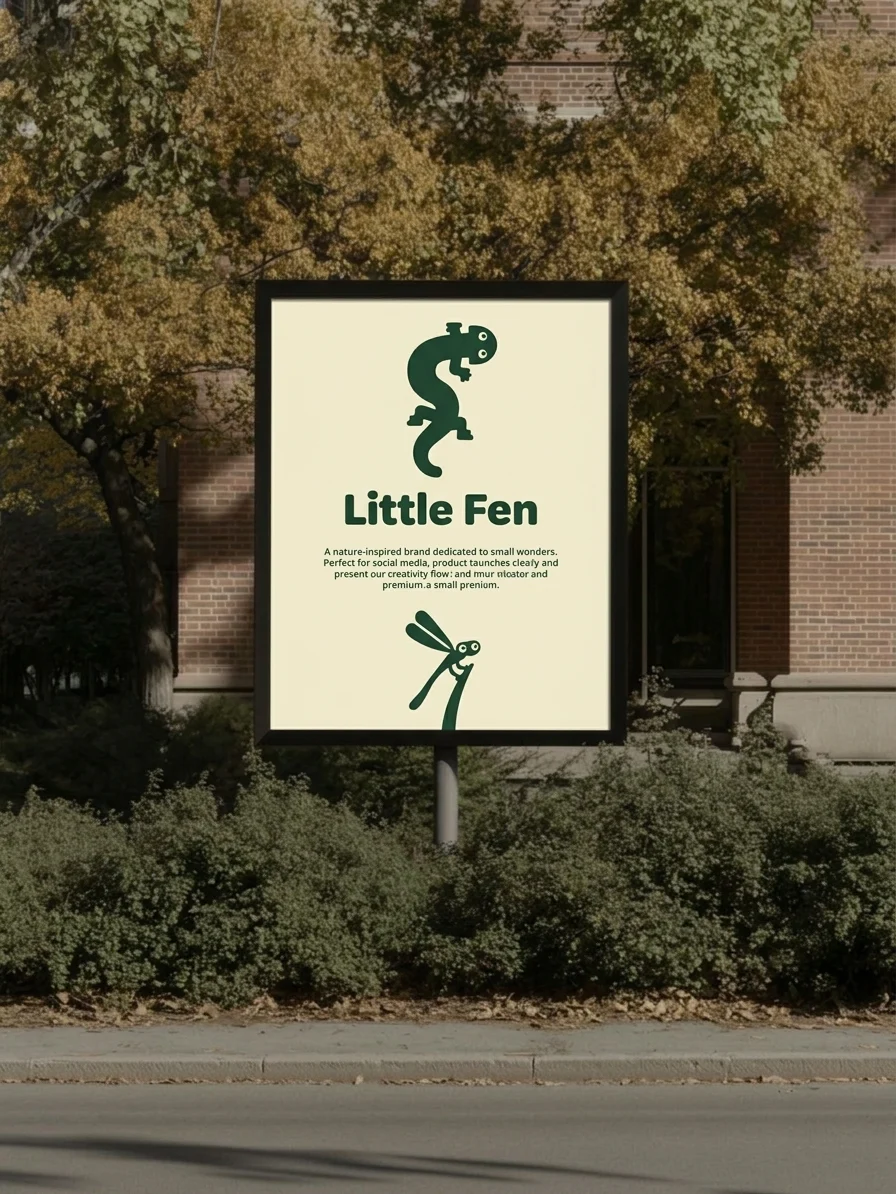
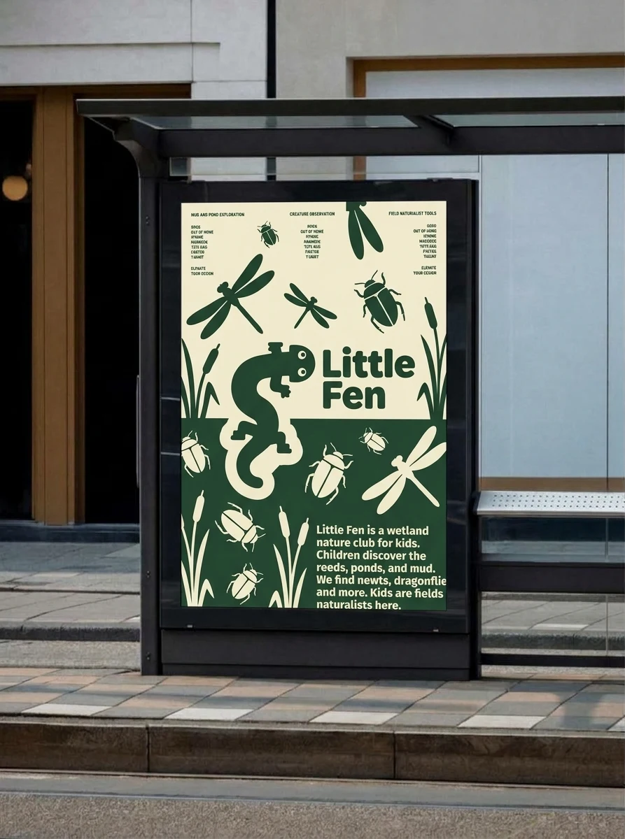
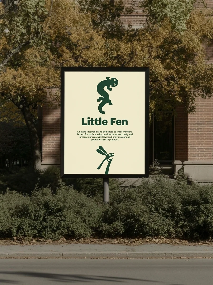
Posters and outdoor. A bus shelter poster splits cream above green, with the newt crossing the line and beetles and dragonflies scattered below. A building mural keeps the message to a heron, a logo and a short paragraph. A third poster lays the flat creature over real macro moss, which tests the system against a busy photographic background.
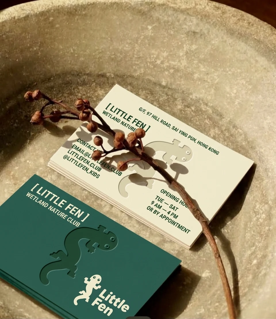
Print. Double-sided business cards in cream and teal, with the newt debossed into the stock and a mono contact block.
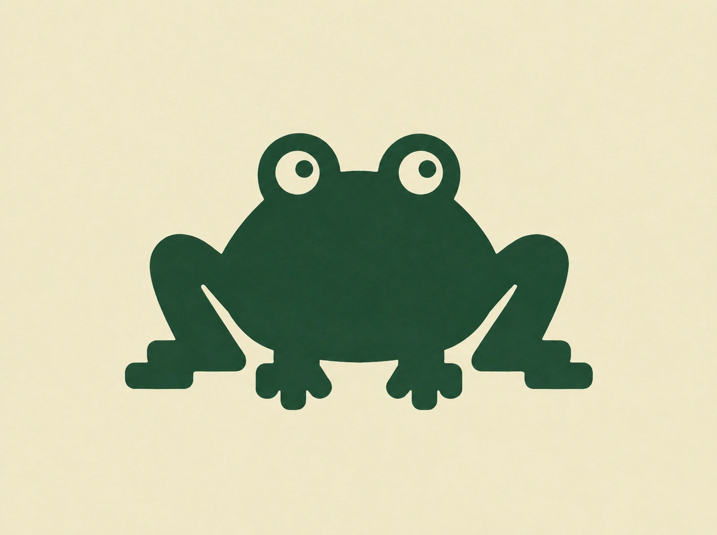
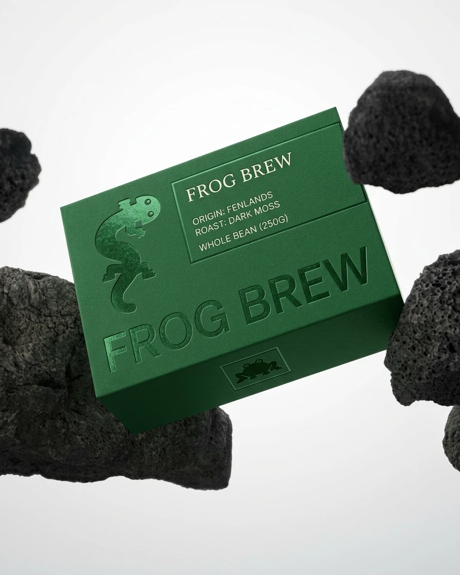
Packaging. Frog Brew, a coffee box in Fen Green with a foil-embossed newt, a mono spec panel (Origin: Fenlands, Roast: Dark Moss, Whole Bean 250g) and a frog stamp on the end panel. It proves the identity can leave the kids’ world and still feel like itself.
Web. The site is a field guide. The hero line is “Boots required.” Below it, the cast sits in numbered plates with common name, Latin name and one field note each, like “Plop. That was the vole.” and “Harmless. Dramatic.” The navigation runs through The Cast, Look Closer, Pack Your Kit and Four Seasons, and a small player (muted by default, playing Where the Heron Nests) sets the mood. The creatures’ eyes follow your cursor.



OUTCOME
One rule produced a family. The newt on a business card, the heron on a mural and the frog on a coffee box all feel related because they share the same eyes, the same thick shapes and the same three colors.
I never needed a mascot. The whole cast is the mascot. What I like most is how little the system asks for: no gradients to match, no photography to source, no accent colors to balance. A new creature is a thick shape, two circles and a rule.
CREDITS
Studio: Révolté, revolte.design
Project: Little Fen
Year: 2026
Scope: Brand Identity, Illustration System, Web Design, Print, Packaging
Industry: Nature education for kids
Like this project
Posted Oct 27, 2026
A wetland nature club for kids, with a cast of thick green creatures that stare back. One newt, three colors, zero cutesy
Likes
1
Views
12
Timeline
Oct 15, 2026 - Oct 27, 2026