Wild Card Tattoo Club Branding and Identity

Révolté


WILD CARD TATTOO CLUB: Permanence as a Bet
LOGLINE
A tattoo club that sells the one purchase nobody can return. I gave it a skeleton jester on one toe and a single rule: the figure stays whole, everything else gets cropped.
THE BRIEF
Wild card is a Boston tattoo club, open since 1998, with hand-drawn flash, custom work, redeals for the ones you regret, and a walk-in day where you draw a card and wear whatever it says. Nobody commissioned the brand. I started with an engraved skeleton jester balanced on a rock tip, reaching up, and had to decide which business would hang that on its door.
The audience is adults between 20 and 40 who collect art, read tarot, buy prints and skate decks, and have already seen every version of tattoo branding. Most of it lands in one of two places: a white clinic with a thin sans, or a skull and a flame. They distrust both.
The problem was narrower than that. A tattoo outlives the mood and the taste of the person who chose it. I needed a brand that could say that out loud, with a straight face and a grin, without turning precious or morbid.
WHAT I DID
My scope: naming, identity, typography and color system, copywriting, mockups, website direction and sound.
THE APPROACH
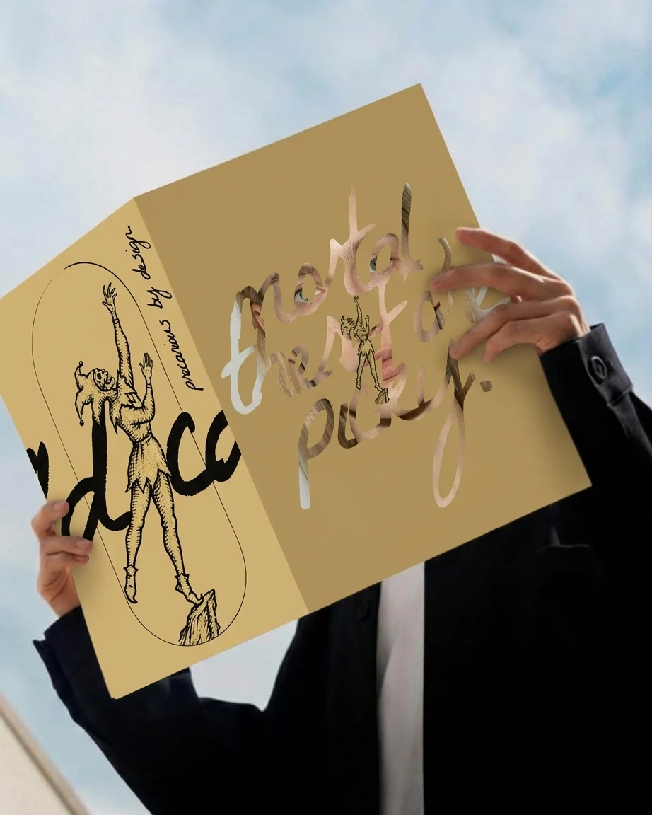
My first instinct was a personal brand. The jester looked like one person’s mark, and I wrote name and portfolio ideas around it. It was too strong for that. A figure with that much posture needs a business behind it.
So I weighed it against seven businesses: fashion, skate, jewelry, spirits, playing cards, a tattoo club and a members’ bar. Skate was tempting, because the capsule reads like a deck. Tattooing won because it is the only product that carries the memento mori literally. The others sell an object. This one sells a body.
The name came from a shortlist of thirty. Dead Serious, Borrowed Time and Card Zero came closest. Wild Card won because the joker and the service are the same idea: on flash days you draw a card and wear it.
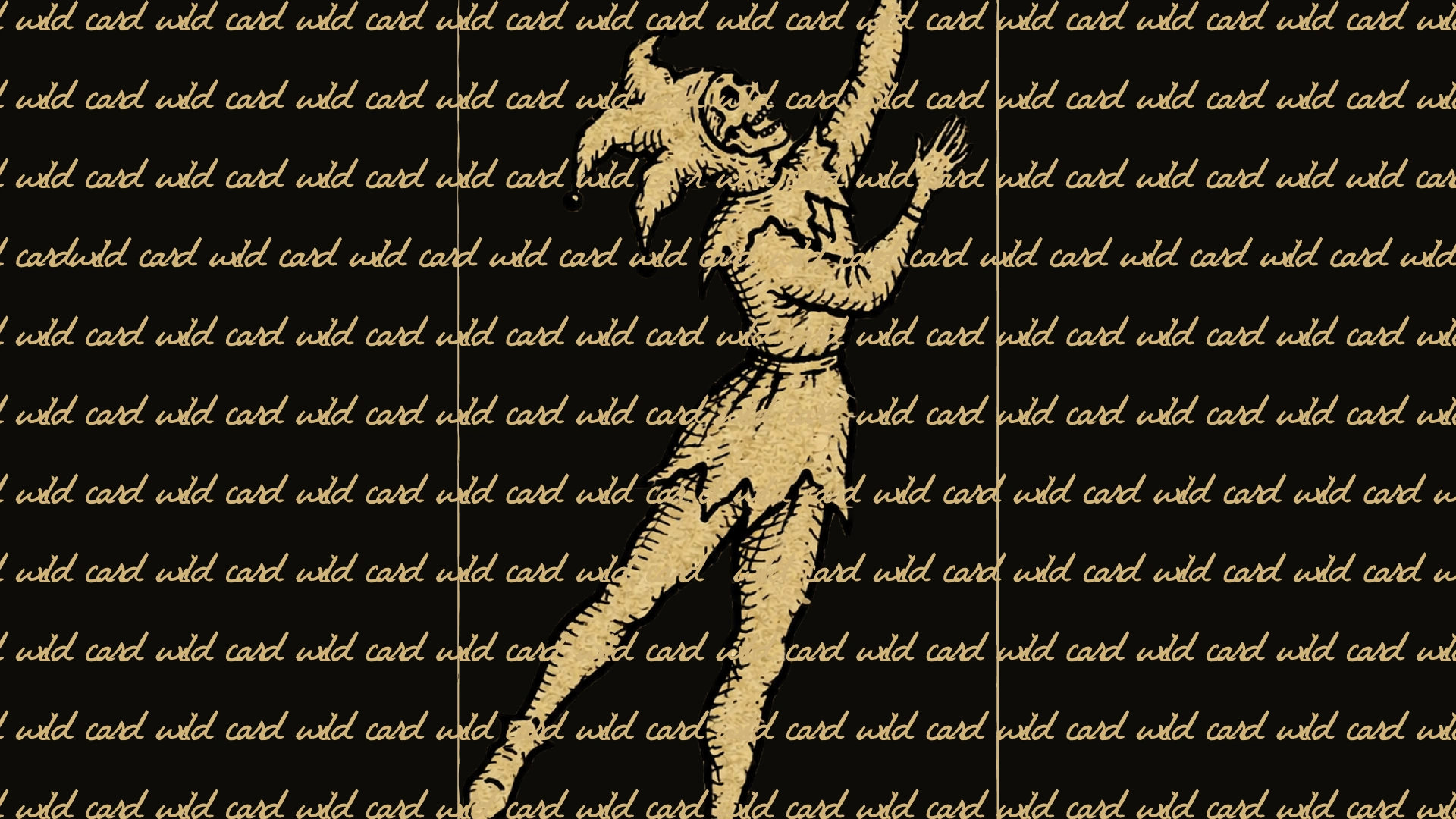
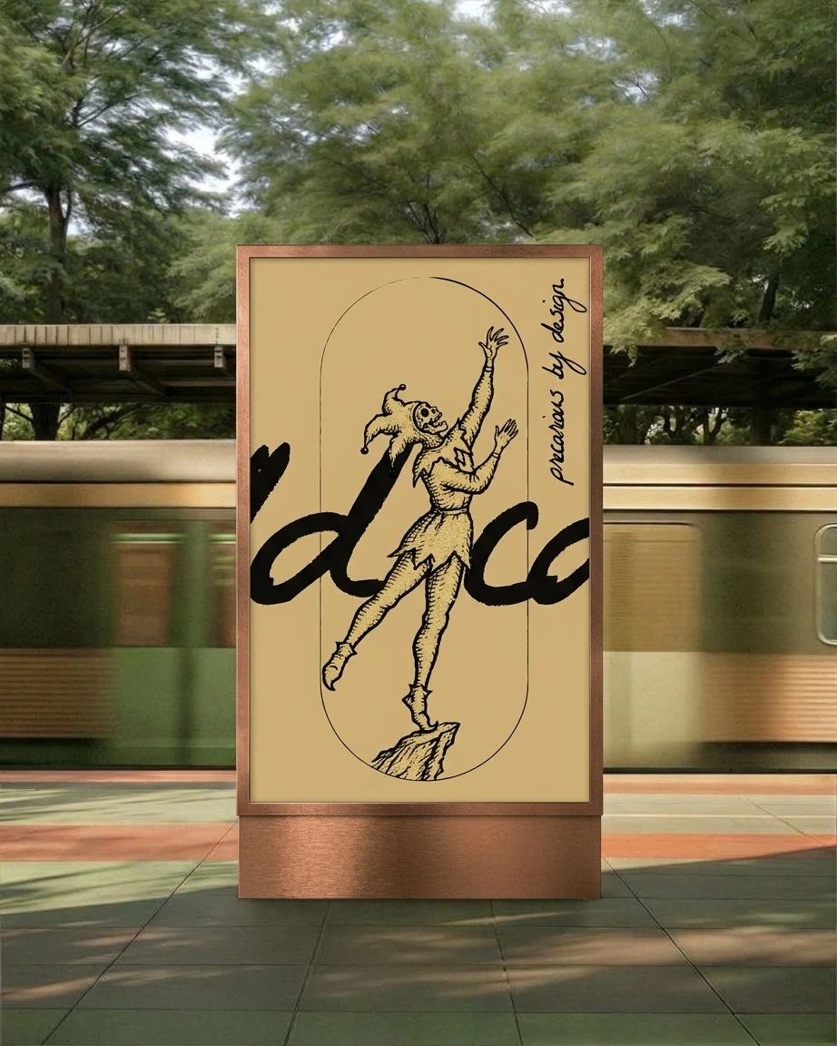
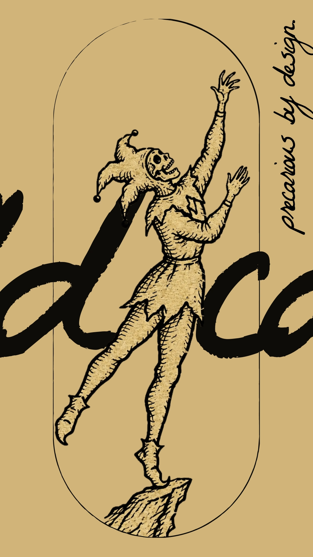
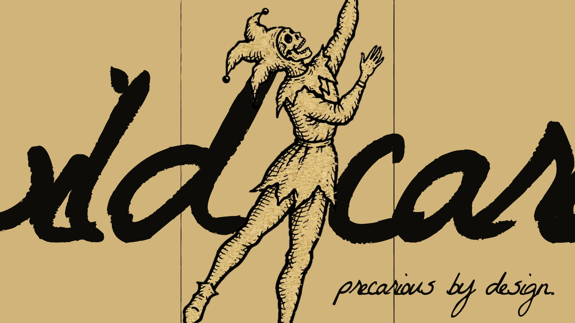
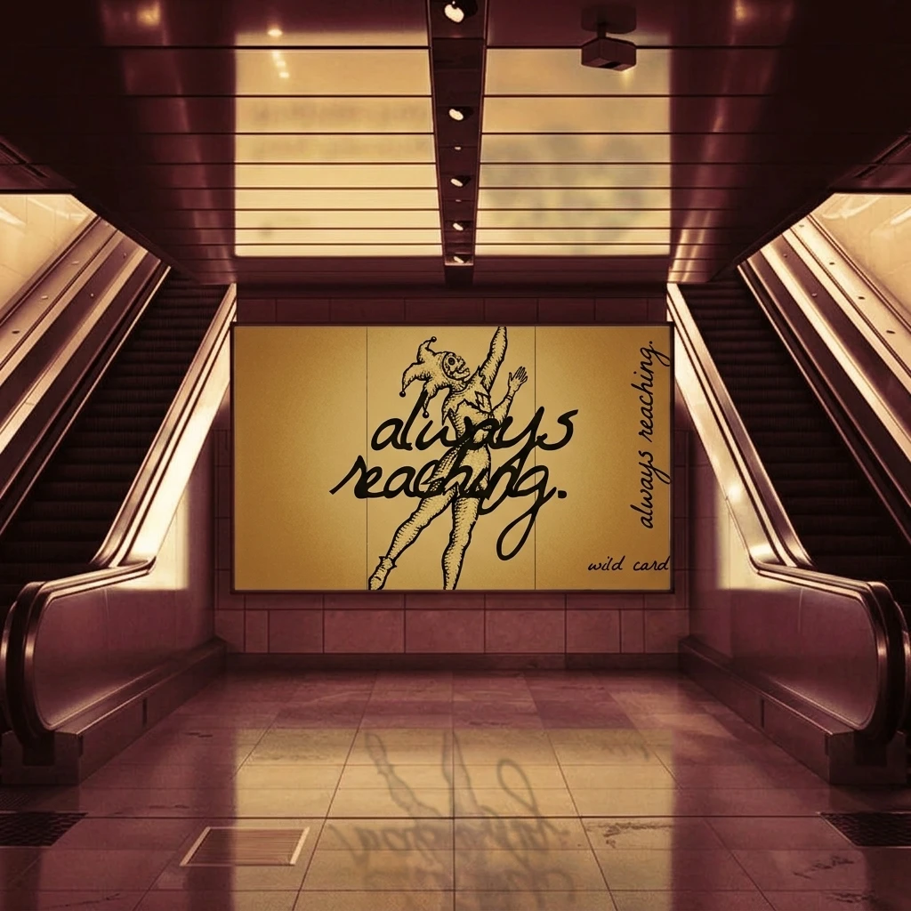
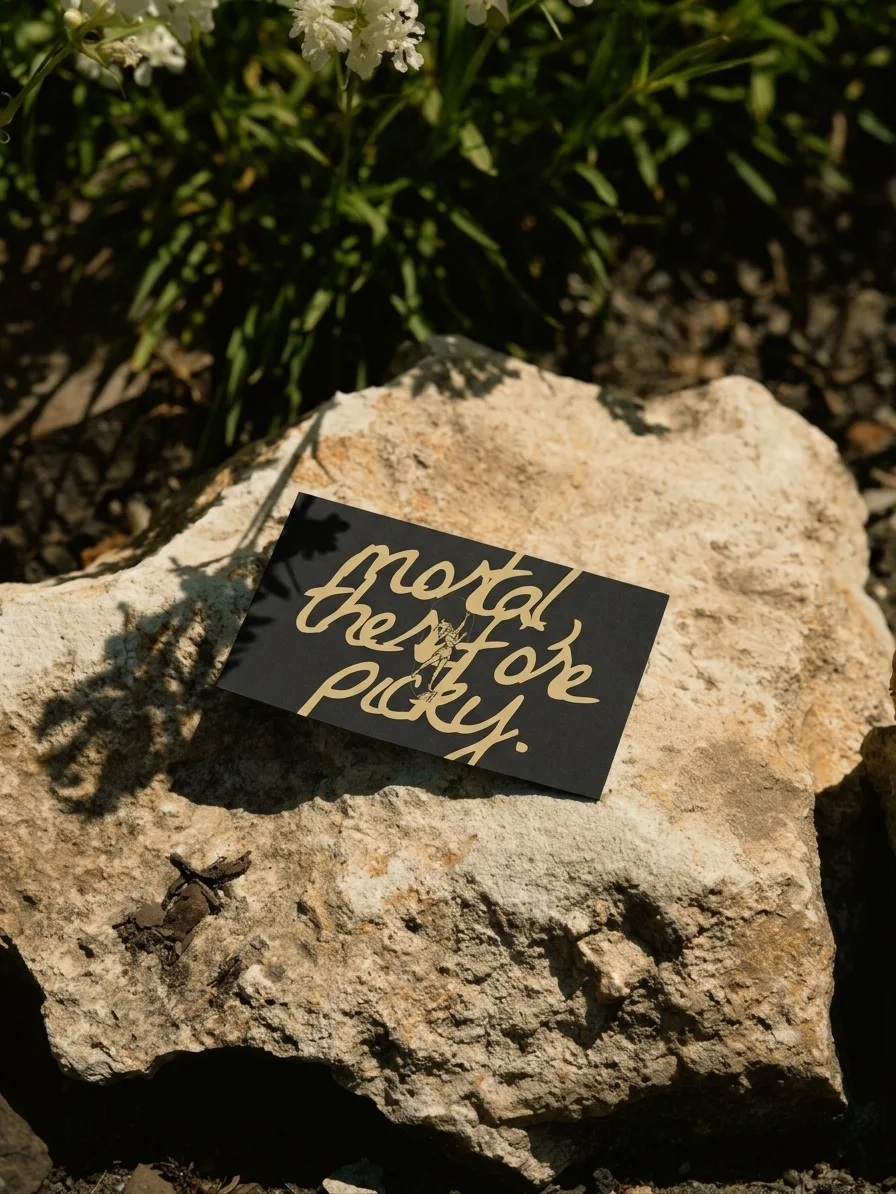
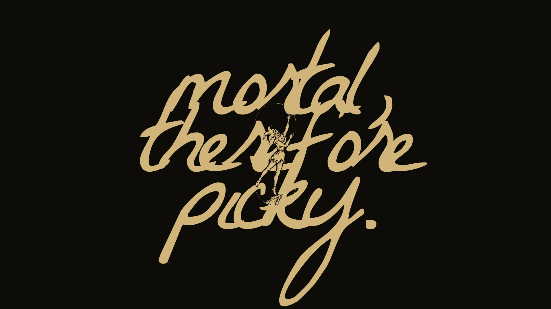
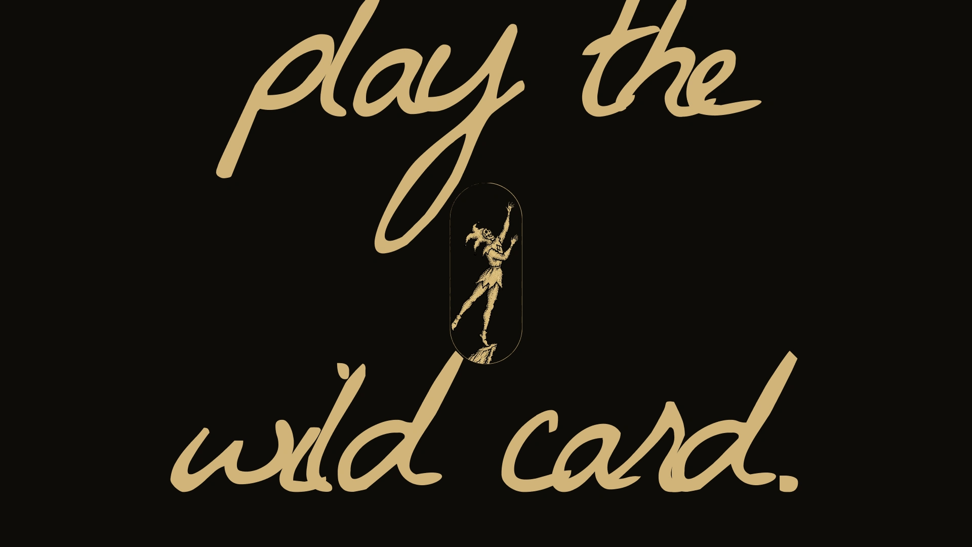
The unlock was cropping. Once “wild card” was cut to “ld car” and the jester stood crisp in front of it, the system had its rule. The script is the entropy and the engraving is the order. Type may bleed off the frame. The figure never does.
THE WORK
BRAND IDENTITY / VISUAL SYSTEM
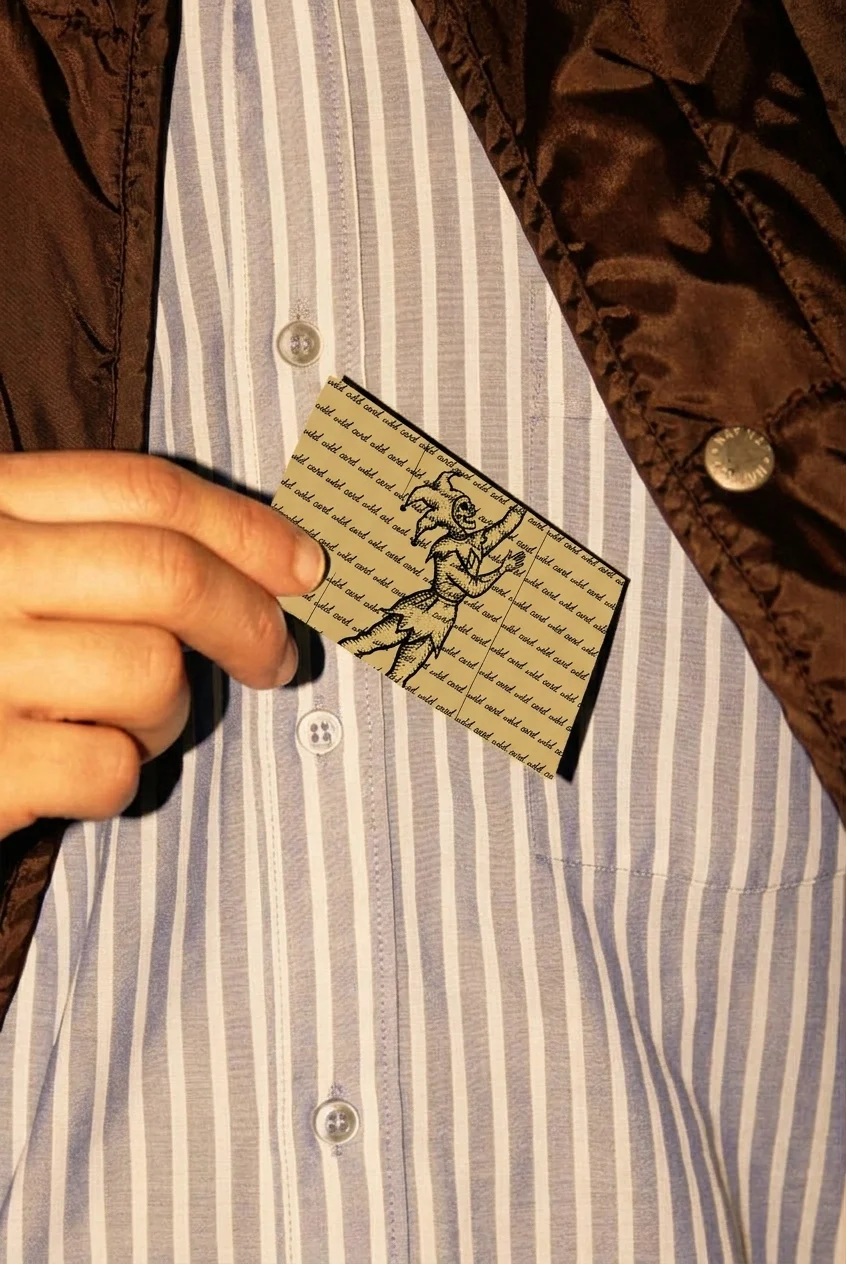
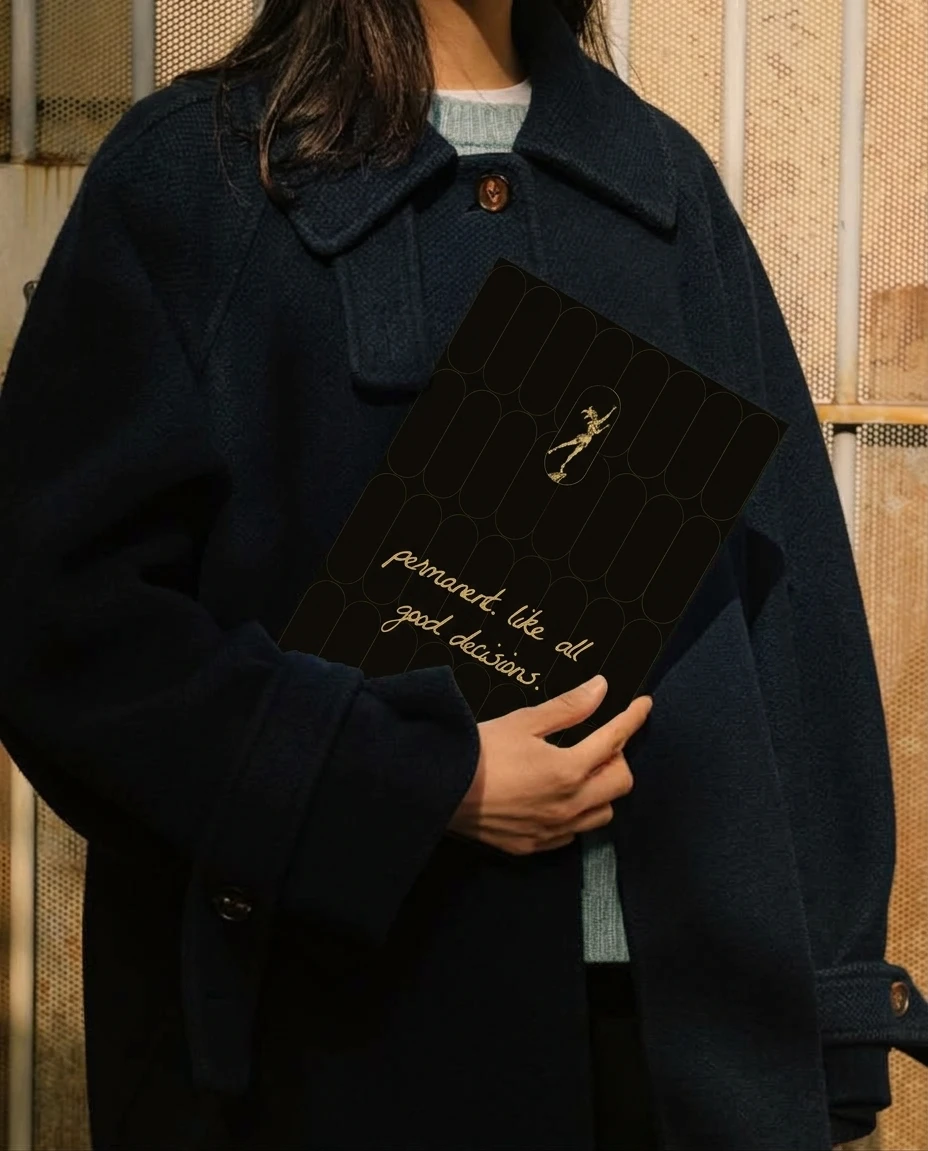
Four devices carry it. Giant handwriting cropped by the frame. Two vertical hairlines at 31.5% and 68.5% of the width that act as card edges. A capsule used as a window, as a faint tiled pattern and as the shape of the lightbox. An arch for the quiet scenes, with a small oxblood asterisk as punctuation.
LOGO
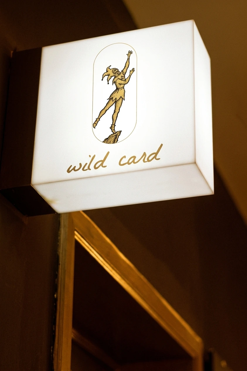
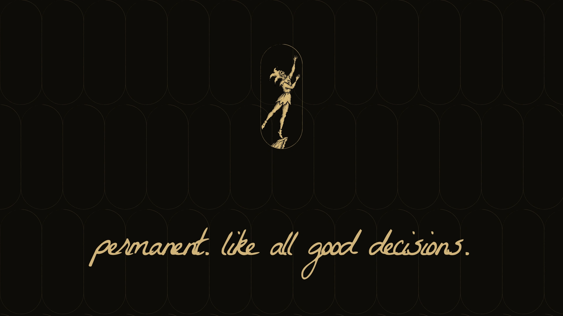
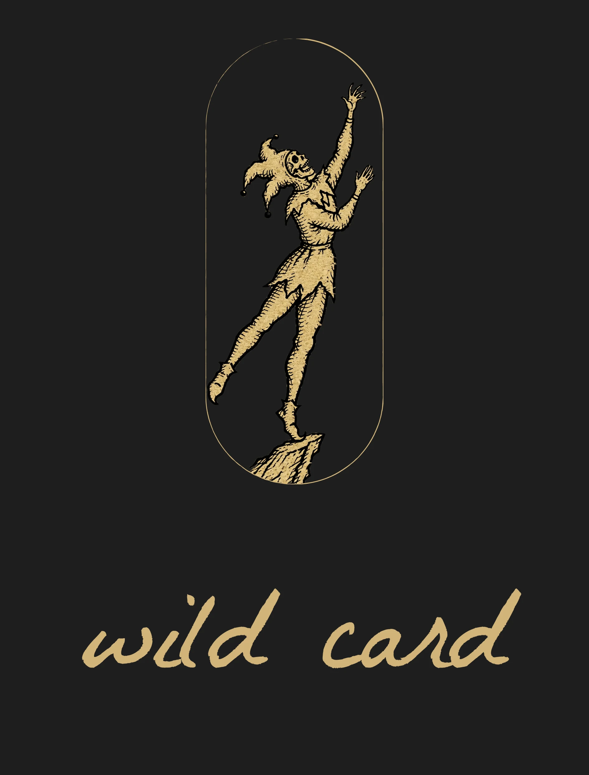
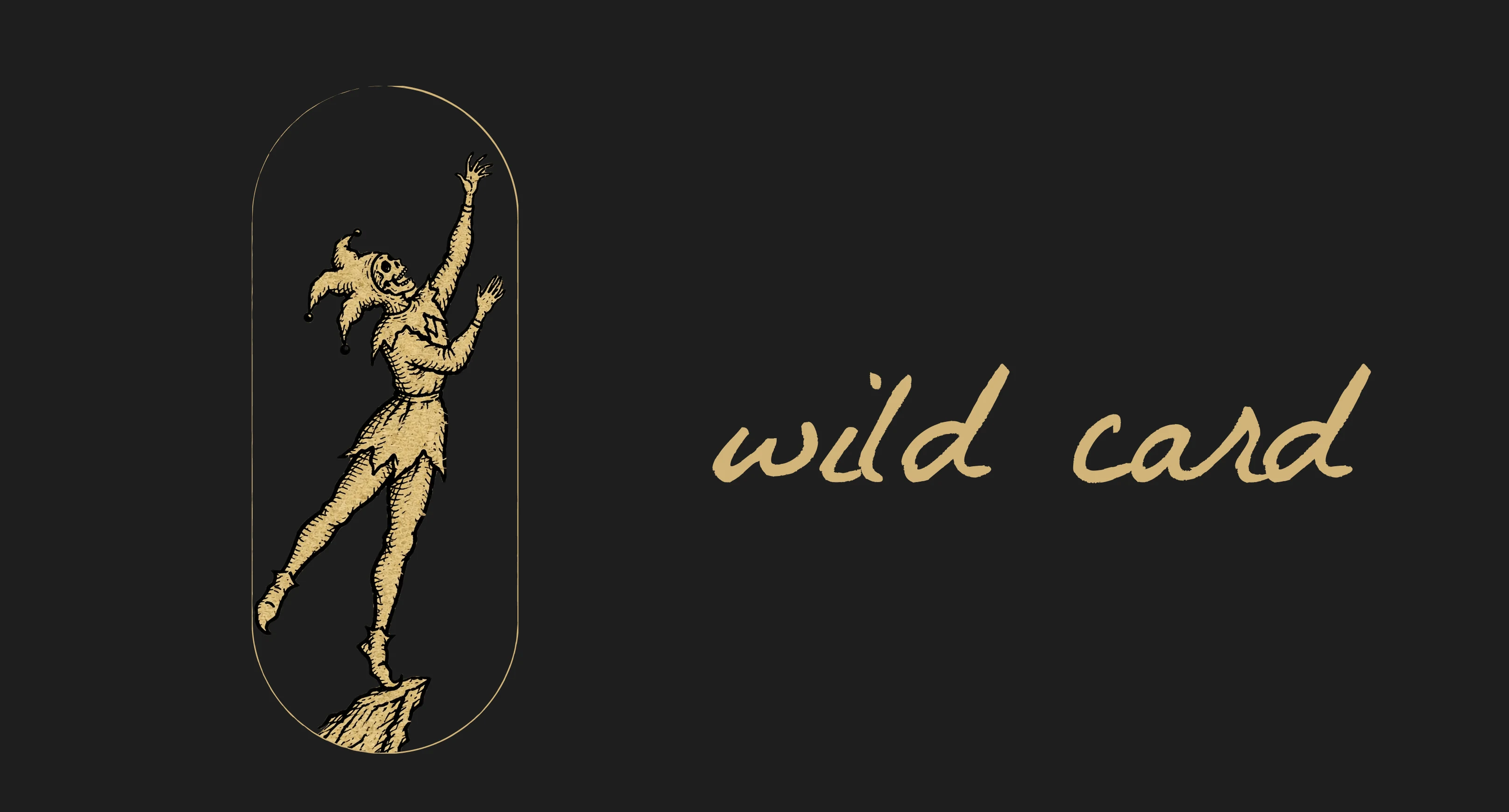
A hairline capsule at roughly 1:2.7, a long card shape, with the jester inside whole and the rock touching the bottom edge. Gold fill with black linework on Ink Black or Chalk, plus one-color versions for stamps and foil.
TYPOGRAPHY SYSTEM
La Belle Aurora, a single-weight handwritten script, always lowercase, used large where its ink edges show. Navigation, prices and captions run in a small uppercase mono with wide tracking. A human hand beside a machine label repeats the tension of the script beside the engraving.
COLOR SYSTEM
Ink Black
#0D0B07 is the room. My first black was #1C1C1C, but the slides read warmer, so I moved it. Gold Leaf #D1B47A is foil, never paint. Chalk #D8D6C8 is aged paper, and it replaced a warmer cream (#EDE4D0) from my first palette. Oxblood #5A1F1D is the rare accent: one phrase, one wordmark, a pair of asterisks. Everything exists in two modes, gold on ink for night and ink on gold or chalk for daylight.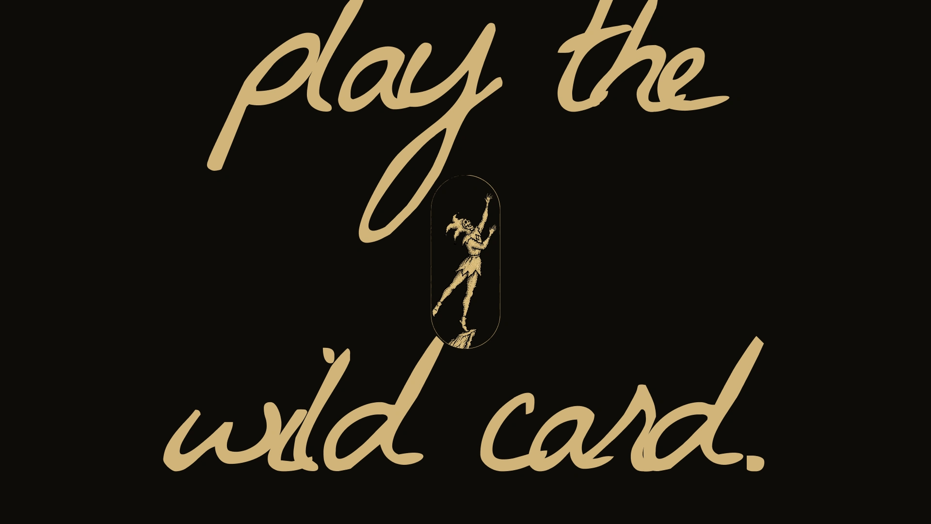
WEBSITE
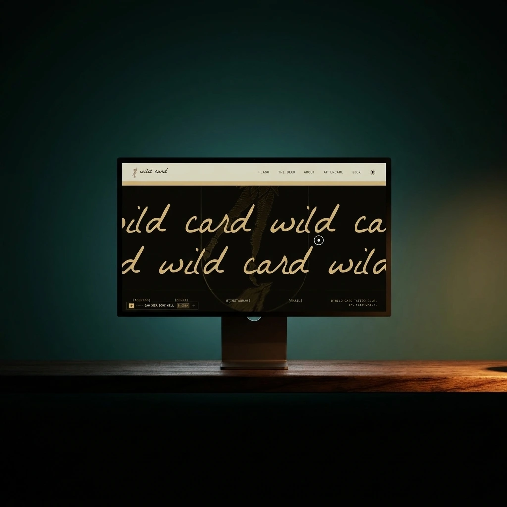
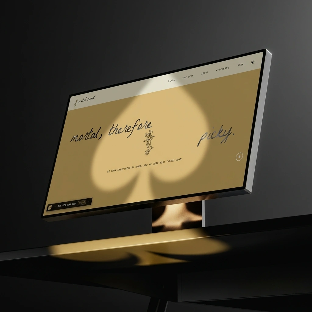
The site opens on a single enter screen, the jester flanked by a spade and a diamond. The hero is the cropped wordmark with the jester standing through it and “precarious by design.” in the margin. Navigation swaps words for suits: spades for flash, diamonds for the deck, clubs for about, hearts for aftercare, a star for book. Five flash cards hang on the wall, numbered card 00 to card 04: the joker, then one per suit, each drawn once and tattooed once. The pick a card section gives a preview draw and says plainly that the real one happens in person. Aftercare is the one section with no jokes.
PRINT / ENVIRONMENT
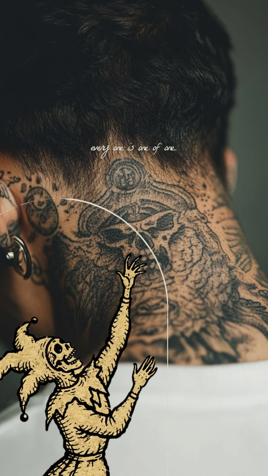
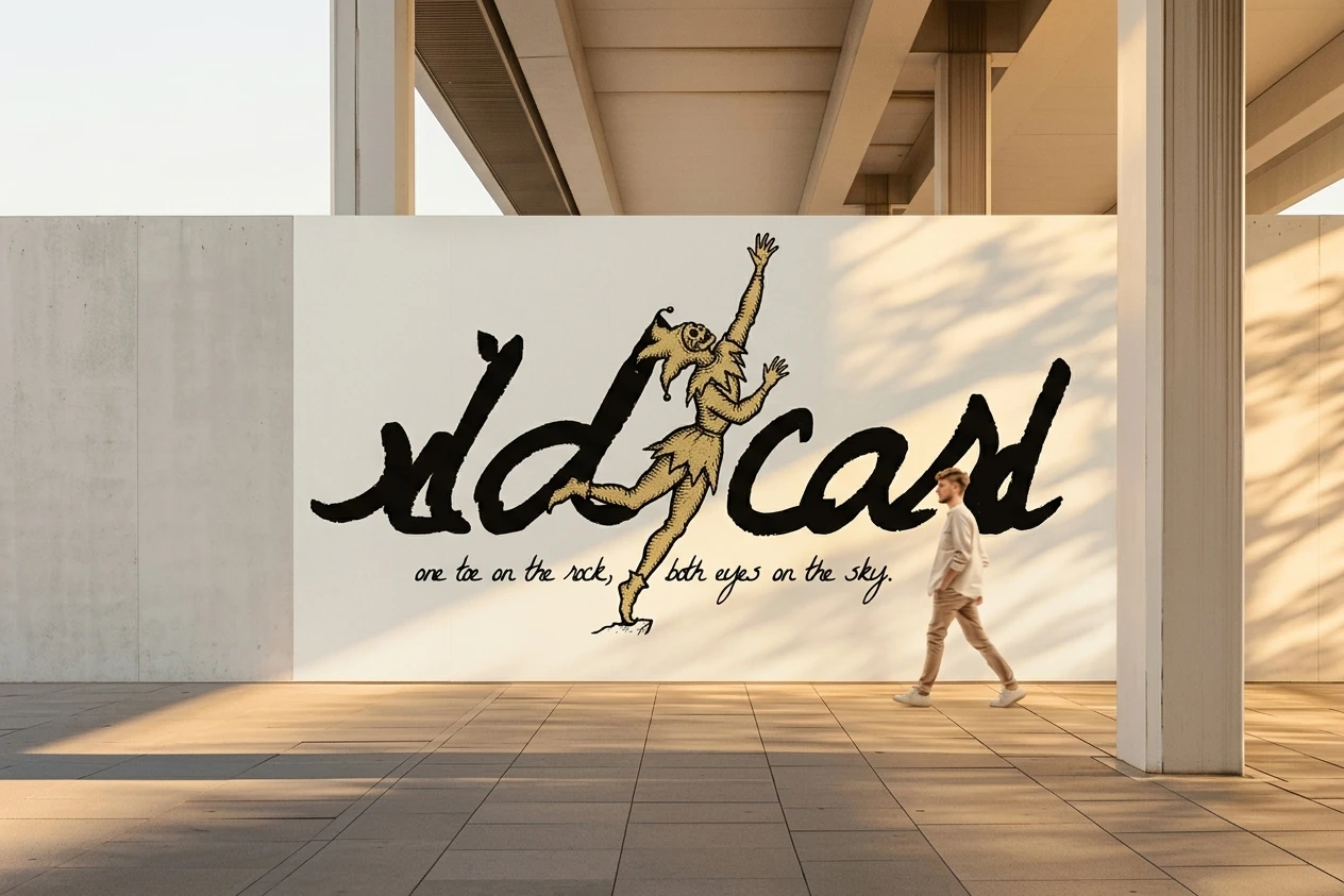
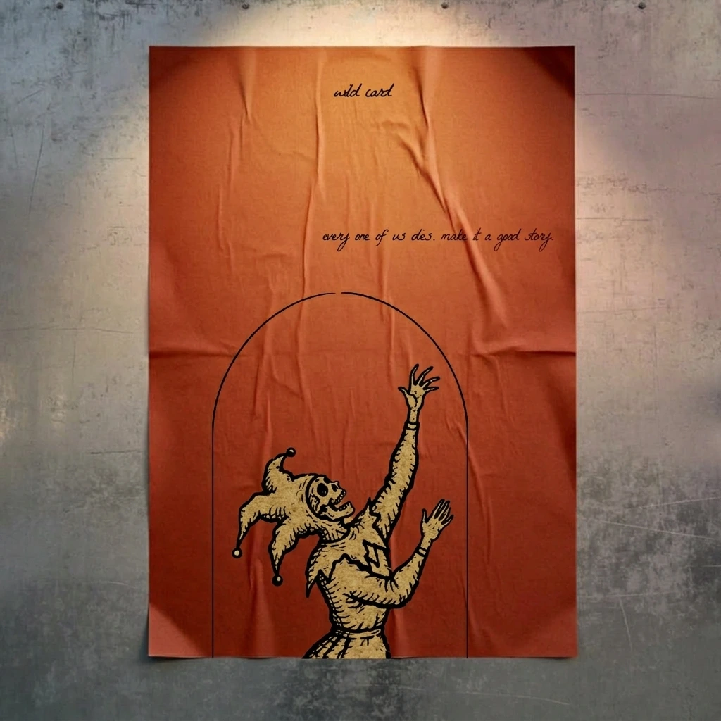
A gold-on-white lightbox over the door. A terracotta wheatpaste poster on concrete carrying “every one of us dies. make it a good story.” A pale wall mural with the jester stepping out of the cropped letters. A neck tattoo photograph with the jester climbing into frame. Two monitor mockups put the site under a spotlight with spade, club and diamond shadows. None of them needed an exception to the system.
LIVE SITE
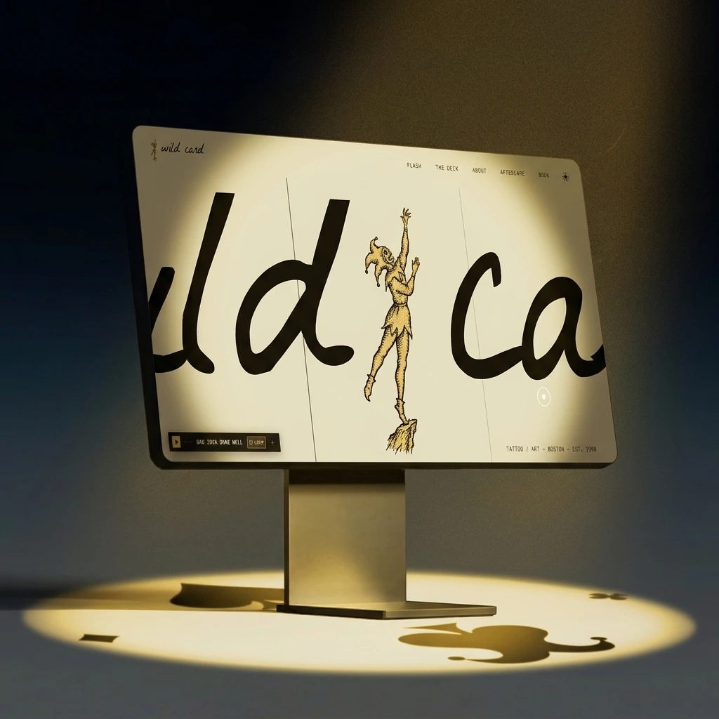
Interactions: an enter screen, a looping soundtrack titled Bad Idea Done Well in a small player with a loop control, a draw button in the pick a card section, an inspect card control on each flash card, and a booking form that asks for the idea (bad ones welcome), placement, size and a preferred suit.
THE RESULT
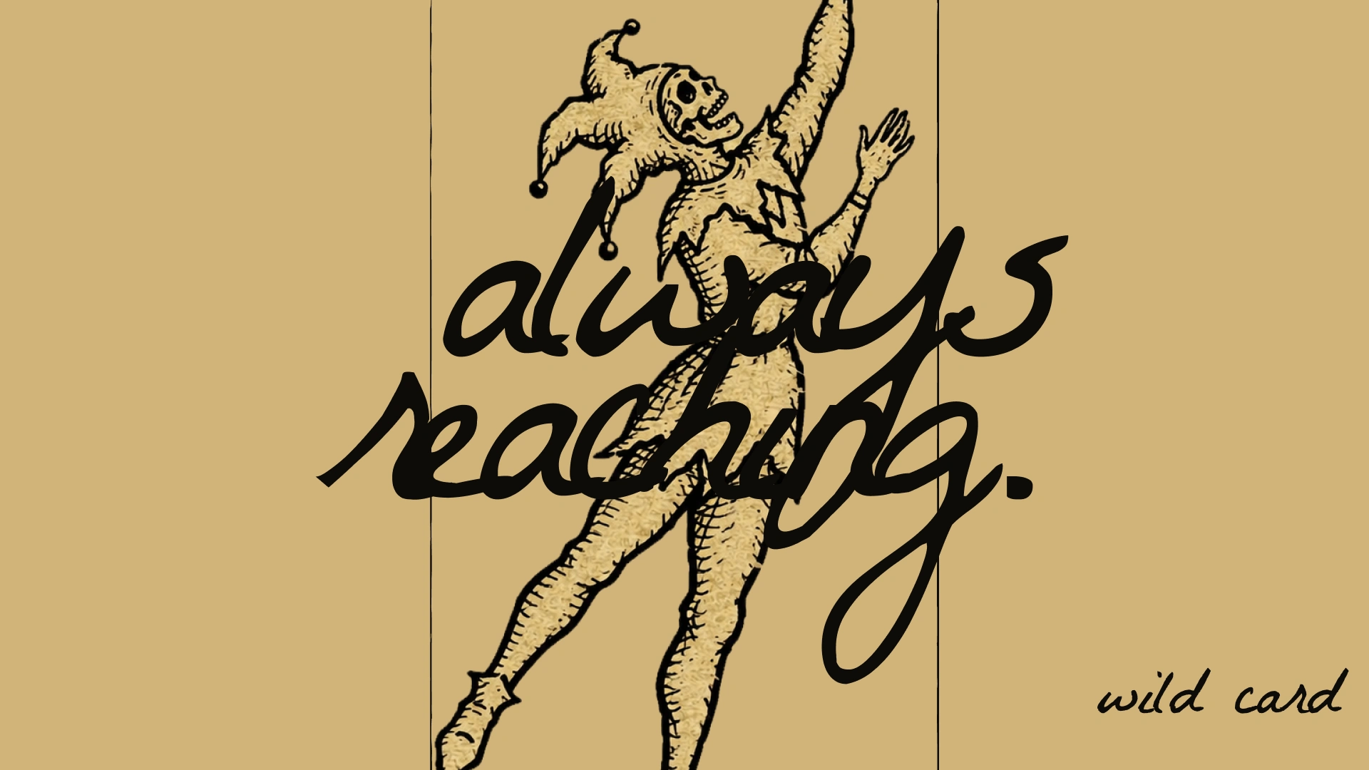
What shipped is a live site, a sign, a poster, a mural and a system that holds when I crop it, recolor it or put it on concrete. The jester never needed redrawing across six very different surfaces. The name, the mark, the palette, the voice and the sign all say one thing, so there was almost nothing left to argue about.
There are no numbers behind this yet and I won’t invent any. Next: real flash photographed on skin, a printed deck of five cards plus a joker, and the sign over a real door.
CREDITS / PROJECT INFO
Designer: Révolté (solo freelance designer), revolte.design
Project: wild card tattoo club
Year: 2026
Scope: naming, identity, typography and color system, copywriting, mockups, website direction, sound
Industry: tattoo and art
Live: https://la-belle-aurora-studio.lovable.app/
See more at revolte.design
Like this project
Posted Nov 3, 2026
A skeleton jester on one toe, handwriting cropped past the frame, and a tattoo club where you draw a card and wear it
Likes
0
Views
6
Timeline
Oct 7, 2026 - Nov 3, 2026