
Context
SuperMatics is a technology company based in Berkeley, California, combining fundamental physics with AI to discover new superconducting materials. Its work has the potential to change how electricity is transmitted and used, but the science behind it is far from simple.
As a new company, SuperMatics needed an identity built from scratch. The challenge was that its audience consisted largely of scientists, engineers, and research institutions, so looking like another emerging AI startup wasn't an option. The brand needed the credibility of an established technology company while still having enough personality to stand out in a field where visual identities often look very similar.
What We did
We developed the visual identity for SuperMatics, starting with the logo and building out the typography, colour palette, and supporting graphic system. The symbol went through several rounds of exploration, with the focus shifting from creating an interesting abstract shape to something that felt more intentional and engineered.
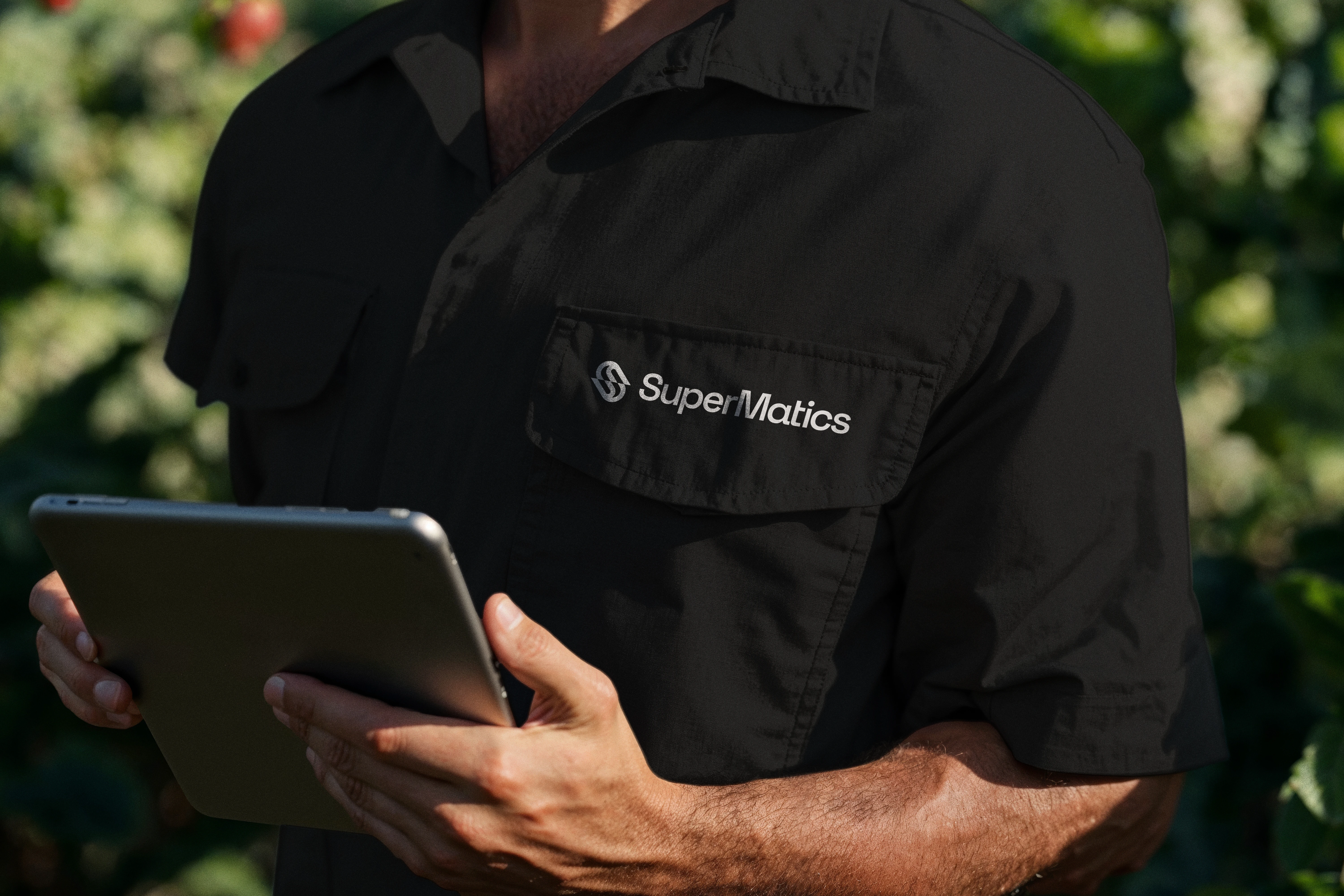
From there, We explored how the identity could extend beyond the logo into different applications, including stationery, research publications, equipment packaging, laboratory signage, presentations, digital touchpoints, and merchandise. We wanted to show how the same visual language could work in a serious scientific environment while still feeling approachable in everyday applications.
Wordmark Grid
Brandmark Grid

Brandmark
Color Palette
Typeface
Logo Sizes
Socials
Key Decisions
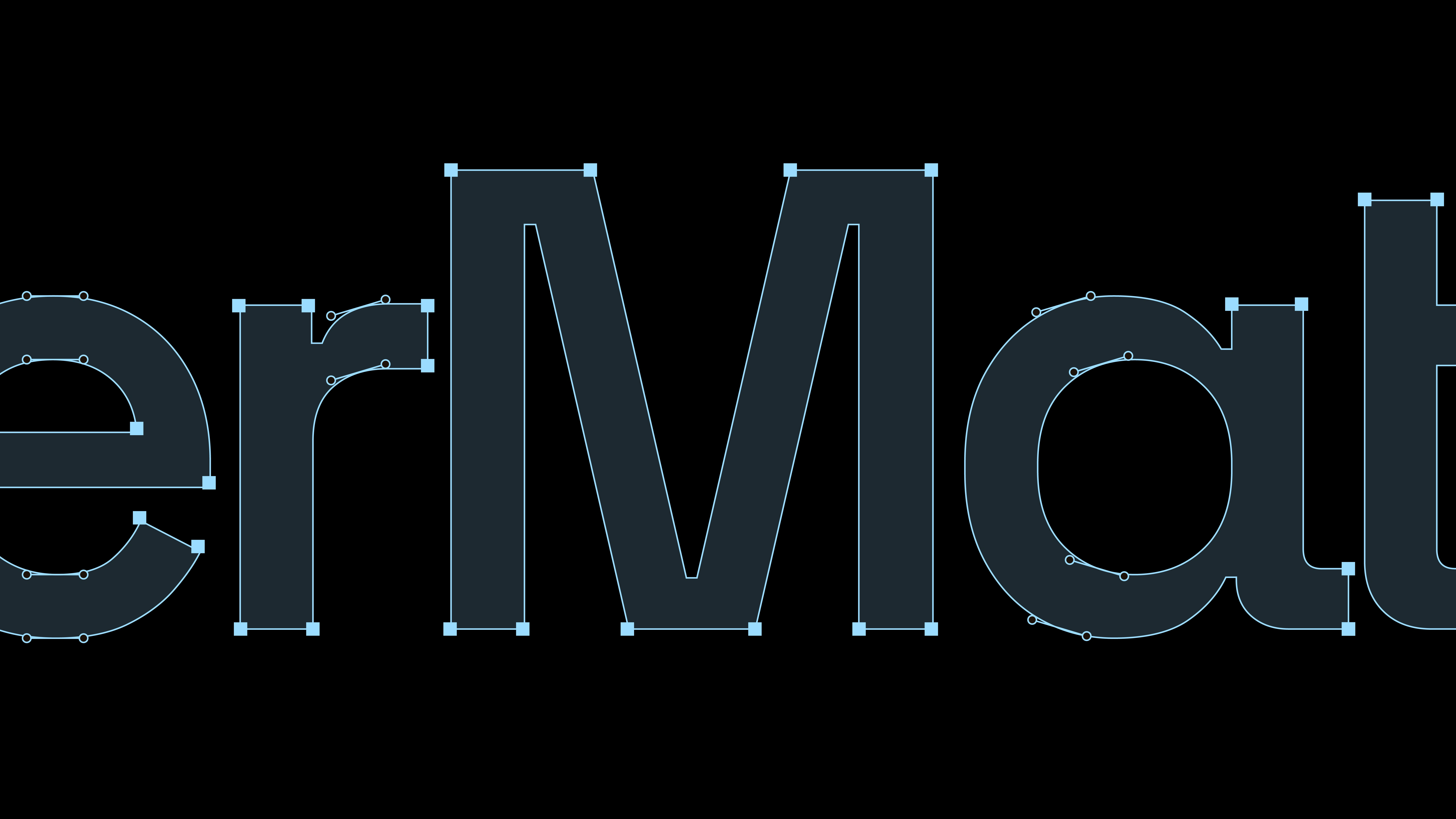
The biggest challenge was the symbol. The client wanted something distinctive without relying on the usual visual references associated with AI and technology. I eventually developed an abstract S from two mirrored, interlocking shapes, constructed on a geometric grid. The result feels structured and precise, but still has enough movement to give it its own character.
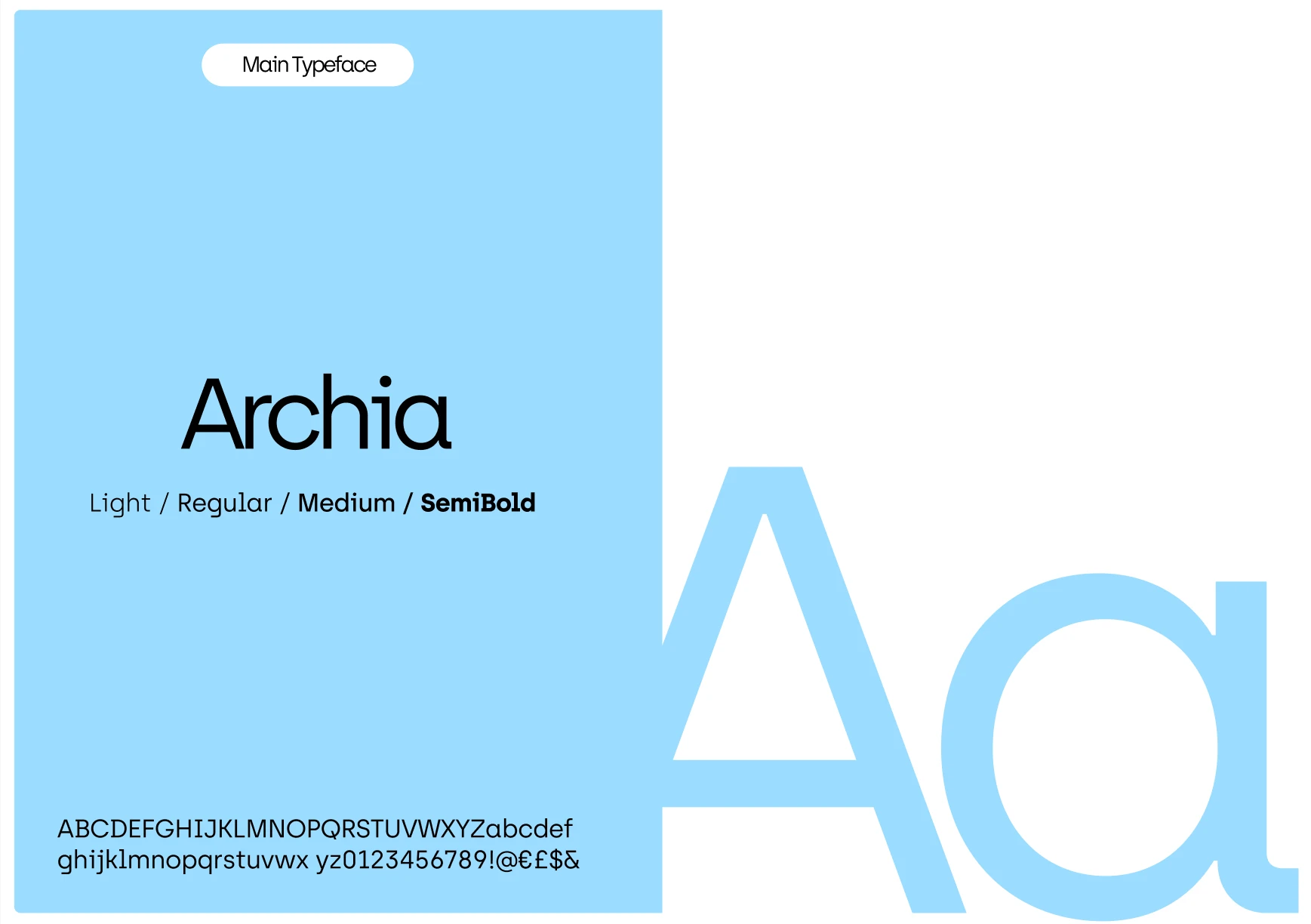
I paired the symbol with Archia, a geometric sans-serif that complements its rounded forms without competing with them. The colour palette was another important decision. Rather than limiting the identity to the dark, corporate colours commonly seen in scientific branding, I introduced a brighter blue alongside warm orange, coral, yellow, and neutral tones. This gave the brand more flexibility, allowing it to feel technical and restrained in one application and more expressive in another.
I also introduced small graphic details, technical labels, and a more conversational approach to copy. These elements helped connect the scientific side of the company with a more human personality, without losing the sense of precision behind the identity.
Work Wear

Branded Bottle
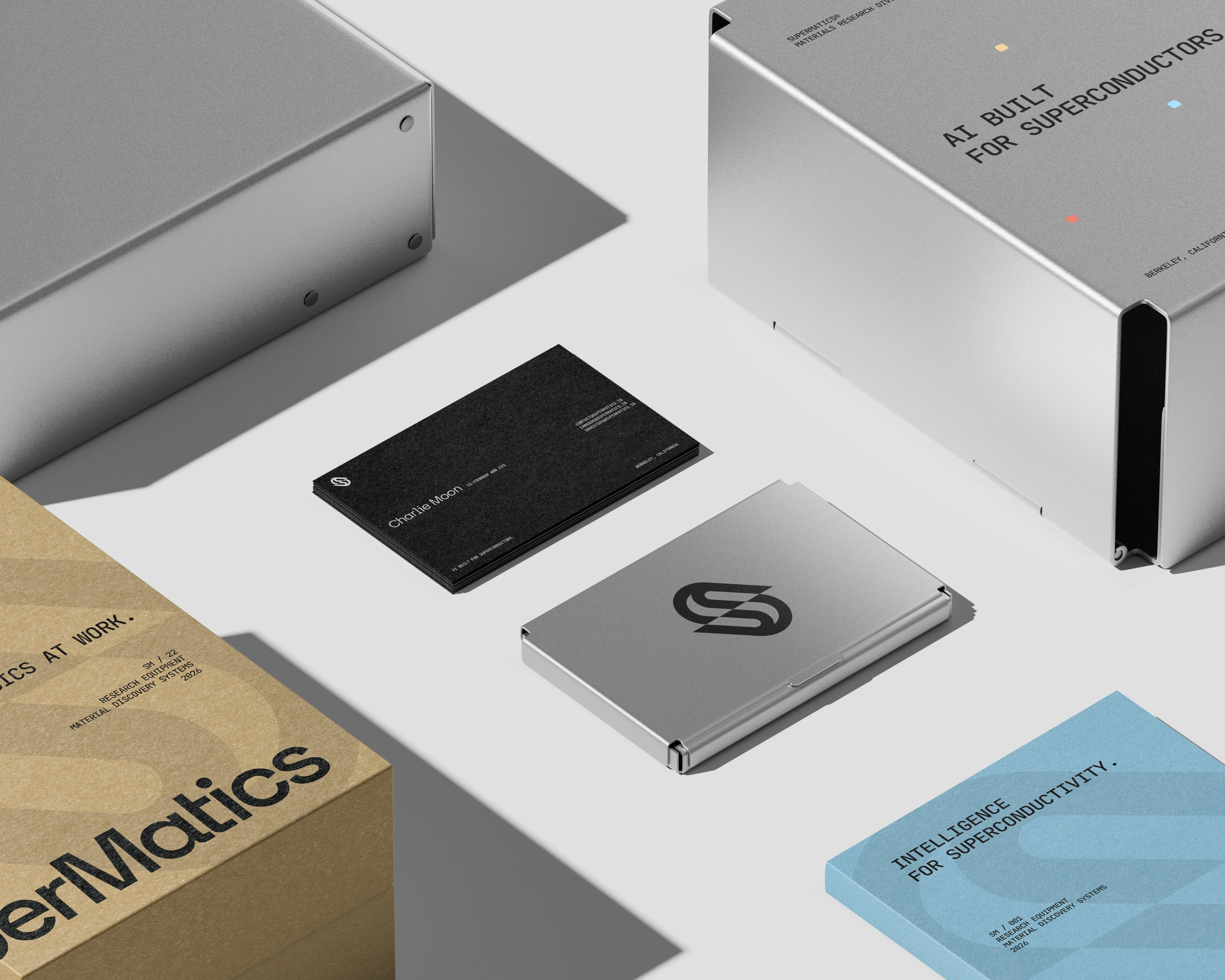
Stationary Kit
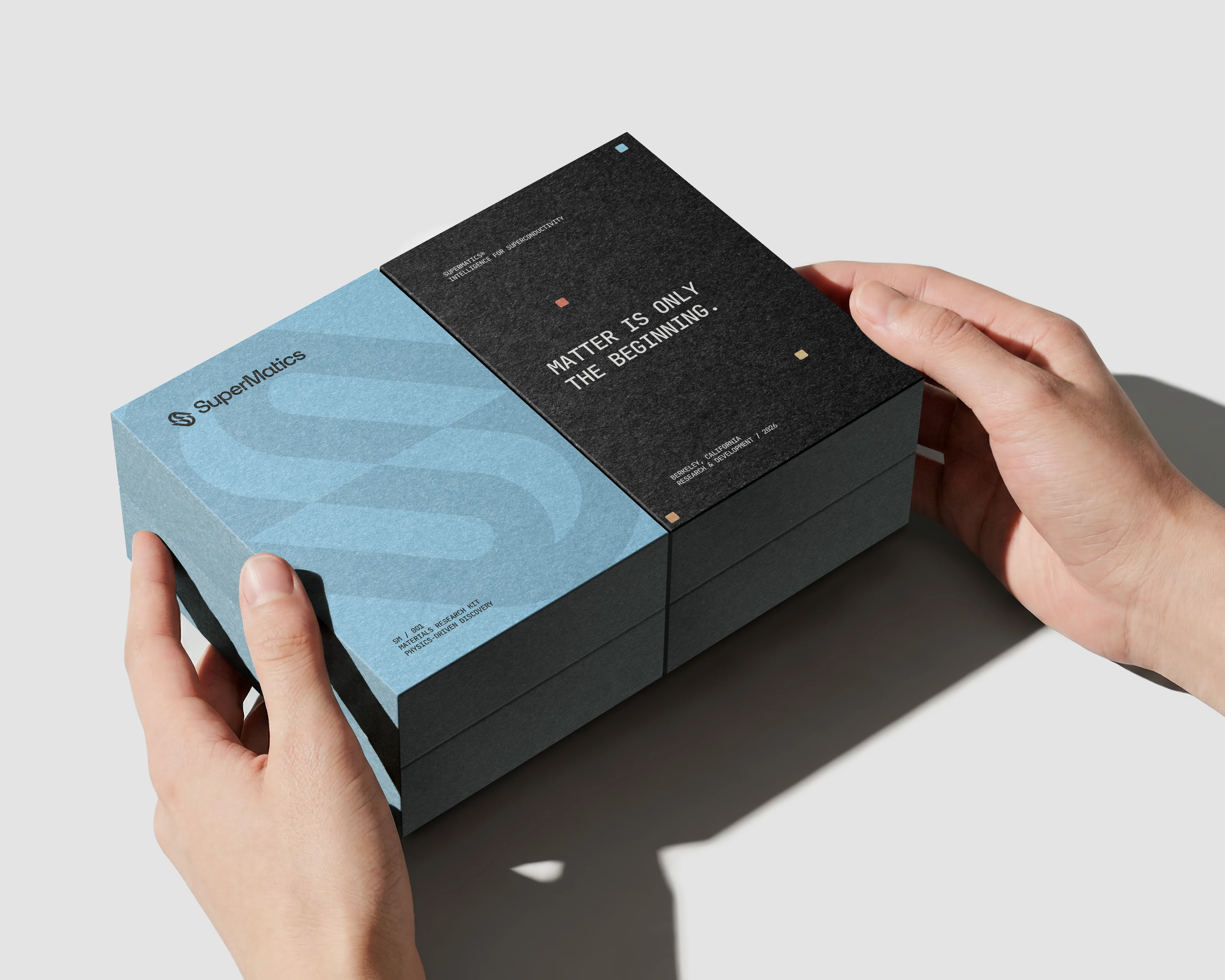
Stationary Kit

Packaging
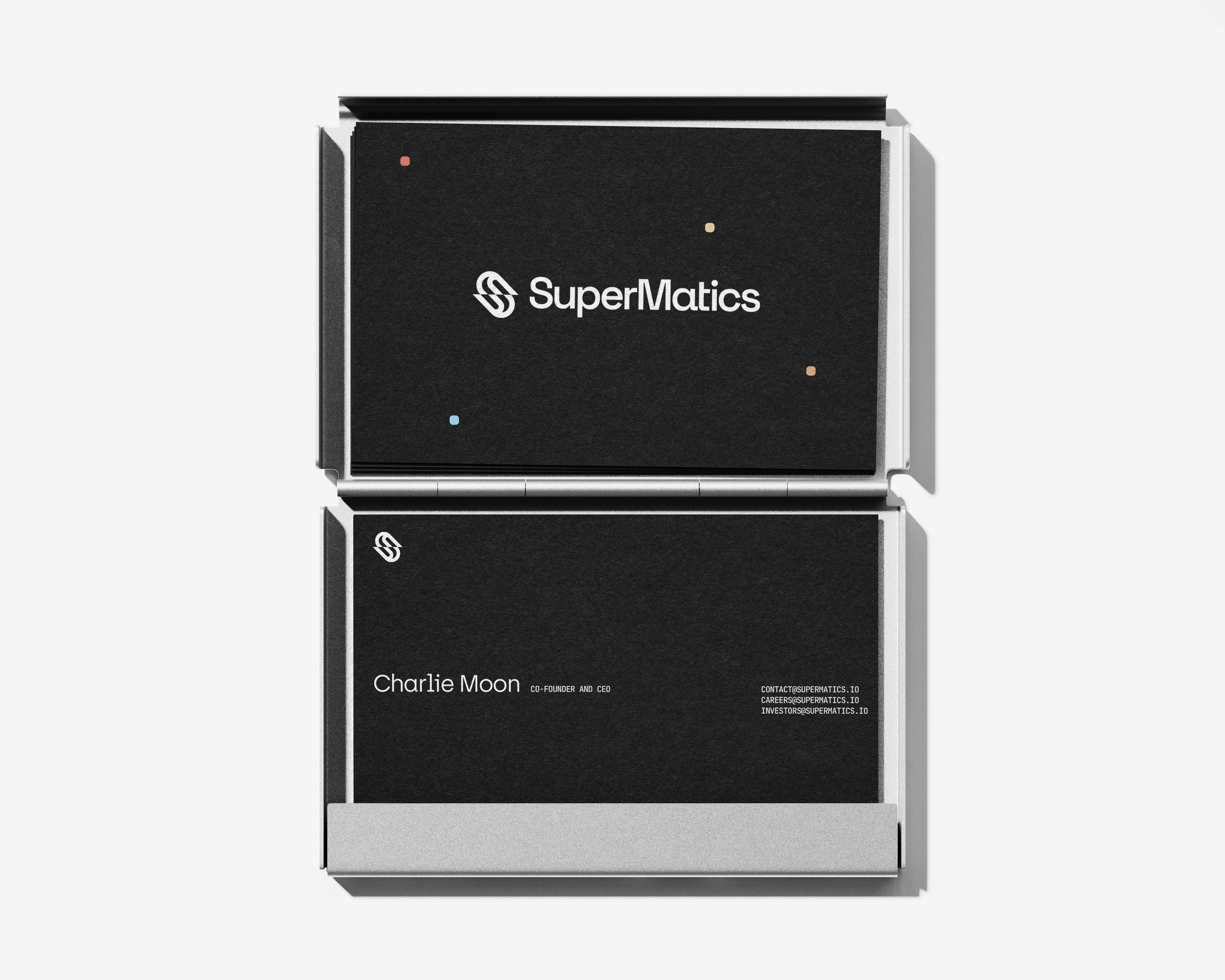
B-Cards
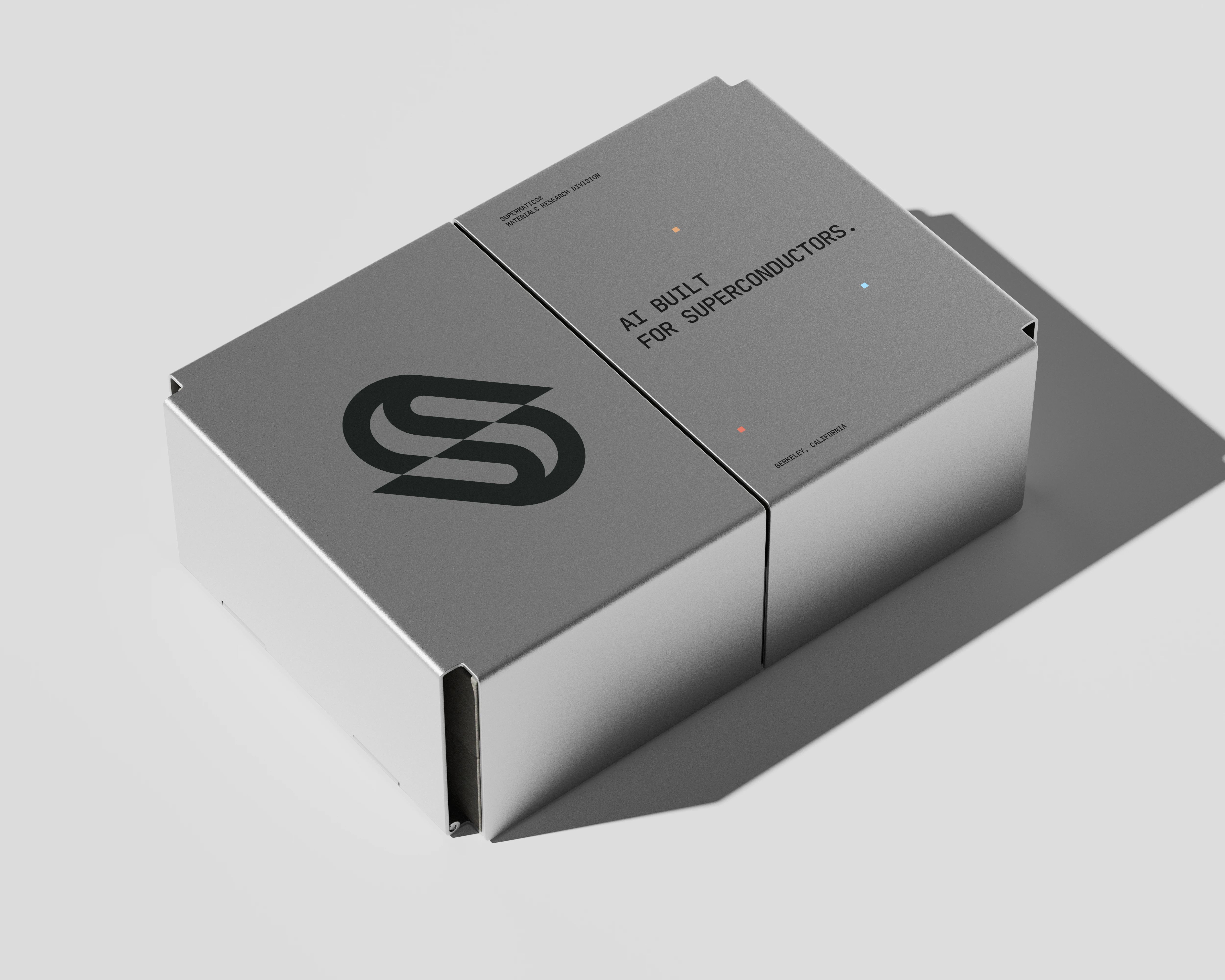
Packaging
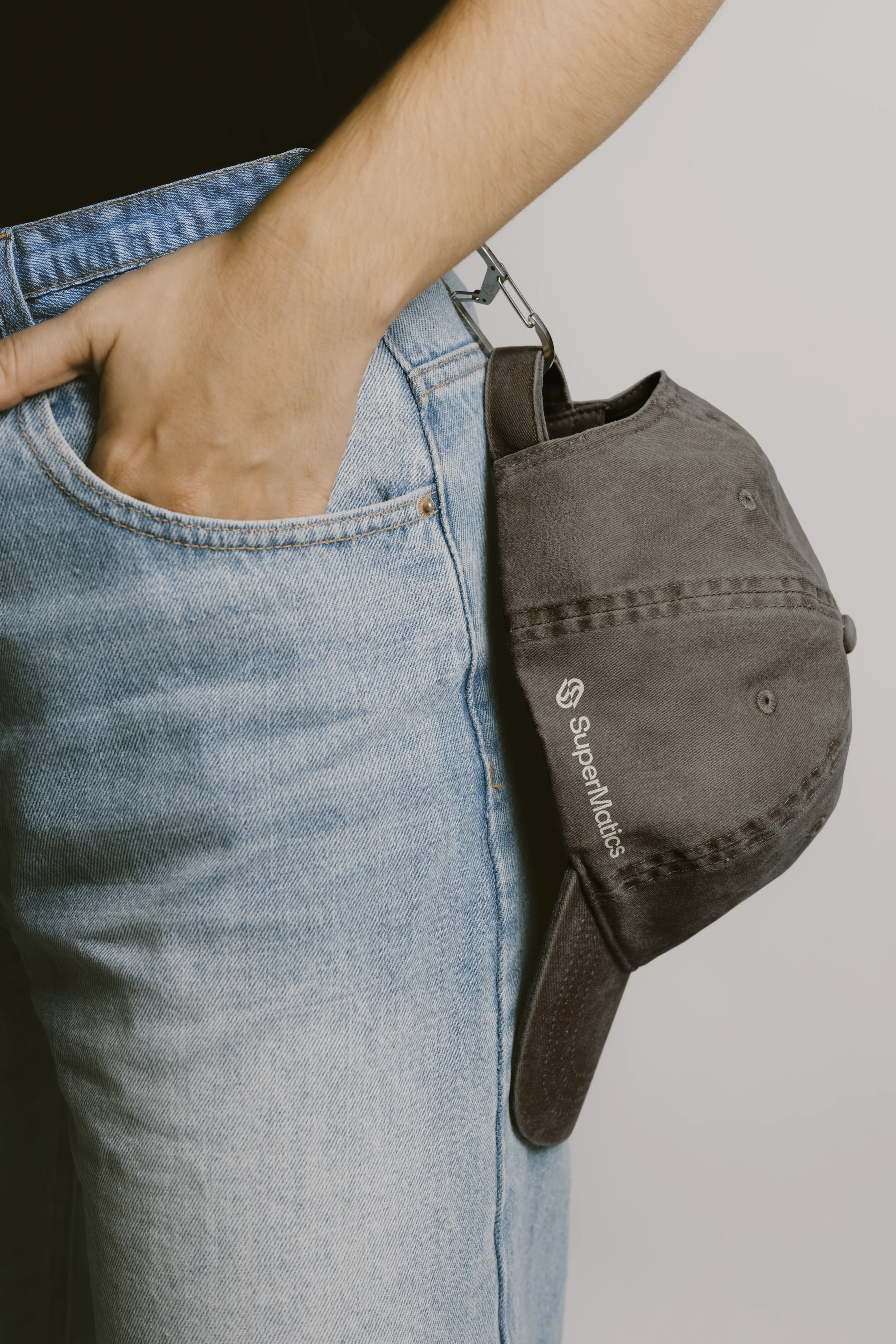
Caps
Caps
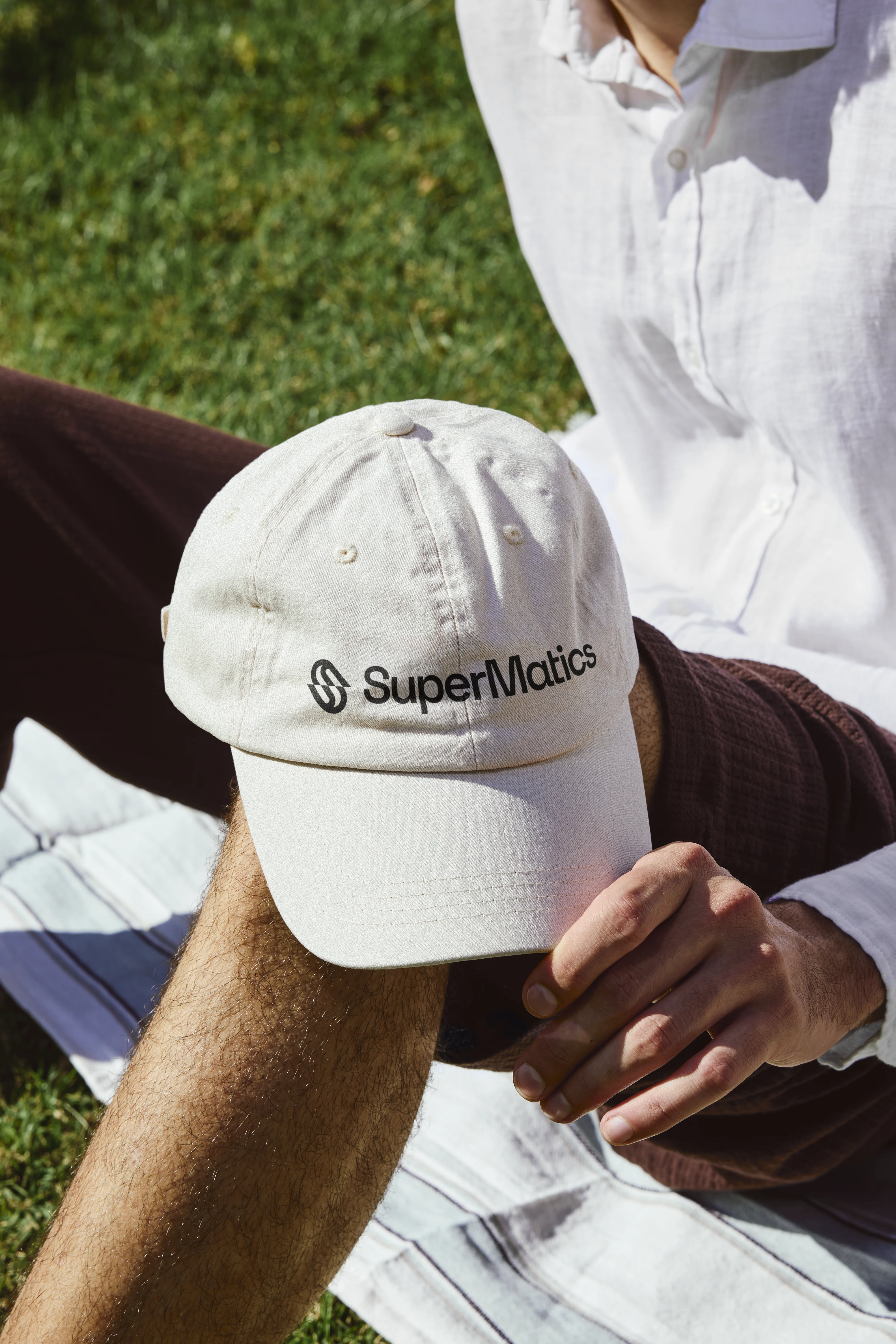
Caps
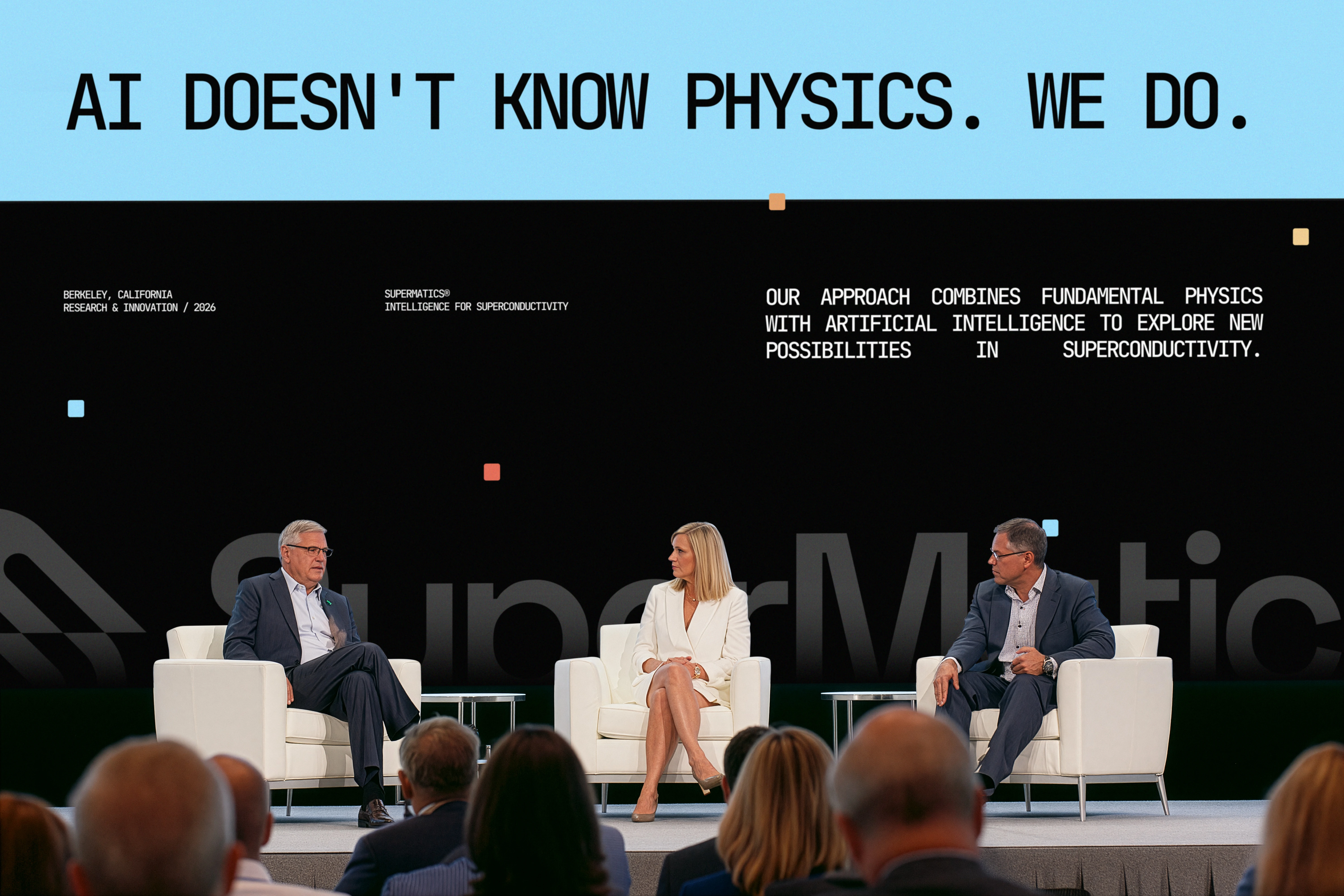
Screen Event
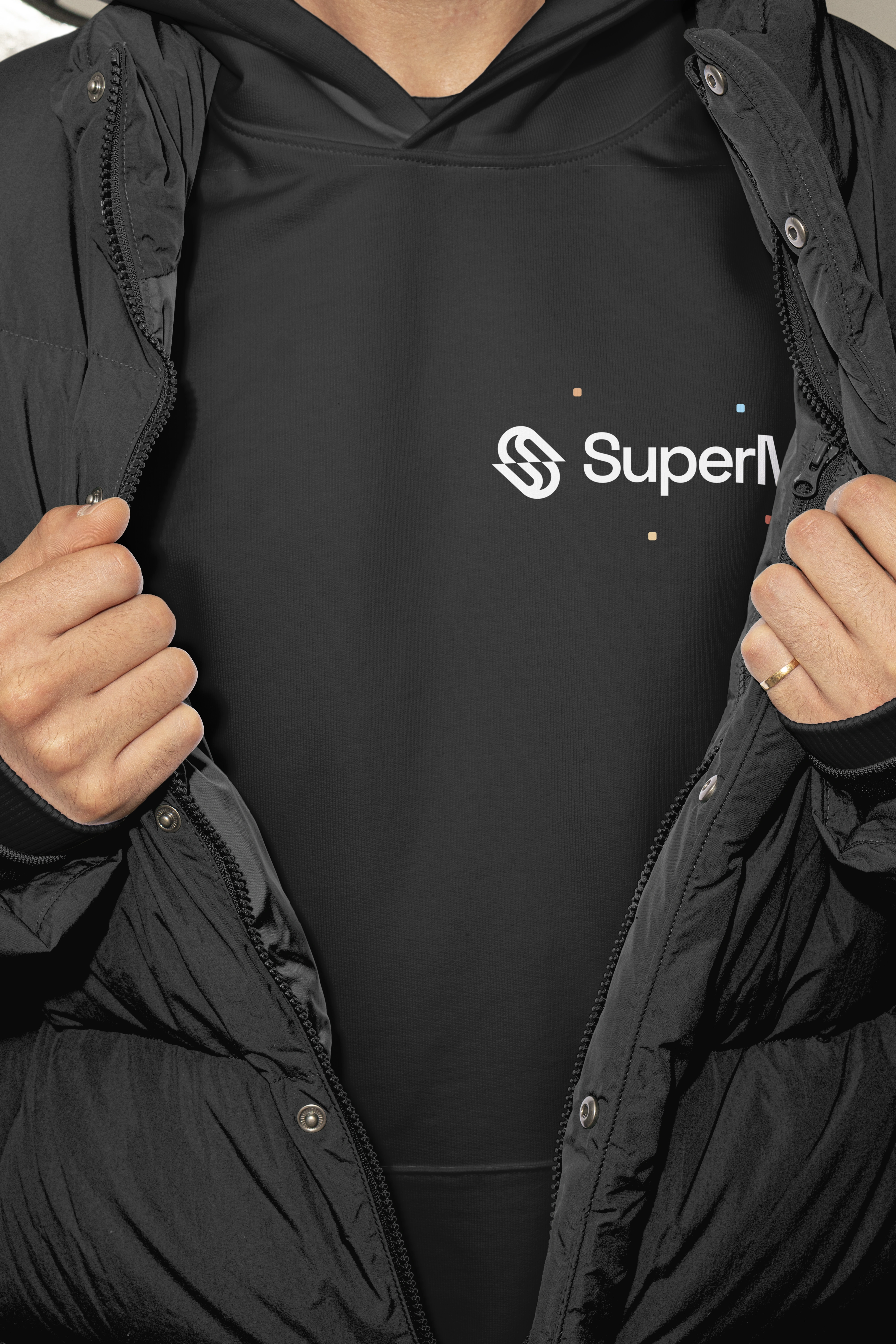
Hoodie

Hoodie
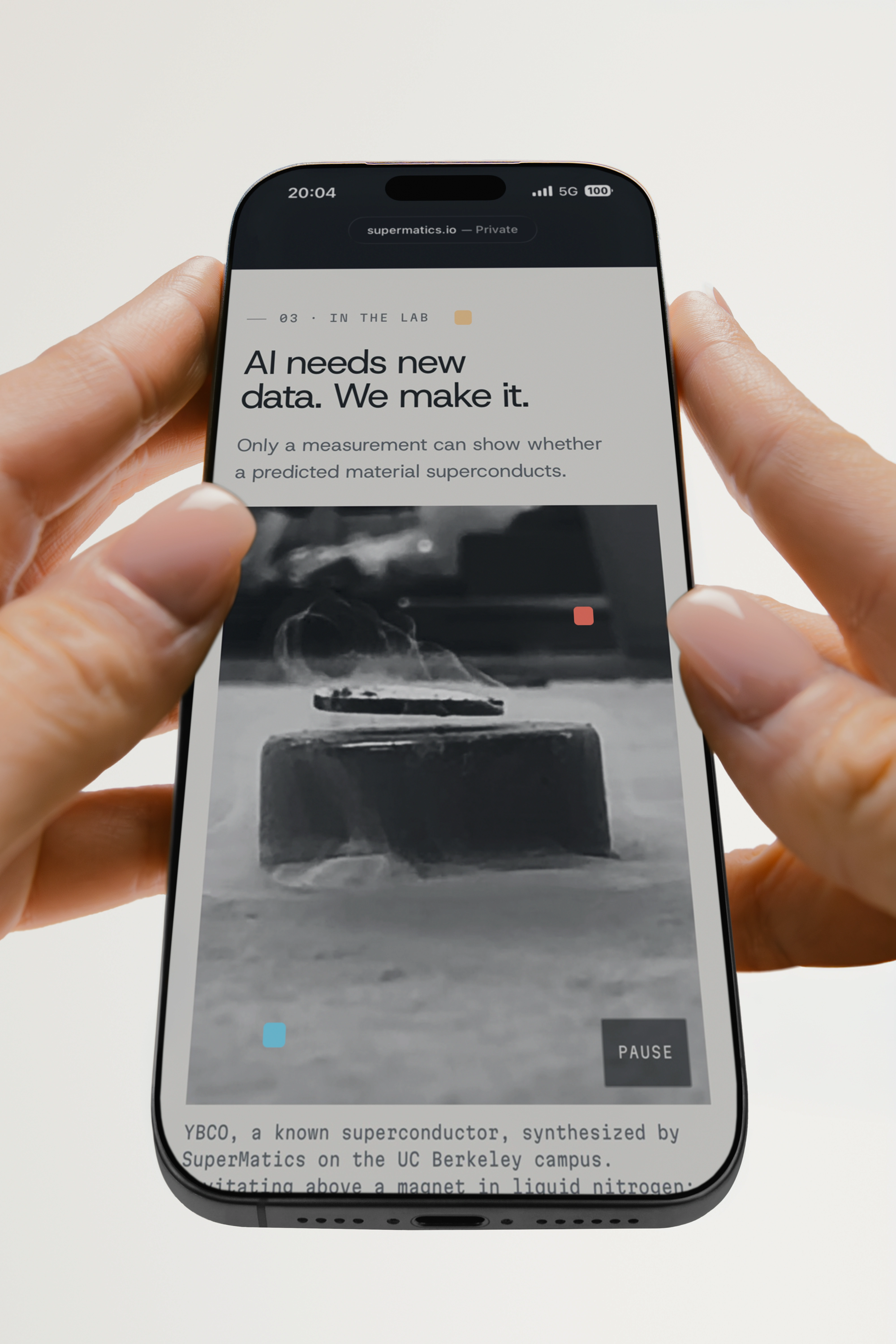
Web Design
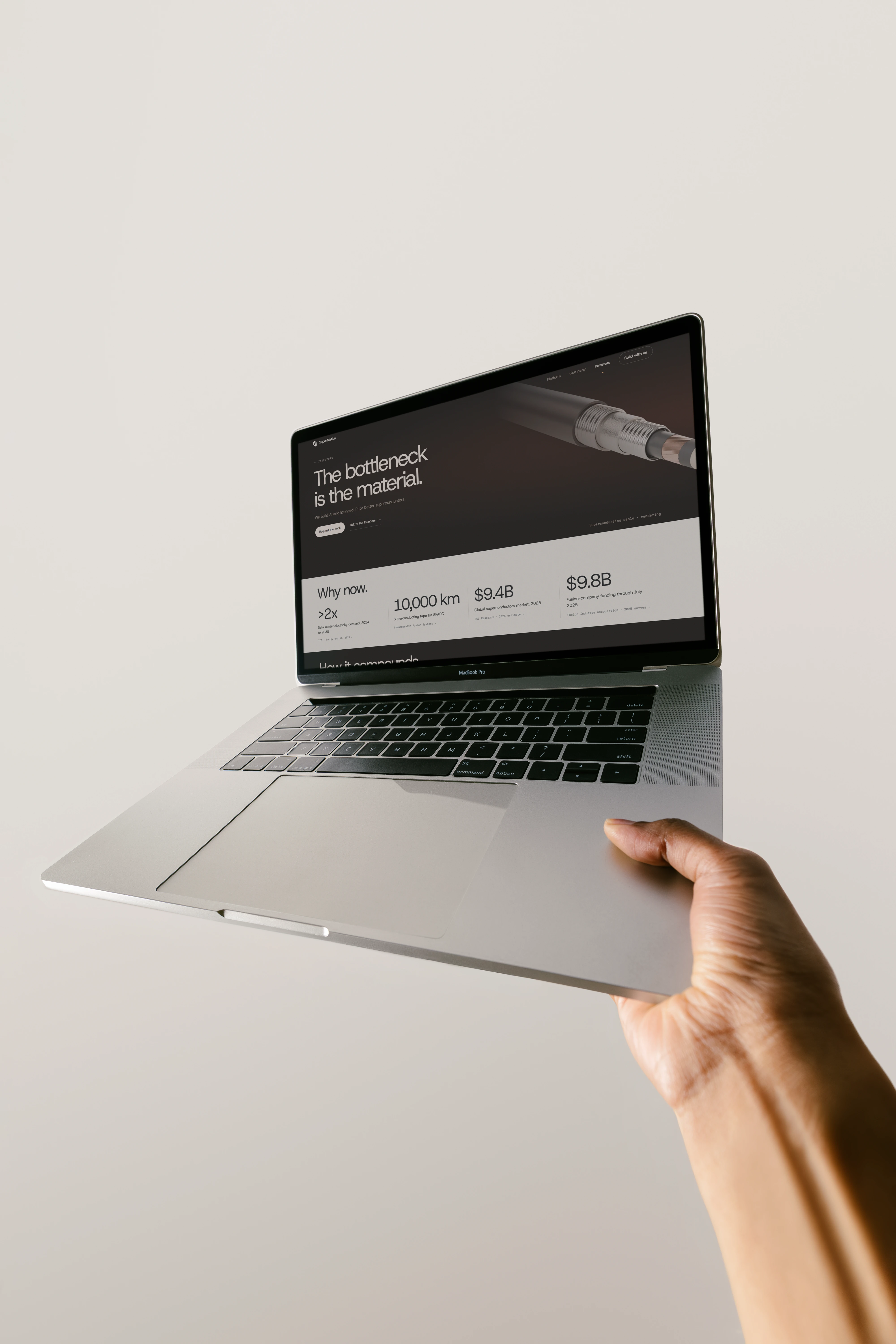
Web Design
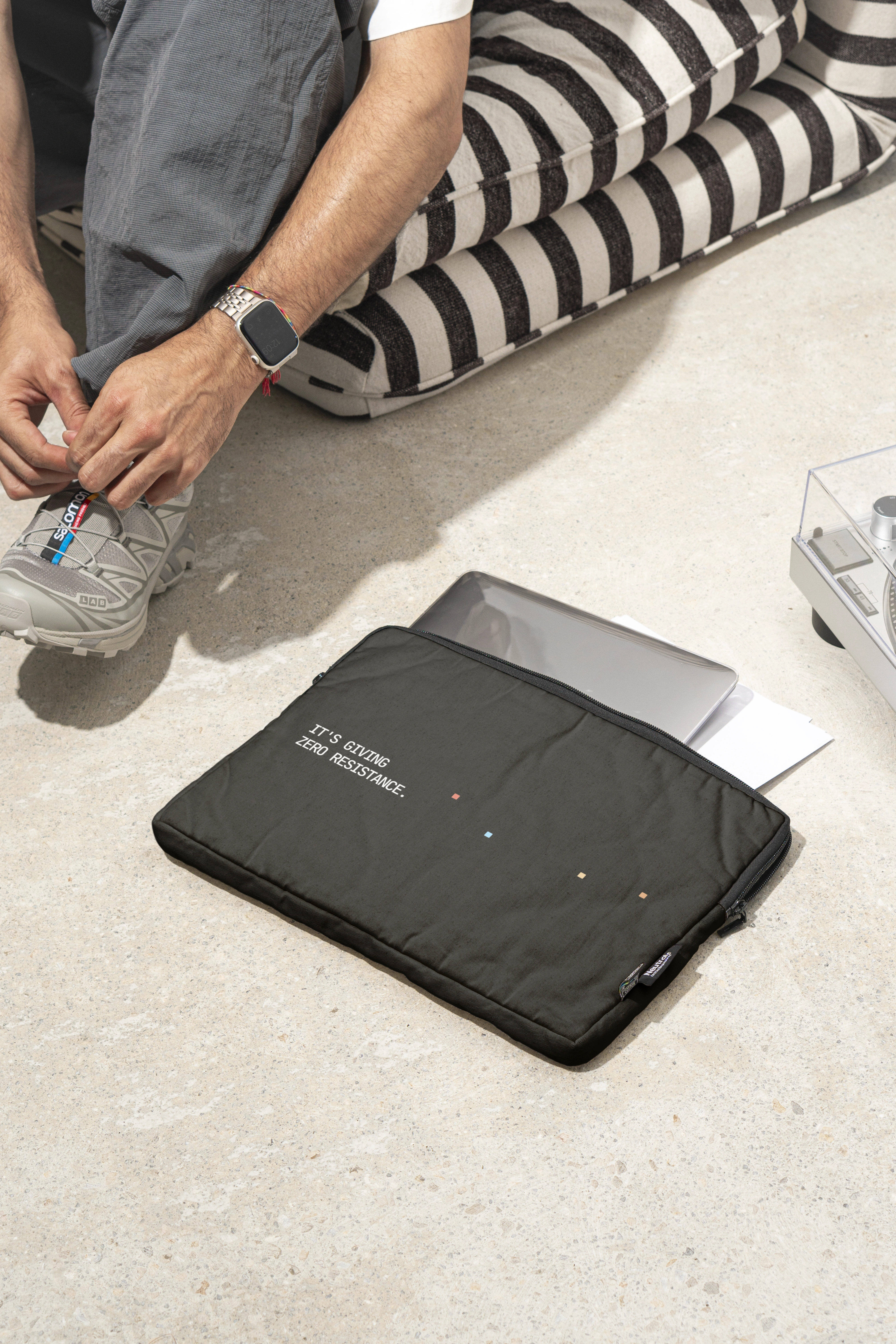
Work bags
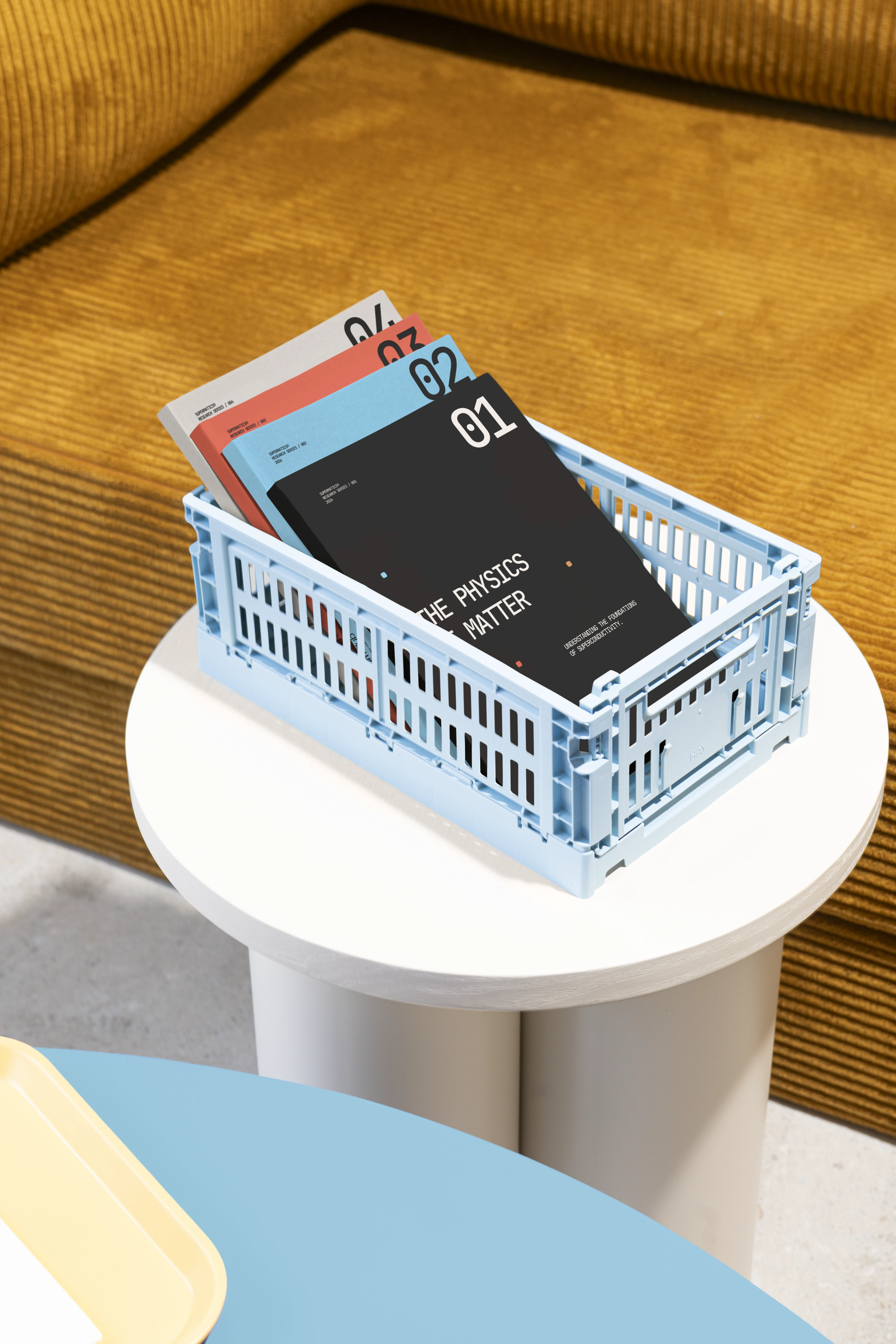
Books
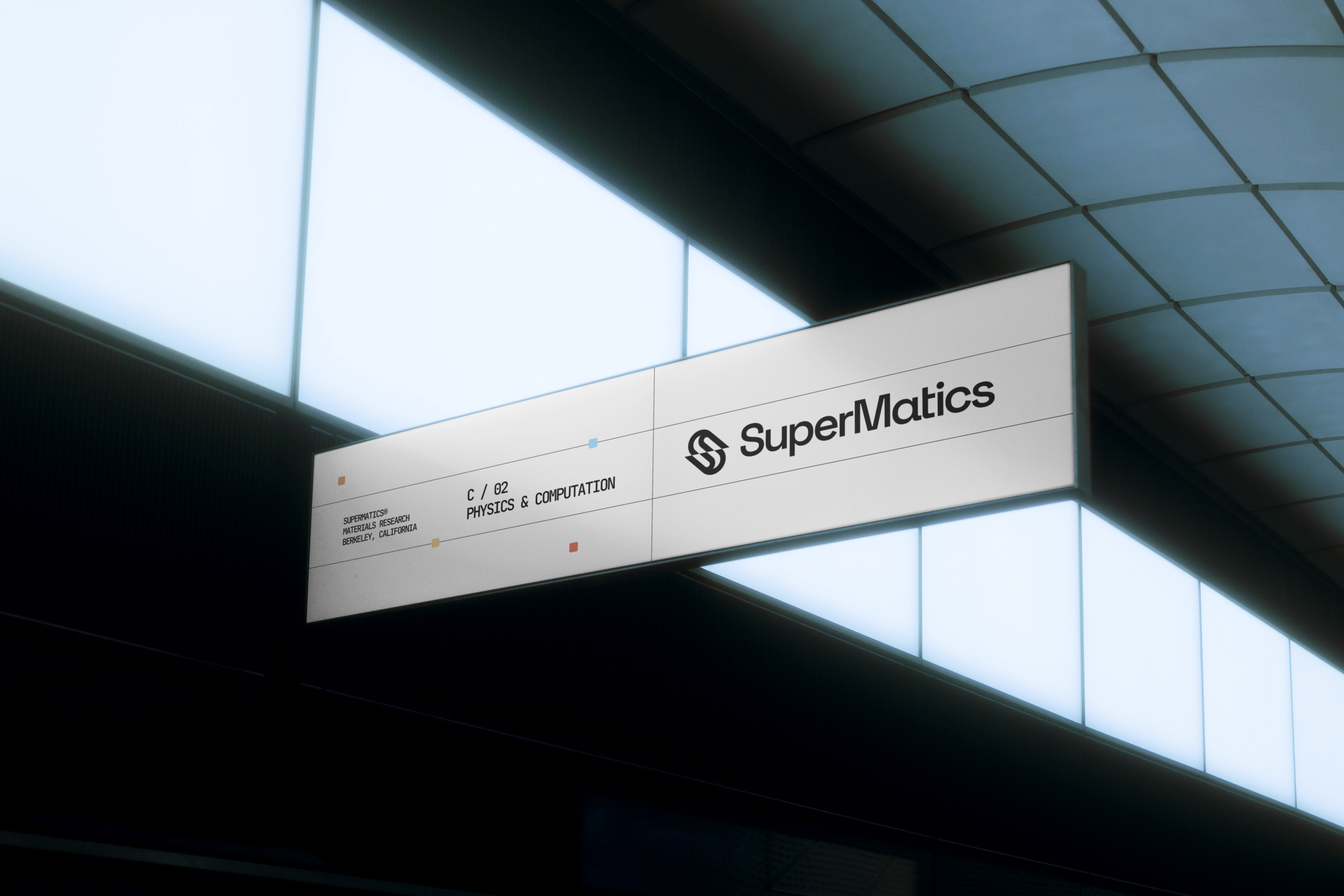
Sign
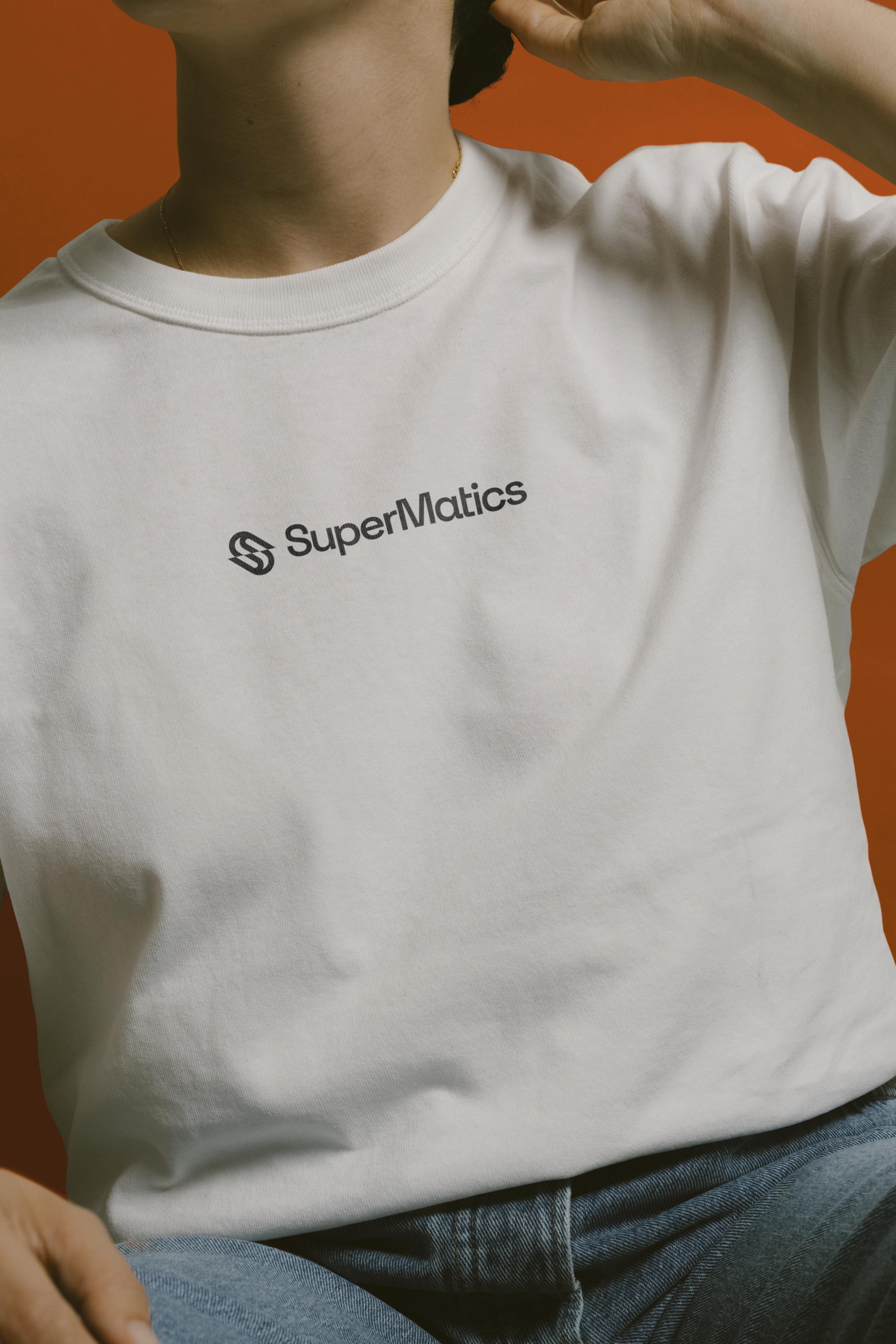
Hoodie
Outcome
The result is a flexible visual identity that gives SuperMatics a recognisable presence across different environments. The geometric symbol works independently or alongside the wordmark, while the typography, colours, and supporting graphics create a consistent language that can adapt to everything from research documentation to digital communication and merchandise.
The identity was designed to grow with the company, balancing the credibility expected in scientific research with a more contemporary and approachable personality. Rather than making SuperMatics look like another AI company, the goal was to give it something of its own.
Read the full case study
By Katlan.co ©
1 like · 2 views · Nov 16, 2026
Developed a visual identity for SuperMatics, a Berkeley-based technology company combining physics and AI to discover new superconducting materials. The project


