Ordinal Partners™ | Logo Design

Alec Minimalec
Verified


Ordinal Partners™
is a strategic financial advisory firm working alongside ambitious businesses and their leadership teams. From strengthening financial foundations to navigating investment, acquisitions and long-term growth, their work is about bringing clarity to complex decisions and helping businesses move forward with confidence.
The challenge was to create a visual presence that reflected that same thinking. Something professional and trustworthy, but without the usual corporate look.
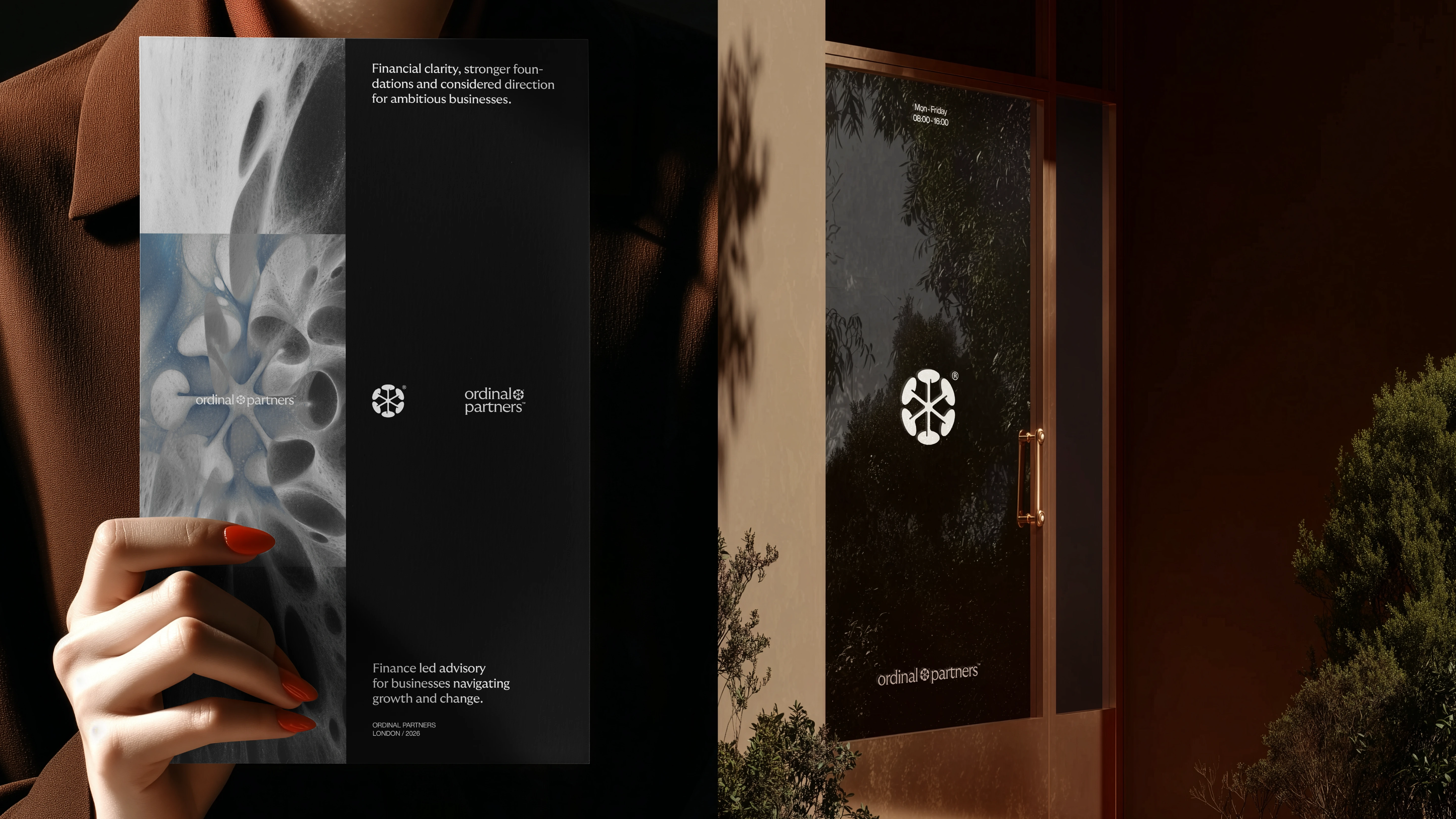
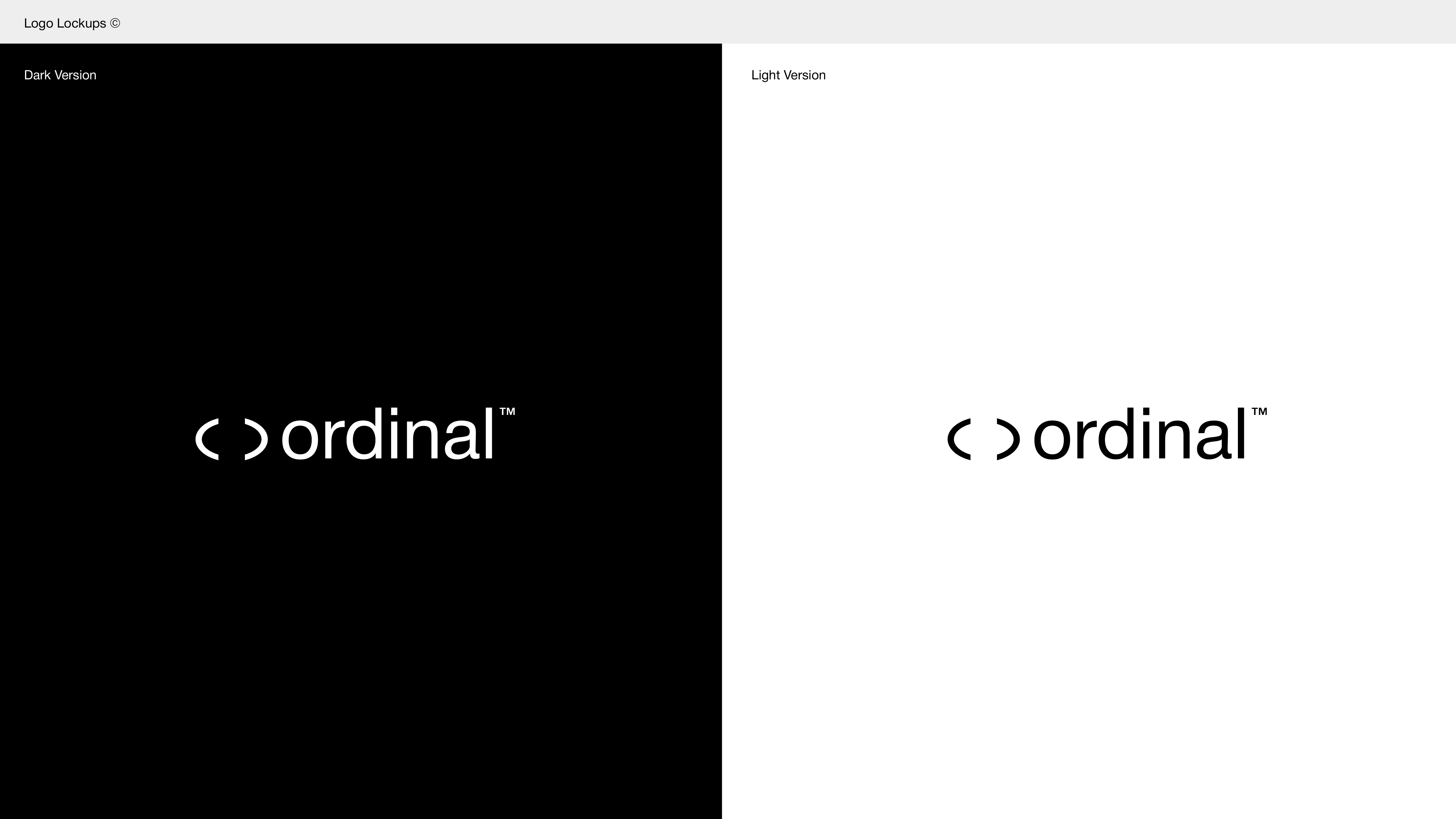
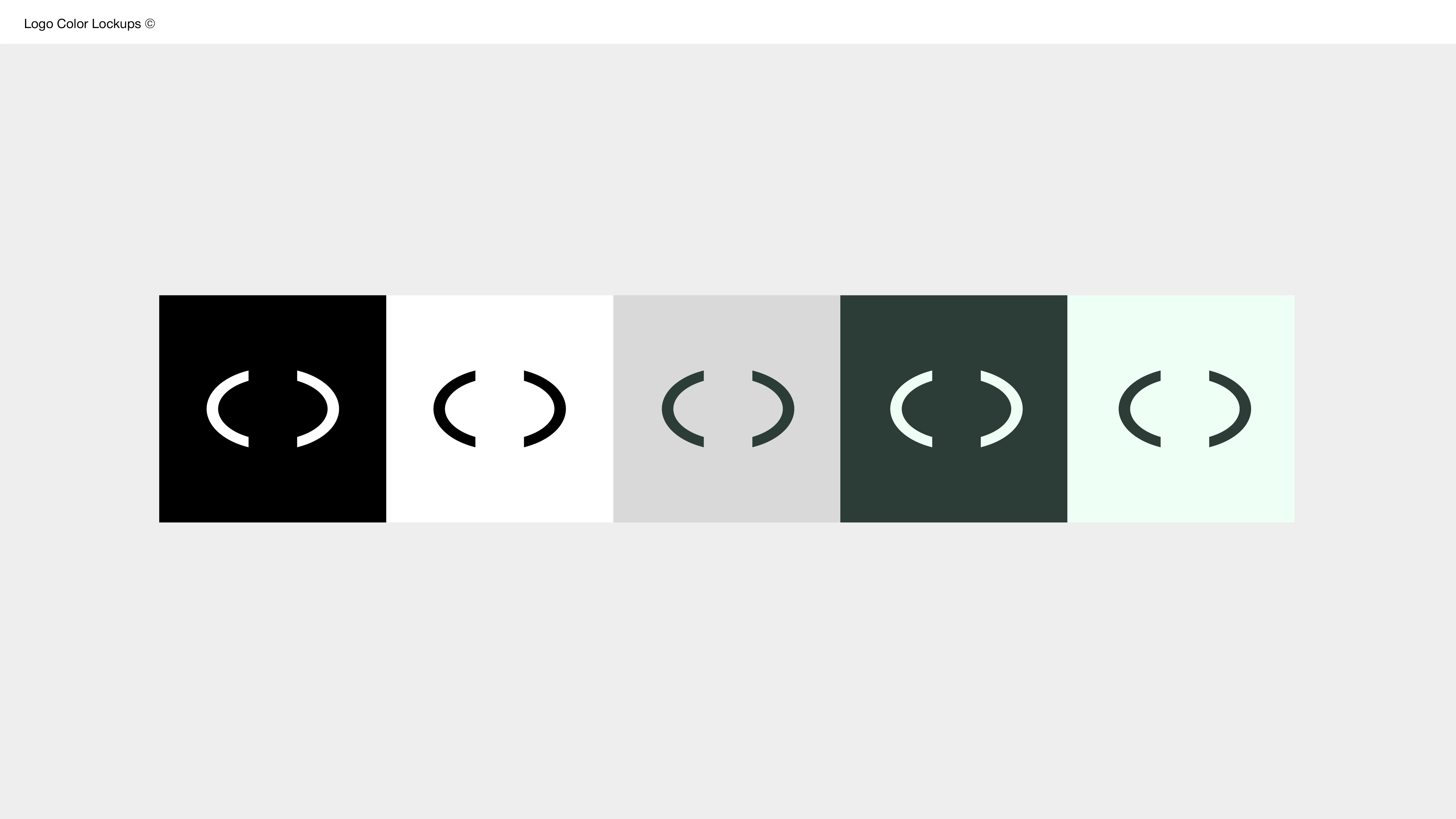
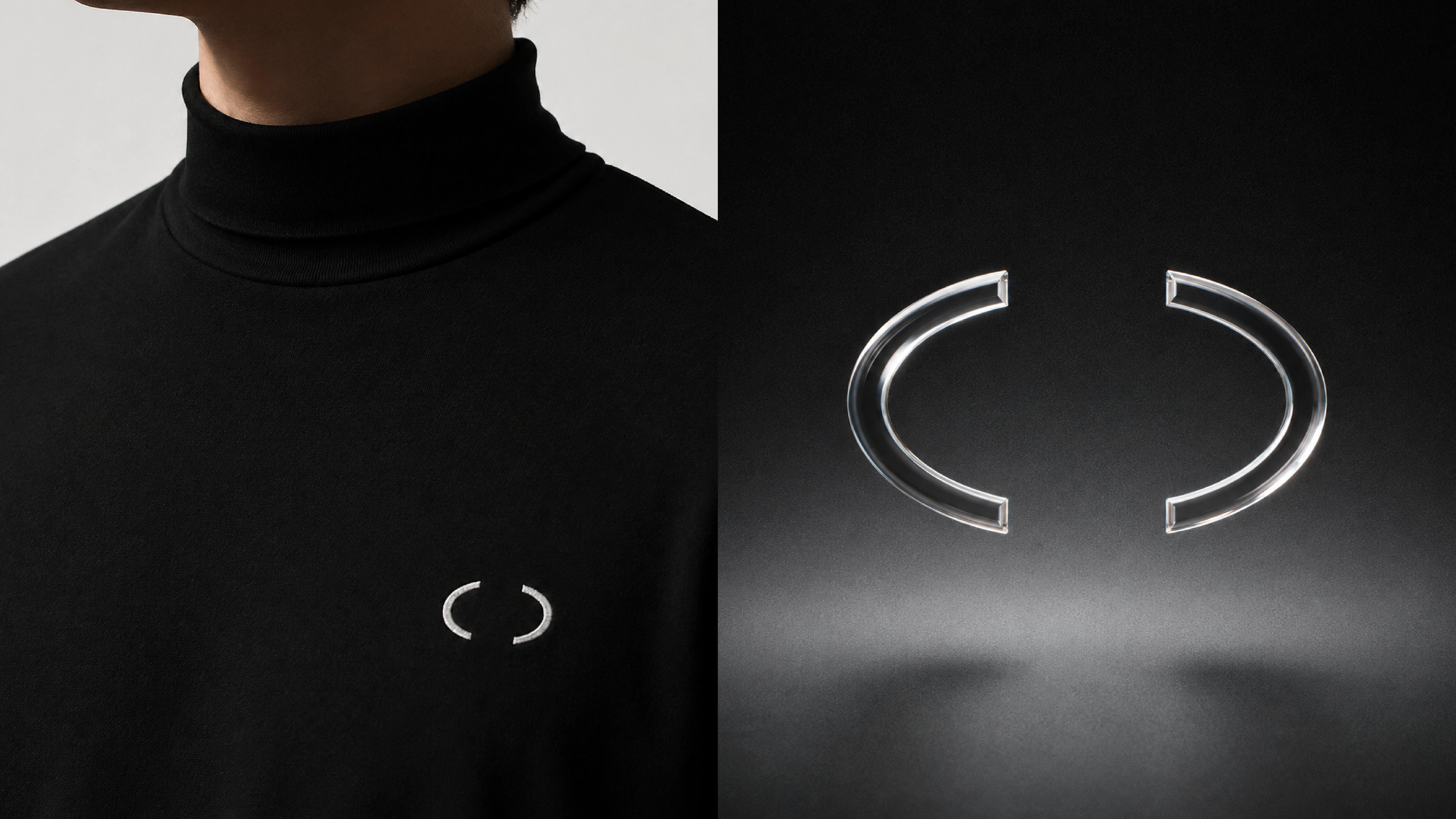
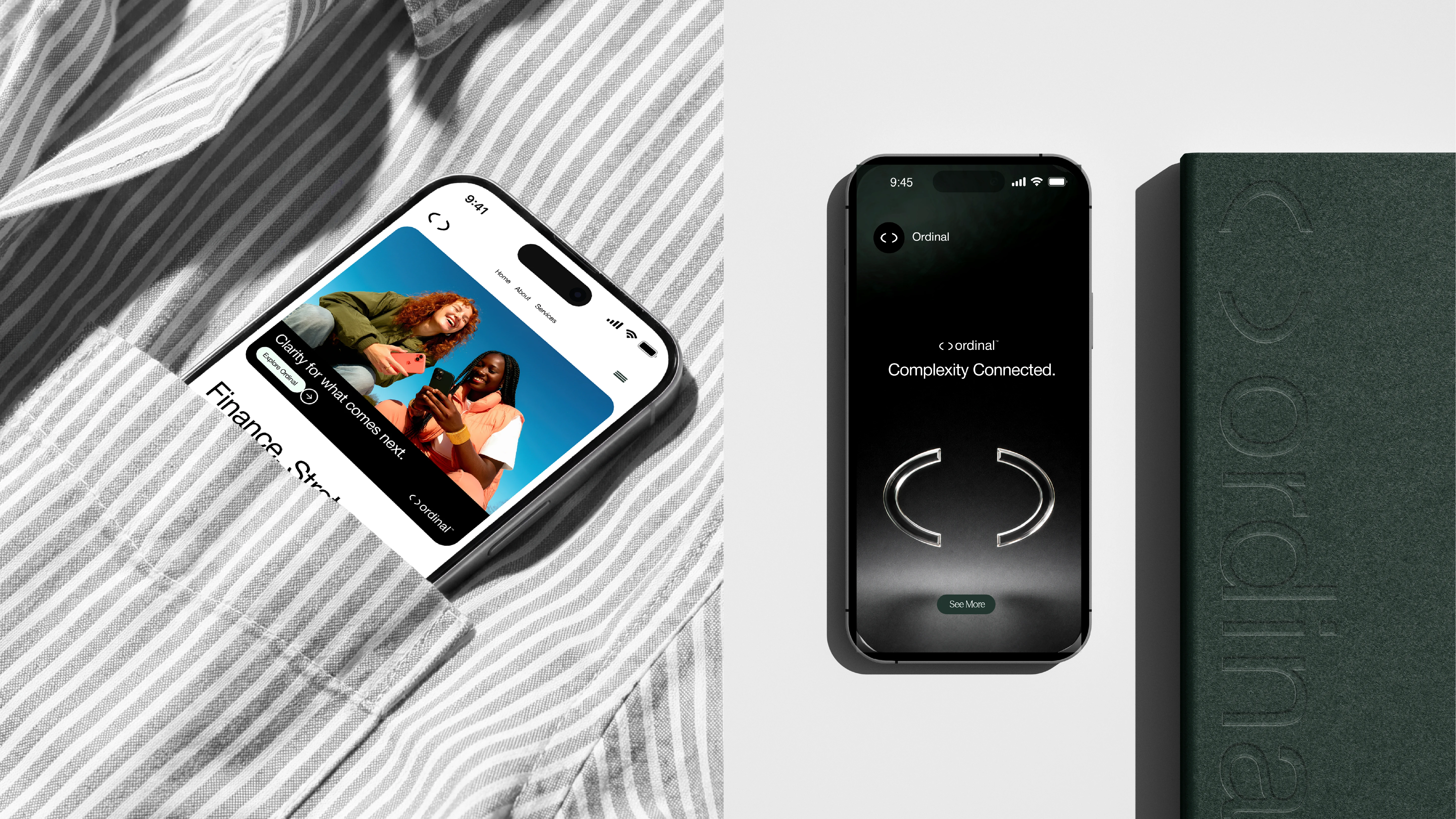
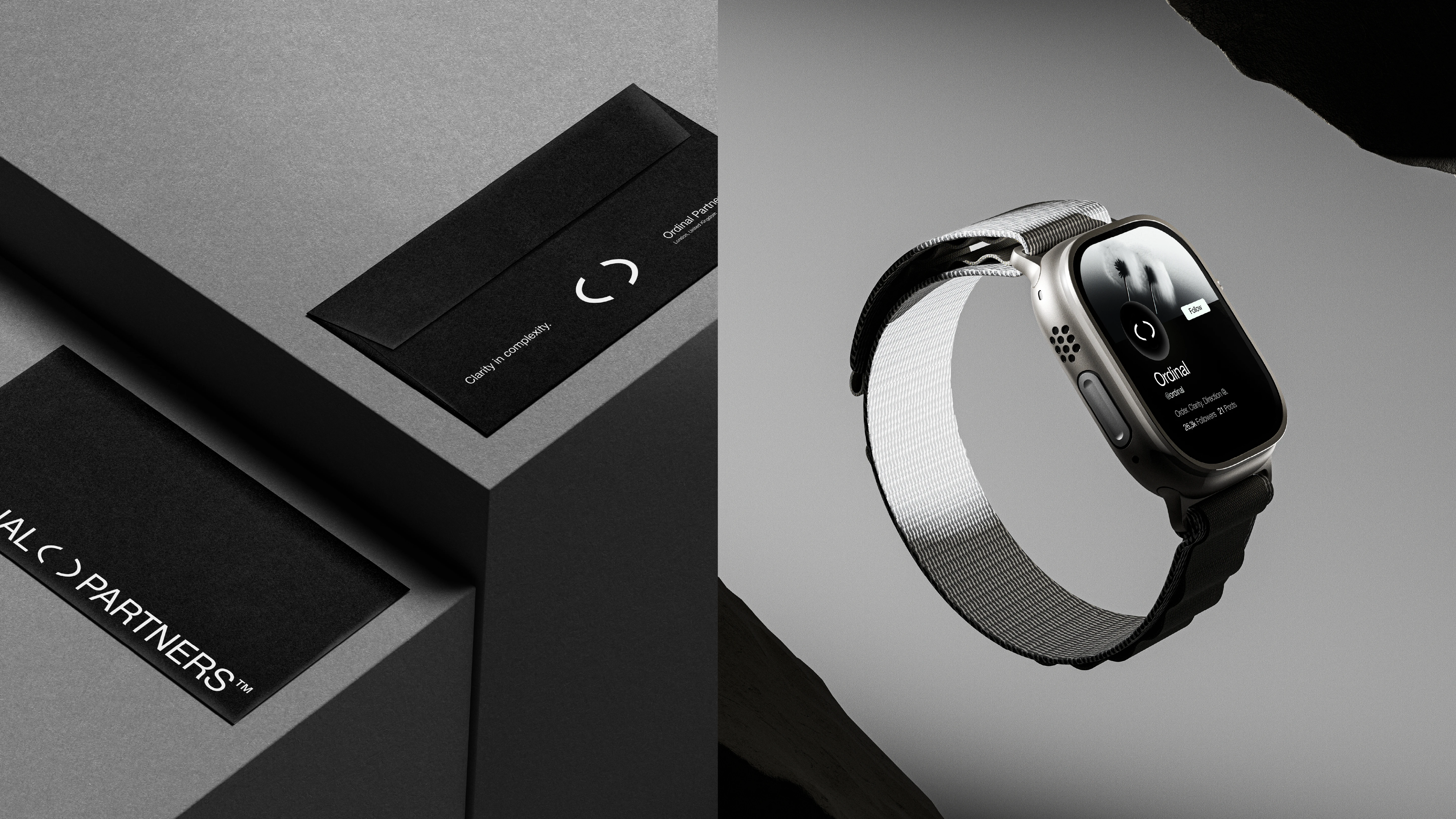
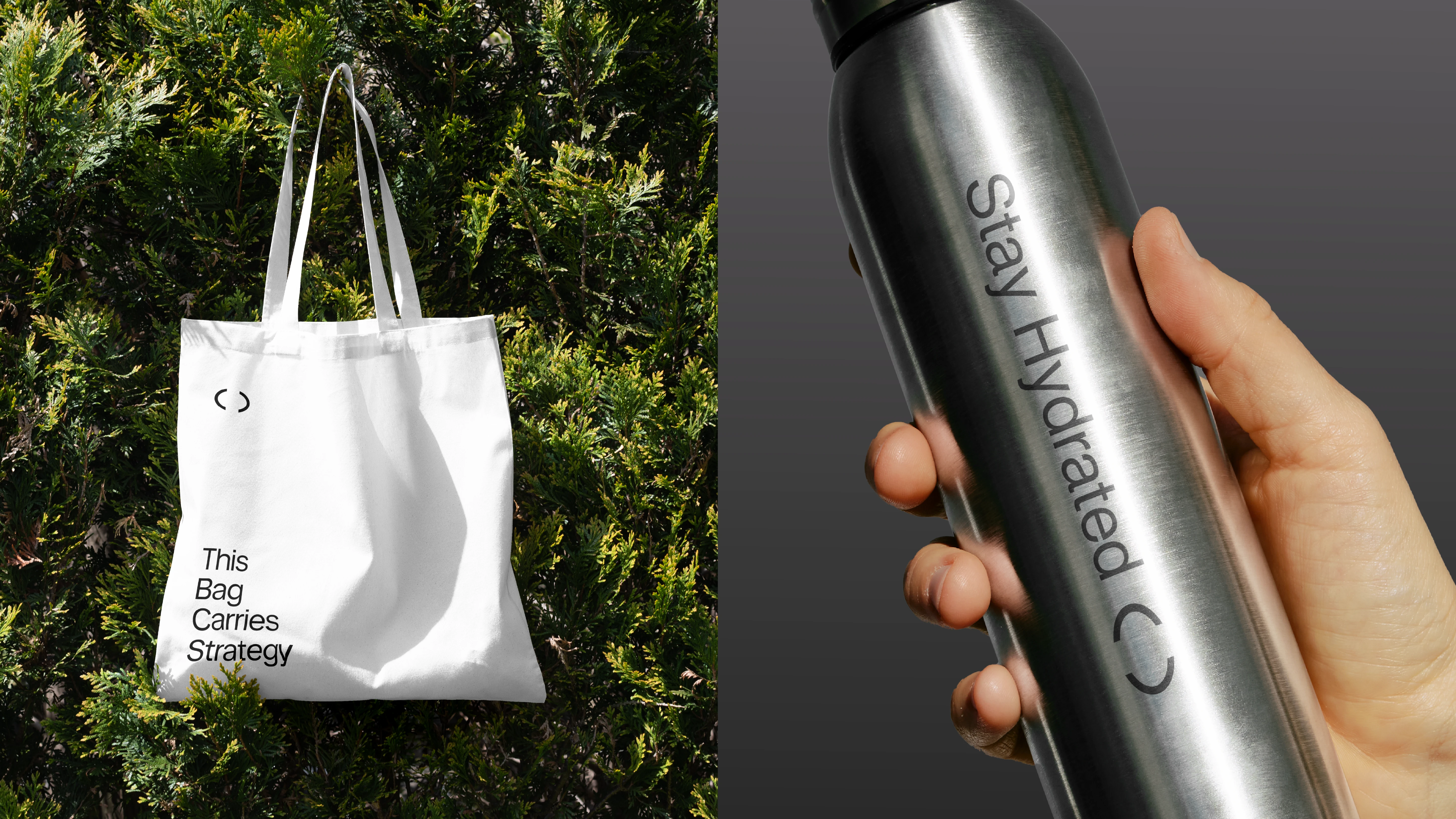
We explored several directions, eventually returning to one of the simplest ideas: a pair of custom-drawn brackets.
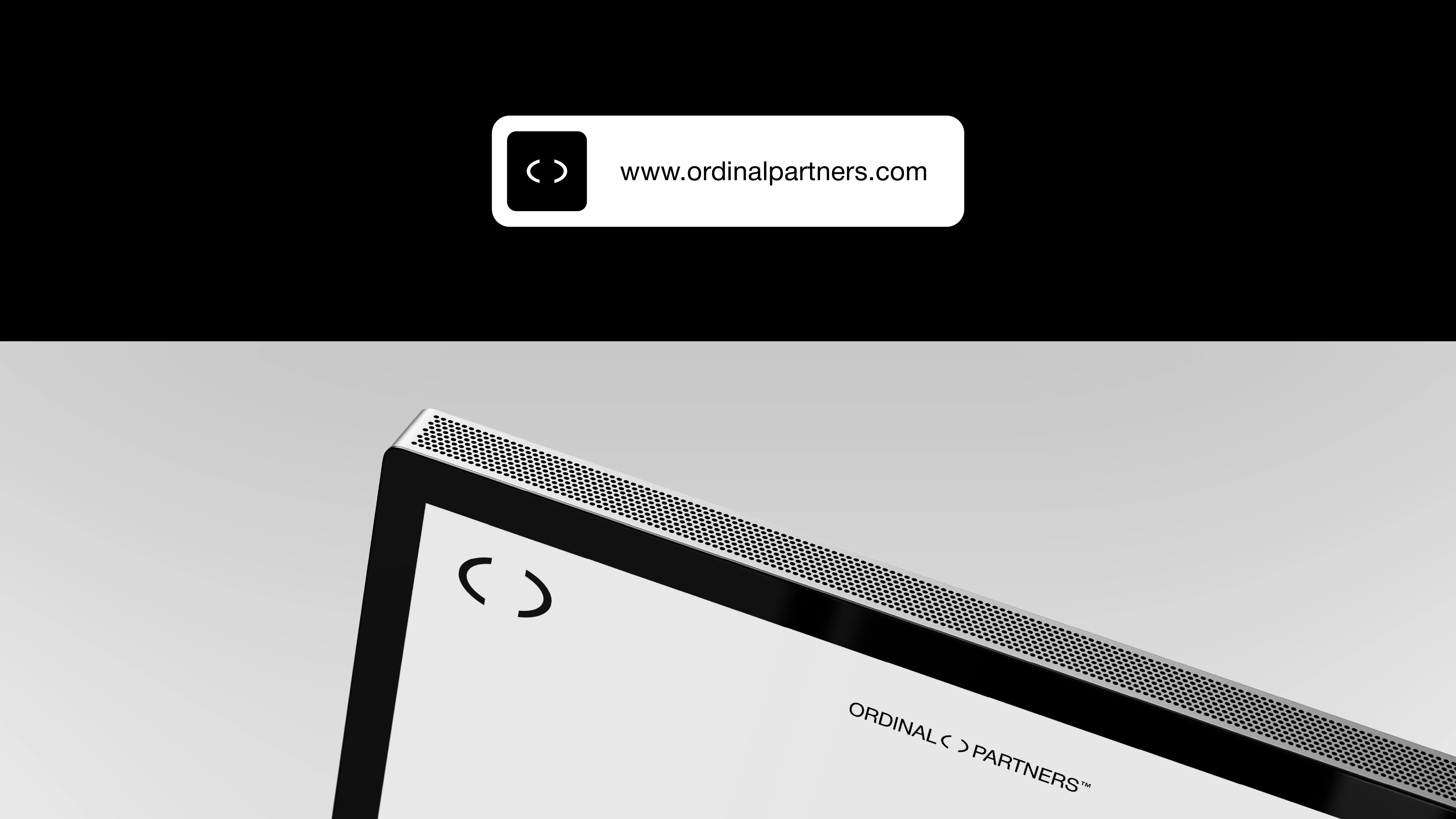
The brackets represent structure, order and connection. Two forms working together, creating a space between them. A subtle reference to how Ordinal works with its clients, bringing different pieces together and helping make sense of what matters.
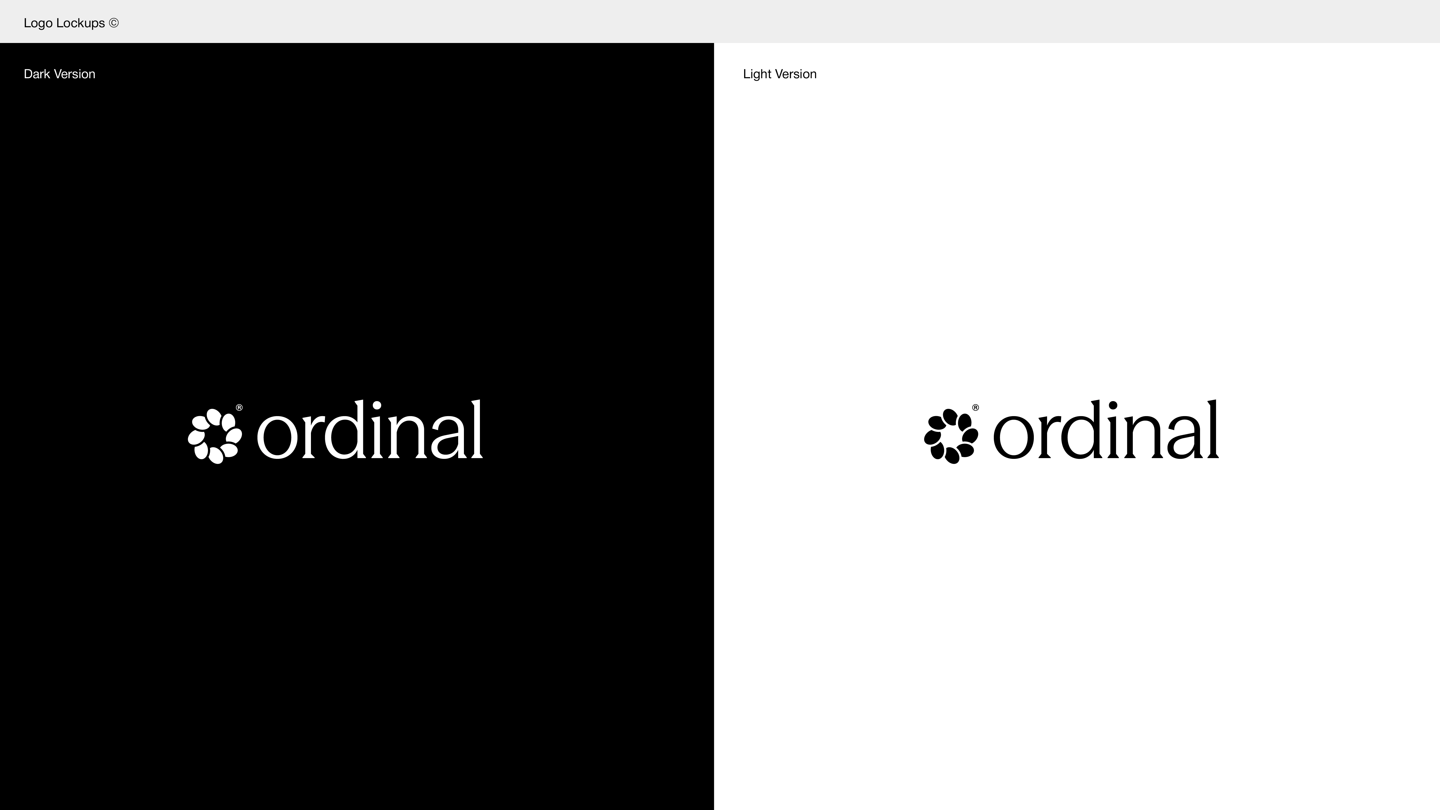
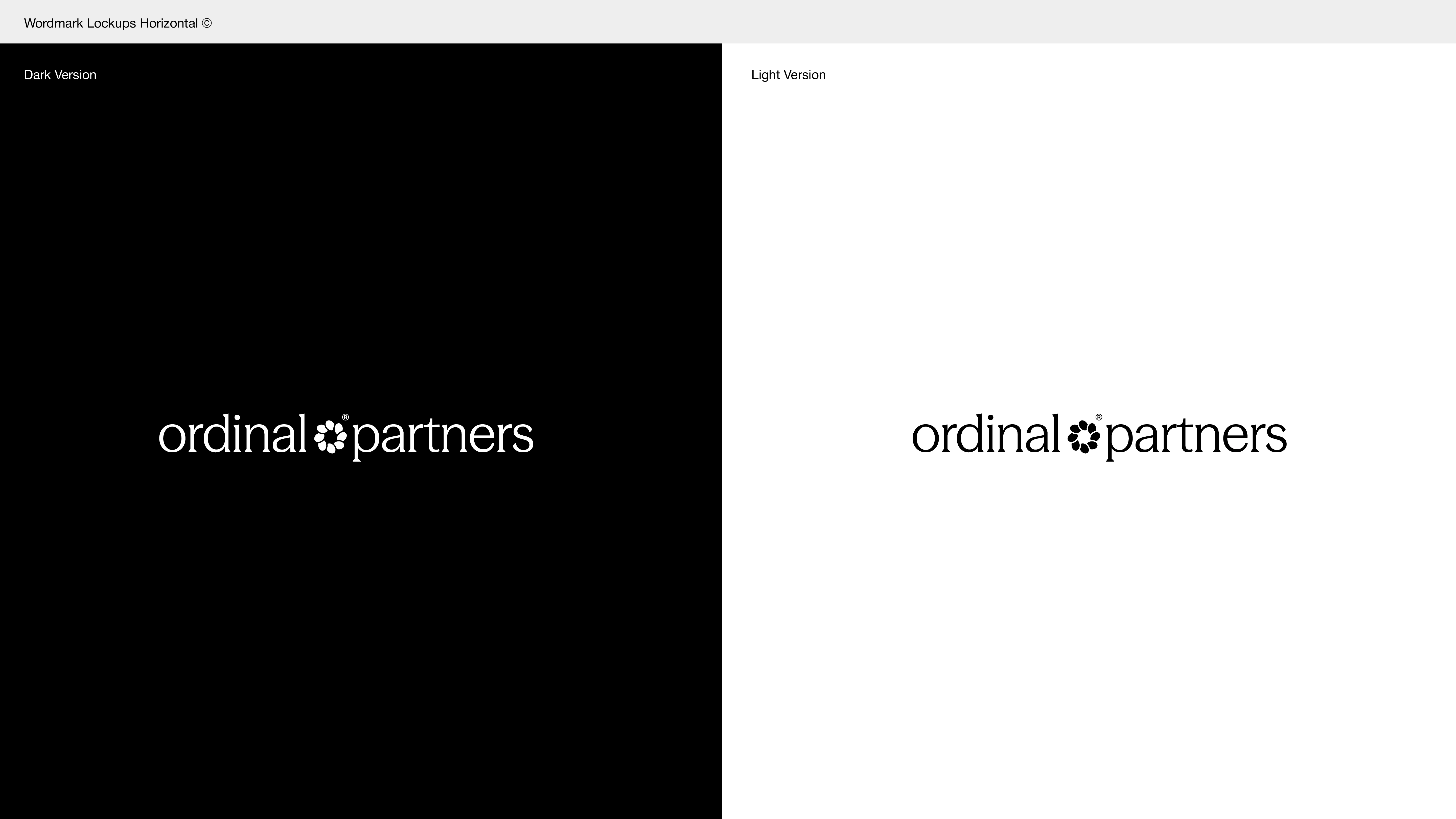
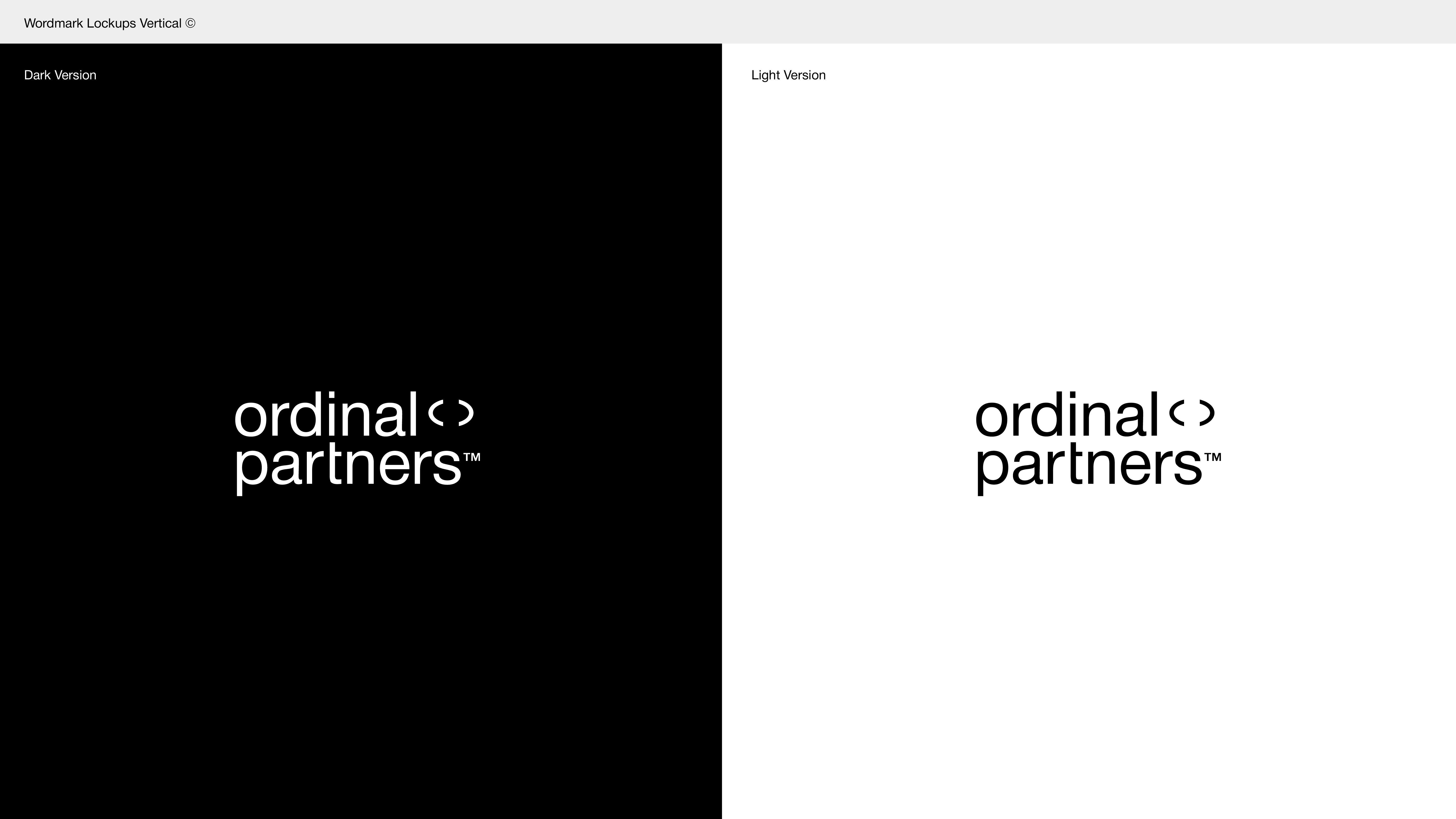
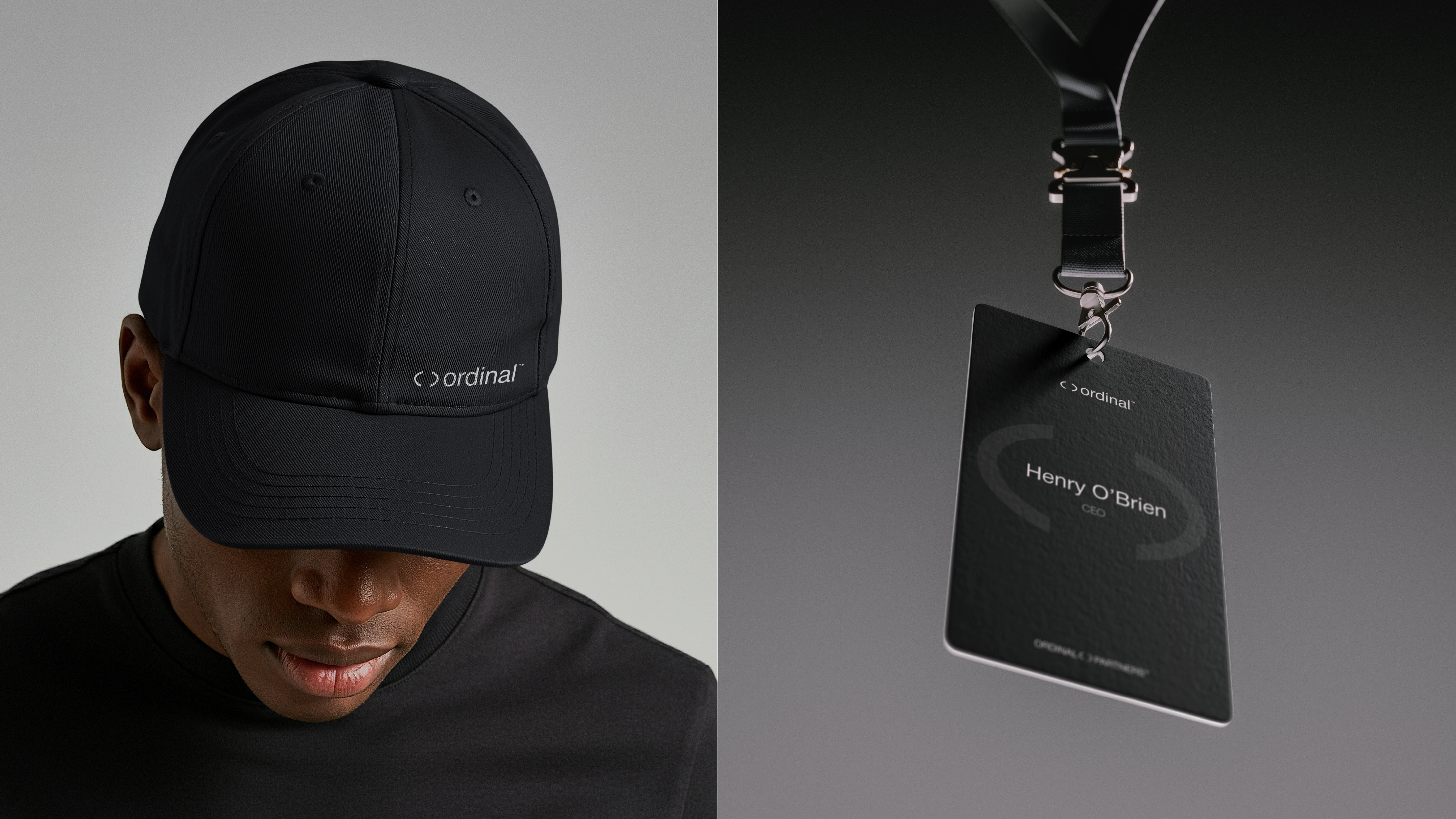
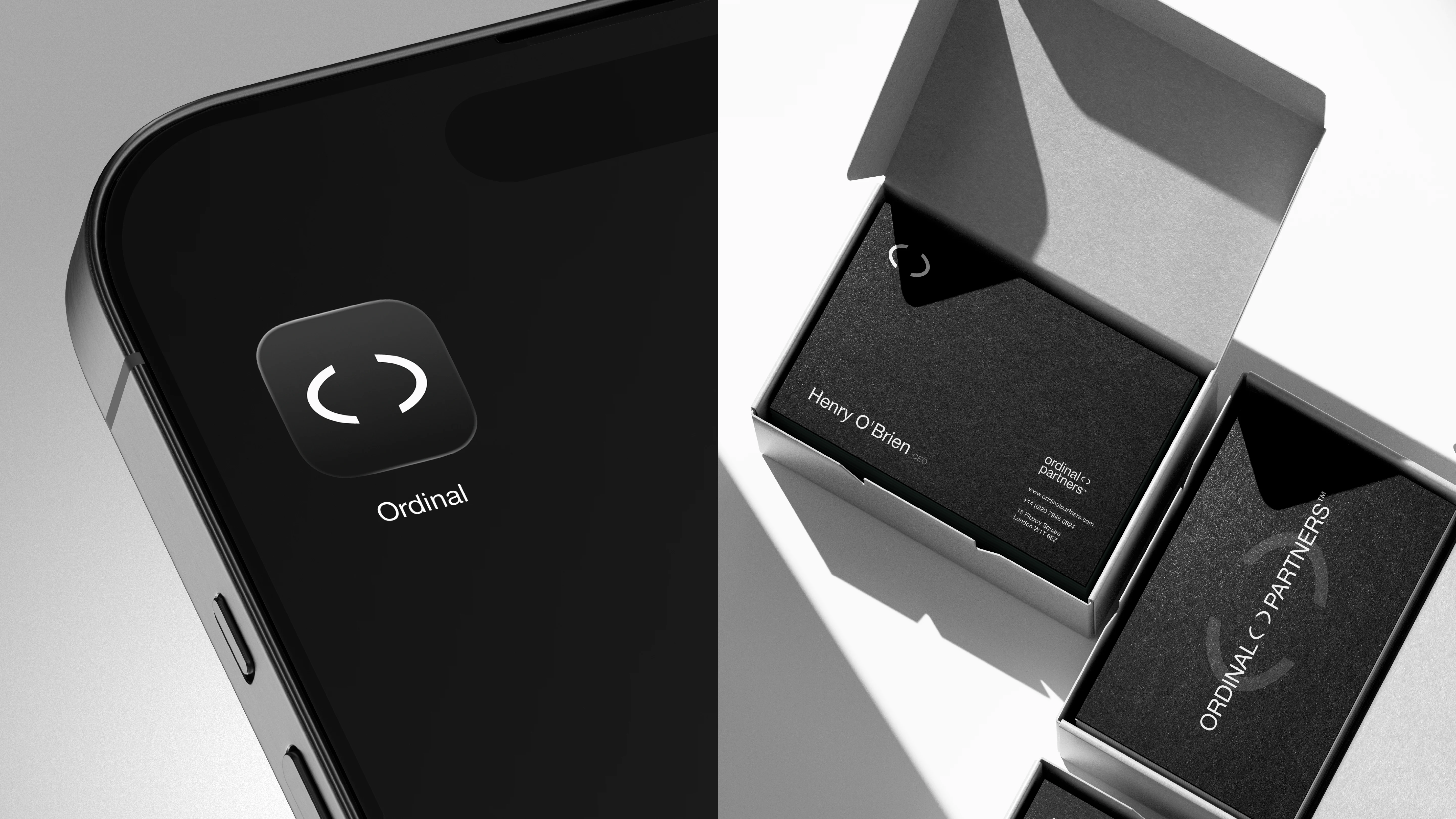
Rather than treating the mark as a separate symbol, we also explored using it as part of the wordmark, sitting between ordinal and partners. This gave the identity a small but distinctive detail that could work just as well on its own.
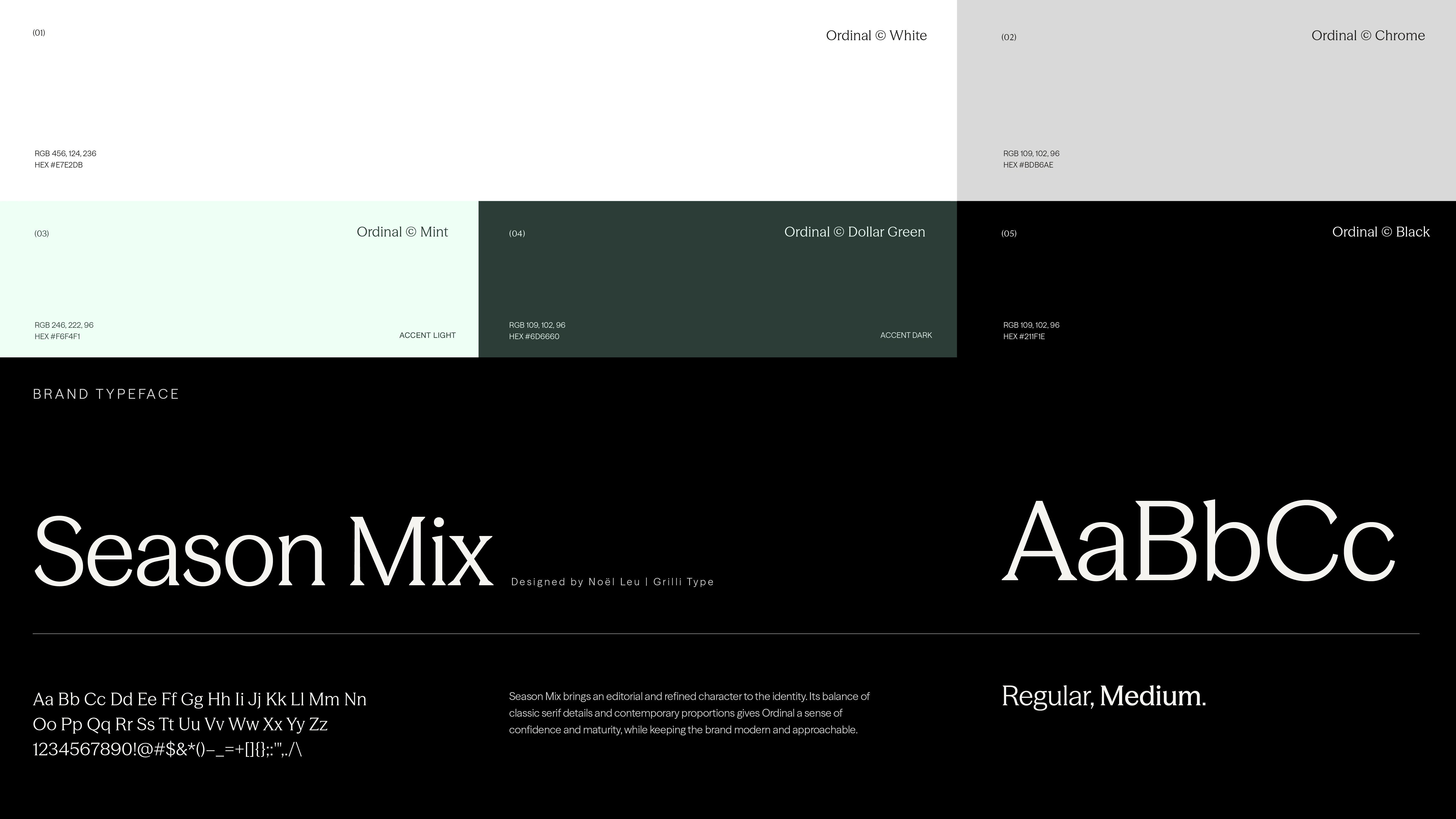
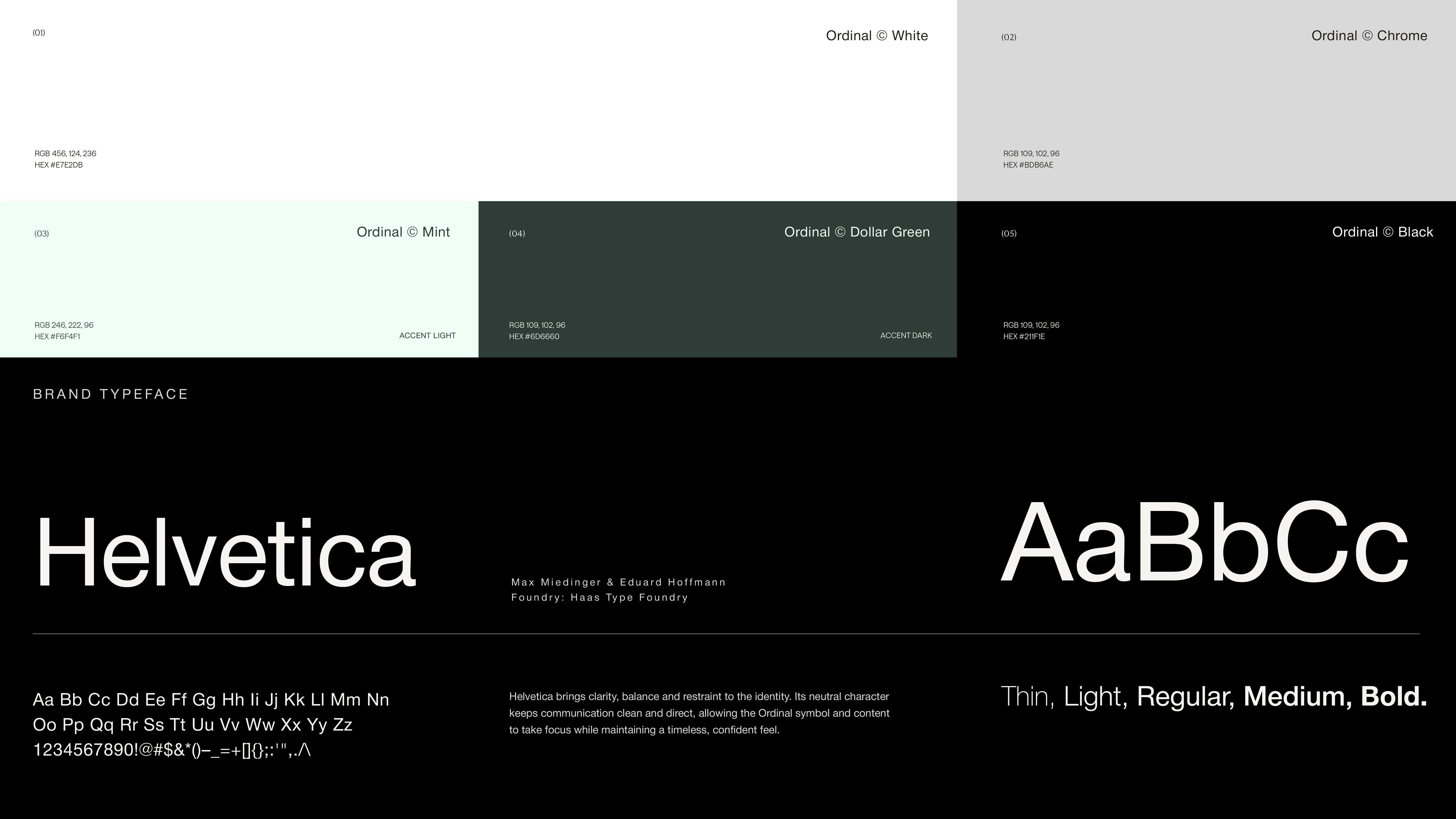
We kept the typography equally considered. Söhne brings clarity and simplicity to the wordmark and everyday communication, while Reckless Neue adds a more human, editorial character to larger statements.
The result is a straightforward, flexible logo and typography system that gives Ordinal room to grow without overcomplicating things.
Client: Ordinal Partners
Industry: Strategic Financial Advisory
Scope: Logo Design, Typography, Color Palette & Usage Guidelines
Concept (01)
The idea here was separate elements coming together into one organised whole. Its about Ordinal bringing clarity and structure to different parts of a business
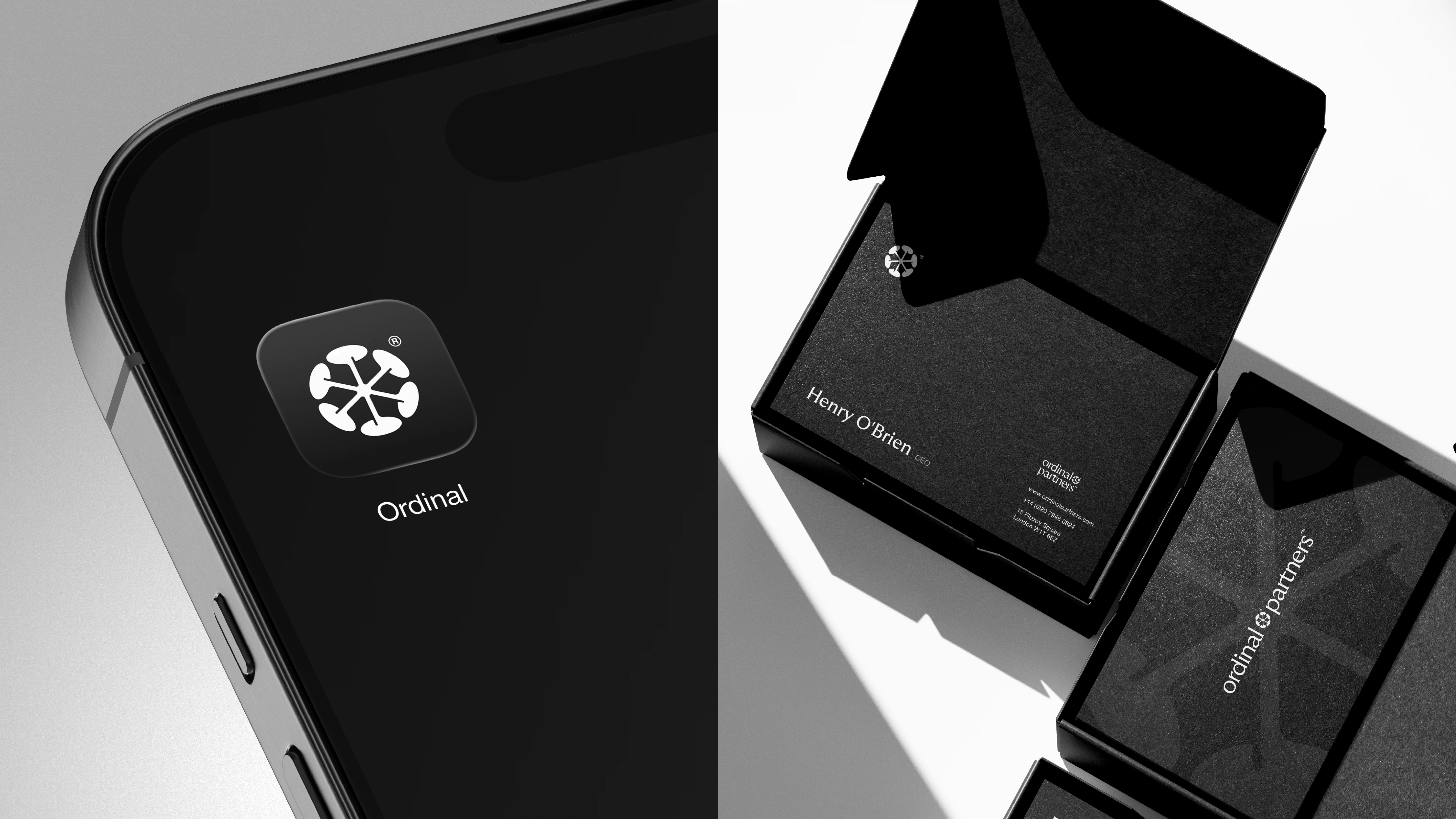
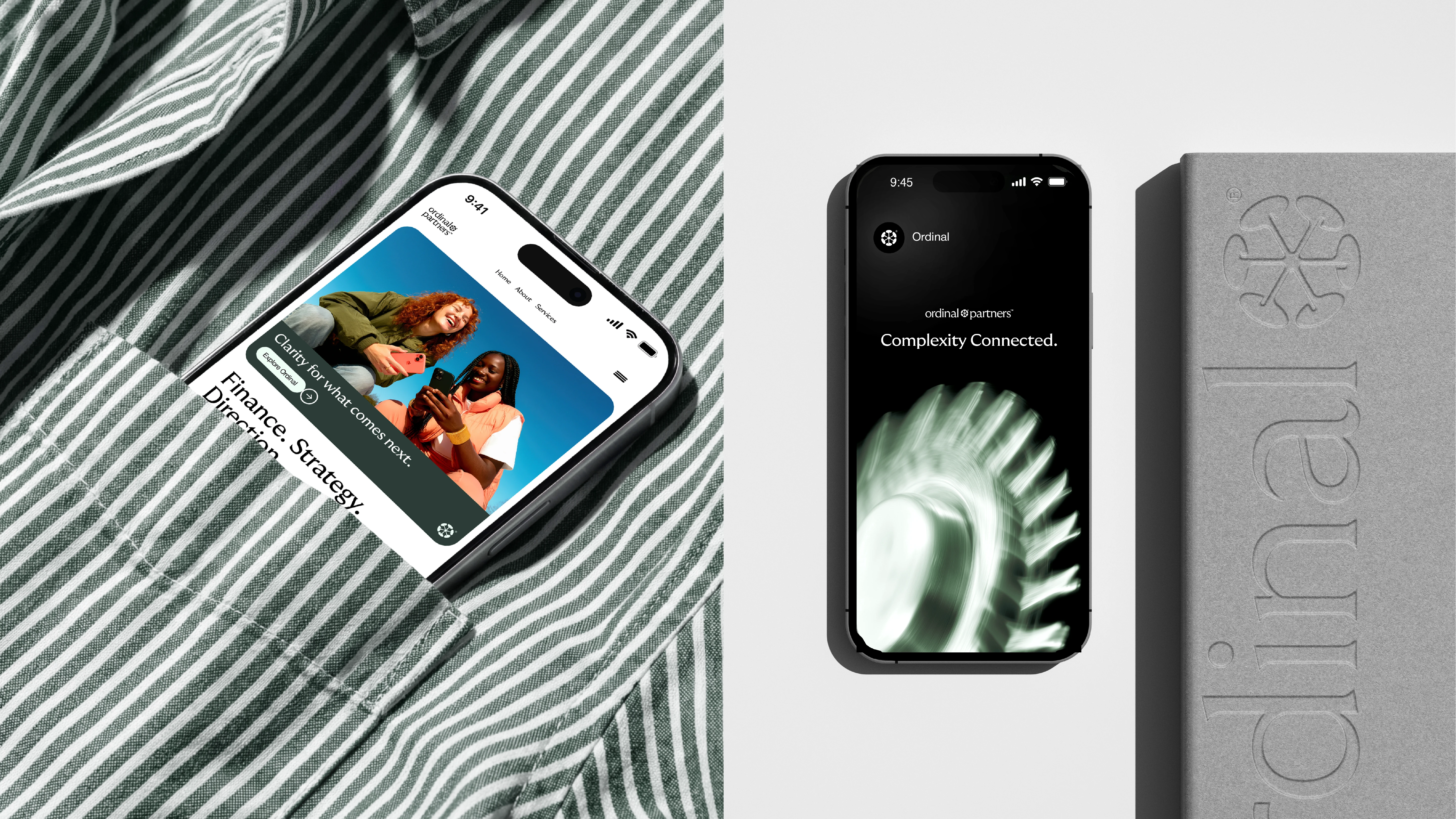
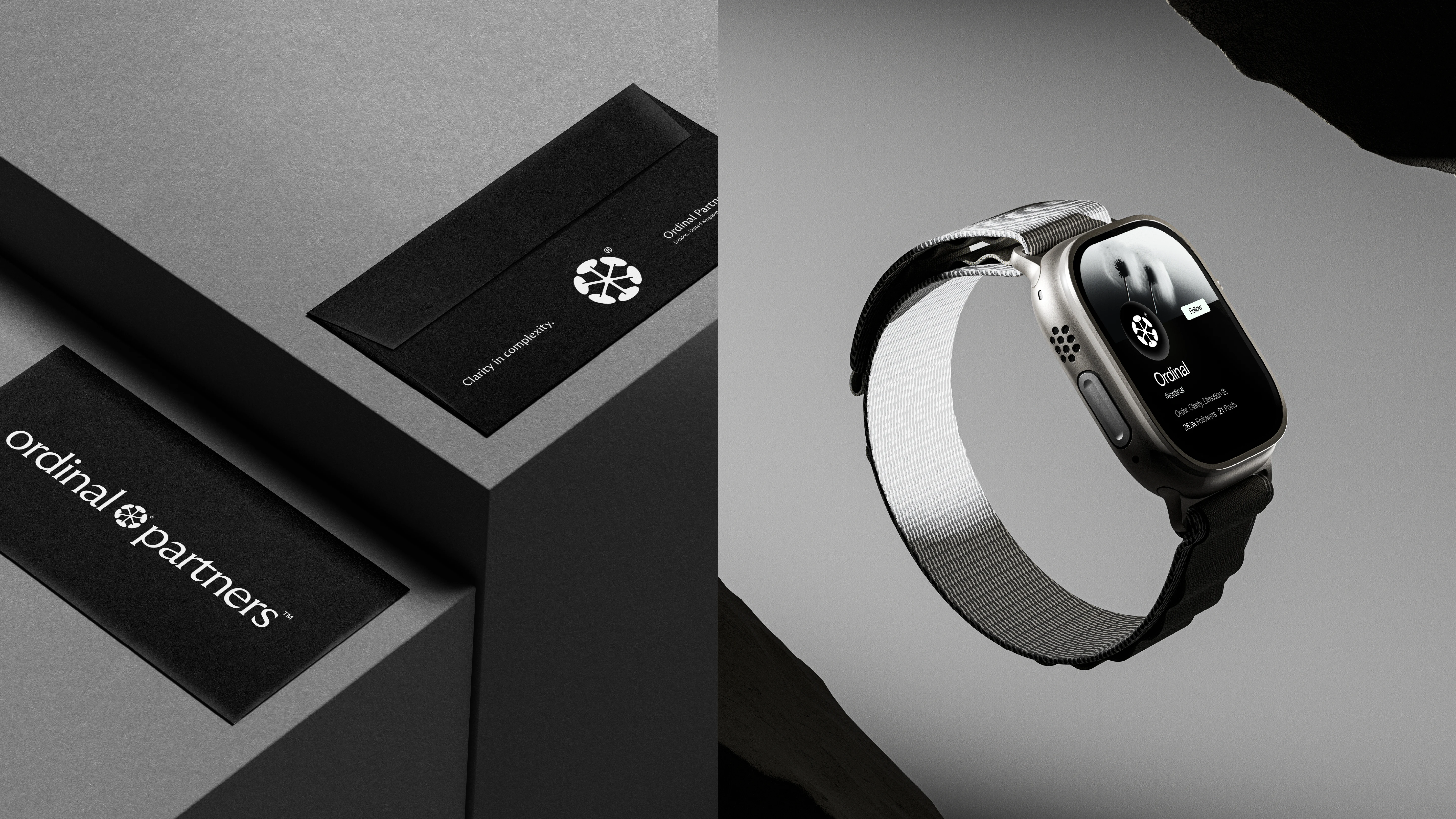
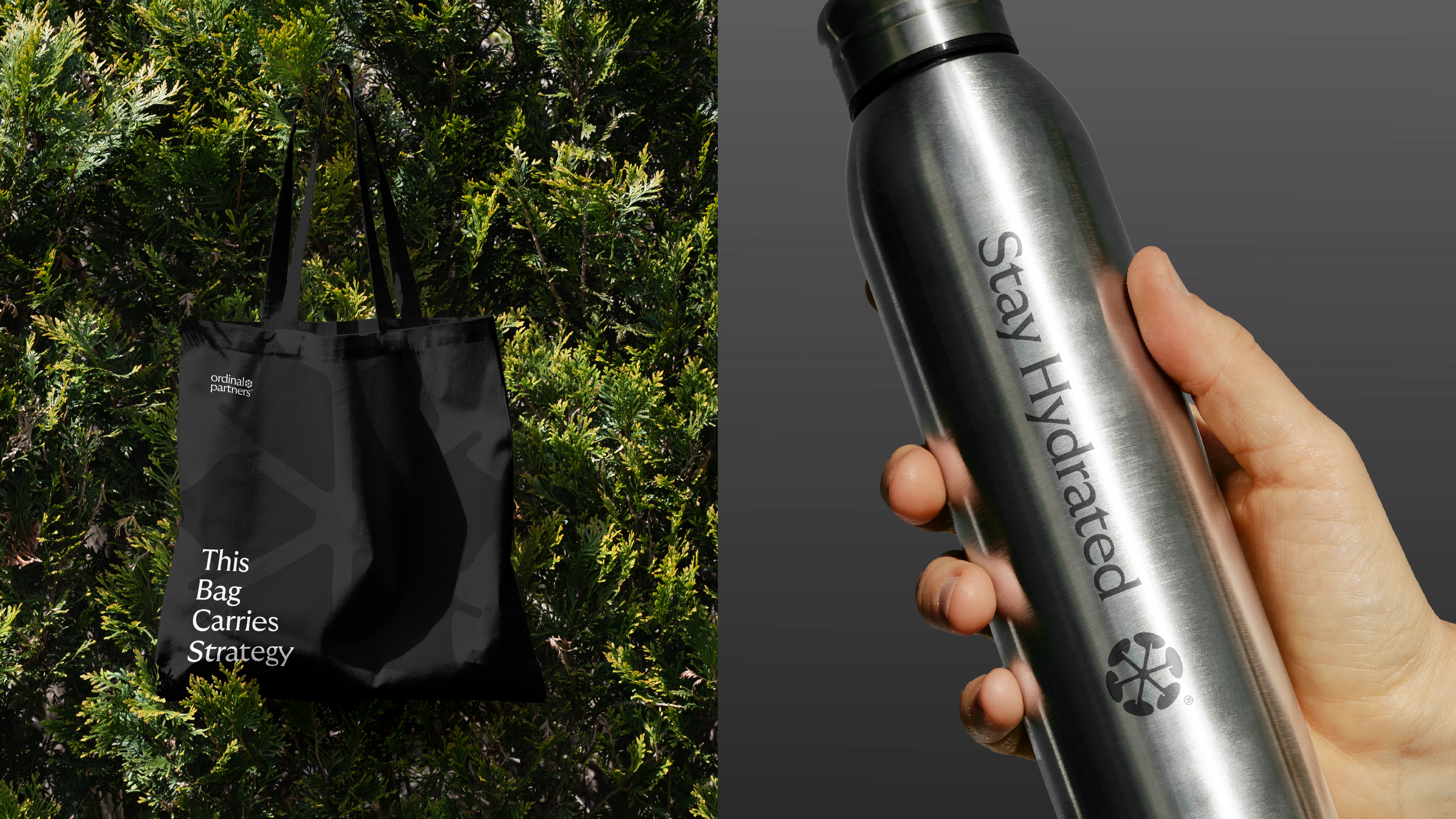
A refined and structured direction built around the idea of bringing separate elements together into one clear system. The identity balances precision with a more human character. The structured symbol represents connection, order and alignment, while the rounded forms and considered typography soften the overall feel.
A restrained palette of black, soft neutrals and deep green creates a sense of quiet confidence, giving Ordinal a premium and established presence without feeling like a traditional financial institution.
The result is a brand that feels intelligent, calm and considered, reflecting Ordinal’s role in creating clarity from complexity.
Concept (02)
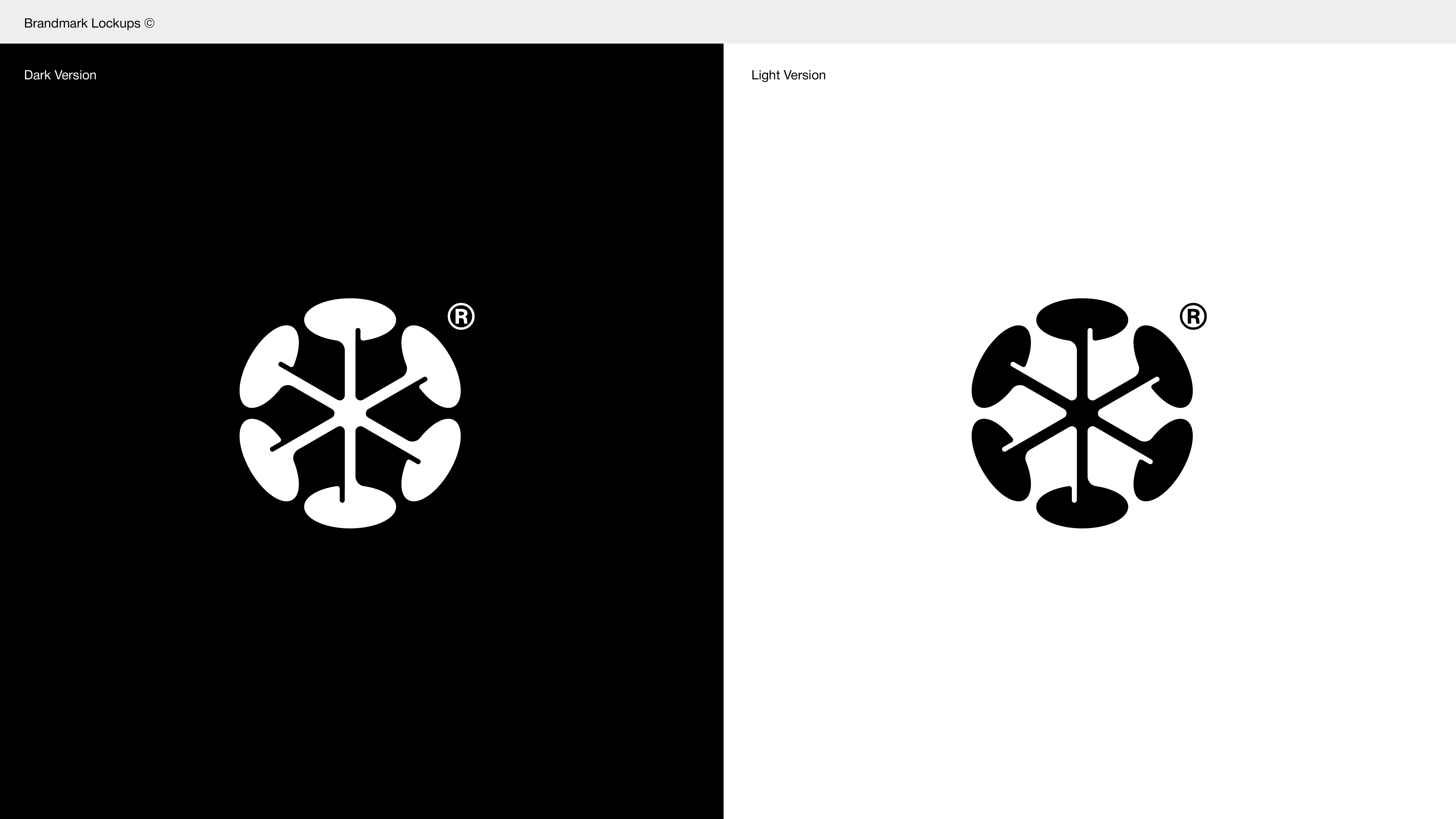
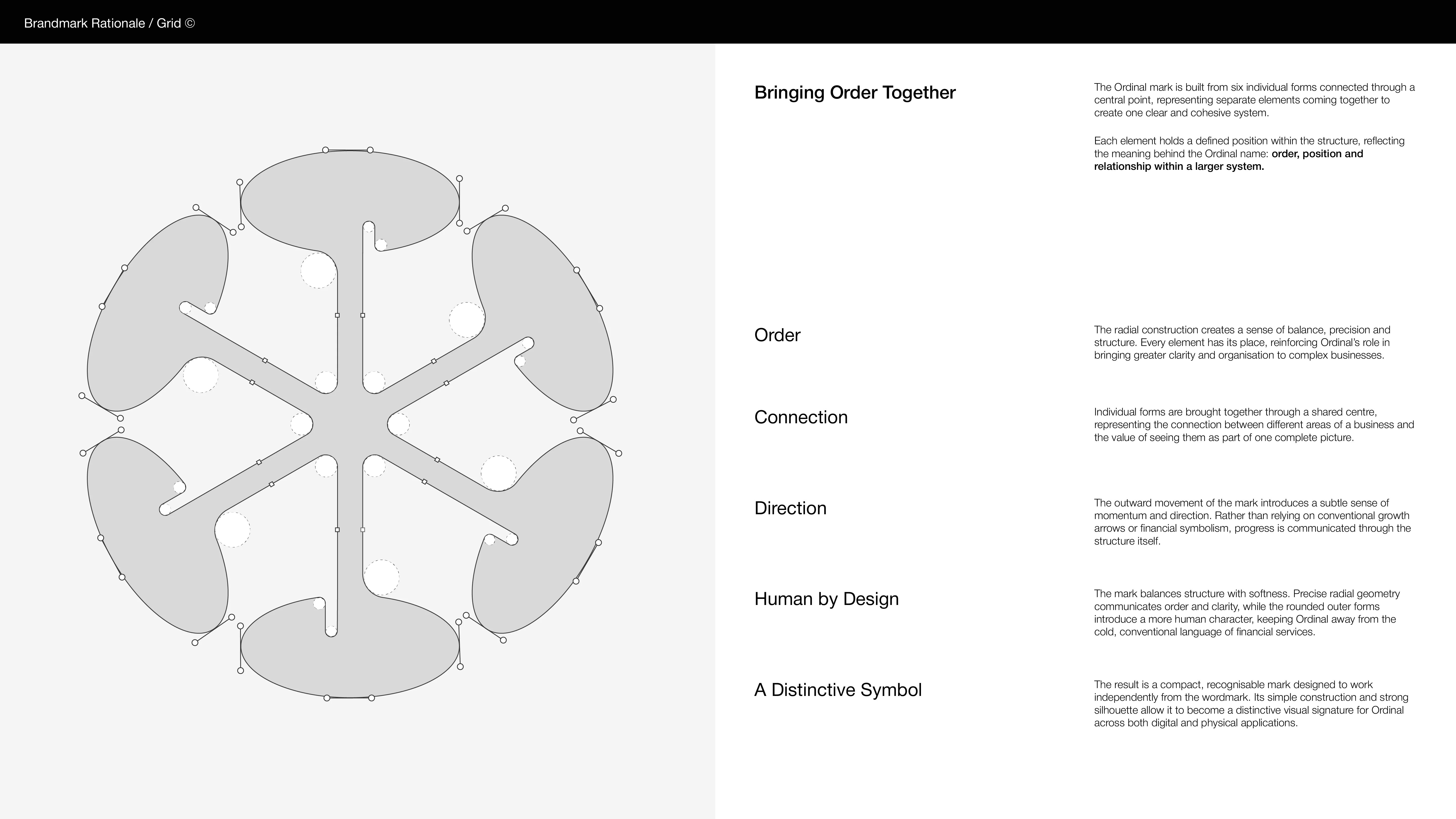
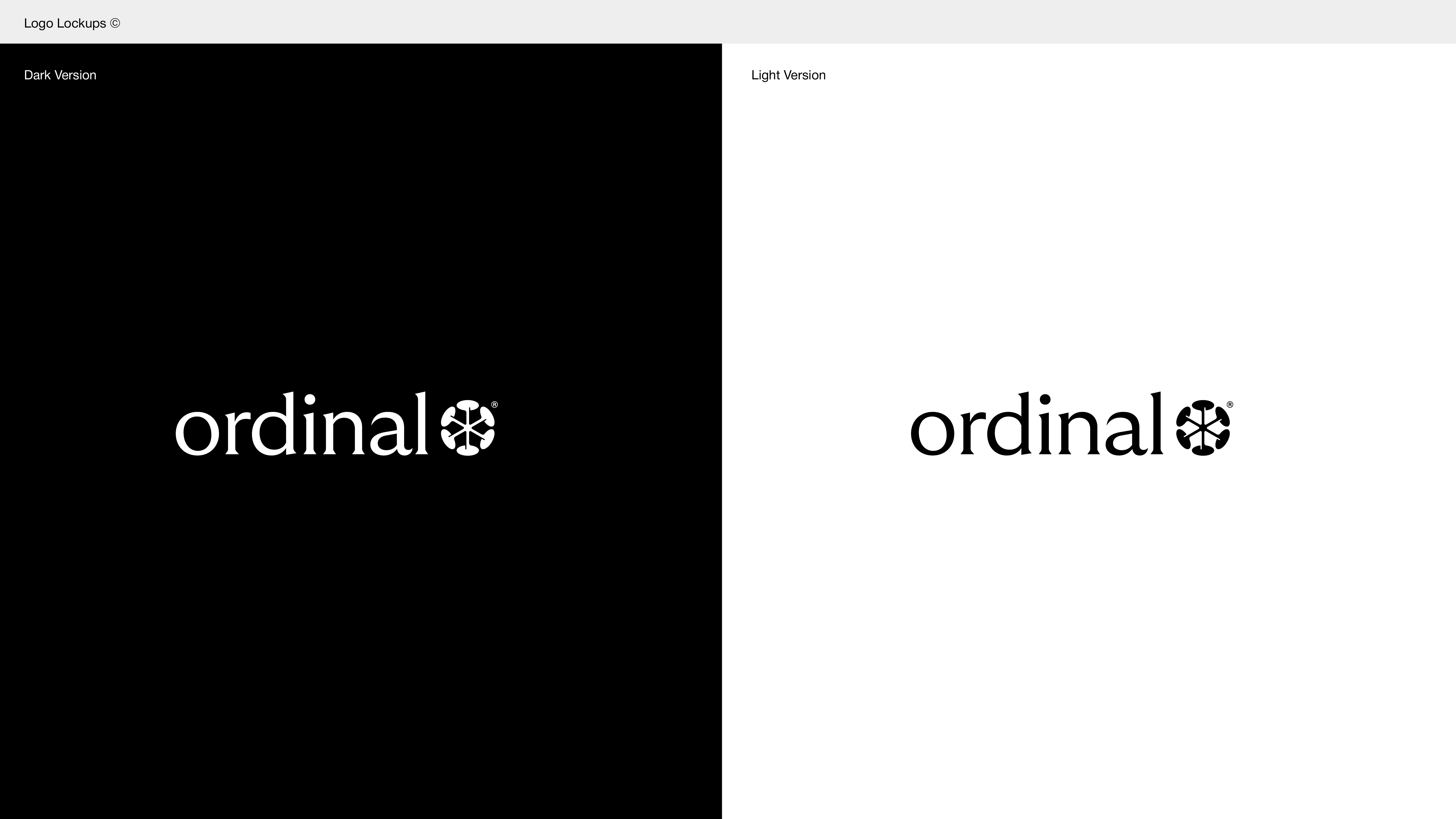
Circle of Value
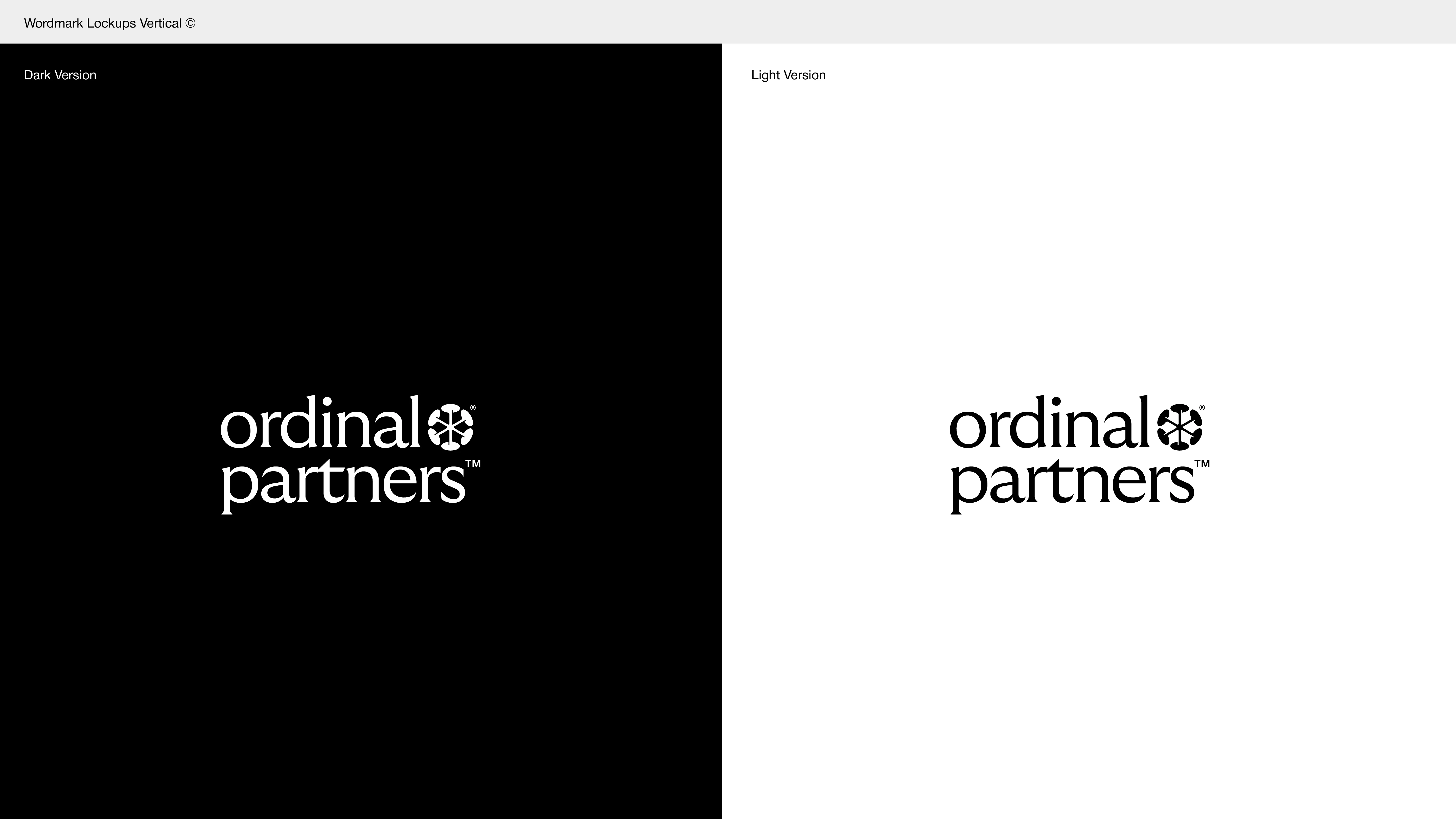
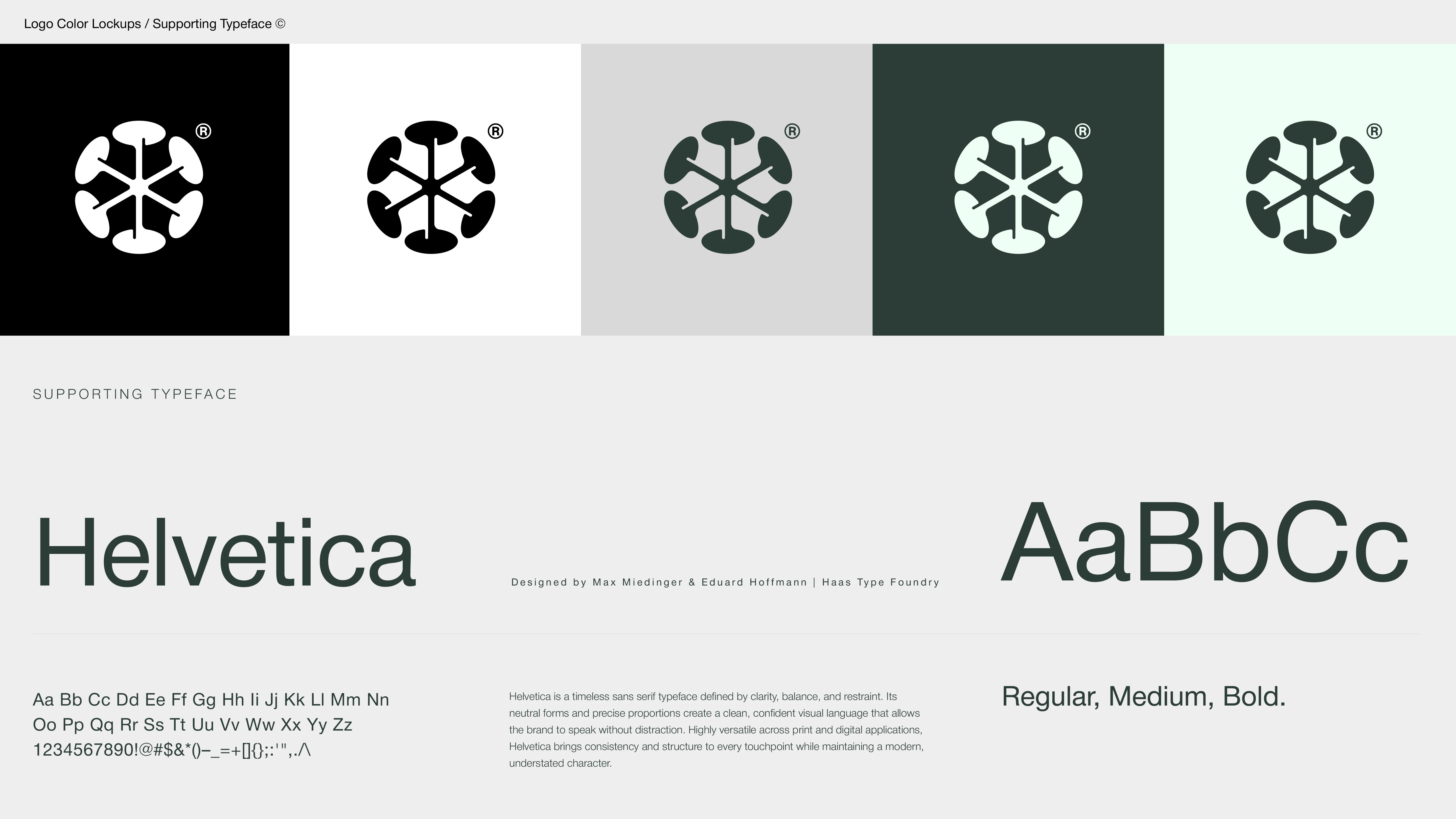
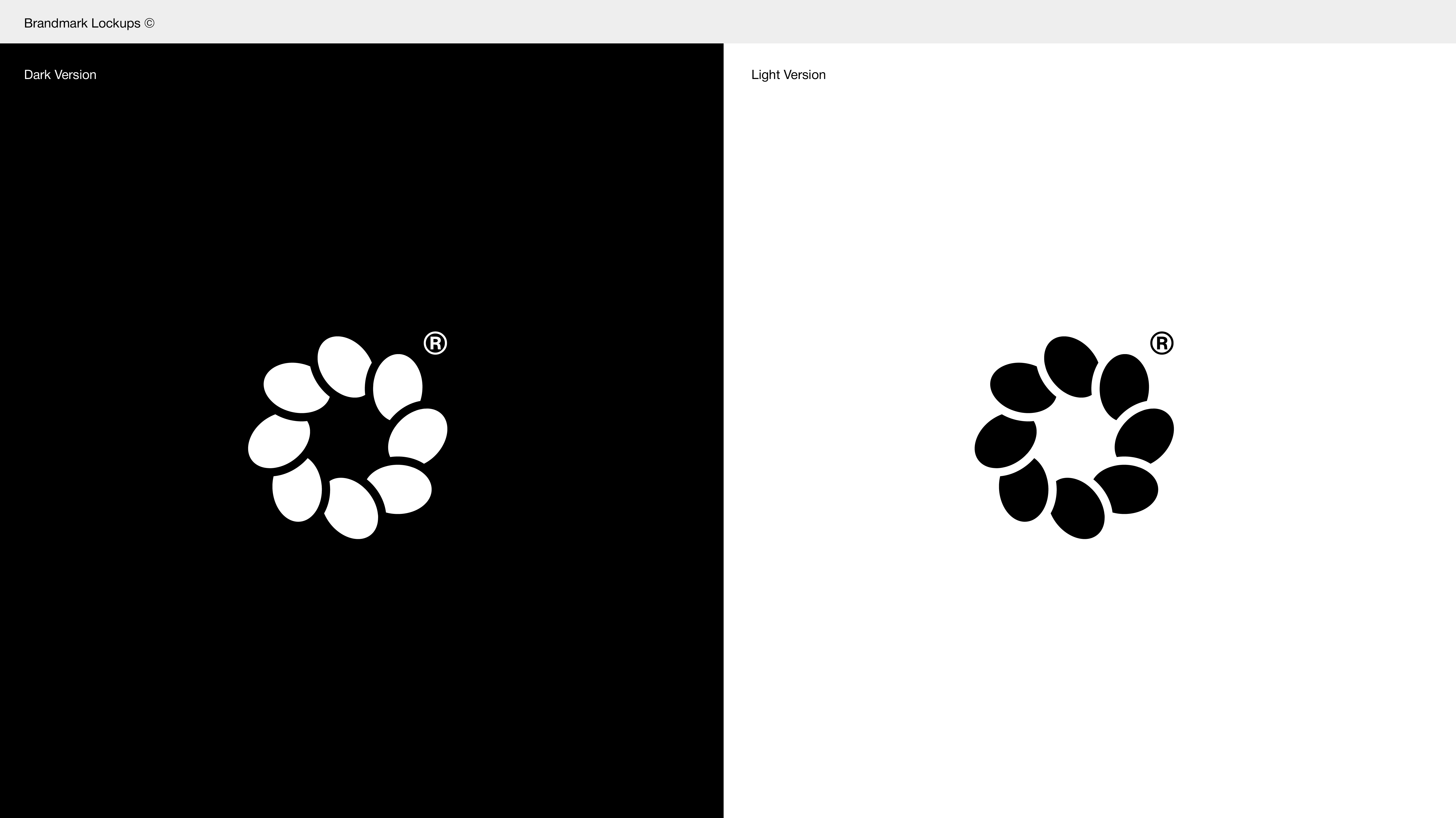
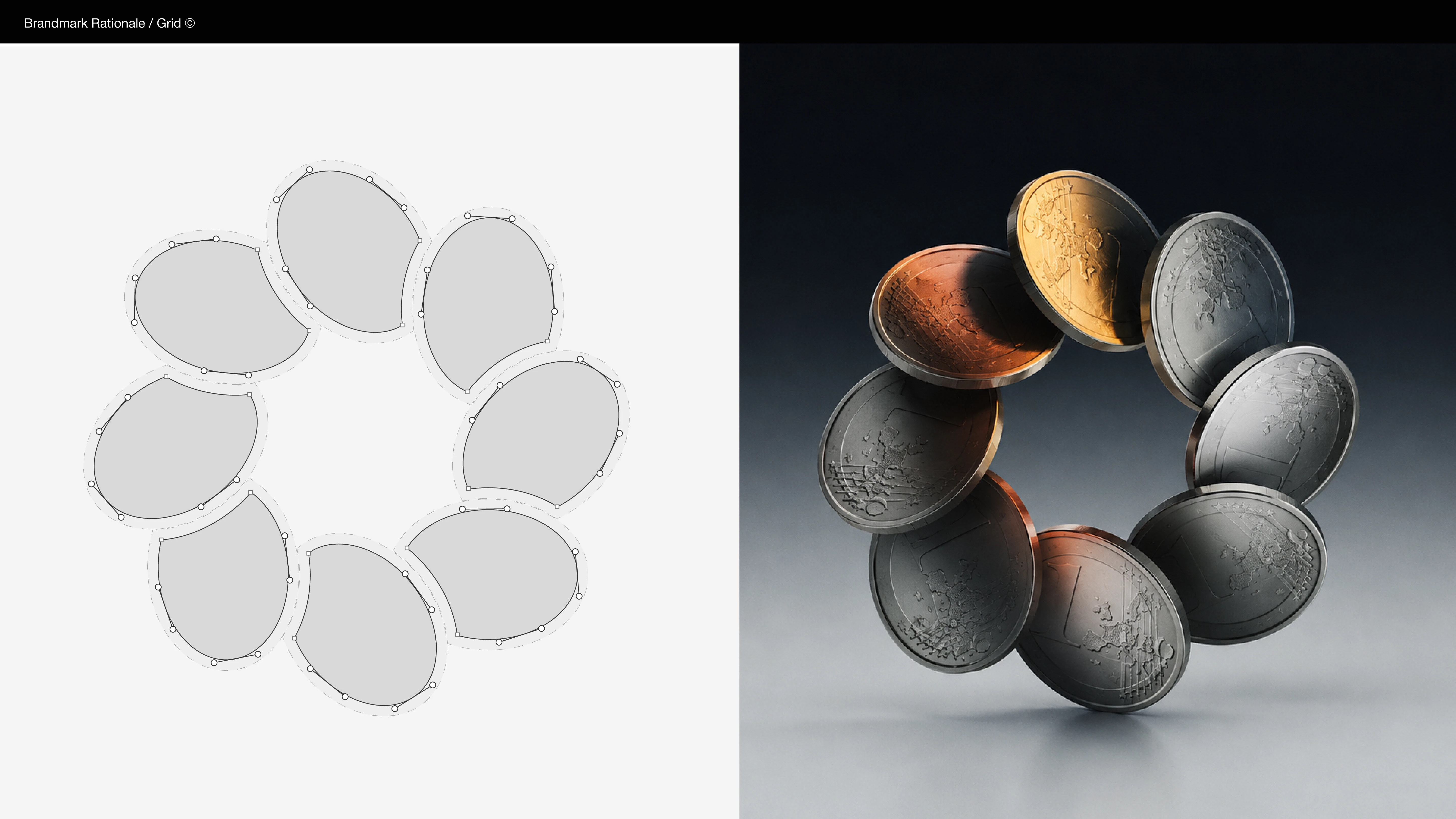
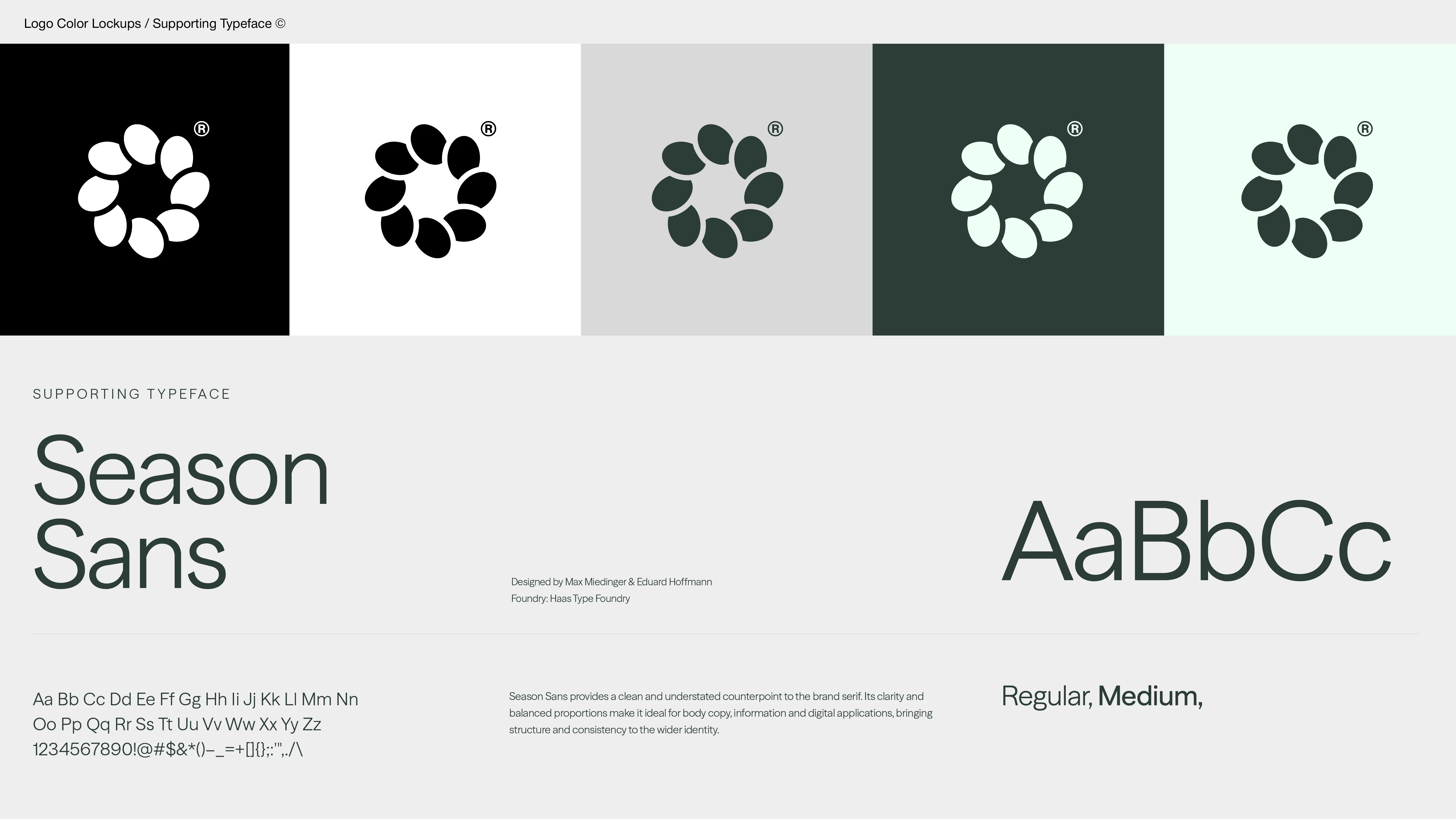
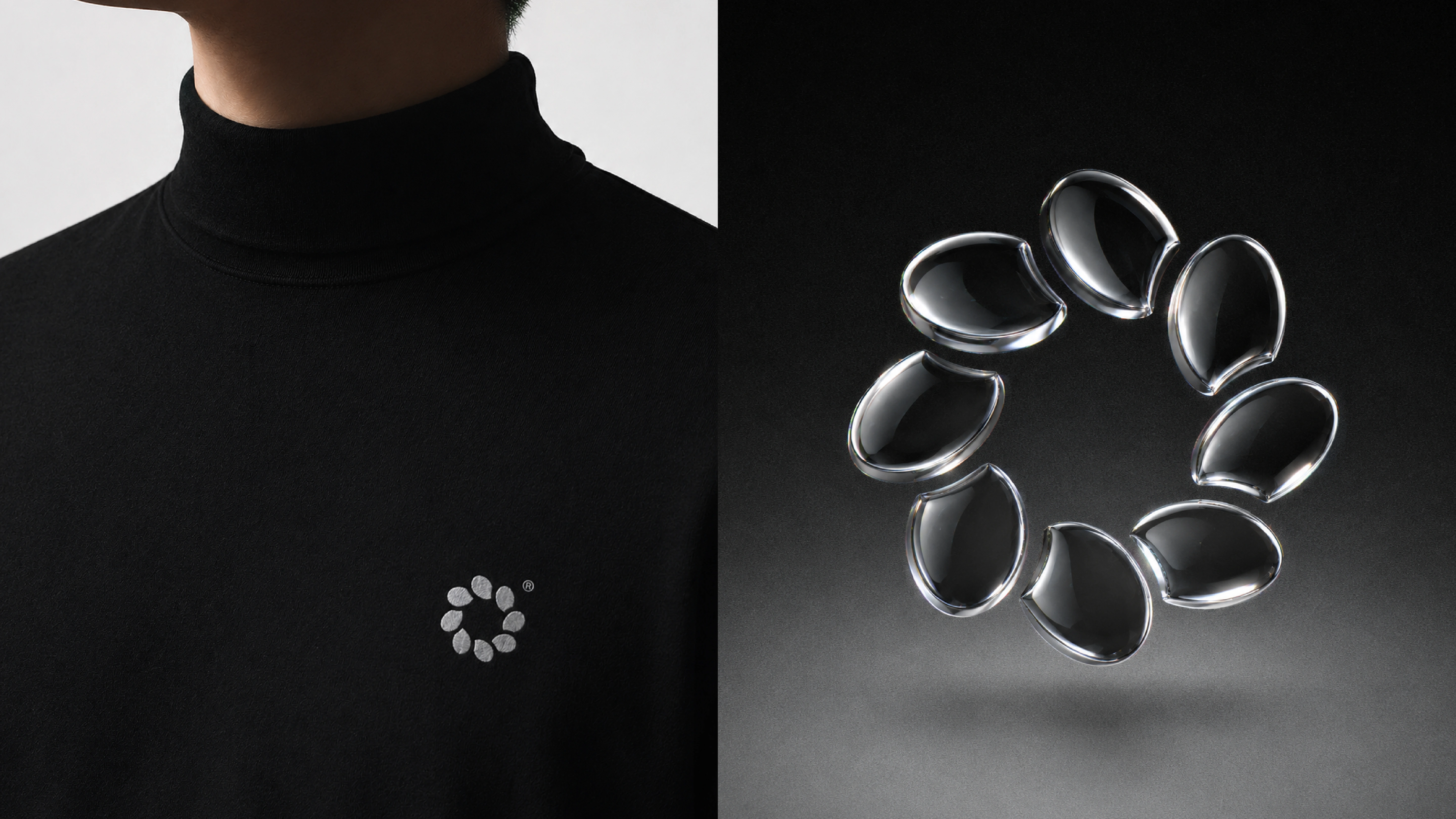
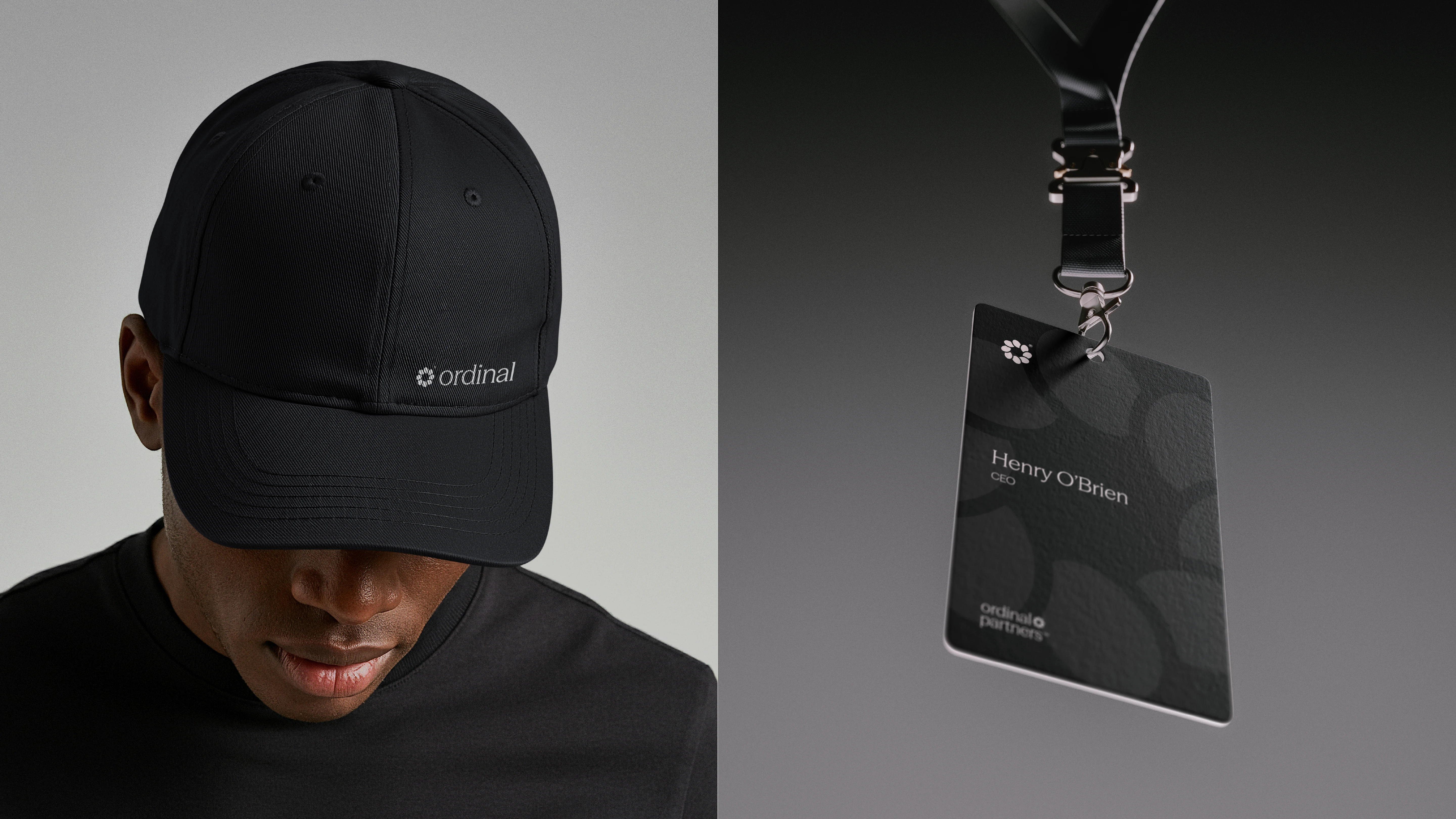
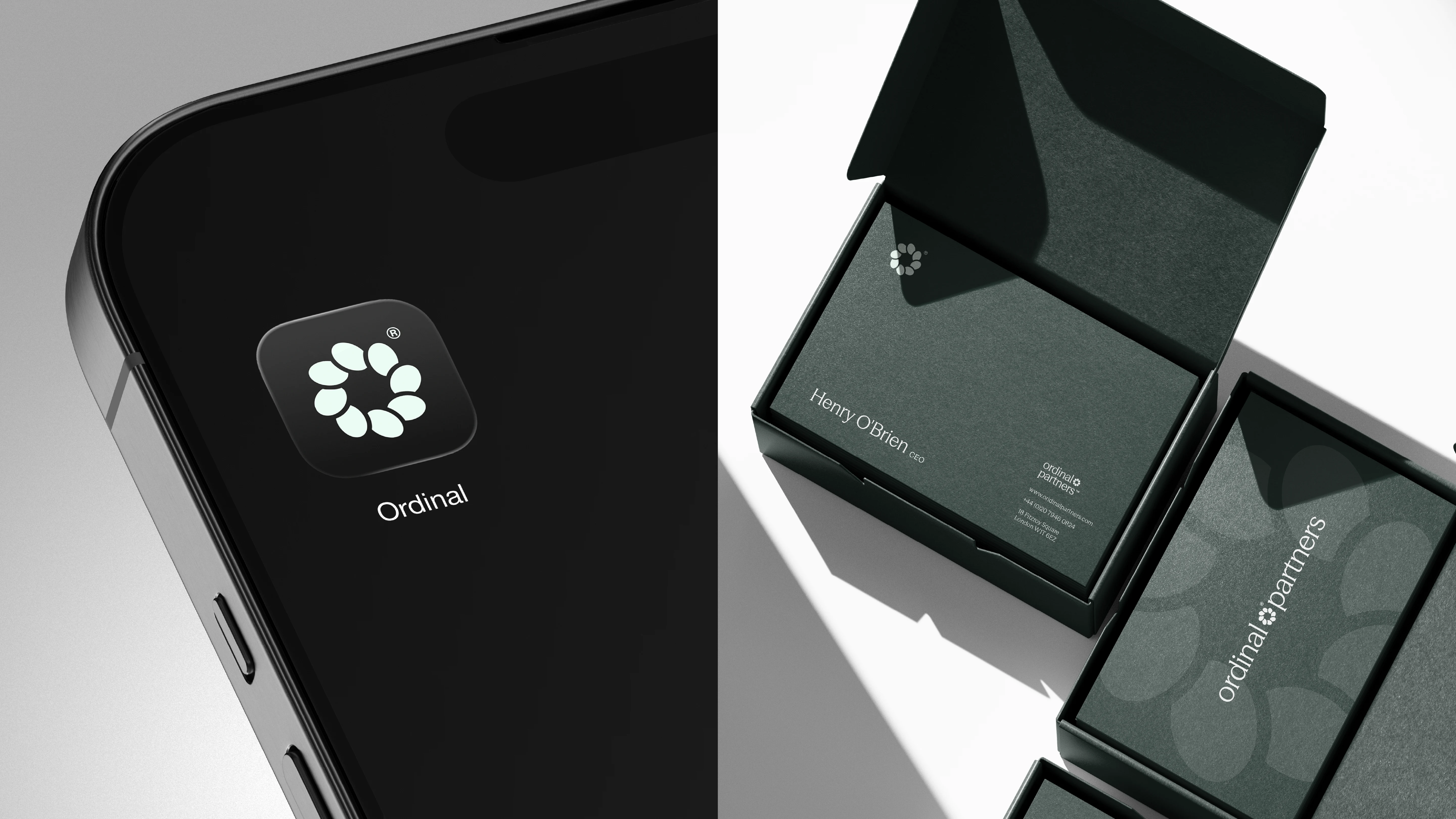
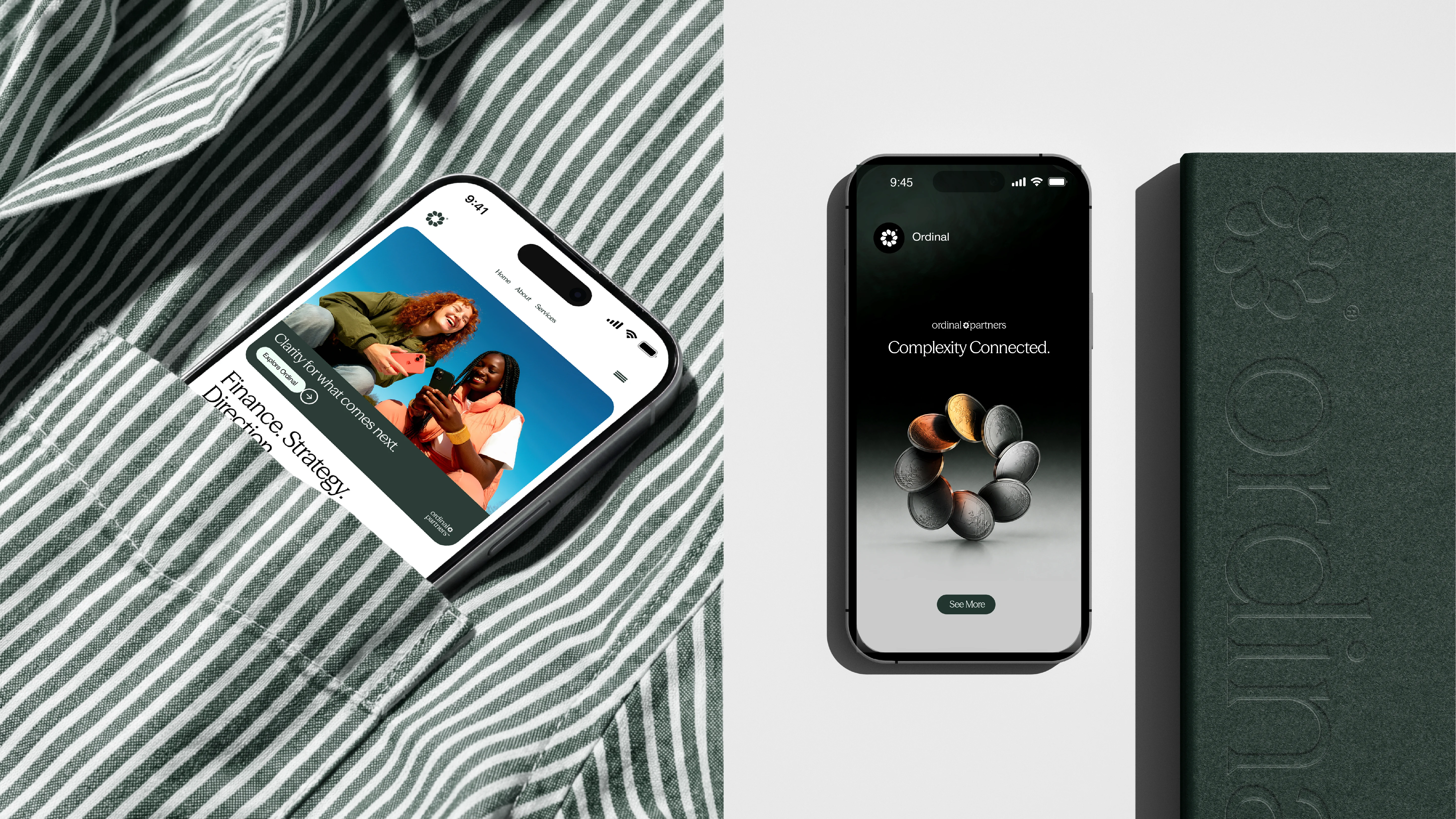
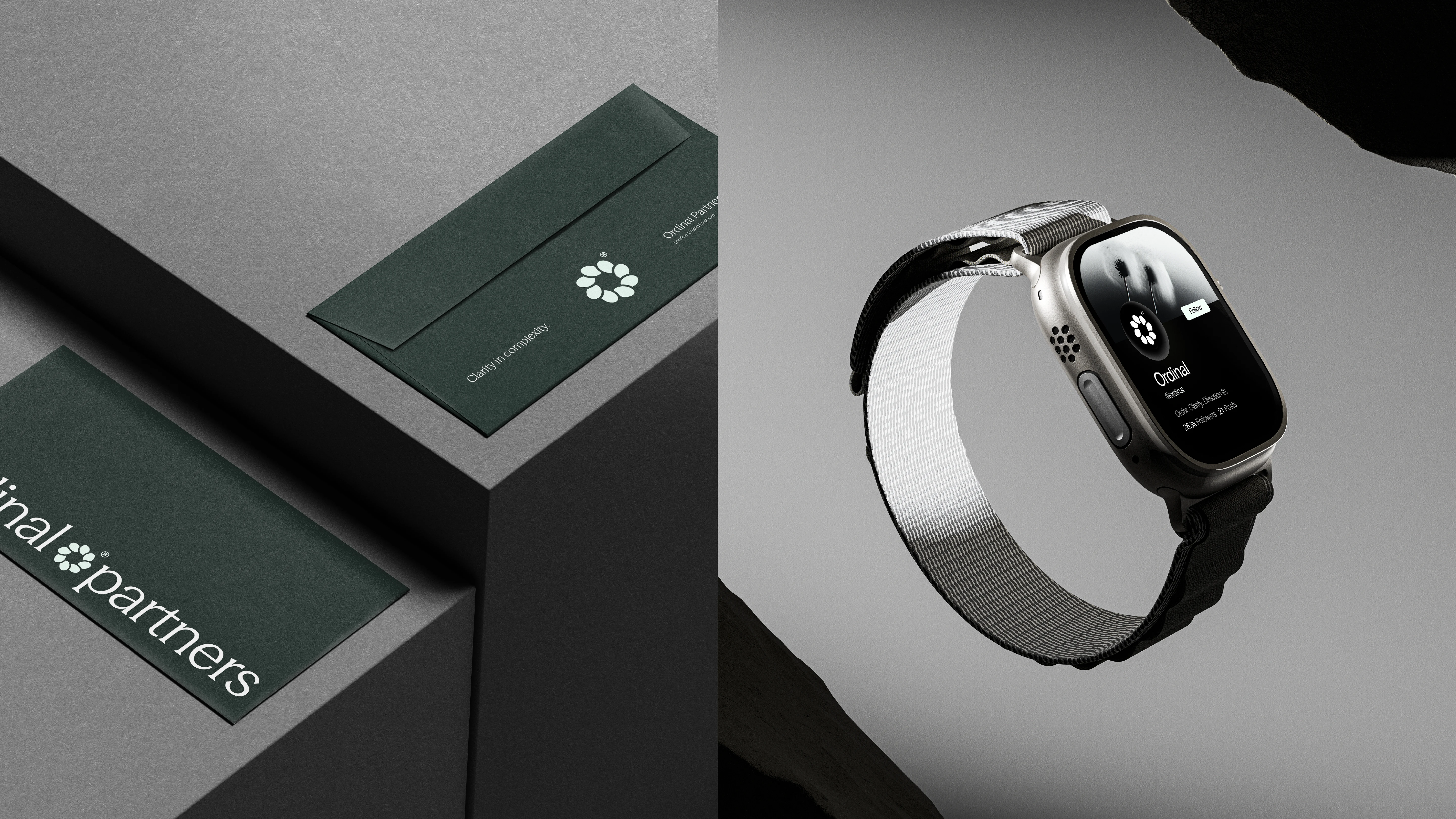
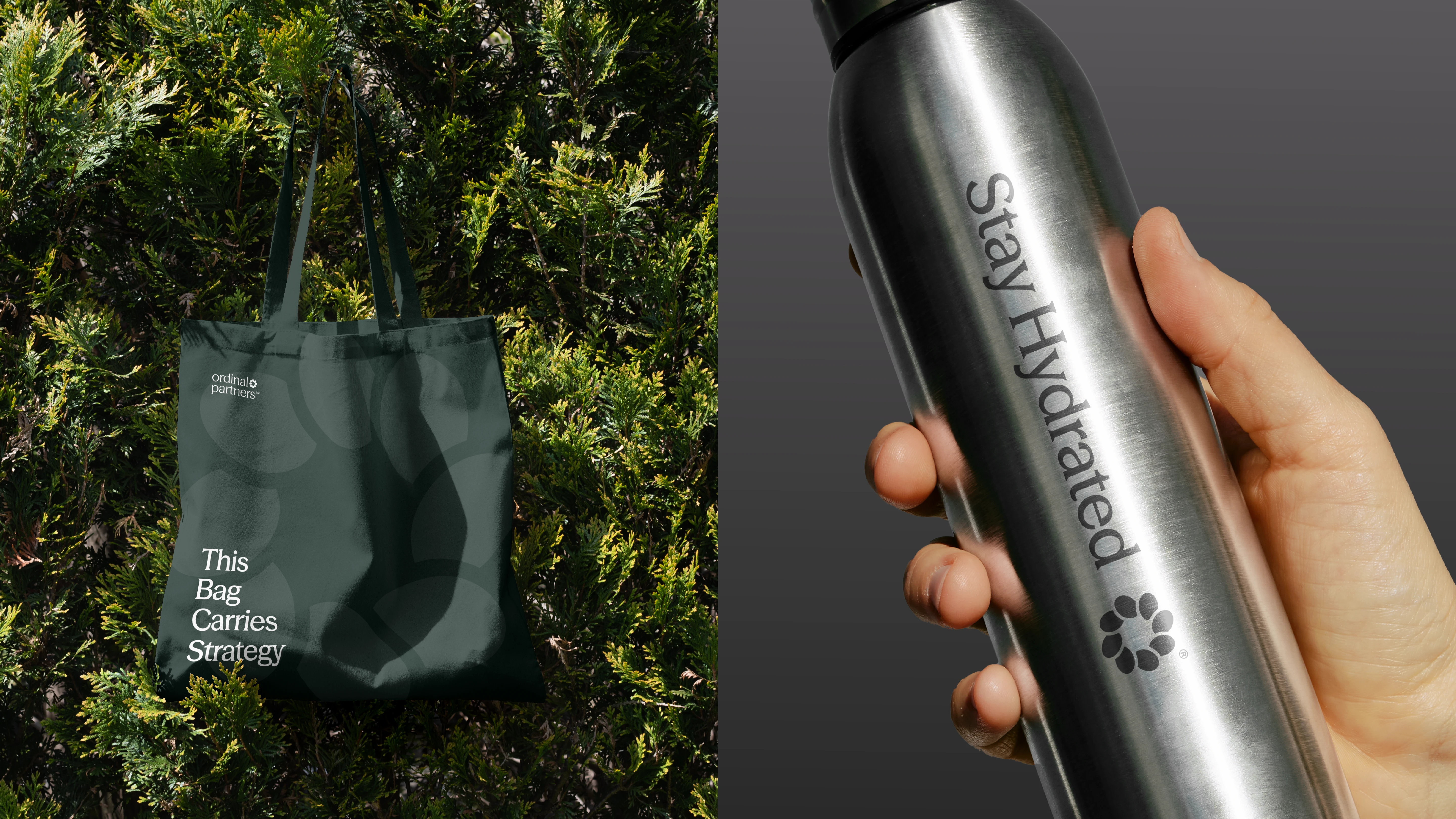
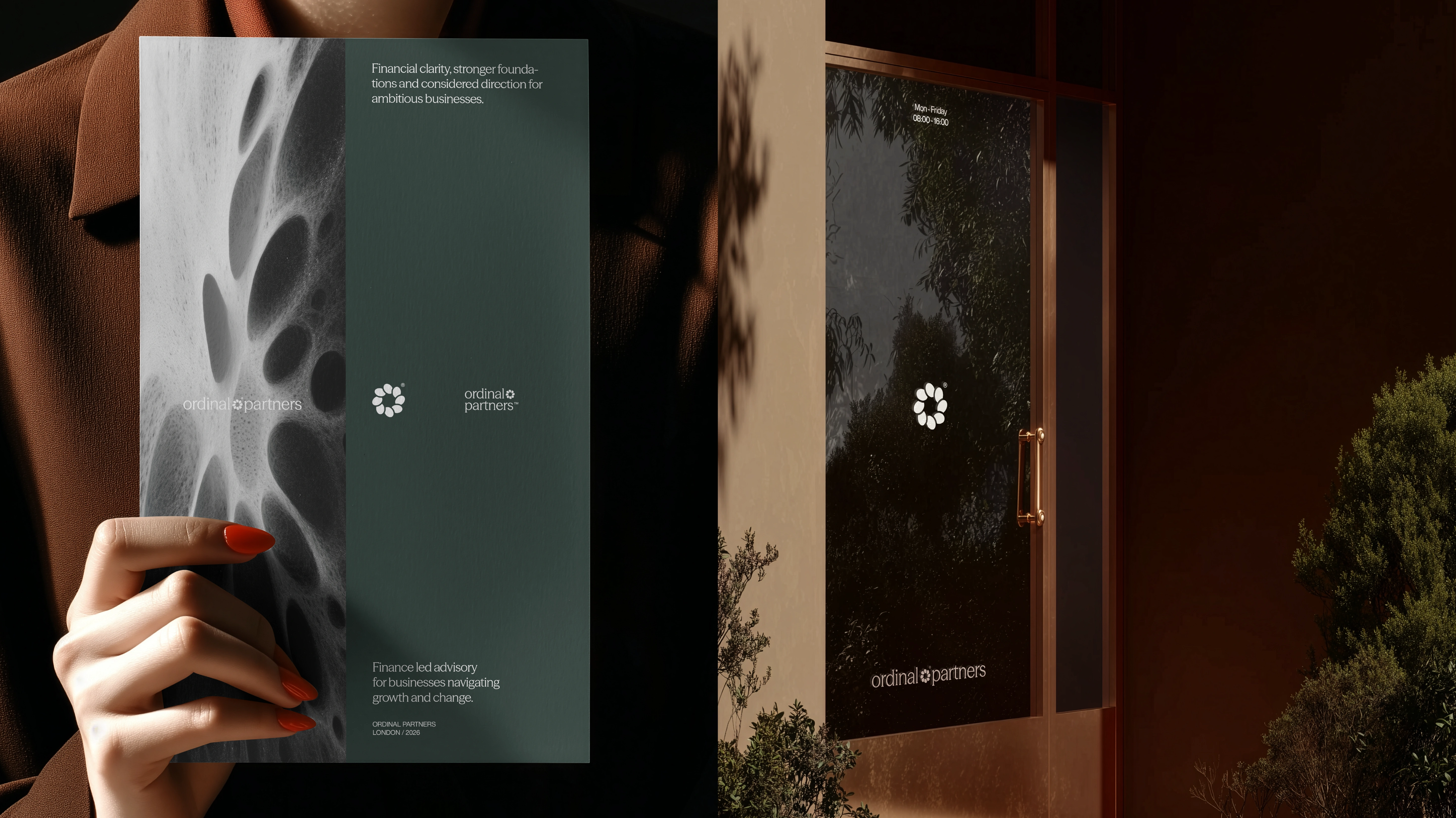
A refined direction inspired by the idea of money in motion and the continuous flow of value through a business. The symbol takes subtle inspiration from coins, using a single repeated form arranged in a circular sequence. The movement creates a sense of progress and continuity, while each element holds a defined position, connecting naturally back to the meaning of Ordinal.
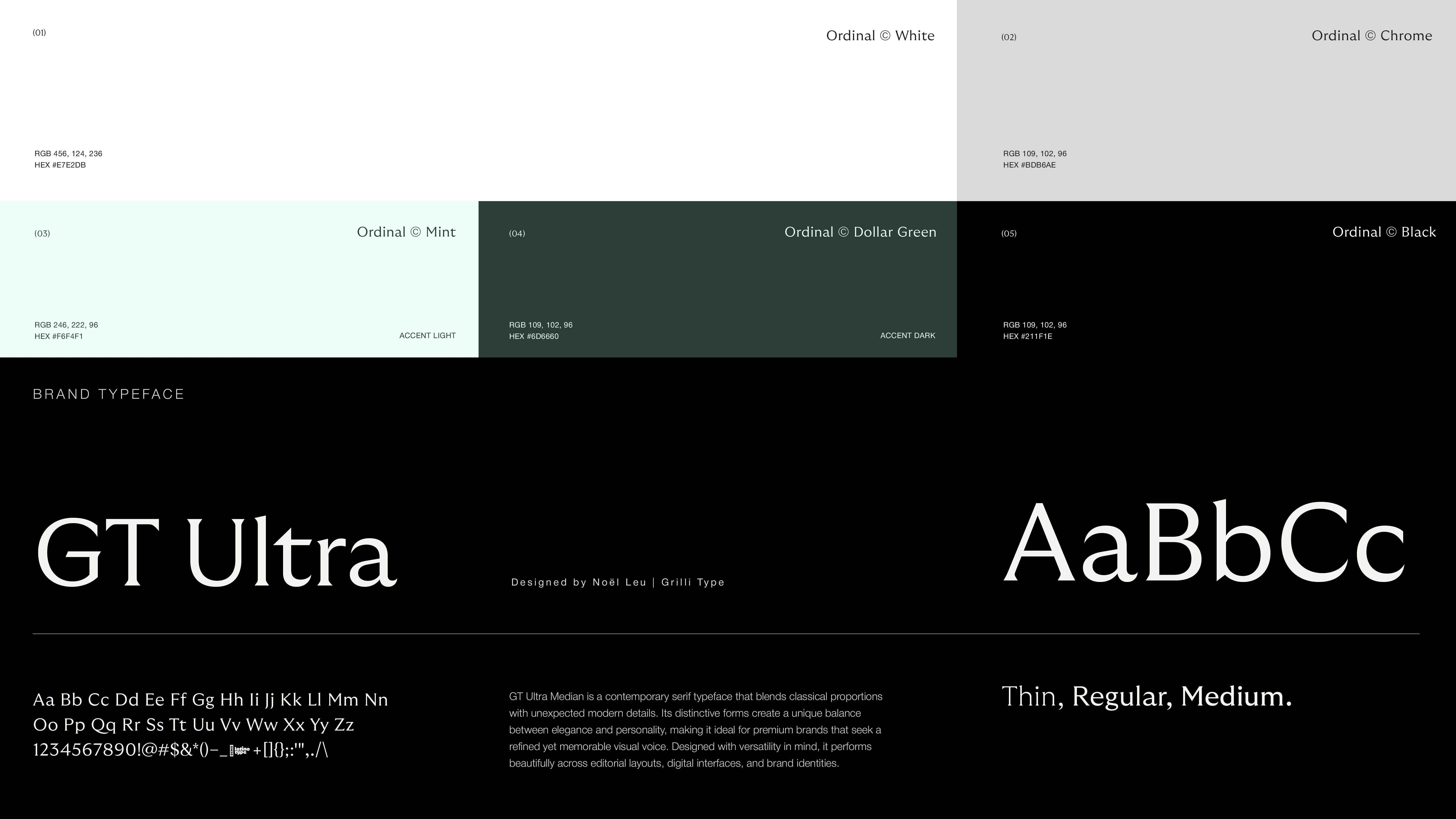
The serif and sans serif pairing gives the identity a more editorial and established character, while the deep green and soft mint palette brings warmth and a subtle connection to finance without relying on traditional financial cues.
The result is a brand that feels considered, confident and progressive, combining financial relevance with a simple and distinctive visual language.
I wanted one direction to have a connection to finance, but I didn't want to use charts, arrows or anything you'd expect from a finance brand. So I started with the form of a coin, abstracted it and built it into an ordered sequence.
Concept (03)
Bringing Order.
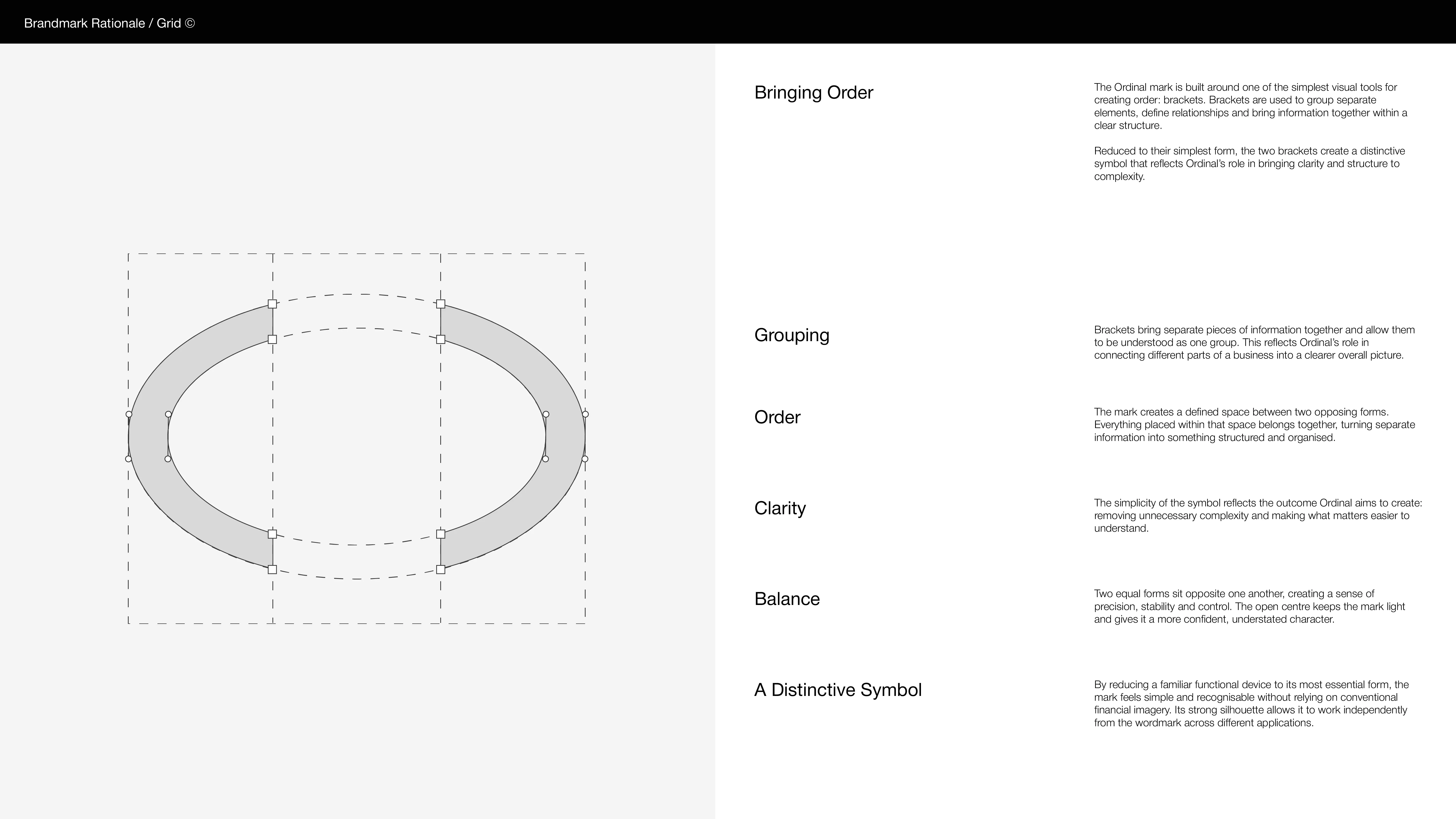
A minimal and structured direction built around one of the simplest tools for creating order: brackets. Used to group information and define relationships, they become a natural visual expression of Ordinal’s role in bringing structure to complexity.
The symbol reduces this familiar form to its essentials, creating a mark that feels precise, balanced and immediately recognisable without relying on traditional financial imagery.
Paired with restrained typography and a considered color palette, the direction feels intelligent, confident and established, reflecting Ordinal’s focus on making complex businesses clearer and easier to navigate.
I kept coming back to the idea of order and asking what we actually use visually to organise things. One of the simplest answers was brackets. We use them to group separate information, define relationships and tell us that what sits inside belongs together.

Like this project
Posted Oct 10, 2026
A clean, considered logo system for Ordinal Partners, built around a custom bracket mark, refined typography and a simple, flexible visual direction.
Likes
1
Views
6
Timeline
Aug 3, 2026 - Sep 19, 2026