M. Tayyab - Brand Designer | ContraWork by M. Tayyab
M. Tayyab

M. Tayyab

Branding & Digital Design

New to Contra

M. is ready for their next project!

Cover image for A premium visual identity for
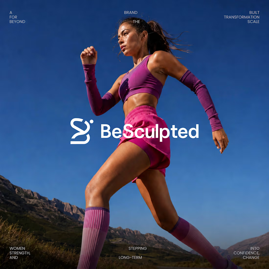
A premium visual identity for a women’s fitness platform built around strength, confidence, and long-term transformation.
0
15
Cover image for A handyman business needed more
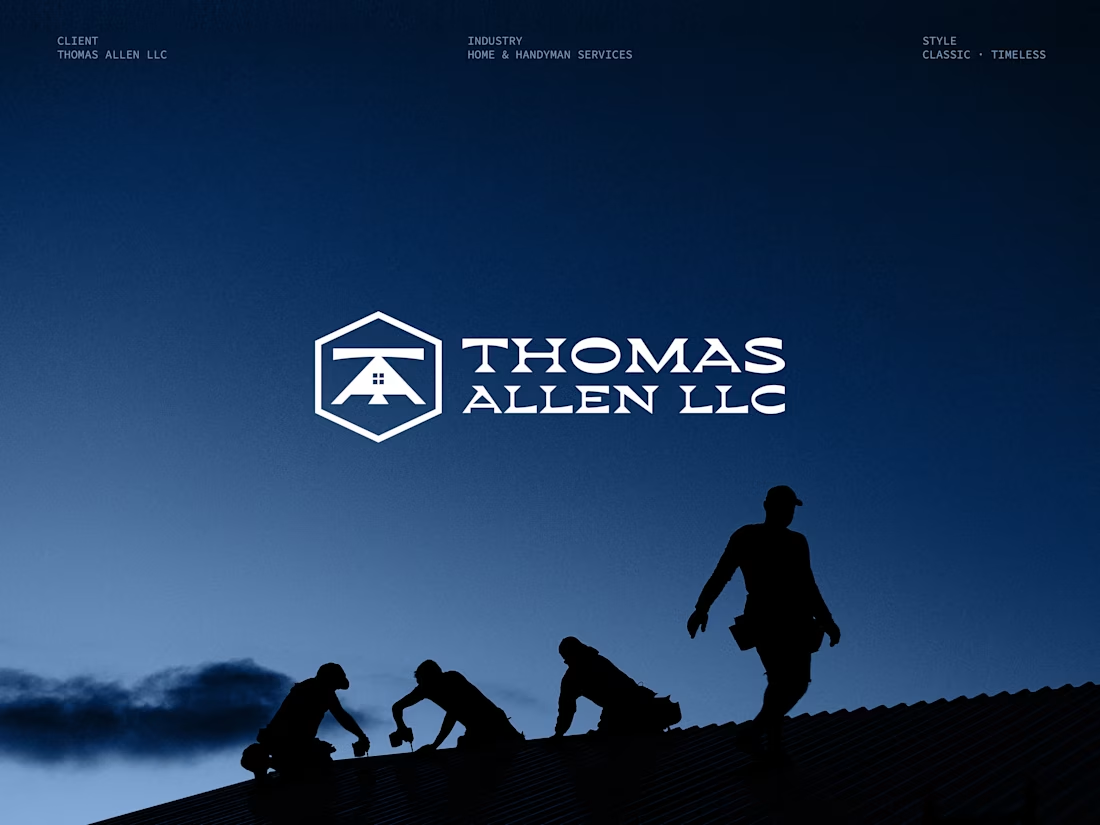
A handyman business needed more than just a logo, they needed an identity. Thomas Allen LLC came to me with a clear vision: classic, trustworthy, and built to last. No trendy gradients. No playful icons. Just a strong, professional brand.
0
33
Cover image for Faith isn't quiet. It's powerful,
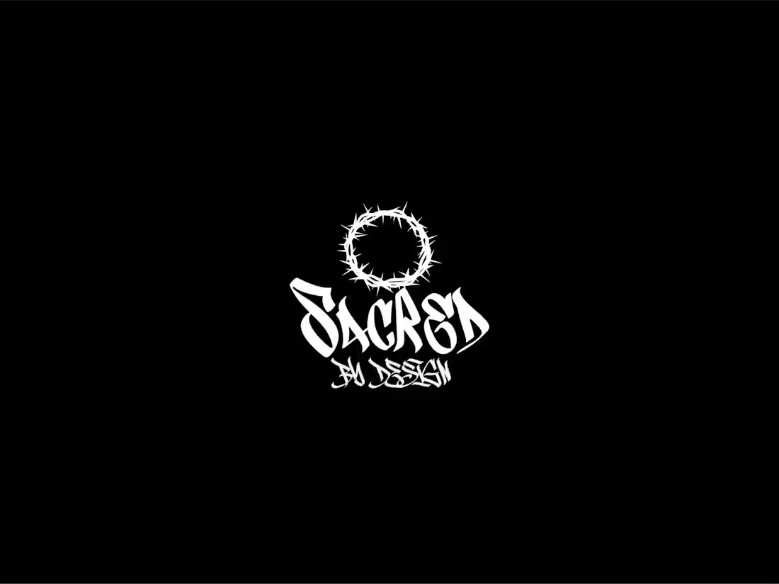
Faith isn't quiet. It's powerful, it's fearless, and it deserves to be worn with authority. This brand identity project was built for a streetwear label that wanted more than just a logo. They wanted a statement. So I combined sacred symbolism with raw street typography to create something that hits different. Crown of thorns. Graffiti soul. Streetwear DNA. This is where faith becomes identity.
0
74
Cover image for Excited to share one of
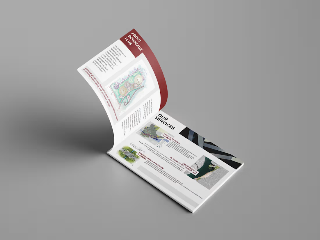
Excited to share one of my recent projects a complete Company Profile Design created for an international Urban Planning & Design Consultancy. My role covered: • Full visual direction • Layout design • Typography & structure • Brand-consistent styling • Project showcase formatting The goal was to present complex urban planning data in a clean, premium, and high-level corporate format while maintaining clarity, hierarchy, and a strong design language.
1
202
Cover image for I truly enjoyed creating this
I truly enjoyed creating this brand identity for a women-focused event. The logo represents career transitions and empowerment through calm, thoughtful design.
0
192
Cover image for The Come Back
The Come Back
1
2
Cover image for Secondary mark designed for Stoked.
Secondary mark designed for Stoked. Clothing. This symbol represents unity, loyalty, and momentum created to live seamlessly across apparel, social media, and brand touchpoints. The focus was simplicity with strength, allowing the mark to stand alone while reinforcing the brand’s identity. Minimal. Intentional. Built for brands that value consistency and long-term vision.
1
266
Cover image for U4RIA Studios is a startup game development company focused ...
U4RIA Studios is a startup game development company focused on creating immersive digital experiences. The goal was to design a bold, modern logo that instantly communicates gaming culture while remaining clean, scalable, and brand-ready. The concept integrates a D-pad controller directly into the “4” of the brand name, creating a subtle yet memorable visual connection to gaming. Strong typography ensures the logo feels confident and future-forward, while the minimal execution keeps it versatile across digital platforms, launch screens, social media, and merch. This project was designed with brand recall, adaptability, and startup scalability in mind — making it suitable for both indie teams and growing studios. #logodesign #brandidentity
2
2
232