Muhammad Omer Usman
UI/UX Designer creating intuitive & engaging user experience
- 5
- Followers


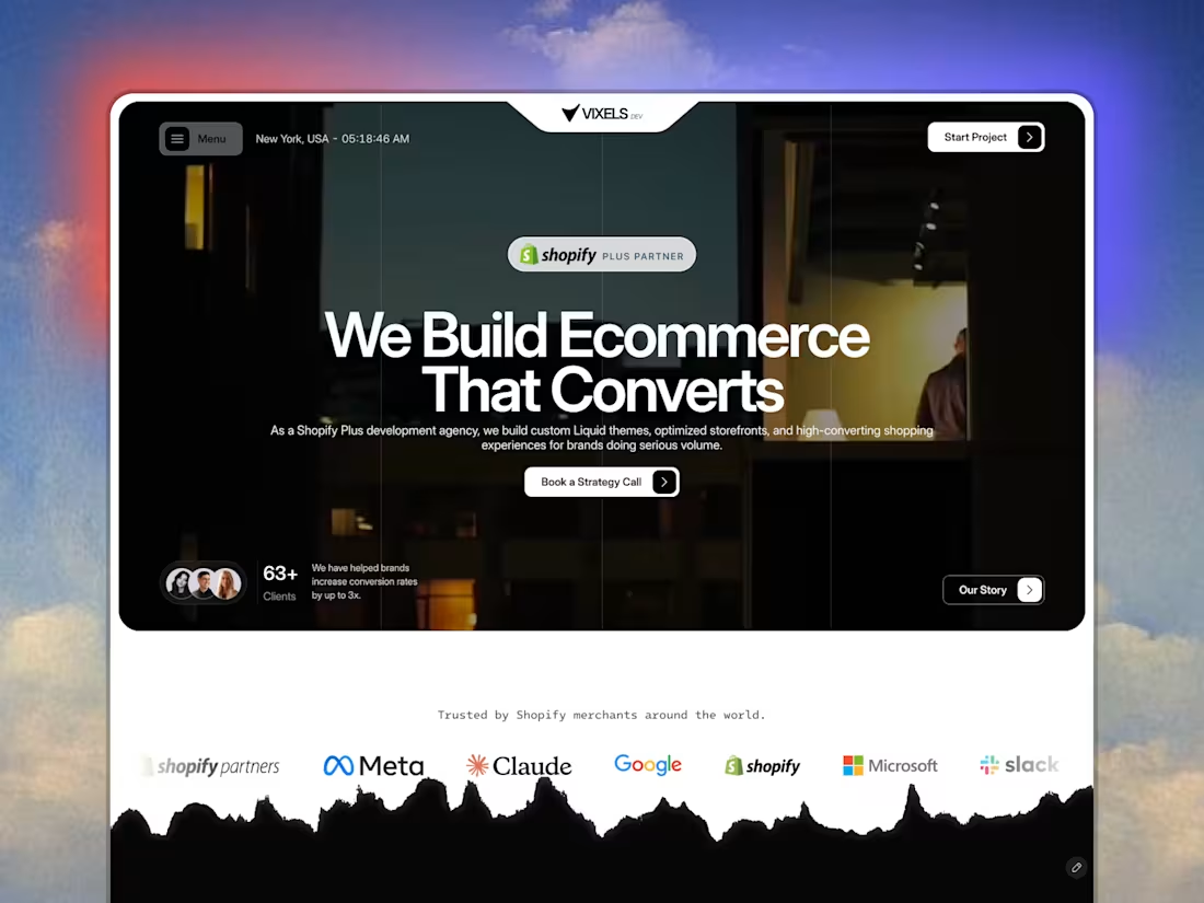
Just launched the exact Framer build we use at Vixels for our agency site, now available as a fully customizable template!
Most agency templates focus purely on looks, but this one is engineered for revenue. Built specifically for Shopify Plus and CRO agencies to pitch high-ticket clients.
⚡️ Pre-built Tiered Retainer Pricing Modules
📈 Conversion-driven UI/UX & clean service architectures
📱 100% No-Code & lightning fast in Framer
Stop guessing and start converting: https://www.framer.com/marketplace/templates/vixels/
1
72
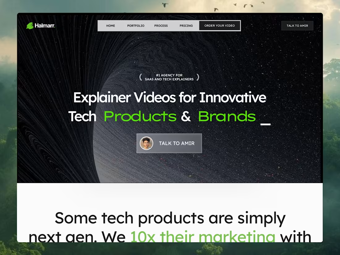
Just launched a new Framer template The MotionStudio Mograph, designed specifically for motion design studios and B2B SaaS marketing agencies.
Running Vixels and focusing heavily on Conversion Rate Optimization has shown me exactly where creative agency websites leak leads. I wanted to take those core CRO principles, clear visual hierarchy, strategic social proof, and frictionless user journeys & pack them into a ready-to-launch layout.
This template is structured to help creative founders sell high-ticket services, featuring:
A conversion-engineered project portfolio
Built-in trust badge and founder message sections
Flawless breakpoints across all viewports
If your studio builds next-gen tech products or SaaS explainer videos, your website should be your best salesperson.
Check out the live preview and grab the template here: https://proud-fade-319532.framer.app/
5
4
344
Business Name: Smile Dental Clinic (Lahore, Pakistan)
Solo dental practice losing prospective patients to clunky intake forms and endless back-and-forth messaging by turning chaotic inbound inquiries into instant, self-served appointment bookings with zero owner friction
LinkedIn Post (https://www.linkedin.com/posts/muhammad-omer-usman_lovablechallenge-webdesign-ux-ugcPost-7510629516885827584-v_hP/?utm_source=share&utm_medium=member_desktop&rcm=ACoAADfMnpUBln_pFLh9tIxDJ7jBNuj23xj_pGI) | Live Site (https://my-smile-dental-clinic.lovable.app/) | X
(https://x.com/OmerUsman8/status/2104867061038186974?s=20)
2
2
244
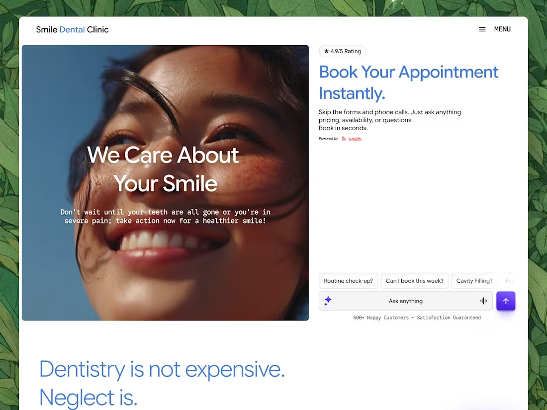
Working on the Lovable challenge and just dropped the initial draft for this dental clinic web app!
Here’s a quick UX decision I made during the wireframing stage: I originally considered a live chatbot, but ended up replacing it with a structured, interactive FAQ-to-booking funnel instead.
Why the pivot?
Conversion Optimization: Patients visiting a dental site usually want instant answers on pricing, insurance, or immediate availability. A streamlined FAQ that leads straight into a clear "Book Now" CTA reduces friction and drives higher conversion rates.
Implementation Speed: Let's be honest, setting up a full conversational chat integration within a tight challenge timeframe isn't practical.
By prioritizing high-intent UI elements like interactive prompt chips ("Routine check-up?", "Can I book this week?"), the user journey stays fast, clear, and focused on booking appointments.
Building this whole design system and prototype using Lovable and Figma. Wish me luck! 🤞
2
2
201