
Rahman Rahe
Website & UI Designer ( SaaS, E-commerce, Local business )
New to Contra
Rahman is ready for their next project!


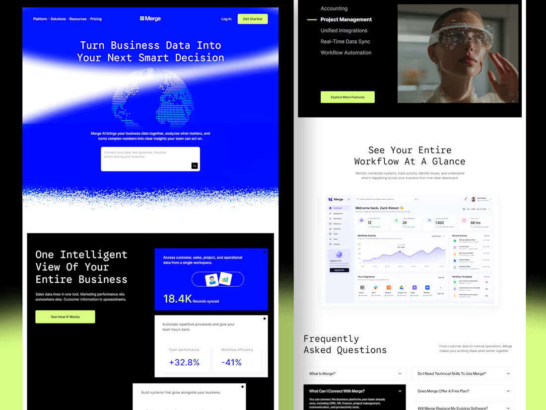
Merge — AI-Powered Business Intelligence SaaS Landing Page Design
Businesses often struggle with disconnected tools, scattered data, and complicated workflows. When important information lives across multiple platforms, teams waste time switching between tools instead of focusing on growth.
For Merge, I designed a modern SaaS landing page concept that presents business intelligence, unified integrations, and workflow automation through a clear and engaging user experience.
The goal: Create a landing page that communicates product value quickly, builds trust, and helps potential customers understand how the platform fits into their workflow.
Design focus
Clear value proposition and messaging
Strong visual hierarchy and conversion-focused CTAs
Dashboard UI to demonstrate product capabilities
Feature sections that simplify complex functionality
Consistent design language across the entire page
A SaaS website should do more than look attractive. It should help the right customers understand the product, recognize its value, and feel confident taking action.
3
4
151
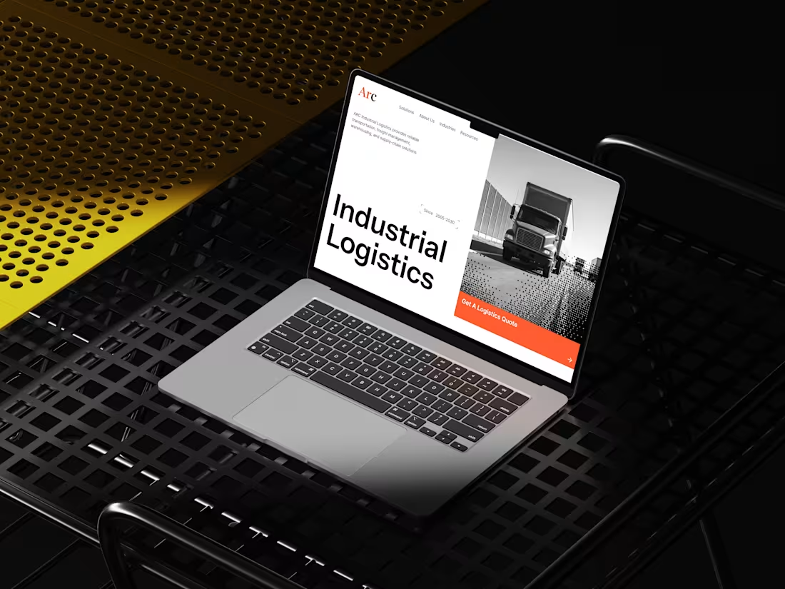
B2B Industrial Logistics Website
Industrial logistics can be complex — multiple services, routes, industries, and operational details can quickly overwhelm a website visitor.
For this concept, I designed a clean and structured website experience for ARC Industrial Logistics, focused on turning that complexity into a clear digital journey.
The goal was to help potential clients quickly understand what ARC does, where they operate, and how they can get in touch — without making the experience feel corporate or complicated.
4
4
178
Riwo – Premium Bicycle Brand Website Design
Most bike brands look the same: spec sheets, stock photos, and cluttered shops. I designed Riwo to feel like the ride itself, which is bold, fast, and effortless.
What I created
A high-impact website concept for a modern bicycle brand, built to turn first-time visitors into buyers.
What it does for the business
Hooks visitors instantly. A cinematic hero ("Ride Beyond Limits") with a clear price and a single call to action.
Makes products easy to compare. Clean product cards with pricing front and center, so shoppers see what they want in seconds.
Builds trust. A features section built around lightweight construction, responsive geometry, and everyday reliability.
Raises order value. An accessories section that encourages customers to complete their setup.
Keeps people scrolling. Smooth scroll animations and text reveals that make the site feel premium and memorable.
Ideal for
E-commerce brands, product launches, and lifestyle or sports companies that want a site that looks as good as their product.
5
5
537
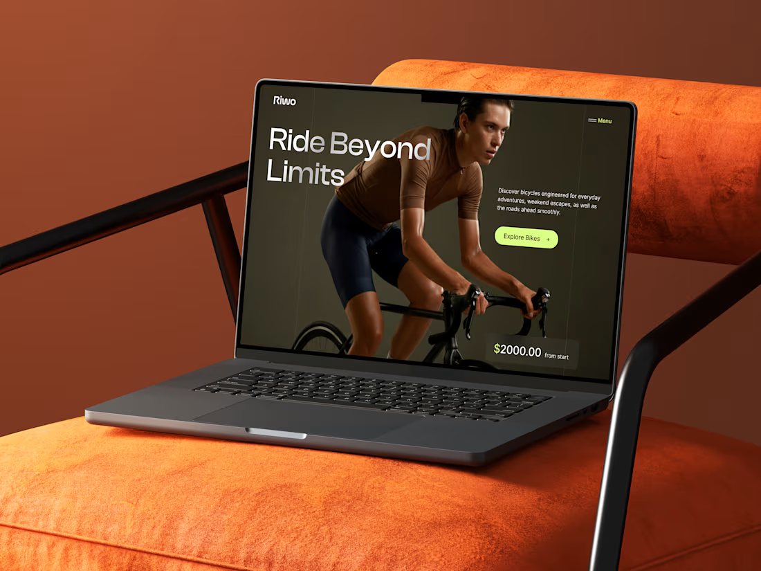
Riwo: Bicycle Brand Landing Page Design
The Spark
Riwo wanted to stand out in a crowded cycling market where every website looks the same: white backgrounds, endless product grids, and spec sheets nobody reads. They didn't just want a site. They wanted a first impression people would remember.
My Take
I started with one question: what does it feel like to ride? Not the gear, not the numbers, but the moment you lean forward, grip the bars, and focus on the road ahead. That feeling became the whole design direction.
What I Built
A hero with attitude: The rider's intense, focused expression tells the brand story without a single paragraph.
Warm, grounded colors: Deep olive and earthy brown give the page a premium, editorial feel, far from the typical neon-and-chrome cycling look.
A lime-green spark: One bright accent on the button, menu, and price pulls attention exactly where it matters.
Typography with confidence: The large, clean headline "Ride Beyond Limits" sets the tone: bold, modern, and motivating.
Simple, clear path: One message, one price anchor, one button. No clutter, no confusion.
The Outcome
A landing page that feels premium, moves with energy, and guides visitors straight to the bikes. It gives Riwo a strong visual identity and a hero section that works as both a brand statement and a sales tool.
3
6
382