
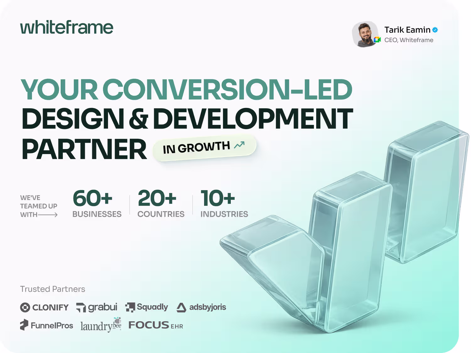
max
Tarik Eamin
SaaS Product & Website Design Partner · Framer & Webflow Pro
- $10k+
- Earned
- 12x
- Hired
- 4.94
- Rating
- 104
- Followers
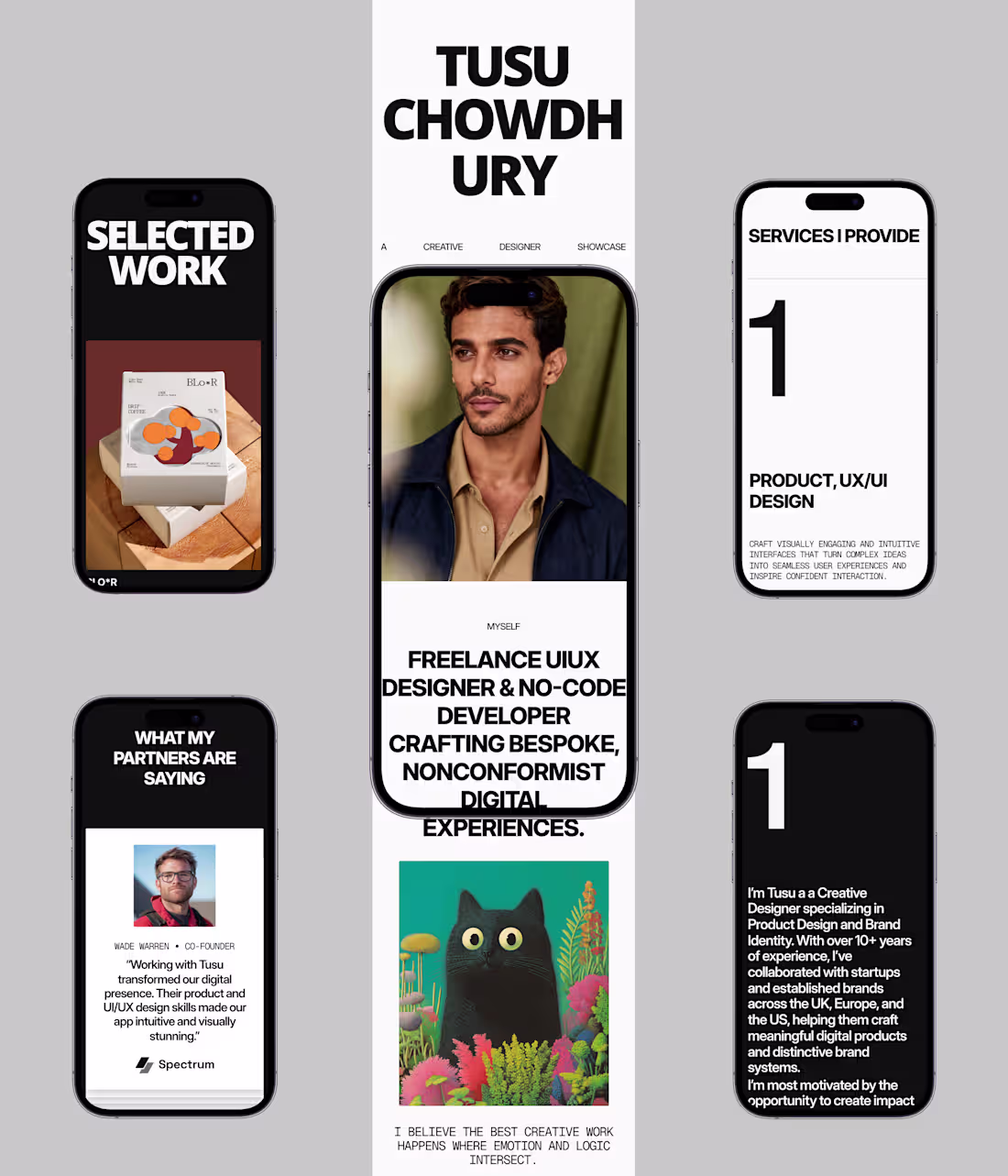
Tusu Designer Portfolio System Development Case Study
1
4
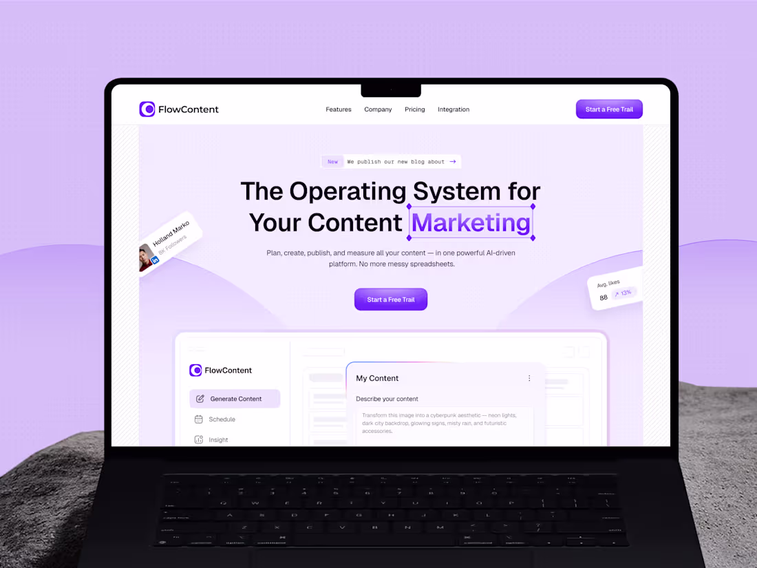
FlowContent AI SaaS Website Development
1
9
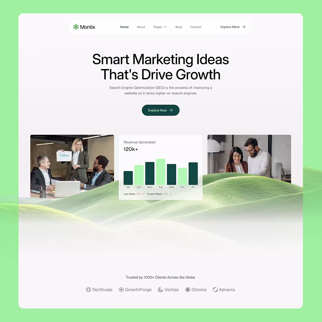
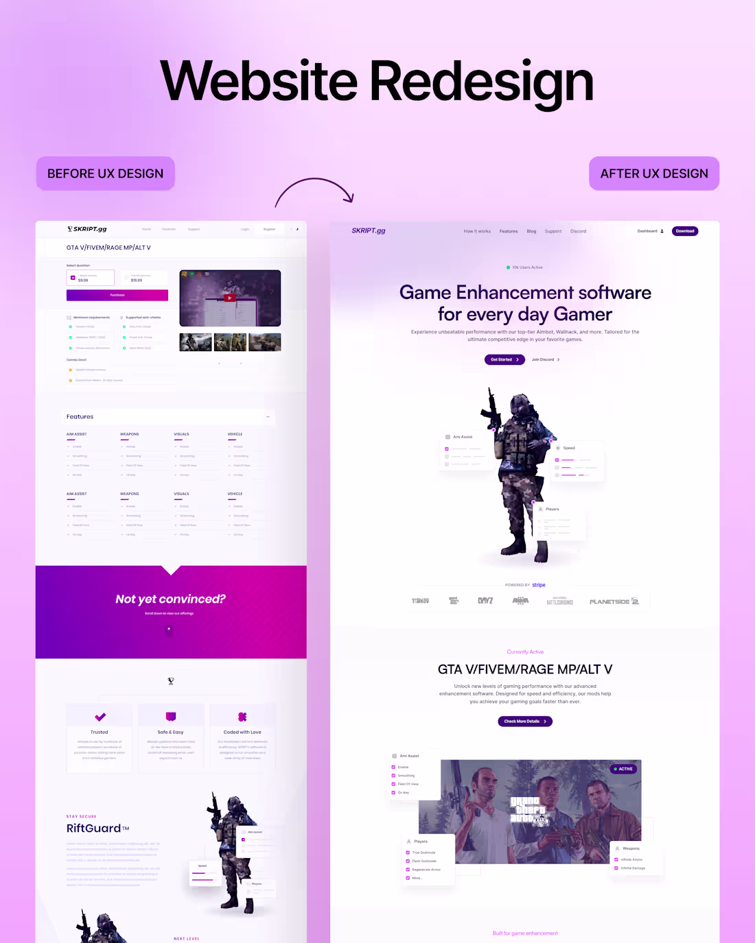
Most agency websites look impressive. But convert terribly.
Visitors land, scroll for 10 seconds, and still can't answer:
- What do you do?
- Who for?
- Why you?
That confusion is costing you clients.
Montix fixes this.
A Webflow template built for marketing agencies, where every section has one job: turn visitors into booked calls.
Real proof.
Clear positioning.
Strategic CTAs.
17 pages.
CMS-powered.
Your website should close clients.
This one does.
Check comment for the link.
6
10
606
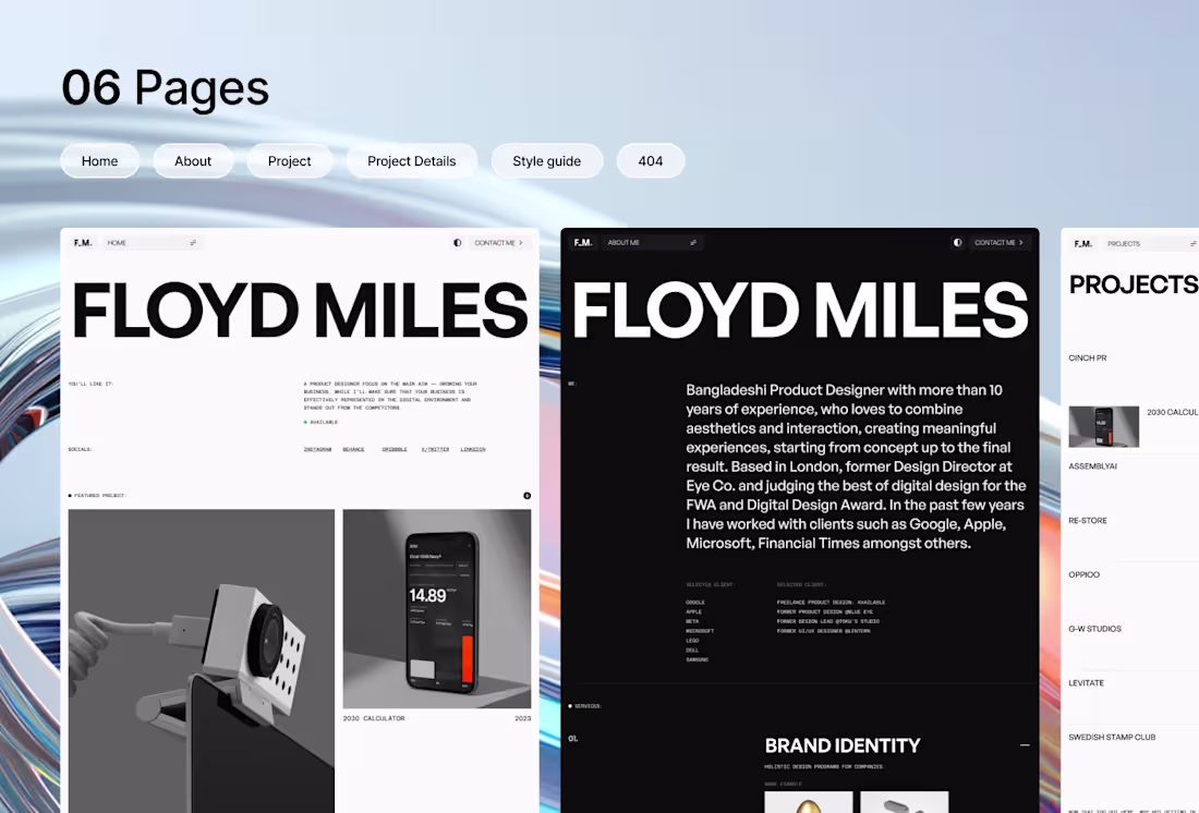
You spent 3 years getting good at design.
But your portfolio still looks like it was made in an afternoon.
Hiring managers and clients decide in seconds.
If your site doesn't match your skill level, they're gone before they read a single case study.
You don't stack a project list on your portfolio.
You just need a site that works tonight.
Floyd Miles is a Framer template built specifically for product designers.
Clean, simple, faster; ready in hours, not weeks.
It comes with a Figma design file and a Framer Remix link.
Key features include light and dark mode, case studies, pricing, about, and even a 404 page.
No need to add another layer of tension when showcasing your work.
Start now with this premium portfolio template.
Link in the comment.
9
8
557
Your landing page doesn’t have to be the most aesthetic or trendy.
It needs to have the feeling that you actually reached the right place.
That trust makes clients sign up in 3 seconds.
2
7
445
A premium landing page design is not about adding more features.
It's doing more with less clutter.
Minimalistic design brings clarity and better conversion.
What's your take on this?
2
5
427
You spent 6 months planning the event.
Your website took 6 hours to put together.
Result?
Blurry hierarchy.
No clear registration button.
Speaker section that looked like a list.
Attendees landed on the page and had no idea what to do next.
Eventivee® Confexpro was built for exactly this moment.
A Framer template tailored for
- Summits
- Business expos
- product launches
- In-person or virtual conferences
With its responsive layouts and SEO-Optimized homepage, speakers, schedule, tickets, blog, contact, and 404 pages;
You’ll find everything you need in one place.
Link in the comment.
11
12
506
We took a website apart and rebuilt it.
Every screen.
Every interaction.
Every detail.
The result?
Good enough to land on Contra's Pinterest.
9
15
517
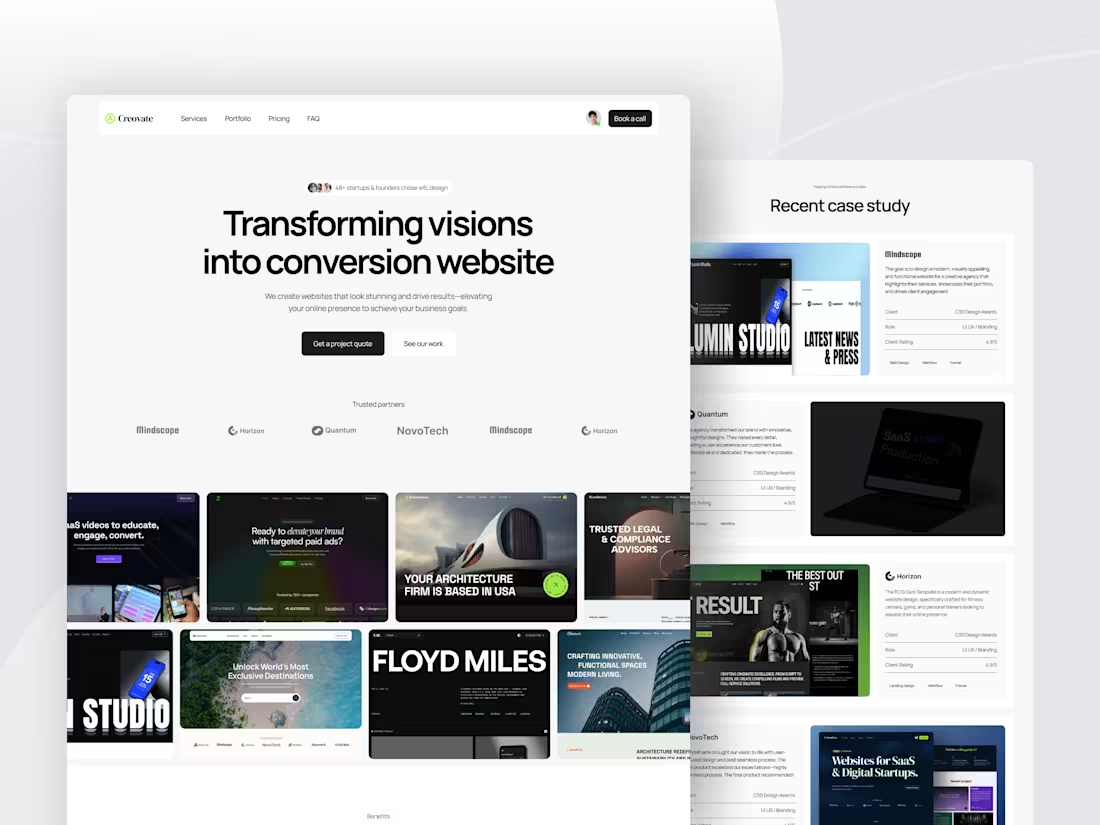
Still wondering why your landing page is not converting?
"Creovate", a Webflow template, is your perfect solution.
Built for design agencies, freelancers, startups, and businesses that specialize in creating custom landing pages and full website templates
• SEO-optimized
•Customizable
•Fully Responsive
•Sleek & Professional Design
Whether you’re trying to create your digital presence or for your clients, "Creovate" will be everything you need.
🔗 Link in comment.
1
2
116
New Template's Hero Section WIP.
What do you think?
5
7
363
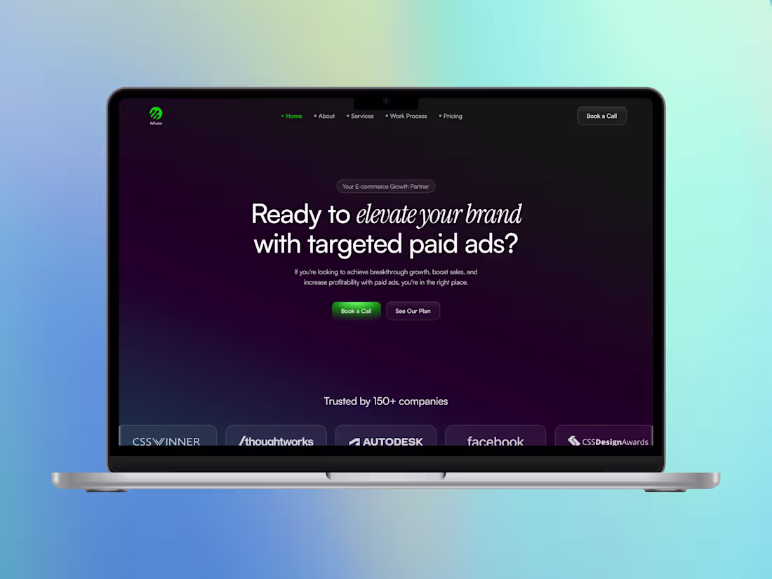
Your ad campaigns are live.
But your landing page is killing conversions.
AdFusion is here to fix that.
A high-conversion Webflow template built for Google Ads, Meta, YouTube, and TikTok campaigns.
• 5 ready-to-use sections
• SEO-optimized
• Drag-and-drop editor
• Flexible layouts
• Super-fast loading time
🔗 Link in comment.
1
2
340
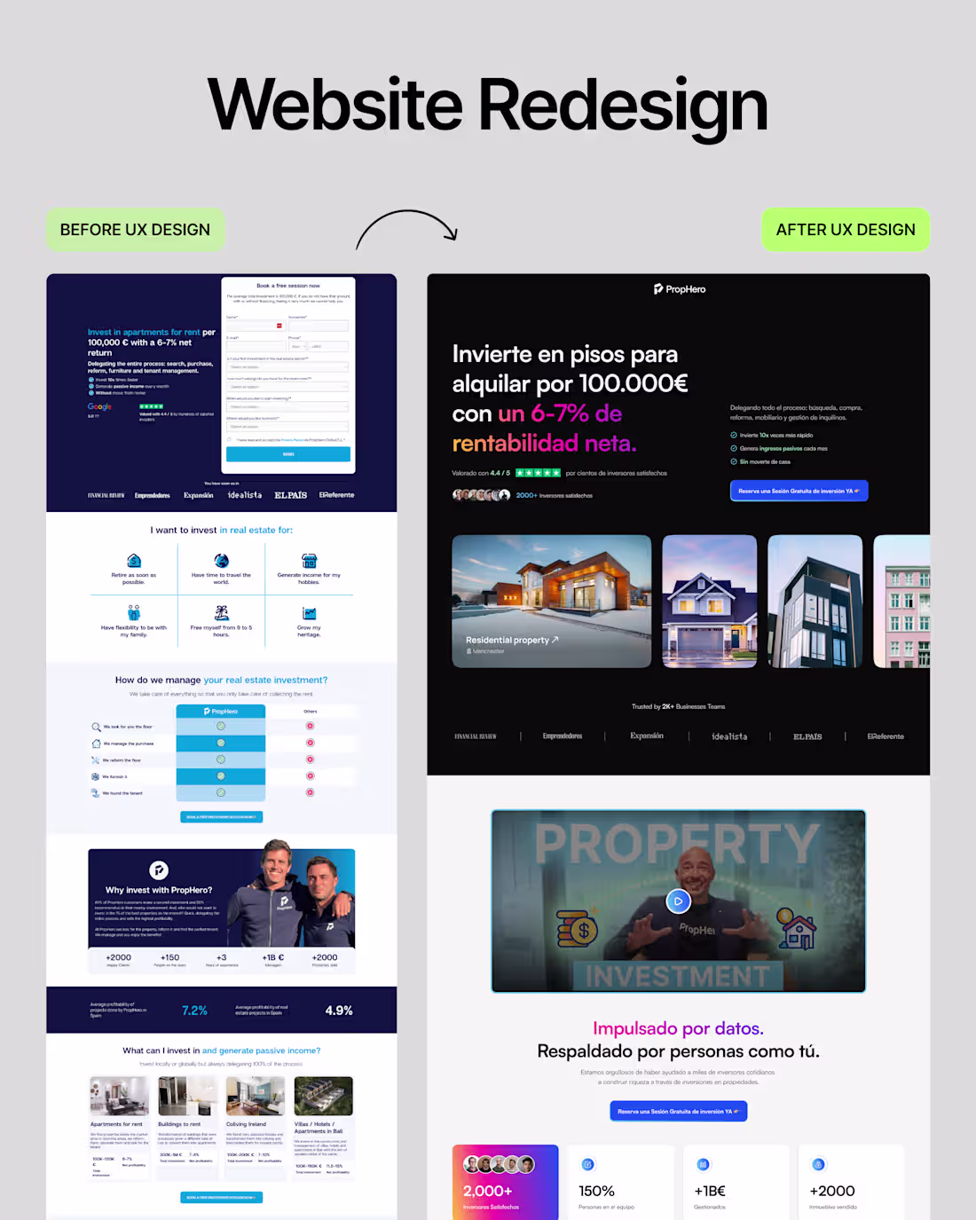
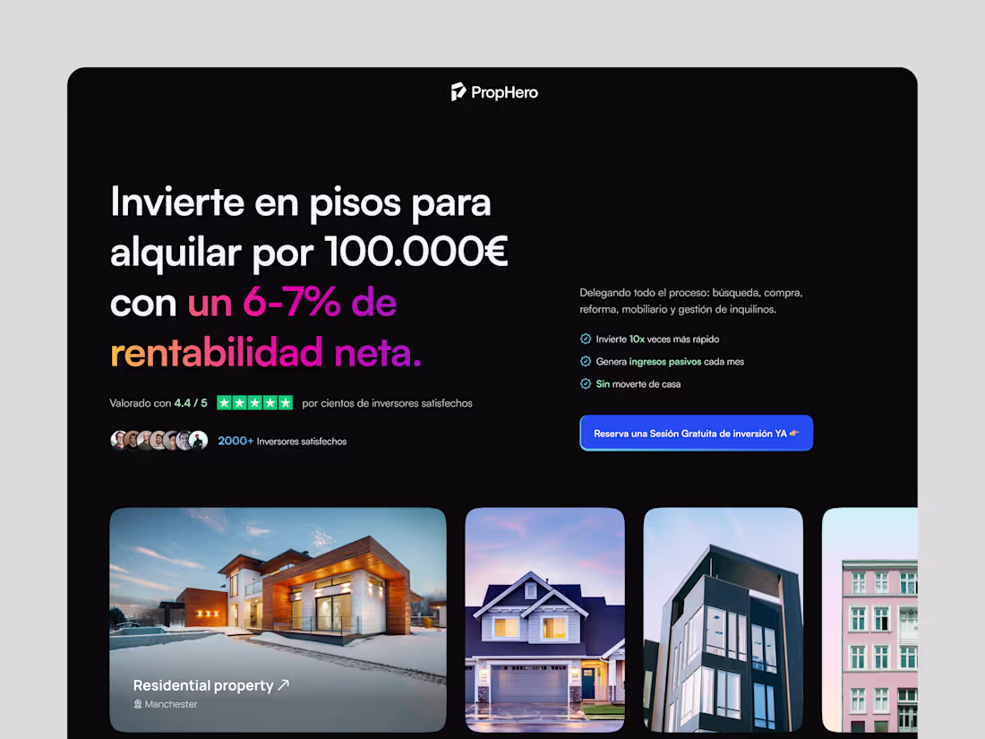
While redesigning PropHero’s landing page,
I wanted to create a safe experience for the users.
• A guided CTA
• Simple 3-step process
• Property listing comparison module
• Real testimonials placed right before the booking form
These simple changes increased consultation bookings by 40%.
What’s your thought on this redesign?
3
262
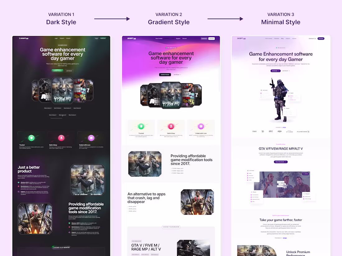
Which version will make you want to buy instantly?
7
8
398
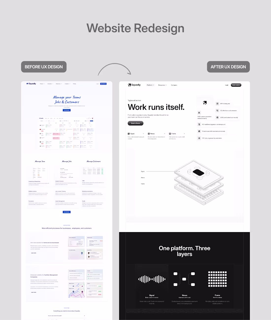
Your powerful product can’t save you.
If your website doesn't show it.
An outdated design costs credibility and conversions.
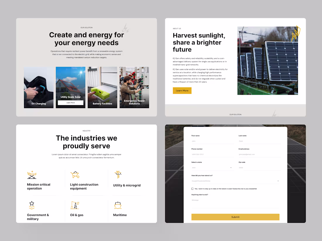
When we were working with Squadly, an Intelligent Operations Platform;
Our focus was to build a conversion-driven design with a consistent flow.
Let the product speak.
Highlight the services.
Remove the noise.
Every screen will move the user forward.
The result?
A website that finally matched the product behind it.
Interactive.
Modern.
And ready to convert.
Before you design a single screen, understand the product first
Design without purpose is just decoration.
What's your thought process behind working on a SaaS product?
2
7
413
5 Brutal Landing page mistakes and fixes:
1. No Clear Headline
Fix → Keep the most valuable information upfront.
Let the visitors know what to expect
2. Unclear CTA or too many CTAs
Fix → Keep one clear, actionable CTA.
❌Contact us
✅Subscribe to our newsletter
3. Weak Visual hierarchy
Fix → Add relevant images and information.
4. Not device-friendly
Fix → Make your landing page responsive with shorter copy and device-friendly pop-ups.
5. Slow in speed
Fix → Regularly test your site and remove unnecessary clutter like large files or images.
Which one are you going to fix first?
1
3
318
Why do most trading education websites fail to convert?
Not because the courses are bad.
Because the site doesn't build trust fast enough.
For FX Educators, we rebuilt the entire experience around one idea:
Show proof before you ask for commitment.
What we did:
- Clear offers and courses
- Structured CMS
- Guide the visitors from course discovery to signup
- Visible testimonials
- Sticky action bars
- Device-friendly layout
Trust, proof, and expertise aren't just design steps.
They're the driving force for conversion.
What are the issues you face in trading websites?
2
301
We just didn't redesign the website.
We redesigned how people understand what they actually do.
Every section answers a question before the user thinks to ask it.
Intentional structure.
Simple language.
The way to conversion is easy.
Clean specs.
Lean components.
Good UX isn't decoration, it's direction.
What do you think about this redesign?
1
4
315
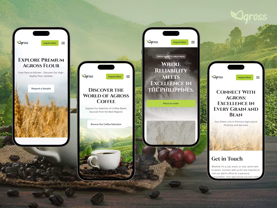
Redesigning Agross Agri Trading, our primary focus was designing for their reality.
Farmers and buyers aren't at a desk.
They're checking prices in a field, ordering from a truck.
Fast speed, as rural networks are slow.
Lead with data: prices, stock, and seasonal availability.
Make buttons bold and text readable outdoors.
Visible CTA always.
Is your agriculture business website built for the people actually using it or just the people who built it?
3
282
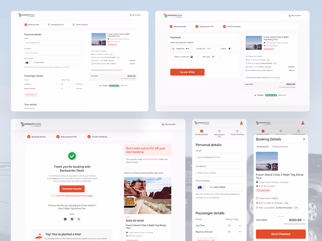
Finding your next adventure shouldn't feel like a second job.
We redesigned BackpackerDeals so you can go from "where to next?" to fully booked in just 3 clicks.
Step one: Add your booking details, personal information, and tour details.
Step two: Add payment information, secure checkout, and confirm.
Step three: You're Confirmed
Instant confirmation. No waiting. No chasing emails.
It is as simple as it looks.
Frictionless booking isn't just a feature; it's the whole point of conversion.
What is the number one obstacle you face in designing a booking page?
How do fix it?
2
6
368
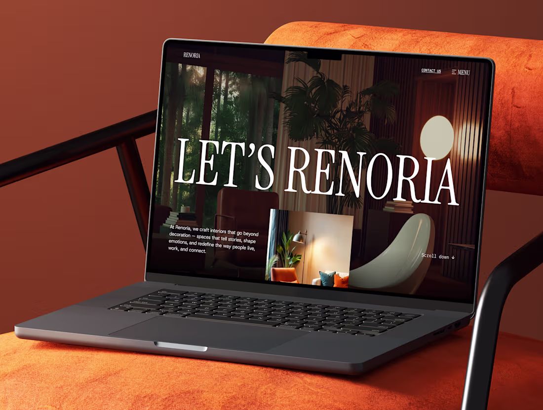
Renoria: Interior Design Agency Website Template
1
21
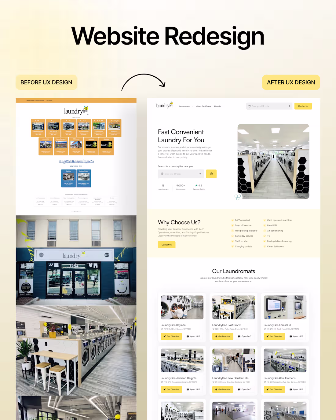
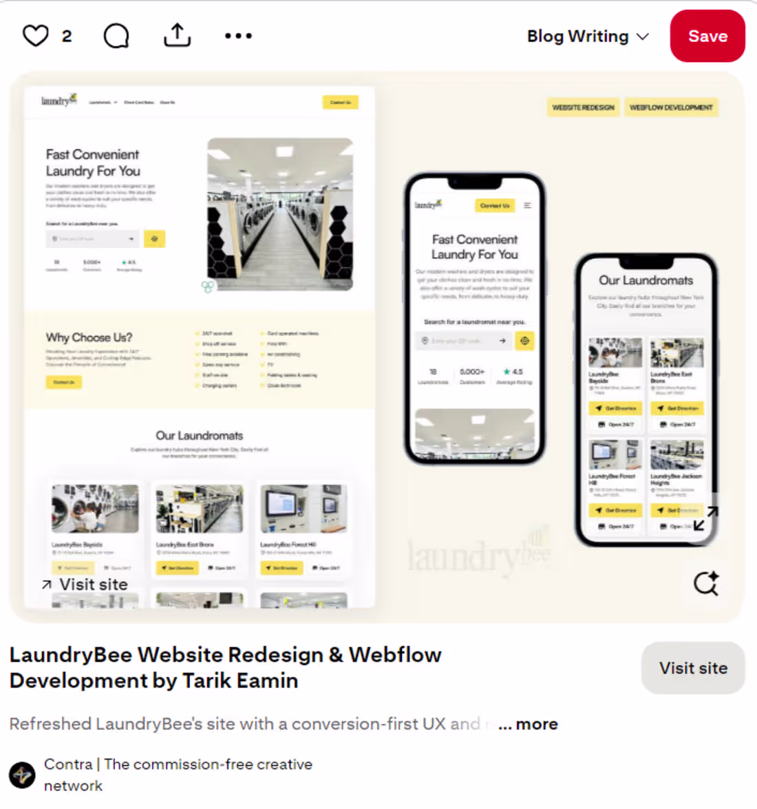
People don't read the homepage.
They scan it for 3 seconds and leave.
So we deleted 70% of laundrybee’s homepage content.
- Less copy
- Conversion-focused headline
- Visible hero section
- One clear CTA
- Double the white space
- Showcased their offers and USP
Result?
Visitors don't leave confused.
They get what they want and come back.
What's the one thing you fix first on a homepage redesign?
2
5
319
40% more conversions. No ad spend.
Here's what changed.
The old site, cluttered with information, confused the visitors. We redesigned the experience.
- Clear offers
- Social proof and FAQ front and centre
- Conversion cues with sticky CTAs, service comparisons, and quick contact
Custom Webflow build with structured CMS, conditional content, and light custom code for interactions and layout logic
Good design is not just aesthetics; it's helping someone make decisions faster.
What do you think about the redesign?
4
6
407
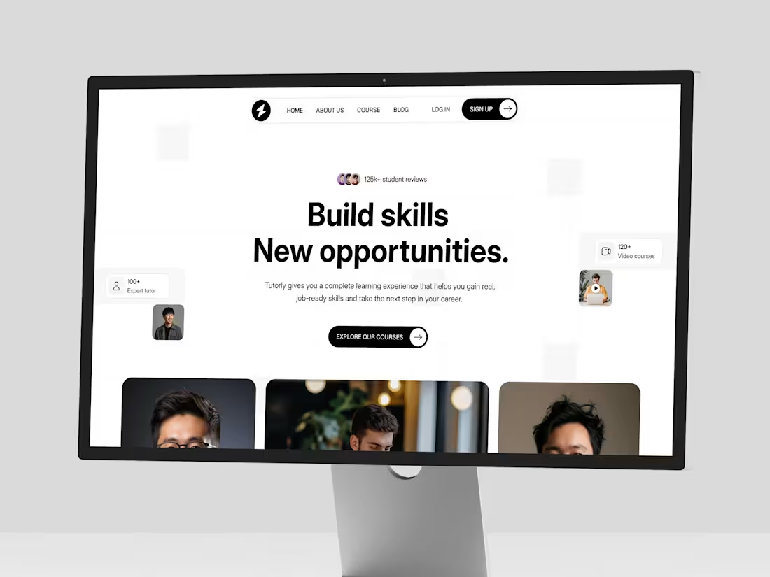
Tutorly - Education Website Template
1
13
No one books a home they don't trust.
Redesigning Artic Media's landing page, our priority was to establish that trust.
With clear visuals and structured social proof, we made sure to provide simple navigation that removes friction.
Because people won't come back to a site that doesn't feel safe about their homes.
What’s your thoughts on this redesign?
6
6
379
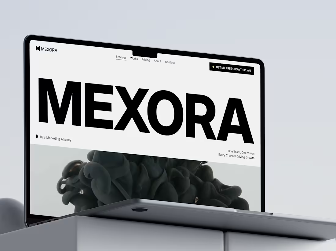
Mexora: Strategic & High-Conversion Agency Website Template
1
22
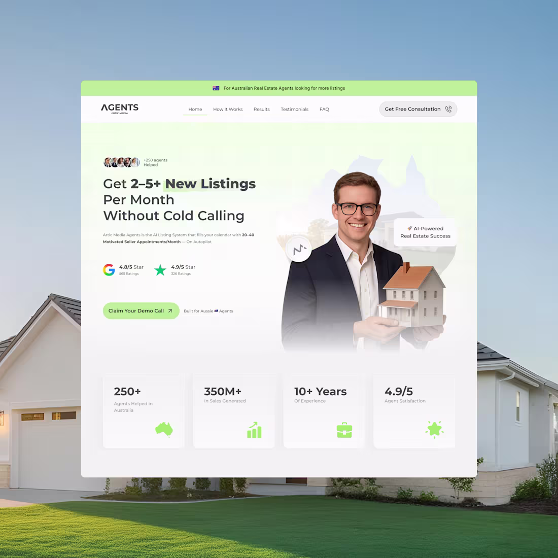
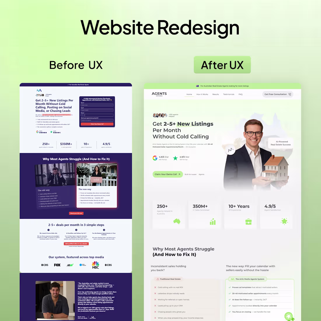
Real Estate Website Redesign for Lead Generation Agent
1
31
Marketing Agency Website Redesign + Webflow Development
3
44
LaundryBee Website Redesign & Webflow Development
1
39
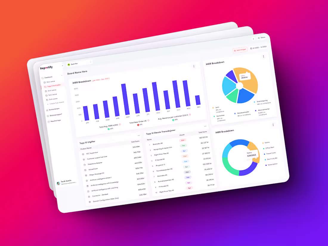
UX/UI Design for Financial Dashboard | Figma Expert
1
43
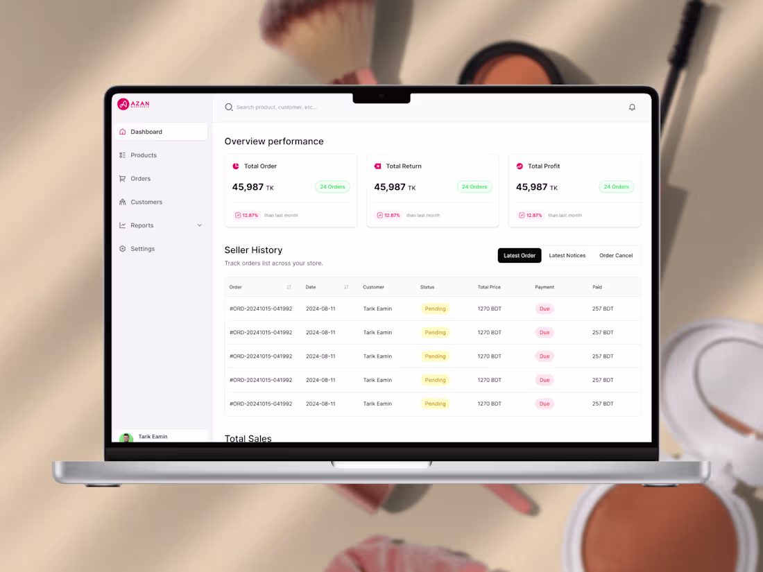
UX UI Design for eCommerce & Dropshipping Platform
2
67
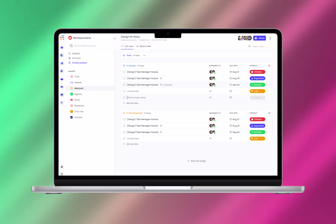
UX/UI Design for a Productivity & Collaboration SaaS
2
38
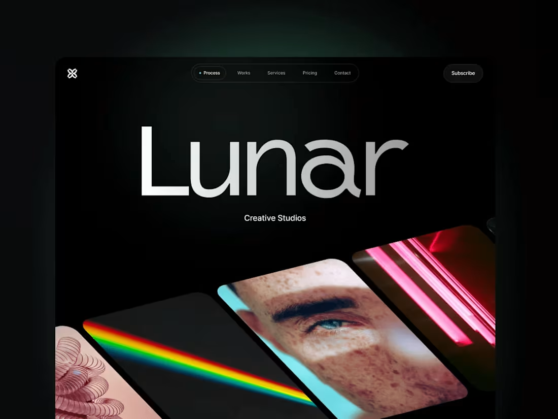
Lunar Pro - Portfolio & Agency Website Template
26
438
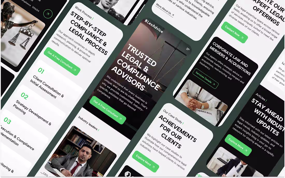
Legal Consulting Firms and Professionals Webflow Website
1
23
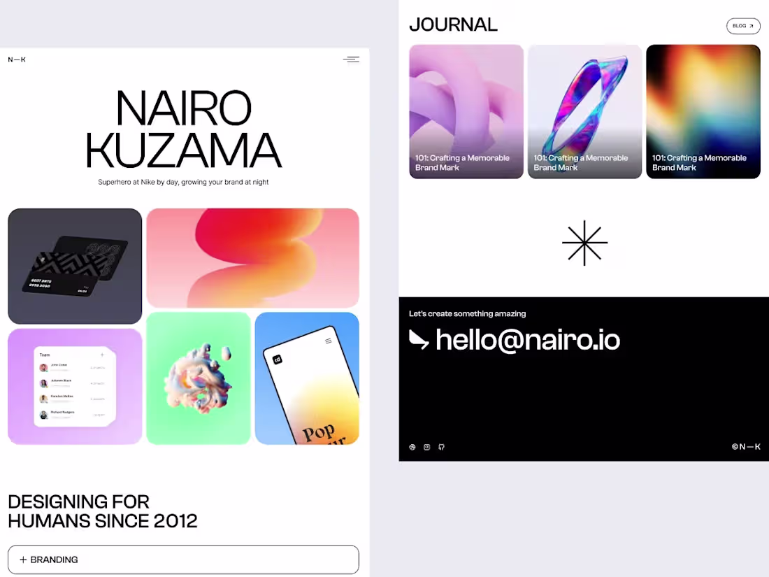
Nairo Pro - Portfolio & Agency Website Template
1
31
Portfolio Framer Template for Product Designers
1
184
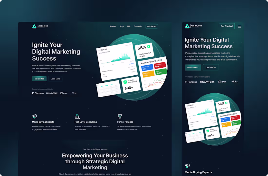
Ads By Joris | Agency Website Design
1
80
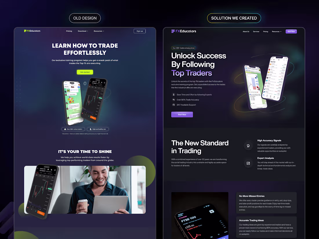
FxEducators | Website Design & Webflow Development
1
109
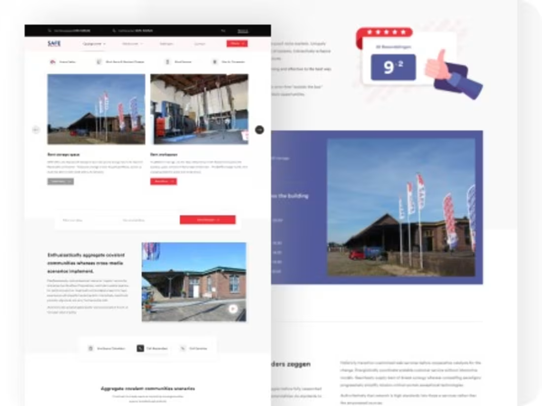
Redesign Safe Ruimteverhuur | Website UI/UX Design
1
77