Freelance Brand Designers in State of São Paulo
Sign Up
Post a job
Sign Up
Log In
Filters
2
Projects
People
Nathalia Palma
São Paulo, Brazil
Creative Art Director, Graphic Designer and AI Creator
10
Followers
expert
Follow
Message
Creative Art Director, Graphic Designer and AI Creator

0
Rebranding | Brocco
0
10
0
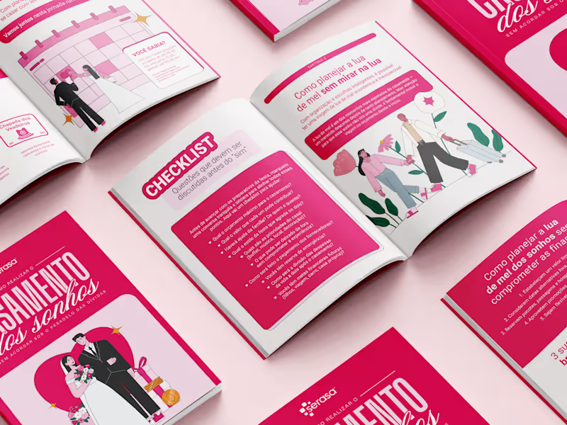
Ebook Illustrated
0
15
3
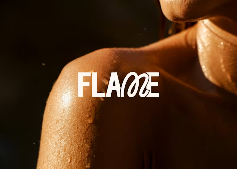
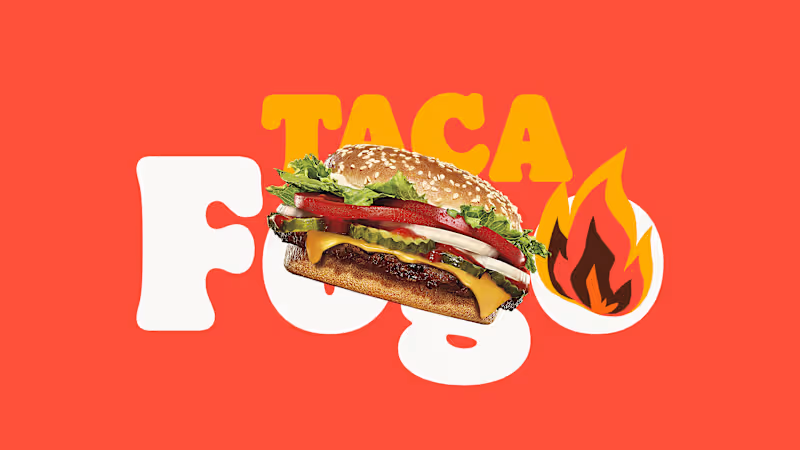
Flame | Visual Identity
3
36
View more →
Brand Designer
(1)
Follow
Message
Eduardo Duccigne
São Paulo, Brazil
Designer with 20+ years of experience.
13
Followers
Follow
Message
Designer with 20+ years of experience.
0
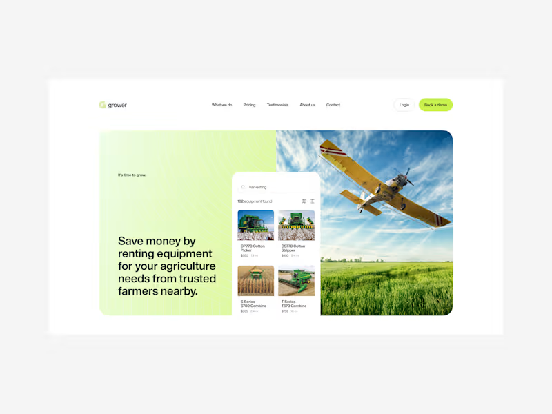
Grower
0
7
0
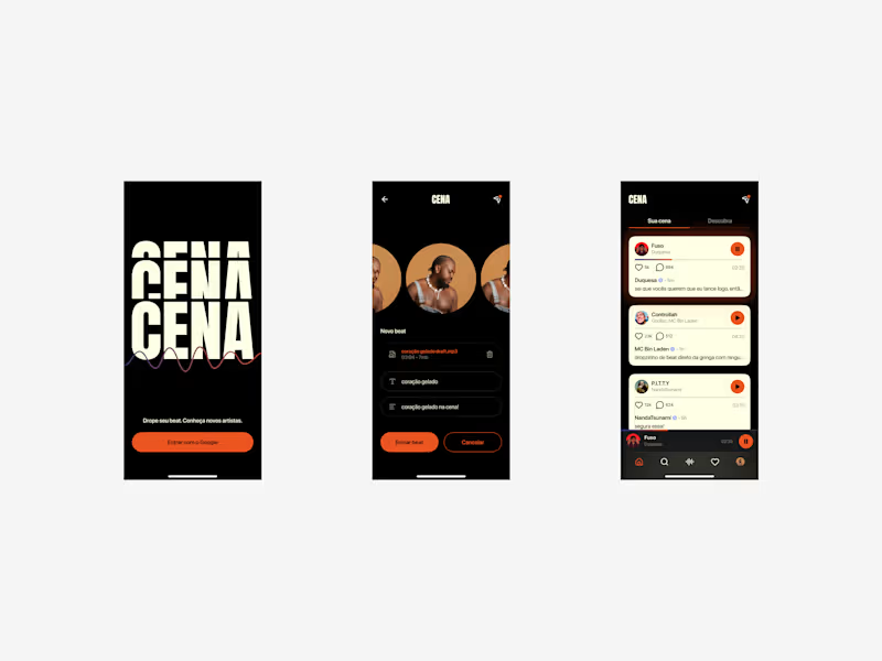
Cena
0
5
0
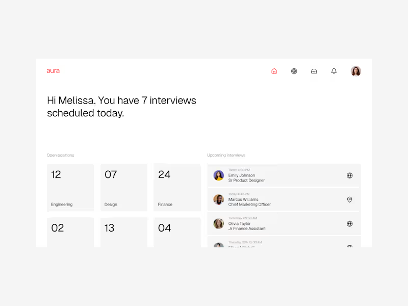
Aura
0
7
17
Ready for Production
17
110
Brand Designer
(4)
Follow
Message
Lucas Fields
pro
São Paulo, Brazil
Designing future-proof logos for tech startups.
$100k+
Earned
35x
Hired
4.8
Rating
555
Followers
Top
Follow
Message
Designing future-proof logos for tech startups.
4
Nodus Logo & Visual Identity
4
31
79
Amplemarket Logo Design
79
1.1K
71
Seashell Logo & Visual Identity
71
1.3K
37
Session Logo & Visual Identity
37
895
Brand Designer
(4)
Follow
Message
Robson Severo
pro
São Paulo, Brazil
Senior Product Designer · On brand user experiences
$10k+
Earned
9
Followers
Follow
Message
Senior Product Designer · On brand user experiences
1
Designing the brand foundation of a news intelligence tool
1
5
0
Bringing modern luxury to Brazil’s romantic route
0
11
1
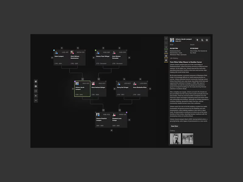
Reimagining the world’s largest genealogy database
1
13
2
Designing a viral gamification feature for Burger King Brazil
2
21
Brand Designer
(3)
Follow
Message
Pedro Freixo
São Paulo, Brazil
AI Creative and Digital Designer / Presentation Specialist
19
Followers
expert
Follow
Message
AI Creative and Digital Designer / Presentation Specialist
5
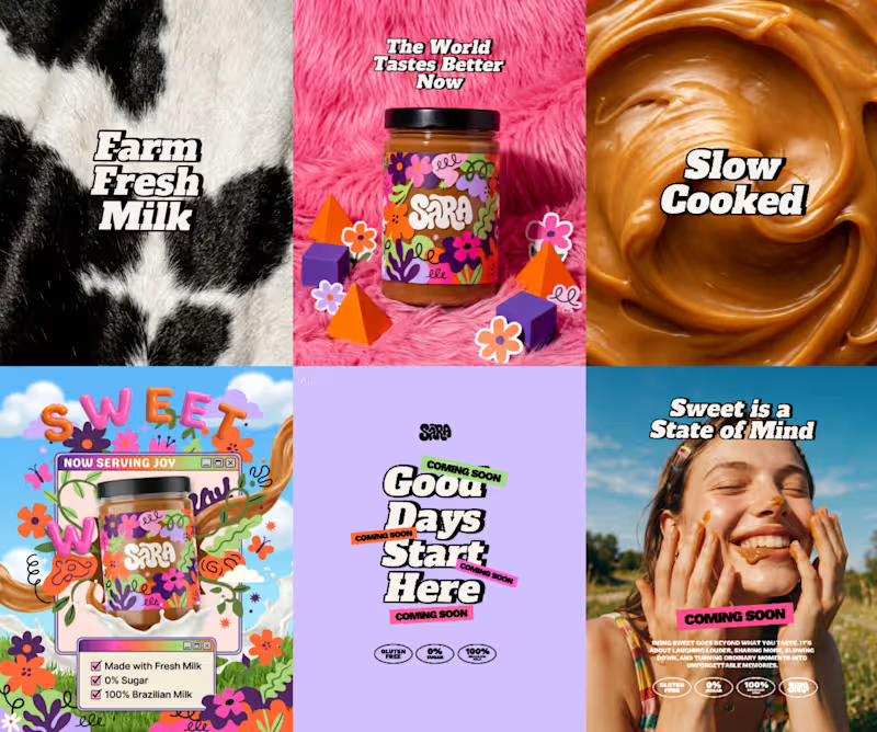
Brazilian Sweet 100% AI Brand and Visual Design Today, it's almost impossible to think about design without thinking about AI. Recently, I joined a @CapCut Design Studio challenge in other platform where the goal was to create an entire brand and campaign using only the platform. I was skeptical at first and expected limited results, but I committed to the process and intentionally stepped away from my usual workflow. The images below showcase part of the final campaign and reflect how AI supported different stages of the project as a creative partner. Concept: 90% AI Logo: 100% AI Color Palette: 70% AI Product Stills: 100% AI Campaign Posts: 50% AI (AI assets combined with manual art direction and composition)
1
5
224
0
(UI / Brand) Nexus App
0
14
0
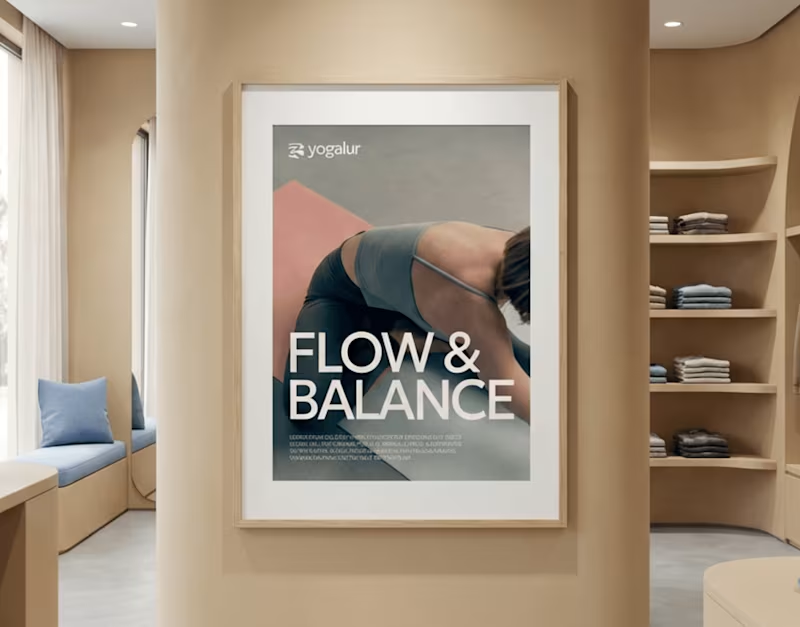
AI Brand Concept Yoga & Wellness
0
5
0
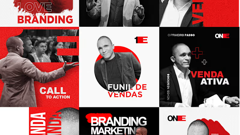
Brand Identity - Digital Marketing
0
11
Brand Designer
(8)
Follow
Message
Aline Brantis
pro
São Paulo, Brazil
Authentic Design with Cultural Insight
1x
Hired
5.0
Rating
2
Followers
Follow
Message
Authentic Design with Cultural Insight
1
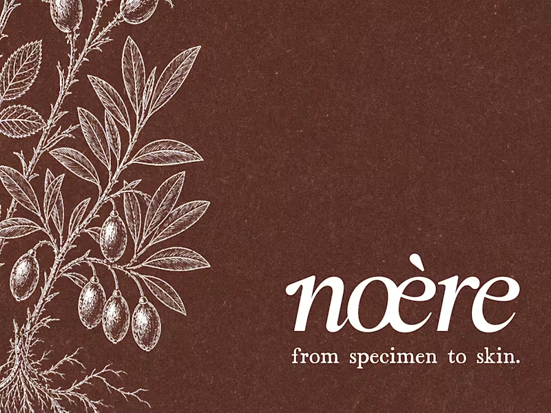
Noère Branding & Packaging
1
16
2
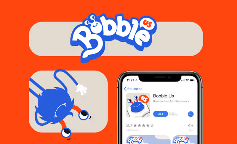
Bobble Us • Brand and Illustration System
2
18
1
Casa Rolio Brand Refresh and Packaging System
1
15
1
SeoPard • Branding & Illustration
1
14
Brand Designer
(5)
Follow
Message
Beriky Studios
São Paulo, Brazil
AI cinema & filmmaking | CPP: CapCut/Dreamina/MiniMax
13
Followers
Follow
Message
AI cinema & filmmaking | CPP: CapCut/Dreamina/MiniMax

7
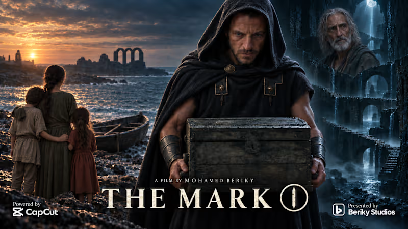
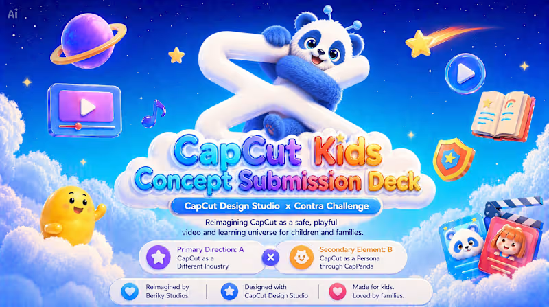
Work Title: CapCut Kids Main Direction: Direction A — CapCut as a Different Industry Secondary Element: Direction B — CapCut as a Persona through CapPanda Concept Statement: CapCut Kids reimagines CapCut as a safe, playful, and educational video platform for children and families. The concept translates CapCut from a creative technology tool into a new kids entertainment and learning universe where children can watch, learn, play, and explore through age-appropriate shows, interactive quizzes, creative activities, family experiences, and parent-controlled safety features. The original CapCut mark remains the foundation of the identity. It is softened, rounded, and transformed into a friendly 3D form, welcoming CapPanda into the logo and turning the brand into a warmer, more emotional, character-driven world. CapCut Kids keeps CapCut’s core spirit of accessible creativity and visual storytelling, while expanding it into a new industry built around trust, imagination, safety, and joyful design. The project includes, among other elements: • Logo evolution and new brand identity • Mascot system • Web platform experience • Mobile app adaptation • Social media ecosystem • App store concept Core Promise of CapCut Kids: Watch. Learn. Play. Grow. Created by: Beriky Studios Built with: CapCut Design Studio Presentation link: https://drive.google.com/file/d/1a4oWACWuQ_X1msoyzK-lNJeFNanR2MJN/view?usp=sharing Full submission package link: https://drive.google.com/drive/folders/13M7B_kjPnWI5tr2f9Ds31M1ofUW7C1Zn?usp=drive_link The post on LinkedIn: https://www.linkedin.com/posts/capcutdesignstudio-capcut-capcutcpp-ugcPost-7468792433787654145-W_Dk/?utm_source=share&utm_medium=member_desktop&rcm=ACoAACeNI8wBy3QEJnT0k5uveLAeL-eBzTd1pBE The Post on X: https://x.com/Berikystudios/status/2063026056756359536 #CapCutDesignStudio
24
7
540
2
VELORIS ONE — A 50-second premium automotive demo, Created with early-access Seedance 2.5 from CapCut, as part of Beriky Studios’ cinematic demo series. VELORIS ONE is a fictional brand developed by Mohamed Beriky (https://www.google.com/search?q=mohamed+beriky&sca_esv=4f86b927197d87de&biw=1164&bih=815&sxsrf=APpeQnv7Y01jcFZ-fN-QTxw-5Go5qqa4-Q%3A1785655960787&ei=mPJuauPML9rZ5OUP3ObVqAg&ved=0ahUKEwjj-O7ptoGWAxXaLLkGHVxzFYU4ChDh1QMIEA&oq=mohamed+beriky&gs_lp=Egxnd3Mtd2l6LXNlcnAiDm1vaGFtZWQgYmVyaWt5SABQAFgAcAB4AJABAJgBAKABAKoBALgBDMgBAJgCAKACAJgDAJIHAKAHALIHALgHAMIHAMgHAIAIAQ&sclient=gws-wiz-serp). Should you wish to bring it to life, you know who to call (https://www.linkedin.com/in/mohamedberiky/). 😉 #CapCutCPP #CapCutSeedance25 #CapCutVideoStudio
2
110
3
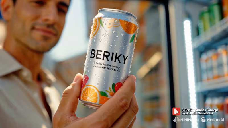
BERIKY — Refresh Your Creativity. A fictional cinematic beverage spot created using early-access MiniMax H3. Concept and production: Beriky Studios #MiniMaxH3 #HailuoAI #AIAdvertising
3
86
6
A SMALL MERCY 30 seconds. One act of kindness. One unbroken take. While the whole station rushed toward the next train, one little girl quietly shared her bread with the smallest life. 🐭🍞 Sometimes humanity survives in the quietest moments. A SMALL MERCY is a 30-second wartime short about tenderness surviving inside urgency. Set in a winter London railway station in the 1940s, the film begins high above a vast world of soldiers, civilian travelers, luggage, steam, orders, and constant movement. In one uninterrupted physical camera move, the perspective gradually descends from the scale and pressure of the station to the vulnerable world of a small mouse at floor level. The mouse moves almost unnoticed through the crowd. Its struggle is quiet, physical, and easy for the larger world to overlook. Eventually, it reaches the torn shoe of a little girl waiting beside her grandmother at the ticket window. The camera rises naturally to reveal the girl quietly eating a small piece of coarse bread. When she notices the mouse, her response is deliberately simple: no speech, no dramatic reaction. She simply recognizes another living creature in need and shares part of what little she has. Because the bread itself is scarce, the gesture carries weight. Her compassion is not grand or performative. It is instinctive. The girl’s worn clothing and torn shoe are intentional. They are not simply period details; they place her within the same wartime world of scarcity and vulnerability as the mouse. The mouse first reaches her through the damaged part of that shoe — a visible sign that she, too, is living with less. That makes the bread more important. She is not giving from excess. She is sharing something that has value to her. The mouse first encounters her vulnerability, and then her mercy. What begins as an instinctive act of survival — the mouse nibbling at the torn shoe — becomes an encounter between two vulnerable lives when the girl chooses to offer it part of her own food instead. The gesture matters precisely because she has little to spare. The One-Take Language Camera choreography: high → descend → track → rise → observe → descend → hold. The uninterrupted take is not simply a technical device. It is the storytelling itself. The camera begins with the scale of the station, then physically lowers our attention toward something almost invisible within it. As the camera moves closer to the mouse, the sound perspective narrows too — from the huge reverberation of the railway station to boots, footsteps, floor vibrations, fabric, dry bread, and small movements. When the girl notices the mouse, the camera does not isolate the moment from the world around it. The grandmother’s ticket transaction continues quietly in the background. Trains still wait. People still move. Orders are still given. The station remains urgent. Nothing stops for this moment. Yet, for a few seconds, the girl creates a small space of care within it. The guiding thought behind the film was: “In a world moving too fast to notice, someone noticed.” The line is never spoken or displayed. It is simply the principle beneath the film. The final camera decision is essential to that idea. When the girl and her grandmother leave, the camera does not follow them. It stays behind. The station continues moving in the background while the mouse remains beside the wall, eating the bread she left for it. The film does not resolve the war. It does not transform the station. It does not suggest that one small gesture can change the world. It simply allows that gesture to exist. And for one small life, for one brief moment, that is enough. Production Approach The process began with crafting the story, followed by visual research using archival references of 1940s London railway stations to establish the period, architecture, scale, and atmosphere. From there, dedicated visual references were developed for the girl, grandmother, and mouse, alongside period-specific research and reference material for British soldiers, civilian travelers, wartime clothing, footwear, luggage, weapons, and supporting props. Before generation, the station geography and character blocking were mapped with precise timing across the full 30 seconds — defining exactly when the camera would discover the mouse, follow its journey, reach the girl, reveal the human relationship, observe the act of compassion, descend again, and settle into the final frame. The complete camera choreography and cinematography were then defined: lens character, camera height, physical movement, composition, depth, winter lighting, atmospheric treatment, and the restrained pale blue-grey visual language of the film. The storyboard was designed not as a sequence of separate shots, but as one uninterrupted 30-second take, mapping a single physical camera journey from the high architecture of the station to the final mouse-level hold. Music and sound design were also planned before generation. The sound perspective was designed to move with the camera — from the large reverberant environment of the station to the intimate world of boots, floor vibrations, fabric, bread, and the mouse — while the restrained score follows the same emotional progression without becoming sentimental. Story → archival research → visual references → blocking & timing → camera choreography → cinematography → continuous-take storyboard → music & sound design → generation This structured pre-production became the foundation for the final execution. The core 30-second film was achieved in the very first generation, demonstrating how detailed filmmaking decisions made before generation can shape a coherent one-take result rather than leaving storytelling, performance, and camera language to chance. Created with Seedance 2.5 via CapCut Video Studio. Note: the opening title was generated as part of the film itself. Links🚀 X: https://x.com/Berikystudios/status/2089171298664546759 TikTok: https://www.tiktok.com/@berikystudios/video/7674809187699805458 https://www.tiktok.com/@berikystudios/video/7674814580530482450 Instagram: https://www.instagram.com/p/DcH39B8gkgH/ https://www.instagram.com/p/DcH4WpygYzK/ Youtube: https://youtu.be/R7Z2UWulVlw LinkedIn: https://www.linkedin.com/feed/update/urn:li:ugcPost:7494945424458276864/ https://www.linkedin.com/feed/update/urn:li:ugcPost:7494946347880714241/
3
6
298
Brand Designer
(3)
Follow
Message
Carolina Zeferino
Campinas, Brazil
Design that breaks brands out of the cocoon.
5.0
Rating
49
Followers
Follow
Message
Design that breaks brands out of the cocoon.
10
Language can be a portal, where each word opens a passage to new worlds. Yet in the language school market, many brands still communicate in similar ways. With MEKHO, the goal was to move away from traditional academic imagery without losing credibility or structure. The challenge was to translate depth and authenticity into a consistent visual system for digital environments. The logotype features angular strokes to convey precision. The symbol combines stylized bat wings, representing guidance, with a form that suggests a coded sign, reinforcing language as a system to be deciphered. The palette builds authority through dark tones, while green acts as a calculated contrast, signaling sophistication and direction. The result is an identity that positions MEKHO as an immersive brand focused on real communication.
5
10
86
2
Alquimia do Sabor is a vegan confectionery brand that transforms plant-based ingredients into sensory experiences filled with care, consciousness, and meaning. More than sweets, the brand creates everyday potions, creations that awaken memory, affection, and presence.
2
75
27
This is the essence of the brand: a hybrid space that connects literature and botany as two forms of care. Here, books are not merely objects, they are seeds of possible worlds. And flowers are not just ornaments, they are gestures of affection, small breaths that soften the day.
2
27
221
18
NÓRIA is an artisanal fashion studio that brings together gesture, technique, and silence. Each piece emerges as a study of form: soft curves, natural textures, and a drape that follows the body’s own flow. The process is slow and intentional — stitching that respects time, fabric, and touch. The visual identity begins with the central symbol: four continuous loops inspired by the running stitch. It represents the movement of the thread, the repetition of the gesture, and the delicate precision of patternmaking. The neutral, mineral palette reflects the studio’s aesthetic: calm, tactile, organic. Fine, gentle typefaces support the brand’s editorial character. Graphic elements derived from the loop create visual rhythm, as if the motion of sewing extended across the entire system.
2
18
190
Brand Designer
(14)
Follow
Message
Explore people