The network for creativity
Join 1.25M professional creatives like you
Connect with clients, get discovered, and run your business 100% commission-free
Creatives on Contra have earned over $150M and we are just getting started
Back to feedPost


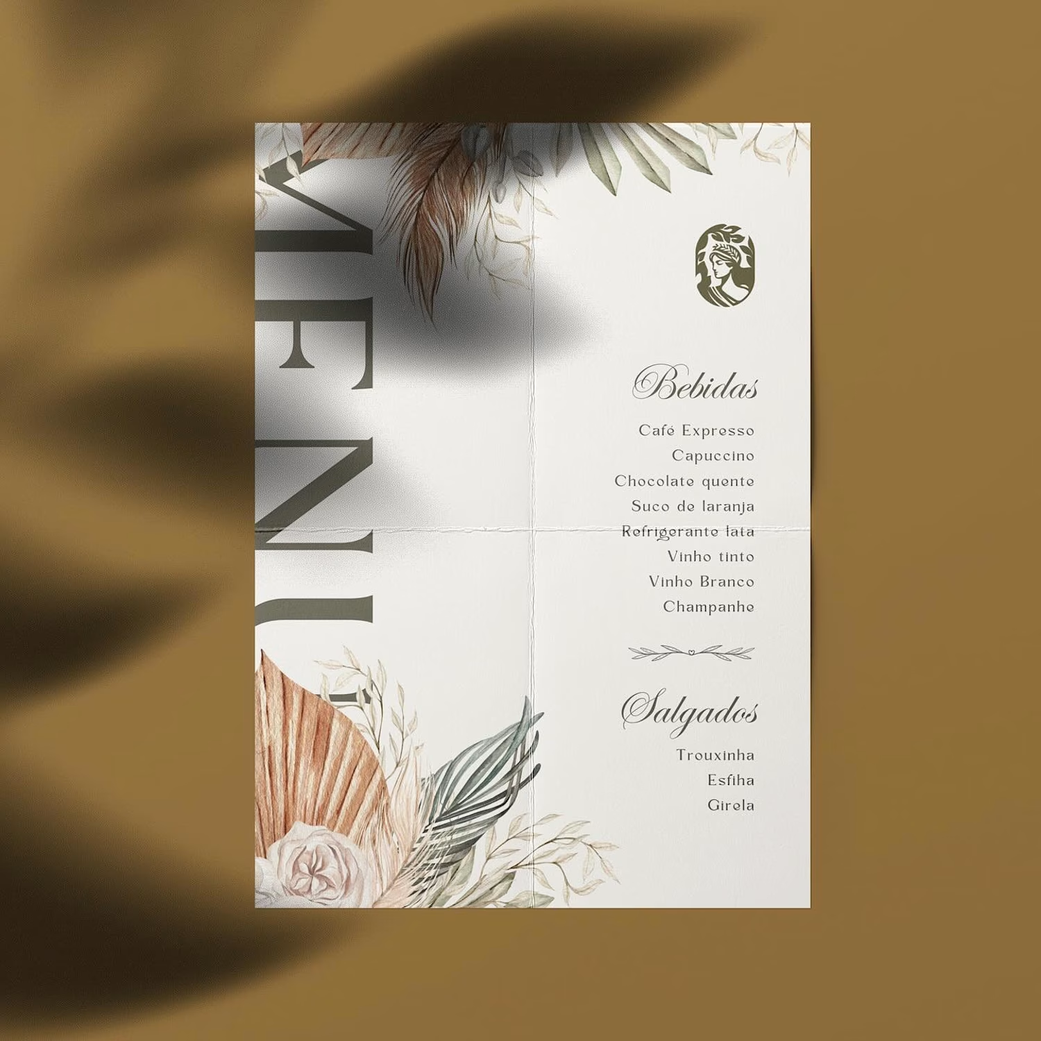
Hot take: aesthetics and clinical results should walk hand in hand.
Most brands in this space lean into cold, sterile whites or aggressive dark tones. It reads functional, but it also feels like something you'd hide in a medicine cabinet, not display on your vanity.
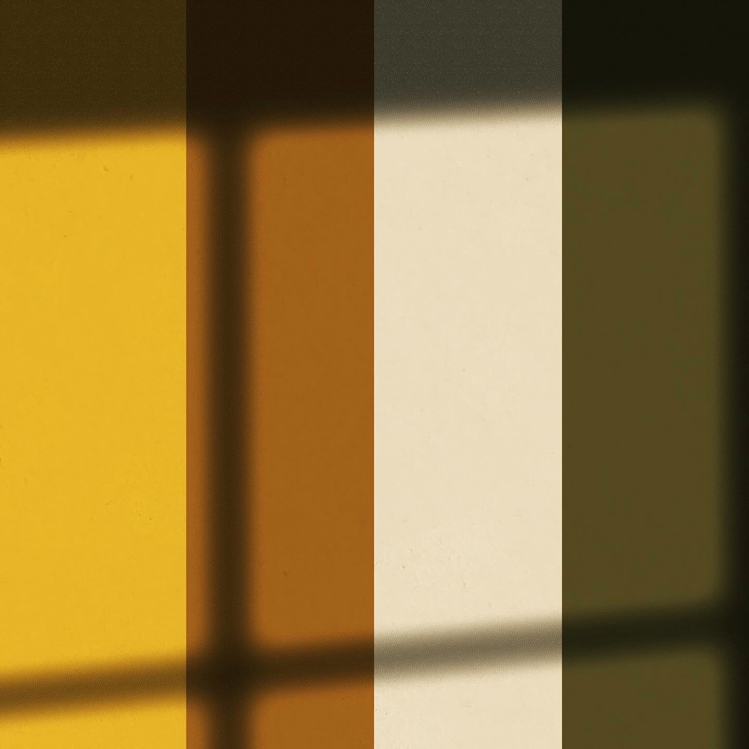
For this rebrand, we anchored the identity in classical beauty and organic sophistication. By combining warm earthy tones, botanical cues, and timeless iconography, we moved away from the "pharmacy product" feel into true high-end personal care.
It was a deliberate shift: positioning the brand not for someone who feels like they are treating a flaw, but for someone investing in a premium daily ritual.
Would a piece like this deserve a spot on your display shelf?





Beautiful work!
Thanks Bella! Are you also working on any wellness or personal care identity projects as well?

Appreciate it, Ganesh! What element you think stood out to you the most?

This is brilliant!
Thanks Damilola! What part of the branding stood out to you the most?
Love the choice of color!

100% agree. The shift from pharmacy aesthetic to ritual-driven luxury is the right move. Warm earthy tones and classical imagery signal that this is a product you choose, not one you need. That distinction is everything in premium beauty.
Spot on, Tabish! That transition to choosing the product completely unlocks its pricing power.
What visual cues do you like using to strike that balance between clean minimalism and luxury?
I usually use a lot of whitespace, refined typography, subtle contrast, restrained colors, and strong visual hierarchy. For the luxury feel, I focus on premium imagery, elegant details, and consistent spacing without making the interface feel overly decorative.

Thanks Alaa! What detail of the design caught your eye the most?

Appreciate it, Nirooz! What element you think stood out to you the most?

Nice.
Appreciate it, Muhammad! What element you think stood out to you the most?

This is great
Thanks Folorunsho! What detail of the design caught your eye the most?

Nice execution
Appreciate it, Hatypo! What element you think stood out to you the most?

The shift from correcting a flaw to investing in a daily ritual comes through clearly, especially in the warm palette and classical cues. Did you set any specific guardrails for product claims or scientific information so the packaging could feel luxurious without losing clinical credibility?
Spot on observation! Our guardrail was letting minimalism do the heavy lifting, using clean typography and precise language instead of cluttered clinical claims.
Where do you usually see brands trip up when trying to bridge that clinical-to-luxury gap?
I often see brands overcorrect either making the packaging feel too clinical and cold, or adding too many luxury cues that weaken its credibility. Your use of minimalism strikes a thoughtful balance between the two.

Nice designs
Appreciate it, Louis! What element you think stood out to you the most?
The flawless combination of colours and some element keeps me in awe

One of the best designs I’ve seen today. Really solid work 👏 Ditching cold clinical whites for vanity-worthy aesthetics makes product packaging look so elevated.
Thanks Boluwatife! What detail of the design caught your eye the most?

Looks amazing! 🔥🔥
Thanks DESH! What detail of the design caught your eye the most?


Yes, this would earn a spot on the shelf. The earthy tones do a lot of work here.
Appreciate it, Pixel One! What element you think stood out to you the most?

The medicine cabinet versus vanity line nails it. Warm earthy tones say it works AND earns a spot on display, sterile white only reads clinical and gets hidden on a shelf.
You nailed it!
When you see brands trying to make this shift from purely clinical to vanity-worthy, where do you usually see them trip up the most?
For me, the standout element is the interplay between the timeless cameo and laurel motif and the tactile, organic depth created by the dappled foliage shadows and earthy olive and neutral color palette.


This is brilliant!

Love the shift toward warm, earthy tones. The branding feels premium, elegant, and much more like a personal-care ritual than a typical clinical product. 👏

This nice

This would absolutely get a spot on my shelf. The earthy tones are such a nice break from the usual sterile clinical branding.

Love the mark! Incredible work using negative space 👌

the textures are what caught my attention here and they make the whole identity feel less like the typical clinical brand

Was the starbucks logo lady was your inspiration?

this is very clean and neat! Great!!!


The network for creativity
Join 1.25M professional creatives like you
Connect with clients, get discovered, and run your business 100% commission-free
Creatives on Contra have earned over $150M and we are just getting started







Related posts

Hey everyone! 👋
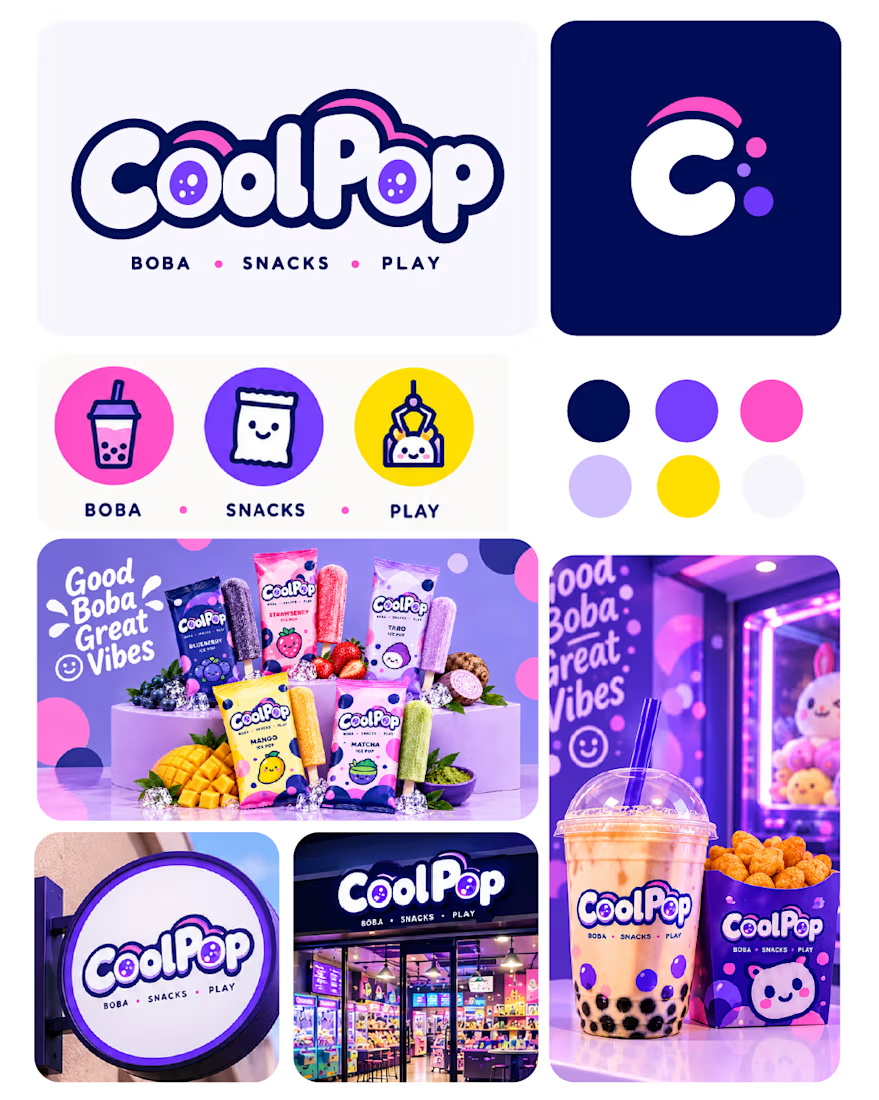
I’m working on a logo design for a brand called “Cool Pop” — an Asian pop drink brand.
I’d love to hear your thoughts and honest feedback on the logo concept. What do you think works, and what could be improved?
Your feedback would really help me refine the design. Thanks! 🙌

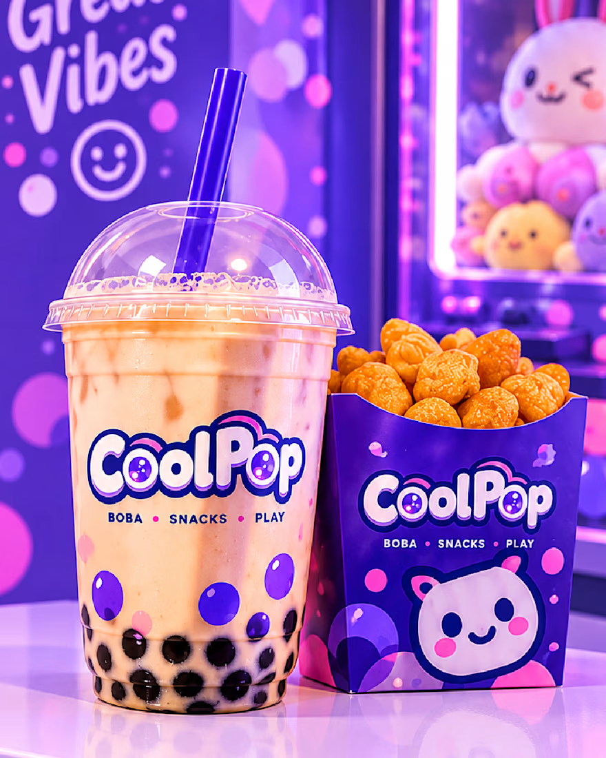
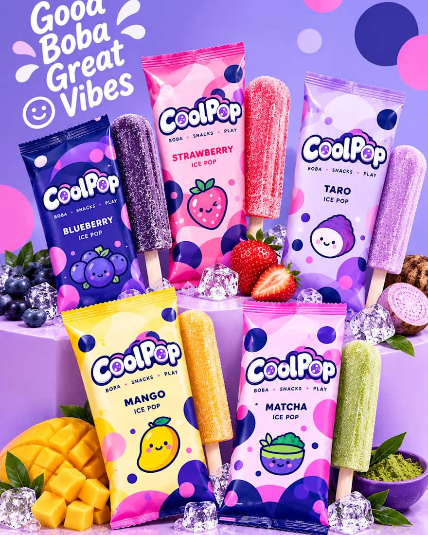

That's stunning how you match the colors and visuals make it unbelievable 🔥🔥🔥🔥🔥🔥

Four restaurants, one dot, and a suspicious amount of work for a punctuation mark.
07:00 bakery. 12:30 lunch counter. 18:45 dining room. 23:10 bar.
Norr & Co. case study, coming soon

Product visuals created for S'IP Coffee Shop
Delicious designs engineered to turn scrollers into customers