The network for creativity
Join 1.25M professional creatives like you
Connect with clients, get discovered, and run your business 100% commission-free
Creatives on Contra have earned over $150M and we are just getting started
Back to feedPost
Taste Test
Exploring two different hero directions for a new project.
Same message, two completely different visual approaches.
Which one makes a stronger first impression?
A or B? Curious to hear your thoughts!

36 voted
90%
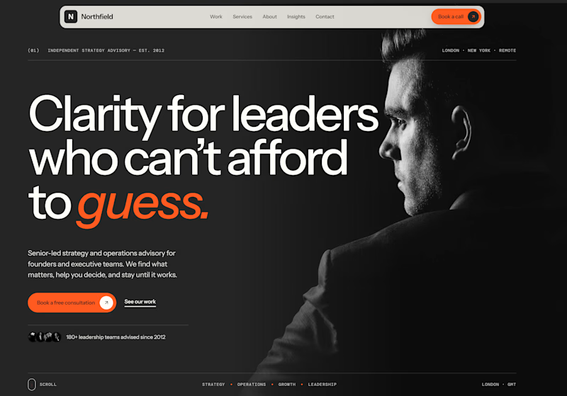
4 voted
10%
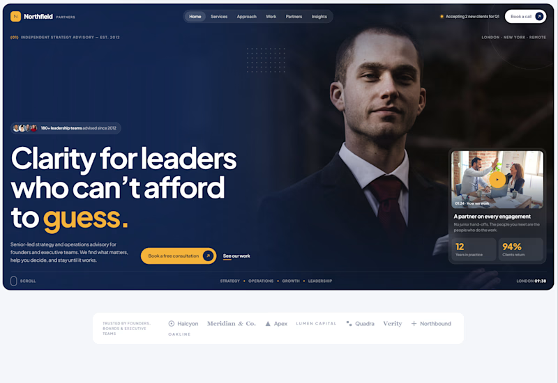
40 votes
Closed

Option1 wins

nice work


Both are strong. I lean towards the dark version, because the orange accent on the italic "guess." pops and the profile portrait gives it a more editorial, confident feel. The navy one reads a bit more corporate, which could suit a more conservative audience. Nice exploration!

Option 1 for me. The dark version with the orange on guess gives the headline more weight for a leadership audience.

I would lean toward whichever has the clearer headline hierarchy. A strong first impression is mostly about how fast someone understands the offer, and the visual style can support that after.

Showing the same message in two visual directions is a smart way to get useful feedback. I would also read each hero headline aloud, since a hero that is easy to scan in one breath usually converts better than a clever one. Which headline do you feel is stronger on its own?

Incredible!

Option 2 for me. The navy feels more trustworthy for a leadership audience, and the card on the right gives people a reason to keep reading. Option 1 is bolder but has less to hold onto.

Well done.

Looks great, nice work

option 1 for me, the orange on the italic "guess" carries the whole line. curious if the navy one lands better with the leaders you're aiming at though


option 1 as it easily grabs the attention of a user

First of all I think both are really good, but here are my thoughts and why I'm not voting.
On layout and text I do prefer dark version. It feels strong and gives a "Leadership" vibe.
On the image side, I like that the person is looking at the text, guiding users to it, but...

option 1 is good layout

For me 1 even more intriguing

Cool exercise. Funny how the same message lands so differently depending on the visuals. Leaning towards Option 1 for the first impression.

Option A for me as black theme show the authority of leader

Option A is a winner🙂
Here is a live preview: https://nordconsulting.framer.website/
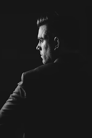
nordconsulting.framer.website
Nord Consulting — Senior-led strategy & operations advisory
Independent, senior-led advisory for founders and executive teams. Clear decisions, measurable results and a partner who stays until it works.
Whole design is really inspiring great work 👏
The network for creativity
Join 1.25M professional creatives like you
Connect with clients, get discovered, and run your business 100% commission-free
Creatives on Contra have earned over $150M and we are just getting started






Related posts

Exploring a few different hero directions for Frame 18.
Which one would you go with, A or B, and why?
Would love to hear your thoughts before I finalize the design!
#webdesign #uiux #framer #websitedesign #designfeedback
9 voted
50%
9 voted
50%
18 votes
Closed
A for me. The portrait grid shows the range of work right away, though B has the stronger first impression.

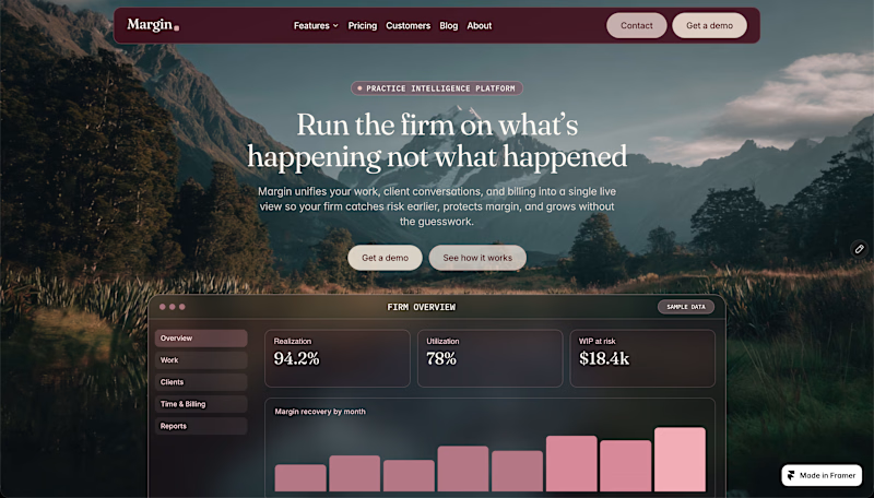
One template. Two completely different personalities. 👀
Experimenting with visual directions for a new Framer template.
🍂 1 — Warm, cinematic & editorial
🏔️ 2 — Dark, moody & premium
Both are still works in progress.
Which one would make you stop scrolling 1 or 2?
2 voted
67%
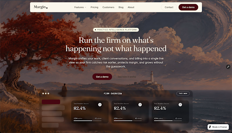
1 voted
33%
3 votes
Closed

Warm 🔥

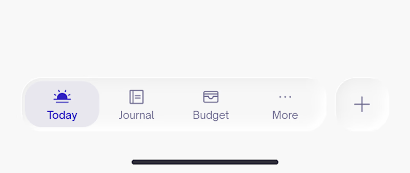
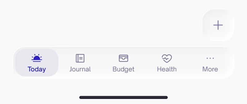
Which navigation do you prefer more? With side or floating action?
11 voted
48%
12 voted
52%
23 votes
Closed

Depends on the product and how data heavy it is. For example, an app for insurances and alot of document handling the FAB works best 👌