The network for creativity
Join 1.25M professional creatives like you
Connect with clients, get discovered, and run your business 100% commission-free
Creatives on Contra have earned over $150M and we are just getting started
Back to feedPost
Taste Test
Exploring a few different hero directions for Frame 18.
Which one would you go with, A or B, and why?
Would love to hear your thoughts before I finalize the design!
#webdesign #uiux #framer #websitedesign #designfeedback
10 votes
Ends in 17h

B — the dancers give the hero real drama.

Exactly what I was going for with B! Wanted the hero to feel more cinematic and capture that sense of movement. Glad that came across. Appreciate the feedback!

Second one looks clean !
Thanks! B is definitely growing on me too.

A is more like a work showcase/gallery but B actually looks like a hero😊
I'll keep in mind while finalizing the direction. Thanks for the feedback!

A for me. The portrait grid shows the range of work right away, though B has the stronger first impression.
That's a really good point! Thanks for sharing your perspective, appreciate the feedback!
The network for creativity
Join 1.25M professional creatives like you
Connect with clients, get discovered, and run your business 100% commission-free
Creatives on Contra have earned over $150M and we are just getting started




Related posts

Need a second pair of eyes 👀
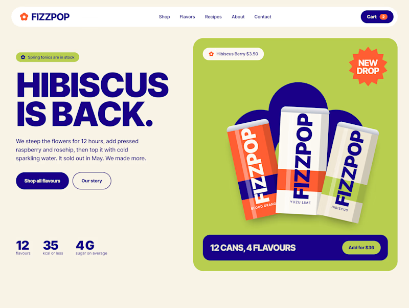
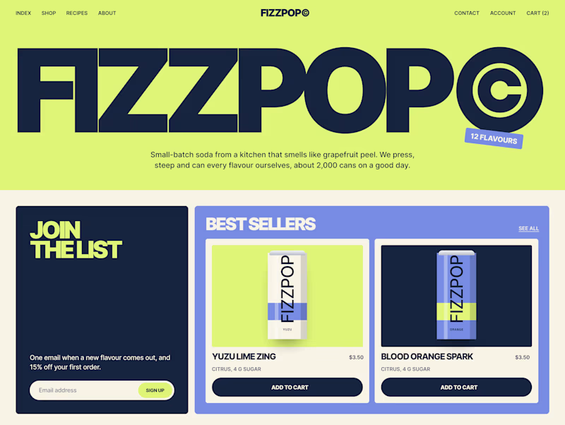
I'm designing the online store for FizzPop, a craft soda brand: all-natural sodas, sparkling waters and botanical tonics.
Flower Fizz(A): eggshell, tiger orange and deep ultramarine, with flower shapes and stacked colour swatches for the flavours
Corner Shop(B): lime, soft blues and navy, editorial layout with a giant wordmark and menu-style flavour tiles

38 voted
44%
48 voted
56%
86 votes
Closed


Working on a Contra project - which one is your go to?
90 voted
52%
82 voted
48%
172 votes
Closed

I will go for A - Spiral

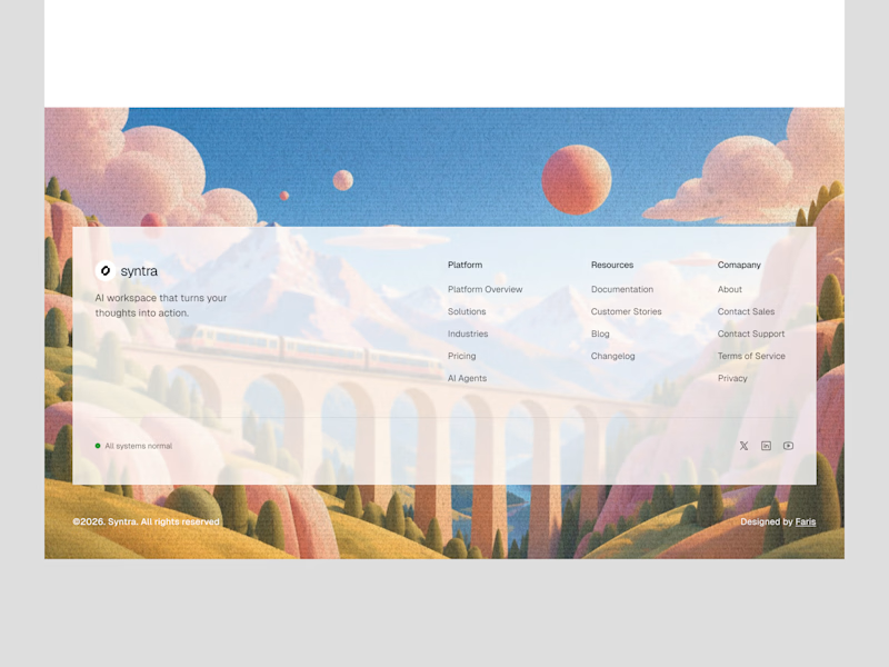
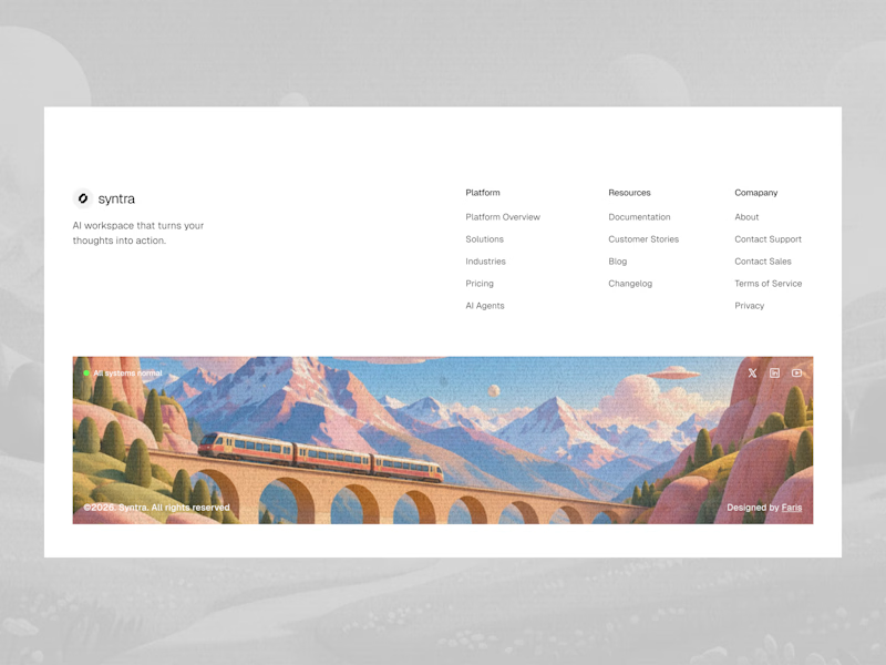
Footer explorations.
Which one do you like it?
7 voted
32%
15 voted
68%
22 votes
Closed

Love these explorations! The first one really stands out to me, the illustrated train scene makes the footer feel so memorable instead of just links at the bottom. It's such a clever way to end the page on a beautiful, branded note. Really great work!