The network for creativity
Join 1.25M professional creatives like you
Connect with clients, get discovered, and run your business 100% commission-free
Creatives on Contra have earned over $150M and we are just getting started
Back to feedPost
Taste Test

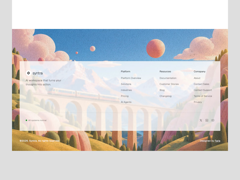
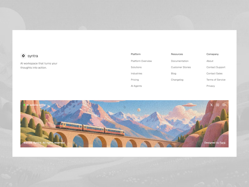
Footer explorations.
Which one do you like it?
7 votes
Ends in 1d

Love these explorations! The first one really stands out to me, the illustrated train scene makes the footer feel so memorable instead of just links at the bottom. It's such a clever way to end the page on a beautiful, branded note. Really great work!

Both look great, but I'd go with B. The clean white background makes the navigation easier to read, while the illustration adds personality without distracting from the content. A feels more immersive, but B strikes a better balance between visual appeal and usability. Nice exploration!

i think second one
The network for creativity
Join 1.25M professional creatives like you
Connect with clients, get discovered, and run your business 100% commission-free
Creatives on Contra have earned over $150M and we are just getting started



Related posts

New here, so I'm slowly filling in my portfolio and getting to know the place. So far I like it.
Here's an extract from Software Intelligence, a Framer site I designed and built a few months ago for an enterprise data consulting startup.
The visual idea mirrors what they do with data: compact blocks that animate, break apart and recompose, like charts taking shape. Few effects, all consistent, everything managed through the CMS.
If you have a minute, take a look at the full case study.
I'd love to know what you think, especially whether the motion supports the content or ends up overpowering it.


You're very welcome, Francesco — glad the note landed. The motion in that extract really does the heavy lifting for the content, so keep sharing your work here. Looking forward to seeing what's next from you. ✌️

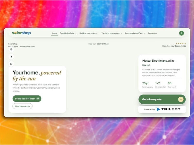
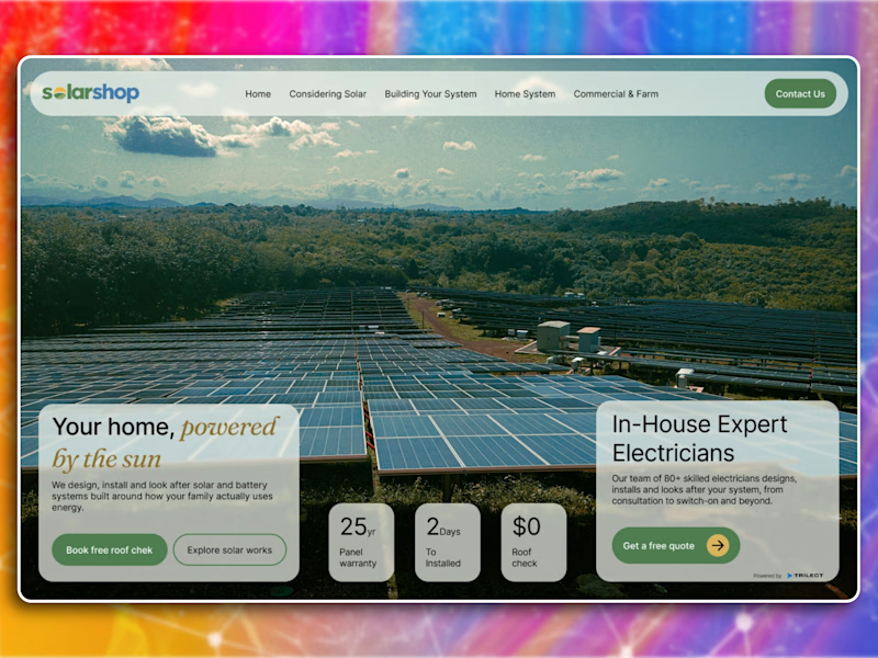
Which hero would actually make you book a free roof check?
Redesigned the hero section for Solarshop, a New Zealand solar company.
The original had everything it needed but nothing was working together. Stats were floating around, two cards just sitting on top of a photo, no clear place for your eye to land.
So I kept the same general layout but actually made it do something. Full bleed photo, cards anchored to the bottom corners, stats moved inside the left card where they actually support the headline. Typography got more contrast too, the golden italic reads properly now.
The goal was to make it feel more premium without losing that local, approachable feel they had going.
What would you have changed?

0 voted
0%
3 voted
100%
3 votes
Closed

The "After" layout feels so much more cohesive. Two quick catches, the primary CTA has a small typo and the headline says Your home, powered by the sun but the background image shows a massive industrial solar farm rather than residential rooftops.

Which homepage would you trust more to download 3D products from?
2 voted
33%
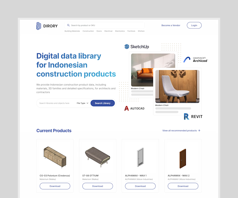
4 voted
67%
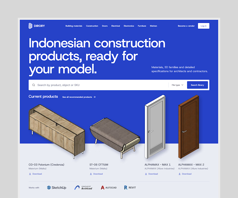
6 votes
Closed
