The network for creativity
Join 1.25M professional creatives like you
Connect with clients, get discovered, and run your business 100% commission-free
Creatives on Contra have earned over $150M and we are just getting started
Back to feedPost


Hot take: functionality and brand attitude should walk hand in hand.
Most brands in the vape/pod space default to cheap generic designs or overly crowded, messy visuals. It reads low-tier, unreliable and forgettable.
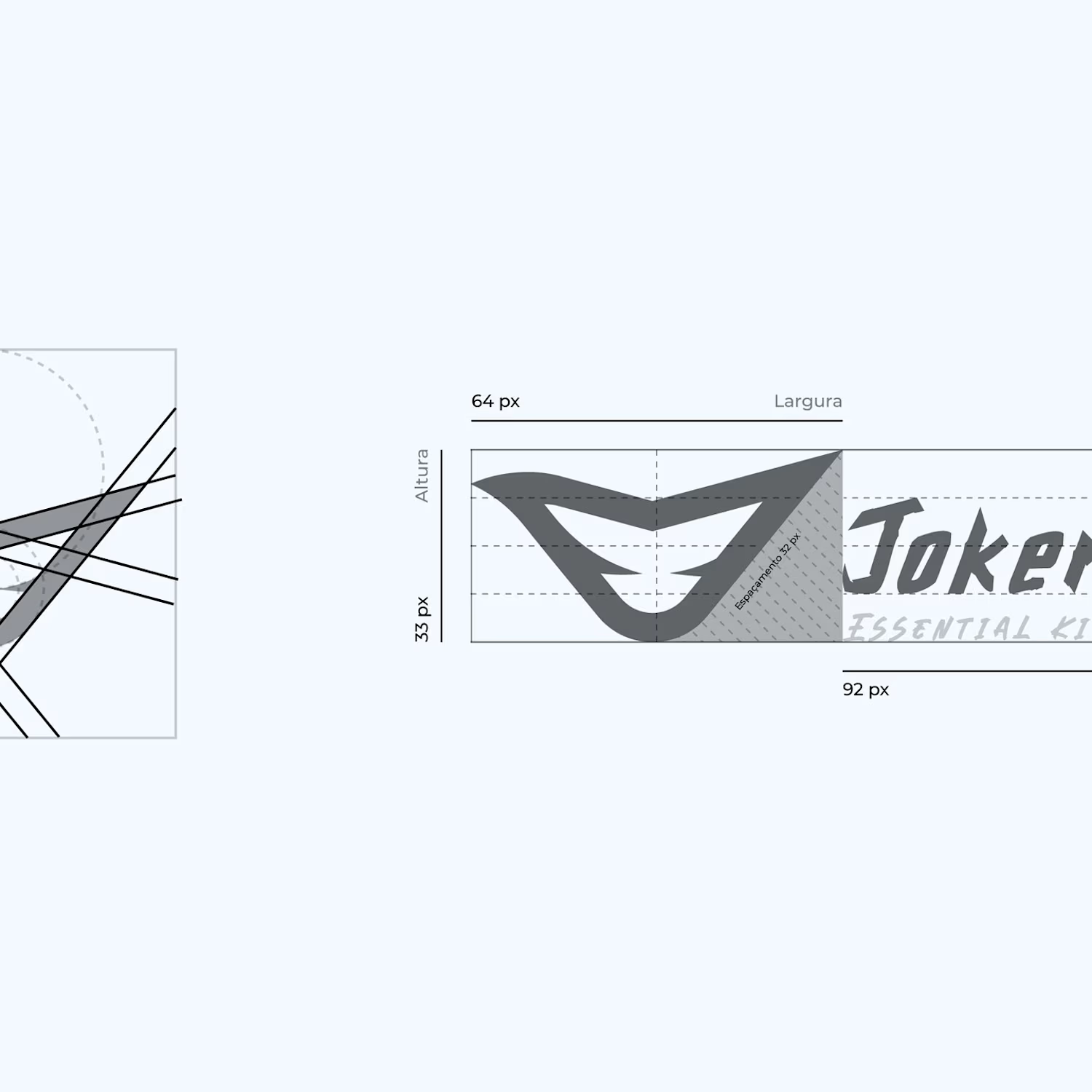
For the Joker Pods identity, we took a radically different path. We built the branding around high-contrast energy combining a electric neon green palette with sleek black packaging and an unforgettable sharp icon.
It was a deliberate positioning shift: moving away from generic commodity packaging into a bold, streetwear-inspired unboxing experience. Every detail from the custom box copy to the street poster aesthetic is designed to turn a simple delivery into a memorable brand ritual.
Would an unboxing like this make you stop scrolling?


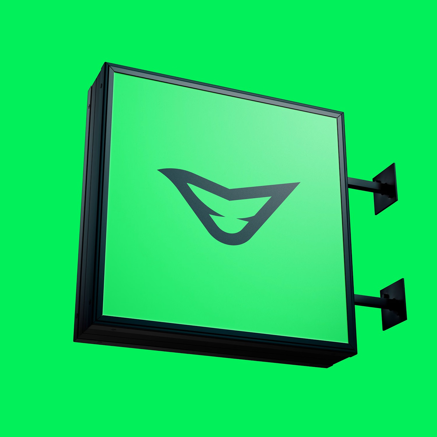
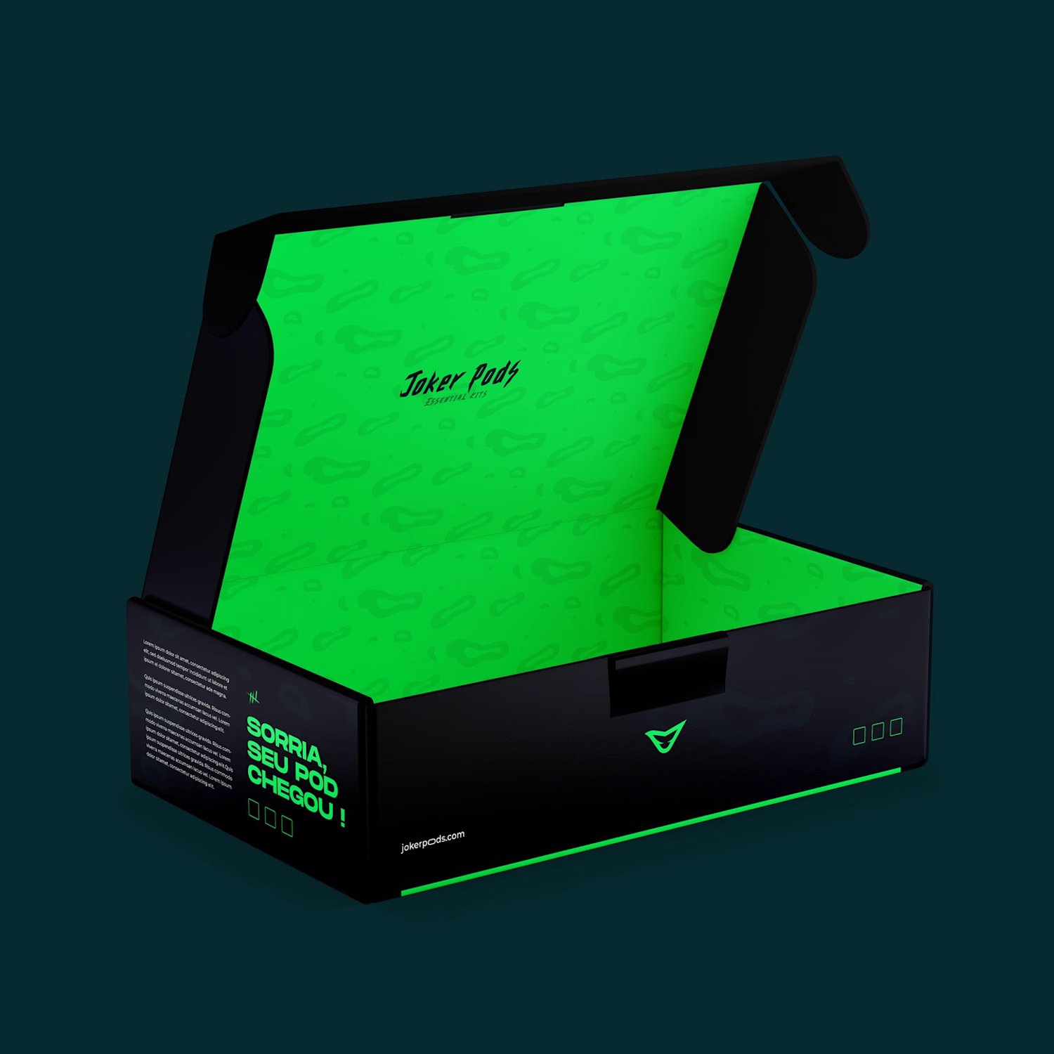
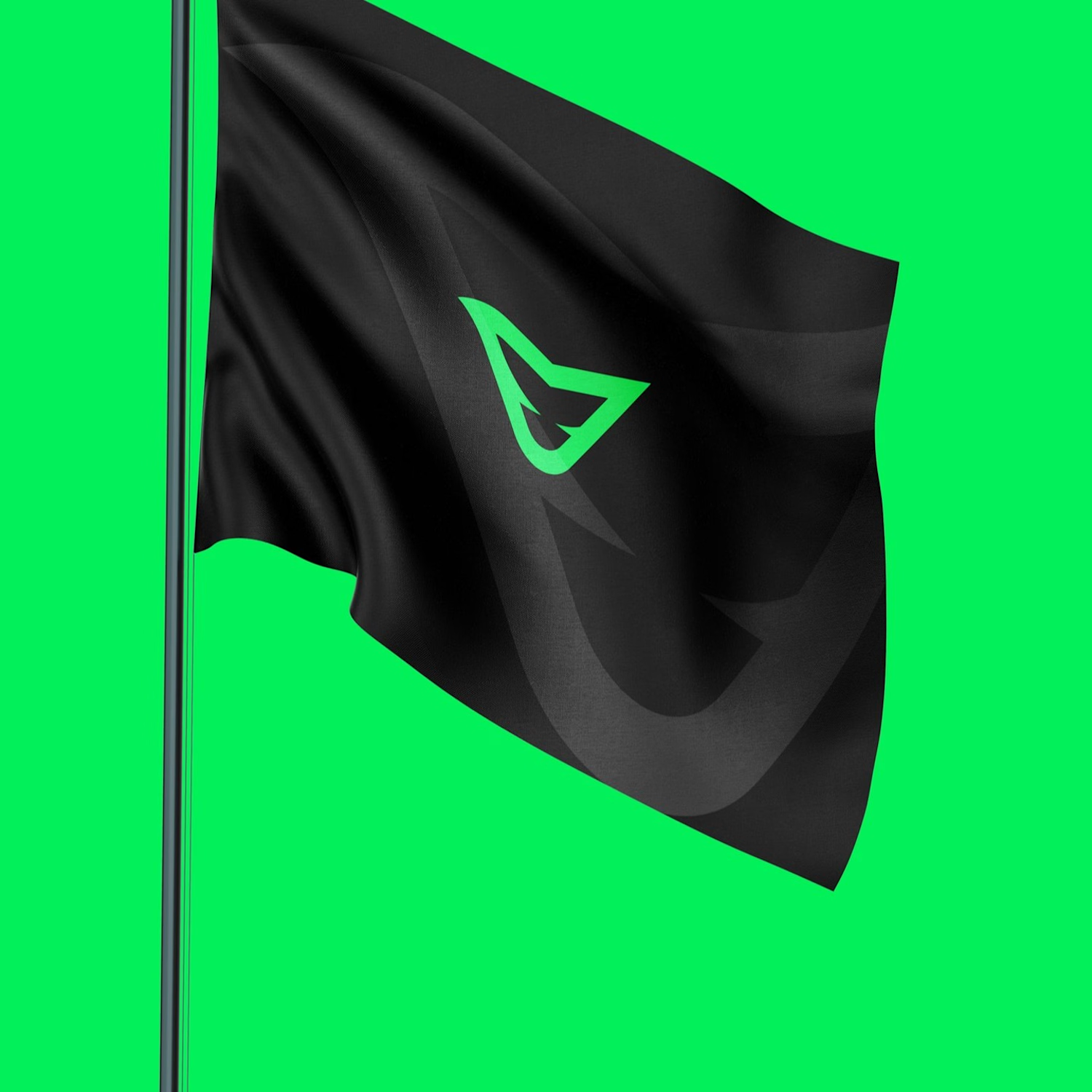

It would, though for me it's the black doing the work rather than the neon — the green stops the scroll, the black is what makes it read as a considered product instead of a novelty. The trade-off with a streetwear-coded unboxing is category legibility, so I'm curious whether...
Nice point Artur, the contrast between the matte black and neon green accent was exactly meant to bridge that gap between premium product feel and high-energy street culture.
How do you usually balance category legibility with breaking out of generic industry conventions when launching a new DTC physical product?

I think this has another level of personality that most of brandings done not have


The network for creativity
Join 1.25M professional creatives like you
Connect with clients, get discovered, and run your business 100% commission-free
Creatives on Contra have earned over $150M and we are just getting started






Related posts


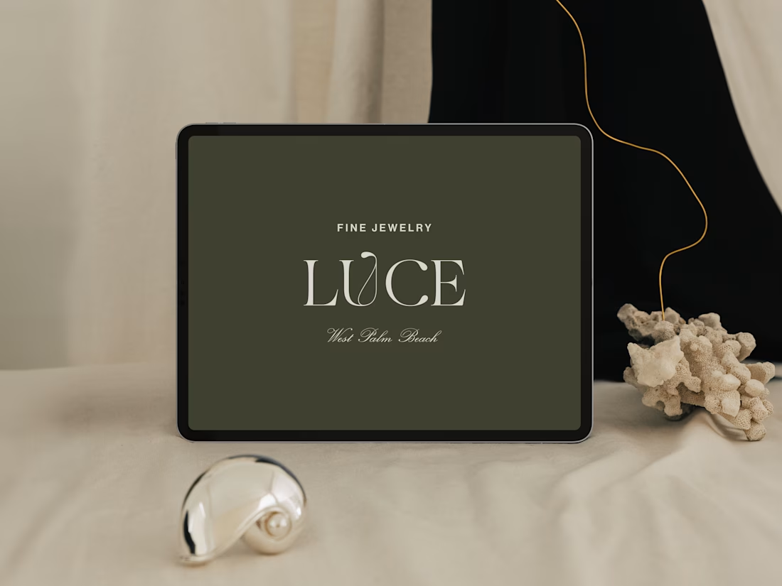
Introducing LUCE, a fresh chapter in four generations of fine jewelry.
Earthy greens, expressive typography, and thoughtful packaging bring warmth and personality to a brand rooted in heritage.
I worked with LUCE across brand strategy, visual identity, packaging experience, and full Shopify website design and development, bringing every detail into one cohesive world.


NEAT
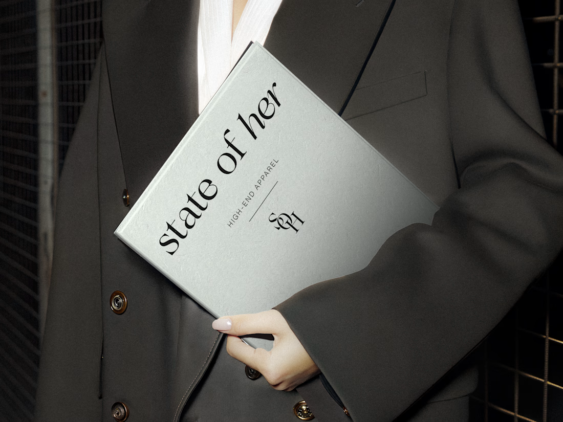
Introducing State of Her, a womenswear brand made for every state of her life.
Custom typography, sculptural monograms, and a softly grounded palette come together in an identity that balances confidence with ease.


Every element feels perfectly placed! 👏