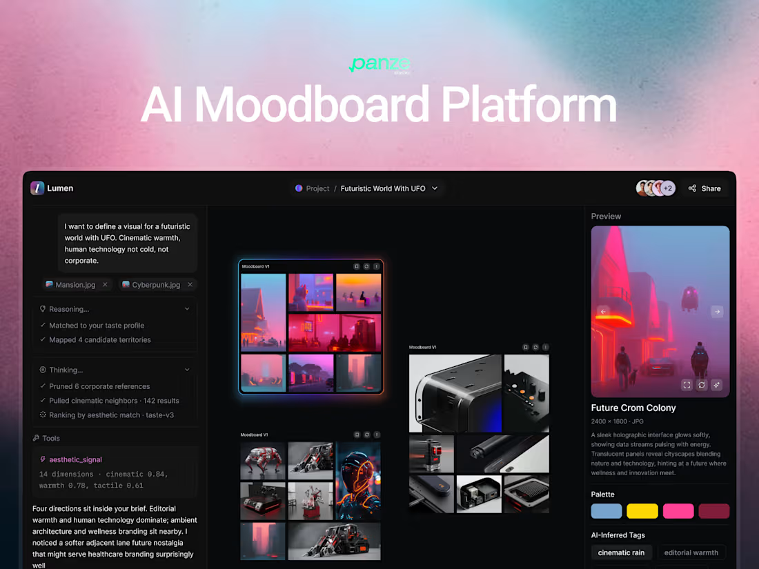
I designed this for an AI agentic research and content SaaS tool that turns recordings, documents, and video into structured summaries, the transcript workspace, the multi source input, and the agent chat output.
It's for creators, researchers, and teams working through long-form material, a two hour interview, a stack of PDFs, a recorded meeting, who need the key points and quotable clips without scrubbing the whole thing themselves.
Designed in Figma. Available for AI product and SaaS web app UI/UX design work π¬
1
4
I designed the marketing landing page for Voibly, AI voice dictation app for Mac and Windows.
It's for people who write all day and are deciding, in about forty seconds, whether a dictation tool is worth installing β writers, developers, founders, anyone who types more than they'd like to.
Designed in Figma. Available for SaaS landing page and web UI/UX design work.
0
9
I designed these app screens for Snoco, a loyalty and rewards mobile app for a fuel and convenience store chain β the home browsing screen and the deals screen.
It's for everyday convenience store and gas station customers collecting points on fuel, snacks, and orders β people who open the app in a parking lot or at a counter and need the relevant thing in a few seconds.
Category tabs scroll horizontally, so a chain selling fuel, food, and orders fits without a crowded menu.
Designed in Figma. Available for mobile app UI/UX design work π¬
2
20
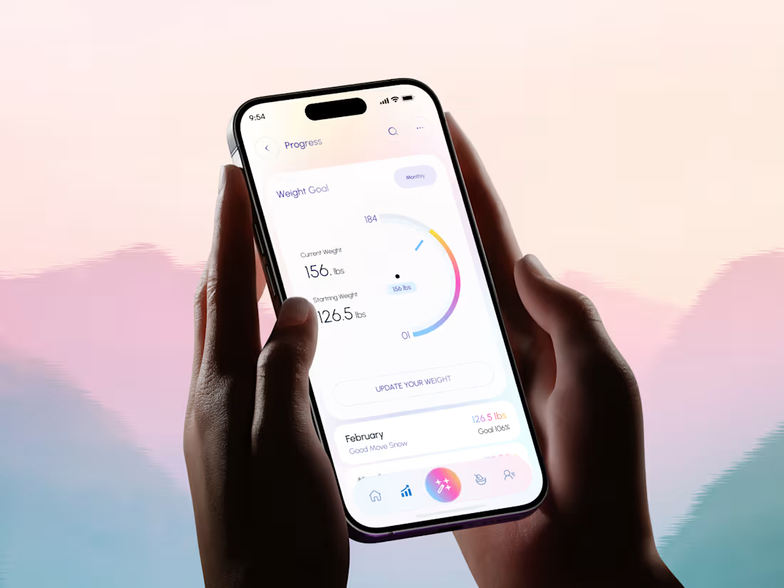
I designed this screens for Aqua AI, an AI calorie tracking and meal planning mobile app β progress tracking, AI meal suggestions, and sleep data.
It's for people tracking food and fitness who want the app to tell them what to do next, not just store numbers they have to interpret themselves.
Four decisions shape these screens. Weekly calorie intake is broken down by food category with percentages, so the takeaway is what to change rather than a single score to feel good or bad about. The AI meal suggestion arrives as a card with its calorie count and two clear actions β View Details or Save Recipe β so a recommendation ends in a decision instead of a dead end. The assistant's message states why it's suggesting something and links into a chat, keeping the reasoning attached to the advice. And the daily calorie gauge carries a plain-language note underneath explaining typical adult ranges, giving a number context before it gets judged.
Across all screens the AI action sits center stage in the tab bar as the only gradient element, keeping the app's core feature reachable from anywhere.
Designed in Figma. Available for mobile app and health & fitness UI/UX design work.
0
13
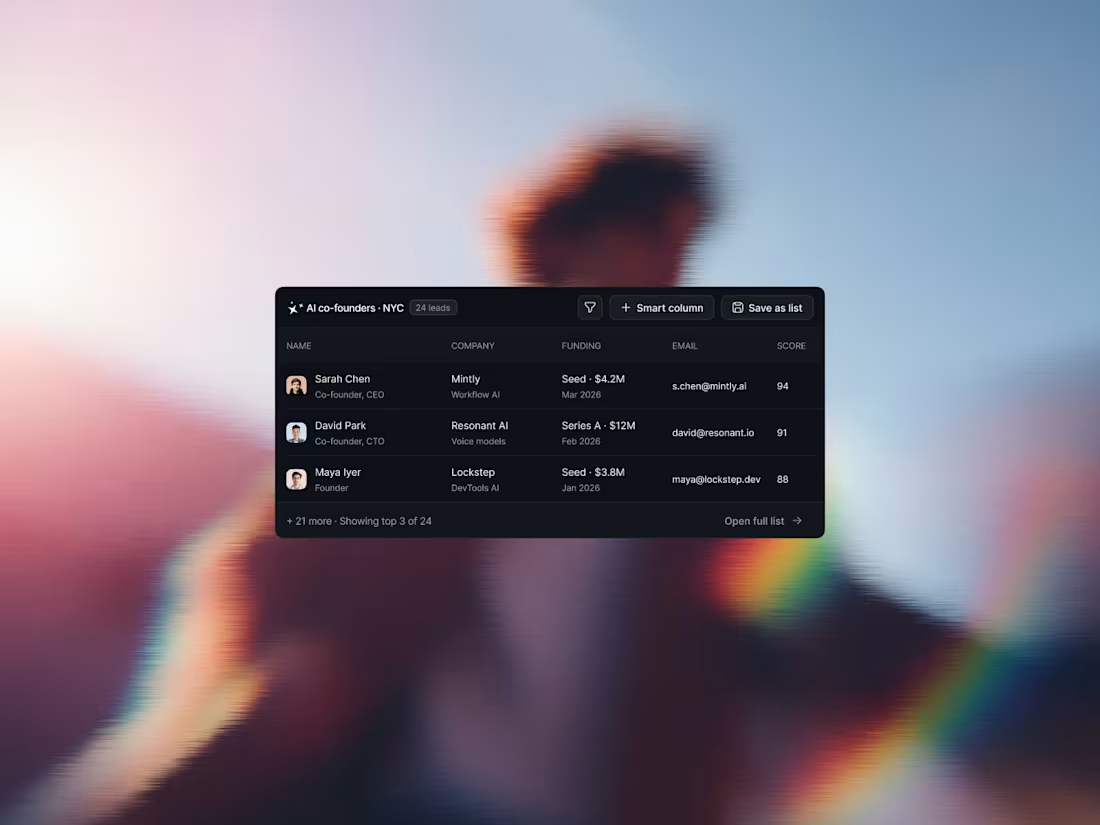
I designed the copilot interface for an AI lead generation tool that builds verified B2B prospect lists from a plain-language request.
It's for founders, sales teams, and growth agencies who spend hours assembling lists across LinkedIn, Crunchbase, and Apollo β people who need the list to be trustworthy enough to email, not just fast to generate.
Four decisions carry the screen. The agent shows its plan before its answer, with a count next to each source β 142 profiles narrowed to 38 to 24 β so the user can see how the number was reached instead of trusting a black box. Results land as a structured table inside the chat, with company, funding, email, and a match score in scannable columns, and only the top 3 of 24 shown so the conversation stays readable while the full list stays one click away. Suggested next actions sit directly under the result, turning the usual dead end after an answer into the actual workflow: generate a cold email, push to HubSpot, find lookalikes. And connected data sources are pinned to the composer, so the user can see and change what's being searched at the moment they're asking.
Credits remaining are visible in the sidebar, keeping usage-based cost in view before it's spent.
Designed in Figma. Available for AI product and SaaS dashboard UI/UX design work.
1
49
Recent Coaching Website I Designed π₯
Stay tune for more β€οΈ
0
24
AI tools are free & can design now.
But taste is the only thing left for human design.
0
26
The hardest skill in visual design is knowing when to stop, and it's the last one anyone learns.
AI App Builder SaaS Design π₯
1
34
Most AI tools look powerful and feel impossible.
The gap between those two is design quality, and it's the whole reason people churn.
$8,000 to close it.
3
2
82
Most people think picking a logo is about which looks better.
It's about which option represents the company's voice best.
Left or Right?
0
43
Good mobile app design makes one decision for the user per screen.
Bad mobile app design makes them make all of them.
0
50
App design should be cool π§
1
49
Every loyalty app shows you how many points you have.
Most donβt show how close you are. Those are different feelings, and only one brings you back.
2
65
"Make it clean design" isn't the brief.
Clean is what's left after you've decided what matters.
That decision is the entire job.
Recent work β¬οΈ
2
2
135
Designed this for @contra (https://x.com/contra) mobile app
The hardest part of app onboarding design isn't the screens. It's admitting how little you're allowed to ask.
Every question is a cost the user must pay to get help. So keep it simple, make the rest optional, and you can ask for more later.
2
83
Every startup wants an energetic brand and then picks a typeface that sits perfectly still.
Designed this logo for @virlomain
0
63
A habit app's job isn't to track the habit. It's to make you want to open it on day 2.
Almost none of them survive day 2.
1
1
89
Payout flows are where freelancers decide whether they trust you.
Built this one so there's nothing to think about at the moment they'd be most nervous.
@Contra HQ app design concept π₯
2
3
148
This one project made $20K+ because client loved our figma design file.
Founders think design is the last 10% of a product.
It's the reason the other 90% gets used.
1
69
Every CRM is built for the manager who wants the report, not the rep who has to fill it in.
I redesign CRMs for $4,000. Takes a week.
1
65
Every time-tracking tool is designed for the person checking up on you.
None of them are designed for the person doing the work.
That's why nobody fills them in, and why the data is always wrong.
1
75
Most therapist websites are built like a form to fill out, not a person to talk to.
#website #uidesign #consultations #coaching
1
3
73
Real Estate Website @framer Template
3
67
Website Elements Design
2
72
Personal Fitness Coach & Consultant Website Design π₯
0
58
AI Video Editor SaaS Landing Page HeroΒ β€
1
55
Design is Dead.
Client: Need this kind of cool work for my SaaS
0
45
Personal Consulting Service Website Design
Super Clean and Premium Feel π₯
1
53
App Design Need π₯ Only
Habit Tracker Mobile App Design β€οΈ
0
43
Consulting Service - Personal Website
2
3
87
Design is Dead π
Also client: Can you help me to redesign my vibe coded website?
0
52
Quality I added in this website for @Framer marketplace
0
51
Detailed I love to deliver to SaaS Design
2
57
Userflow design for a recent project..
I wish I could brainstrom like this all the day π