The network for creativity
Join 1.25M professional creatives like you
Connect with clients, get discovered, and run your business 100% commission-free
Creatives on Contra have earned over $150M and we are just getting started
Back to feedPost

Torna-te quem tu és. Become who you are.
That is the motto of Colégio Altiora, and the whole identity starts from it. Altiora is Latin for "higher things", so the symbol is a small "a" built from two pieces, an arch that rises and a yellow ball.
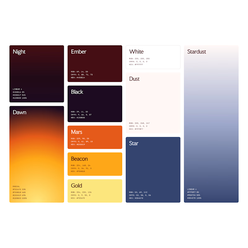
From those two pieces came everything else. The patterns, the brand elements, the icons for the school app, the classroom signs and the uniform all share the same arch and the same ball.
A school for those who always reach higher.


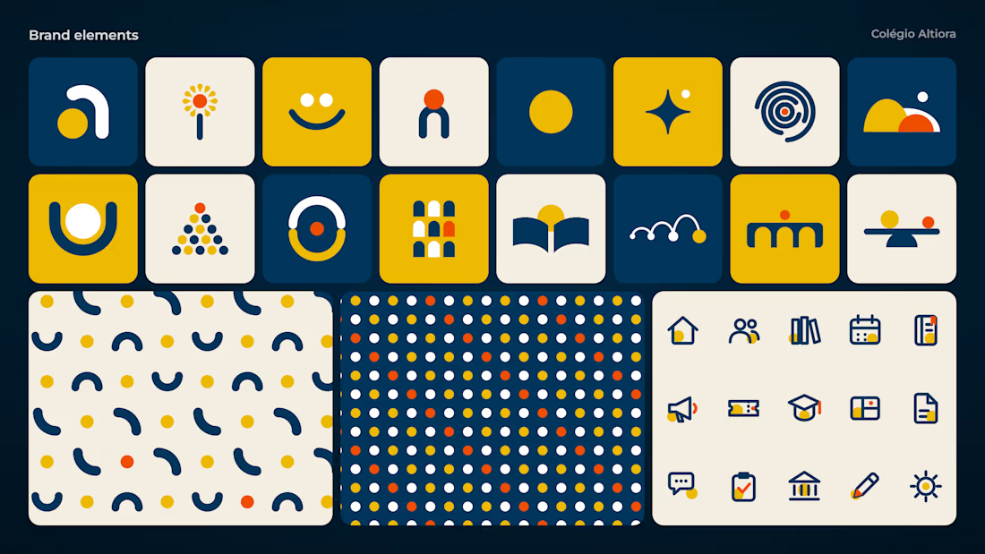
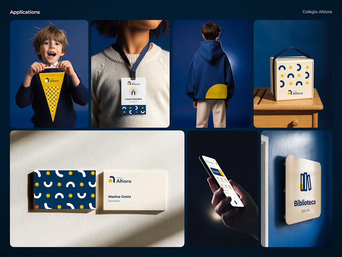

Pulling the patterns, icons and even the uniform from one arch and one ball is what keeps this feeling like a system. Did you set firm rules for where the ball sits against the arch, or let each application find its own balance?
Thanks, Artur! Inside the logo it's fixed, the ball never moves or changes size. Outside of it, the ball is the one piece that's free. It jumps higher each time, rests in the cradle, crosses the bridge and turns into the sun. The firm rule is in the patterns, where elements never mix, so each one grows from a single idea.
The network for creativity
Join 1.25M professional creatives like you
Connect with clients, get discovered, and run your business 100% commission-free
Creatives on Contra have earned over $150M and we are just getting started
Related posts

New on Contra, not new to design.
I draw logos by hand, then build everything around them: the brand, the website, the store. Lately I also make product films and ads with AI.
Recent work: an RY monogram and site for a Koreatown law firm, a winged W for a defense firm, and my family's golf eyewear brand, from the mascot to Shopify.
Starting a brand, or have one that doesn't feel like you yet? Show me what you're building.

The logo-led system reads tight because the wordmark sits clean in the negative space instead of fighting the emblem — when a brand has that kind of restraint, the Shopify store usually carries the same hierarchy into the product grid and checkout without inventing new rules....

Brand Expressions -- Merdes



love this


Which color palette feels more masculine to you?
16 voted
15%
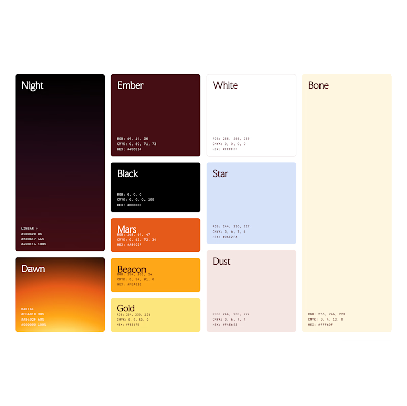
94 voted
85%
110 votes
Closed
