Freelance Data Visualizers in Maharashtra
Sign Up
Post a job
Sign Up
Log In
Filters
2
Projects
People
Abu Aasif Ansari
Bhiwandi, India
I build AI-powered data apps and dashboards
13
Followers
Follow
Message
I build AI-powered data apps and dashboards
2
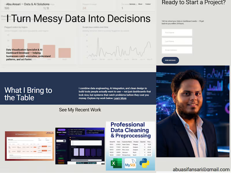
Project Overview This is a personal portfolio and services site built for a working freelancer β myself β as part of the Make It Real Challenge. I'm a data visualization specialist and AI dashboard developer, and I wanted the site itself to reflect that work rather than just describe it. So instead of stock photography and generic copy, every visual on the site is a real screenshot from a project I've actually shipped. The Concept Most freelance portfolio sites lean on polished lifestyle photography β laptops on wooden desks, people in blazers looking thoughtfully at monitors. I wanted to flip that: let the actual product screens do the talking. The site is built around a simple idea β "solutions built on data, not guesswork" β and that shows up literally in the visuals, not just the copy. What's on the site Homepage: A direct hero statement ("I Turn Messy Data Into Decisions") backed immediately by a real dashboard screenshot from my Anomaly Review & Action Console, followed by a "recent work" section pulling in three separate real projects. Services page: Four core offerings β Anomaly Detection Dashboards, Power BI & Data Analytics, AI-Integrated Internal Tools, and Custom Data Automation β each paired with an actual screenshot of that specific project (not a mockup). About page: A short, direct bio and a real photo, no filler. Contact page: A simple inquiry form paired with a data-visualization graphic that matches the site's overall theme. How I used Finish Layer Block Animations: I used on-appear and on-scroll triggers (Reveal and Slide styles) across the homepage, services, and contact pages. Section headings reveal as the page loads, and content blocks slide/fade in as the visitor scrolls β this turns what would be a static, all-at-once page into a guided, paced experience. Block Transform: Rather than a flat grid, I applied a subtle rotation to a couple of key visuals (a dashboard screenshot and the contact-page graphic) β just a few degrees, enough to break the rigidity of the layout without sacrificing readability. It gives the page an asymmetrical, more intentional feel instead of looking templated. Process I built this using Squarespace's Blueprint AI to get a fast base structure, then went through every page replacing AI-generated placeholder content (stock imagery, generic service descriptions, an accidental product/ecommerce section) with real project data, real screenshots, and copy that actually reflects how I work with clients. The site is password-protected rather than published on a paid plan, and is fully responsive across desktop and mobile. Access: π Site: https://pike-megalodon-4yb2.squarespace.com (https://pike-megalodon-4yb2.squarespace.com)π Password: Omega
2
263
0
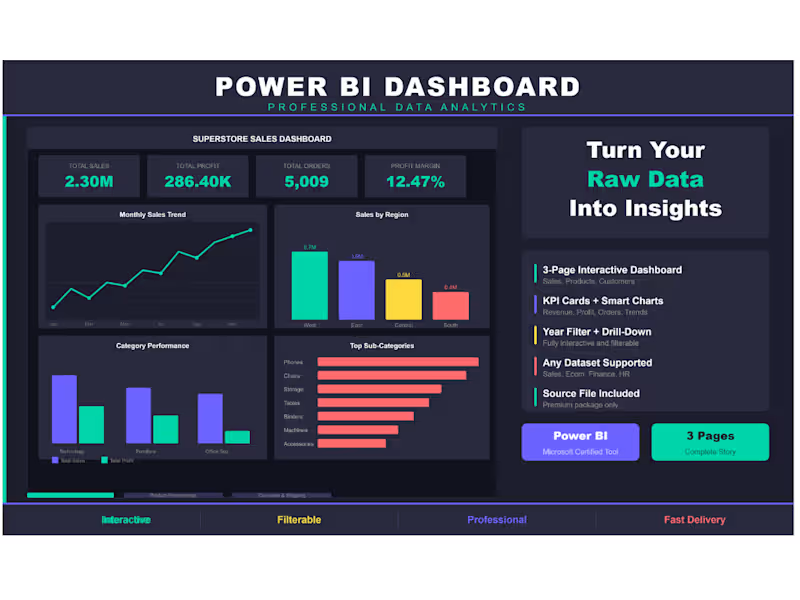
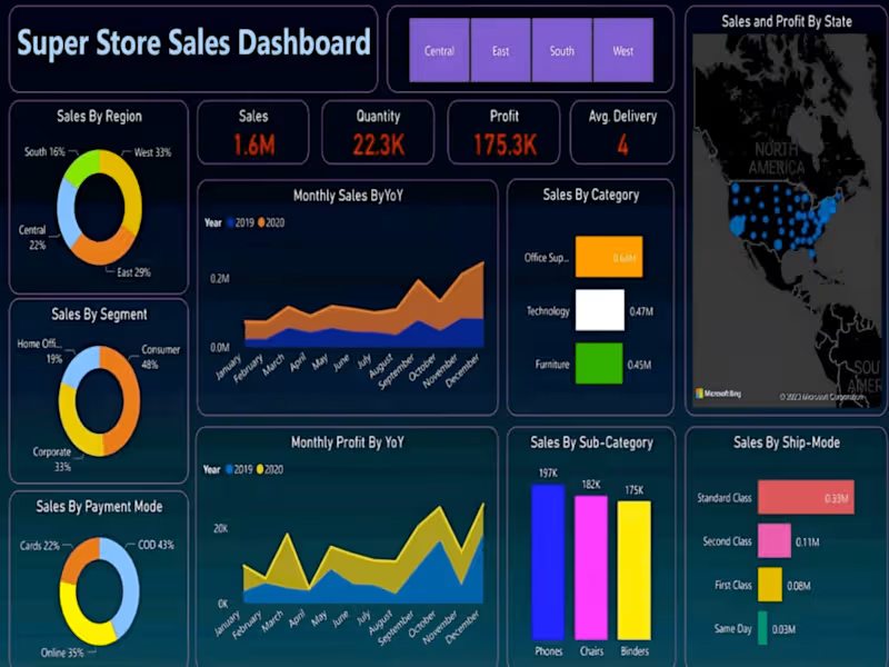
Superstore Sales Dashboard β 3-Page Power BI Report Built an interactive 3-page Power BI dashboard using the Superstore Sales dataset (9,994 orders across USA). Page 1 β Sales Overview: KPI cards, monthly trend, regional breakdown, category performance. Page 2 β Product Performance: Top products, category donut, profit analysis, sales vs profit scatter. Page 3 β Customer & Shipping: Segment breakdown, top 10 customers, monthly growth, ship mode distribution. Tools: Power BI, DAX, Superstore Dataset Theme: Dark professional with interactive year filter.
0
159
1
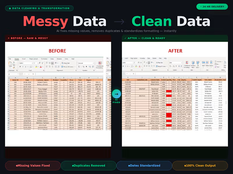
AI-Powered Data Cleaning Tool Development
1
10
1
AI-Powered Data Cleaning Tool
1
6
Data Visualizer
(11)
Follow
Message
Smita S
Pune, India
Senior Data Analyst | Business Intelligence Consultant
10
Followers
Follow
Message
Senior Data Analyst | Business Intelligence Consultant
0
Power BI Templates for Self-Service Reporting
0
22
0
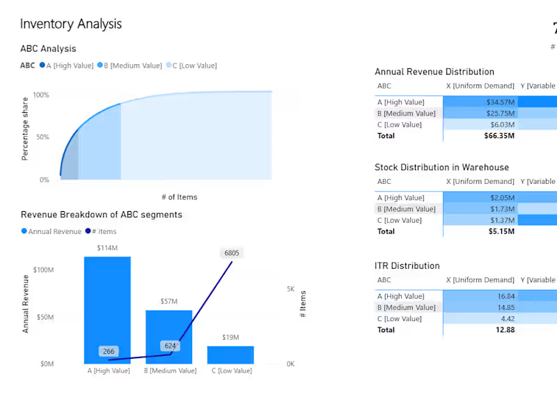
Inventory Optimization with ABC-XYZ Segmentation
0
32
0
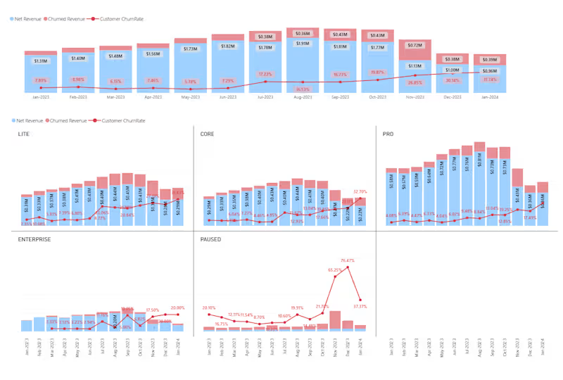
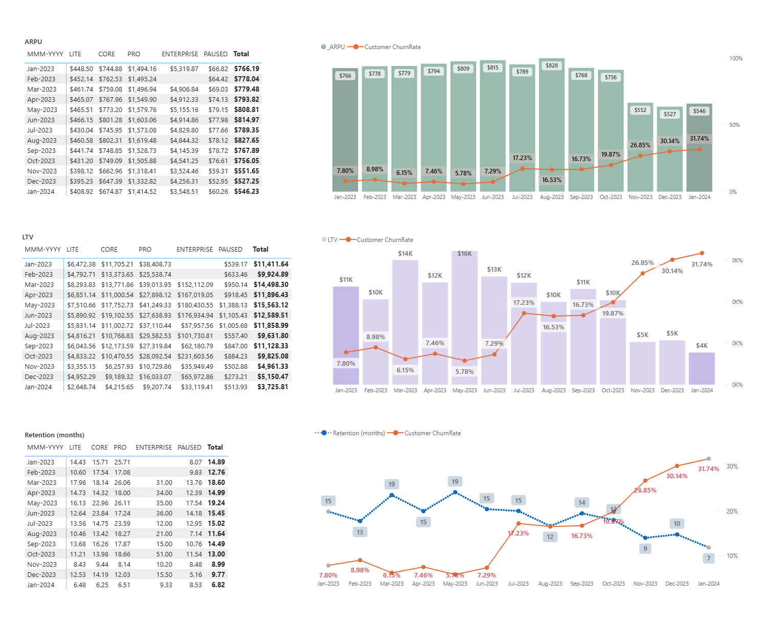
MRR & Churn Analysis Dashboard for SaaS Retention and Growth
0
39
View more β
Data Visualizer
(3)
Follow
Message
Rohit Poddar
Pune, India
Data Analyst: Transforming Insights π
5.0
Rating
1
Followers
Follow
Message
Data Analyst: Transforming Insights π
0
Data Visualisation and Storytelling using Power BI
0
97
0
Exploratory-Data-Analysis-on-Electric-Vehicle | Python
0
44
0
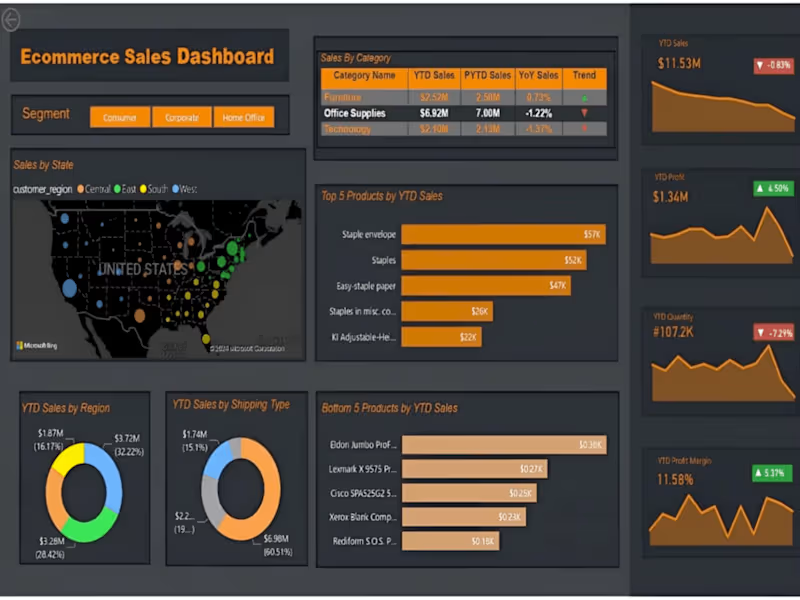
E-commerce Sales Dashboard | Power BI
0
54
0
SuperStore Sales Dashboard and Forecasting | Power BI
0
37
Data Visualizer
(6)
Follow
Message
Sarbjot Singh
Pimpri-Chinchwad, India
Power BI Expert | Turning Raw Data into Actionable Insights
New to Contra
Follow
Message
Power BI Expert | Turning Raw Data into Actionable Insights
1
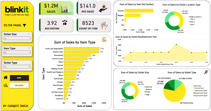
Data Analytics Project | BlinkIT Grocery Sales Analysis Excited to share my latest Data Analytics project ,where I analyzed BlinkIT Grocery Sales Data and delivery data to uncover meaningful business insights π π What I worked on: Analyzed sales performance across product categories, outlet types, sizes, and locations Identified top-performing item categories and customer preferences Studied the impact of outlet size, establishment year, and visibility on sales Converted raw data into actionable insights and business recommendations π‘ Key Insights: Fruits & Vegetables, Snack Foods, and Frozen Foods drive maximum sales FOR FULL PROJECT VIST GIT HUB β( https://lnkd.in/d34sdAPz )
1
60
2
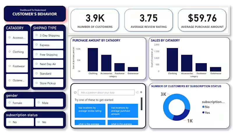
Iβm excited to share my latest Data Analytics project where I analyzed Customer Shopping Behavior to uncover trends in sales, demographics, and purchasing habits.This project was a great exercise in building a complete data pipeline. The Tech Stack: Python (Pandas & NumPy): Used in Jupyter Notebooks for initial data exploration and statistical analysis. PostgreSQL: Utilized for rigorous data cleaning, querying, and structuring the dataset for analysis. Power BI: Built an interactive dashboard to visualize key metrics like seasonal trends, subscription impacts, and category performance. Project Highlights: β Data Cleaning: Leveraged PostgreSQL and Pandas to handle missing values and standardize categorical data.
1
2
88
0
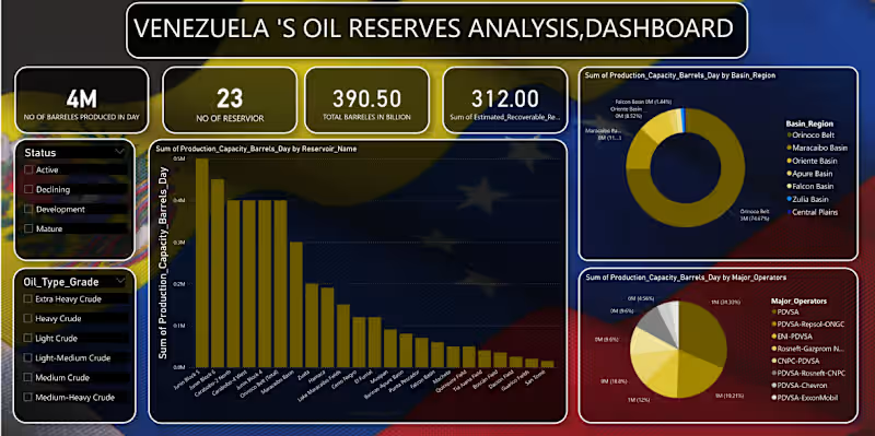
Venezuelaβs Oil Reserves Analysis Dashboard π I am excited to share my latest data analytics project focusing on the energy sector. Using a dataset covering 23 reservoirs, I designed a comprehensive dashboard to track production capacity and resource distribution in Venezuela. Key Features: β Real-time Metrics: Tracking the 390.50 Billion total barrels in reserve. β Granular Analysis: Production capacity breakdown by reservoir name and oil grade (Extra Heavy to Light). β Stakeholder Mapping: Visualizing the production sum by major operators. Tools Used: [pandas(jupyter notebook)/mysql(for analysis and cleaning of data), Power BI / Excel(for building dashboard)] Iβd love to hear your thoughts or feedback on the dashboard design! must visit my github for full project -( https://lnkd.in/dYKdZ8J2 )
0
67
1
Data Analytics Project | BlinkIT Grocery Sales Analysis Excited to share my latest Data Analytics project ,where I analyzed BlinkIT Grocery Sales Data and delivery data to uncover meaningful business insights π π What I worked on: Analyzed sales performance across product categories, outlet types, sizes, and locations Identified top-performing item categories and customer preferences Studied the impact of outlet size, establishment year, and visibility on sales Converted raw data into actionable insights and business recommendations π‘ Key Insights: Fruits & Vegetables, Snack Foods, and Frozen Foods drive maximum sales Medium-sized outlets outperform others in overall revenue FOR FULL PROJECT VIST GIT HUB β( https://lnkd.in/d34sdAPz ) Feedback and suggestions are always welcome!
1
1
87
Data Visualizer
(3)
Follow
Message
VARSHA ZOKE
Pune, India
MS PowerBI certified DataAnalyst | Get results, improvements
Follow
Message
MS PowerBI certified DataAnalyst | Get results, improvements
0
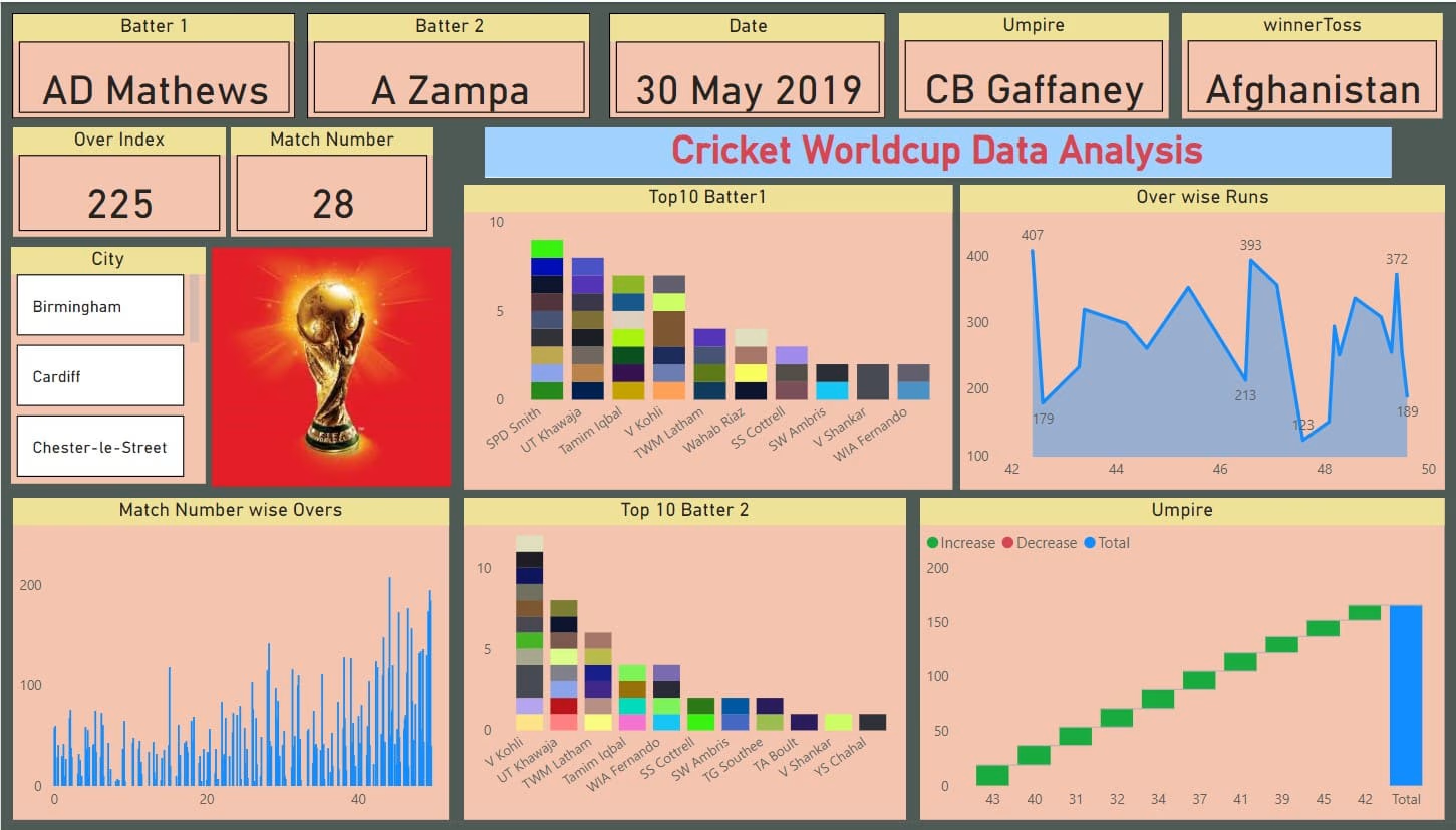
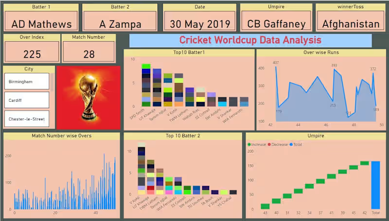
Cricket WorldCup Dashboard
0
8
0
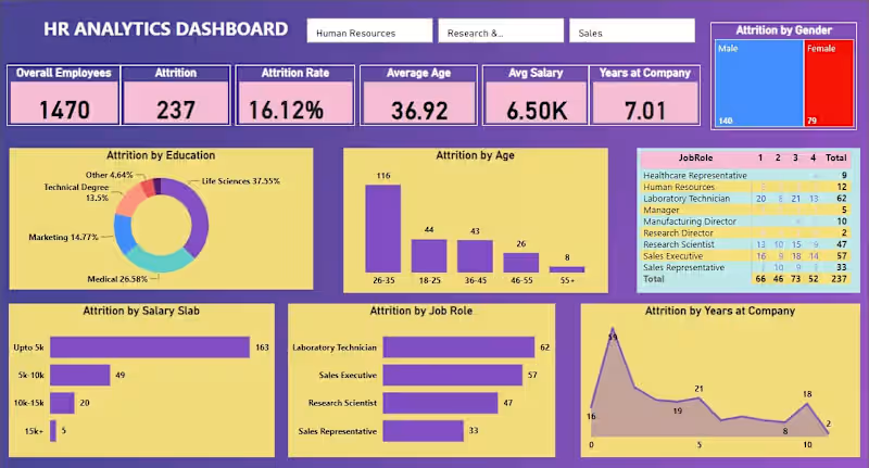
HR Analysis For Attrition
0
6
0
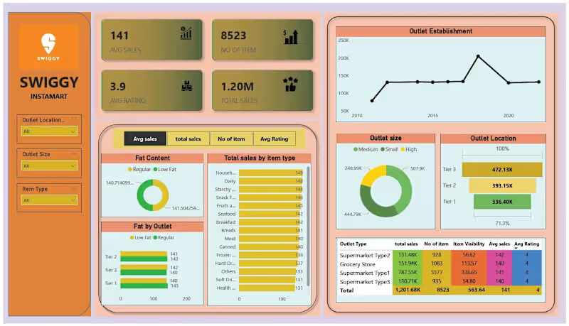
Swiggy Instamart Sales Dashboard
0
81
View more β
Data Visualizer
(3)
Follow
Message
Ateeb Mahedvi
Pune, India
Data Analyst | Transforming raw data into clear insights.
Follow
Message
Data Analyst | Transforming raw data into clear insights.
0
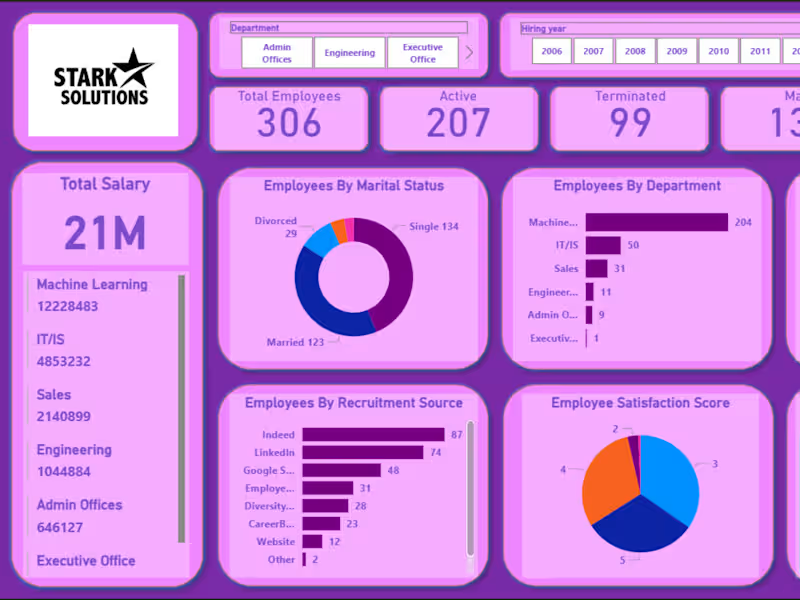
HR Analytics Dashboard
0
3
0
Excel Sales Dashboard Project
0
2
0
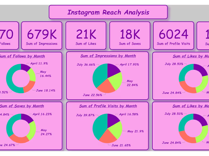
Instagram Reach Analysis with Power BI
0
4
0
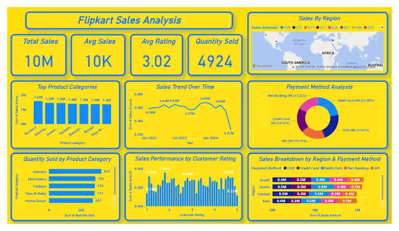
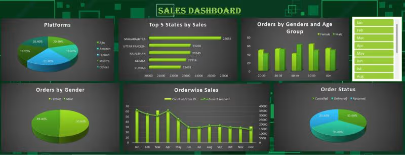
Flipkart Sales Analysis Dashboard
0
2
Data Visualizer
(4)
Follow
Message
Manigandan Acharya
Mumbai, India
Data Specialist for Clean, Organized & Smart Reports
New to Contra
Follow
Message
Data Specialist for Clean, Organized & Smart Reports
0
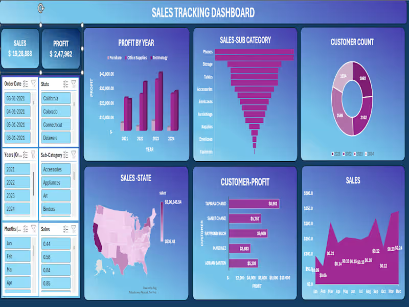
π Sales Tracking Dashboard | Excel + Power BI Project Built an end-to-end interactive Sales Tracking Dashboard covering 2021β2024 across the entire US market. Top-Line Numbers: π° Total Sales: $19,28,888 π Total Profit: $2,47,962 π₯ Total Customers: 8,314 across all years What the dashboard reveals: π Best-selling sub-categories: Phones ($2,79,464) and Chairs ($2,77,058) lead the pack β together accounting for nearly 29% of all sales π Profit growth year-on-year: β 2021: $49,556 β 2022: $61,618 β 2023: $81,786 β consistent upward trajectory across Furniture, Office Supplies & Technology πΊοΈ Geographic concentration: California dominates at $3,90,145 in sales. New York ($2,46,517) and Texas ($1,51,436) follow. West Virginia sits at the bottom with just $536 β a clear signal for regional strategy review. π¦ Technology drives profit β highest-margin category across all 4 years, despite Furniture holding significant volume π§Ύ Seasonal trends: Q4 is king β November ($2,34,013) and December ($2,41,464) are the strongest months. February dips to just $59,640 β opportunity for targeted campaigns. π€ Top customer by profit: Tamara Chand at $8,981, followed by Raymond Buch ($6,939) and Sanjit Chand ($5,757) Tools used: Microsoft Excel Β· Pivot Tables Β· Power Query Β· Charts & Slicers Β· Dashboard Design This project sharpened my ability to turn raw transactional data into a clean, decision-ready visual β with filters for state, date, year, sub-category, and month. Open to feedback! π #Excel #DataAnalytics #SalesDashboard #DataVisualization #BusinessIntelligence #MicrosoftExcel #DashboardDesign
0
20
0
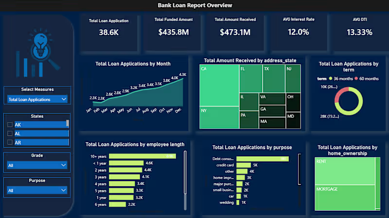
π¦ Bank Loan Portfolio Analysis | Power BI Dashboard Project Analyzed 38,576 loan records across 50 states to give a bank's lending division a unified view of portfolio health β something they simply didn't have before. What the data revealed: β Net-positive portfolio: $435.8M disbursed, $473.1M recovered β οΈ 13.8% bad loan rate = $28.25M net capital loss π Debt consolidation drives nearly half of all loan applications β³ 73% of borrowers chose 60-month terms over 36-month π 60%+ of repayments concentrated in just 5 states (CA, NY, FL, TX, NJ) Tools used: PostgreSQL β Excel β Power Query β Power BI + DAX Built two interactive dashboards: β Summary: KPI cards, good vs. bad loan segmentation, loan status grid β Overview: Trends, geographic maps, term/purpose/employment breakdowns The next phase? Building a predictive risk scoring layer using DTI, interest rate, and employment length to flag at-risk loans before they default. Open to feedback from data folks in the community π #PowerBI #DataAnalytics #SQL #DAX #BankingAnalytics #PortfolioAnalysis #DataVisualization
0
31
0
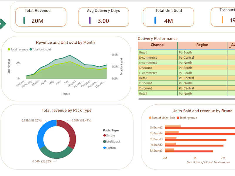
I Built a two-page Power BI dashboard on 190K+ FMCG transactions β tracking revenue, SKU performance, promotional impact, and delivery across 3 channels and 3 regions. Uncovered a balanced 33% revenue split across all channels and identified the top 3 revenue-driving SKUs for smarter inventory decisions. Tools: Power BI Β· DAX Β· Excel
0
64
0
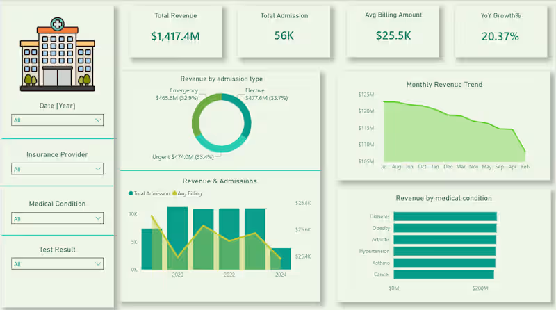
Every hospital generates thousands of data points daily but without the right lens, it's just noise. Built this Healthcare Analytics Dashboard to turn patient records into decisions. From tracking $1.4B in revenue across admission types to spotting a consistent dip in monthly billing trends the numbers tell a story most teams never get to read. The insight that stood out? Diabetes and Obesity quietly lead revenue by medical condition which says a lot about where healthcare demand is heading. This is what data visualization is actually for not prettier reports, but faster, clearer thinking. Tools: Power BI Β· DAX Β· PostgreSQL Β· Power Query
0
54
Data Visualizer
(3)
Follow
Message
Tejas Shinde
Mumbai, India
Merging insights with storytelling
Follow
Message
Merging insights with storytelling
0
Ipman201/Cognizant_AI_Internship
0
3
0
Ipman201/Time-Report-Swords-Freelance-Work
0
4
0
GitHub - Ipman201/Basic-Statistical-Analysis-of-Job-Data-Freelaβ¦
0
30
View more β
Data Visualizer
(3)
Follow
Message
Explore people