The network for creativity
Join 1.25M professional creatives like you
Connect with clients, get discovered, and run your business 100% commission-free
Creatives on Contra have earned over $150M and we are just getting started
Back to feedPost

Project Overview
This is a personal portfolio and services site built for a working freelancer — myself — as part of the Make It Real Challenge. I'm a data visualization specialist and AI dashboard developer, and I wanted the site itself to reflect that work rather than just describe it. So instead of stock photography and generic copy, every visual on the site is a real screenshot from a project I've actually shipped.
The Concept
Most freelance portfolio sites lean on polished lifestyle photography — laptops on wooden desks, people in blazers looking thoughtfully at monitors. I wanted to flip that: let the actual product screens do the talking. The site is built around a simple idea — "solutions built on data, not guesswork" — and that shows up literally in the visuals, not just the copy.
What's on the site
Homepage: A direct hero statement ("I Turn Messy Data Into Decisions") backed immediately by a real dashboard screenshot from my Anomaly Review & Action Console, followed by a "recent work" section pulling in three separate real projects.
Services page: Four core offerings — Anomaly Detection Dashboards, Power BI & Data Analytics, AI-Integrated Internal Tools, and Custom Data Automation — each paired with an actual screenshot of that specific project (not a mockup).
About page: A short, direct bio and a real photo, no filler.
Contact page: A simple inquiry form paired with a data-visualization graphic that matches the site's overall theme.
How I used Finish Layer
Block Animations: I used on-appear and on-scroll triggers (Reveal and Slide styles) across the homepage, services, and contact pages. Section headings reveal as the page loads, and content blocks slide/fade in as the visitor scrolls — this turns what would be a static, all-at-once page into a guided, paced experience.
Block Transform: Rather than a flat grid, I applied a subtle rotation to a couple of key visuals (a dashboard screenshot and the contact-page graphic) — just a few degrees, enough to break the rigidity of the layout without sacrificing readability. It gives the page an asymmetrical, more intentional feel instead of looking templated.
Process
I built this using Squarespace's Blueprint AI to get a fast base structure, then went through every page replacing AI-generated placeholder content (stock imagery, generic service descriptions, an accidental product/ecommerce section) with real project data, real screenshots, and copy that actually reflects how I work with clients. The site is password-protected rather than published on a paid plan, and is fully responsive across desktop and mobile.
Access:
🔗 Site: https://pike-megalodon-4yb2.squarespace.com
🔑 Password: Omega


The network for creativity
Join 1.25M professional creatives like you
Connect with clients, get discovered, and run your business 100% commission-free
Creatives on Contra have earned over $150M and we are just getting started







Related posts


Every element feels perfectly placed! 👏

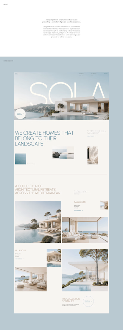
A luxury property deserves a presentation that does it justice.
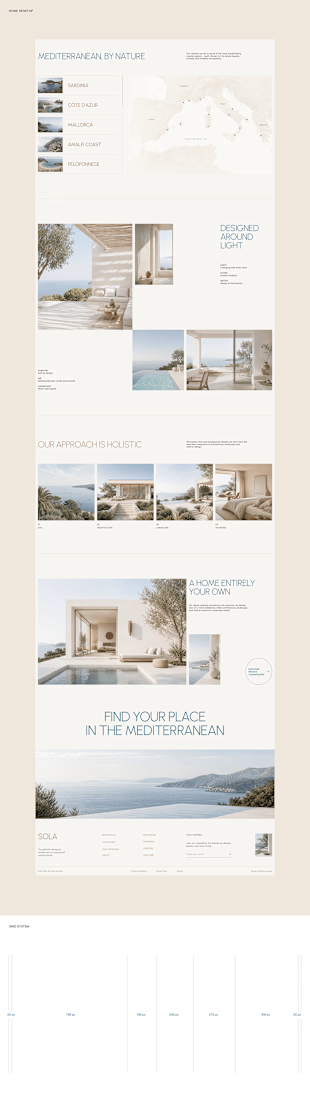
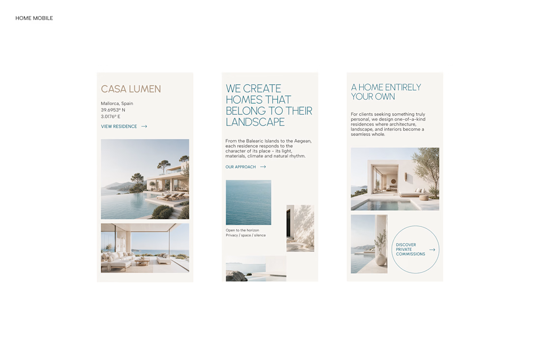

With SOLA – Architecture Studio & Luxury Real Estate, I wanted to bring the beauty of modern coastal architecture into the website itself.
From the large property images and soft blue tones to the clean layout across desktop and mobile, every part of the design helps create a calm, premium feel while making the homes the centre of attention.
I like how the website brings architecture and digital design together, giving visitors a chance to explore the properties before making an enquiry.
If you were looking for a luxury home, would a website like this make you more interested in the property?
#WebDesign #Architecture #LuxuryRealEstate

Incredible work, you transformed SOLA into a premium property brand.

Working on the branding for Rekann. A quick look at the visual system, product UI, and brand applications.

Brilliant execution!