The network for creativity
Join 1.25M professional creatives like you
Connect with clients, get discovered, and run your business 100% commission-free
Creatives on Contra have earned over $150M and we are just getting started
Back to feedPost

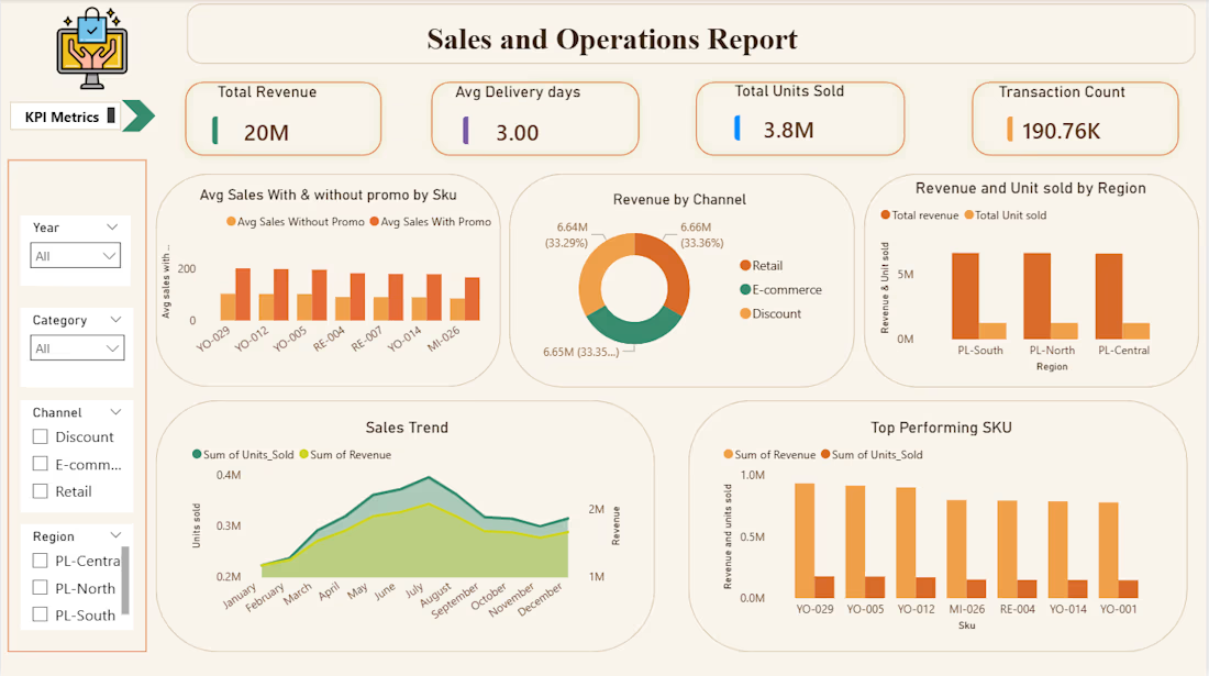
I Built a two-page Power BI dashboard on 190K+ FMCG transactions — tracking revenue, SKU performance, promotional impact, and delivery across 3 channels and 3 regions. Uncovered a balanced 33% revenue split across all channels and identified the top 3 revenue-driving SKUs for smarter inventory decisions.
Tools: Power BI · DAX · Excel


The network for creativity
Join 1.25M professional creatives like you
Connect with clients, get discovered, and run your business 100% commission-free
Creatives on Contra have earned over $150M and we are just getting started




Related posts

Everyone thinks a data dashboard should look complicated.
I think that is exactly why most of them fail.
I just finished Helios, a tool that tracks solar energy assets in real time. Dozens of sites, live output, verification records, a wall of numbers. The kind of screen people drown in.
Most designers would make it feel technical. More lines, more glow, more charts. I did the opposite. Every number had to answer one question in half a second, is this good or is this a problem. If it could not, it lost its place.
Because design is not decoration, it is closer to math. It is deciding what to remove until only the truth is left.
Complexity was never the enemy. Confusion is.
Get that right, and people trust you before you have said a word.
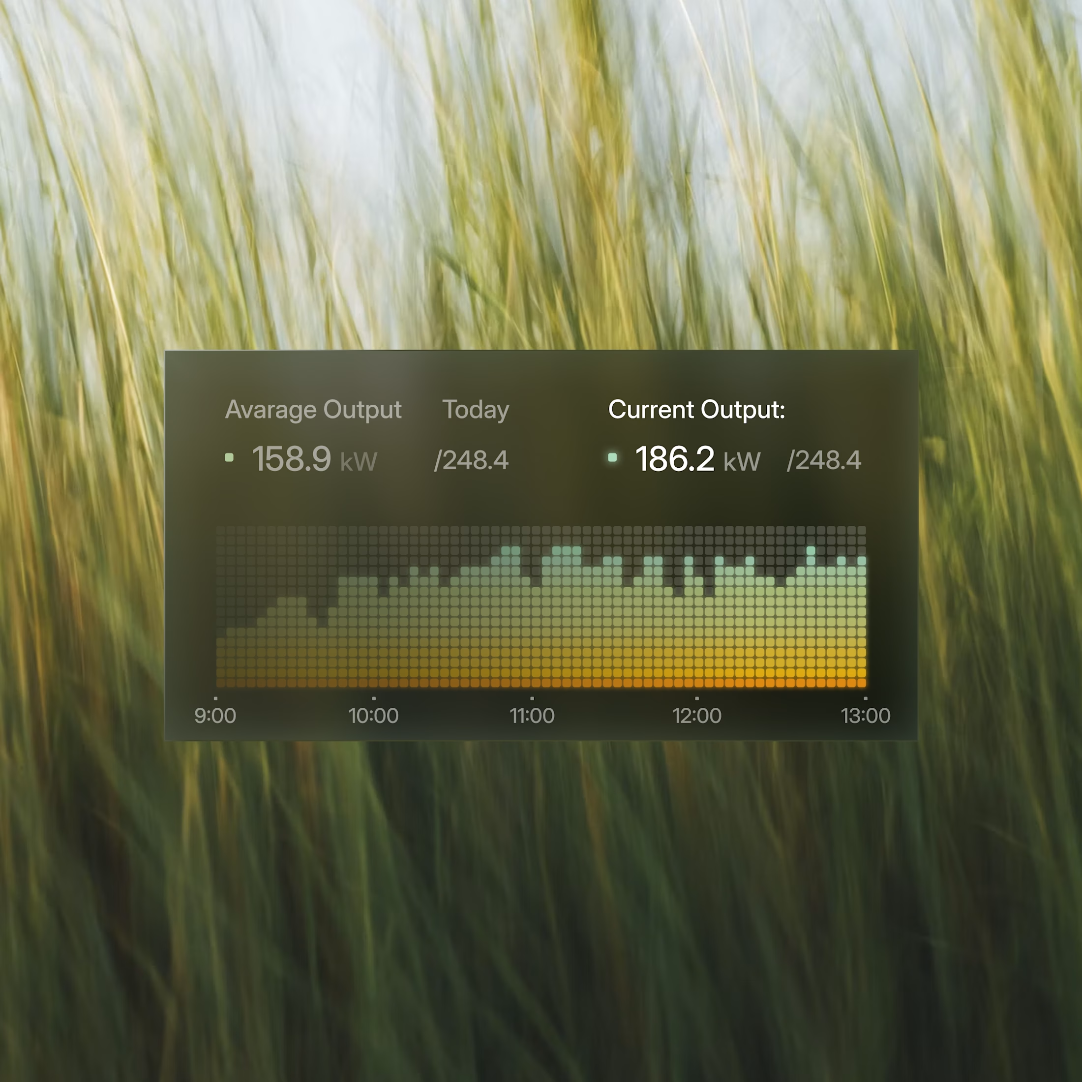
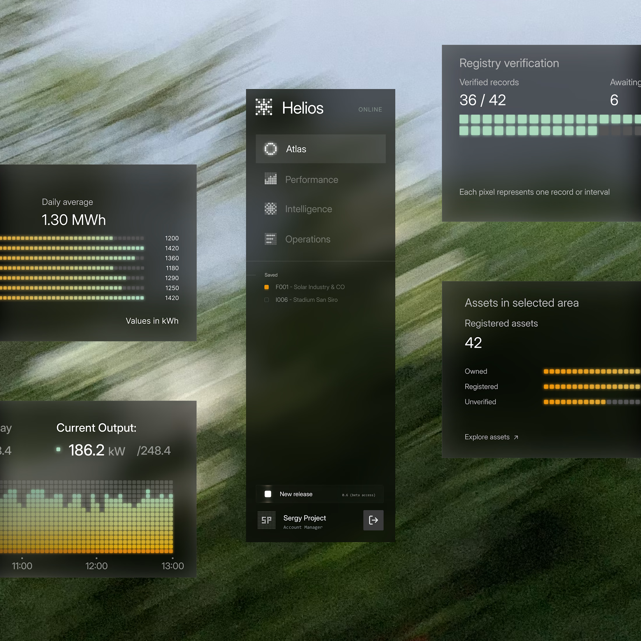

These components are perfectly executed, and the background is perfect for them.

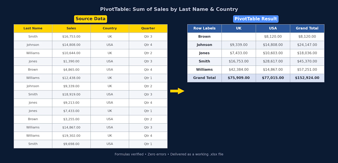
Excel PivotTable — Sales Summary
Client had raw sales data (14 rows across UK/USA, split by quarter) and needed it turned into something actually usable. I cleaned it up and built a PivotTable that breaks total sales down by rep and country, with grand totals for both.
What I did:
Structured the raw data into a proper table (consistent headers, currency formatting)
Built a PivotTable summarizing Sum of Sales by Last Name and Country
Used SUMIFS so the totals update automatically if the source data changes — nothing hardcoded
Checked every formula for errors before delivery
Delivered as a working .xlsx file, ready to plug into a bigger report or dashboard.
If you've got messy sales/ops data sitting in a spreadsheet and need it turned into something you can actually read at a glance, this is exactly the kind of thing I can help with.

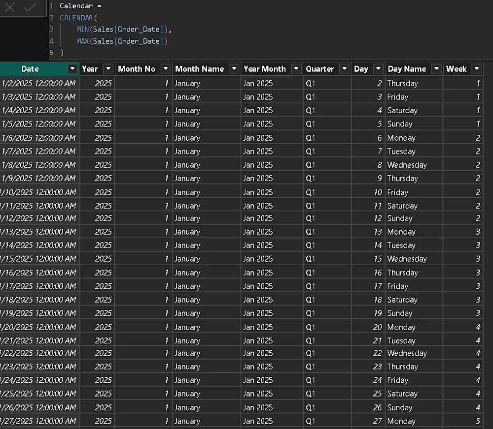
Power BI – Calendar Table using DAX
Aaj maine Power BI mein Calendar Table create ki aur usme different date-related columns banaye:
📅 Daily / Weekly / Monthly analysis
📈 YTD, MTD & QTD calculations
🔄 Time Intelligence
📊 Month-over-Month comparison
📆 Date-based slicers
📉 Sales trends
1️⃣ Calendar Table
Calendar = CALENDAR( MIN(Sales[Order_Date]), MAX(Sales[Order_Date]) )
2️⃣ Year
Year = YEAR('Calendar'[Date])
3️⃣ Month Number
Month No = MONTH('Calendar'[Date])
4️⃣ Month Name
Month Name = FORMAT('Calendar'[Date], "MMMM")
5️⃣ Year Month
Year Month = FORMAT('Calendar'[Date], "MMM YYYY")
6️⃣ Quarter
Quarter = "Q" & QUARTER('Calendar'[Date])
7️⃣ Day
Day = DAY('Calendar'[Date])
8️⃣ Day Name
Day Name = FORMAT('Calendar'[Date], "dddd")
9️⃣ Week Number
Week = WEEKNUM('Calendar'[Date], 2)
🎯 Why Calendar Table?
A proper Calendar Table is very useful for:
📅 Daily / Weekly / Monthly analysis
📈 YTD, MTD & QTD calculations
🔄 Time Intelligence
📊 Month-over-Month comparison
📆 Date-based slicers
📉 Sales trends
Learning Power BI one step at a time! 🚀
I’d love to know from experienced Power BI users:
Is there anything else you would add to this Calendar Table?