Expense Tracker
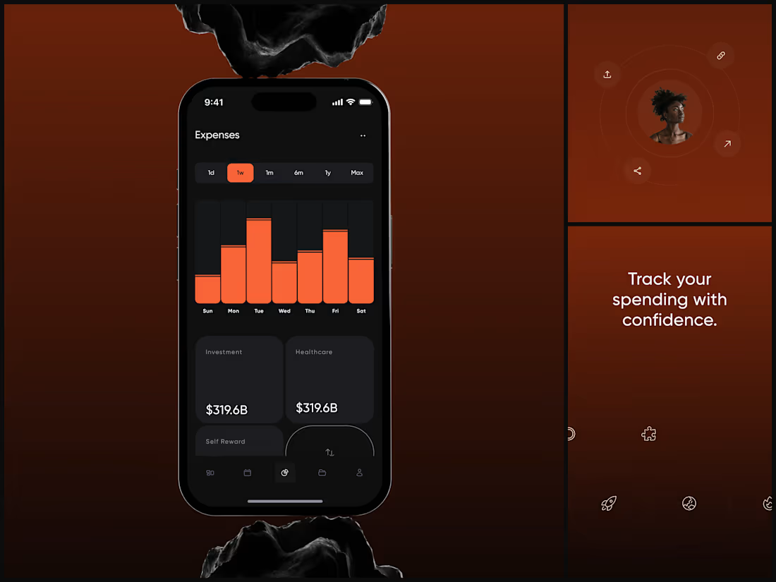
The dark UI isn't aesthetic. It's functional. When you're reviewing weekly spending at 11pm, your eyes need low-strain contrast that still makes the data pop.
The category cards sit below the chart for a reason. The chart answers "how much did I spend this week?" The cards answer "where did it go?"
Finance apps either look sterile or playful. This needed to feel like neither - it needed to feel powerful. Like your money is being managed by something that takes it seriously.
"Track your spending with confidence." Confidence. That word choice shaped every design decision.
#MobileDesign #UIDesign #Fintech #AppDesign #DarkUI #DataVisualization #ProductDesign #iOSDesign #ExpenseTracker #FigmaDesign
2
57
Leeroo - Luxury Fragrance House
How do you design the visual equivalent of a scent?
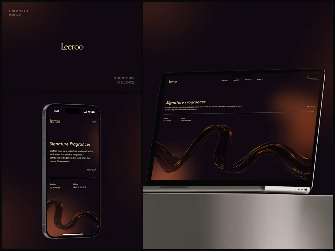
You can't show smell. So the 3D amber resin ribbon does the work - liquid, warm, moving slowly like something expensive evaporating. That one element replaces every product photo a fragrance brand thinks it needs.
"Crafted from rare botanicals and aged resins, each scent is a private language." The copy already sounds like it smells good. The design just had to stay out of its way.
Dark. Gold. Italic serif. Nothing else.
What's the first luxury brand site that made you feel something?
#WebDesign #UIDesign #LuxuryBrand #DarkUI #3DDesign #Typography #FragranceDesign #Ecommerce #ArtDirection #FigmaDesign
2
57
AI Voice Platform
You're designing sound. On a screen. Without sound.
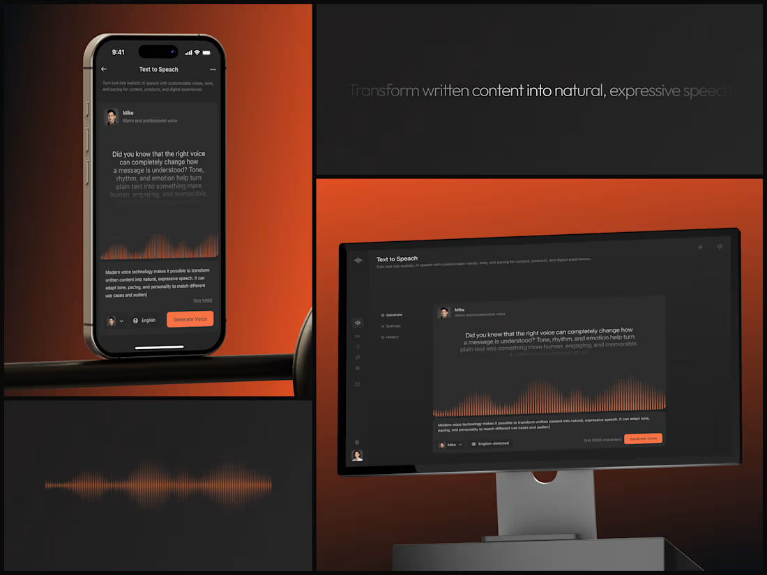
The waveform is the entire UX. It's proof the AI is working, it's visual feedback, and it's the emotional bridge between typed words and a human voice saying them. Remove the waveform and this is a text box with a button. Keep it and it's an instrument.
"Mike. Warm and professional voice." Personality selection. The interface makes choosing a voice feel as natural as choosing a font.
Orange accent. Dark canvas. Voice deserves a stage.
#UIDesign #DarkUI #AI #VoiceTech #ProductDesign #SaaS #MobileDesign #WebApp #TextToSpeech #FigmaDesign
2
42
AI Insight Engine
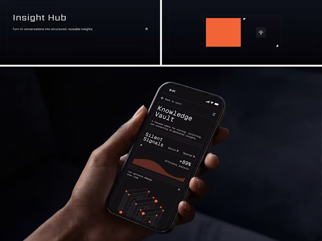
An isometric data map that looks like it belongs in a command center. It's a thinking tool that looks the way thinking feels: structured, quiet, precise.
+89% efficiency analysis. The data proves itself. The design just gets out of the way.
What's the best dark UI you've seen this year?
#UIDesign #DarkUI #AI #SaaS #MobileDesign #ProductDesign #DataVisualization #AppDesign #MonoType #FigmaDesign
2
46
EV Charging & Vehicle Management App
Second automotive project in my portfolio and honestly one of my favorites.
There's something satisfying about designing for physical products. You're not just making screens, you're connecting a real object (a car) to a digital experience.
The whole app revolves around one moment: you plug in your EV and want to know "how long till its ready?" So I made that the hero of every screen.
Charging percentage, time remaining, real-time status. Front and center, no hunting for it. Then the secondary layer has vehicle stats, driving patterns, speed data with graph visualisations for people who actually want to geek out on their efficiency.
Chose a green palette for obvious reasons - clean energy, sustainability, all of that. But it also just works really well on dark backgrounds, and the 3D car renders (including a Porsche 911 GT3 which was fun to work with) pop against it beautifully.
#IoT #MobileAppDesign #UIDesign #Automotive #EV #DataVisualization #Innovation #DigitalExperience #CleanTech
5
359
Fitness Tracking App - Workout & Progress UI/UX
3 workouts. 1.2kg lifted. 45.3min training. 1200kcal burned. 85% weekly progress.
Numbers. That's all fitness apps really are at the core. But the difference between an app people open once and an app that becomes part of their morning routine is how those numbers make them feel. Accomplished or overwhelmed. Motivated or guilty.
This design bets on calm discipline. Olive green palette, soft rounded progress rings, generous spacing. No screaming neon, no aggressive "CRUSH YOUR GOALS" energy. The whole vibe says "you showed up today, here's where you're at." The onboarding asks one question at a time - how many times a week do you plan to work out? Just pick a number. Skip all and start. No 12-step setup interrogation before you even get to see the app.
That "Welcome, Mary" dashboard is probably my favourite screen. Daily goals laid out as circular meters that fill up quietly as you go. Not gamified, not competitive, just... yours. Sometimes the most radical design choice is restraint.
#MobileAppDesign #UIDesign #UXDesign #HealthTech #Fitness #ProductDesign #DigitalExperience #iOS #Wellness #AppDesign
1
5
271
Fitness & Workout Tracking App
Most fitness apps try to do everything. Track your food, count your steps, log your sleep, remind you to drink water, basically become your entire personality. This one takes a different approach - it focuses purely on workout discipline and progress tracking, and does it really well.
The onboarding walks users through goal setting step by step before they ever see a dashboard. That was intentional. When someone opens the summary screen and sees their 3 workouts, 12kg lifted, 1000 kcal burned - those numbers mean something because the app already knows what they're working toward.
Went with a deep olive green palette which is kind of unconventional for fitness apps (everyone defaults to electric blue or neon orange). But it gives the whole experience this grounded, focused energy. Like the app is saying "we're here to work, not to hype you up." The 3D elements add a layer of visual interest without competing with the data, which should always be the star of the show in a product like this.
#MobileAppDesign #UIDesign #UXDesign #HealthTech #Fitness #ProductDesign #DigitalExperience #iOS #Innovation
6
309
fitness training app
85% weekly progress. 3-day streak. The data is motivating. The design makes it feel earned.
Green on dark olive isn't just a palette. It's borrowed from the environment where this training happens - trails, parks, the outdoors. The phone resting on a rock in the mockup isn't a prop choice. It's the brand world.
Consistency is the design. The user learns the pattern once and reads every sport the same way.
The day streak circles are the most satisfying element. Your brain wants to complete the row. That's not gamification. That's just good UX.
#MobileDesign #UIDesign #FitnessApp #DarkUI #ProductDesign #HealthTech #AppDesign #DataVisualization #UXDesign #Figma
2
19
Social Film Editing App
Frame by frame. That's not just the tagline, it's the entire interaction model.
Designing a creative tool is a paradox. The interface has to be powerful enough for serious work and invisible enough to not interrupt the creative flow. The second someone notices the UI, you've failed.
The dark interface isn't a trend choice here. When you're working with footage, light, shadow, and color grading, the tool has to disappear. Olive and warm amber tones against black create a palette that feels cinematic before the user touches anything.
"Craft the mood, frame by frame." The app does exactly what it promises. The design just stays out of the way.
#MobileDesign #UIDesign #ProductDesign #AppDesign #DarkUI #CreativeTools #FilmEditing #UXDesign #InteractionDesign #DigitalProduct
3
144
FLIGHTLY - Travel Booking Mobile App
JFK → LHR. That's the whole screen. Everything else is secondary.
Travel apps have a density problem. Flight time, gate, baggage allowance, boarding pass, seat selection, airline perks, meal options, loyalty points - all competing for attention on a 6-inch screen. Most apps solve this by adding tabs. I solved it by subtracting everything that isn't the next thing you need.
The information hierarchy: route (JFK → LHR) is the largest element because it confirms you're looking at the right flight. Time and date sit below because those are the second question. Baggage allowance is a glanceable icon row because nobody reads "7 kg carry-on, 20 kg checked" they just need to see the numbers.
"Ready to fly?" on the launch screen with a single blue Start button. Three words and one action. That's confidence in the product.
#MobileDesign #UIDesign #TravelApp #AppDesign #DarkUI #3DDesign #ProductDesign #UXDesign #iOSDesign #FigmaDesign
1
3
121
Lucent - Sneaker E-Commerce Website & Mobile
"Not Just Shoes. A Statement." That headline set the tone for everything else. This wasn't an e-commerce site, it was a product launch experience that happens to also sell.
Soft sky-blue gradients, dreamy cloud backgrounds, and floating 3D sneaker renders that feel more editorial fashion than online catalog. The KYNEX product card sits where most e-com sites would shove a generic "shop now" banner, which is exactly the point. The product IS the marketing.
Designed both desktop and mobile with the same emotional weight because customers don't downgrade their expectations when they switch devices. They downgrade when designers do.
#WebDesign #ECommerce #UIDesign #MobileAppDesign #CreativeDirection #Branding #DigitalExperience #ProductDesign #Shopify
5
273
Music Streaming App - Audio Player UI/UX
Threw out the Spotify template and started from scratch. What if a music player actually felt like listening to music?
Built the now-playing screen around a spinning disc with a color-shifting gradient ring that reacts to album artwork. Playlist view uses rich artwork cards instead of the standard vertical scroll list - feels more like flipping through vinyl at a record store than browsing a database. Even the mini player shows the artist's photo instead of just a text label, because why not.
Because music is personal and the UI should remind you there's a human behind the track, not just an algorithm.
Honestly, this is the project I open when I need to remind myself that design doesn't always have to solve a business problem. Sometimes it just has to make someone feel something.
#MobileAppDesign #UIDesign #UXDesign #MusicApp #CreativeDirection #DigitalExperience #iOS #ProductDesign #AppDesign #Innovation
2
5
348
Axion - Tech Startup Website & Mobile Design
The brief was basically "we want to look like the future." Which, honestly, can go wrong in a hundred ways. But Axion had the product to back it up, so the job was to match the visual energy to what they were actually building.
Went with a dark base and hit it hard with neon yellow and purple gradients. Bold typography. The kind of design that stops your scroll. Desktop version leads with a full-bleed hero and that "20K users" number placed right where your eye naturally lands after reading the headline. Mobile version isn't just a responsive resize - I rethought the hierarchy so it works as its own experience when you're swiping on a phone.
Built the final version in Webflow so the client could update content themselves without needing a developer every time they wanted to change a number.
#WebDesign #UIDesign #StartupDesign #CreativeDirection #Webflow #DigitalExperience #Branding #TechDesign
6
398
Sleep Tracking App - Health & Wellness UI/UX
Designed SomnyX, a sleep tracking mobile app that helps users monitor sleep efficiency, patterns, and quality over time.
The dark-themed UI was intentional - it fits the product context (sleep) and reduces eye strain for users checking the app at night.
Key screens include onboarding, a dashboard with sleep efficiency scoring, detailed sleep stage visualisations, and trend analytics with waveform data.
The focus was on making complex sleep data feel simple and actionable at a glance.
6
344
Productivity & Task Manager
Every task manager defaults to blue or neutral. The result: they all blend together in your app drawer and in your brain. Pink breaks that pattern. When Marianna opens her phone at 9:30 AM (her most productive hour, according to the data bar), this app doesn't look like work. It looks like hers.
"Every step you take brings you closer to success." The bold on "to success" is a micro-detail most people won't consciously notice. But their eyes land there first. That's typography doing motivation's job.
#MobileDesign #UIDesign #ProductDesign #DarkUI #AppDesign #Productivity #TaskManager #iOSDesign #UXDesign #Figma
2
12
Language Learning App
"Grocery shopping for a dinner party." That's an English lesson.
A real scenario where you learn "balsamic vinegar" because you need it, not because it's on page 47. The stacked card system (Discount → Receipt → vocabulary) mimics how your brain actually layers context onto new words.
Personalized learning is a buzzword. This is what it actually looks like in UI.
#MobileDesign #UIDesign #EdTech #AppDesign #DarkUI #ProductDesign #LanguageLearning #UXDesign #iOSDesign #Figma
2
23
Rubix - Mechanical Keyboard Brand & E-Commerce
Loud. On purpose.
Rubix makes mechanical keyboards, and they wanted a digital presence that hits as hard as their products. So we went all in on orange. Not a safe accent color - full, unapologetic orange across every surface. Combined it with bold retro-futuristic typography, lifestyle photography with real hands on real keyboards, and a layout that feels more like a streetwear drop than a tech product page.
The responsive design was key here. Desktop version gives you that immersive editorial spread with the "where every keystroke feels like a step into the future" messaging front and center. Mobile keeps the same energy but restructured for thumb-friendly browsing and quick add-to-cart. Built the whole thing to work on Webflow so the client can manage product launches independently.
#WebDesign #ECommerce #UIDesign #Branding #CreativeDirection #Webflow #DigitalExperience #TechDesign #StartupDesign
5
292
Zoola - Gamified Animal Discovery App
Ok this one was just pure fun to design. Zoola is basically what happens when you combine a nature documentary with Minecraft. Users pick animal species, track their behaviors, learn how they live - all wrapped in this bright yellow UI with voxel-style 3D animals that look like they walked straight out of a game.
The trick was keeping it educational without making it feel like homework. So instead of long text blocks about crocodile habitats, users get bite-sized stat cards with numbers and visuals. Pick a species, see its stats, unlock new ones as you go. Gamification done right - not forced badges and streaks, but genuine curiosity driving engagement.
Honestly, designing those voxel animal carousels was the highlight of my month.
#MobileAppDesign #UIDesign #Gamification #EdTech #ProductDesign #CreativeDirection #DigitalExperience #iOS #Innovation
10
9
585
Somena - AI Meditation & Wellness App
Meditation apps usually go one of two routes: either ultra-minimalist zen (white space, whisper-quiet UI) or corporate wellness (blue gradients, stock photos of people doing yoga).
Somena goes neither.
Its warm. Reds, corals, soft pinks. It feels like a conversation with a friend, not a clinical relaxation tool.
The core feature is an AI companion named Mila who opens with "Hey Mila, I'm here to help" and a simple prompt: "Tell me how you feel." From there, the app recommends meditation sessions based on your emotional state. Quiet Water, Breathe Into Stillness, The Calm Reset - each session card is color-coded and feels approachable, not intimidating.
What made this project interesting from a UX perspective is that the entry point is emotional, not functional. You don't open the app and pick a 10-minute session. You open it and tell it how you're feeling. That tiny shift changes everything about how the experience unfolds.
#MobileAppDesign #UIDesign #UXDesign #AI #HealthTech #Wellness #DigitalExperience #Innovation #ProductDesign
7
359
Story Discovery & Reading App
"Let stories speak. Feel deeper." That tagline set the entire design direction. This is a reading app that treats books less like a library catalog and more like an emotional experience. You don't just browse titles - you explore moods, genres, feelings.
The color palette shifts from warm pinks to deep purples depending on the section, which sounds subtle but completely changes how the app feels as you move through it. Book covers are displayed as bold, illustrated cards rather then tiny thumbnails, because a great cover deserves space to breathe. The favorites section shows a match percentage (68%) which hints at a recommendation engine working behind the scenes.
I wanted every screen to feel like flipping through a beautifully designed indie bookstore, not scrolling through Amazon.
#MobileAppDesign #UIDesign #UXDesign #EdTech #CreativeDirection #Branding #DigitalExperience #iOS #ProductDesign
6
474
Pulse Digital - SaaS Agency Website & Mobile
Dark and premium is easy to attempt. Slap a black background on anything and it instantly looks more "serious." But there's a gap between dark-themed and actually premium, and most designs fall straight into it.
This one didn't. The 3D crystalline visuals carry the entire brand concept - "where ideas crystallize into impact" isn't just a tagline, it's the design language. Every hero element, every section transition, every texture reinforces that metaphor without ever spelling it out twice. You feel it before you read it, and thats when you know the visual storytelling is doing its job.
Mobile version was the real test though. Premium dark UI on desktop is forgiving - you have space, you have resolution, you have context. On a phone screen it either looks cinematic or it looks like a dark blob. Spent extra time making sure the typography breathes, the CTAs are unmissable, and that 3D element still commands attention at 390px wide.
#WebDesign #UIDesign #SaaS #CreativeDirection #Branding #DigitalExperience #TechDesign #StartupDesign #Webflow #Innovation
5
288
Sentra — AI Decision Intelligence Platform
AI platforms have a credibility problem. Everyone claims intelligence. Most websites look the same: gradient blobs, generic dashboard screenshots, vague promises. Sentra needed to feel like the product already works before you've even signed up.
The 3D wireframe spheres do the heavy lifting here. They visualize the pipeline (Raw Signals → Decision Engine → Actionable Output) without a single flowchart arrow. You read the data journey through the visuals, not despite them. The dark UI isn't an aesthetic choice, it's a trust signal. When your product processes unstructured multi-source data into confident decisions, the interface should feel like a control room, not a marketing page.
Mobile keeps the same weight. No compromises, no "lite" version. Same conviction, smaller screen.
"Clarity. Signal. Control." Three words in the footer. The design already said it.
#WebDesign #UIDesign #SaaS #AI #DataVisualization #DarkUI #ProductDesign #LandingPage #3DDesign #TechDesign
4
152
Property Discovery Platform - Real Estate Web App
Map-based search is the feature every real estate platform has. It's also the feature every real estate platform gets wrong. The default approach: throw pins on a map, add a sidebar with filters, call it done. Users end up bouncing between map and list, losing context every time they switch.
This one works differently. Left panel holds all the decision-making tools while the map stays live and responsive on the right. Click a pin, the property card appears in context, right where you're looking. No page jumps. No lost scroll position. No "wait, which one was that?" moments.
The dark UI was a deliberate choice for a product that's used during long browsing sessions. Light interfaces cause fatigue when you're comparing 30 properties in one sitting. Dark keeps your eyes comfortable and makes the map tiles, price badges, and property photos pop without competing for attention.
#WebAppDesign #UIDesign #UXDesign #RealEstate #SaaS #DataVisualization #ProductDesign #DigitalExperience #PropTech
6
261
Axiom - Fintech Web App & Mobile Platform
Axiom is one of those projects where the complexity almost designed itself. It's a fintech platform with articles, research tools, a discovery feed, and trading features. So the real challenge wasn't "make it look good" - it was "make all of this make sense without overwhelming people."
I gave it a dark, space-inspired aesthetic with particle data visuals that feel alive without being distracting. The web app carries the heavy lifting - multi-section layouts, deep-dive research screens, editorial content. The mobile app strips it down to what you actually need when you're on the move: quick portfolio checks, key insights, and alerts.
What I'm most happy with here is that both platforms feel like they belong to the same product even though they serve pretty different use cases. Same visual DNA, different executions. Thats the part most designers skip.
#WebDesign #UIDesign #UXDesign #TechDesign #CreativeDirection #DigitalExperience #Branding #StartupDesign #AI #IoT #Innovation
5
359
Mood Tracking App - Health & Wellness UI/UX
6
342
EV Car Companion App - Automotive UI/UX
Designed a companion mobile app for an electric vehicle that gives drivers full control and visibility over their car from their phone. The interface covers real-time vehicle status (on/off toggle, battery level, power usage), trip tracking with distance and efficiency metrics, and a last ride summary with key stats.
The biggest UX challenge here was translating traditional automotive gauge design into a mobile-first experience without losing the tactile, premium feel drivers expect. I used analog-style gauge visualizations for speed and power data while keeping the layout clean and scannable - because no one should be struggling to read their battery level.
Also integrated 3D car renders right into the interface which honestly made the whole experience feel way more connected to the actual vehicle, rather than just staring at a bunch of numbers.
6
367
Donut Lab: E-Commerce & Brand Identity
A donut replaced the "o." That was the easy part.
The real design problem: how do you make a bakery feel like a product launch? Donuts are a $5 impulse buy. But if the brand looks like an impulse buy, you're competing on price forever.
So the hero treats a chocolate donut like a tech product. "Glaze Formula: rich chocolate, limited batch" called out with the same precision you'd see on a spec page. The 3D donut sitting in the logo isn't decoration, it's the entire brand positioning in one visual. You see it and think craft, not convenience.
The rest of the page stays clean. White space, line illustrations mapping the ingredient story, warm product cards on mobile that make ordering feel effortless. The brand does the convincing. The interface just gets out of the way.
#WebDesign #UIDesign #Ecommerce #BrandIdentity #MobileDesign #FoodDesign #ProductDesign #3DDesign #LandingPage #CreativeDirection
1
3
147
Health Supplements E-Commerce App
This one started with a simple question:
"How do you sell supplements online without looking like every other generic wellness brand?"
The client wanted something that felt clean and premium but also approachable. Not clinical, not crunchy granola, somewhere in between.
I built the whole experience around discovery.
Instead of dumping users into a giant product list, the app opens with personalized categories like Immunity, Heart Health, Focus.
You pick what matters to you, and the catalog filters itself. Product cards show benefits upfront, not ingredient lists - because lets be honest, nobody's buying omega-3 because they love the molecular structure.
The aesthetic ended up being this minimal, almost editorial style with lots of breathing room and the product photography doing most of the talking.
#MobileAppDesign #UIDesign #UXDesign #ECommerce #HealthTech #ProductDesign #DigitalExperience #iOS
6
396
StockIQ - Retail Intelligence Platform
"Retail Intelligence That Drives In-Store Sales." Six words and you know exactly what this product does. The design's job was to make the rest of the experience match that clarity.
How do you show footfall (6,872), conversion (16%), capture rate (1.19%), and transactions (1,100) on one screen without it feeling like a spreadsheet?
Answer: give each metric its own breathing room, use consistent card structures, and let the 3D brain visualization be the emotional anchor point. When a retail director sees that visual, they don't think "dashboard." They think "intelligence." And thats the entire positioning shift the product needed.
#WebDesign #UIDesign #SaaS #DataVisualization #RetailTech #ProductDesign #DigitalExperience #AI #TechDesign #Innovation
6
268
Botanical Collection & Discovery App
This is probably the most visually unique project in my portfolio.
A botanical collection app where users discover, scan, and collect different flower species - almost like a Pokedex but for plants. Dark theme, gorgeous macro flower photography, and a collection progress system (13 out of 52 species, 26% complete) that makes the whole thing genuinely addictive to use.
The design challenge was interesting because the content itself is so beautiful that the UI needed to get out of the way. I kept the interface minimal and dark so the flowers absolutely explode off the screen. Every detail page feels like opening a page in a premium botanical encyclopedia. QR code scanning lets users collect species in real life, which bridges the digital and physical experience in a way that just feels magical.
Also designed the tablet and desktop "Moments" gallery view where users can browse their collected species as a visual mosaic. Its the kind of screen you'd actually want to leave open on your desk just to look at.
#MobileAppDesign #UIDesign #UXDesign #ProductDesign #CreativeDirection #DigitalExperience #iOS #Innovation #Branding
4
9
532
A Moving Exhibition - Exhibition Website & Web App
"Every frame is a window. Every window is a choice of perspective."
That manifesto line was already written. My job was to make the website feel like you're standing in the exhibition, not reading about it.
The hero does something most portfolio sites are afraid to do: it lets a single image bleed across the entire viewport while the typography carves through it at an angle. The text doesn't sit on the image, it collides with it. That tension between the moving figure and the typographic weight is the whole point. An exhibition about movement shouldn't feel static.
The bottom section flips the tone. Red monospaced type on black, justified like a print manifesto. "We work with pause as carefully as with movement. Light is our editor. Silence is our montage." It reads like credits at the end of a film. Intentional pacing. Every word earning its space.
The hardest part wasn't the visuals. It was resisting the urge to add more.
Tools: Figma
Industry: Art / Culture / Exhibition
#WebDesign #UIDesign #EditorialDesign #Typography #CreativeDirection #CulturalDesign #ArtDirection #DigitalExperience #MinimalDesign #GraphicDesign
3
150
Architecture & Design Platform
Architects, industrial designers, design directors - an audience that will judge every pixel, every margin, every typographic decision as a reflection of your credibility.
The hero is a monochrome aerial photograph of a building's geometry. No color. No gradient. No illustration. Raw structure.
The article layout below treats the content like an editorial spread. Because the audience will notice if the body text is set at 16px/1.5 instead of 17px/1.6. That's who this is for.
The mobile version doesn't shrink. It recomposes. The same editorial confidence holds at 375px because if the design breaks on a phone, you just told an architect that you don't understand responsive systems.
"Minimal form. Maximum expression." The website is the argument.
#WebDesign #UIDesign #EditorialDesign #Typography #MinimalDesign #ArchitectureDesign #DarkUI #CreativeDirection #DesignSystems #Figma
3
97
Dé Forme: Ceramic Studio Landing Page & Mobile Experience
Ceramics are shaped by what you remove, not what you add. The design had to work the same way.
Dé Forme is an artisan ceramic studio where every piece is hand-formed and fired slowly. The brief was simple: make the digital presence feel as intentional as the objects themselves. No animation tricks. No visual noise. Just material, form, and space.
The hardest decision wasn't what to include, it was what to leave out. One serif typeface. A palette pulled directly from unfired clay. Asymmetric image placement that mirrors how you'd arrange objects on a shelf, not a grid.
The mobile collection view treats each piece like it deserves its own moment rather than cramming a product catalog into a scroll feed.
Tools: Figma
Industry: Luxury / Artisan E-commerce
#WebDesign #UIDesign #LandingPage #MobileDesign #LuxuryBrand #MinimalDesign #Typography #EditorialDesign #ProductDesign #Ecommerce
3
137
AURALIS - Premium Headphones E-Commerce
Auralis talks to people who care about quality but don't want a spec sheet as a homepage. The entire visual system was built around one principle: let the product do the convincing.
Mobile and desktop share the same visual weight. No compromises. No "see full site" links.
Industry: Consumer Electronics / E-Commerce
#WebDesign #UIDesign #Ecommerce #ProductDesign #LandingPage #MinimalDesign #Typography #LuxuryBrand #ConsumerElectronics #FigmaDesign
3
106
VoxBox - Voice Recorder App
The brief for VoxBox was deceptively simple: a voice recording app. Record, stop, save. Three actions. But the difference between a utility and a product people love is how those three actions feel.
The warm gradient (peach to gold) is a deliberate counter to every other recorder app on the market. Open Voice Memos, Otter, or any competitor and you'll see clinical whites and grays. Functional. Cold. VoxBox chose warmth because recording your voice is a vulnerable moment. You're capturing thoughts in progress. The interface should feel like a journal.
The audio waveform on the recording screen is the centerpiece. It's confirmation that the app is listening. When you see your words become waves in real time, you trust the product. That trust is the entire UX.
The app icon (orange on black, sitting next to Figma, Pinterest, Snapchat on the home screen) was designed to hold its own in that context. Because if the icon doesn't earn the tap, nothing else matters.
#MobileDesign #UIDesign #AppDesign #ProductDesign #VoiceRecorder #iOSDesign #MinimalDesign #CreatorTools #UXDesign #Figma
7
126
ATELIER VÉRITÉ - Luxury Automotive Landing Page
A car brand that treats its website like a gallery opening. That's rare.
Most automotive sites fall into the same trap: hero shot of the car, specs grid, configurator, dealer locator. It works. It's also forgettable.
Atelier Vérité went the other direction. The script logotype layered over a vintage racing photograph immediately tells you this isn't about specs. It's about provenance. The car isn't centered and hero-lit, it's caught mid-motion in what looks like an archival print. That single decision shifts the entire brand perception from "car company" to "automotive house."
You don't scroll a product page, you move through a story.
The page trusts the visitor enough to let the brand do the talking.
4
171
SolBank - Banking Mobile App UI/UX
Banking apps have a problem: they all look the same. Blue gradients, sans-serif headers, account balance at the top, transactions list below. Trustworthy and boring in equal measure. SolBank wanted to break the mold without breaking trust.
The visual direction is built around warmth. Deep ambers, sunset oranges, golden glow effects. Sounds risky for a financial product but it actually does the opposite of what you'd expect: instead of looking less serious, it makes the app feel approachable in a category that usually treats users like risk assessments. Your money lives here. It should feel like your money, not like a vault.
Honestly my favorite part of this project was the small detail that nobody asks for: the way each section uses light and color to create emotional rhythm. Bright for onboarding (welcome, excitement). Dark for daily banking (focus, calm). Most fintech apps pick one mood and force every screen into it. This one breathes.
#MobileAppDesign #UIDesign #UXDesign #Fintech #Banking #ProductDesign #DigitalExperience #iOS #CreativeDirection #Innovation
2
7
315
Fintech Payment Platform - SaaS & Mobile App
Fintech has a color problem. Everything is either cold blue or safe grey. This project was a deliberate rebellion against that - a warm amber and burnt orange palette for a payment management platform. Sounds risky for finance. Turned out to be the thing that makes it memorable.
The platform has two sides. A web dashboard with transaction analytics, revenue charts, and payment method breakdowns (that donut chart showing Visa vs MasterCard usage splits is doing serious work). And a mobile app where users can check balances ($4,183.85 sitting right at the top, no scrolling needed), make payments, and browse upcoming transactions on a calendar view.
I went deep on the design system for this one. Custom color palette documented, Manrope chosen as the primary typeface for its readability at small sizes and personality at large ones, full component library built out. The kind of foundation that means the dev team can ship new features without the design falling apart three months later.
#Fintech #SaaS #UIDesign #UXDesign #MobileAppDesign #DataVisualization #DesignSystems #DigitalExperience #ProductDesign
4
194
ADGOJI: Ad Campaign Analytics Dashboard (SaaS + Mobile)
Black Friday at 89% campaign health. Now show me that without a spreadsheet.
That's the test. A marketing manager running Black Friday specials doesn't have time to interpret data. They need to glance at a screen and know: is this working or not?
The "Smart Suggestions" panel on the right was the hardest design call. "Pause your ad creatives" with a Skip/Accept binary. That's the AI making a recommendation and the UI making it frictionless to act on. Most analytics dashboards show you data. This one shows you data and then asks: "so what are you going to do about it?" That shift from passive reporting to active decision-making changed the whole product positioning.
The mobile version doesn't compress the dashboard, it rethinks it. Swipeable suggestion cards instead of a sidebar. Because nobody's managing ad campaigns on their phone unless something's on fire, and when something's on fire, they need actions.
#UIDesign #SaaS #Dashboard #DataVisualization #MobileDesign #ProductDesign #AdTech #DarkUI #Analytics #FigmaDesign
3
118
Cognify - AI Assistant App & Web Platform
Everyone's building AI products right now. Most of them look the same - white background, chat bubble, sparkle emoji, done. Cognify needed to feel different. Smarter. Like the tool itself was thinking alongside you, not just responding to prompts.
So I built the whole visual identity around depth. Deep purples, soft glows, ambient light effects that shift as you move through the app. The mobile experience opens conversationally - "Hey, Stella" - and immediately feels personal rather than transactional. The web platform takes it further with a full workspace layout where users can see insights, brainstorm with the AI, and track their creative output.
My favorite detail? That 64% Idea Starters metric. It shows users how much of their thinking was sparked by the AI versus their own input. Small thing, but it completely changes the relationship between user and tool. Suddenly its not "AI doing the work for me" - its "AI helping me think better." Thats a UX decision, not a visual one.
#AI #MobileAppDesign #WebDesign #UIDesign #UXDesign #SaaS #Innovation #DigitalExperience #ProductDesign #TechDesign