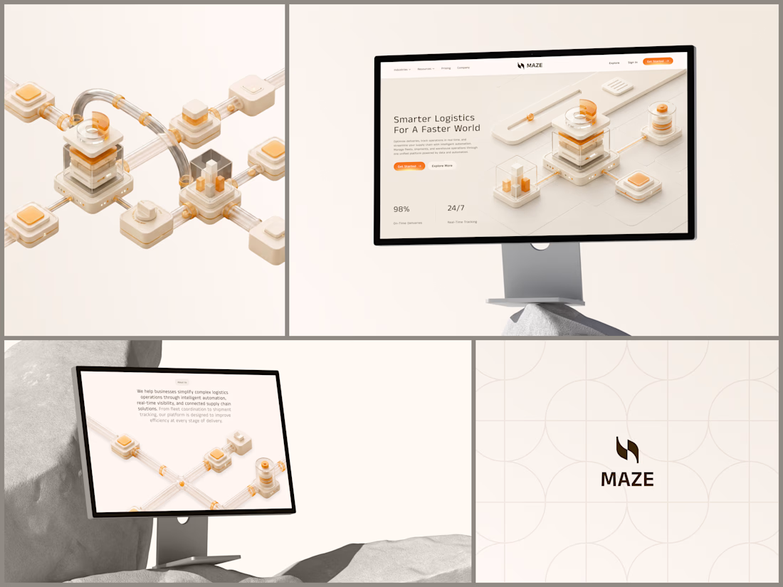


Novent - Payment Processing Platform
The quietest fintech dashboard I've designed in a while. And that's the point.
One blue. That's the entire accent system. When a "Failed" status tag shows up in red it hits immediately because nothing else in the interface is using warm colors....

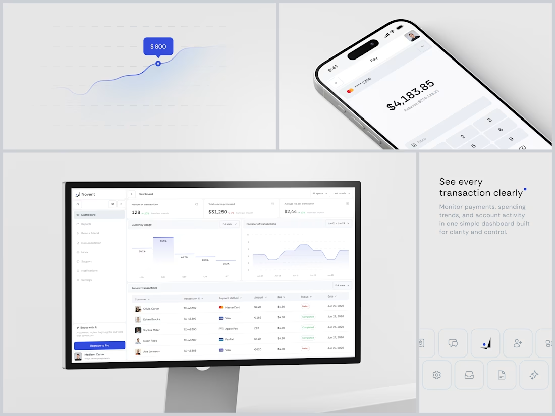
Neuraly - AI Data Analytics Platform
The headline says "Collaborate with data, not just analyze it" and the entire visual system is reinforcing that exact position. Data isn't cold infrastructure you feed queries into. It's something alive that grows when humans interact with it....
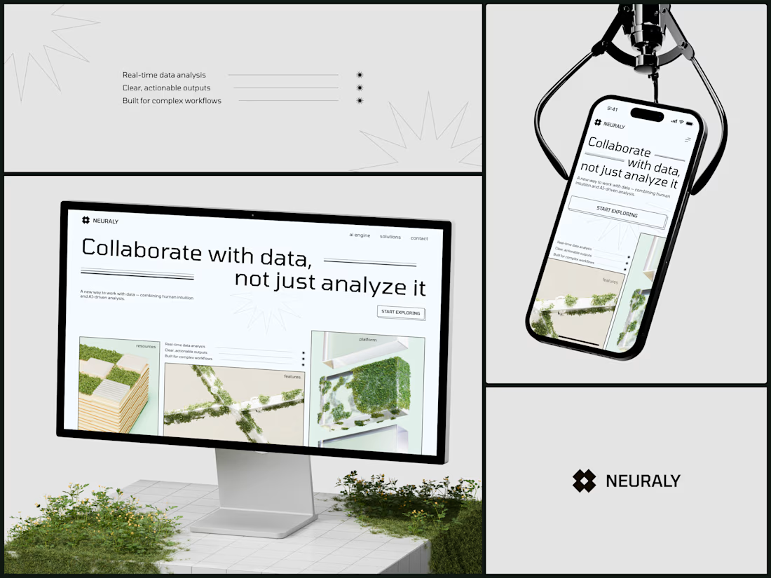
AEROVEX - Drone Technology Product Website
Hardware companies either go full corporate spec-sheet or full sci-fi movie trailer. There's rarely anything in between. This one finds the gap.
The typography is massive enough to set the tone but transparent enough to stay behind the...
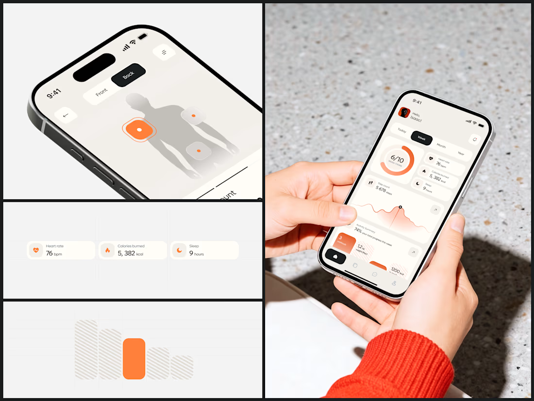
Health & Wearable Tracking App
I chose the warm background to make this feel like a wellness journal. And limiting the entire UI to a single accent means your eye always knows where the important thing is - because there's only ever one color telling you.
The body mapping screen...
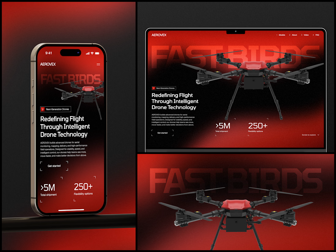
MAZE - Logistics & Supply Chain Platform
Glass tubes connecting modular nodes, orange data packets flowing through the network, warehouse blocks stacked in an interconnected grid. A copywriter would need three paragraphs to describe what that illustration communicates in one...