The network for creativity
Join 1.25M professional creatives like you
Connect with clients, get discovered, and run your business 100% commission-free
Creatives on Contra have earned over $150M and we are just getting started
Back to feedPost

Design Agency Website
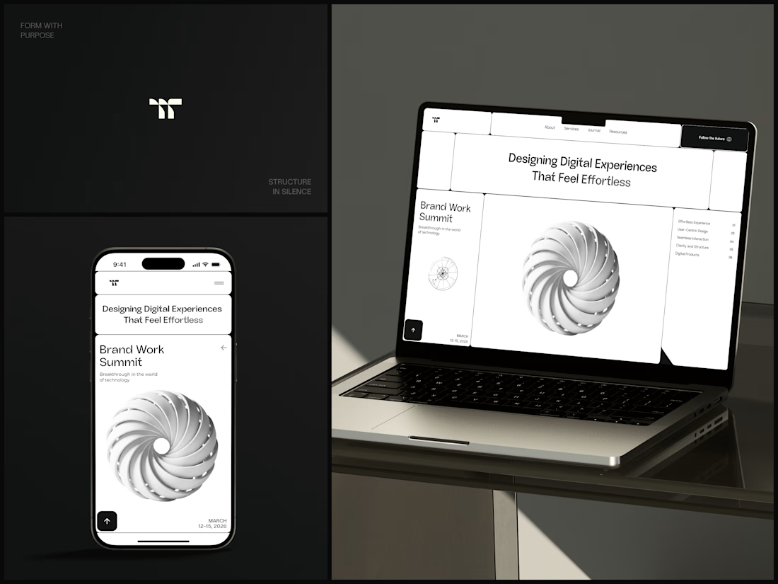
Only one cell on this homepage is black.
The rest of the page is a grid of rounded white cells: the headline, an event card, a white 3D spiral and a list of services. The black one, top right, holds the "Follow the future" button and stands out against all that white.
On the phone, the cells stack into a single column. The navigation folds into a menu icon, and the event card and spiral merge into one cell.
The headline reads "Designing Digital Experiences That Feel Effortless", so the grid has to look organized before anyone reads a word.
Designed by the Hue & Machine team.
#DesignAgency #WebDesign #AgencyWebsite #LandingPage #BentoGrid #MinimalDesign #UIDesign #ResponsiveDesign #MobileDesign #FigmaDesign



The restraint is what makes this work — one black cell does all the heavy lifting, and the rest of the grid just stays quiet and organised. It reads as a design agency before you've read a word, and the way the cells stack on mobile keeps that same calm feeling. Really considered.

Great Job


Nice!

Looks cool

One black cell doing all the work is such a confident move. Was top right always the plan, or did you test other spots?


Nice work🔥👏👏


one black cell in a white grid is such a smart focal point, love how the button pops

Great work

So cool

Impressive!


Clean work, love it.

creativity

Beautiful work!

The grid layout is really clean, and the single black cell gives the page a clear focal point. The way the same design carries across desktop and mobile looks consistent and polished.

Thats really cool, love it man!

That's a very stylish torus

Great!

This is a beautiful website concept! The layout feels clean, intuitive, and thoughtfully structured.
The network for creativity
Join 1.25M professional creatives like you
Connect with clients, get discovered, and run your business 100% commission-free
Creatives on Contra have earned over $150M and we are just getting started



Related posts

Vihta is a Framer template for saunas, bathhouses and wellness venues, designed in Figma and built in Framer. It has 14 pages, live booking, gift cards and a CMS for events and a journal. Coming soon to the Framer Marketplace.

Nice work!!

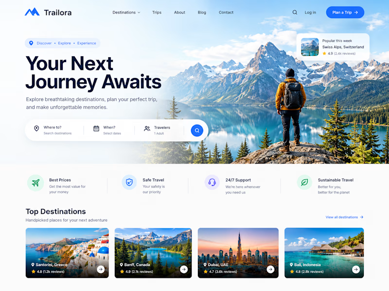
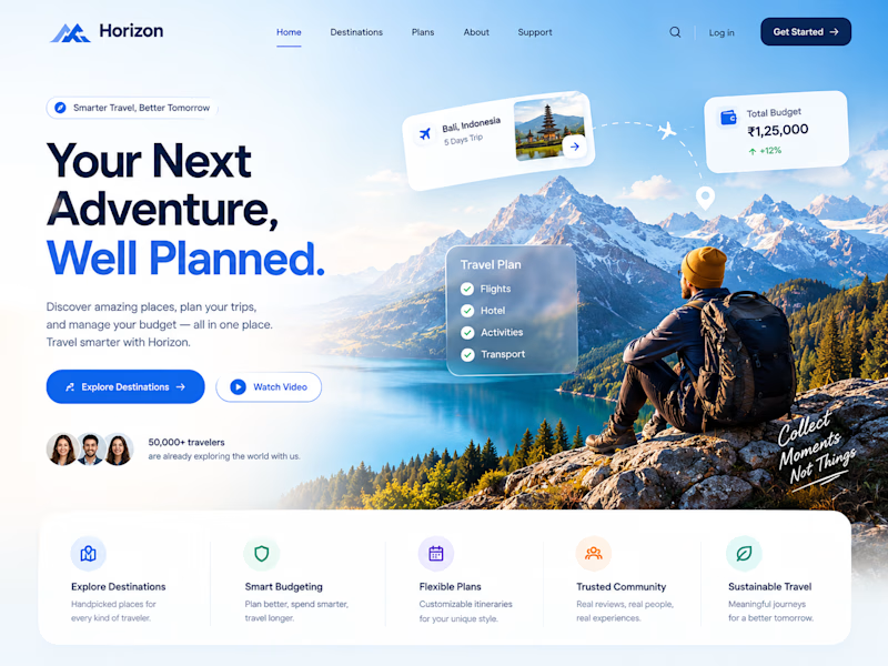
Two designs. One idea. Two different ways to experience travel. ✈️
What if planning your next trip felt less like managing a checklist and more like discovering a story waiting to unfold?
Trailora makes discovery feel effortless, while Horizon turns travel planning into a smarter, more structured experience.
Same industry. Different design directions.
Which direction would you choose: the freedom to explore or the confidence of a well-planned journey?
25 voted
71%
10 voted
29%
35 votes
Closed

Both are lovely! The second one feels more like an adventure, which fits travel well.

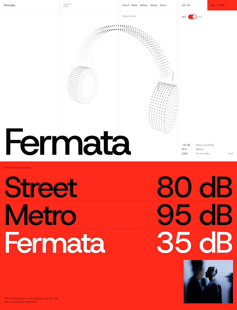
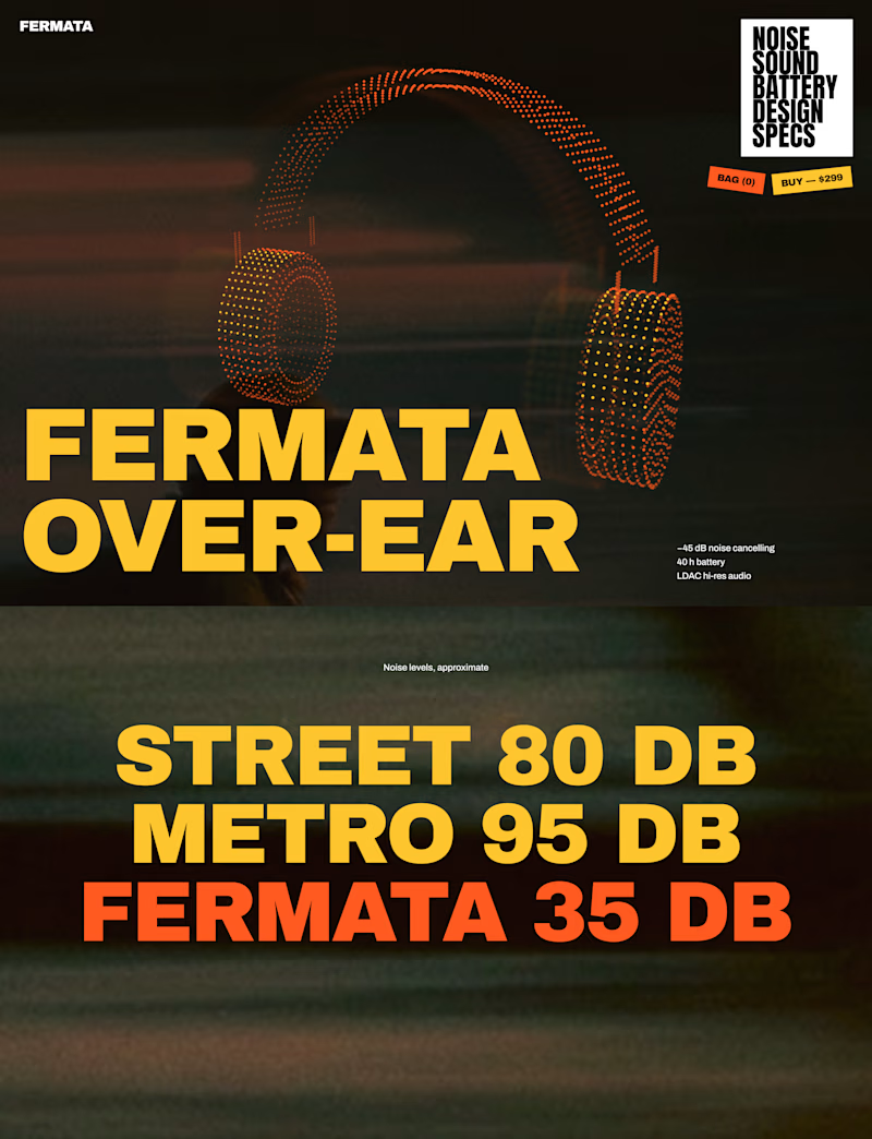
🎧 FERMATA — new over-ear headphones, coming soon.
A — Swiss poster: red, light blue, white and black. Clean grid, one grotesk typeface, product as a stipple 3D model.
B — Night edition: black, yellow and orange. Heavy condensed type, motion-blurred city photography, sticker details.
Both will have a scroll-driven 3D headphone (particles) as the hero.

56 voted
79%
15 voted
21%
71 votes
Closed


The Red Color Scheme looks nice