MRR & Churn Analysis Dashboard for SaaS Retention and Growth
Smita S
MRR & Churn Analysis Dashboard for SaaS Retention and Growth
In fast-scaling SaaS companies, understanding top line growth alone isn’t enough. While Monthly Recurring Revenue (MRR) may increase, it can mask hidden problems like rising churn, declining customer lifetime value (LTV), and uneven performance across pricing tiers.
This project presents a retention and cohort analysis dashboard for a subscription-based SaaS business, highlighting revenue risk, high-value churn, and actionable GTM and product insights across customer plans.
Problem
Despite steady MRR growth, the company’s profit margins stagnated, raising concerns at the leadership level:
Churn was likely offsetting revenue gains, particularly within specific pricing tiers.
Marketing was driving customer acquisition, but those efforts weren’t translating into profit growth.
A lack of plan-level visibility made it difficult to diagnose performance issues or take targeted action.
The goal: Uncover where growth was leaking and how to fix it.
Solution
I built a two-layer SaaS growth dashboard in Power BI, powered by a dbt-BigQuery backend, to illuminate full-funnel revenue performance and surface retention risks by customer segment.
Layer 1 : Company-Wide View
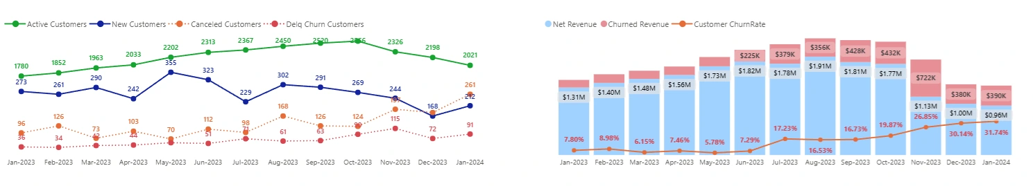
Level 1 Dashboard : Shows steady decrease in new customers and increase in canceled customers. Churn rate follows a similar pattern to cancellations.
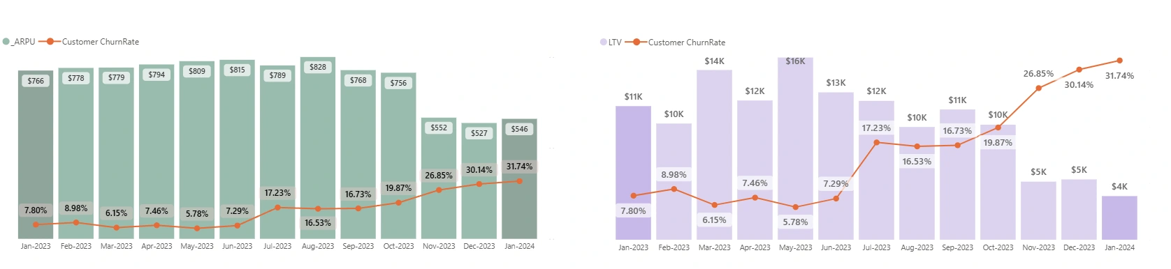
Level 1 Dashboard : ARPU is stable except for last quarter and LTV shows steady decline from May
This layer gave leadership a pulse on the overall health of the SaaS business.
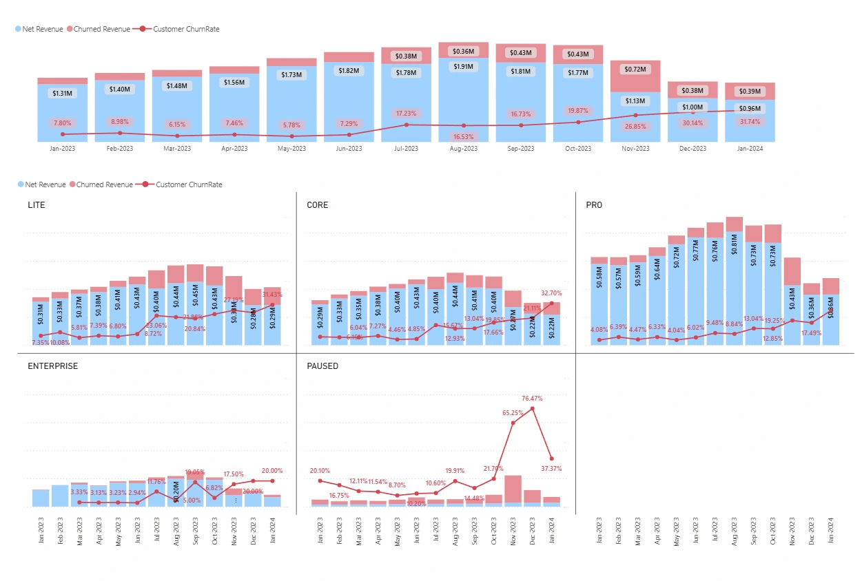
Net Revenue increased from $1.3M (Jan) to $1.9M (Aug), but dropped in Q4. Churn Rate surged in Q4 hitting 30.14% in Dec.
Churn Rate follows the path of cancelled users , indicating the churn is coming in from existing customers leaving which starts in Aug.
ARPU stayed relatively flat around $750-$800 in Q1, Q2, Q3.
LTV crashed from $16K in May to $5K in Dec.
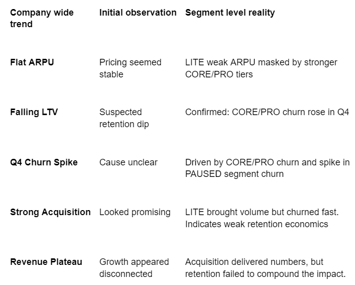
Insight: The real problem wasn’t pricing, it was retention
ARPU vs. LTV vs. Churn - Flat ARPU masked a deeper issue because churn was hidden by high-value segments
LTV was collapsing due to early churn. Customers weren’t staying long enough to generate value.
Layer 2 : Subscription-Level View
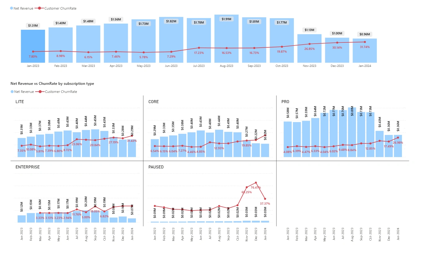
Level 2 Dashboard : Revenue vs Churn Rate by subscription type
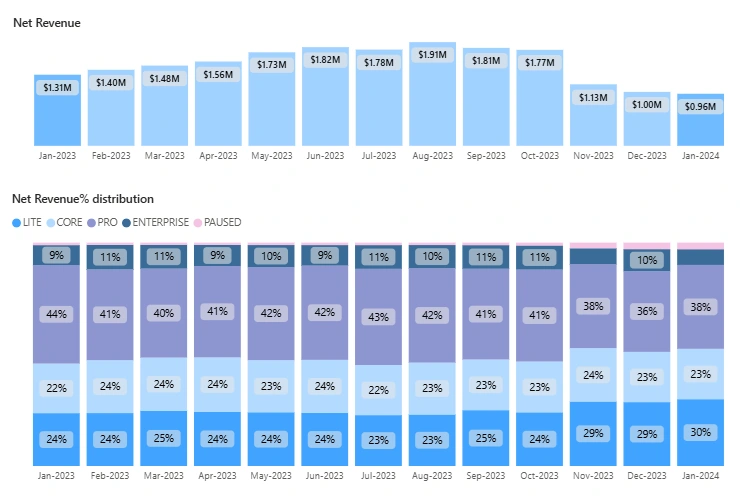
Level 2 Dashboard : ~45% of revenue is from PRO which points that these are highly valuable to the business.
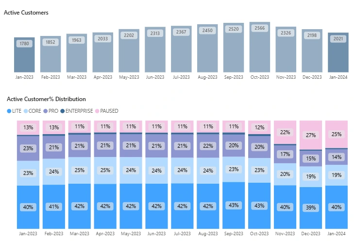
Level 2 Dashboard : The valuable PRO segment contributes to only ~21% of the active user base.
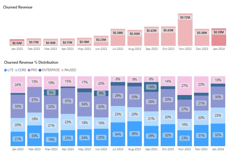
Level 2 Dashboard : PRO is a high-risk, high-churn tier, whereas CORE appears to be more resilient and predictable
This drill-down gave actionable insight into which plans were causing growth leakage.
LITE : High-volume, low-value tier with ~40% of users contributing only ~25% of revenue. Suffered the steepest churn and LTV drop, indicating poor retention and low monetization.
CORE : A previously stable mid-tier segment now facing churn risk, with a 30% drop in users during Q4. Despite solid ARPU ($740-$830), LTV fell from $17.4K to $9K, calling for retention focus.
PRO :Top-performing segment, generating ~45% of revenue from just ~21% of customers. However, active users dropped nearly 37%, and LTV declined from 41K to $16K , an early red flag for a key tier.
PAUSED : Low-revenue segment with churn spiking to 76% points to a clear churn staging zone. ARPU and LTV remained negligible, confirming these users rarely convert back to active.
ENTERPRISE : High-value but low-volume segment with the highest ARPU ($4K-$5K) and relatively low churn. LTV remained volatile due to contract-based variability, requiring account-level focus.
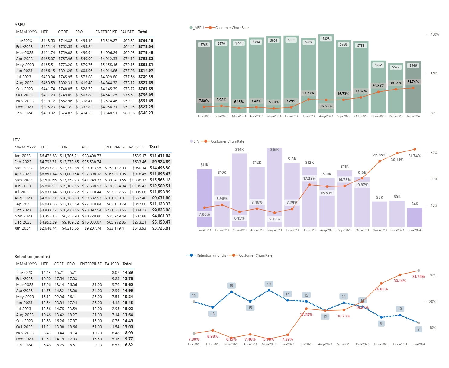
Level 2 Dashboard : Customer stickiness declined sharply across all plans, with LITE, CORE, and PRO retention dropping to single-digit months by Jan 2024
Cross-Layer Insight Summary
Outcome
The dashboard reshaped revenue strategy by revealing:
LITE and PAUSED were high-churn, low-LTV segments driving vanity growth.
Q4 revenue crash was linked to churn in CORE and PRO, previously stable cohorts.
PAUSED was flagged as a pre-churn stage, prompting early intervention workflows.
PRO users contributed ~44% of revenue from just 21% of users but accounted for ~45% of churned revenue, exposing a high-value churn risk. In simple words, the most valuable customers are churning fast.
GTM strategy shifted toward CORE-style customers that are high-LTV, mid-risk, and more retainable.
The LITE strategy was refined to:
Focus on upgrading high-fit users to CORE.
Improve onboarding and engagement to reduce early churn.
Limit acquisition of low-fit, non-converting users.
Marketing, Product, and Success aligned around cohort-based growth and retention priorities.
Tech Stack
Source: Stripe (Subscription Billing)
ELT: Stitch - dbt
Warehouse: BigQuery
Visualization: Power BI
Conclusion
This dashboard helped the SaaS business move from growth-by-volume to growth-by-value. By uncovering how different plans affected revenue, churn, and lifetime value, the company could optimize its strategy, boost retention, and reallocate marketing toward the most profitable segments.
Table of Contents
Like this project
Posted Aug 5, 2025
This project showcases growth and retention dashboard for a SaaS business with multiple plans, built using Stripe, dbt, BigQuery, and Power BI.