


Additional resources
What Are Data Visualizers and Why Your Business Needs ThemData Analysts vs. Data Visualizers: Key DifferencesCore Responsibilities of Data Visualization ExpertsBusiness Impact of Professional Data VisualizationTypes of Data Visualization Services AvailableReal-Time Dashboard DevelopmentInteractive Report CreationGeospatial Data MappingPredictive Analytics VisualizationMobile-Responsive Visualization DesignEssential Skills to Look for When You Hire Data VisualizersTechnical Programming CompetenciesStatistical Analysis ExpertiseDesign and UX/UI PrinciplesData Storytelling AbilitiesIndustry-Specific Domain KnowledgeWhere to Find Data Visualization ConsultantsProfessional Networks and CommunitiesSpecialized Recruitment AgenciesUniversity Partnerships and Academic ProgramsRemote Work Platforms and Talent PoolsHow to Evaluate Data Visualization ExpertsPortfolio Assessment CriteriaTechnical Assessment MethodsCommunication and Presentation Skills TestingCultural Fit and Collaboration EvaluationCost Structure for Data Visualization ServicesFreelance Data Visualizers Pricing ModelsFull-Time Employee Salary BenchmarksProject-Based vs. Retainer AgreementsGeographic Variations in CompensationKey Tools and Technologies Data Visualization Experts UseBusiness Intelligence PlatformsProgramming Languages and LibrariesCloud-Based Visualization SolutionsEmerging AI and Machine Learning ToolsIndustry-Specific Requirements for Data VisualizationHealthcare and Medical Data VisualizationFinancial Services Dashboard RequirementsE-commerce and Retail AnalyticsManufacturing and Supply Chain VisualizationBuilding Your Data Visualization Team StructureSolo Practitioner vs. Team ApproachIntegration with Existing Data TeamsRemote vs. On-Site ConsiderationsScaling Your Visualization CapabilitiesCommon Pitfalls When Hiring Data Visualization ConsultantsOveremphasis on Tool ProficiencyNeglecting Communication SkillsMisaligned Project ExpectationsInadequate Data Infrastructure PreparationLong-Term Success with Data Visualization ServicesContinuous Skill Development ProgramsPerformance Metrics and KPIsRetention Strategies for Top TalentFuture-Proofing Your Visualization Strategy
Organizations today generate unprecedented amounts of data, yet many struggle to transform this information into actionable insights. The solution lies in hiring skilled data visualizers who can bridge the gap between complex datasets and strategic decision-making.
What Are Data Visualizers and Why Your Business Needs Them
Data Analysts vs. Data Visualizers: Key Differences
While data analysts focus on extracting insights from raw data through statistical methods and modeling, data visualizers specialize in transforming these findings into compelling visual narratives. Data analysts typically work with spreadsheets, perform statistical tests, and generate reports with numerical summaries. In contrast, data visualization experts create interactive dashboards, design intuitive charts, and develop visual storytelling frameworks that make complex information accessible to non-technical stakeholders.
The key distinction lies in their end products. A data analyst might conclude that customer retention dropped 15% in Q3, while a data visualizer would create an interactive timeline showing retention trends across different customer segments, complete with drill-down capabilities and predictive forecasting elements.
Core Responsibilities of Data Visualization Experts
Data visualization specialists handle multiple interconnected responsibilities that extend beyond creating charts. They collaborate with data engineers to ensure clean, structured datasets suitable for visualization. They work closely with business stakeholders to understand reporting requirements and translate abstract business questions into visual solutions.
Technical responsibilities include designing responsive dashboards that function across devices, implementing real-time data connections, and creating automated reporting systems. They also establish visual design standards, ensuring consistency in color schemes, typography, and layout principles across all organizational dashboards.
Communication forms another critical aspect of their role. Data visualizers present findings to executive teams, conduct training sessions for end-users, and document visualization methodologies for future reference.
Business Impact of Professional Data Visualization
Professional data visualization services deliver measurable business outcomes across multiple dimensions. Organizations typically experience 25-30% faster decision-making processes when complex data gets presented through well-designed visual interfaces. Executive teams spend less time interpreting reports and more time acting on insights.
Revenue impact often follows improved visualization capabilities. Retail companies using advanced customer behavior dashboards report 12-18% increases in conversion rates through better-targeted marketing campaigns. Manufacturing firms implementing supply chain visualization systems achieve 8-15% reductions in operational costs by identifying bottlenecks and optimization opportunities.
Risk management also improves significantly. Financial institutions using real-time risk visualization dashboards detect potential issues 40% faster than traditional reporting methods, preventing substantial losses through early intervention.
Types of Data Visualization Services Available
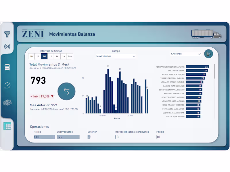
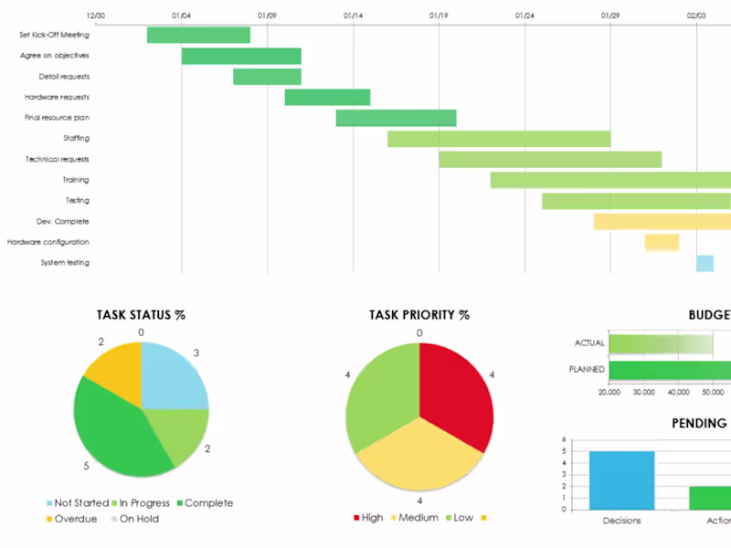
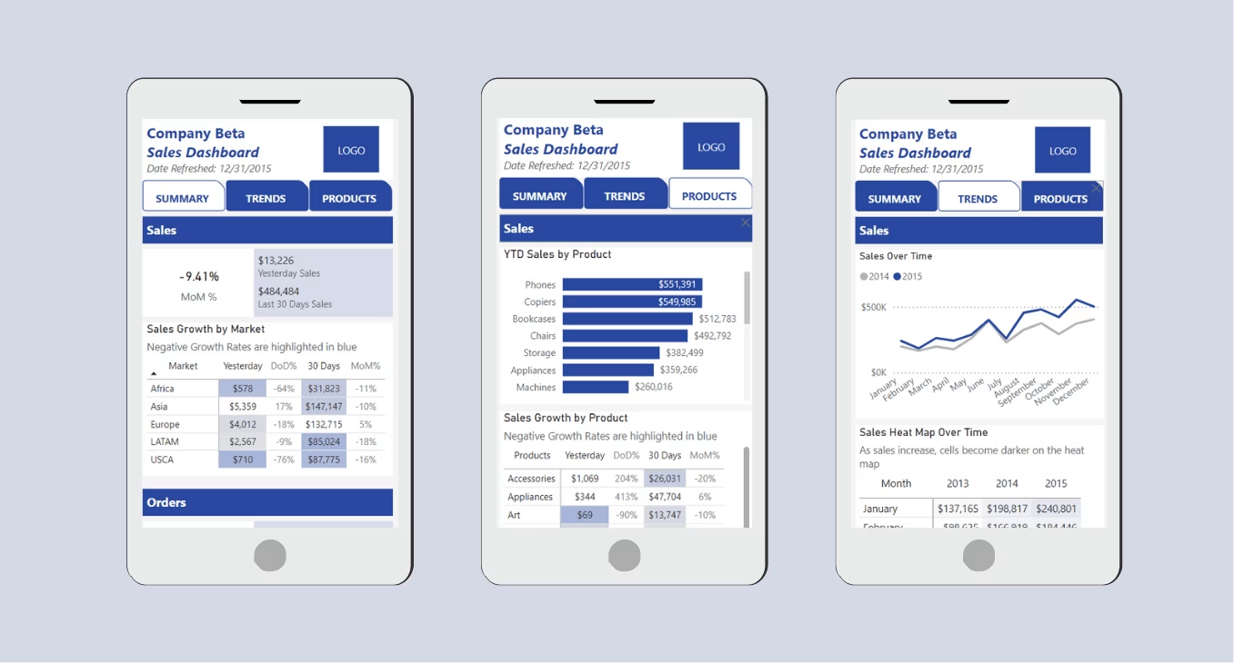
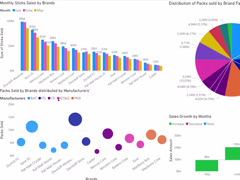
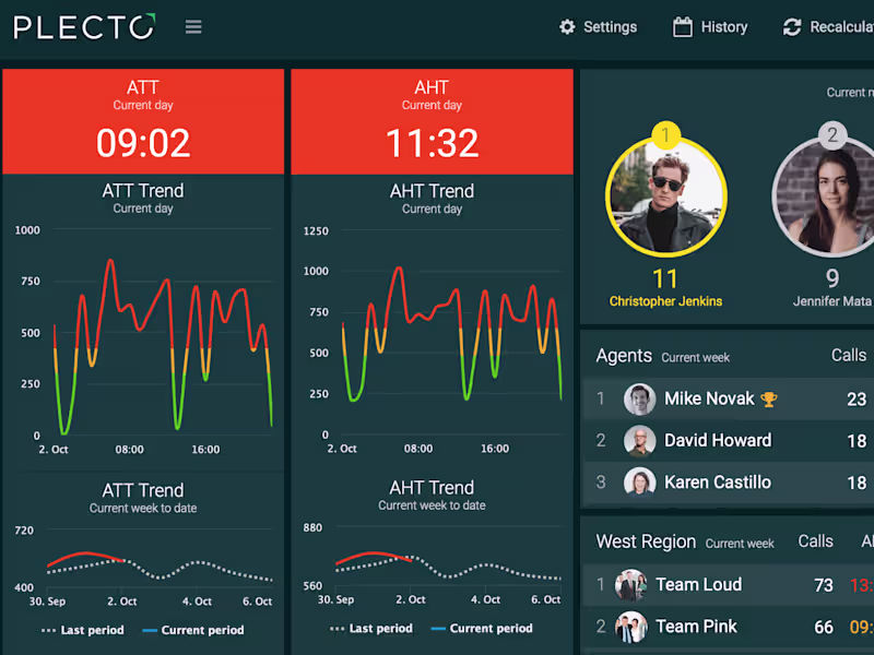
Real-Time Dashboard Development
Real-time dashboard development involves creating dynamic interfaces that update automatically as new data enters organizational systems. These dashboards connect directly to databases, APIs, and streaming data sources to provide instant visibility into key performance indicators.
Common applications include sales performance tracking, website analytics monitoring, and operational efficiency dashboards. Healthcare organizations use real-time patient monitoring dashboards to track vital signs and alert medical staff to critical changes. Manufacturing companies implement production line dashboards that display equipment status, output rates, and quality metrics.
Interactive Report Creation
Interactive reports go beyond static charts by allowing users to explore data through filtering, drilling down, and cross-referencing different metrics. Users can adjust date ranges, select specific product categories, or compare performance across different regions without requesting new reports.
These reports typically include features like hover-over tooltips, clickable elements, and dynamic filtering options. Sales teams use interactive reports to analyze pipeline progression, while marketing departments create campaign performance reports that allow stakeholders to examine results by channel, demographic, or geographic region.
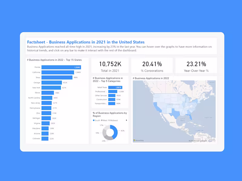
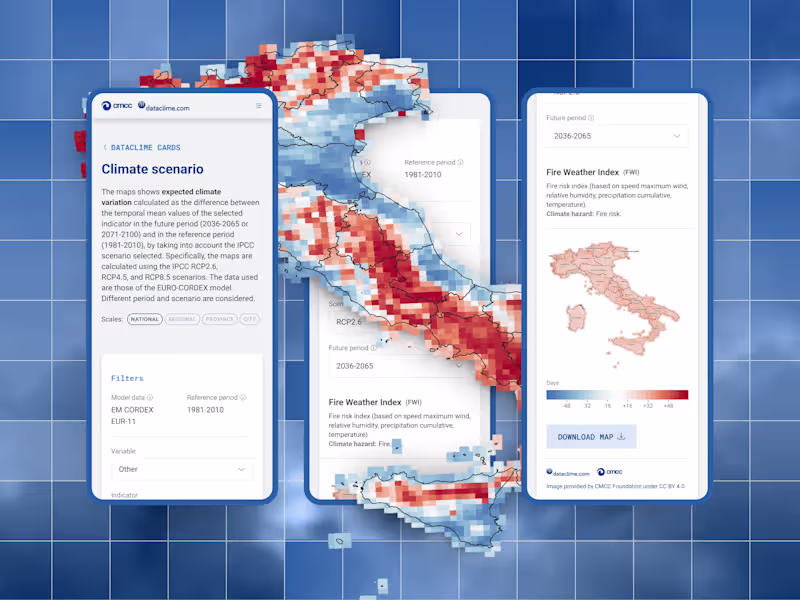
Geospatial Data Mapping
Geospatial visualization combines geographic information with business data to reveal location-based patterns and trends. This service includes creating heat maps, territory analysis, and location-based performance tracking.
Retail chains use geospatial mapping to identify optimal store locations and analyze customer distribution patterns. Logistics companies create route optimization visualizations that reduce delivery times and fuel costs. Public health organizations develop disease tracking maps that help identify outbreak patterns and resource allocation needs.
Predictive Analytics Visualization
Predictive analytics visualization transforms statistical forecasting models into understandable visual formats. These visualizations show projected trends, confidence intervals, and scenario planning outcomes through interactive charts and probability distributions.
Financial services firms use predictive visualizations to display market forecasting and risk projections. Supply chain managers rely on demand forecasting visualizations to optimize inventory levels and production planning. Human resources departments implement employee turnover prediction dashboards to identify retention risks.
Mobile-Responsive Visualization Design
Mobile-responsive design ensures data visualization works effectively across smartphones, tablets, and desktop computers. This service includes optimizing chart layouts for smaller screens, implementing touch-friendly navigation, and ensuring fast loading times on mobile networks.
Field sales teams access customer data through mobile dashboards while visiting clients. Service technicians use mobile-optimized maintenance dashboards to access equipment histories and troubleshooting guides. Executive teams review key metrics through mobile dashboards during travel and off-site meetings.
Essential Skills to Look for When You Hire Data Visualizers
Technical Programming Competencies
Strong programming skills form the foundation of effective data visualization work. Python proficiency enables automation of data processing tasks, statistical analysis, and integration with machine learning models. SQL expertise allows direct database querying and complex data manipulation.
JavaScript knowledge becomes essential for creating custom interactive elements and web-based visualizations. R programming skills support advanced statistical analysis and specialized visualization packages. Many data visualization experts also understand API integration, enabling real-time data connections and automated dashboard updates.
Version control systems like Git facilitate collaboration and project management. Cloud platform familiarity with AWS, Azure, or Google Cloud supports scalable visualization deployments and data pipeline management.
Statistical Analysis Expertise
Statistical knowledge ensures data visualizers create accurate, meaningful representations of underlying data patterns. They must understand descriptive statistics, correlation analysis, and regression modeling to avoid misleading visualizations.
Data cleaning and validation skills prevent errors from propagating into final visualizations. Understanding sampling methods, confidence intervals, and statistical significance helps create honest representations of data uncertainty and limitations.
Advanced practitioners understand time series analysis, clustering algorithms, and hypothesis testing. This knowledge enables them to choose appropriate visualization types and highlight statistically significant findings while avoiding spurious correlations.
Design and UX/UI Principles
Visual design principles guide effective communication through charts and dashboards. Color theory knowledge ensures accessibility for colorblind users and creates intuitive visual hierarchies. Typography skills improve readability and professional appearance.
User experience design focuses on creating intuitive navigation, logical information architecture, and efficient workflows. Understanding cognitive load principles helps prevent overwhelming users with excessive information density.
Responsive design skills ensure visualizations function across different devices and screen sizes. Accessibility standards compliance makes visualizations usable for people with disabilities, expanding audience reach and meeting legal requirements.
Data Storytelling Abilities
Data storytelling transforms raw insights into compelling narratives that drive action. Effective storytellers understand audience needs, craft logical flow structures, and highlight key takeaways through visual emphasis.
Presentation skills enable clear communication of findings to diverse stakeholders. Writing abilities support creating executive summaries, methodology documentation, and user guides for complex dashboards.
Context awareness helps frame data insights within broader business objectives and industry trends. Successful data visualizers understand when to simplify complex analyses and when to provide detailed technical explanations.
Industry-Specific Domain Knowledge
Domain expertise enables data visualization specialists to understand business context, identify relevant metrics, and create industry-appropriate solutions. Healthcare visualizers understand clinical workflows, regulatory requirements, and patient privacy considerations.
Financial services expertise includes knowledge of trading systems, risk management frameworks, and regulatory reporting requirements. Retail domain knowledge covers customer journey mapping, inventory management, and seasonal trend analysis.
Manufacturing understanding encompasses production processes, quality control metrics, and supply chain optimization. Technology sector knowledge includes user behavior analysis, system performance monitoring, and product development metrics.
Where to Find Data Visualization Consultants
Professional Networks and Communities
Industry-specific professional associations provide access to experienced data visualization consultants with proven track records. The Data Visualization Society maintains member directories and hosts networking events where organizations can connect with specialists.
Local business associations and chamber of commerce groups often include data professionals who offer visualization services. Technology meetups and user groups for specific tools like Tableau or Power BI create opportunities to meet practitioners and evaluate their expertise.
Professional conferences and workshops allow direct interaction with potential consultants while observing their presentation skills and technical knowledge. Many consultants speak at these events, providing insight into their communication abilities and thought leadership.
Specialized Recruitment Agencies
Technical recruitment firms focus specifically on data and analytics roles, maintaining networks of qualified data visualization experts. These agencies understand industry requirements and can match specific skill sets with organizational needs.
Boutique firms specializing in business intelligence and analytics placements offer deeper expertise in evaluating technical competencies. They often provide pre-screened candidates and can arrange trial projects to assess fit before long-term commitments.
Executive search firms handle senior-level visualization leadership roles, including data visualization managers and chief data officers. These firms understand strategic requirements and cultural fit considerations for leadership positions.
University Partnerships and Academic Programs
Universities with strong data science and visualization programs provide access to emerging talent and cutting-edge research. Graduate students often seek internship and project opportunities that benefit both parties.
Faculty members frequently consult on industry projects, bringing academic rigor and latest methodological advances. Research partnerships can address complex visualization challenges while providing access to specialized expertise.
Alumni networks from relevant programs create ongoing talent pipelines. Many universities maintain job boards and career services that connect graduates with industry opportunities.
Remote Work Platforms and Talent Pools
Specialized platforms focus on connecting organizations with remote data visualization professionals worldwide. These platforms often include portfolio reviews, skill assessments, and project management tools.
Global talent pools provide access to diverse expertise and competitive pricing options. Remote work arrangements enable organizations to access specialists regardless of geographic location, expanding available talent significantly.
Platform-based matching algorithms help identify candidates with specific tool expertise, industry experience, and availability requirements. Many platforms offer project management features and payment protection for both parties.
How to Evaluate Data Visualization Experts
Portfolio Assessment Criteria
Strong portfolios demonstrate diverse data visualization techniques across multiple industries and use cases. Look for examples that show progression from raw data to final visualizations, including intermediate steps and decision-making rationale.
Technical complexity indicators include interactive elements, real-time data integration, and custom programming solutions. Evaluate whether visualizations effectively communicate key insights without overwhelming viewers with unnecessary detail.
Business impact documentation shows how visualizations influenced decision-making or improved organizational outcomes. Quantified results like increased efficiency percentages or cost savings demonstrate practical value beyond aesthetic appeal.
Technical Assessment Methods
Practical exercises reveal actual capabilities better than theoretical discussions. Provide sample datasets and request specific visualization outputs within defined timeframes. Observe problem-solving approaches and tool selection rationale.
Code review sessions for programming-heavy roles assess quality, efficiency, and maintainability of custom solutions. Technical interviews should cover statistical concepts, data manipulation techniques, and visualization best practices.
Tool-specific assessments verify claimed proficiencies in platforms like Tableau, Power BI, or D3.js. Request live demonstrations of complex features like calculated fields, custom functions, or API integrations.
Communication and Presentation Skills Testing
Presentation exercises simulate real-world scenarios where data visualizers must explain findings to non-technical stakeholders. Evaluate clarity, logical flow, and ability to adapt explanations for different audience levels.
Written communication assessment through documentation review or sample report creation reveals ability to create user guides, methodology explanations, and executive summaries.
Collaborative skills evaluation through team exercises or reference checks indicates how well candidates work with data engineers, business analysts, and end-users throughout project lifecycles.
Cultural Fit and Collaboration Evaluation
Team integration assessment determines how well candidates align with organizational culture and working styles. Consider communication preferences, collaboration approaches, and adaptability to existing processes.
Problem-solving style evaluation reveals whether candidates prefer independent work or collaborative approaches. Assess alignment with organizational decision-making processes and change management approaches.
Long-term growth potential consideration includes learning agility, technology adaptation skills, and career development interests. Evaluate whether candidates can grow with evolving organizational needs and emerging technologies.
Cost Structure for Data Visualization Services
Freelance Data Visualizers Pricing Models
Freelance data visualizers typically charge between $75-150 per hour depending on experience level and project complexity. Entry-level freelancers with 1-2 years experience charge $75-95 per hour, while senior specialists with 5+ years command $120-150 per hour.
Project-based pricing often provides better value for defined scope work. Simple dashboard creation projects range from $3,000-8,000, while complex interactive visualization systems cost $15,000-35,000. Fixed-price arrangements reduce budget uncertainty but require detailed scope definition.
Retainer agreements work well for ongoing visualization needs. Monthly retainers typically range from $5,000-15,000 depending on expected hours and complexity levels. This model provides priority access and consistent availability for urgent requests.
Full-Time Employee Salary Benchmarks
Data visualization professionals earn varying salaries based on experience, location, and industry. Entry-level positions start around $65,000-80,000 annually, while mid-level roles range from $85,000-110,000. Senior specialists and team leads earn $115,000-145,000 or more.
Geographic location significantly impacts compensation expectations. Major metropolitan areas like New York, San Francisco, and Seattle command 20-30% premiums over national averages. Remote positions often fall between local and premium market rates.
Industry specialization affects salary ranges substantially. Financial services and technology companies typically offer the highest compensation, while non-profit and education sectors provide lower but often more stable packages.
Project-Based vs. Retainer Agreements
Project-based contracts suit organizations with specific, defined visualization needs and clear deliverable requirements. These arrangements provide cost predictability and defined timelines but may lack flexibility for scope changes.
Retainer agreements offer ongoing access to visualization services with priority scheduling and consistent availability. Monthly retainers typically cost 15-25% less per hour than project rates while providing guaranteed capacity allocation.
Hybrid models combine project delivery with ongoing support retainers. Initial development occurs under fixed-price contracts, followed by monthly maintenance retainers covering updates, user support, and minor enhancements.
Geographic Variations in Compensation
North American rates typically represent the highest global pricing for data visualization services. Western European rates generally fall 10-20% below U.S. levels, while Eastern European specialists offer 40-60% cost savings with comparable quality.
Asian markets provide significant cost advantages, with rates often 50-70% below North American levels. However, time zone differences and communication considerations may offset some cost benefits for real-time collaboration requirements.
Remote work arrangements increasingly blur geographic boundaries, with many specialists pricing based on value delivered rather than location. Global talent access enables organizations to optimize cost-quality trade-offs based on specific project requirements.
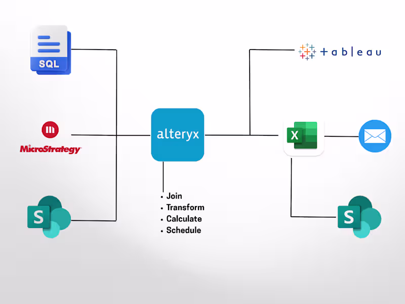
Key Tools and Technologies Data Visualization Experts Use
Business Intelligence Platforms
Tableau dominates enterprise data visualization with comprehensive features for complex dashboard creation, real-time data connections, and advanced analytics integration. Its drag-and-drop interface enables rapid prototype development while supporting sophisticated customization through calculated fields and parameters.
Microsoft Power BI integrates seamlessly with Office 365 and Azure ecosystems, making it popular among organizations already invested in Microsoft technologies. Its cost-effective licensing and strong Excel integration appeal to budget-conscious organizations with existing Microsoft infrastructure.
QlikView and QlikSense provide associative data modeling that enables dynamic exploration and discovery-driven analytics. Their in-memory processing delivers fast performance for large datasets and complex calculations.
Programming Languages and Libraries
Python remains the most versatile programming language for data visualization, with libraries like Matplotlib, Seaborn, and Plotly supporting everything from basic charts to interactive web applications. Pandas integration enables seamless data manipulation and analysis workflows.
R offers specialized visualization packages like ggplot2 that provide fine-grained control over chart aesthetics and statistical graphics. Its extensive package ecosystem supports advanced statistical visualizations and academic research applications.
JavaScript enables custom web-based visualizations through libraries like D3.js, Chart.js, and Three.js. These tools create highly interactive, animated visualizations that integrate directly into web applications and custom dashboards.
Cloud-Based Visualization Solutions
Amazon QuickSight provides serverless business intelligence with automatic scaling and pay-per-use pricing. Its machine learning insights feature automatically identifies patterns and anomalies in data without manual configuration.
Google Data Studio offers free visualization capabilities with strong integration to Google Analytics, Google Ads, and other Google services. Its collaborative features enable real-time sharing and editing among team members.
Looker, now part of Google Cloud, combines data modeling with visualization in a unified platform. Its LookML modeling layer enables consistent business logic across all visualizations and reports.
Emerging AI and Machine Learning Tools
Automated insight generation tools use natural language processing to create narrative summaries of visualization findings. These systems identify key trends, outliers, and correlations automatically, reducing manual analysis time.
Augmented analytics platforms leverage machine learning to suggest optimal chart types, identify relevant data relationships, and recommend visualization improvements. These tools democratize advanced analytics by reducing technical expertise requirements.
Natural language query interfaces allow non-technical users to create visualizations through conversational commands. Users can request charts by typing questions like "show me sales trends by region" instead of manually configuring dashboard elements.
Industry-Specific Requirements for Data Visualization
Healthcare and Medical Data Visualization
Healthcare data visualization must comply with HIPAA privacy regulations and medical data security standards. Patient information requires de-identification processes and access controls that prevent unauthorized data exposure.
Clinical decision support dashboards integrate real-time patient monitoring data with historical trends and treatment protocols. These visualizations help medical professionals identify deteriorating conditions and optimize treatment plans.
Population health analytics combine individual patient data with demographic and geographic information to identify disease patterns and resource allocation needs. Public health officials use these visualizations to track epidemic spread and plan intervention strategies.
Financial Services Dashboard Requirements
Financial data visualization operates under strict regulatory oversight requiring audit trails, data lineage documentation, and compliance reporting capabilities. Visualizations must support regulatory examinations and demonstrate adherence to risk management frameworks.
Trading dashboards provide real-time market data with millisecond refresh rates and advanced charting capabilities. Risk management visualizations combine portfolio exposure data with market volatility measures to identify potential threats.
Customer analytics dashboards help financial institutions understand client behavior patterns, identify cross-selling opportunities, and detect potential fraud indicators through anomaly detection algorithms.
E-commerce and Retail Analytics
Retail data visualization focuses on customer journey mapping, inventory optimization, and sales performance tracking across multiple channels. Real-time dashboards monitor website traffic, conversion rates, and abandoned cart patterns.
Supply chain visualizations track product movement from manufacturers through distribution centers to retail locations. These systems identify bottlenecks, optimize inventory levels, and predict demand fluctuations.
Customer segmentation dashboards combine purchase history, demographic data, and behavioral patterns to identify high-value customers and personalize marketing campaigns.
Manufacturing and Supply Chain Visualization
Manufacturing dashboards monitor production line efficiency, quality control metrics, and equipment performance indicators. Real-time visualizations help identify bottlenecks and optimize production scheduling.
Predictive maintenance visualizations combine sensor data with historical failure patterns to predict equipment maintenance needs. These systems reduce unplanned downtime and optimize maintenance scheduling.
Supply chain risk visualization maps supplier relationships, geographic concentrations, and potential disruption scenarios. These tools help manufacturers diversify supply sources and develop contingency plans.
Building Your Data Visualization Team Structure
Solo Practitioner vs. Team Approach
Solo practitioners work well for organizations with focused visualization needs and limited complexity requirements. Individual specialists can handle most dashboard creation, report development, and basic analytics visualization tasks efficiently.
Team approaches become necessary for enterprise-scale implementations requiring diverse skill sets. Teams typically include data engineers for pipeline development, visualization designers for user experience, and domain experts for business context.
Hybrid models combine internal team members with external specialists for specific projects or peak capacity needs. This approach provides core capabilities while accessing specialized expertise when required.
Integration with Existing Data Teams
Data visualization teams must coordinate closely with data engineering groups to ensure proper data pipeline architecture and quality standards. Clear interfaces between data preparation and visualization development prevent bottlenecks and quality issues.
Business analyst collaboration ensures visualizations address actual business questions and provide actionable insights. Regular stakeholder feedback sessions help align visualization outputs with decision-making needs.
IT infrastructure teams provide technical support for dashboard hosting, security implementation, and user access management. Proper integration prevents security vulnerabilities and ensures scalable deployment.
Remote vs. On-Site Considerations
Remote data visualization teams offer access to global talent pools and cost optimization opportunities. Cloud-based collaboration tools enable effective teamwork across geographic boundaries and time zones.
On-site teams facilitate closer collaboration with business stakeholders and faster iteration cycles. Face-to-face interactions often improve requirement gathering and stakeholder buy-in for visualization initiatives.
Hybrid arrangements combine remote technical development with periodic on-site collaboration for stakeholder engagement and strategic planning sessions.
Scaling Your Visualization Capabilities
Scaling strategies include developing internal training programs to build visualization skills among existing staff. Cross-training data analysts in visualization tools expands capacity without additional hiring.
Standardization efforts create reusable templates, style guides, and component libraries that accelerate development and ensure consistency across visualizations.
Automation investments reduce manual effort through self-service analytics platforms and automated report generation systems. These tools enable business users to create basic visualizations independently.
Common Pitfalls When Hiring Data Visualization Consultants
Overemphasis on Tool Proficiency
Organizations often prioritize specific tool expertise over fundamental visualization principles and business understanding. While technical skills matter, the ability to choose appropriate chart types and design effective information architecture proves more valuable long-term.
Tool-focused hiring may result in consultants who create technically impressive but business-irrelevant visualizations. Strong candidates demonstrate how they select tools based on project requirements rather than personal preferences.
Balanced evaluation considers both technical capabilities and conceptual understanding of data visualization best practices. The most effective consultants adapt their tool choices to organizational constraints and user needs.
Neglecting Communication Skills
Technical expertise without communication skills leads to visualizations that fail to engage stakeholders or drive action. Many organizations underestimate the importance of presentation abilities and stakeholder management skills.
Poor communicators struggle to gather requirements effectively, leading to visualizations that miss key business objectives. They also fail to train end-users properly, reducing adoption and value realization.
Assessment processes should include presentation exercises and reference checks focusing on stakeholder interaction quality. Communication skills often determine project success more than technical capabilities.
Misaligned Project Expectations
Unclear scope definition and unrealistic timeline expectations create project failures despite qualified consultants. Organizations sometimes expect immediate results from complex data integration and visualization development efforts.
Budget misalignment occurs when organizations underestimate the effort required for data preparation, custom development, and user training components of visualization projects.
Successful engagements require detailed project planning, realistic timeline development, and clear success criteria definition before consultant selection begins.
Inadequate Data Infrastructure Preparation
Organizations often hire data visualization consultants before ensuring adequate data quality and accessibility. Poor data infrastructure creates project delays and limits visualization effectiveness regardless of consultant quality.
Data governance issues, including unclear ownership and inconsistent definitions, prevent consultants from creating reliable visualizations. Security and access control problems may block consultant access to necessary data sources.
Pre-project data assessment and infrastructure preparation investment often determines project success more than consultant selection decisions.
Long-Term Success with Data Visualization Services
Continuous Skill Development Programs
Technology evolution requires ongoing education to maintain data visualization effectiveness. Organizations should budget for training programs, conference attendance, and certification maintenance for their visualization teams.
Cross-functional training helps visualization specialists understand business domains better while teaching business users basic visualization principles. This knowledge sharing improves collaboration and output quality.
Mentorship programs pair experienced practitioners with junior team members to accelerate skill development and knowledge transfer. External mentorship through professional associations provides additional perspective.
Performance Metrics and KPIs
Dashboard usage analytics measure adoption rates and identify underutilized visualizations that may need redesign or additional training. User engagement metrics help optimize visualization design and content.
Business impact measurement connects visualization initiatives to organizational outcomes like faster decision-making, improved efficiency, or increased revenue. These metrics justify continued investment and guide future priorities.
Quality metrics include data accuracy, refresh reliability, and user satisfaction scores. Regular quality assessments prevent degradation and identify improvement opportunities.
Retention Strategies for Top Talent
Competitive compensation packages must reflect market rates and include performance-based incentives tied to business impact metrics. Regular salary benchmarking ensures compensation remains competitive.
Professional development opportunities, including conference attendance, training programs, and certification support, help retain ambitious practitioners who value skill advancement.
Career progression paths within data visualization and broader analytics organizations provide long-term growth opportunities. Clear advancement criteria and mentorship programs support career development.
Future-Proofing Your Visualization Strategy
Technology roadmap planning anticipates emerging tools and techniques that may impact visualization capabilities. Regular technology assessment helps identify when tool migrations or upgrades become necessary.
Skill diversification across multiple platforms and approaches reduces dependency on specific vendors or technologies. Cross-training initiatives ensure team flexibility as requirements evolve.
Innovation partnerships with technology vendors, academic institutions, or consulting firms provide early access to emerging capabilities and best practices. These relationships help organizations stay ahead of industry trends.


![Cover image for [Case Studies] How I helped startups with product growth](https://media.contra.com/image/upload/q_auto,w_800/uxiibfbxkk1up1hgpv6k.avif)