Freelance Packaging Designers in Hertford
Sign Up
Post a job
Sign Up
Log In
Filters
2
Projects
People
Naomi Heyes
pro
London, UK
Branding, Packaging & Web Design, Award Winning | D2C Brands
$10k+
Earned
5x
Hired
4.8
Rating
89
Followers
expert
Follow
Message
Branding, Packaging & Web Design, Award Winning | D2C Brands
184
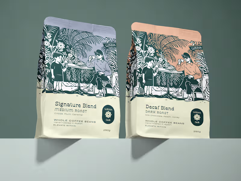
I developed Within Café's refined brand identity and a cohesive packaging system spanning coffee bags, takeaway cups and gelato tubs. Each piece features bespoke hand-drawn illustrations that bring the brand’s “Elevate Within” philosophy to life, capturing calm, connection and everyday ritual. A carefully curated palette of deep greens, warm neutrals and soft pastels creates a premium yet welcoming feel, while consistent typography and layout ensure a seamless, elevated experience full of character across every touchpoint.
106
184
2.9K
3
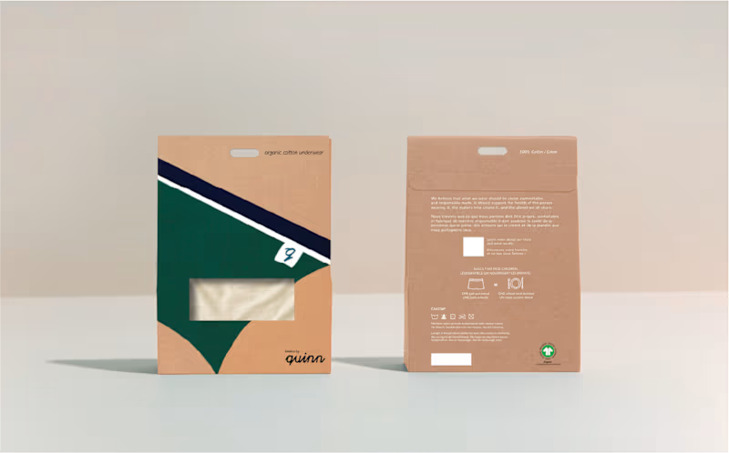
Underwear Packaging Design - bespoke, hand-drawn illustrations bring the personality of the organic, 100% cotton product to life. The design intentionally embraces the kraft brown cardboard. Designed for retail.
3
433
0
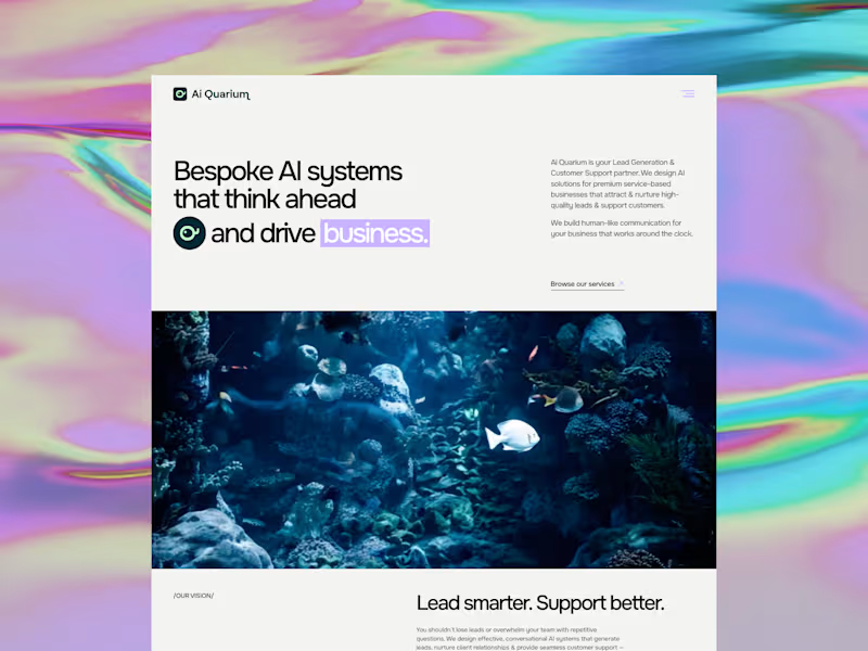
AiQuarium came to me as an AI agency and left with a brand people will trust, remember and gravitate towards. They build tailored AI solutions for lead gen and customer support, drawing on the best tools available globally and configuring them around each client's business. The problem was that almost every brand in this space looks identical. Blue and white, sterile and interchangeable. For an agency whose entire value is bespoke thinking, that was working against them. So I built the brand around the name. The aquarium is the business, the tools within it are the fish and coral and each client gets their own ecosystem assembled from resources gathered worldwide. The mark came from the wordmark itself. I rotated the "Q" letterform 90°, let its natural typographic tail become a fish tail, added an eye - and taadaa, the letterform turned into a fish. I wanted it to be recognisable, playful and entirely their own. For colour I moved away from the black and white category default - instead, I went for a luminous mint and light lavender for energy and intelligence, anchored by a deep teal green that reads as water, rather than tech cliché. Full brand strategy, identity and website, designed and built in Framer. They now look like the only agency doing what they do, rather than one of hundreds. In a category this crowded, that's usually a total game-changer.
0
93
1
EqHarmony came to me as a marketplace brief. The real problem was trust. Buying a horse or finding a trainer still happens through word of mouth and patchy listings - the founder wanted to bring professionalism and transparency to that space. Her aim was to create a platform credible enough for a first-time buyer to trust with a significant purchase and serious enough for professionals to want their name on. I designed 25 screens across 2 phases. The homepage & search experience with advanced filtering, portfolio & public profiles, listing creation for trainers & horses, onboarding, dashboards for every user type, messaging, and an endorsement system built for a professional community rather than a ratings-driven one. All of it as a reusable design system, so the platform can grow without being rebuilt in 6 months time. Four different user types, a lot of genuine complexity underneath - all built without overwhelming someone just browsing or ready to dive in. The founder moved from a concept she was explaining to something she could showcase globally. On final delivery, her feedback was "you nailed it!!!". If you're building something with real complexity behind it, the design is what makes that complexity feel simple. That's usually why I'm brought in.
1
124
Packaging Designer
(2)
Follow
Message
Eva Van der Borght
pro
London, UK
Branding & Packaging Designer for Standout Brands
43
Followers
Follow
Message
Branding & Packaging Designer for Standout Brands
16
I've been slow to update my projects in my portfolio— you're all creatives, you know how this goes 😂 — BOTTOM OF THE PILE! Finally going through a project I finished in March and taking it all in. During those projects, I have tunnel vision and I don't realise how dang good my work actually is! 🔥
2
16
407
1
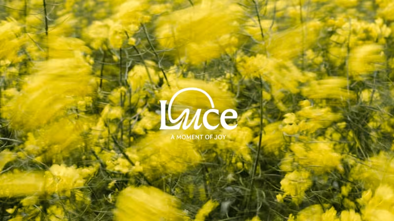
Luce - Vibrant Sustainable Candle Brand
1
38
0
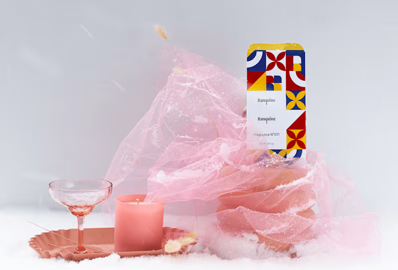
Banquine – Candle Branding & Packaging
0
34
0
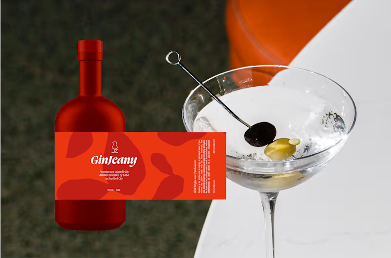
Modern, Vibrant NA Gin Brand & Packaging GinJeany
0
25
Packaging Designer
(4)
Follow
Message
Cara Ellis
max
London, UK
Designing for connection ⋆˚꩜。
$50k+
Earned
24x
Hired
5.0
Rating
1.7K
Followers
Top
expert
+1
Follow
Message
Designing for connection ⋆˚꩜。
3
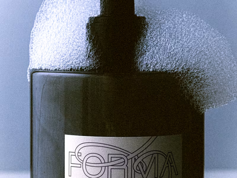
Forma Brand Identity and Logo Design
3
40
3
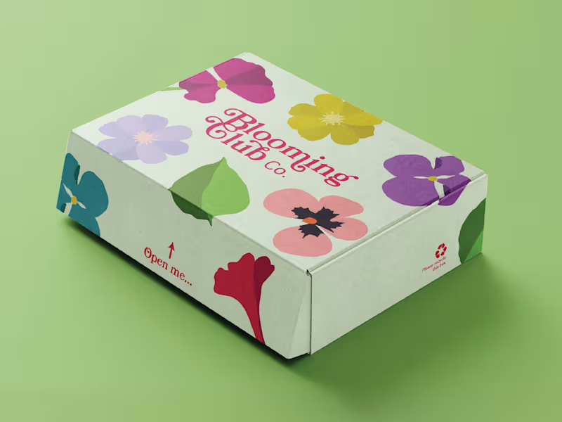
Brand Identity Design for Blooming Club Co.
3
59
7
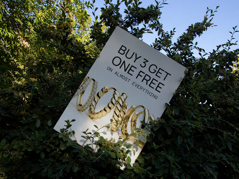
Retail POS and Merchandise Asset Development for Jewelry Brand
7
58
13
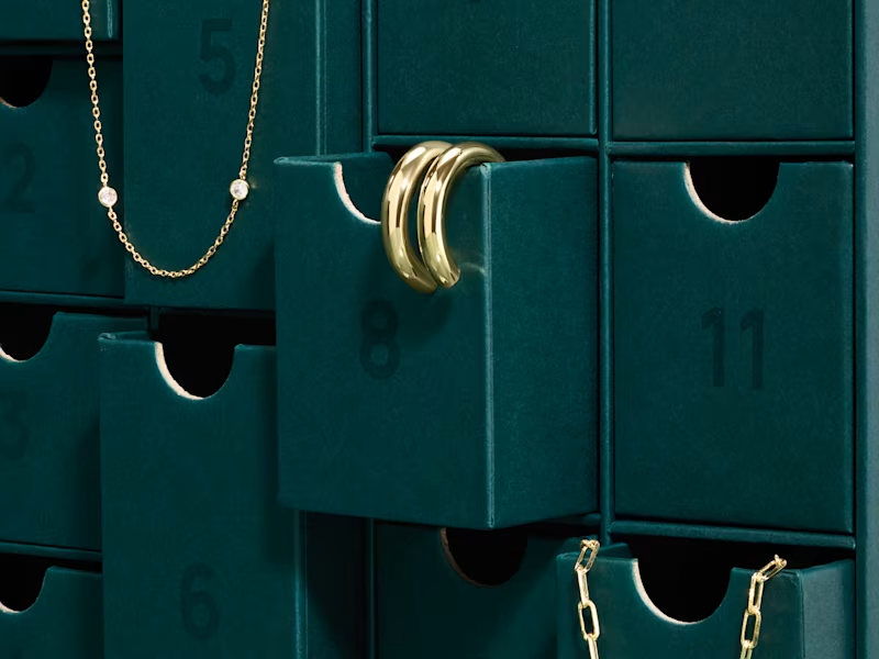
PAVOI Advent Calendar Packaging Design
13
217
Packaging Designer
(4)
Follow
Message
Raneem Wael
pro
London, UK
Brand + Launch Designer for Women-led with bold ideas.
8x
Hired
4.8
Rating
99
Followers
Follow
Message
Brand + Launch Designer for Women-led with bold ideas.
0
Keto & Green
0
2
0
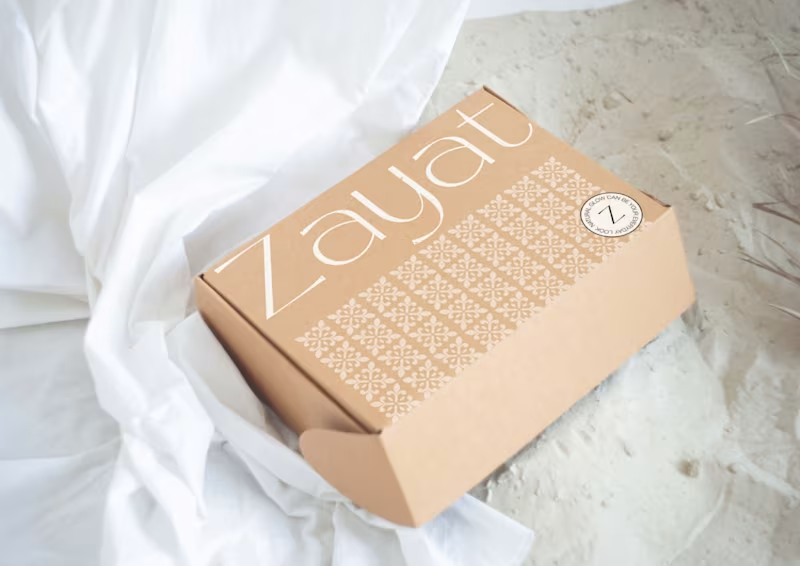
Zayat Beauty
0
8
0
Rogue | Brand Identity + Packaging
0
108
0
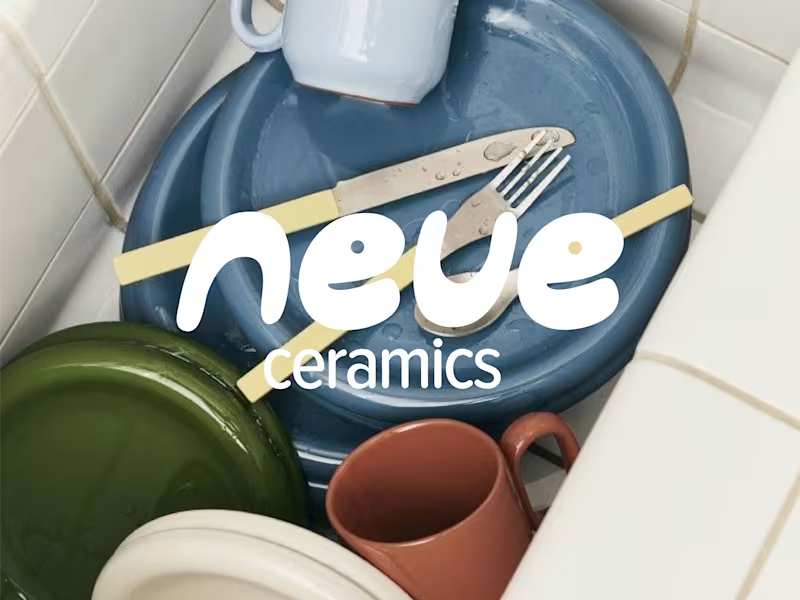
Neue Ceramics
0
6
Packaging Designer
(3)
Follow
Message
Jackson Tate
pro
London, UK
Brand Designer working with CPG brands
5.0
Rating
20
Followers
Follow
Message
Brand Designer working with CPG brands
0
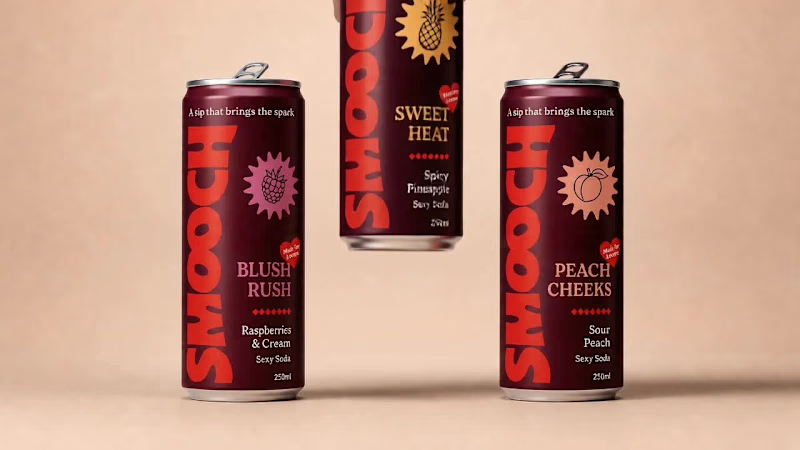
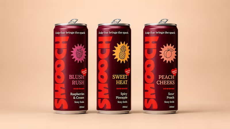
Smooch Aphrodisiac Soda - Full Brand Development
0
5
54
I built the Smooch brand from the ground up, strategy, identity, wordmark, colour world. The can was the last piece, the moment it finally became something real. The brief: a packaging system that scales. One hero flavour today, a full range tomorrow, no rebuild required. First problem, the logo. Smooch's bold wordmark has a curve underneath it that dies at full width on a can, and angling it across felt gimmicky, not confident. So I turned it vertical instead, running the full height, full scale. Colour had to carry the brand and split the flavours at once. Deep burgundy anchors it, red punches through the wordmark, and each flavour gets its own accent, blush, gold, peach. No fruit photography. Instead, a graphic starburst holding a simple illustrated fruit, ownable and ready for whatever flavour comes next. The back label carried ingredients, actives, and every mandatory without losing the premium tone.
30
54
2.2K
1
Lupr Brand Identity: Making AI Feel Simple
1
11
1
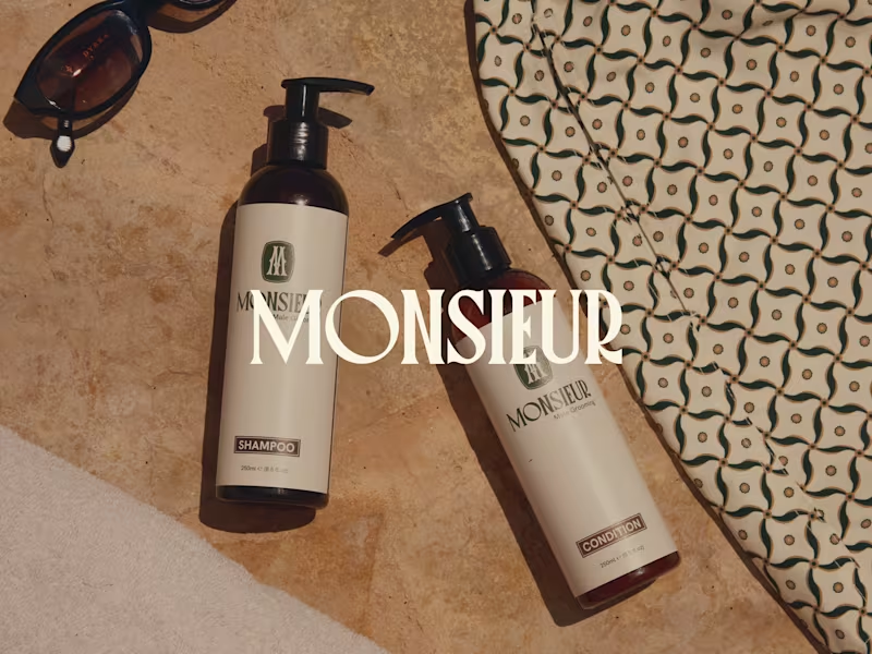
Monsieur Brand Identity Development
1
4
Packaging Designer
(2)
Follow
Message
Cuconno Studio
Hertford, UK
Premium Design: Branding, Web Design & Social Media
5.0
Rating
59
Followers
Follow
Message
Premium Design: Branding, Web Design & Social Media
0
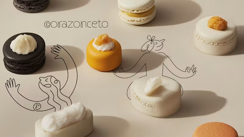
Brand design for bakery brand / Corazonceto
0
31
2
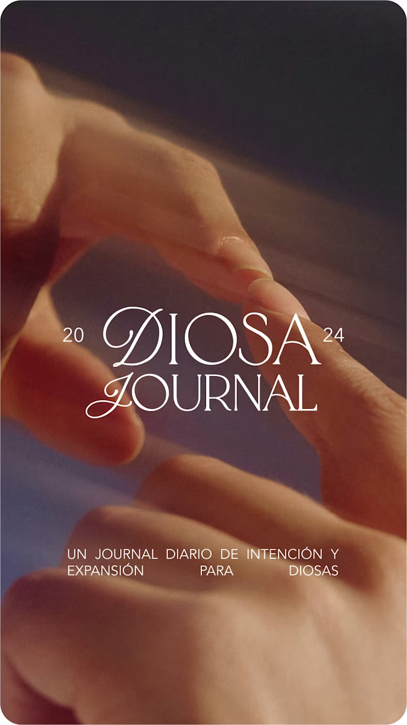
Eren Cazarin / Journal Design
2
38
28
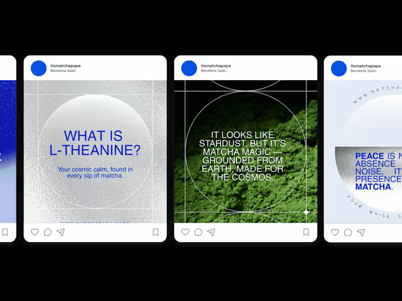
Social Media Design Template & Creative Direction for MATCHAPAPA
28
216
45
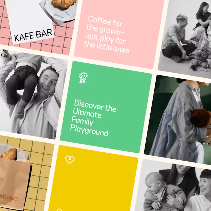
Branding for Kidtopia / Coffee & Playground
45
433
Packaging Designer
(2)
Follow
Message
Rodrigo Di Marzo
London, UK
Art Direction • Design • Branding • Packaging • AI
5.0
Rating
5
Followers
Follow
Message
Art Direction • Design • Branding • Packaging • AI
0
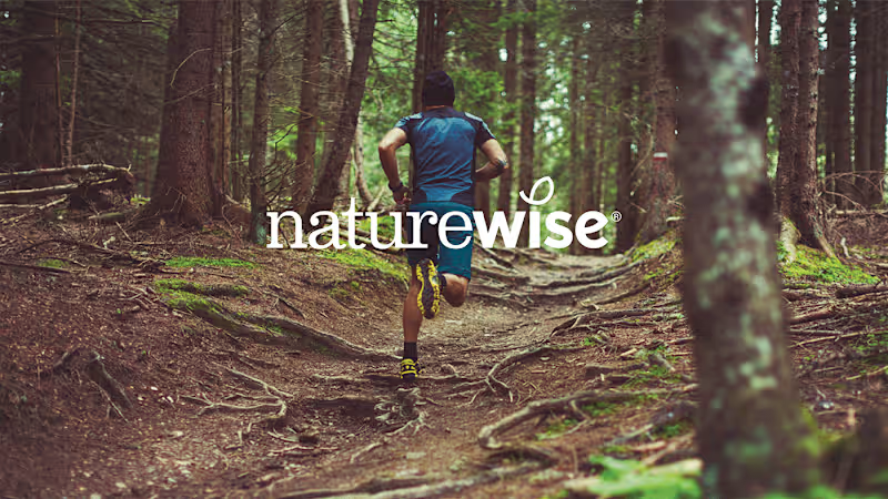
Naturewise - Logo Design, Visual Identity & Creative Direction
0
21
1
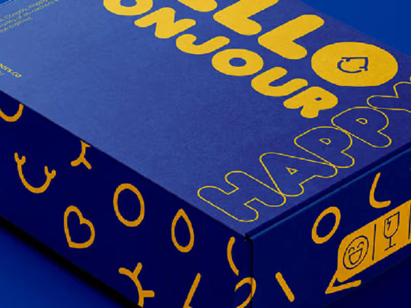
Happy Tears - Visual Identity & Packaging
1
6
2
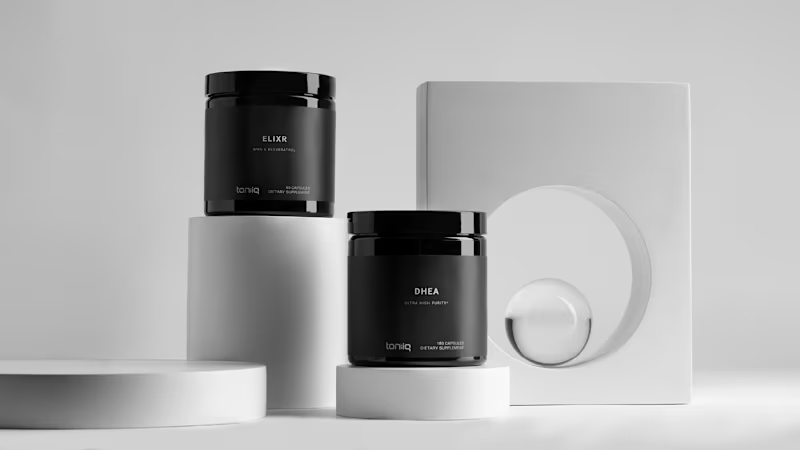
Toniiq Supplements - Branding, Creative Direction & Packaging
2
81
1
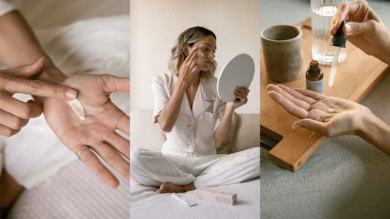
Beauts - Branding, Creative Direction, Website & Packaging
1
37
Packaging Designer
(3)
Follow
Message
Annie Heap
London, UK
Brand & Packaging Design Expert
5.0
Rating
3
Followers
Follow
Message
Brand & Packaging Design Expert
0
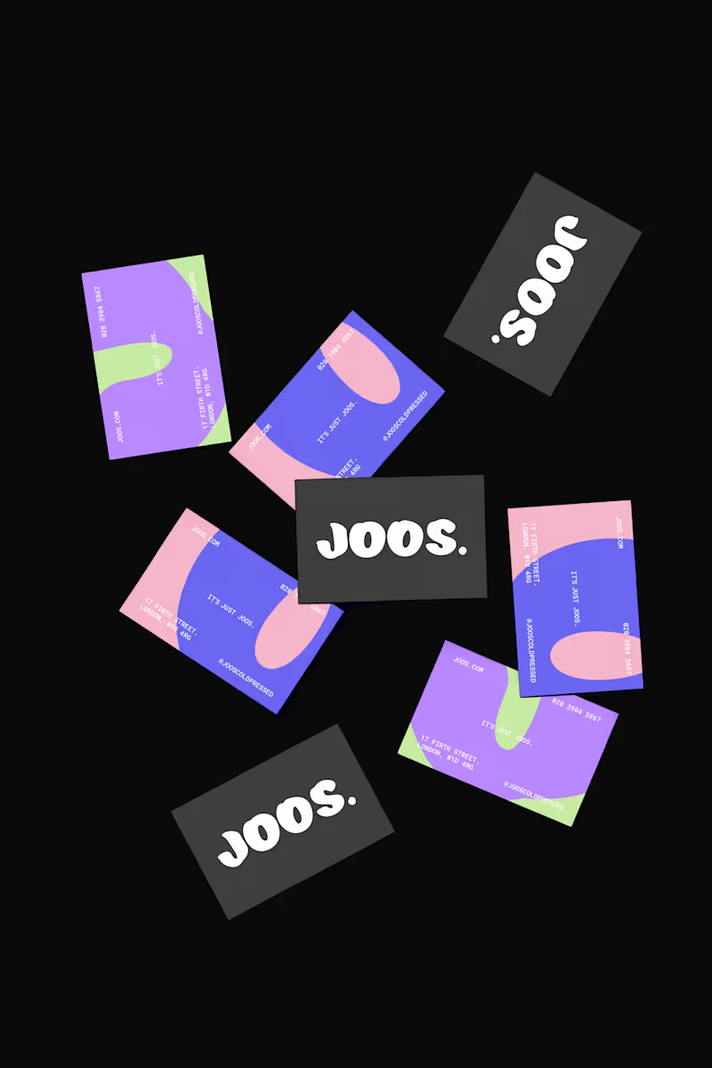
A bold brand for a cold pressed juice company
0
6
0
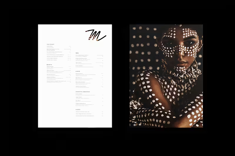
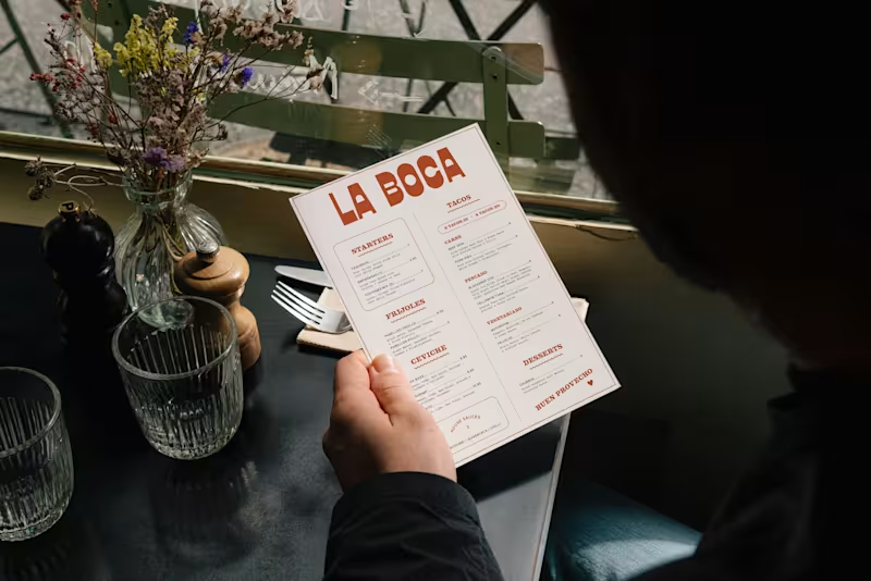
A rule breaking identity for an iconic bar & restaurant
0
10
0
An eclectic identity for a local Mexican fusion restaurant
0
12
0
A sophisticated brand for a seafood restaurant in Cornwall
0
14
Packaging Designer
(4)
Follow
Message
Explore people