Smooch Aphrodisiac Soda - Full Brand Development

Jackson Tate


The Brand
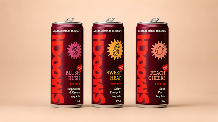
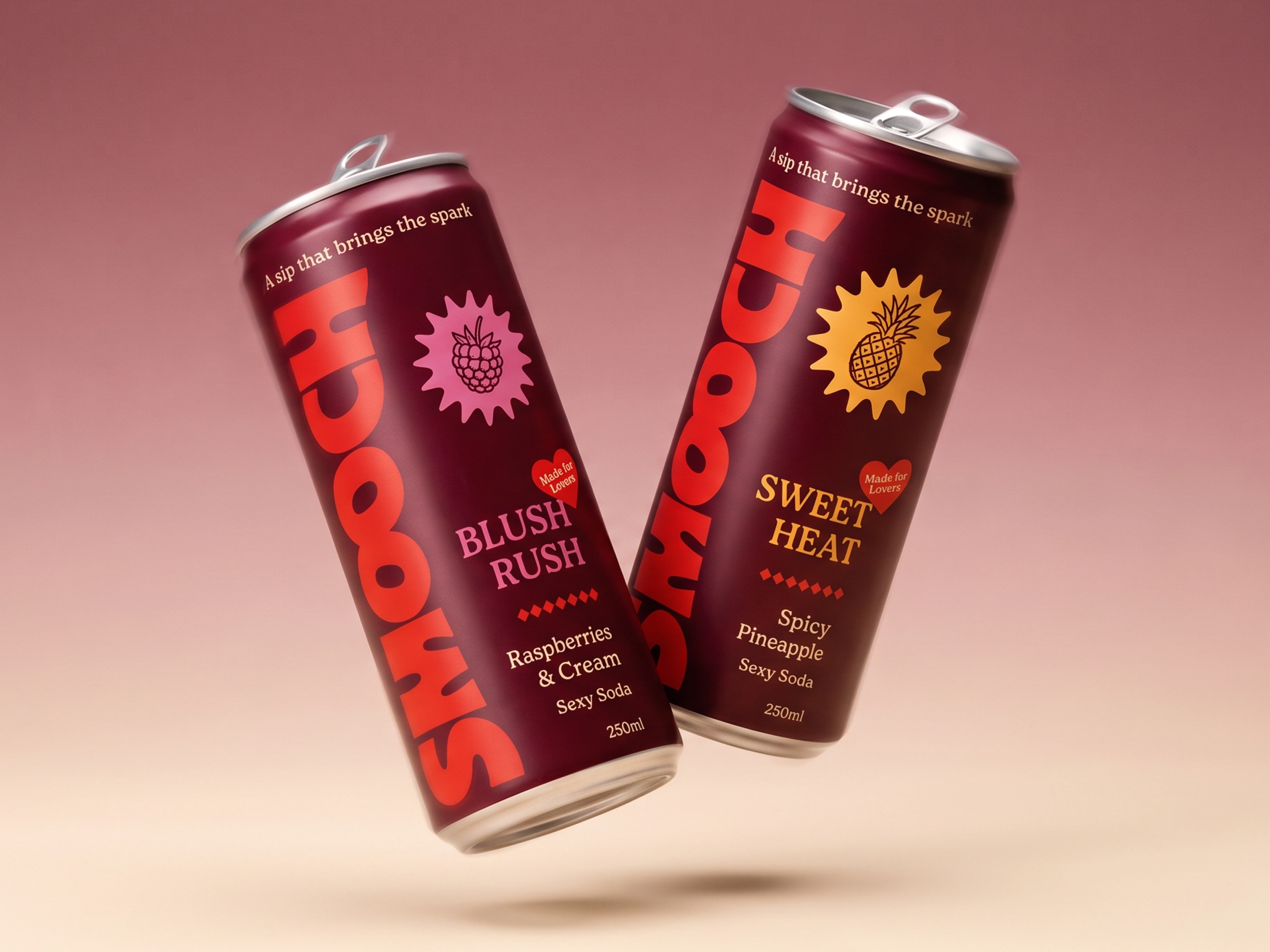
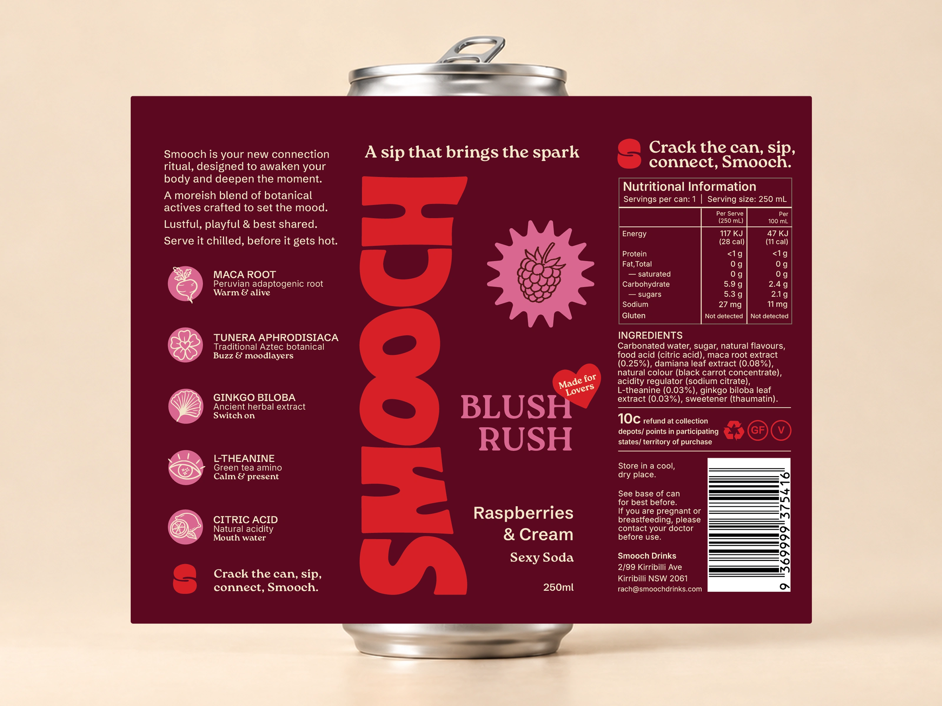
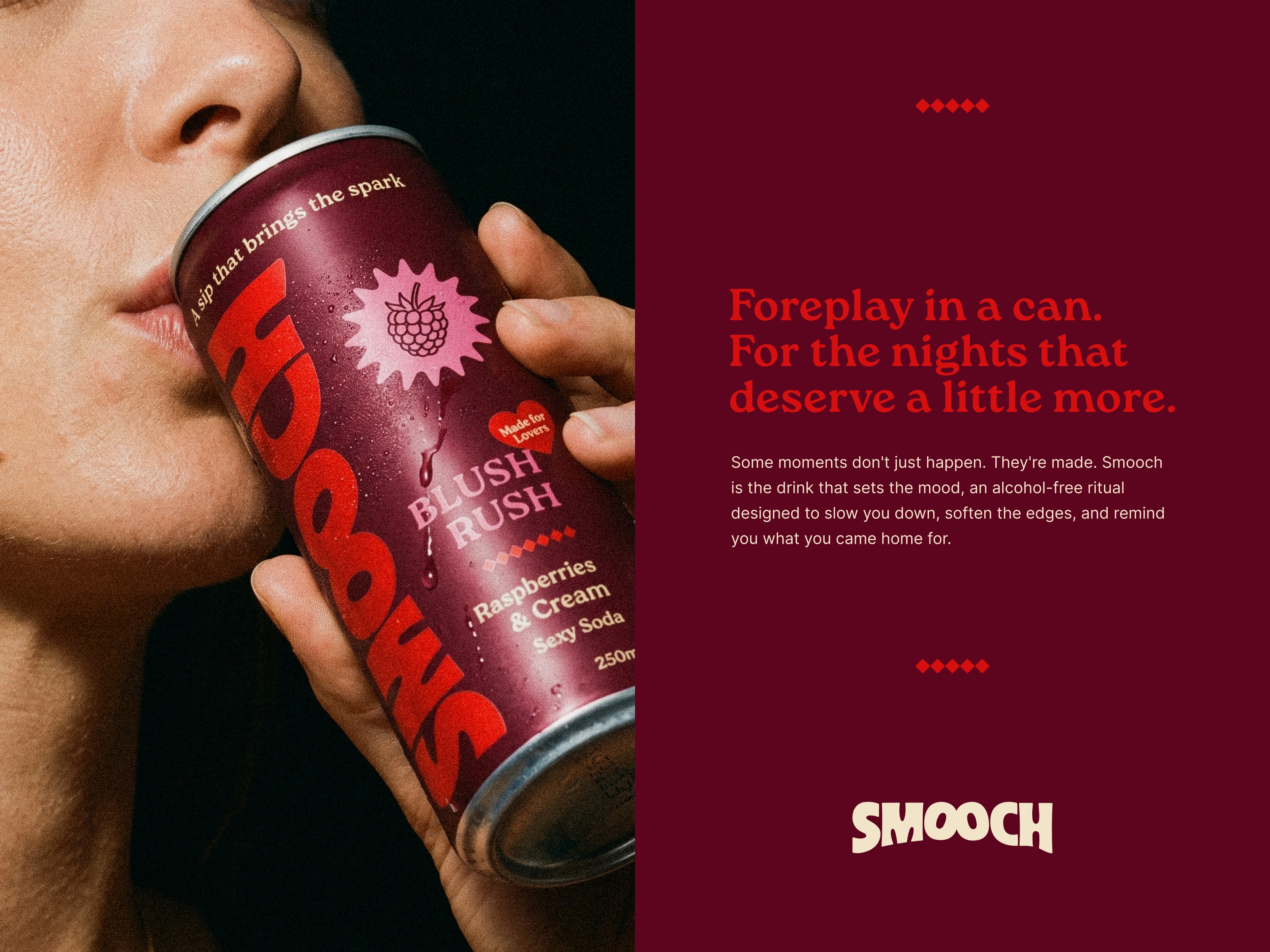
The Smooch wordmark runs vertical on the can itself, full height, full scale, solving two problems at once, it keeps the logo loud at a size that would otherwise shrink to nothing running horizontal, and it reads clean from either side of a tilted fridge shelf. Every colour, icon and layout decision had to work for flavour one and still hold up for flavour ten, a system built to grow rather than get rebuilt each time.
The Colour Palette
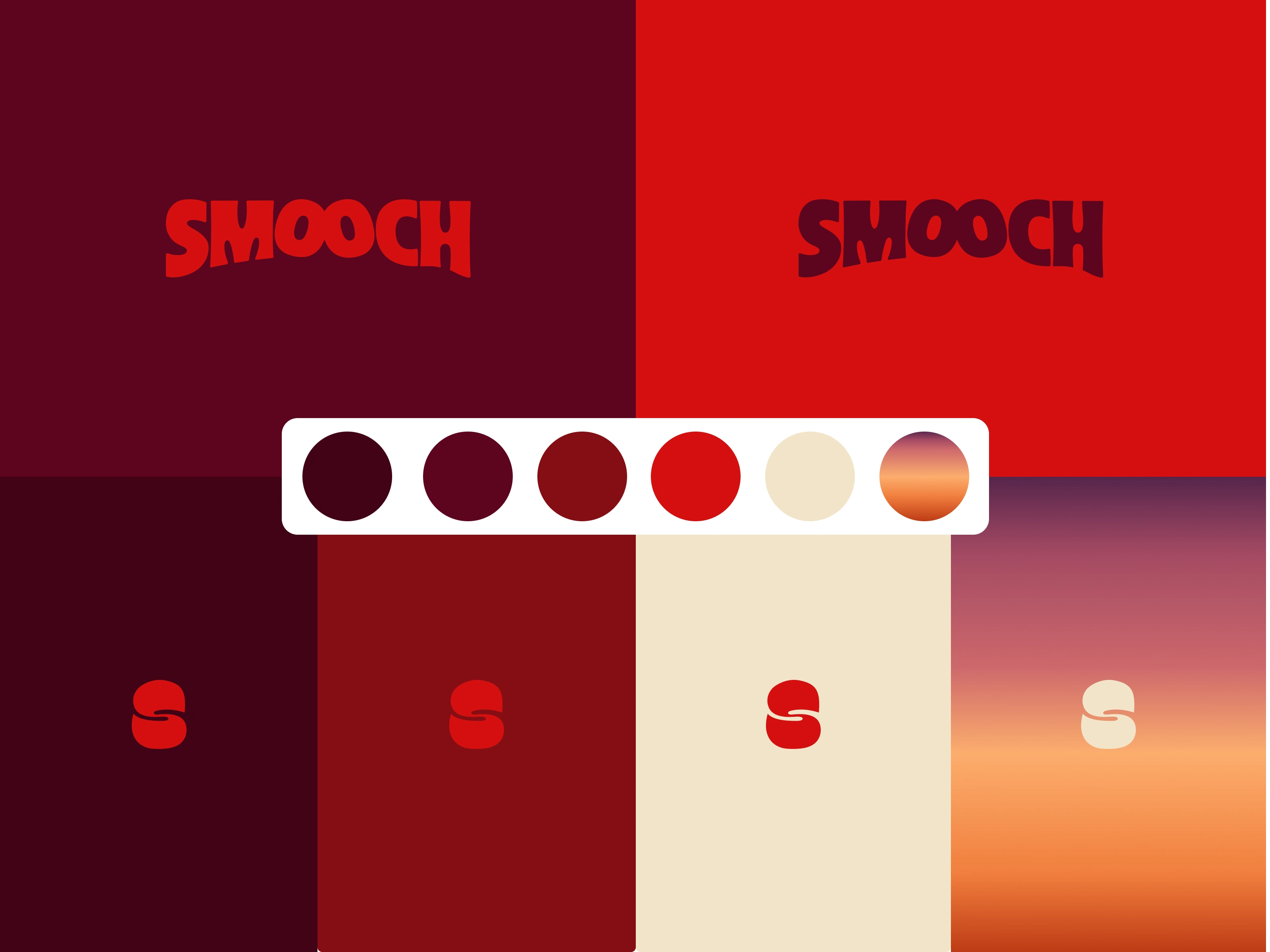
Mulberry, deep red, blush, cream, a sliver of sunset gradient. Each one earns its place on shelf. The dark tones carry the mood the category doesn't touch, the warmer accents keep it from tipping into anything clinical, and together they make Smooch impossible to mistake for anything else nearby.
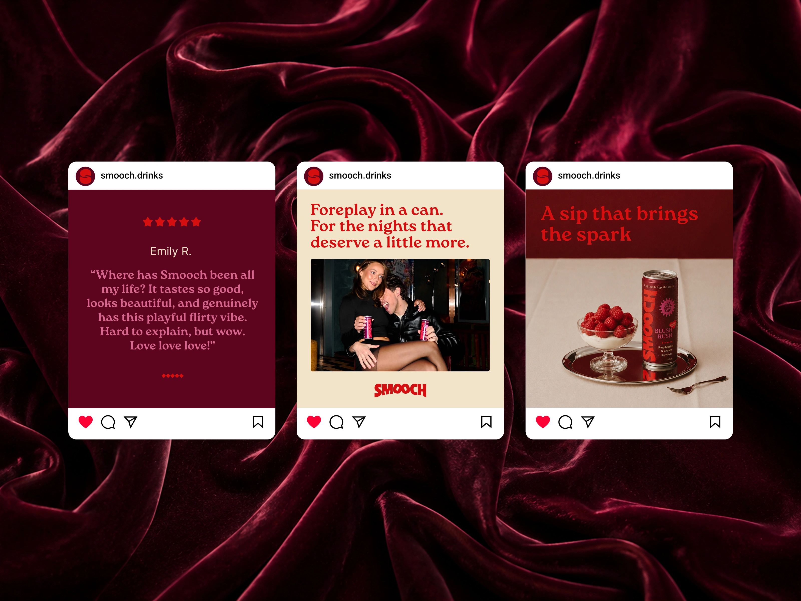
The real world
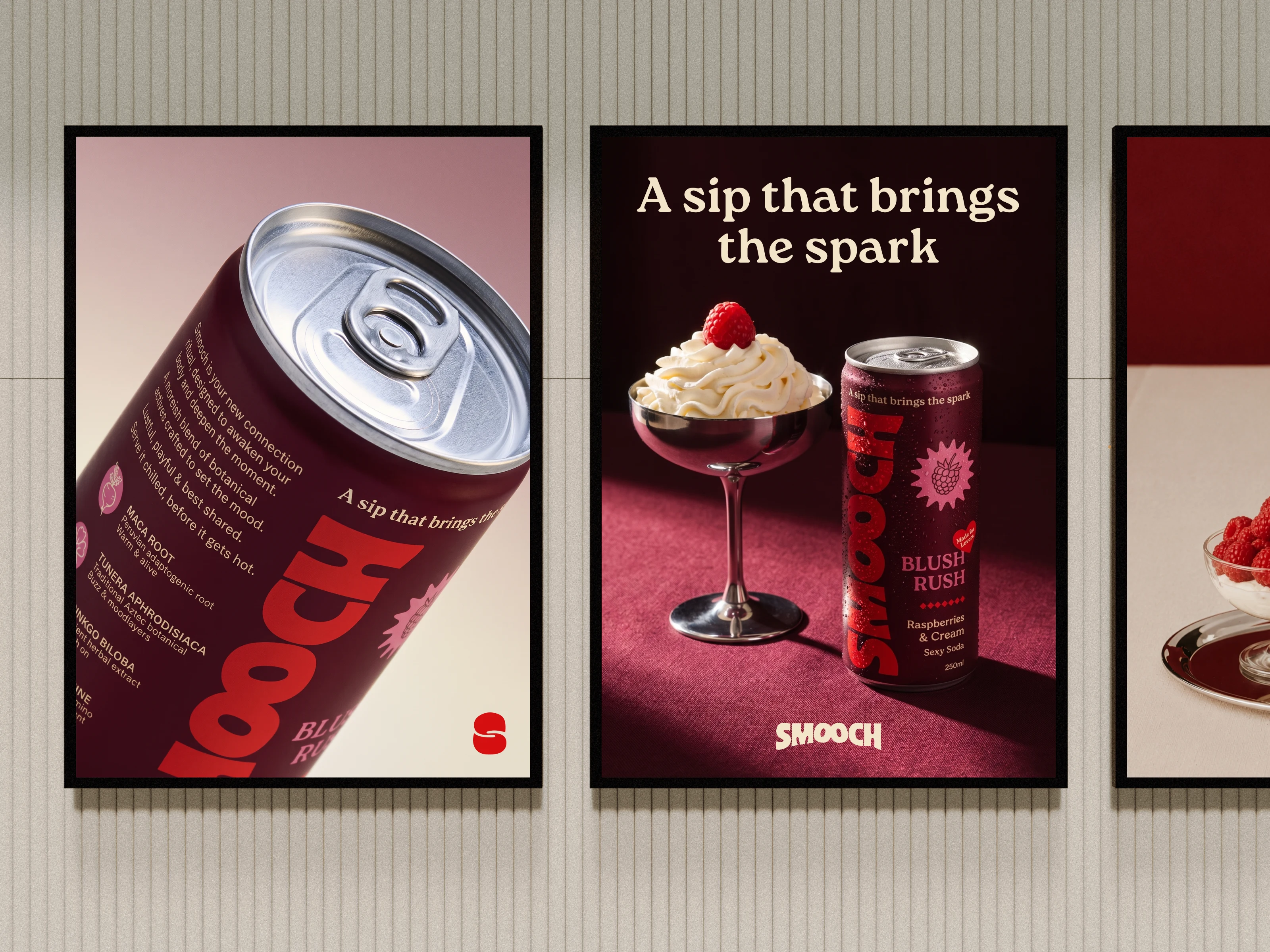
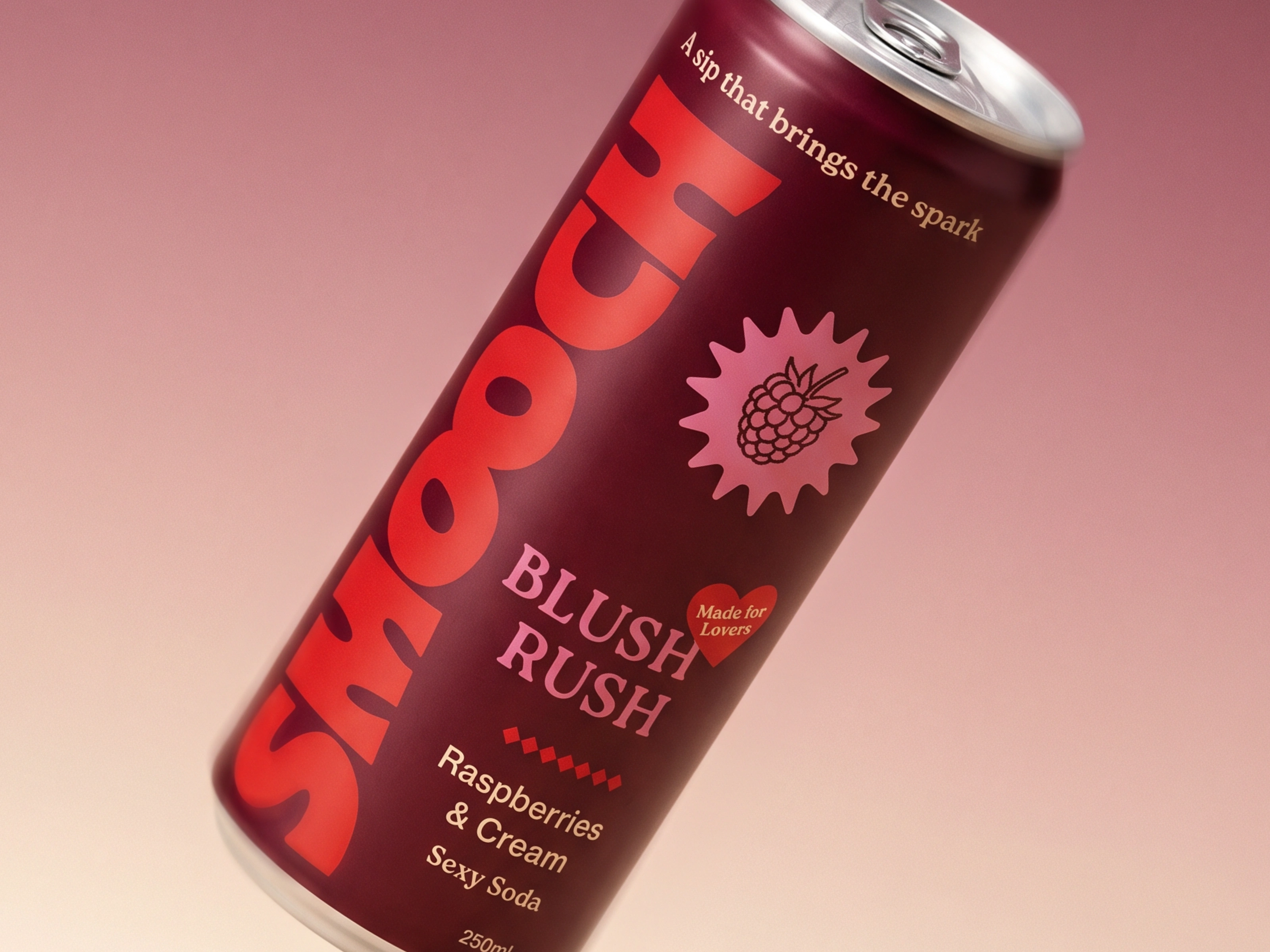
Packaging doesn't live in isolation. Before locking anything in, I tested how it would actually sit in a feed, a story, a product tag, next to a real review. A label that only looks good as a render on its own isn't finished. It has to hold up in the real places people will actually see it.
Like this project
Posted Oct 2, 2026
Full brand & packaging system for Smooch, built to scale from one flavour to a full range, moody & premium against everything else in the category and on shelf.
Likes
0
Views
8
Timeline
Jun 1, 2026 - Jul 15, 2026