Jackson Tate - Founder & Lead Creative | ContraWork by Jackson Tate
Jackson Tate

Jackson Tate

Brand Designer working with CPG brands

Ready for work

Jackson is ready for their next project!

Cover image for Lil Cutties arrived as a
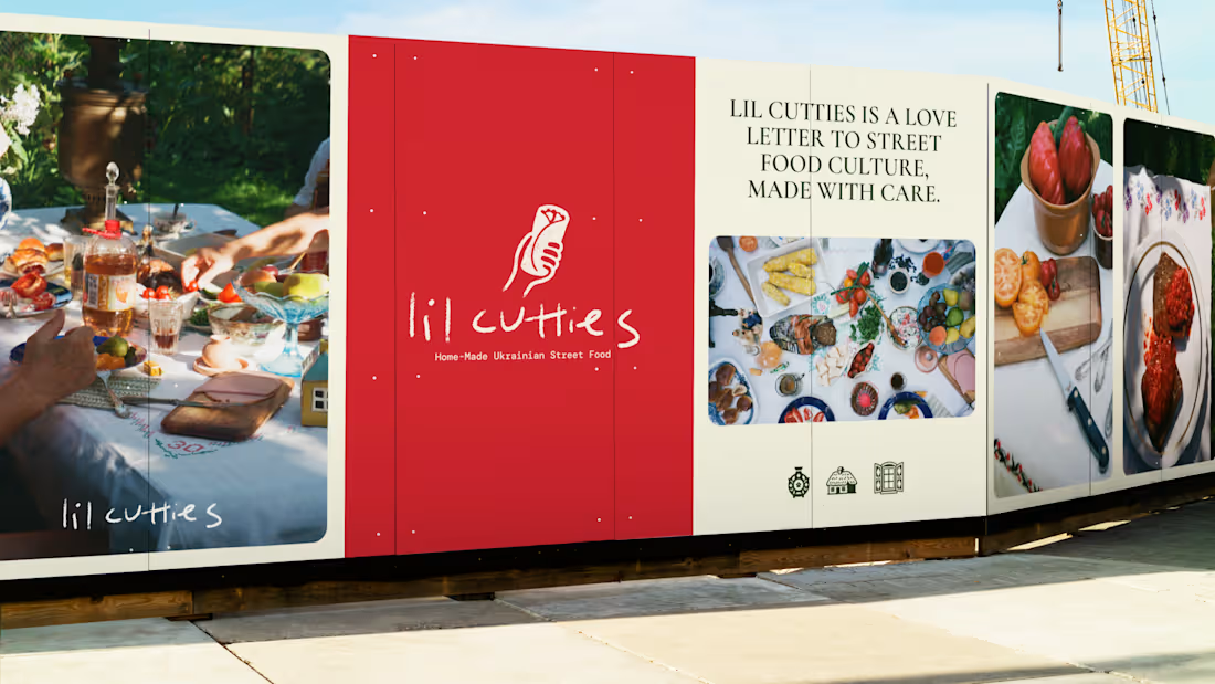
Lil Cutties arrived as a family-run Ukrainian street food concept, built around a family cutlet recipe and a stall in a Bristol food market. The ambition was a brand that felt unmistakably Ukrainian without leaning on the obvious signals, flags, colours, folk patterns straight off the shelf. Going there risked flattening a genuinely personal story into a costume, so the design had to earn that heritage through craft instead of decoration. Every colour got rooted in the actual ingredients, cucumber, tomato, pickled onion, rather than pulled from a mood board. The typography leaned hand-done and imperfect, less printed sign, more something scribbled with care. Photography built around a cross-section cut of the roll itself, so the product does the selling before anyone reads a word. The result is homely, hand-done, and full of craft, modern and new without ever tipping into gimmick, and quietly Ukrainian in a way that feels earned rather than performed.
0
2
Cover image for Monsieur came to me as
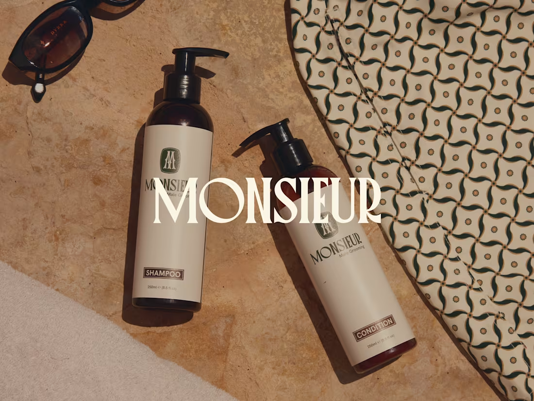
Monsieur came to me as a men's grooming brand that had tried to launch before. It never felt right. There was no strategy behind it, no real reason for the name or the look beyond what someone liked in the moment. So I took it back to strategy first. Purpose, positioning, personality, all before touching a single design. That's where Monsieur came from as a name. Premium and playful at once. Accessible, not elitist. The kind of brand a 22 year old and a 60 year old could both reach for. From there I built the mark around a signet style M. Deep heritage green that reads almost black depending on the light. Clean modern type to keep it from tipping into stuffy old world territory. Every choice had to earn its place. On a bottle. In a bathroom. On a hoodie. The result looks like proper old money at first glance. But it's built for anyone who wants to look sharp without the fuss.
0
5
Cover image for First or Nothing came to
First or Nothing came to me as a founder-led supplement brand already selling well, but their logo was just the wordmark paired with a number 1 icon, simple, but it didn't mean anything. So I built a new layered mark rooted in the brand's actual strategic positioning, its obsession with going all in, four elements converging into one focal point, arrows becoming a mountain, a face, an eye, the glabella line between your eyebrows that only shows when you're truly locked in. Every version had to earn its place on two fronts at once, sharp and scientific enough to trust with what you put in your body, human enough to want on your chest. From there I built out the full brand system, logo, icons, typography, colour palette, illustration direction, apparel, all carrying that same instinct for hidden meaning that rewards a second look. The result is a brand people don't just buy from, they want to wear it, explain it to a friend, and go all in with it.
2
1
18
Cover image for Smooch came to me as
Smooch came to me as a founder-built idea with real momentum, an intimacy soda built to help people reconnect, but a brand that hadn't yet earned the category it wanted to create. The challenge was tension itself: sexual wellness only ever seemed to live in two places, clinical and forgettable, or overtly sexual and tacky, and Smooch needed to exist somewhere else entirely, sophisticated enough to trust, playful enough to want. I rebuilt the brand around a single idea, that this wasn't a product to fix desire but an invitation to make space for it, and let that idea shape everything from the colour world to the wordmark, where two faces now sit hidden inside the letterforms, leaning in. The result is a brand built for the fridge, the shelf and the boardroom in equal measure, one that can talk about intimacy without ever needing to show it.
1
20