The network for creativity
Join 1.25M professional creatives like you
Connect with clients, get discovered, and run your business 100% commission-free
Creatives on Contra have earned over $150M and we are just getting started
Back to feedPost


I built the Smooch brand from the ground up, strategy, identity, wordmark, colour world. The can was the last piece, the moment it finally became something real.
The brief: a packaging system that scales. One hero flavour today, a full range tomorrow, no rebuild required.
First problem, the logo. Smooch's bold wordmark has a curve underneath it that dies at full width on a can, and angling it across felt gimmicky, not confident. So I turned it vertical instead, running the full height, full scale.
Colour had to carry the brand and split the flavours at once. Deep burgundy anchors it, red punches through the wordmark, and each flavour gets its own accent, blush, gold, peach.
No fruit photography. Instead, a graphic starburst holding a simple illustrated fruit, ownable and ready for whatever flavour comes next.
The back label carried ingredients, actives, and every mandatory without losing the premium tone.


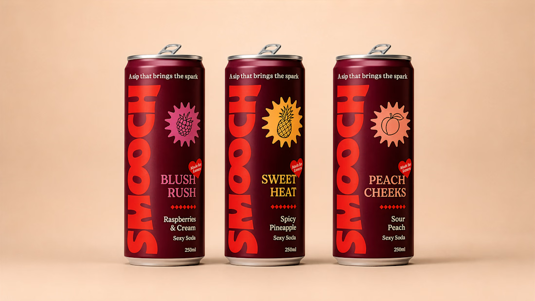

Going vertical also quietly solved the shelf problem: cans sit in a fridge door at a slight angle and a horizontal wordmark rotates out of legibility, whereas a full-height one still reads from either side. Curious whether the starburst has a fixed point count across flavours or...
Thanks, yes agreed, we loved how the wordmark runs up the side, works great across cafe shelves and fridge doors.
The starburst stays fixed, only colour and fruit change. We explored varying the shape too, but kept it consistent so the flavour does the talking, not the shape.

Love thissss
Thank you!

No product shoot. No problem. what a work
Exactly! Small studio's got to do what they can when the client doesn't have budget for a shoot when they launch.
Yeah thats true

those names are so catchy, i love the power you harnessed there with wordplay!
Thanks, they help bring through the brands playful but premium vibe hey.

The graphic starburst instead of real fruit photography is such a smart call, it ages better and scales to future flavors without a reshoot every time. Was that a budget call originally, or did it just win out on brand fit?
Thanks! I totally agree. It was a mix of reasons, but mostly felt the starburst / illustrations was more adult and premium as an on can visual which aligned better with the target audience. But the bonus reason that it's a scaleable system for when the product range expands too. 🙌

Thank you 🙌
Myself and the client were very pleased with how it turned out too!

Great work
Thank you! 🙏

Wow super cool packaging work Jackson, great job!! 😍
Thank you I'm glad you like it!

Burgundy as the anchor with each flavor getting its own accent is a smart way to keep shelf presence and range flexibility at the same time. Did the burgundy come first and the accents got built around it, or did the whole palette land together?
Thanks I totally agree hey!
The Burgundy was a core brand colour we landed on and then we build out the flavour colours off the back of it. Making them vibrant but still from the same world.

Excellent work
Thank you!

The design looks awesome. Great project!
Thank you!

Amazing work!
Thank you!

Such awesome design. Can i do work with you?

Wow! It's creative!
Thank you!

Such a clean and punchy multi-SKU system! Love how the vertical wordmark creates a strong brand block, and the graphic fruit icons feel incredibly premium. And the mockup itself is so crisp and clean — fantastic work!
Thank you, really glad you like it!
The network for creativity
Join 1.25M professional creatives like you
Connect with clients, get discovered, and run your business 100% commission-free
Creatives on Contra have earned over $150M and we are just getting started









Related posts

Pakeging Design Brand Design Product Design


😍

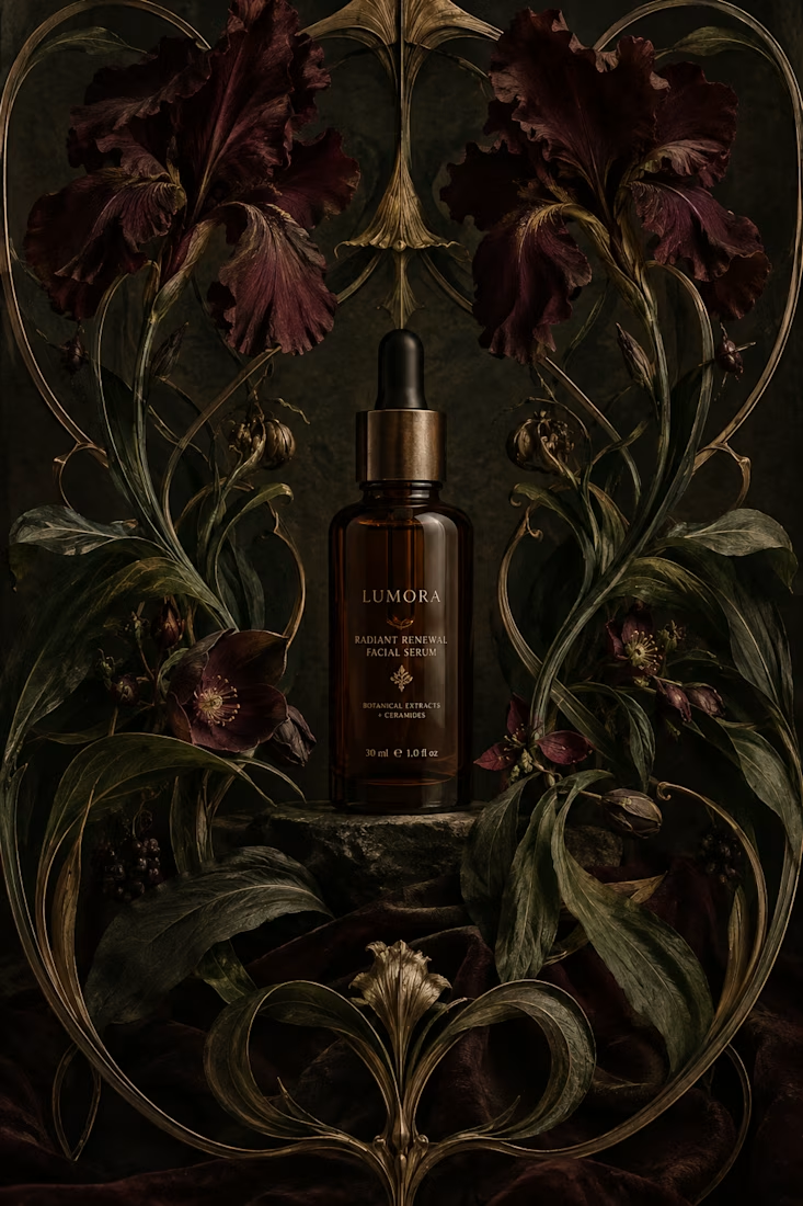
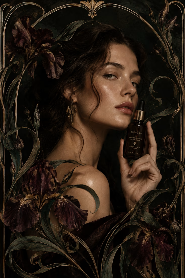
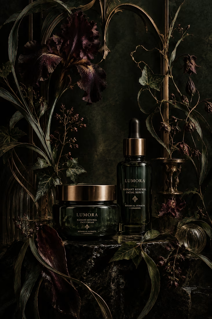
What would happen if a modern skincare product had to communicate without the visual language we associate with beauty today?
Instead, I went back to Art Nouveau, where typography, illustration, architecture, and ornament were treated as one visual system.
The subject actually...

thanks for sharing!

🎨 Graphic Design Is More Than Just Making Things Look Good!
Great design is about telling a story, communicating a message, and creating a lasting impression. ✨
From a memorable logo to eye-catching packaging, every design element plays a role in how people recognize and connect with a brand.
I believe effective graphic design combines creativity, strategy, and simplicity to turn ideas into meaningful visual experiences.
💡 My design philosophy:
✨ Keep it creative and purposeful.
🎯 Make every detail meaningful.
🎨 Build a consistent and memorable brand identity.
💫 Design with the audience in mind.
Whether it’s branding, packaging, social media graphics, or digital design, my goal is to create visuals that make brands stand out.
here is my portfolio
💬 What do you think makes a design truly memorable — its colors, typography, or overall concept? Let’s discuss!
#GraphicDesign #BrandIdentity #LogoDesign #PackagingDesign #CreativeDesign #Contra
sites.google.com
SARA
Hi Hi, I’m SARA! A creative Graphic Designer who loves turning ideas into eye-catching designs. I specialize in logo design, branding, packaging, UI/UX, business cards, flyers, brochures, presentations, and social media graphics. My goal is to help businesses stand out with unique, professional,

Absolutely graphic design is about visual communication great advice 🎉🔥