Naturewise - Logo Design, Visual Identity & Creative Direction

Market: USA
Goals: Logo Design, Visual Identity & Creative Direction
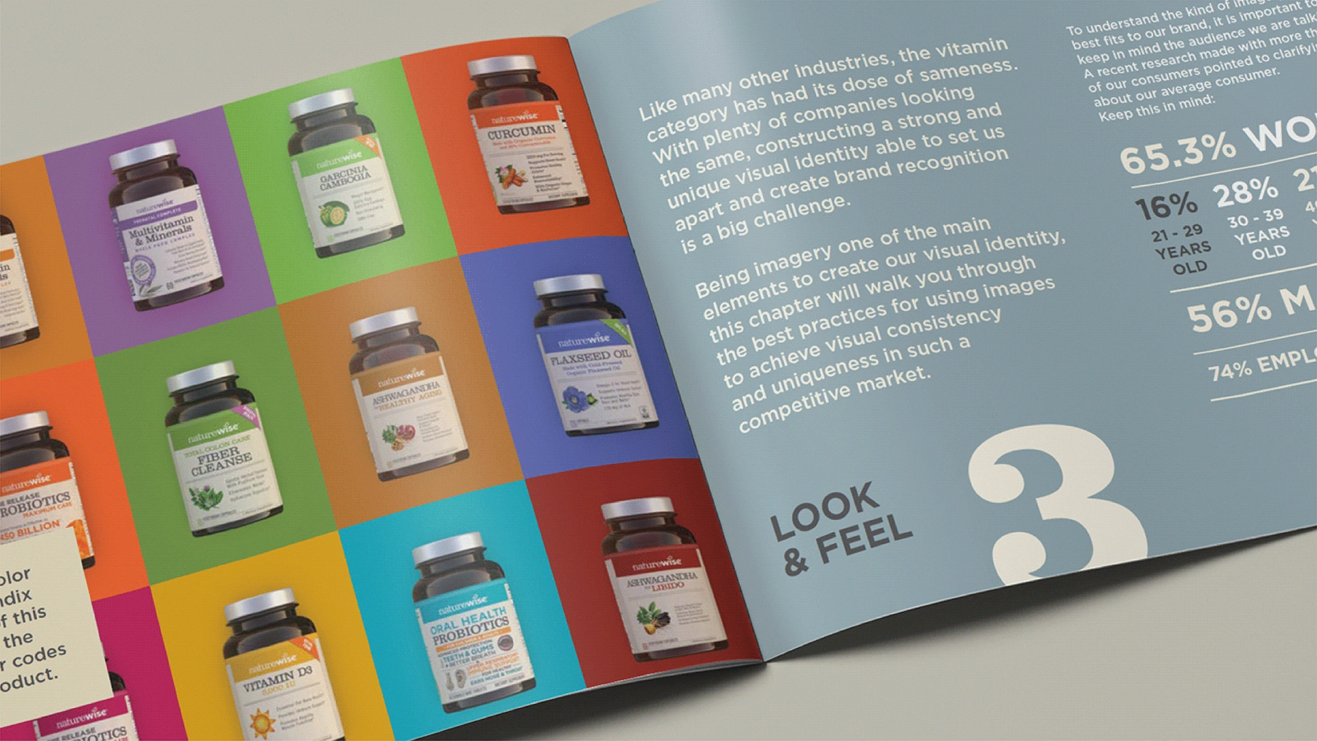
With plenty of companies feeling and looking similar, the vitamin industry has had its dose of sameness over the past years. So in a market full of repetitions that customers are used to and bored by, how does a company create a visual identity that is unique, competitive, and compelling?
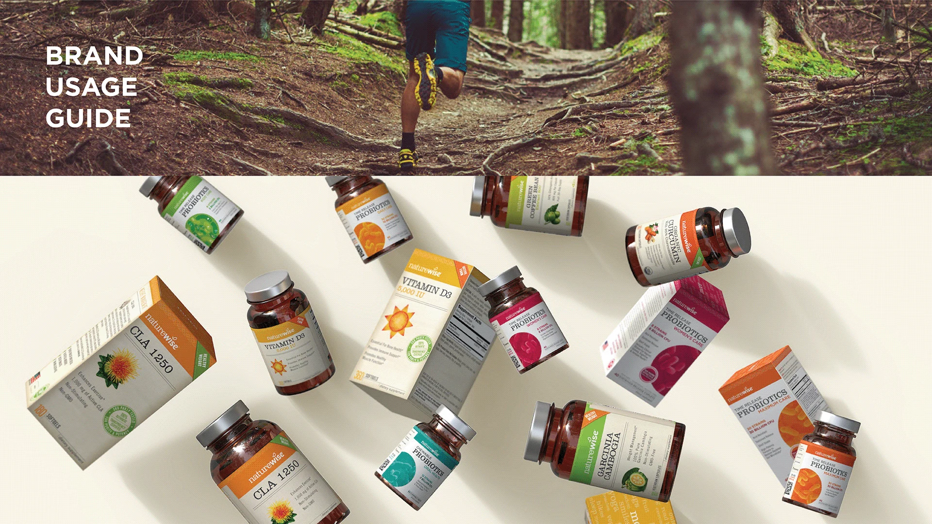
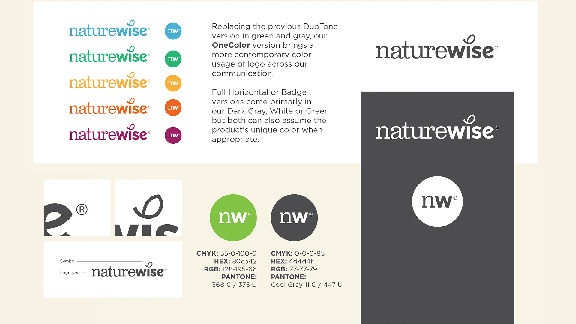
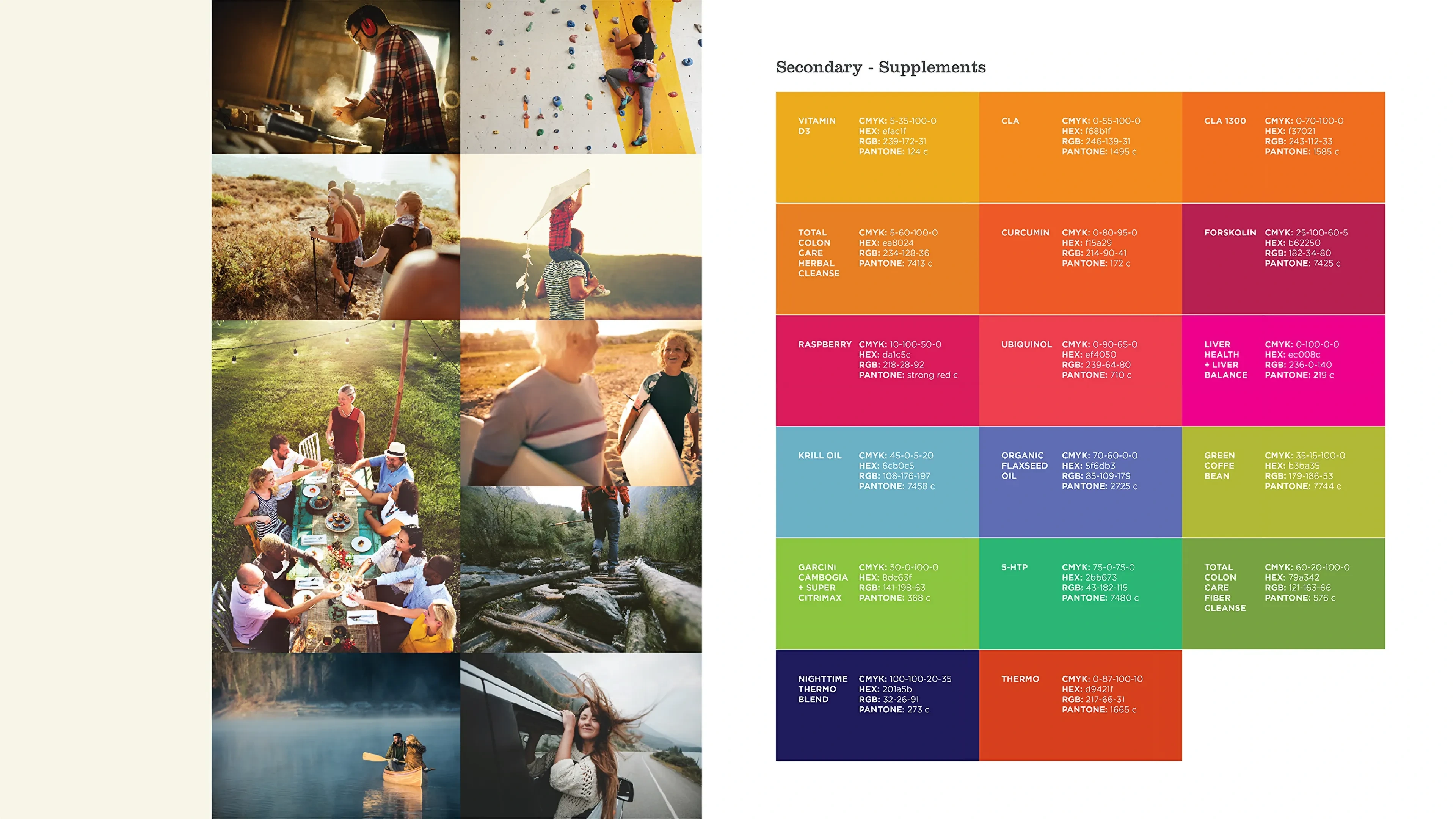
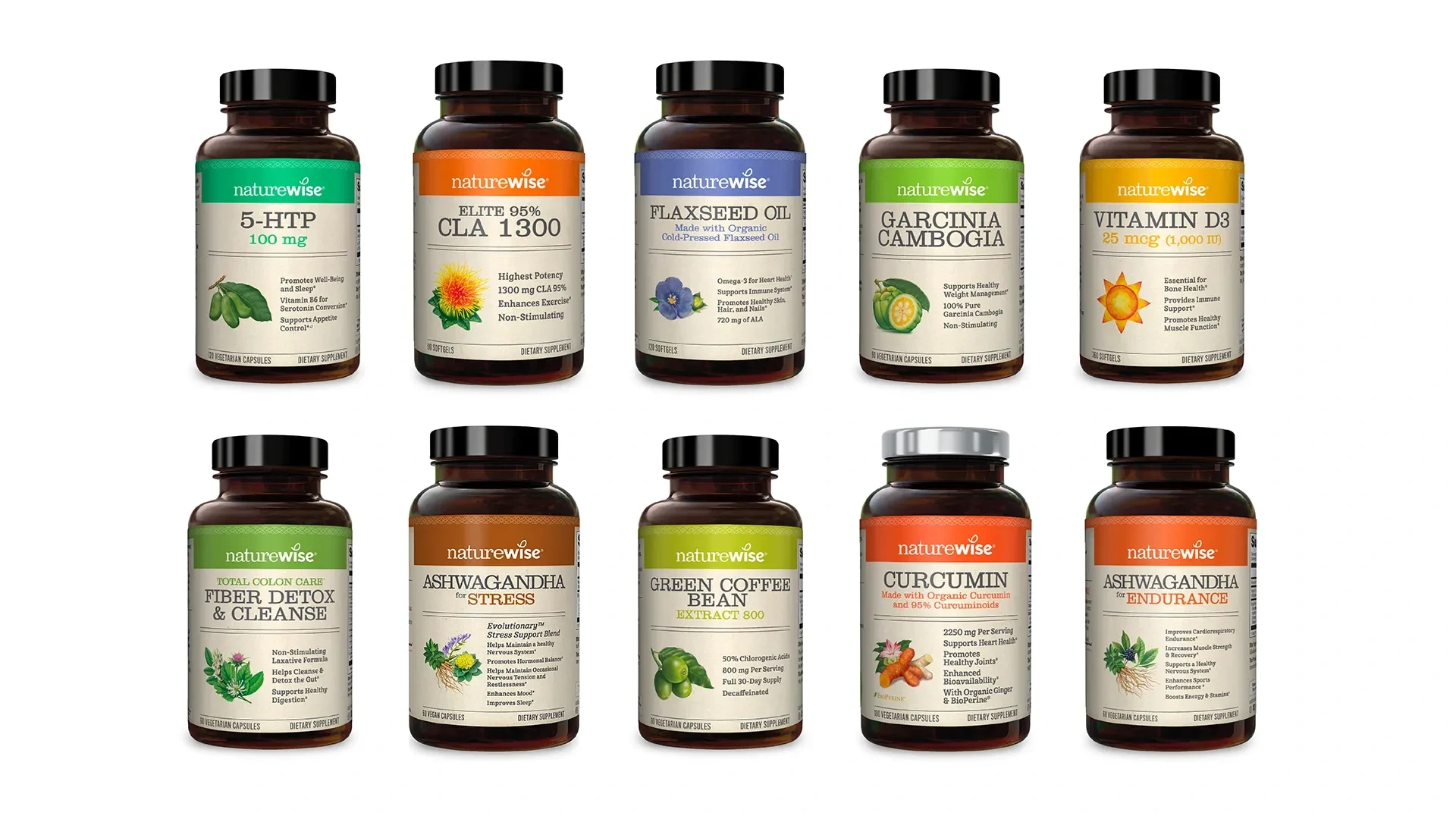
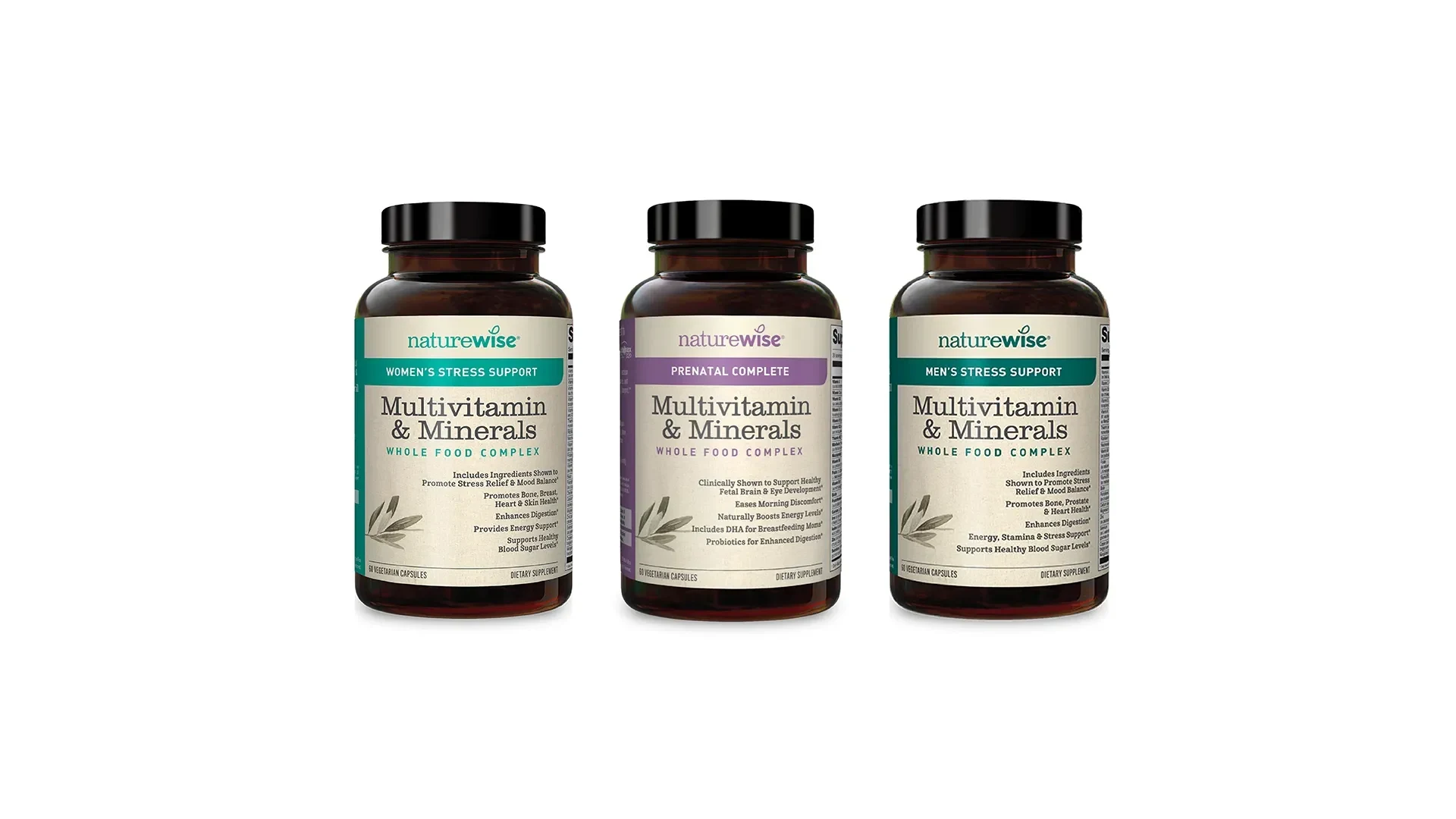
With the company growing quickly over the past years, we wanted NatureWise's identity to allow for consistent and creative scalability. This journey is documented on a brand visual guide with definitions of the primary visual elements, from logo usage to typography, color palette, imagery, and packaging.
A new visual system, updated with the company's growth and values, was elaborated upon and implemented. In addition, brand presence in the digital realm was improved, and a new institutional vs. product-level visual hierarchy was created to bring more color to the overall communication.
Like this project
Posted Sep 15, 2023
NatureWise offers a fresh take in a saturated vitamin world. Our design defines a scalable, vibrant identity for evolving growth & digital presence.
Likes
0
Views
14

