A bold brand for a cold pressed juice company
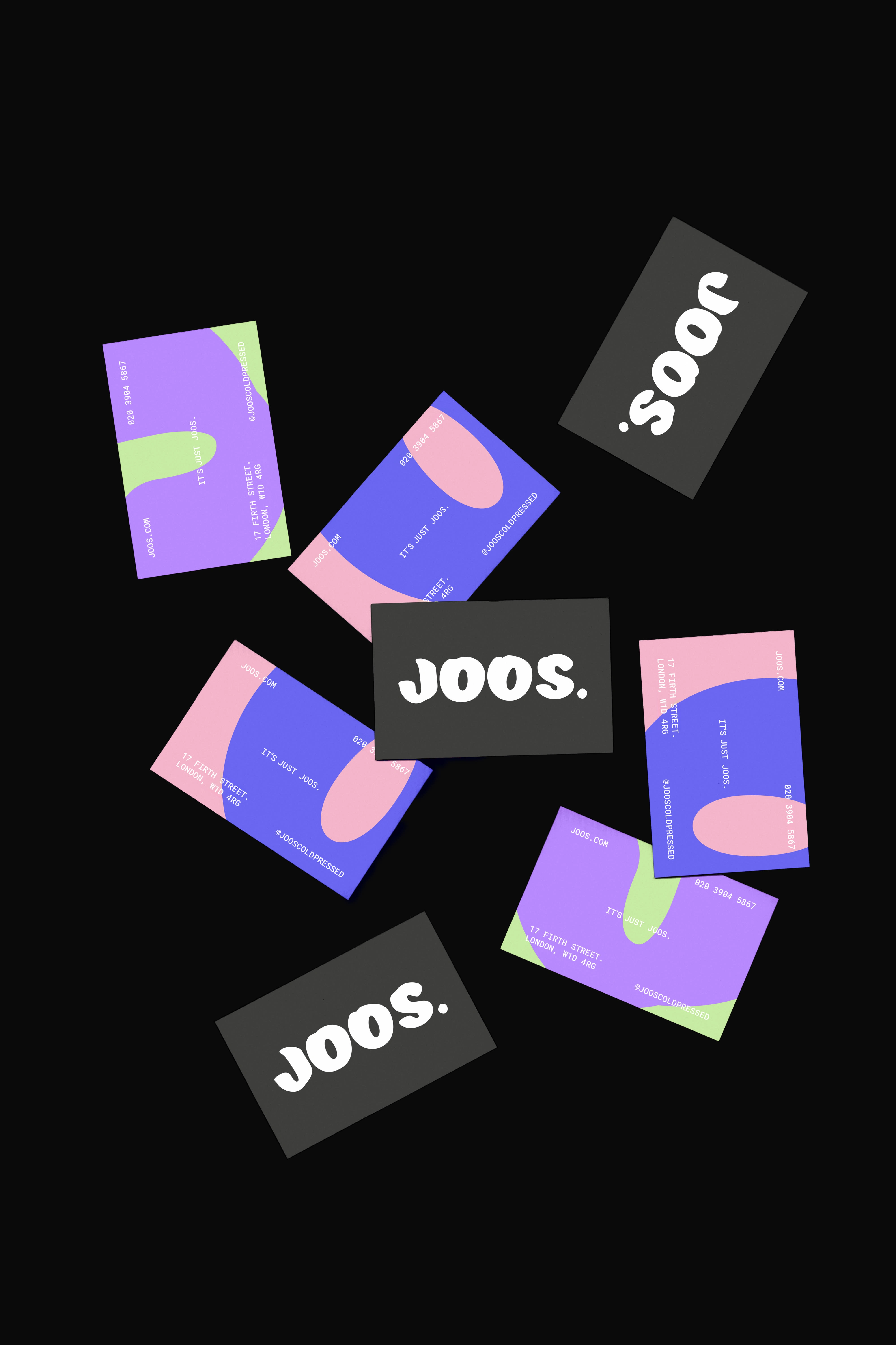
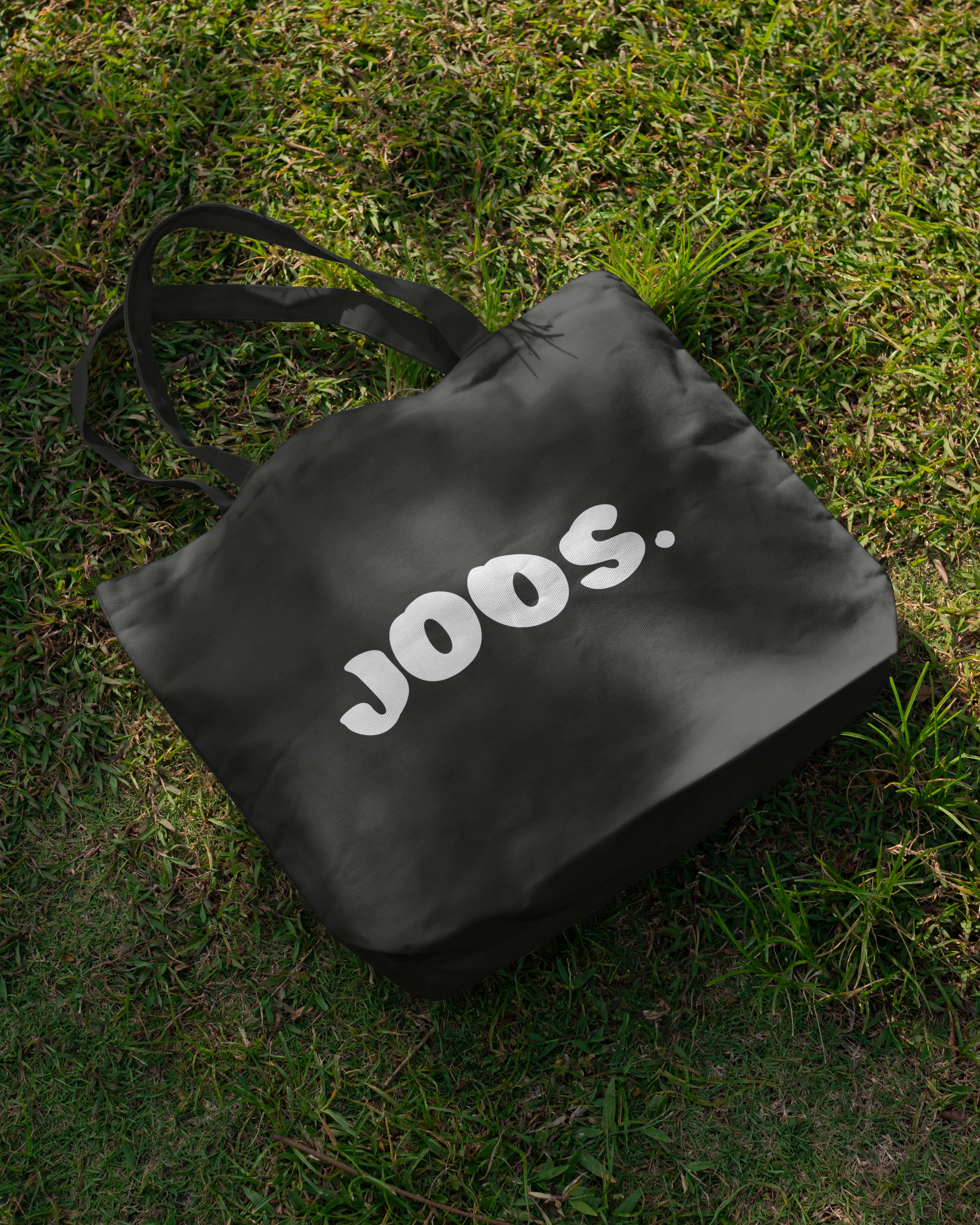
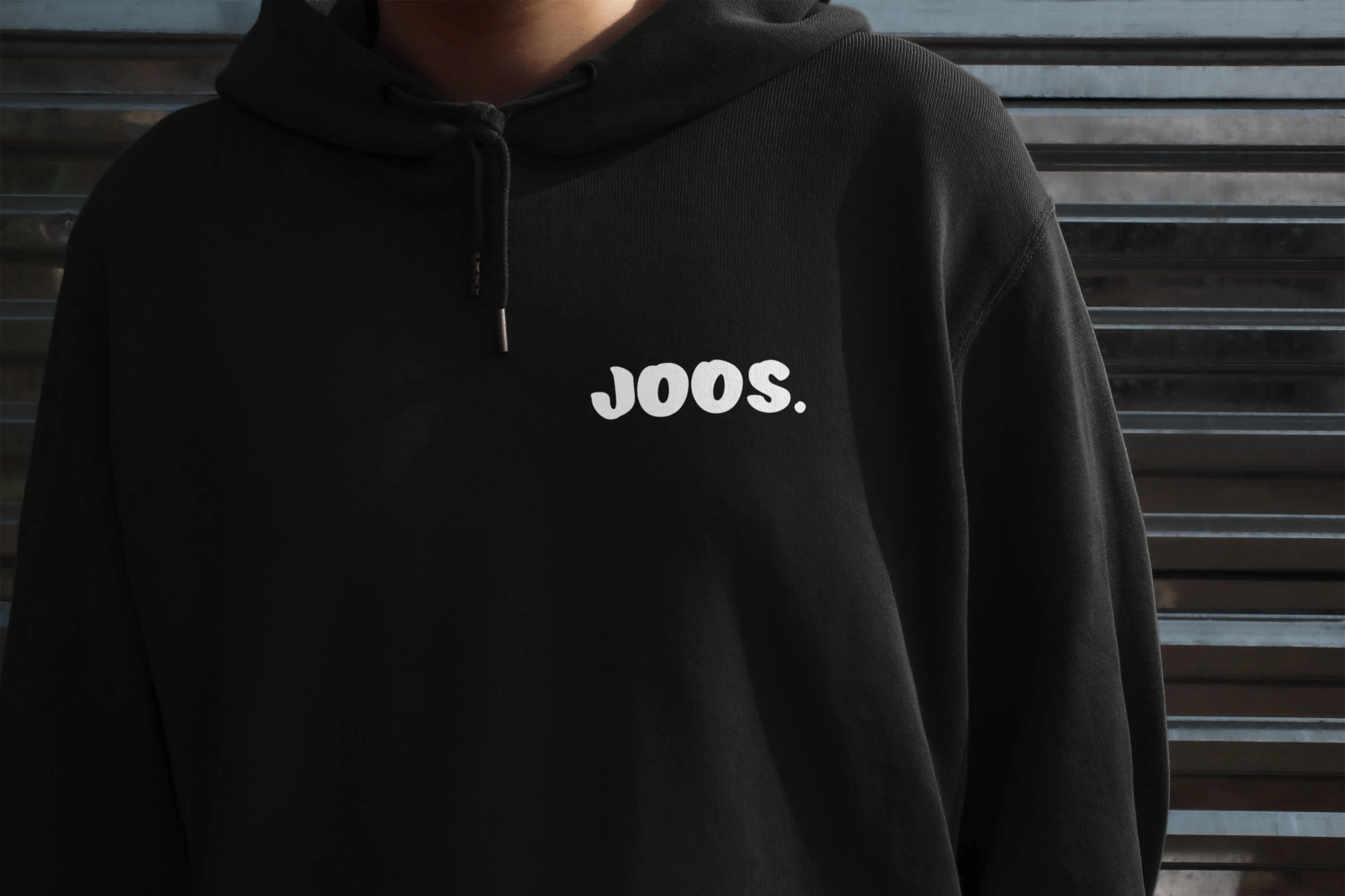
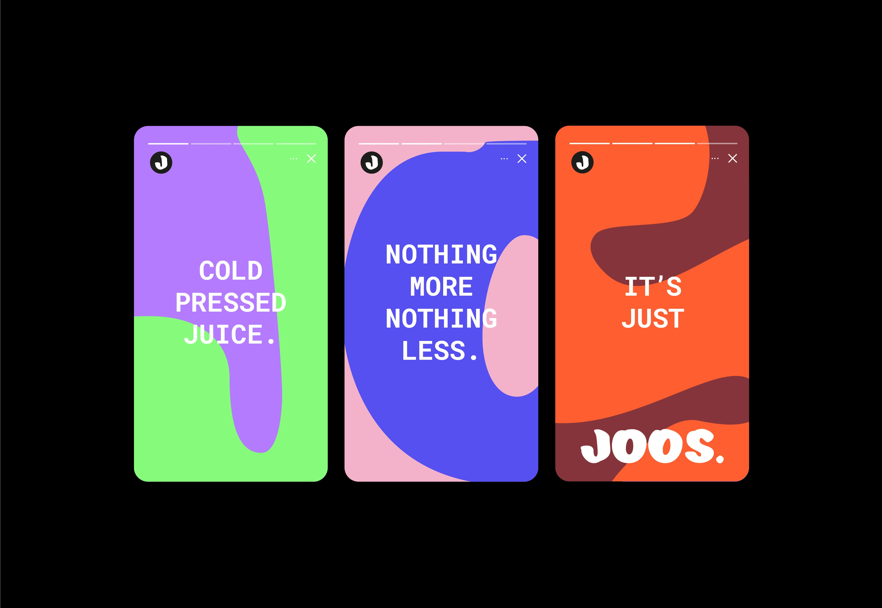
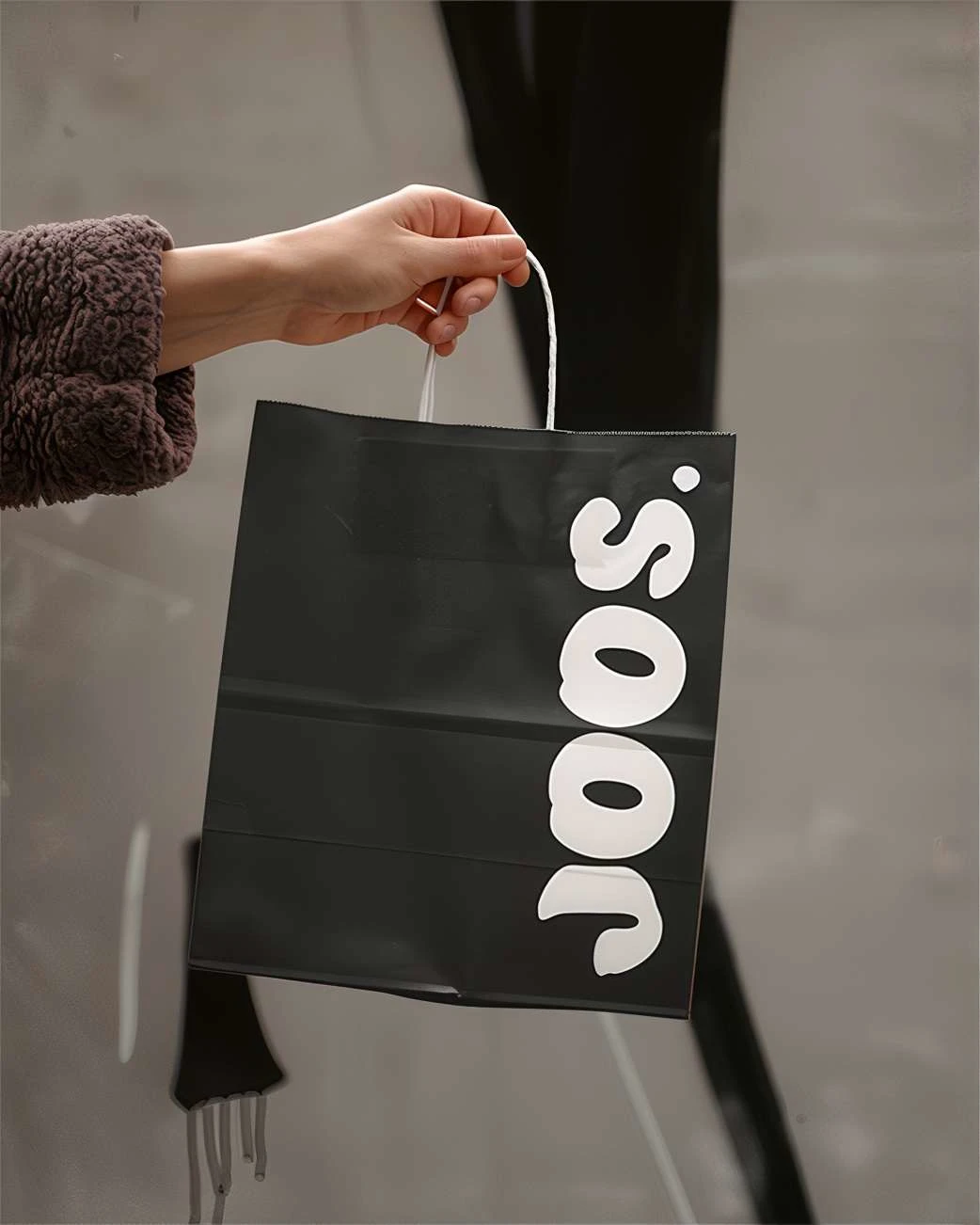
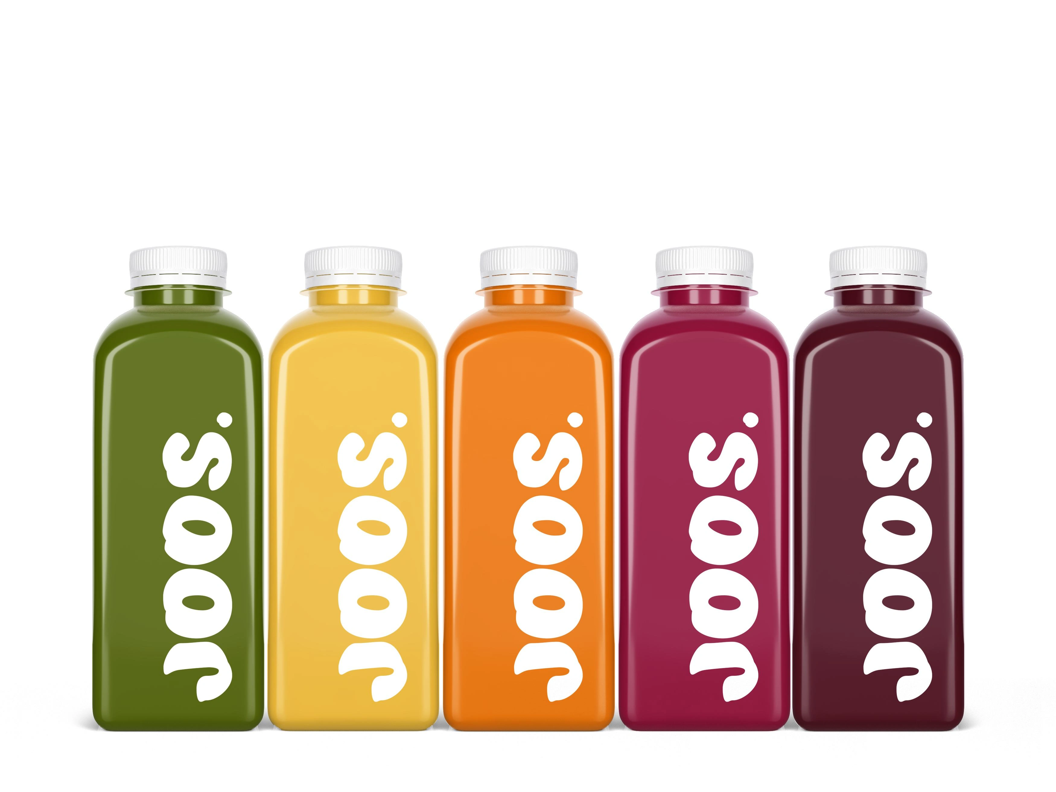
Joos is disrupting the health food scene with refreshing honesty—cold-pressed juice, nothing more. The bold typography of the logo reflects the brand’s straightforward nature, while the clean design emphasises its no-nonsense approach, letting the juice quality shine. Vibrant patterns, using the letters at a large scale to resemble juice spills, hint at the variety of flavours, adding playful energy to the simple visual identity. This balance of plain and bright elements mirrors Joos’ ethos: straightforward in its promise but full of flavour beneath the surface.
Like this project
Posted Oct 7, 2024
A straight forward juice brand in an industry full of false promises. Cold pressed juice–nothing more, nothing less.

