
Isaac Blake Tile
Tastefully Crafting Remarkable Brand Experiences ⚡⚜️
- 1x
- Hired
- 5.00
- Rating
- 20
- Followers
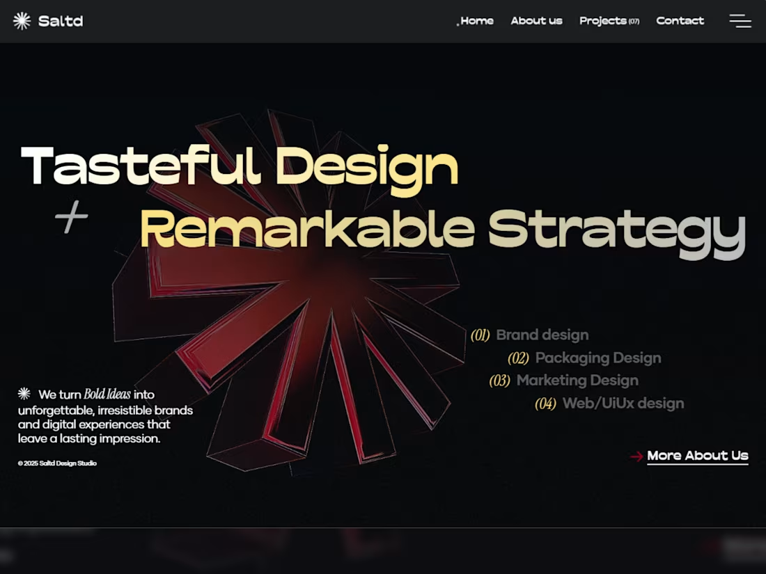
Culinary-Concept Pitch Deck Design for Saltd
0
4
360° Brand Transformation for Project Scope 360
0
4
Website Design for McKarcher Law
0
3
IAM OnDemand SaaS Website Design and Optimization
0
10
Family & Friends Dentistry Website Design
0
2
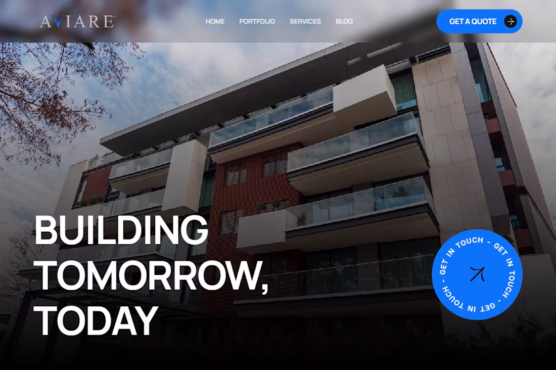
Aviare Global Website Redesign Project
0
3
Saltd Design Studio Custom Website Build
1
6
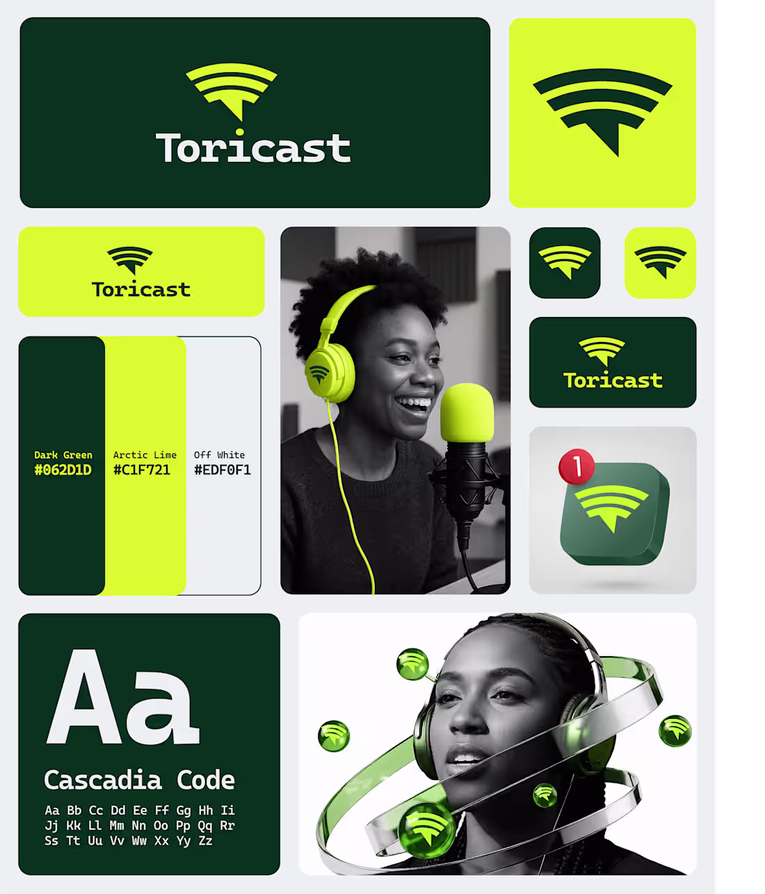
I love how startups are paying more attention to brand identity design >>>>
Here’s one I completed this week for ai startup ‘Toricast’
Brand Identity & Style Guide 💯
#shareyourwork
2
173
Tallow Kind - Brand & Packaging Design
1
13
Wasem - AI Brand Design
1
15
Logo Portfolio v2
1
19
Diverse Packaging Design Portfolio
2
25
Mascot Design Case Studies
2
29
Anime Awakened Logo & Streetwear Collection Design
1
20
Logo and Packaging Design for Laneway Cocktails
1
16
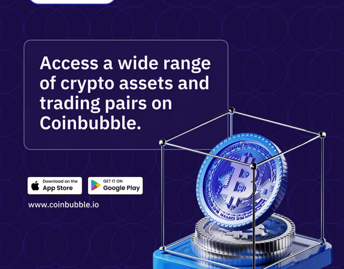
Coinbubble Social Media Designs
0
9
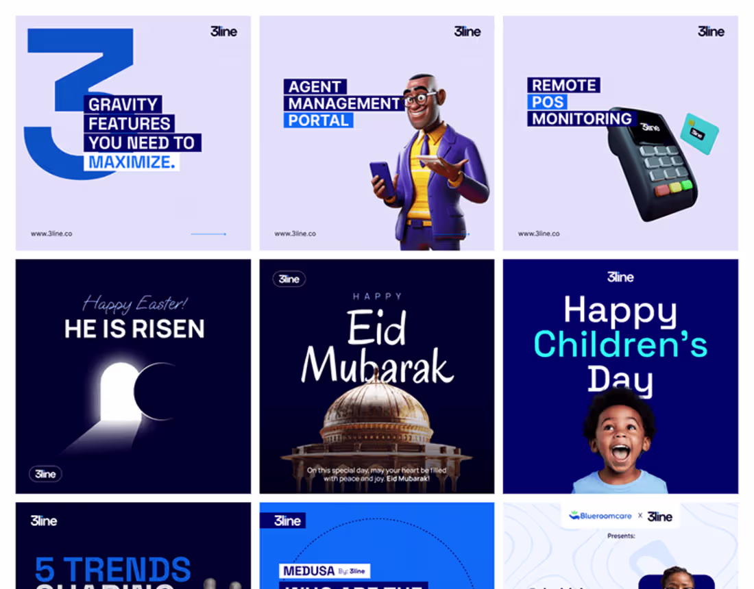
Social media designs | 3Line
0
6
Urban Goth – Between Sigil and Street
1
13
Mousse Café-Bar Brand Identity Design
1
26
Blue Tribe – Branding the New Blue Collar
1
32
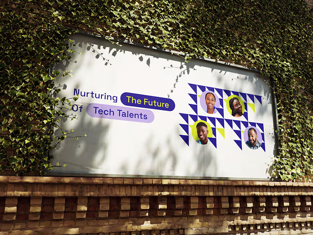
Social Media Design for TalentsFactory :: Behance
0
11
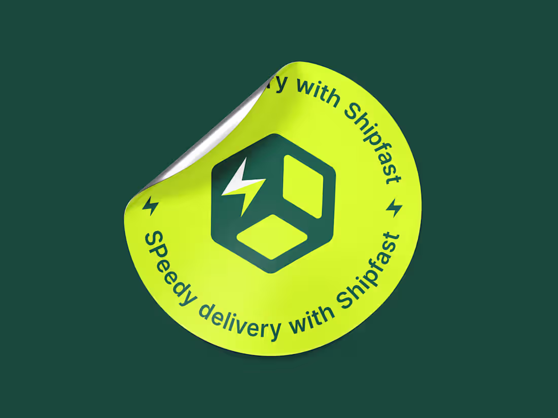
Shipfast Brand (Logo & Identity) Design
0
53
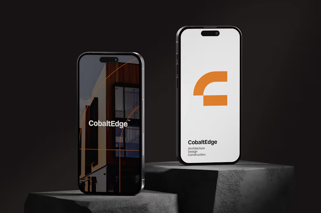
CobaltEdge Logo Design
0
18
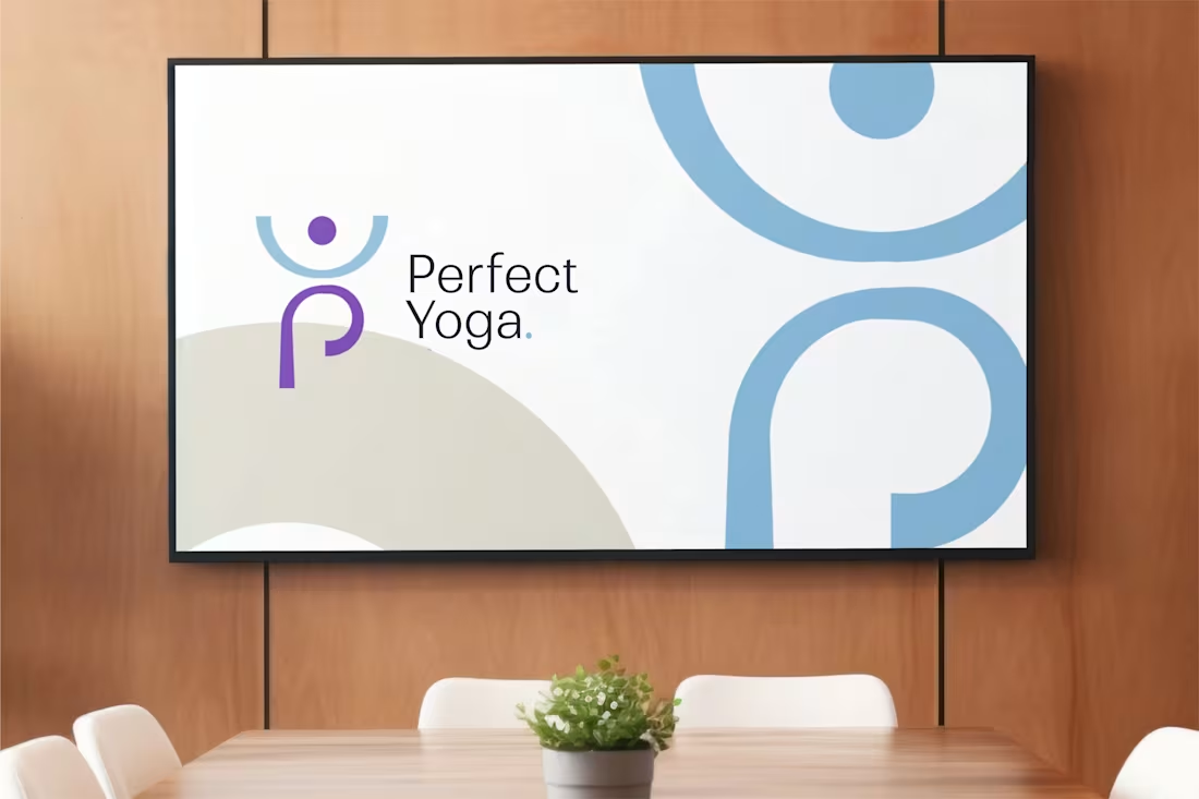
Perfect Pilates Logo Design
0
18
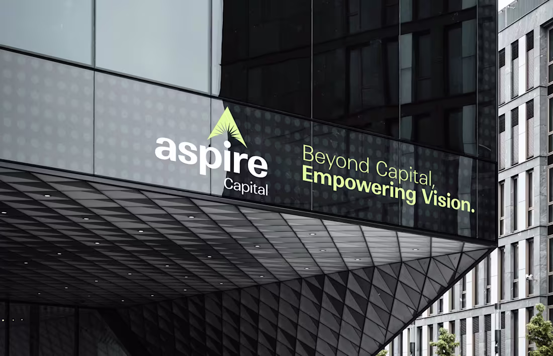
Aspire Capital Logo Design
1
11
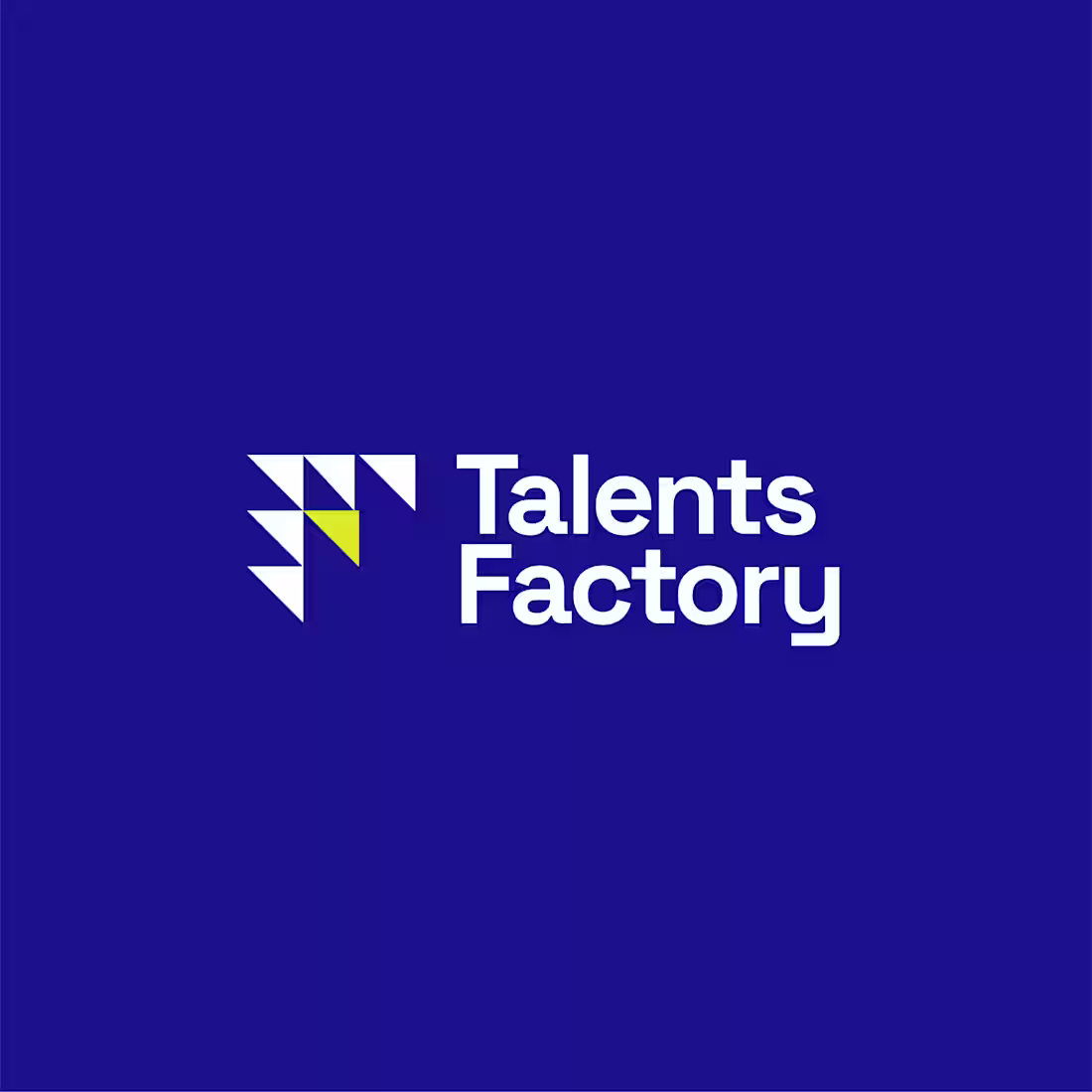
TalentsFactory Brand (Logo & Identity) Design
0
25
Trinitrade Logo, Brand Identity & Brand Guide Design
1
31