Tallow Kind - Brand & Packaging Design
Isaac Blake Tile
TALLOW KIND - Brand & Packaging Design
Client: Tallow Kind
Industry: Natural Beauty & Skincare
Project Scope: Complete brand identity and packaging design
Timeline: 2025

The Challenge
Tallow Kind approached us to create a brand identity for their innovative skincare line featuring beef tallow as the primary ingredient. The challenge was to transform a traditionally rustic ingredient into a premium, modern wellness brand that would appeal to health-conscious consumers seeking natural alternatives.
The brand needed to communicate three core values:
Ancient wisdom - honoring the traditional use of tallow in skincare
Modern wellness - incorporating contemporary ingredients like magnesium and lavender
Premium quality - positioning as a sophisticated skincare solution.
Brand Strategy
Positioning
We positioned Tallow Kind as a bridge between ancestral beauty wisdom and modern wellness science, targeting consumers who value natural ingredients with proven benefits.
Key Messages
Natural, nutrient-rich skincare rooted in tradition
Scientifically-backed ingredient combinations
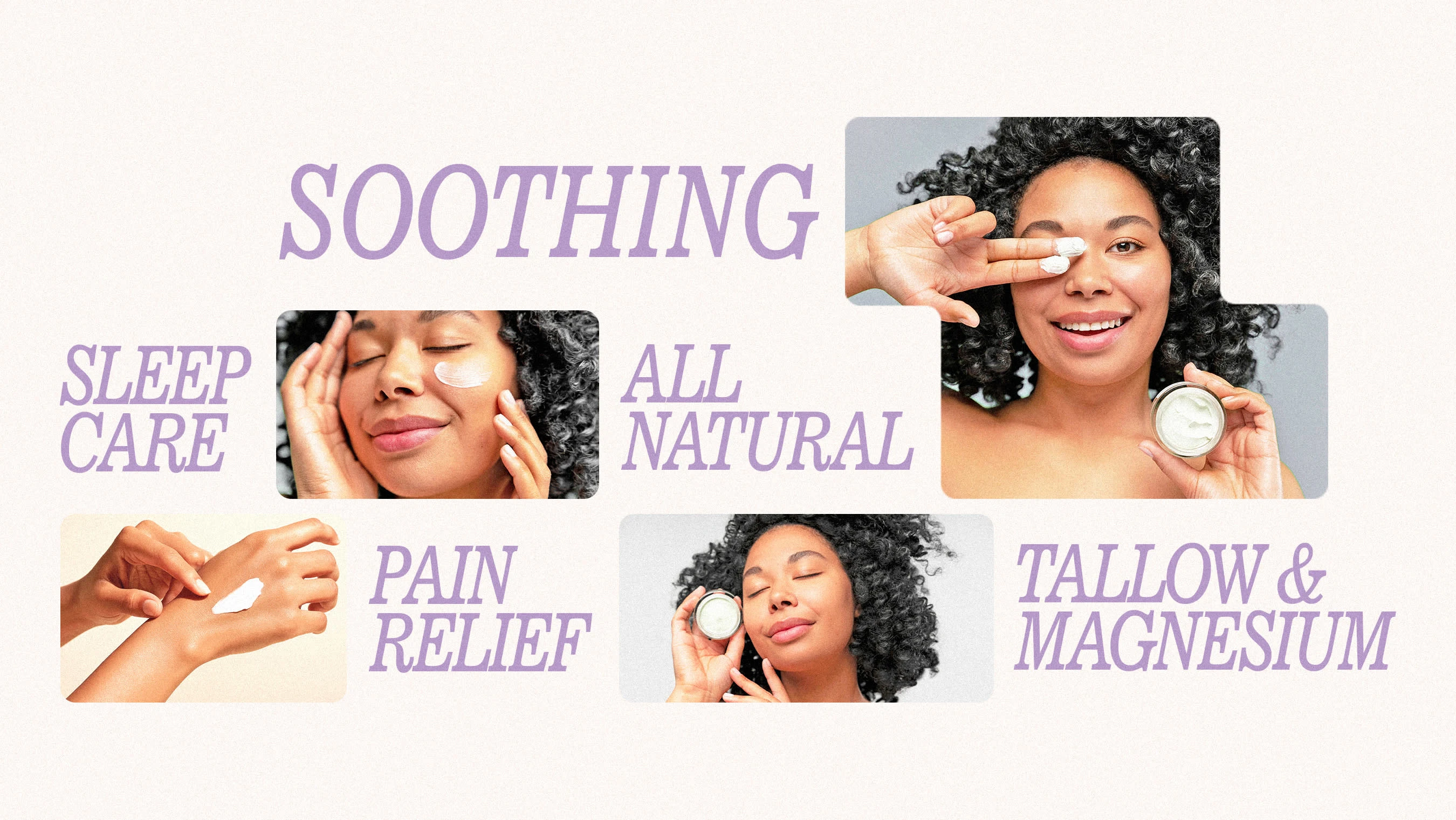
Therapeutic benefits for pain relief and relaxation
Clean, premium formulations
Visual Identity Development
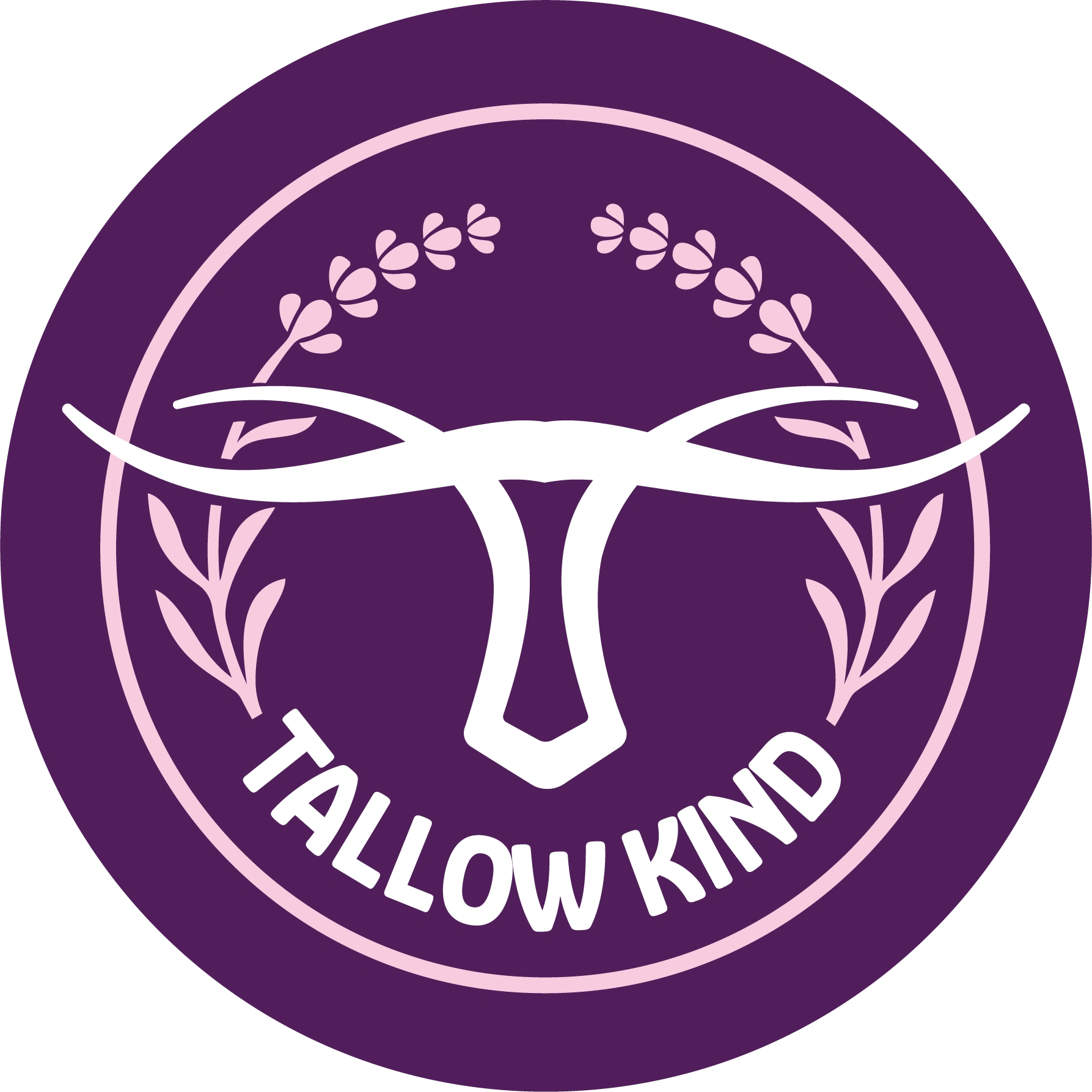
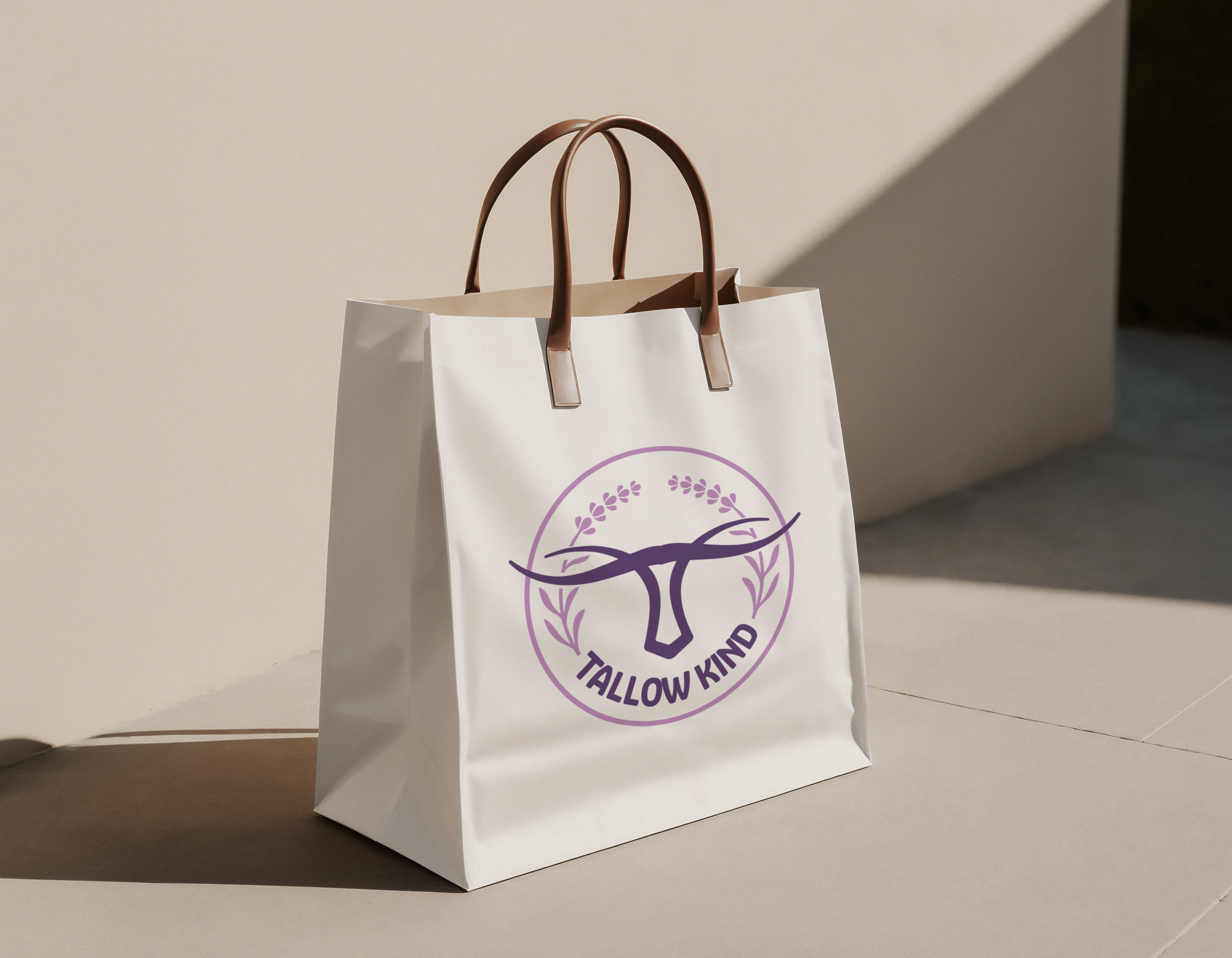
Logo Design Philosophy
The logo centers around a stylized bull's head silhouette, directly referencing the tallow source while maintaining elegance and sophistication. Key design elements include:
Circular containment suggesting wholeness, natural cycles, and protection
Flowing horn lines that evoke organic movement and gentleness
Minimalist execution ensuring versatility across applications
Botanical accents (in the final version) representing the herbal ingredients
Color Strategy
Primary Purple (#6B2C91)
Conveys luxury and premium positioning
Associated with relaxation and wellness
Creates strong shelf presence
Differentiates from typical earthy natural brands
Soft Pink Accents
Adds feminine appeal and softness
Represents the calming lavender ingredient
Creates visual warmth and approachability
Clean White/Cream
Ensures premium, clinical appearance
Provides excellent contrast for readability
Suggests purity and cleanliness.
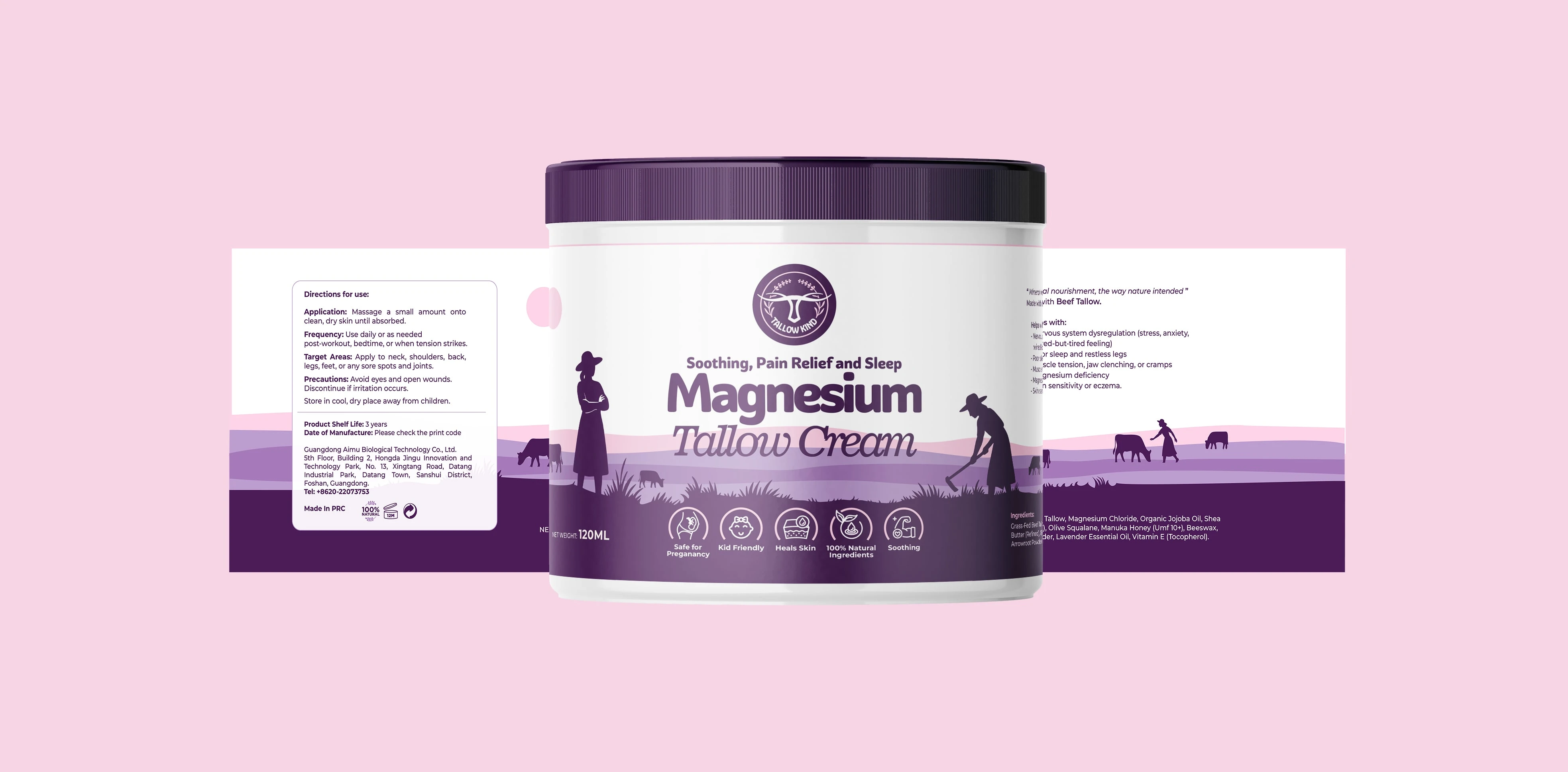
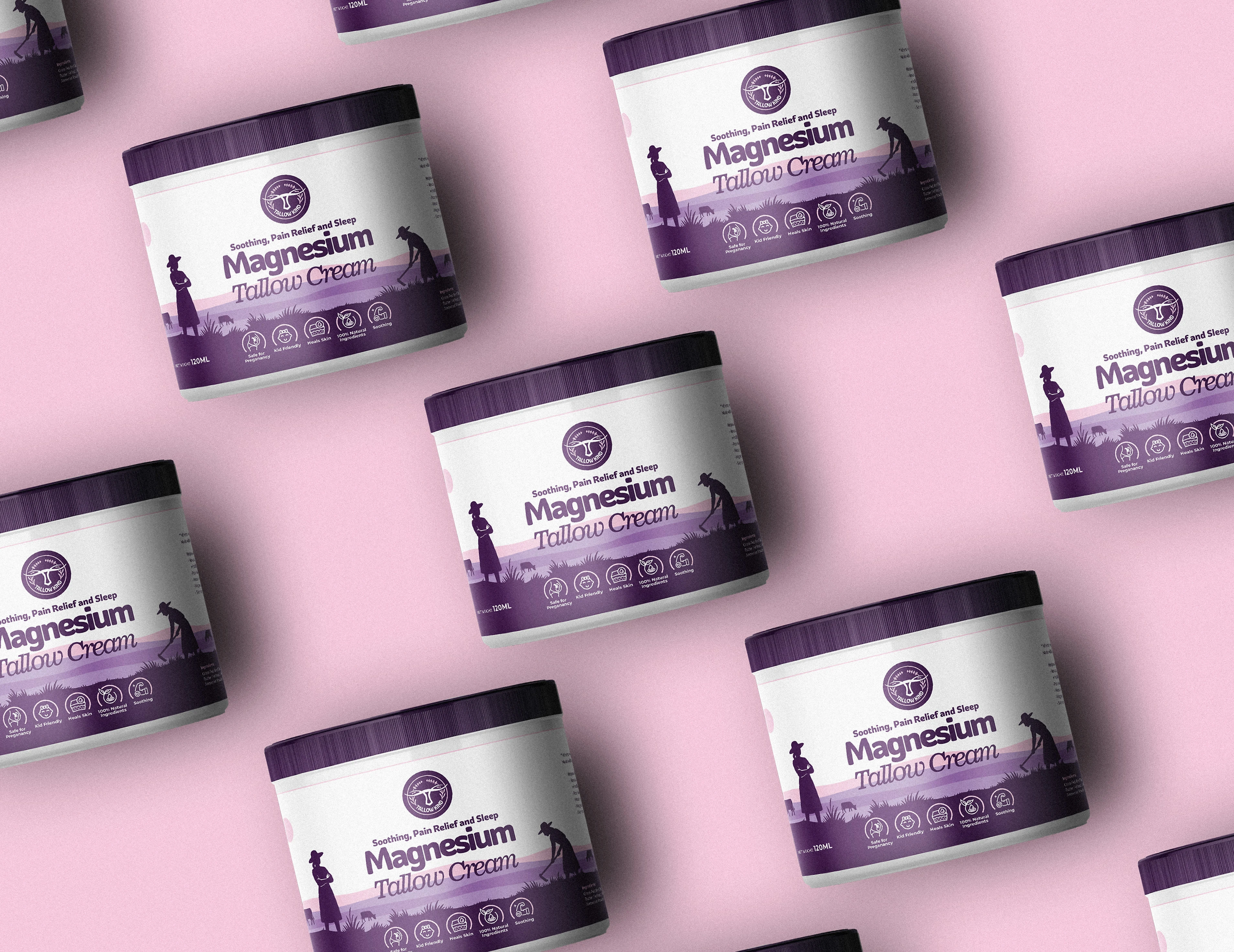
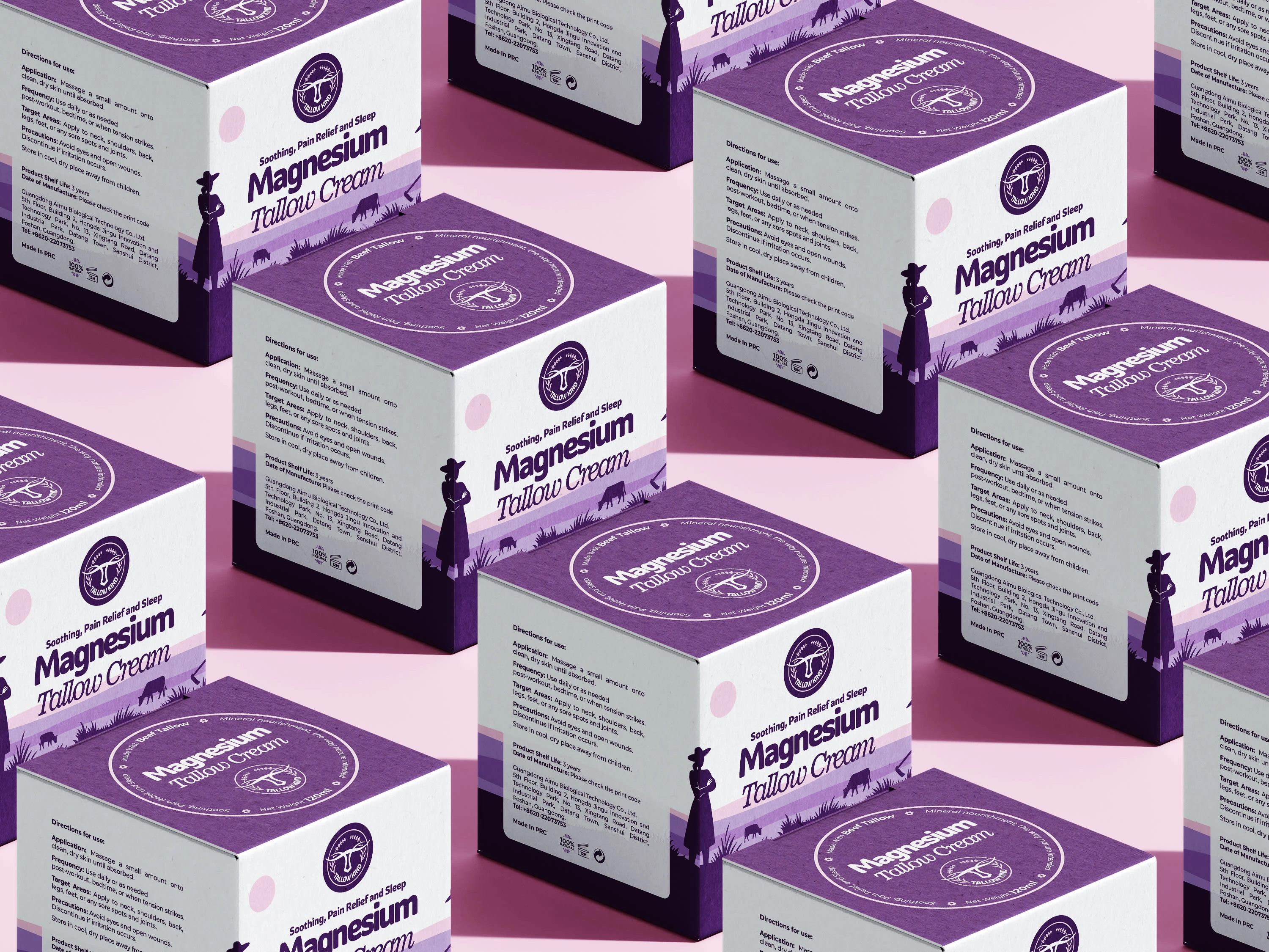
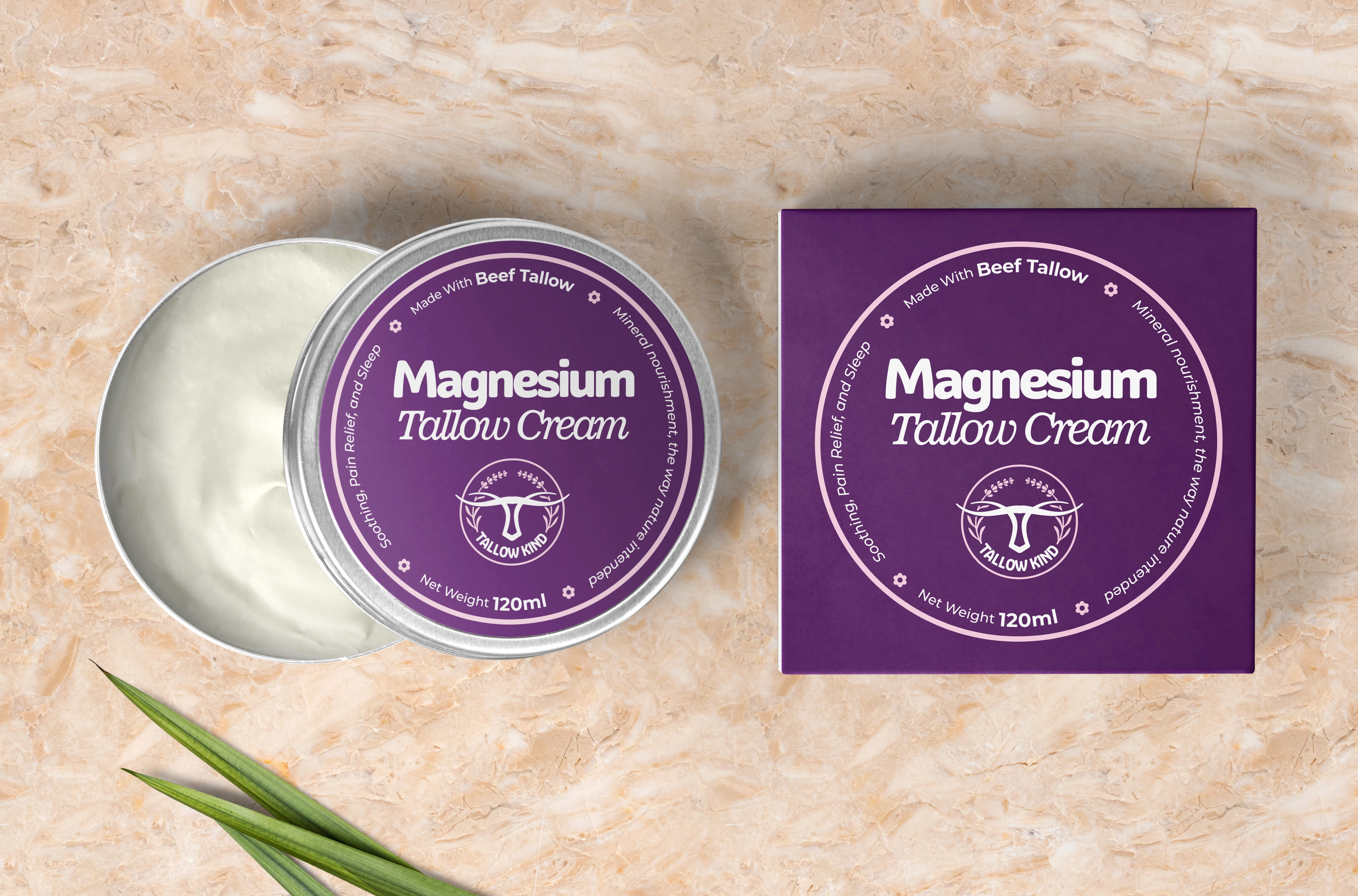
Product Design & Packaging
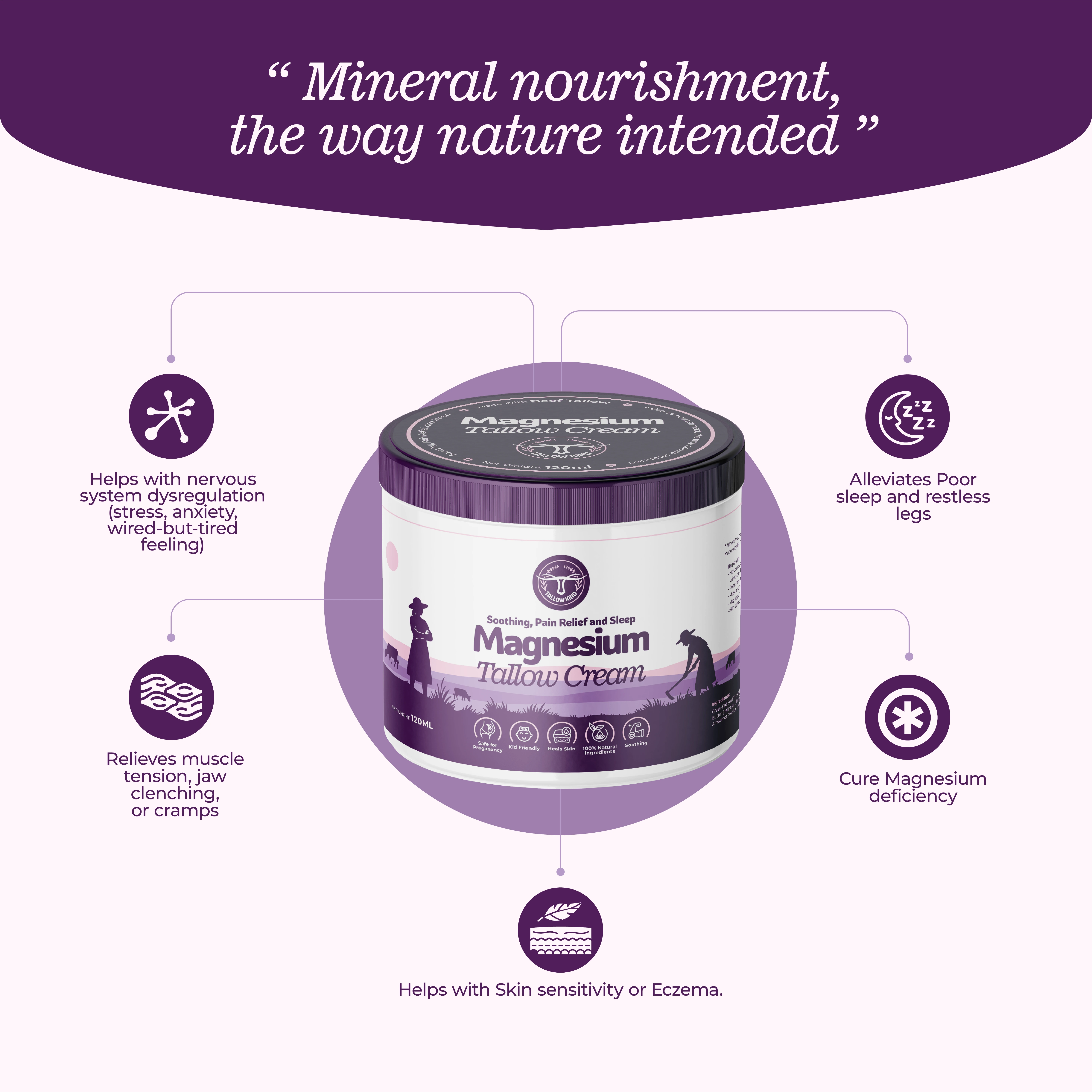
Magnesium Tallow Cream
The flagship product packaging demonstrates the complete brand system in action:
Container Design
Practical jar format for cream application
Premium purple lid with embossed logo
Clean white body for ingredient transparency
Label Hierarchy
Primary product name in bold, modern typography
Clear benefit messaging: "Soothing, Pain Relief and Sleep"
Ingredient storytelling through visual icons
Pastoral silhouette illustration reinforcing natural origins
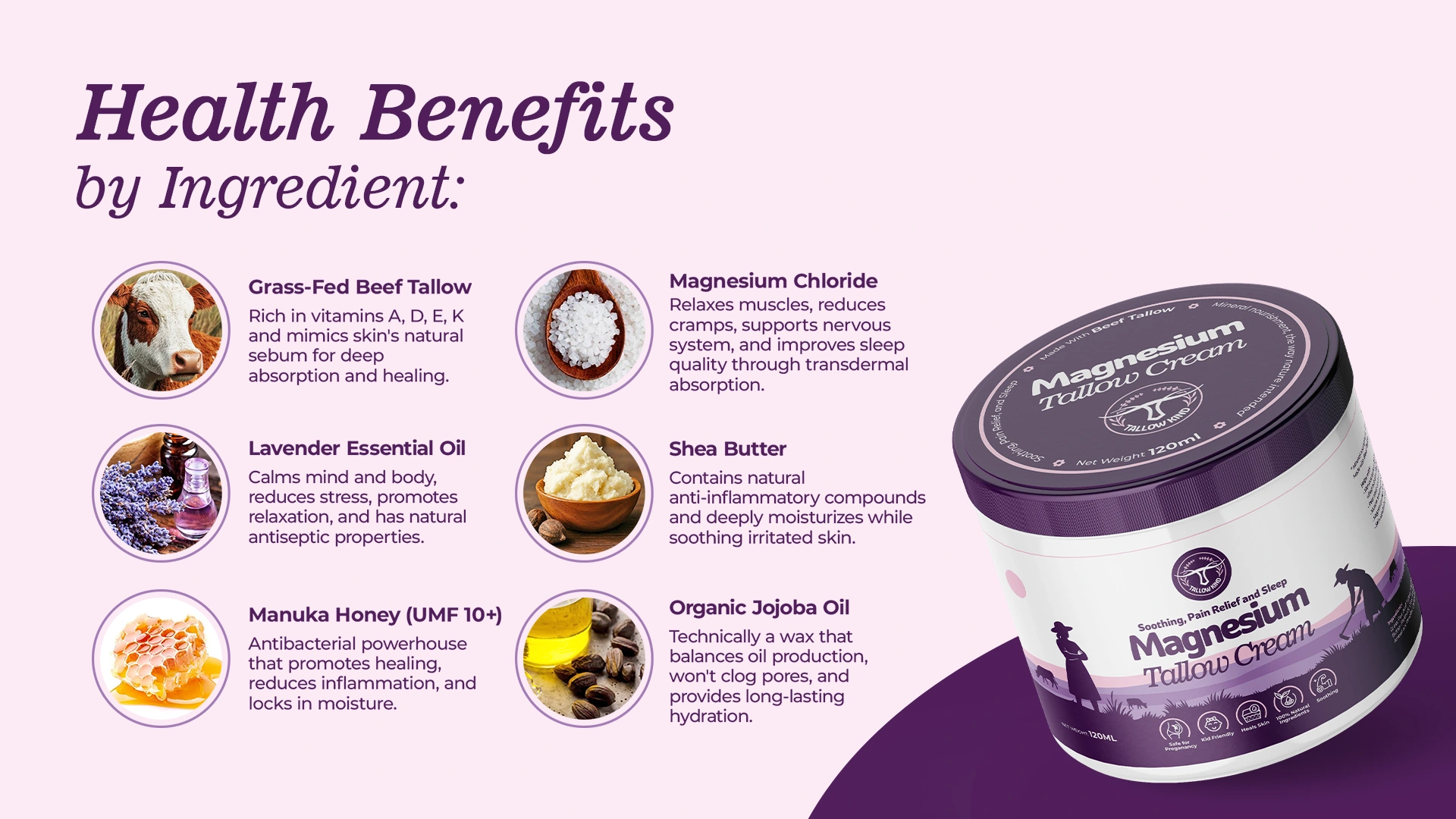
Information Design
Comprehensive ingredient benefits panel
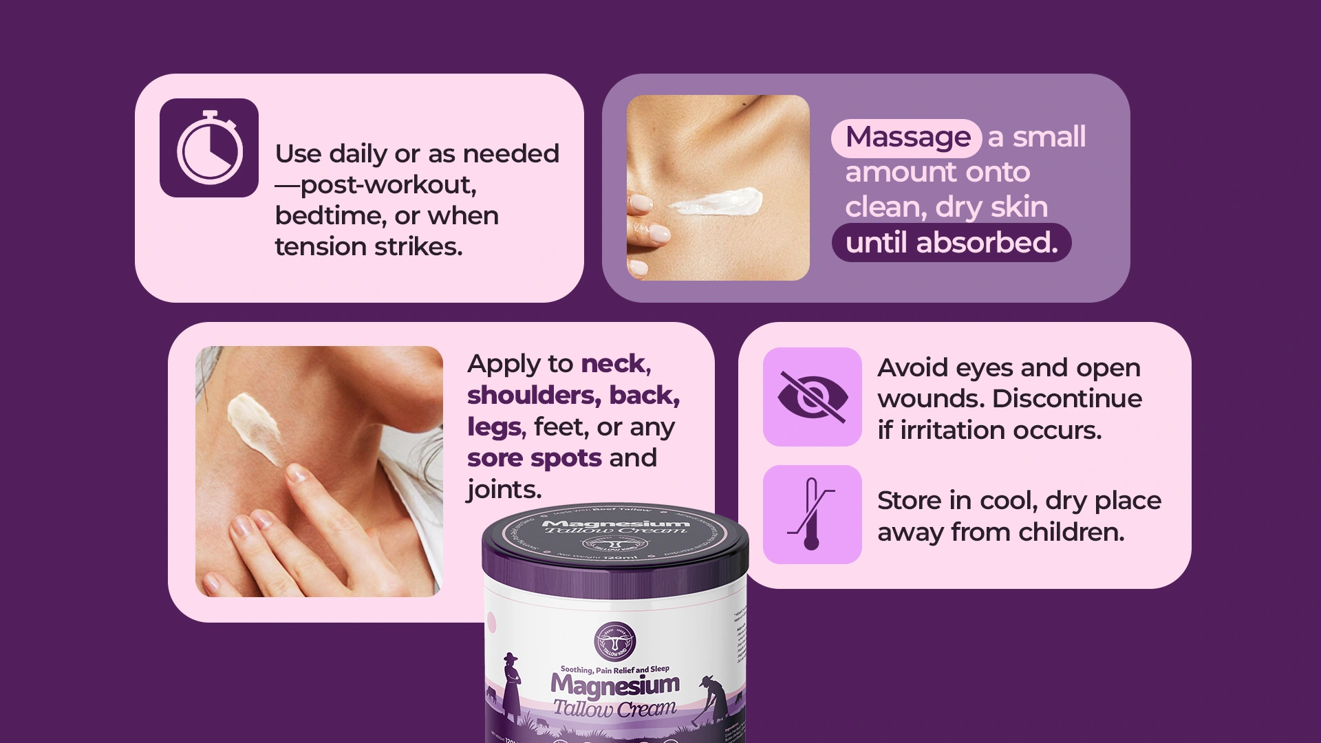
Clear usage instructions
Premium finishing with spot colors
Consistent brand elements across all touchpoints
Design Evolution
Logo Refinement
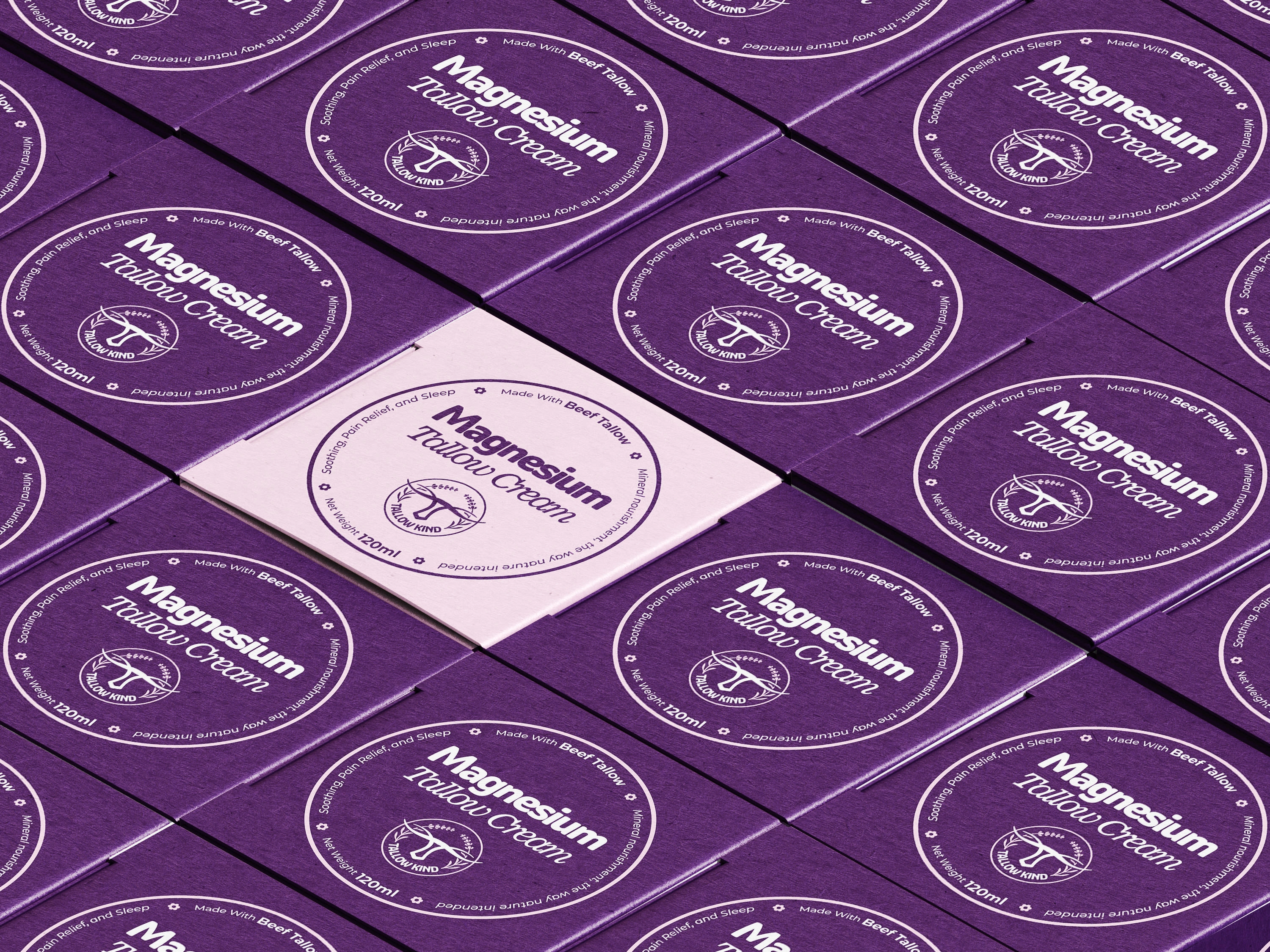
The final logo incorporates delicate botanical elements around the bull's head, representing the herbal ingredients like lavender while maintaining the core brand symbol's strength and recognition.
Packaging System
We developed a cohesive packaging architecture that can scale across multiple product lines while maintaining brand recognition and premium positioning.
Results & Impact
Brand Perception
Successfully elevated tallow from rustic ingredient to premium skincare component
Created strong brand differentiation in the natural skincare market
Established trust through clean, professional design language
Market Response
Clear communication of complex ingredient benefits
Strong shelf presence in competitive natural beauty space
Effective targeting of wellness-conscious demographics
Scalability
Flexible brand system ready for product line extensions
Consistent visual language across all touchpoints
Adaptable packaging format for various product types
Key Success Factors
Strategic Positioning - Balanced traditional wisdom with modern wellness trends
Visual Sophistication - Elevated natural ingredients through premium design
Clear Communication - Made complex benefits easily understandable
Cohesive System - Created unified brand experience across all elements
Market Differentiation - Stood out from typical earthy natural brands.
Conclusion
The Tallow Kind brand design successfully transformed a niche ingredient into an appealing premium skincare brand. By honoring the ancient origins of tallow while presenting it through a modern, sophisticated lens, we created a brand that resonates with contemporary wellness consumers.
The purple color palette, clean typography, and thoughtful iconography work together to communicate quality, efficacy, and luxury—positioning Tallow Kind as a leader in the natural skincare space.
This project demonstrates how strategic design thinking can elevate traditional ingredients and create compelling brand narratives that connect with modern consumers seeking authentic, effective skincare solutions.
THANK YOU
Hire me for your next project here on Contra.
Or Shoot me an email; blakeisaactile@gmail.com
Like this project
Posted Sep 17, 2025
This Tallow Kind project shows how strategic design turns traditional ingredients into a modern, authentic skincare brand narrative.
Likes
1
Views
13
Timeline
Jun 2, 2025 - Jul 10, 2025