Mascot Design Case Studies
Mascot Design Case Studies
Tanuki Quest: Finding Adventure in Folklore
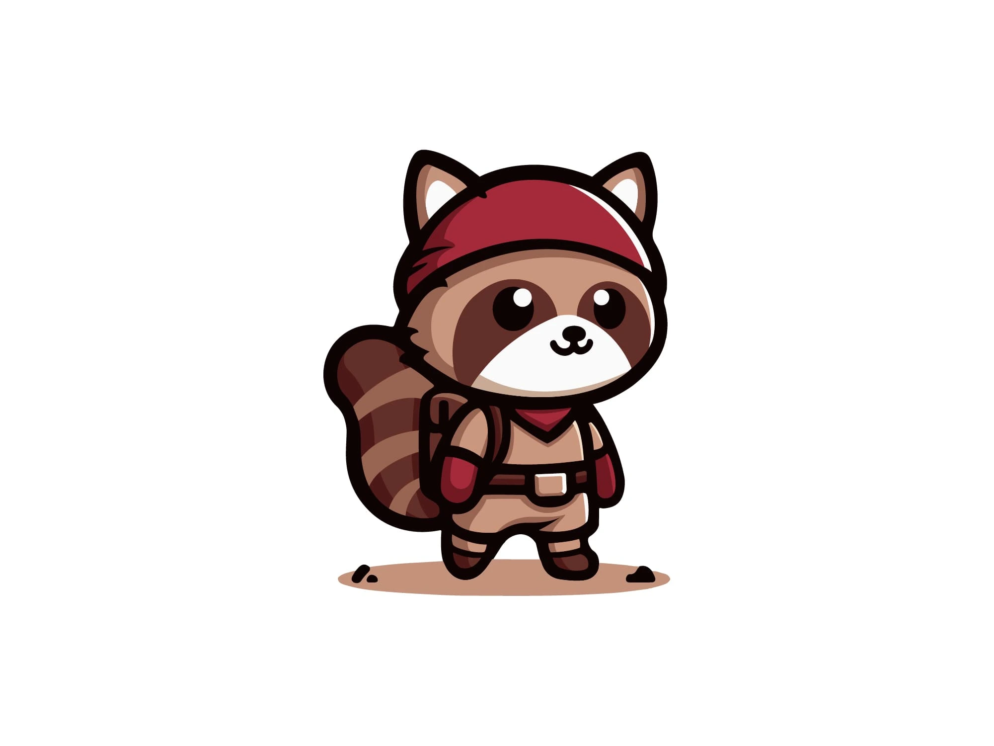
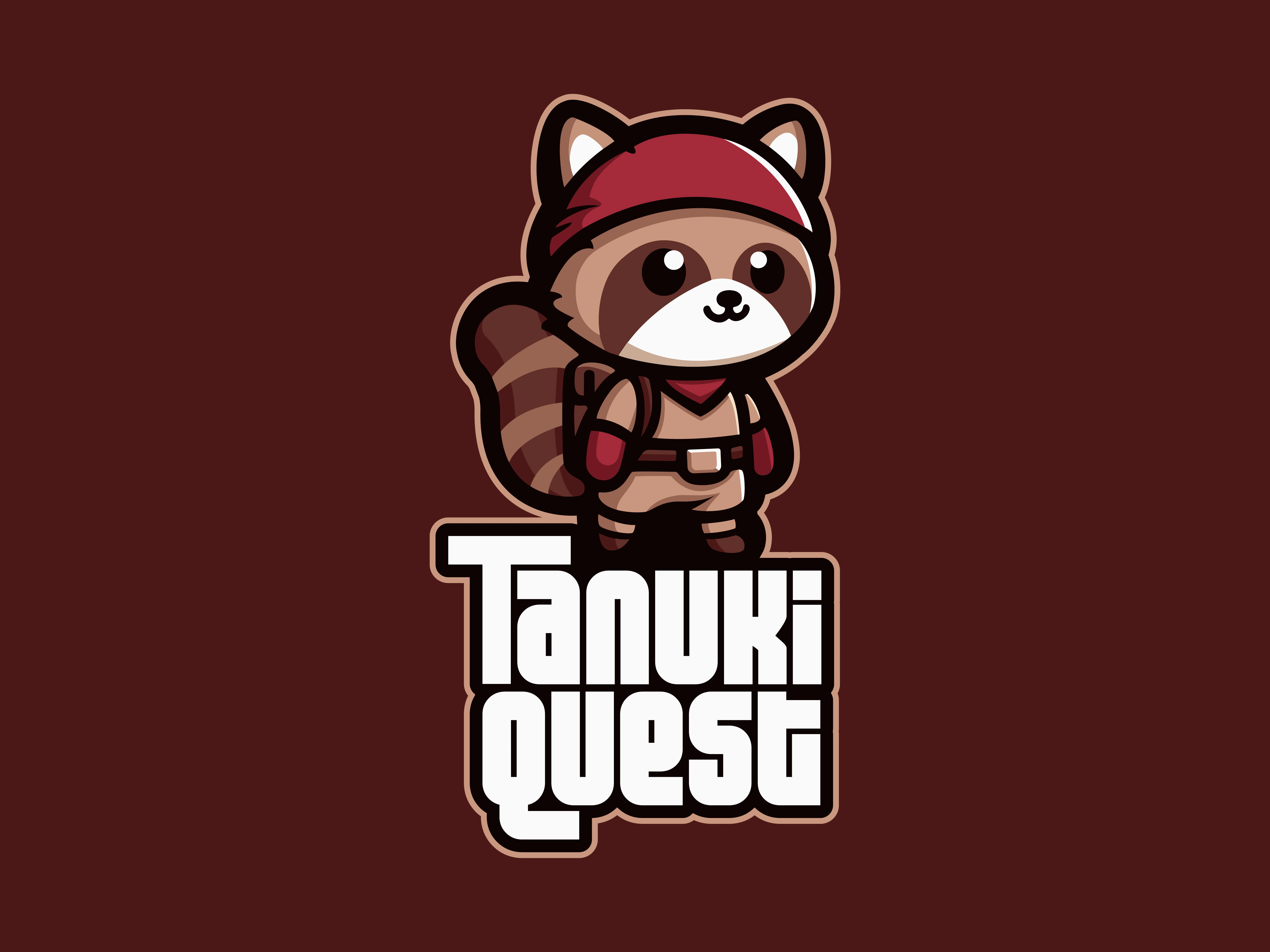
When I began conceptualizing the mascot for Tanuki Quest, I wanted to create something that would resonate with both Eastern and Western gaming audiences. The tanuki (Japanese raccoon dog) offered the perfect foundation—it's deeply rooted in Japanese folklore yet has an inherently adorable quality that transcends cultural barriers.
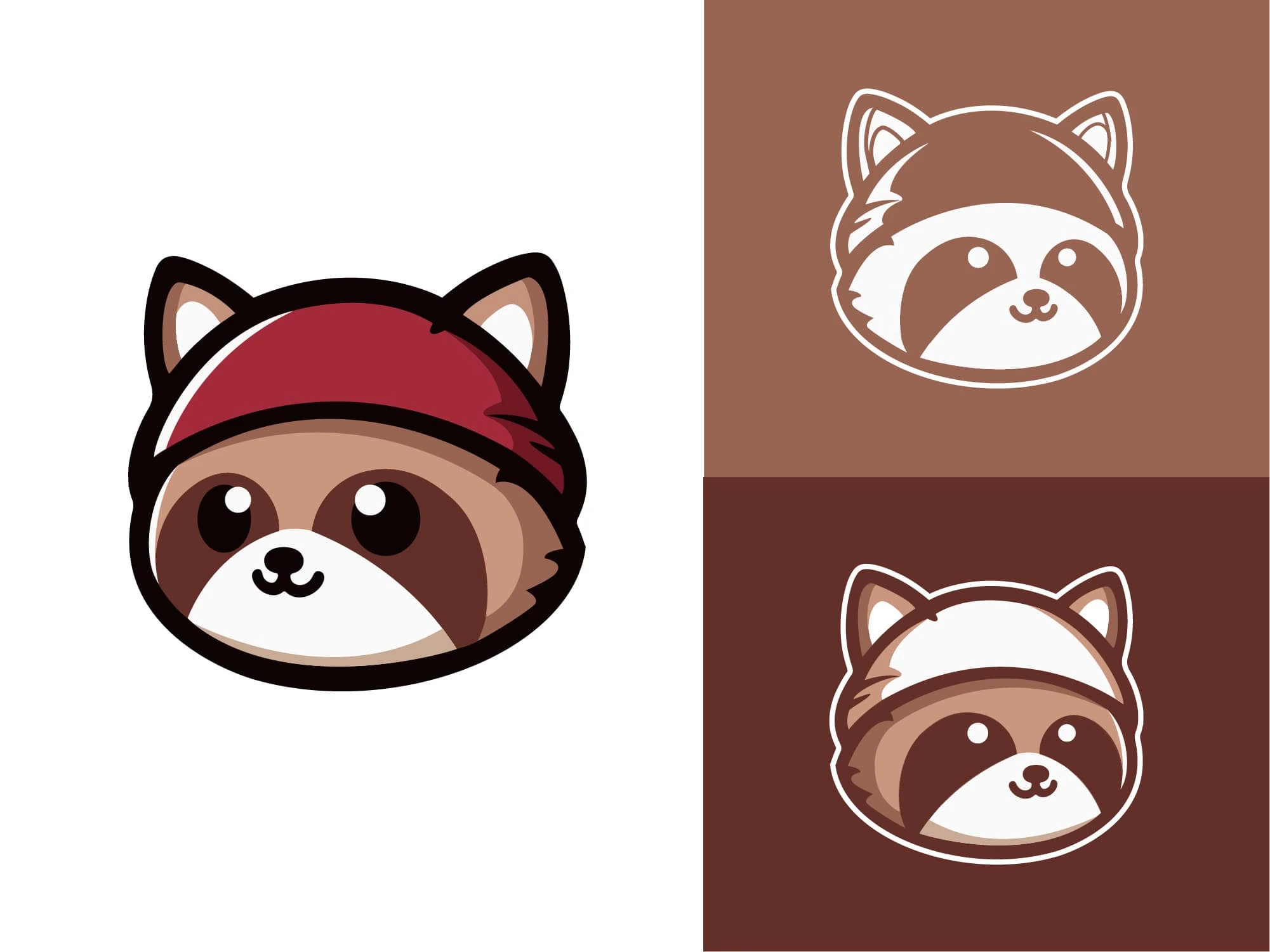
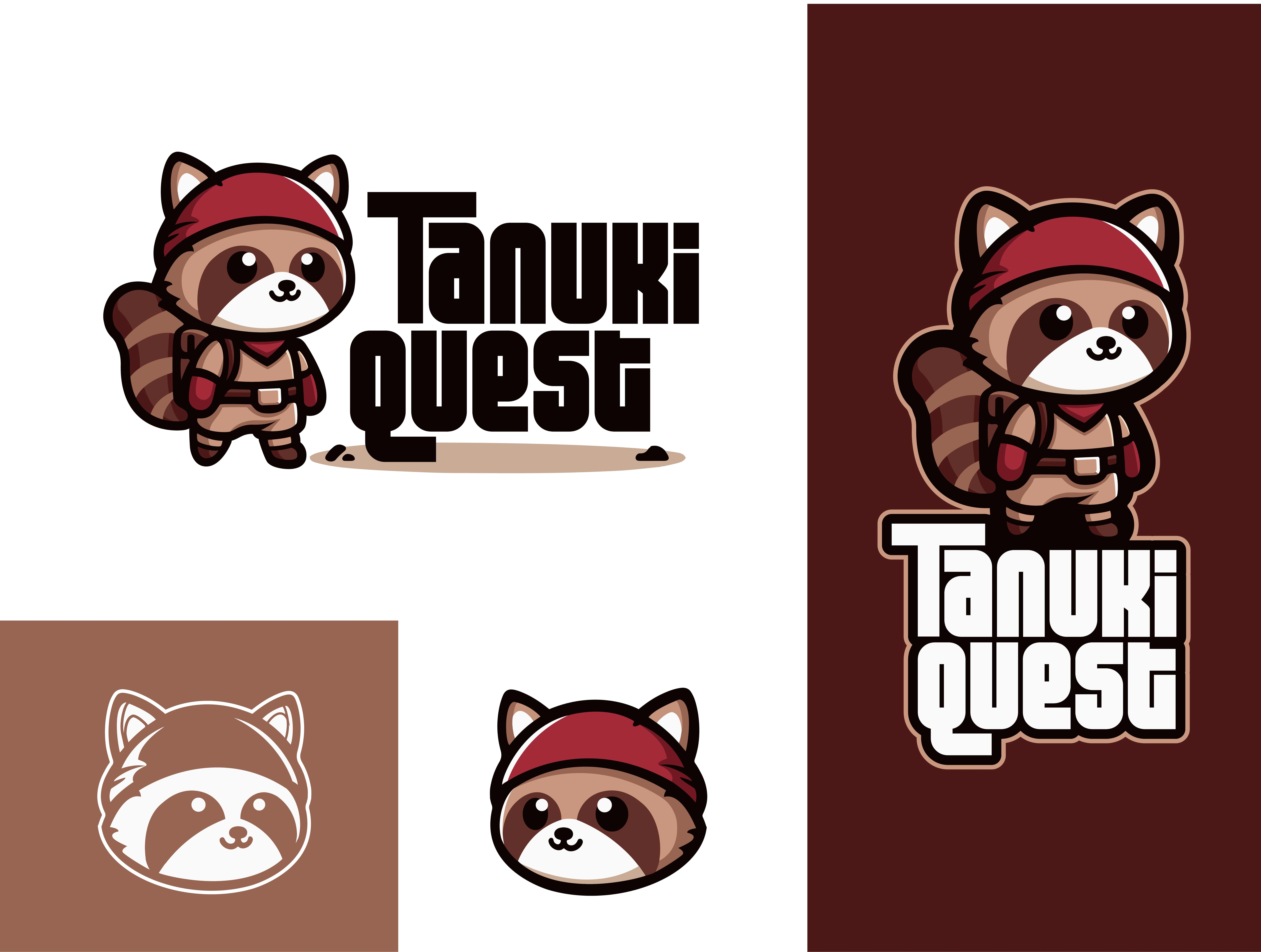
My design process started with character development. I deliberately chose a chibi-inspired style with exaggerated proportions to maximize cuteness while ensuring the character would remain legible at smaller sizes. The adventure gear was crucial—the red bandana, backpack and subtle belt details immediately communicate "adventurer" without overwhelming the character's silhouette.
Color selection was particularly important to me. I chose a warm brown palette that feels organic and approachable, with the red bandana providing a strategic pop of color that draws attention to the character's face. This limited color approach also ensures the mascot reproduces well across different media.
For the typography, I created a custom wordmark that balances playfulness with readability. The letterforms have subtle quirks that echo the mascot's personality while maintaining strong legibility, essential for a gaming brand that will appear across various digital interfaces.
What I'm most proud of is how the system works across different applications. The horizontal lockup serves as the primary logo, while the vertical arrangement works beautifully for mobile applications or merchandise. The simplified face-only version gives the brand flexibility for social media profiles and small-space applications.
Gun Shy: Crafting Western Attitude
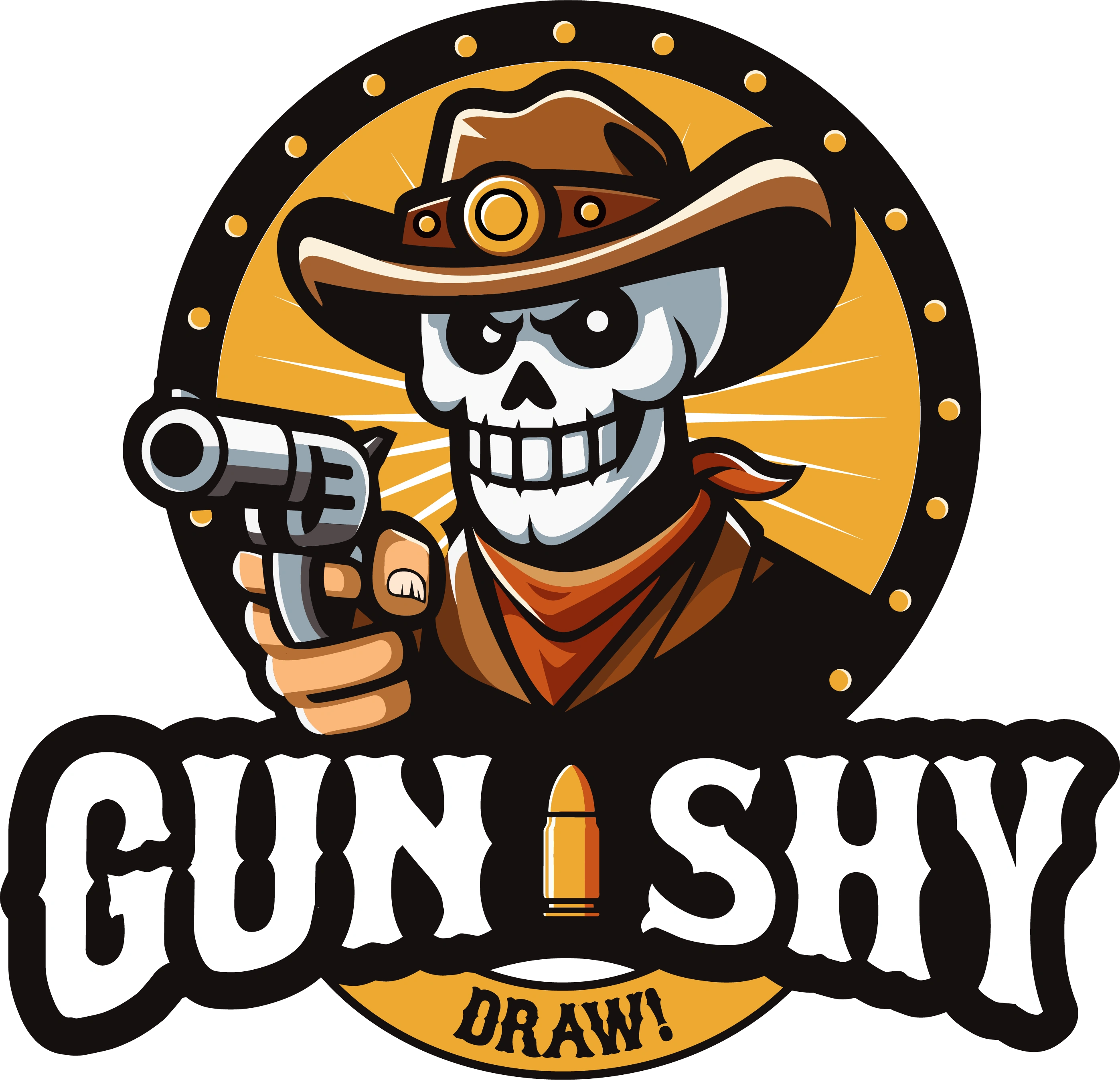
The Gun-Shy mascot was an exciting challenge—creating an edgy character for a beverage brand that would stand out on crowded shelves while maintaining a sense of playful rebellion rather than genuine menace.
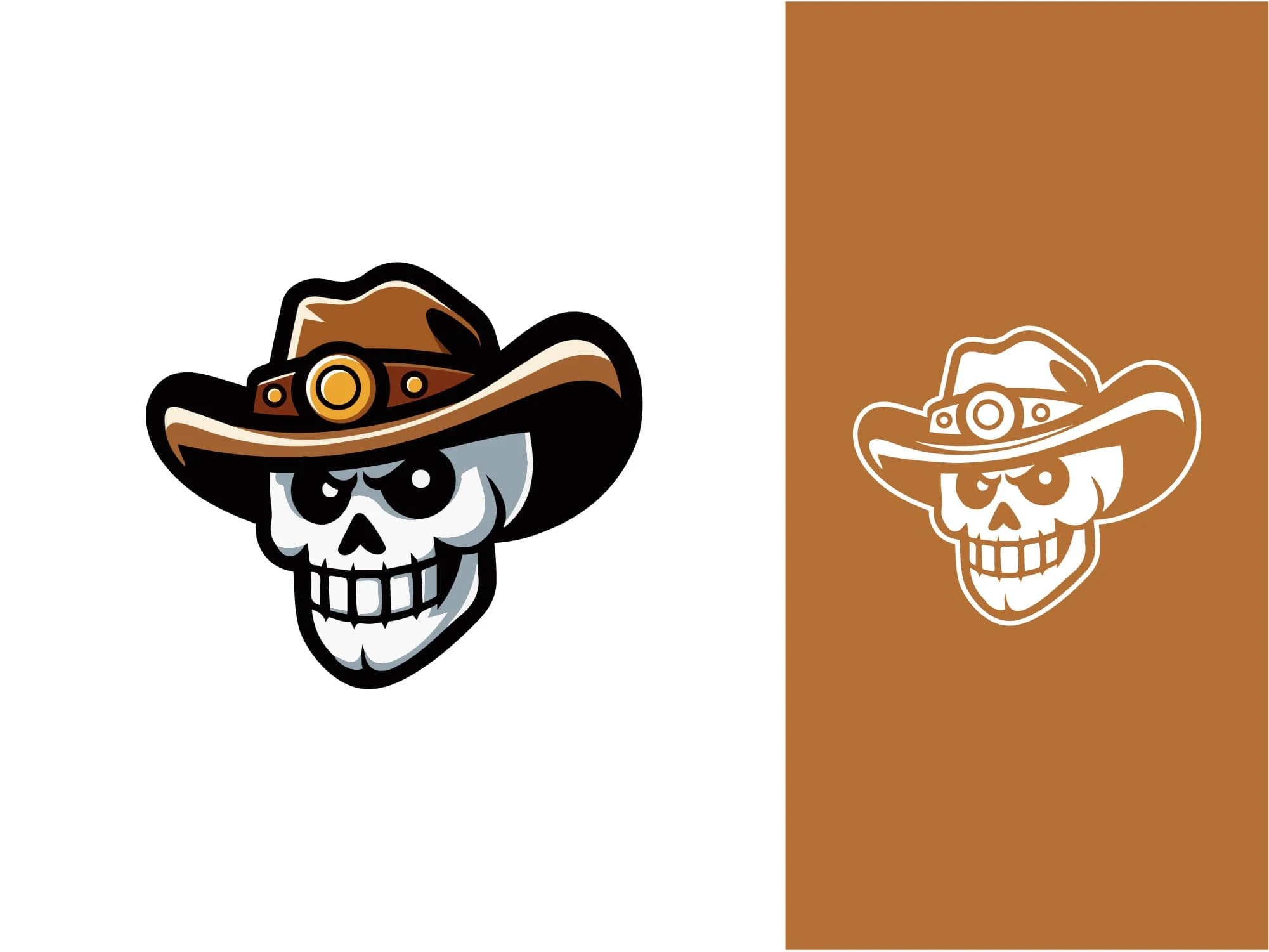
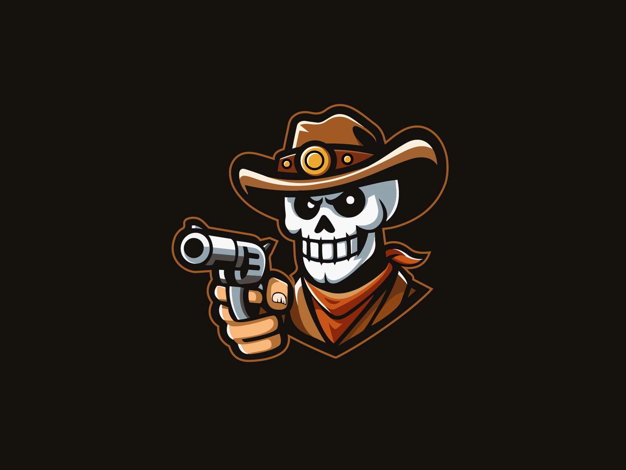
I chose the skeleton cowboy concept after exploring various Western archetypes. The skeleton allowed me to create something with attitude that wouldn't feel too intimidating or off-putting for a consumer product. Every element—from the tilted hat to the bandana and aimed revolver—was meticulously crafted to embody the Wild West spirit.
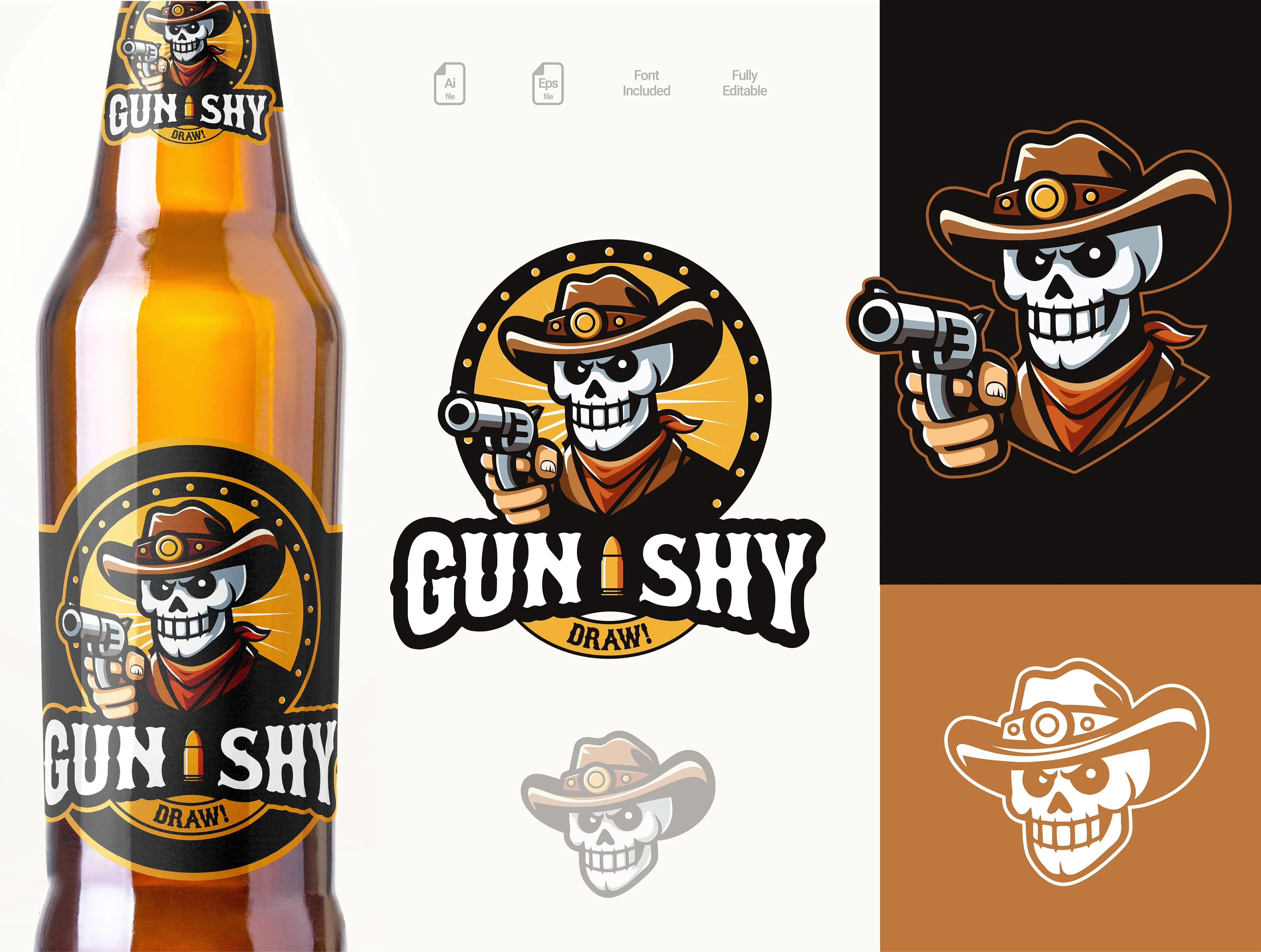
The color palette was a critical decision. The vibrant yellow/orange background creates instant shelf presence, while the black border helps the emblem pop against any background. I intentionally limited the palette to ensure strong brand recognition and cost-effective printing across various applications.
For the typography, I developed a custom wordmark with slightly irregular edges to evoke hand-painted saloon signs. The "bullet" I between the words serves dual purposes—separating the words while reinforcing the Western gunslinger theme.
The bottle application was always the primary consideration throughout the design process. I tested multiple sizes and proportions to ensure the label would maintain its impact when wrapped around the bottle. The simplified one-color versions were developed specifically for merchandise applications where full-color printing might be cost-prohibitive.
What makes me particularly proud of this project is how the character instantly communicates the brand's attitude. In a saturated market, this mascot gives Gun Shy immediate personality and recognition that helps it stand apart from competitors.
Like this project
Posted May 11, 2025
Here is my process for creating mascot logos for brands/products.

