Anime Awakened Logo & Streetwear Collection Design
Isaac Blake Tile
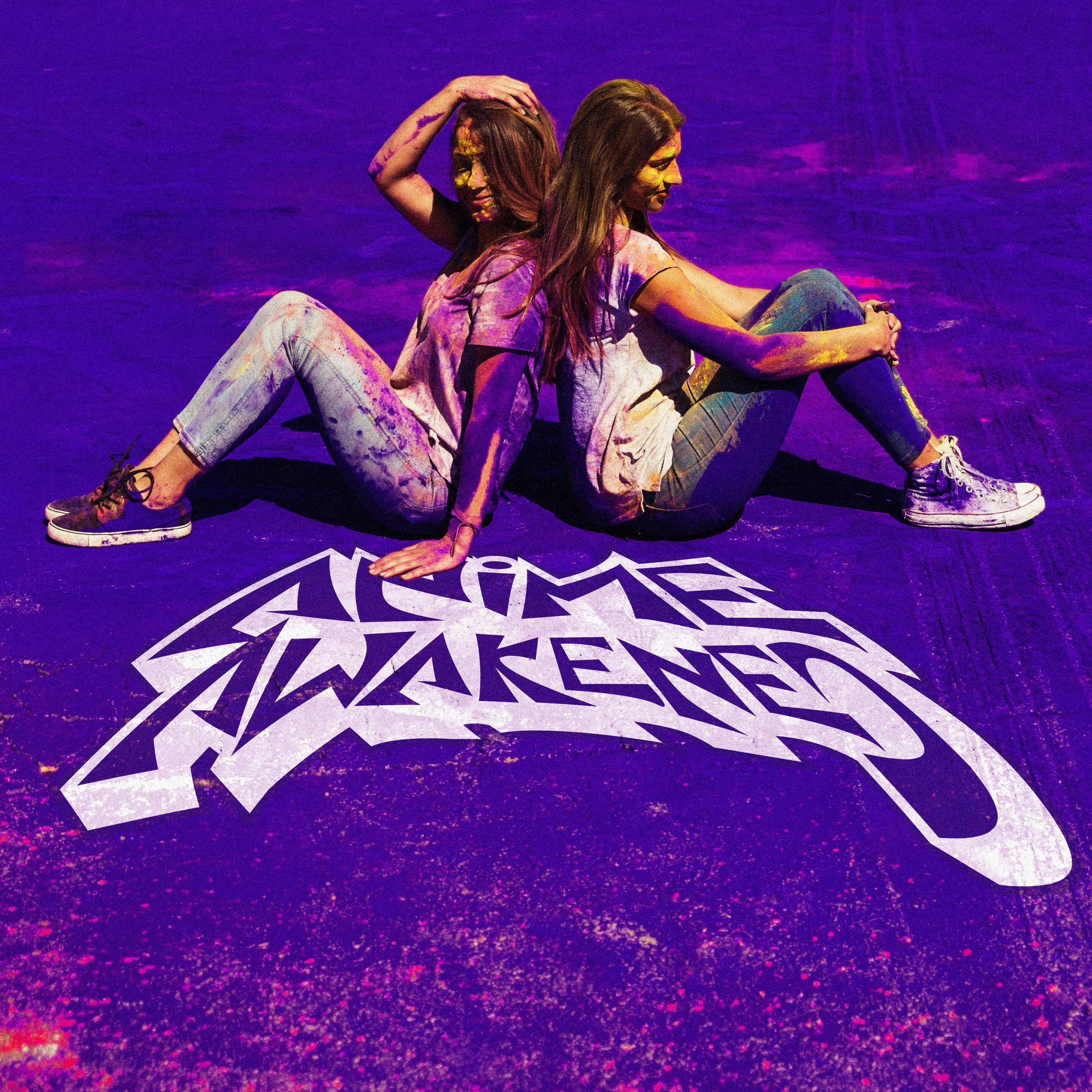
Anime Awakened
A brand that successfully bridges anime fandom with contemporary skate and streetwear culture. Let me craft a case study that highlights the strengths of this design project.
Brand Application
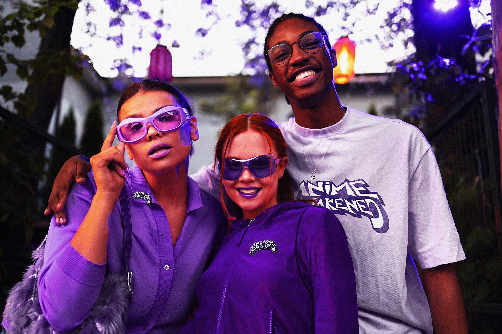
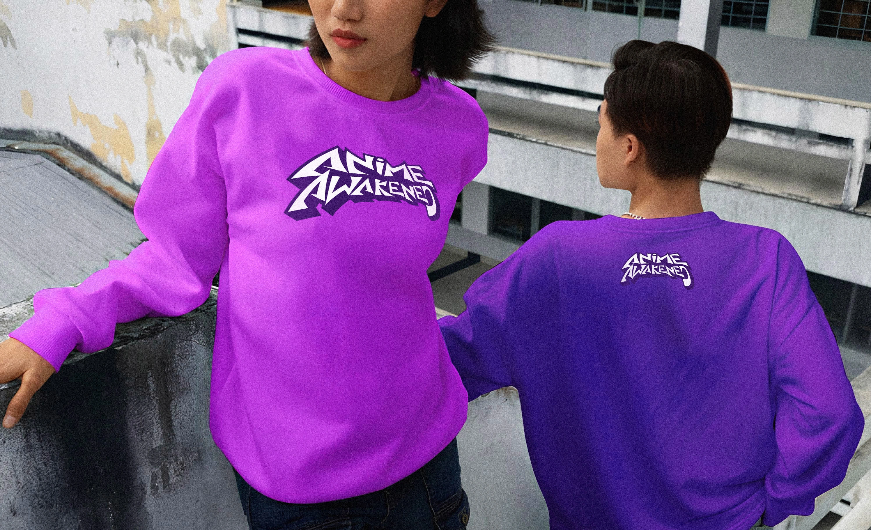
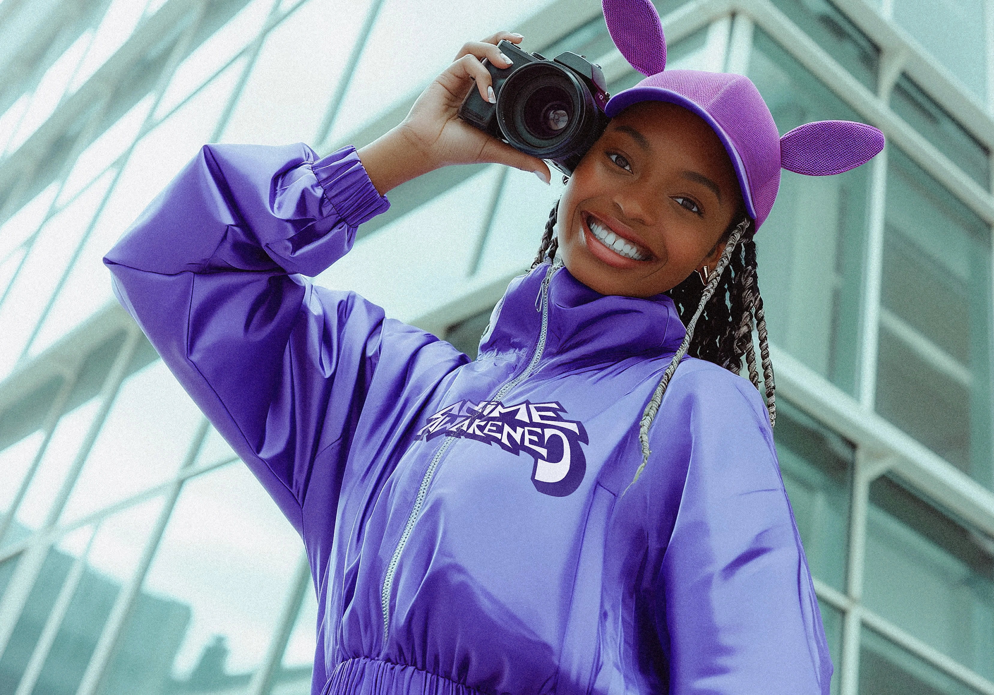
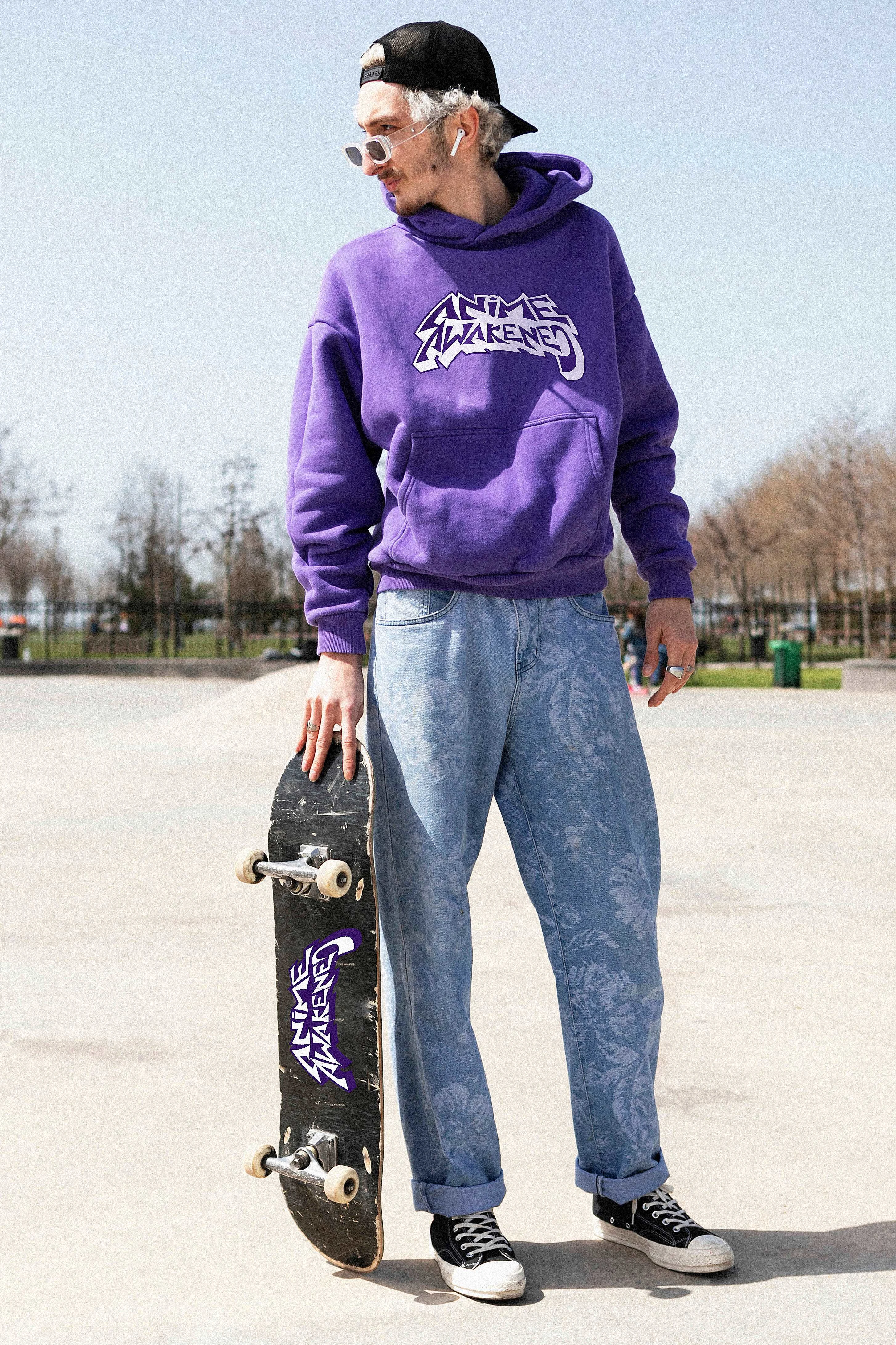
The merchandise showcased in the second image demonstrates how effectively the brand translates to real-world applications. The purple colorway serves as a signature element, creating instant brand recognition across different items.
Brand Ethos
Anime Awakened positions itself at the intersection of multiple subcultures that have become increasingly mainstream. The brand appears to understand that anime fandom is no longer niche but has become a significant cultural force that naturally overlaps with streetwear and skate communities.
The "Awakened" element of the name suggests both:
A celebration of anime culture coming into its own power and recognition
An "awakening" to the creative possibilities when these cultural elements combine.
Target Audience
Young adults who identify with multiple cultural interests
Fashion-conscious individuals who value unique, bold statement pieces
Anime enthusiasts who want to express their fandom in subtle, street-credible ways
Urban culture participants who appreciate the artistic and narrative depth of anime.
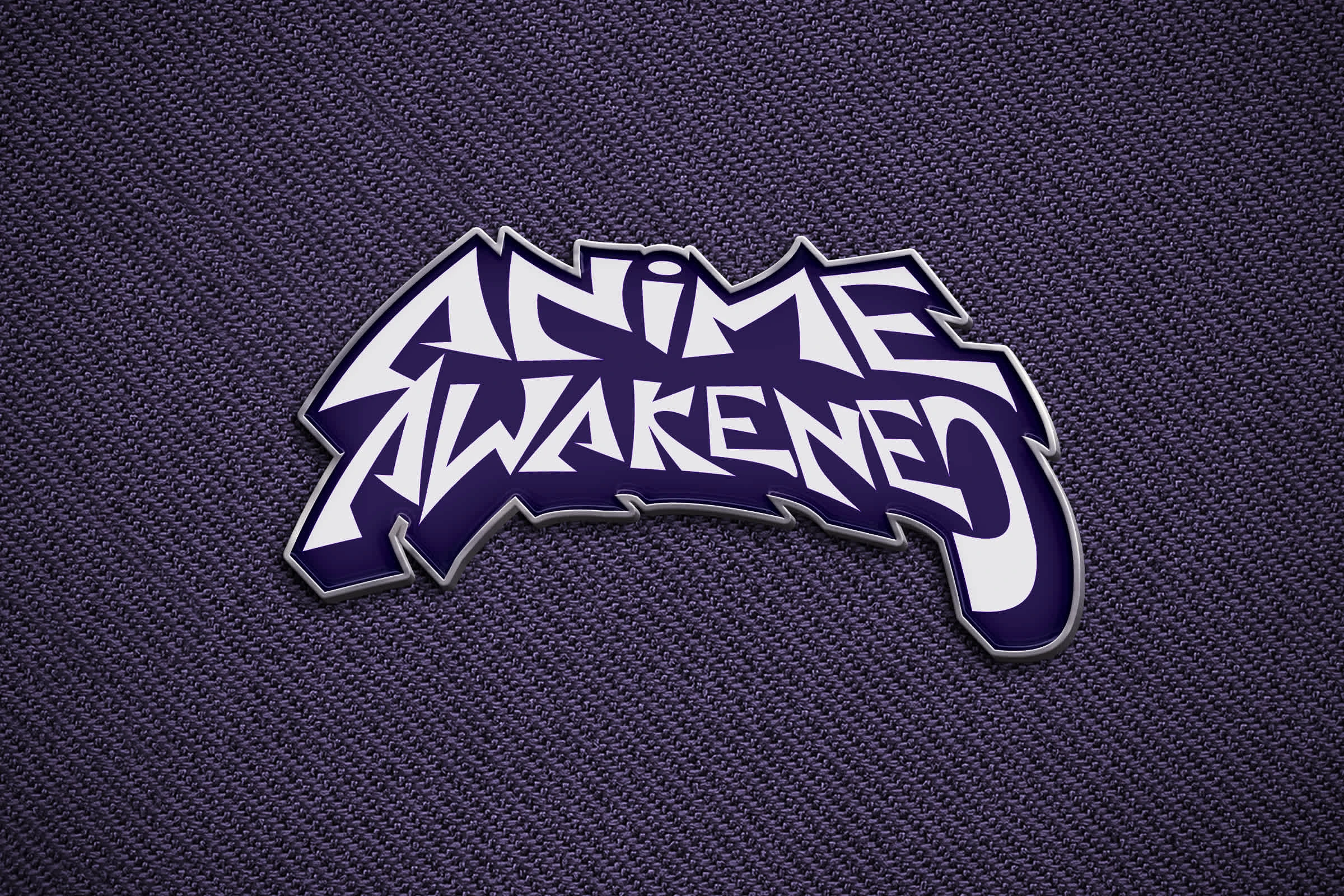
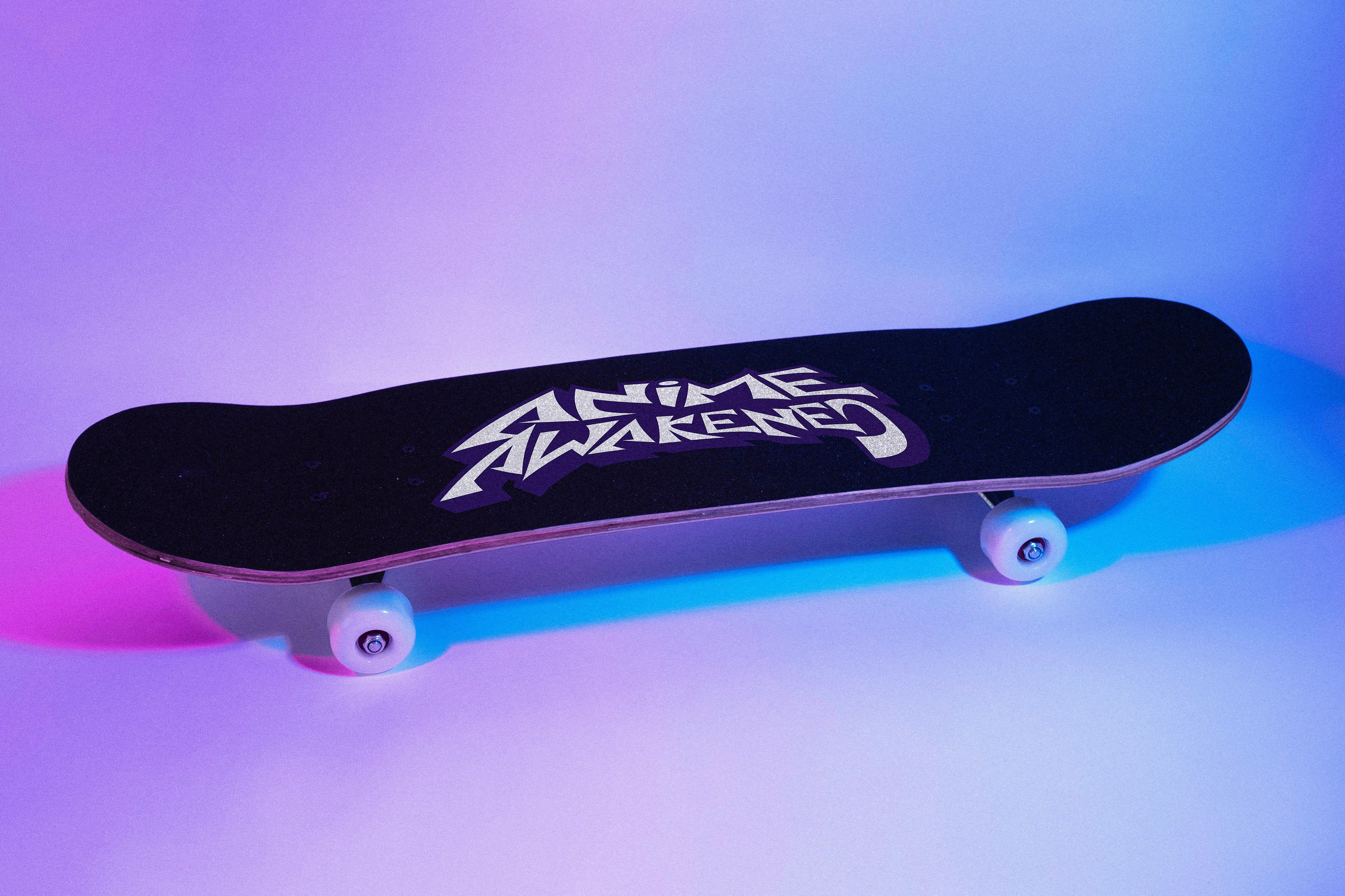
The Logo
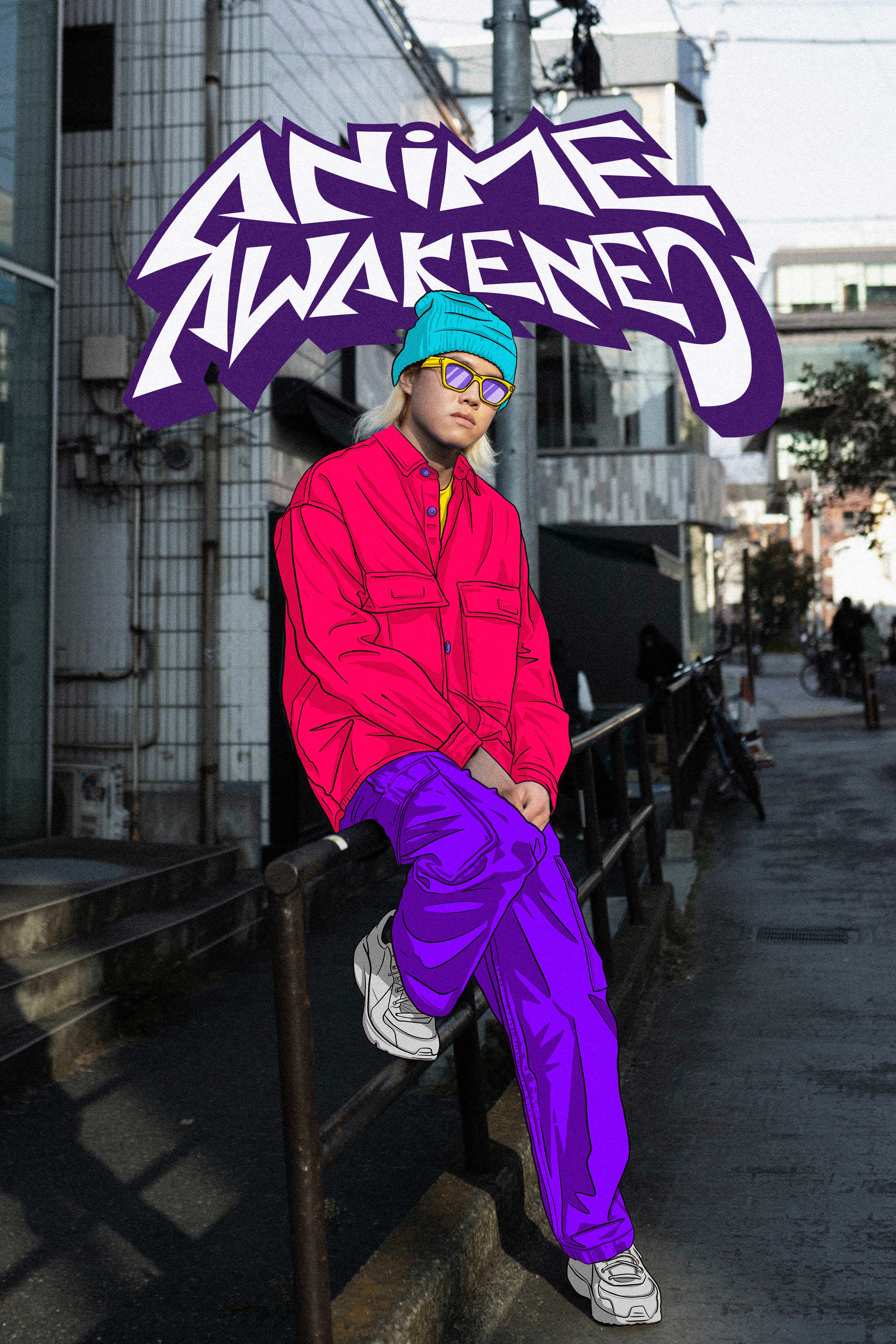
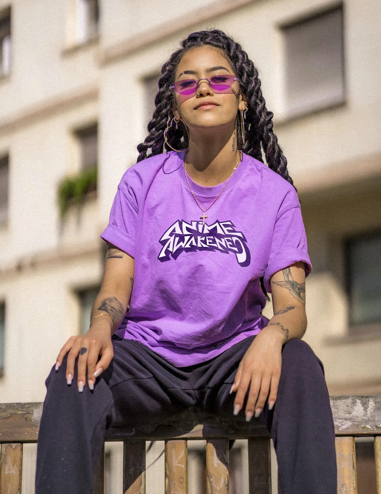
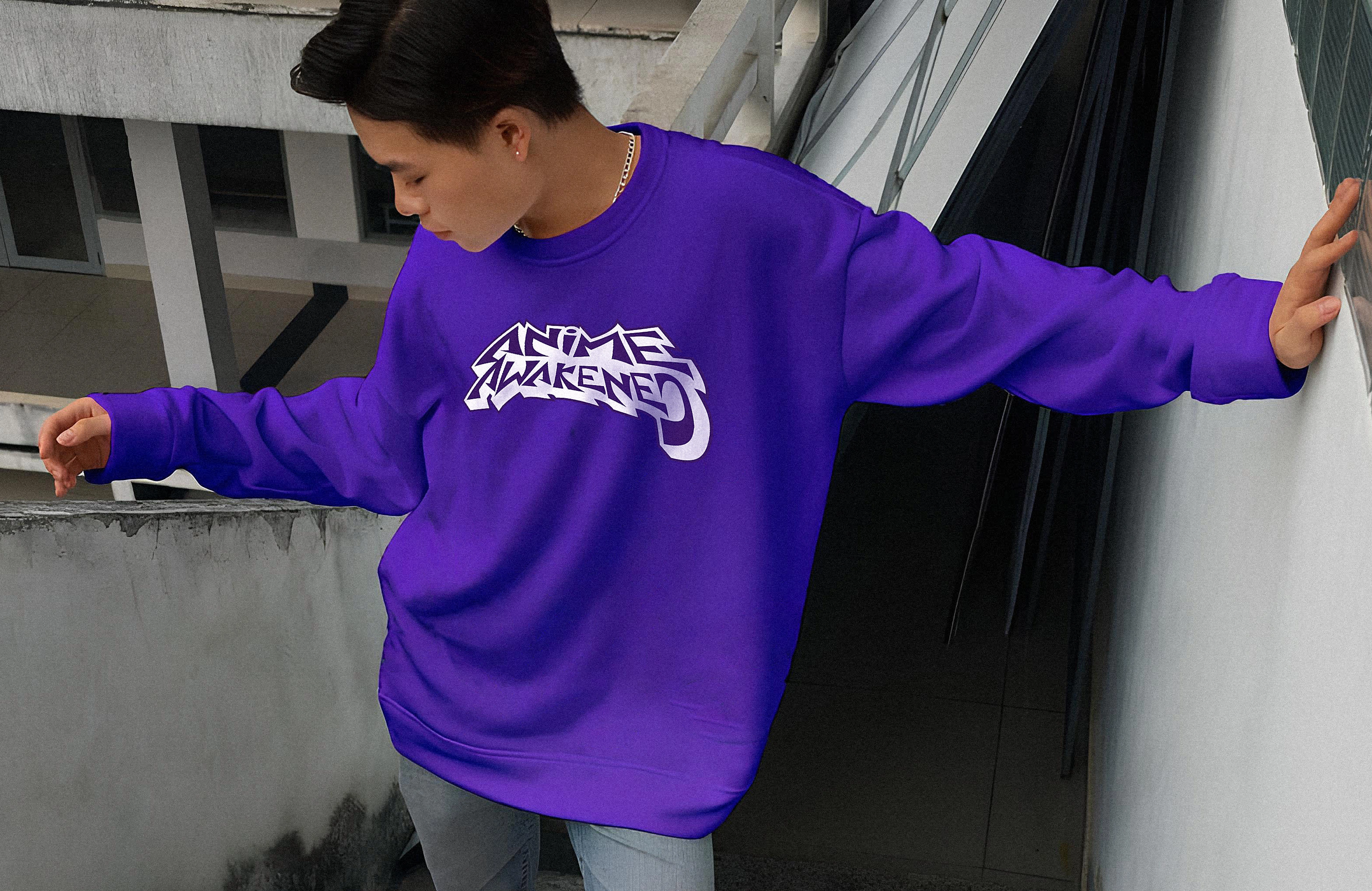
The Anime Awakened logo presents a bold, dynamic typographic approach that immediately communicates energy and attitude. The deep purple color choice is distinctive and memorable, moving away from expected anime-related color schemes while maintaining a connection to the vibrant, expressive world of anime aesthetics.
Key design elements include:
Angular Typography: The sharp, jagged letterforms evoke the dynamic action lines and dramatic styling often found in anime art, particularly in action sequences and title cards
Stacked Format: The vertical arrangement of "ANIME" above "AWAKENED" creates balance while maximizing visual impact
Graffiti-Inspired Elements: The styling has clear connections to urban art and skate culture, with letters that appear to stretch and flow as if in motion
Bold Simplicity: The monochromatic approach allows for maximum versatility across applications.

The Anime Awakened Streetwear Collection: Where Function Meets Fandom
Collection Overview
The Anime Awakened streetwear collection masterfully translates the brand's distinctive visual identity into wearable pieces that resonate with both anime enthusiasts and streetwear aficionados. Instead of relying on obvious anime references or character illustrations, the collection establishes its credibility through thoughtful design choices, quality fabrication, and authentic street sensibilities.
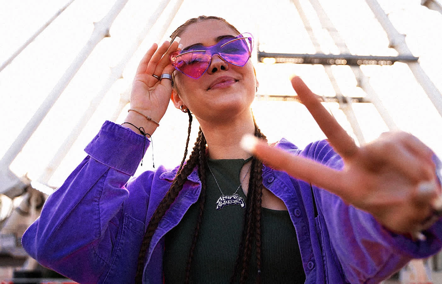
Signature Purple: A Visual Anchor
The collection's standout characteristic is its commitment to the signature purple colorway, which serves multiple purposes:
Creates immediate brand recognition across disparate pieces
Establishes a visual connection to anime's vibrant aesthetic without being literal
Differentiates the line from typical streetwear collections dominated by neutral tones
Provides versatility for layering and creating cohesive outfits
This strategic color choice allows wearers to signal their connection to the culture without overtly announcing it—a hallmark of sophisticated streetwear.
Collection Elements
The collection includes a careful selection of foundational streetwear pieces:
Purple Button-Down Overshirts: This versatile layer functions as both outerwear and statement piece.
Zip Jackets: Featuring technical details like reinforced seams and a distinctive collar treatment, these pieces bridges athletic influences with contemporary street style. The placement of brand identifiers is subtle yet recognizable to those "in the know."
Graphic Tees: The fits perfectly align with current streetwear silhouettes while providing comfort and mobility for skate culture participants.
Eyewears: Though not clothing per se, the collection's tinted purple sunglasses demonstrate how the brand extends its identity beyond apparel, creating a complete aesthetic universe for consumers to inhabit.
Design Philosophy
What's particularly impressive about the Anime Awakened collection is its restraint. Rather than overwhelming garments with busy graphics or literal anime references, the collection builds credibility through:
Quality fabrication with attention to drape and silhouette
Strategic logo placement that feels organic rather than forced
Versatile pieces that integrate seamlessly into existing wardrobes
A cohesive color story that feels intentional rather than random
This approach aligns with contemporary streetwear's evolution away from loud logos toward more refined expressions of cultural participation.
Cultural Positioning
The collection situates itself at the intersection of several influential currents in contemporary culture:
The global mainstreaming of anime beyond dedicated fandom into broader popular culture
Streetwear's evolution from niche subculture to significant fashion force
The increased fluidity between different cultural expressions (skate, anime, fashion)
Youth culture's embrace of bold self-expression through personal style
By acknowledging these convergences without being heavy-handed, the collection feels authentic rather than opportunistic.
Wearability Factor
Unlike some streetwear that prioritizes statement-making over function, the Anime Awakened collection appears to balance aesthetic impact with genuine wearability. The pieces shown suggest comfort, durability, and versatility—essential qualities for consumers who live active lifestyles connected to skate culture.
The collection's focus on adaptable layers rather than single-season trend pieces also speaks to sustainability and longevity—increasingly important considerations for conscious consumers.
Market Differentiation
In a crowded streetwear marketplace, Anime Awakened distinguishes itself by:
Avoiding the oversaturation of obvious anime imagery that characterizes many fandom-based brands
Creating a sophisticated color signature that stands apart from competitors
Balancing brand visibility with wearable designs
Creating pieces that can be styled together for maximum impact or integrated with other brands for subtle cultural signaling
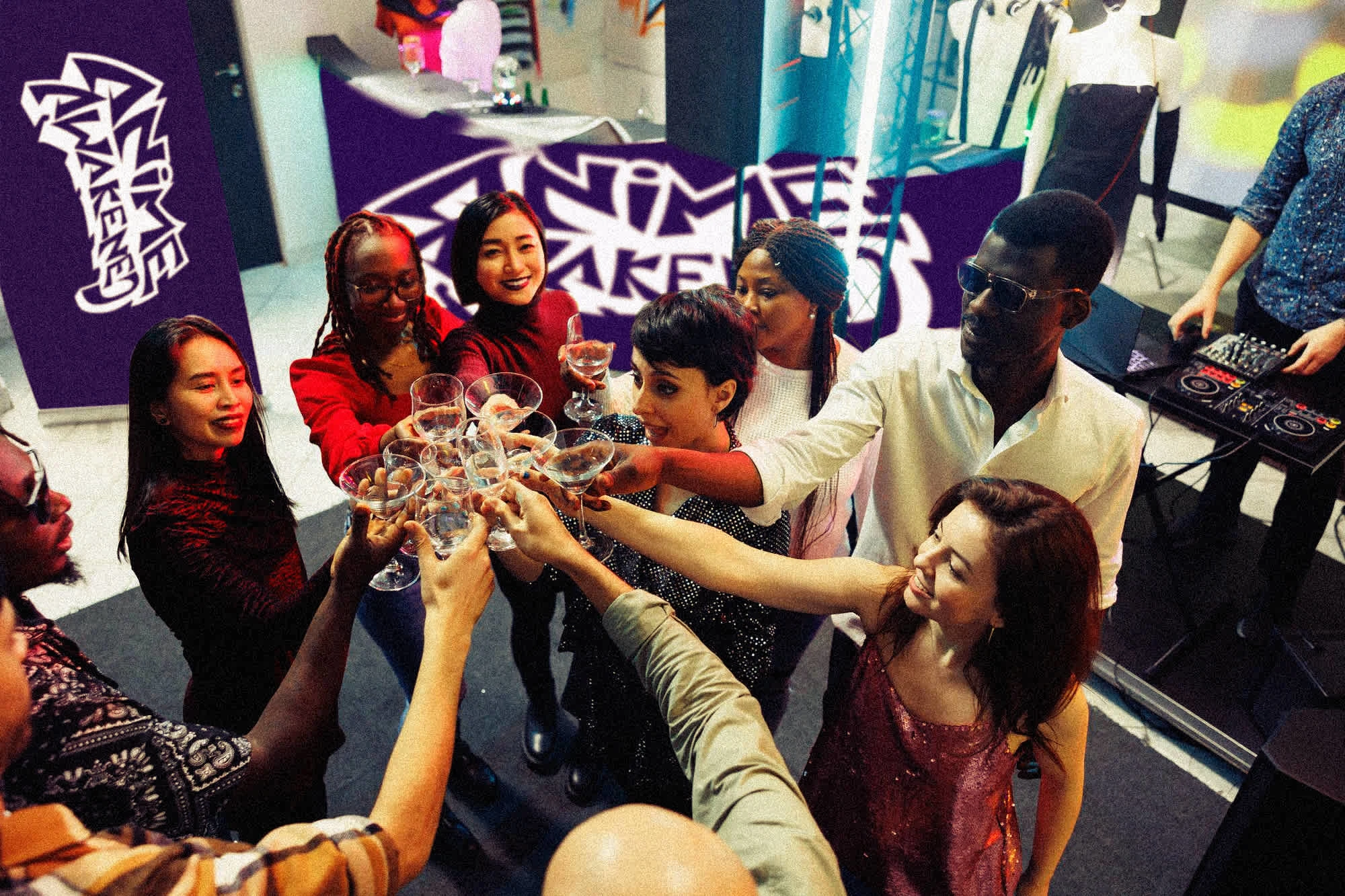
This strategic positioning allows the collection to attract both dedicated anime fans seeking community identification and fashion-forward consumers drawn to the aesthetic without necessarily participating in anime fandom.
Overall
I successfully crafted a visual identity that feels authentic to both anime culture and streetwear sensibilities. By using a distinctive color palette, bold typography, and carefully considered merchandise designs, the brand avoids the pitfalls of appearing gimmicky or inauthentic to either community.
The design strikes a delicate balance - clearly referencing anime without relying on literal character depictions or obvious visual tropes. This approach gives the brand longevity and versatility that more directly referential designs might lack.
Like this project
Posted May 11, 2025
Designed Anime Awakened's streetwear collection blending anime and streetwear culture.