Perfect Pilates Logo Design

Isaac Blake Tile


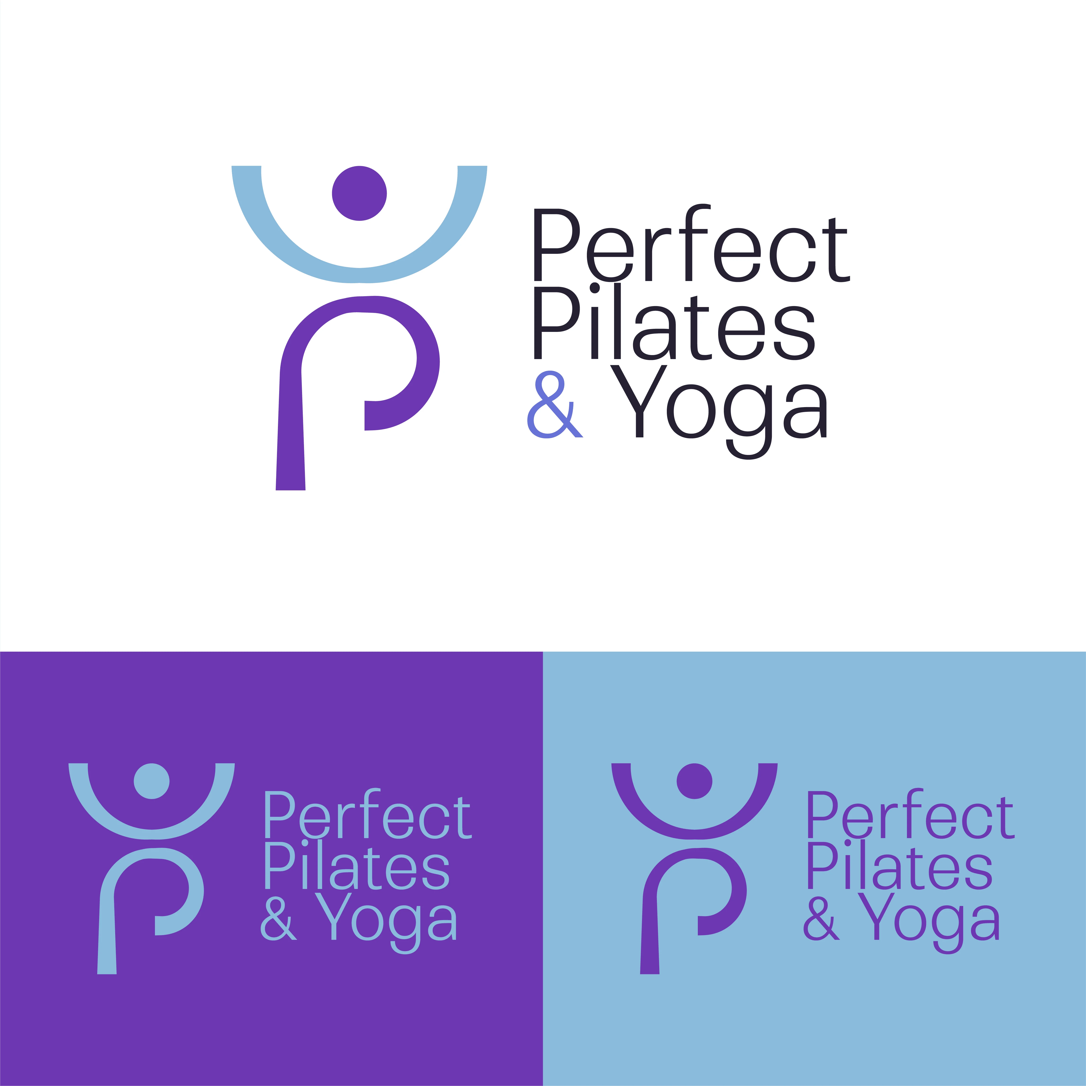
Perfect Pilates - Logo Design
Client: Perfect Pilates
Industry: Health & Wellness
Scope: Logo design
Context: New studio, first logo
Overview
Perfect Pilates is a new yoga and pilates studio that needed a logo to launch with. The brief was specific: a mark that feels flowy, appeals to a female audience, and communicates the physicality of the practice without looking clinical or athletic-brand generic.
The Brief
The client wanted something that felt organic and graceful rather than rigid or corporate. The target audience skews female, so the visual tone needed warmth and elegance over intensity. They wanted the logo to feel like an invitation, not a gym sign.
Logo Concept
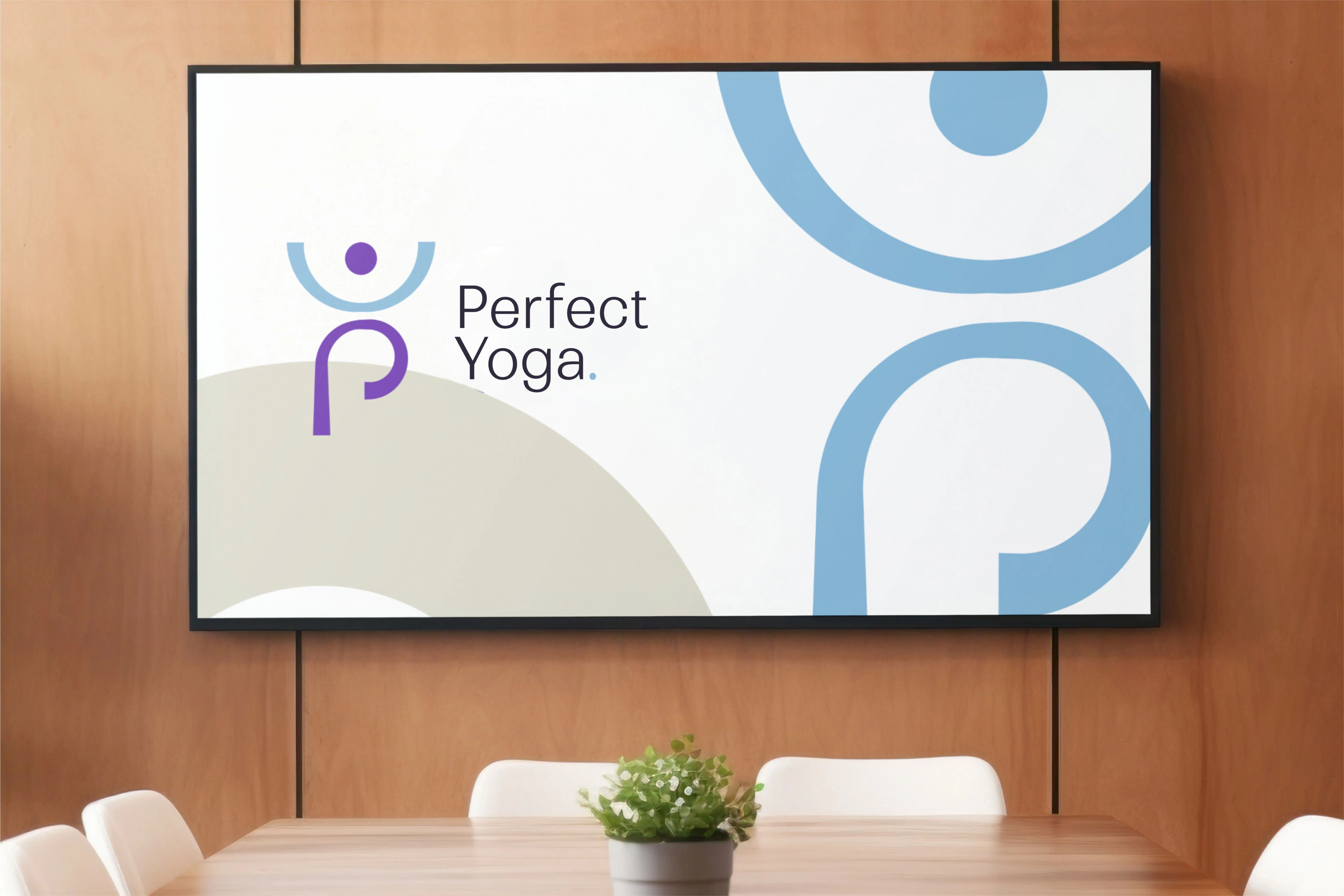
The logomark is a human figure in a pilates pose: arms raised, standing on one leg, with the other leg curved back to form the letter "P" for Perfect Pilates.
This does a few things at once:
Embeds the practice into the mark. The figure is mid-movement, so the logo communicates what the studio does without needing a tagline
Creates a natural letterform. The curved leg forms a "P" that reads clearly but doesn't feel forced. It's discovered rather than spelled out
Delivers the flowy quality the client asked for. The curves of the pose, the raised arms, and the arched leg all create continuous flowing lines rather than sharp angles
The overall silhouette is balanced and graceful, which mirrors the physical discipline itself.
Design Decisions
Line Quality: The figure uses smooth, continuous curves throughout. No hard corners, no geometric rigidity. Every line flows into the next, reinforcing the movement-based nature of pilates and yoga.
Femininity Without Cliche: The mark reads as elegant and female-forward without relying on pink palettes, script fonts, or floral elements. The femininity comes from the fluidity of the form itself.
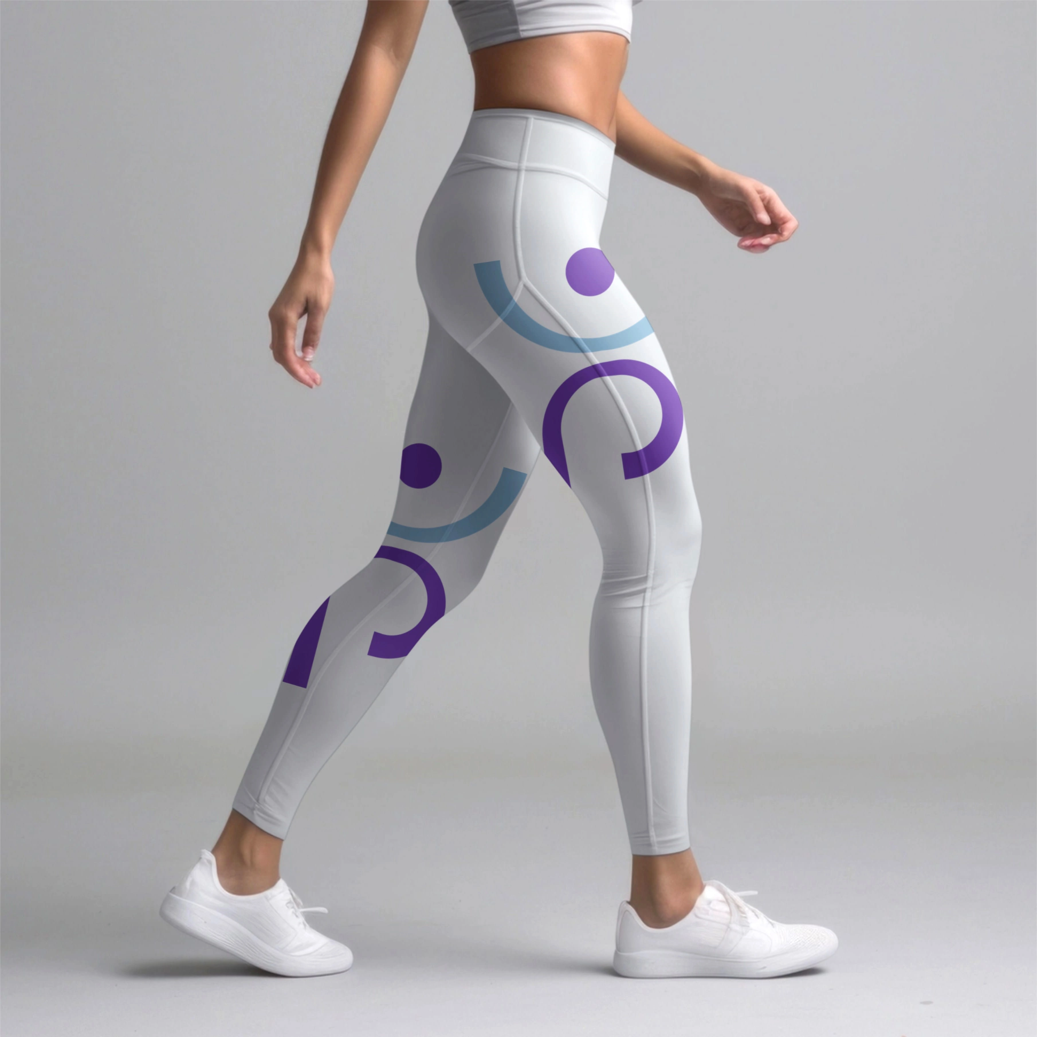
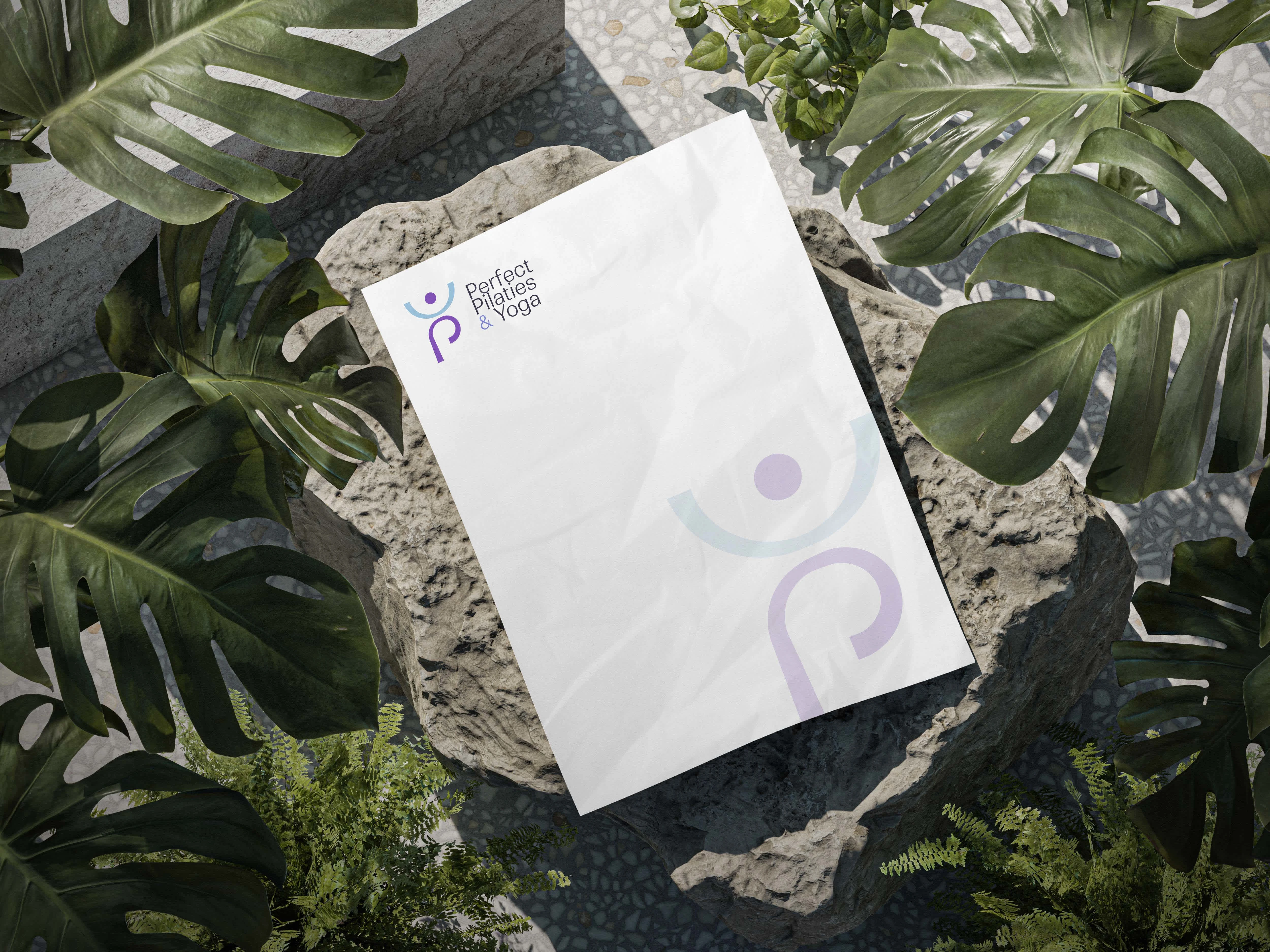
Simplicity: As a logo-only deliverable, the mark needed to carry the entire brand impression on its own. It's clean enough to work at small sizes on signage, apparel, and social avatars, but distinctive enough to be memorable.
Result
A logo for a new pilates and yoga studio that captures the physicality of the practice, appeals to its target audience, and establishes a visual identity the studio can build on as it grows. The hidden "P" gives the mark a layer of craft that rewards a second look.
Like this project
Posted Sep 20, 2024
Logo for Perfect Pilates, a new yoga and pilates studio targeting a female audience. A flowing human figure in pose, with the arched leg forming the letter 'P.' Clean, graceful, and built to work everywhere.